

No More Drawing Fibonacci Arcs by Hand
TradingView has shipped a Fibonacci Arc drawing tool forever, but you place the two anchor points yourself, which means redrawing it every time the market moves. BigBeluga’s indicator “Swing Fibonacci Arcs & Volume Profile” hands that job over to the chart completely.
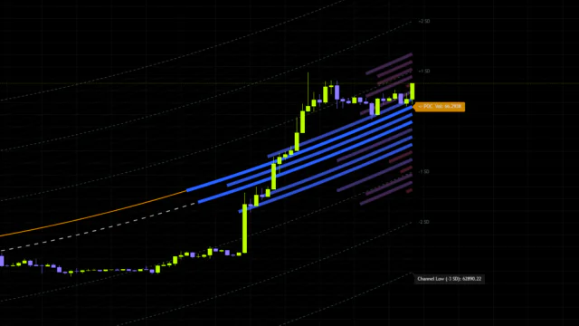
It picks up the latest swing on its own and fans seven arcs out from the point where price turned. On top of that, it stacks a volume histogram to the right of that same anchor and drops a POC line on the price bucket that traded the most. The idea is to cover curved resistance and a horizontal volume shelf, two things with very different personalities, in a single script.
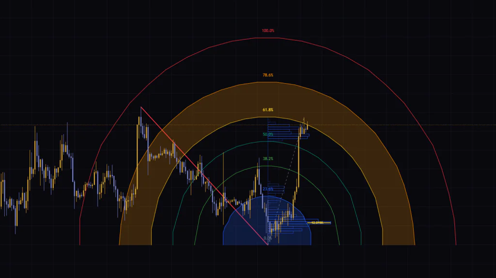
The first time I loaded it, honestly, my reaction was that it looked loud. Rainbow arcs sprawling across the whole screen will throw most people off. Once you sort out which line means what, though, the number of places you actually need to look shrinks fast. This article breaks the display into three parts and spells out what to watch and what you can safely ignore.
For what it is worth, the script is published as open source, so anyone can read through it and use it for free.
How It Differs From Drawing Fibs Yourself
There are plenty of similar tools around, so let me place this one first.
| Tool | How the anchor is set | Shape | Volume link |
|---|---|---|---|
| Fibonacci retracement | You pick two points | Horizontal levels | None |
| Fibonacci arc (drawing tool) | You pick two points | Circular arcs | None |
| “Swing Fibonacci Arcs & Volume Profile” | Automatic, from the latest swing | Half-ellipses with shaded bands | Profile built from the same anchor |
The difference comes down to two things: who picks the anchor and whether volume comes with it. Levels you draw yourself feel more convincing, but you never escape the redraw work, and two traders will place them differently. Nailing that down mechanically is where this indicator sits.
Start With the Anchor, Because Everything Builds From It
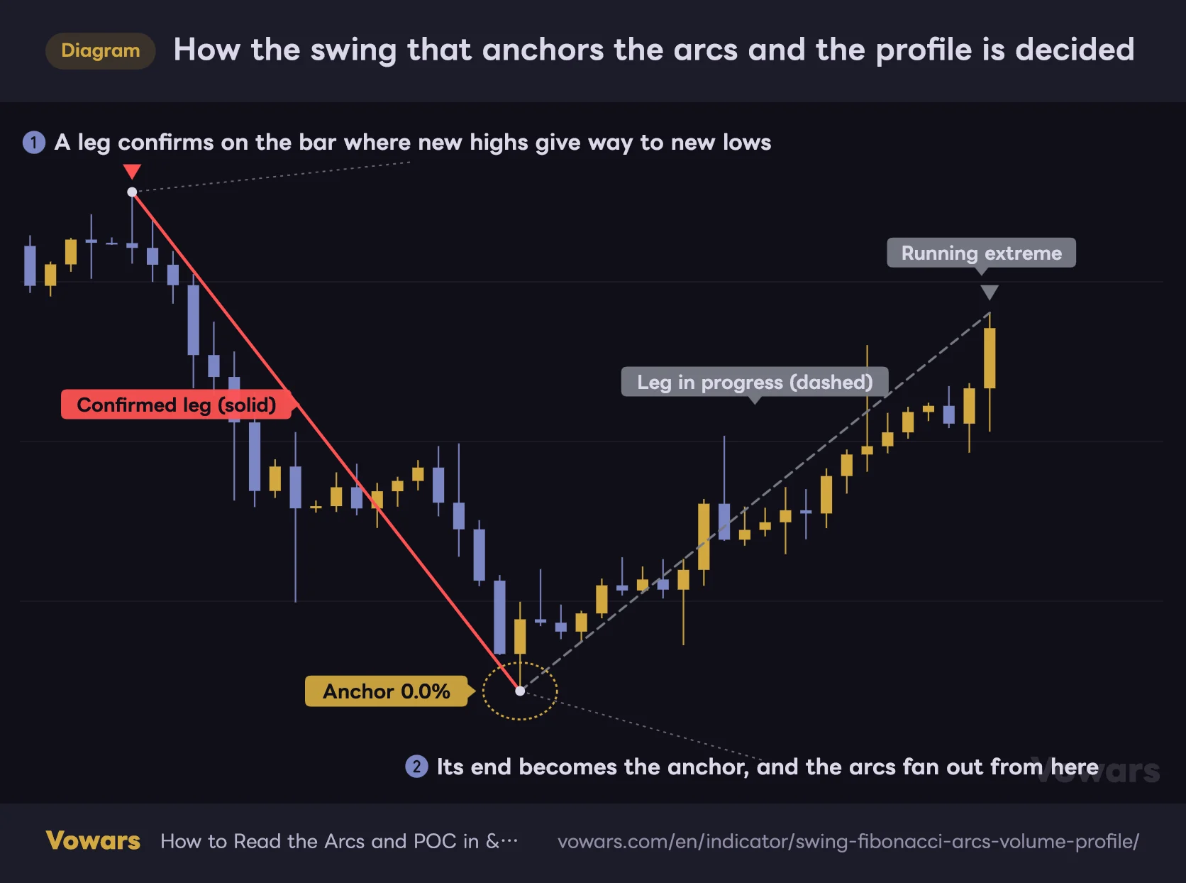
The arcs and the profile both grow from one single point, the turning point of the most recently confirmed swing. I will call it the anchor from here on. Find the anchor and everything else on the chart falls into place.
How the swing that anchors the arcs and the profile is decided
The solid line is the confirmed leg, the dashed line is the leg in progress. The low where they meet becomes the anchor for the arcs and the profile.
Vowars DE ver.3.5.0
Direction is worked out simply. Over the lookback set in Swing Structure, it checks whether a new high or a new low printed. The default is 70 bars. While highs keep getting taken out the structure reads up, and the moment lows start getting taken out it flips down.
On the bar where direction flips, the previous leg locks in as a single solid line. A down leg uses Bear Swing Color (red by default), an up leg uses Bull Swing Color (teal by default). And the end of that solid line is the anchor.
The gray dashed line running from the anchor to the current extreme is the leg still in progress, drawn in Real-time Swing Color. Its tip extends every time a new high or low prints, so read it as a not confirmed yet marker.
The confirmed leg disappears the moment a new one confirms. Past swing lines are never kept as history. What you see on the chart is the current structure and nothing else. It is not built for lining up several swings back.
What the Seven Arcs Are Actually Drawing
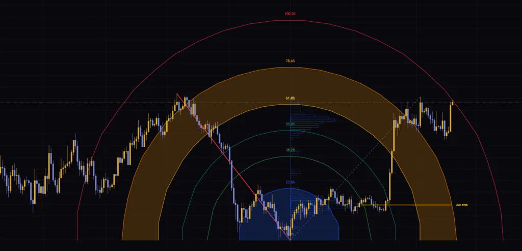
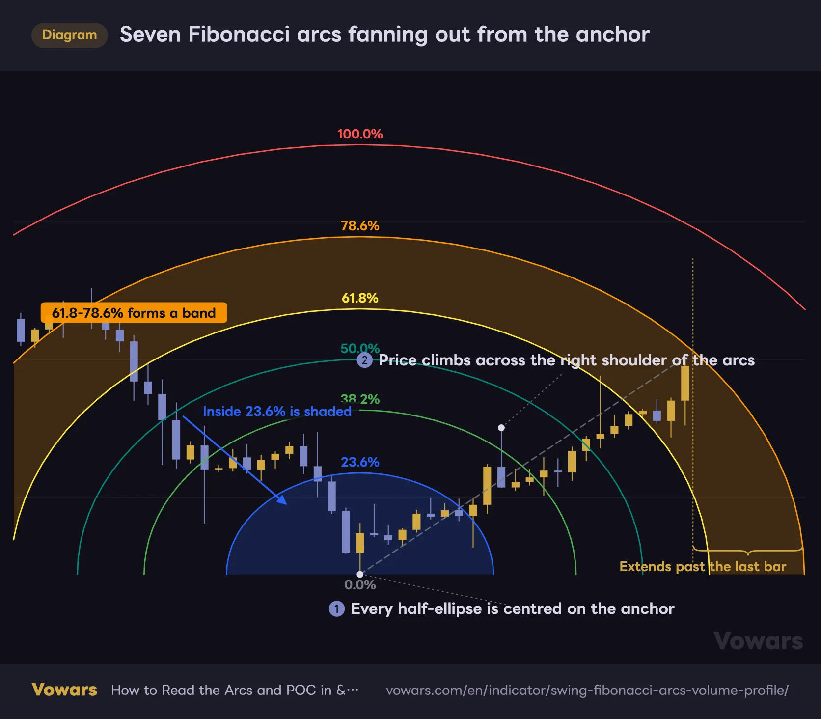
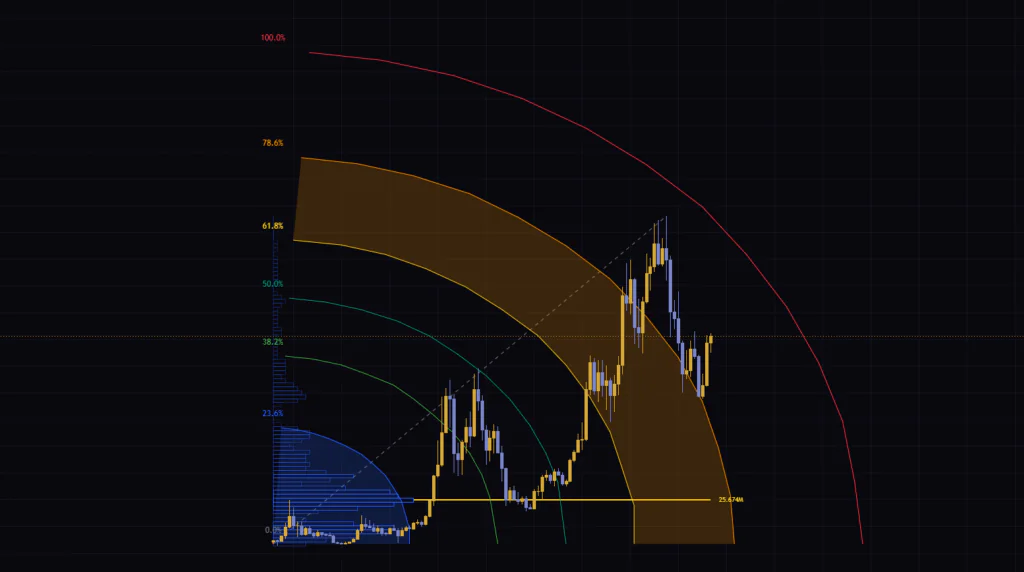
Once the anchor is set, seven half-ellipses fan out from it. The ratios are 0.0%, 23.6%, 38.2%, 50.0%, 61.8%, 78.6% and 100.0%, the same numbers you know from Fibonacci retracements.
Seven Fibonacci arcs fanning out from the anchor
Seven half-ellipses centred on the anchor. By default only the inside of 23.6% and the 61.8-78.6% band are shaded.
Vowars DE ver.3.5.0
There are only three rules to the shape. The apex always sits directly above the anchor, both ends come back down to the anchor price, and the curve extends past the last bar. Keep those three in mind and you will not get lost no matter how many arcs overlap.
Colors are fixed per ratio: 23.6% blue, 38.2% green, 50.0% teal, 61.8% yellow, 78.6% orange and 100.0% red. Only two areas are shaded out of the box, the inside of 23.6% and the 61.8%-78.6% band. Each level has its own Fill checkbox, so turn on whichever band you would rather have stand out.
Turning on Show 0.0% only prints a label at the anchor. No arc is drawn, because the radius is zero. It is easiest to think of it as a marker for where the anchor sits.
Arc Size Is Pinned to a Minimum, Not Just the Leg
This is the part I found most interesting. The width and height of the arcs are not set by the size of the current leg alone.
- Width — the larger of the current leg’s bar count and 70 bars, multiplied by Horizontal Scale (X)
- Height — the larger of the current leg’s range and the range of the last confirmed leg, multiplied by Vertical Scale (Y)
So even a leg that has only just started gets arcs at least 70 x 1.5 = 105 bars wide. The vertical side works the same way. If the prior drop was large, a small new rally still gets arcs scaled to that earlier range. When the arcs look oddly big for a short leg, this floor is usually the reason.
The Other Half of the Tool: Volume Profile and the POC
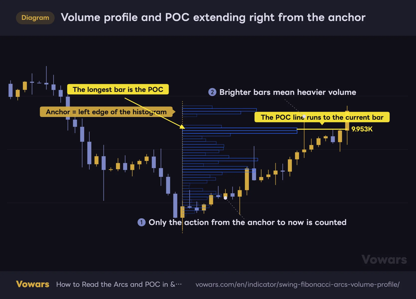
The arcs grab your attention, but in practice this half may be the easier read. It takes the price action from the anchor up to the current bar and stacks volume by price bucket as horizontal bars.
Volume profile and POC extending right from the anchor
The bars are volume per price bucket. The left edge is always the anchor, and the further a bar runs right, the more volume traded in that bucket.
Vowars DE ver.3.5.0
The number of buckets is not fixed. It is derived from the volatility of the symbol. Choppy stretches get thicker rows, quiet stretches get finer ones. The count is held between 10 and 100, so it never collapses into something unreadable.
The way volume gets distributed has a quirk. Each bar’s close sits at the center, and the volume is spread two rows above and below it by distance. It is not spread across the full high-to-low range, so long wicks barely show up in the shape. If you want a strict distribution that includes wicks, this part will feel thin.
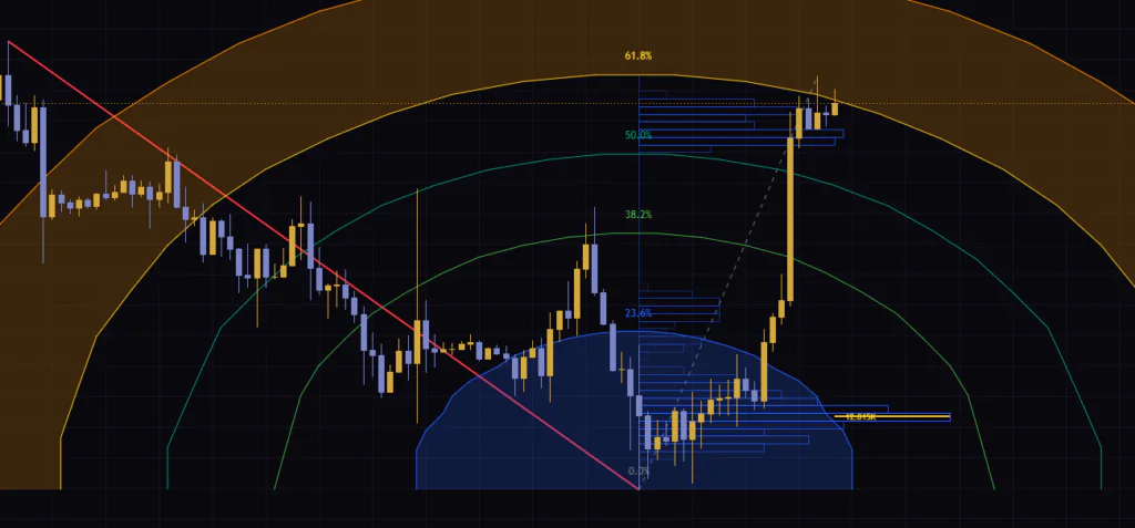
Bars run to a maximum of Profile Max Width (Bars) bars, 35 by default. The longest bar is the POC, and a line in the Show POC Line color runs from there to the current bar, with the volume of that bucket printed at the right end.
On symbols with no volume feed, each bar is counted as 1. The histogram then shows not a volume distribution but how long price stayed in each bucket, a time-at-price distribution. You read it much the same way, but it is worth knowing the two are not identical.
The POC Here Is the Center of Gravity of the Current Leg
POC normally suggests a market-wide shelf, but here the meaning is narrower. It marks the heaviest bucket inside one limited window, anchor to current bar. When the anchor switches, the whole window switches with it and the POC jumps to a different price.
That makes it good for spotting where the center of gravity of the current leg sits. If price is holding above the POC, buyers have the better position within that leg, and a pullback into the POC lands on the price most participants are holding, which tends to produce a reaction.
I watch the POC before I watch the arcs. Curves move as time passes, but the POC stays flat as long as the anchor holds. For a decision point, something that does not move is easier to work with.
Read an Arc Like a Horizontal Level and You Will Get Caught
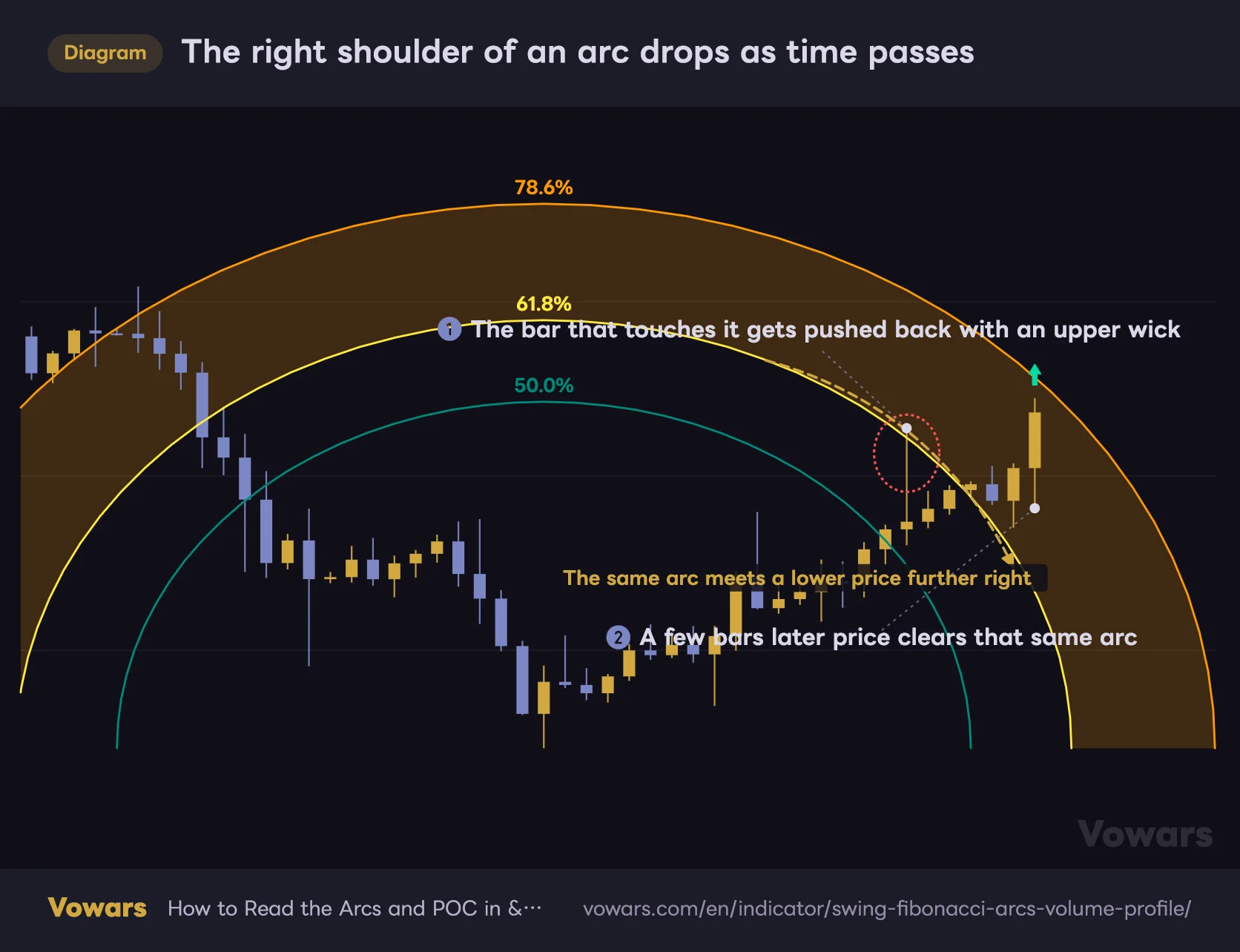
The obvious thing I noticed right away is that the arcs come down as time passes. They are half-ellipses, so the further right you go from the apex, the lower they sit.
The right shoulder of an arc drops as time passes
An arc is a flattened half-ellipse, so the same ratio meets a lower price the further right you go.
Vowars DE ver.3.5.0
The same 61.8% meets a different price today than it will a week from now. Get rejected once, chop sideways for a while, and it is perfectly normal for the arc to drop into price and get taken out without price extending at all.
So the thing to watch is not which price it hit, it is which bar hit it, and with how much force. This indicator got much easier to handle once I started reading the candle that reached the arc together with the two or three bars after it.
How I Actually Read It, Step by Step
1Check the anchor and the direction
A red solid line means the prior leg was down and the anchor is a low, so the arcs open upward. A teal line means the opposite. Get this backwards and every read after it flips too.
2See which band price is sitting in
If price is in the blue area just above the anchor, inside 23.6%, the pullback is still shallow. If it has reached the orange band, 61.8% to 78.6%, it is a deep retracement for that leg.
3Prioritise where the POC overlaps
Where an arc and the horizontal POC line sit at a similar price, curved resistance and a volume shelf line up at once. If you are unsure which arc to watch, hunting for that overlap is the quickest filter.
Which Timeframes It Suits
The default 70 bars covers roughly three and a half months on the daily and about 12 days on the 4H. That is a fairly large unit of structure, so the swings stay clean even on lower timeframes.
| Timeframe | What it suits |
|---|---|
| 15m to 1H | Gauging how deep the pullback of the day runs. Arcs get reached quickly, so watch the shape of the bar that hits |
| 4H | A reference for multi-day dips and rallies. The POC holds up well here, and it is the easiest to work with |
| Daily and above | Waiting on medium-term turns. Arcs project months ahead, so give it room |
Where It Clicks, and Where It Does Not
Every indicator has terrain it likes. With this one the line is unusually clear.
It Clicks When the Market Goes and Comes Back
A hard drop followed by a bounce, or a strong run followed by a pullback. In markets that clearly go and come back, the arc ratios work as a straightforward gauge of retracement depth. The bigger the move, the bigger the arcs, which widens the set of candidate levels naturally. Bitcoin, which tends to run one way and then retrace properly, along with gold and index ETFs where levels get respected, have felt like good fits.
Higher volatility means coarser price buckets, which makes the profile shape easier to read as well. Small noise gets rolled up, so the center of gravity stands out.
It Struggles in One-Way Trends
In a market that grinds one direction without giving a real pullback, the arcs become curves that are simply sitting there. When price blows through 23.6% and keeps going past 100%, waiting on ratios just leaves you behind.
Long tight ranges are the other weak spot. Neither highs nor lows get taken out, so no new leg confirms and the arcs keep hanging off an old anchor. At that point the display has stopped updating, so it is safer to pull the indicator off or drop it from your decision-making.
Most Fakeouts Show Up When the Anchor Switches
The thing that trips me up most is the anchor switching. When a new high or low flips direction, the solid line, the arcs and the profile are all rebuilt at once. A price that was 61.8% yesterday can be 38.2% today.
Watch out in particular for a single spike wick taking out the extreme. Even if the bodies barely moved, one wick reaching the highest high or lowest low of the lookback is enough to flip direction. When the arcs suddenly relocate, get into the habit of checking which side was taken out over the Swing Structure lookback and you will not panic.
Which Settings Are Worth Touching
There are a fair few inputs, but in practice you will only touch the top three. Treat the rest as cosmetic.
| Setting | Default | Suggested | Effect |
|---|---|---|---|
| Swing Structure | 70 | 30-50 / 70-150 | Lookback for the highs and lows that set the anchor. Lower values switch the anchor often, higher values only pick up major turns |
| Horizontal Scale (X) | 1.5 | 1.2-2.0 | Changes arc width only. Higher values flatten the curve and delay when price meets it |
| Vertical Scale (Y) | 1.5 | 1.2-1.8 | Changes arc height only. Higher values put the same ratio at a higher price |
| Arc Resolution (Segments) | 25 | 25-40 | Smoothness of the curve. Higher looks cleaner but costs more to draw |
| Arcs Line Width | 1 | 1-2 | Thickness of the arc borders. Bump it to 2 if the lines get lost in the candles |
| Fill Transparency | 80 | 80-90 | Transparency of the band shading. Higher is lighter and keeps the candles readable |
| Profile Max Width (Bars) | 35 | 20-35 | Longest bar in the histogram. Shorten it if the profile covers the price action to its right |
X and Y Do Completely Separate Jobs
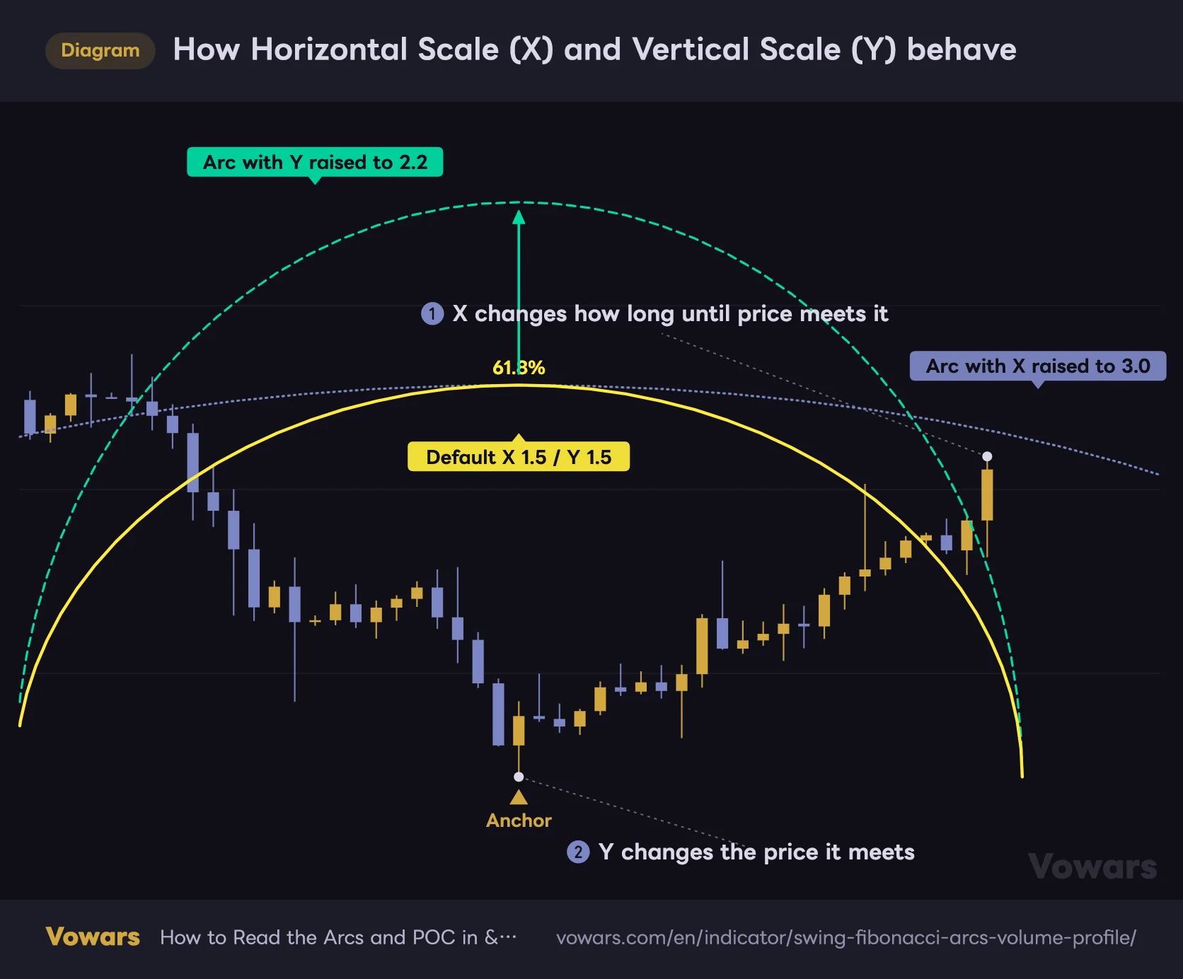
These two get mixed up easily, so a picture is faster than an explanation.
How Horizontal Scale (X) and Vertical Scale (Y) behave
For the same 61.8% arc, X changes the width only and Y changes the height only.
Vowars DE ver.3.5.0
Horizontal Scale (X) stretches horizontally only, Vertical Scale (Y) vertically only. Both run from 0.1 to 10.0, and neither one moves the anchor.
Personally I leave the defaults alone on the daily, and on lower timeframes I drop Horizontal Scale (X) to around 1.2 to stand the arcs up. Flatter arcs take longer to reach price, and on fast timeframes I cannot sit around waiting for the reaction. If you are happy to be patient, flat is fine.
Settings by Trading Style
- Day trading — drop Swing Structure to 30-50 and set Profile Max Width (Bars) around 20. The anchor switches more often, so it tracks recent structure
- Swing trading — leave Swing Structure at 70, or push it to 100-150. Only major turns get picked up and the arcs sit there as a reference
- Lighter chart — set Fill Transparency to 90 and untick Show on the ratios you do not use. Dropping 38.2% and 50.0% alone cleans it up a lot
Thin Out the Ratios to Clean Up the Chart
Running all seven levels permanently is not realistic, to be blunt. Each ratio has its own Show toggle and color, so switching off the ones you do not use makes the chart far easier to read.
I ended up dropping 38.2% and 50.0% and keeping just three, 23.6%, 61.8% and 78.6%. Shallow pullback, deep pullback, overshoot. Three steps is enough, and the chart goes quiet immediately. Leaving the shading at the default two areas also keeps it obvious where to look.
If You Pair It With Anything, Start With Volume
This indicator shows you volume by price, but it never tells you when that volume came in, because the whole window from the anchor to the current bar is lumped together. That felt like the one real gap, so I keep a volume pane underneath.
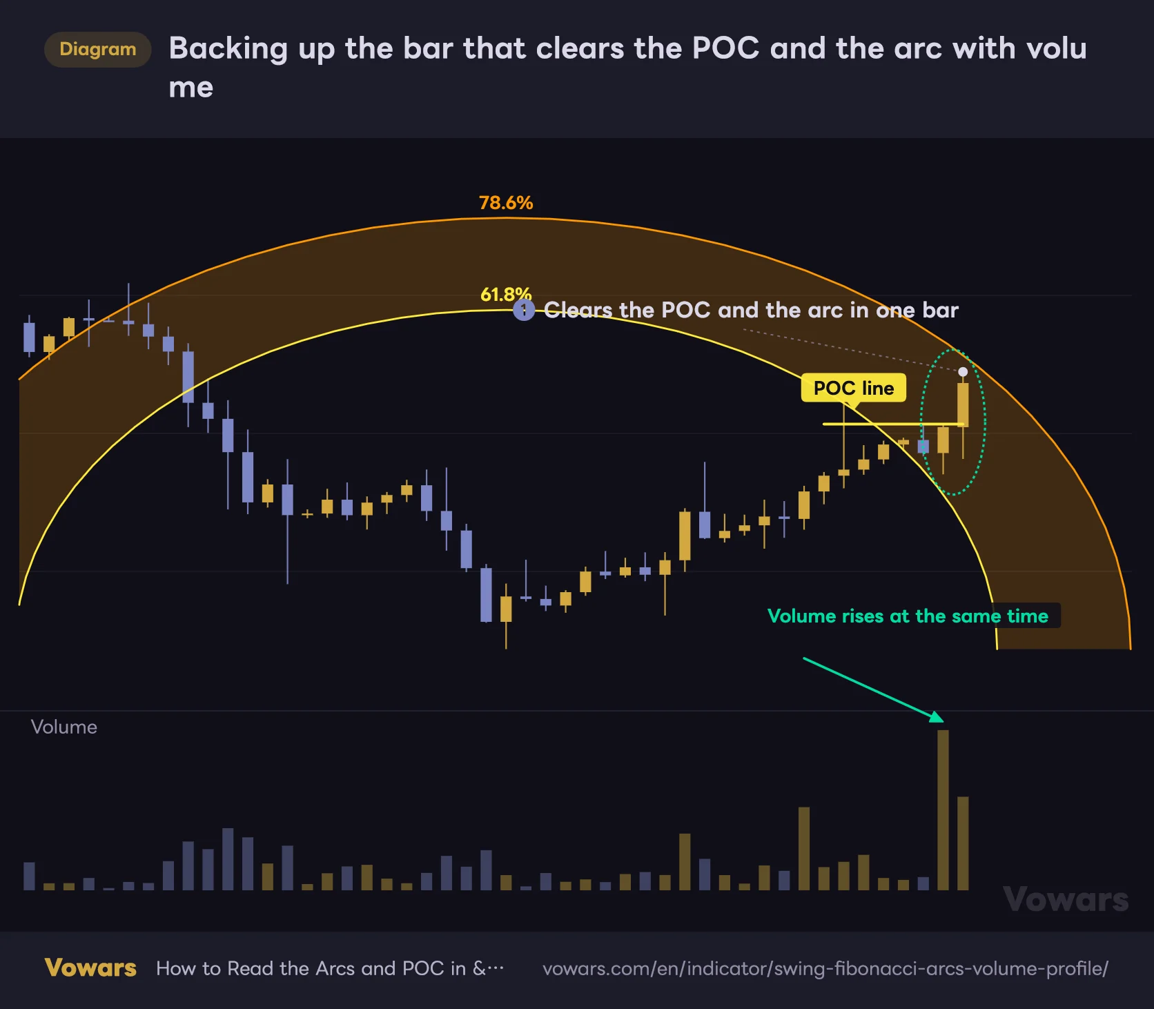
Backing up the bar that clears the POC and the arc with volume
Where a horizontal POC and a descending arc line up is a spot that tends to break. The volume on the breaking bar tells you whether it is backed.
Vowars DE ver.3.5.0
If the bar that clears the overlap of POC and arc comes with volume, you have confirmation for the break. If it just drifted through on thin trade, you can treat it as a break that is likely to get sold back. Volume profile tools and time-series volume were always a natural pair.
Beyond that, pairing it with horizontal support and resistance from a higher timeframe is the obvious move. The arcs are curves, so the spots where they cross a horizontal level narrow down on their own. If you want a separate trend filter, one moving average is plenty. Stack more lines on top of the arcs and the chart stops being readable, so not getting greedy pays off here.
What You Can Lean On, and What You Have to Accept
What You Can Lean On
- Anchor hunting is automatic, so the whole chore of redrawing fibs by hand disappears
- Curved resistance and a horizontal volume shelf in one script
- Arcs extend past the last bar, so you can see where price will meet them ahead of time
- The bucket count adjusts itself, so nothing needs tuning when you switch symbol or timeframe
- Input roles are clear, and there is no confusion about what X and Y actually do
What You Have to Accept
- No buy or sell signals, so every read is on you
- Only one confirmed line exists, and past swings or arcs are never kept
- The profile is close-based, so wick volume barely shows up in the shape
- When the anchor switches, the arcs and profile are rebuilt and the picture changes completely
- It draws a lot, and stacking other indicators on top gets cramped fast
Worth Knowing Before You Load It
To keep this pleasant to use, here are the constraints that come out of how it is built.
The arcs, the profile and the POC are all rebuilt from scratch on the latest bar every time. What the arcs looked like a few bars ago is not left on the chart. To review past setups, stepping through with TradingView Bar Replay is the reliable route. Note that Bar Replay on the free plan is limited to daily and higher, so replaying intraday needs a paid plan.
A word on repainting. The swing logic only looks at highs and lows up to that point, so it is not the type that peeks at future data and rewrites the past. That said, confirmation comes late and the shape keeps moving while a leg is in progress, and there is no way around either. Arc size tracks the current extreme, and when the anchor switches it relocates in one go.
The script does not fire alerts on its own, so notify-me-when-price-reaches-an-arc is not available out of the box. TradingView price alerts and alerts on drawings are the practical workaround. Draw a horizontal line at the POC price and set an alert on it and you get close enough in practice.
There is also no mechanism for pulling higher-timeframe data, so you cannot overlay daily arcs on a 15-minute chart. If you want arcs from a higher timeframe on screen at the same time, lining up timeframes in a TradingView multi-chart layout is the quicker route.
Adding It to Your Chart
Open the Indicators menu at the top of your TradingView chart and search the name. It shows up as a community script, and one click applies it. There is nothing special to set up.
The first thing to do after loading it is work out where the anchor is. That is it. Spot the color of the solid line and the 0.0% label at its end, and you can read everything else from there.
Narrow It Down to Two Things and It Gets Easy
 Image
Image“Swing Fibonacci Arcs & Volume Profile” is not an indicator that hands you an answer. No arrows, no win-rate claims. What it does is carve out the structure automatically and show you measured references as curves and volume.
In exchange, the whole routine of drawing fibs by hand, adding a volume profile separately and redrawing both every time the market moves simply goes away. That chore hitting zero lands hardest for people who open charts every day.
Personally, the most practical setup was the 4H with only the POC line and the 61.8%-78.6% band in view. You do not need to track all seven arcs. Narrow it to two things and, for all the loud visuals, the decision actually gets simpler.
If you use Fibonacci daily and you are tired of redrawing it, or you want to gauge retracement depth alongside a volume shelf, it is well worth putting on the chart at least once.