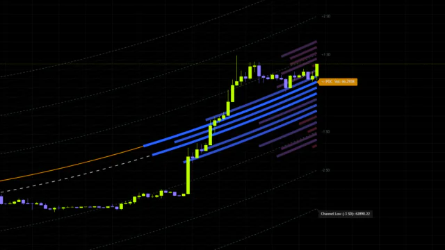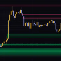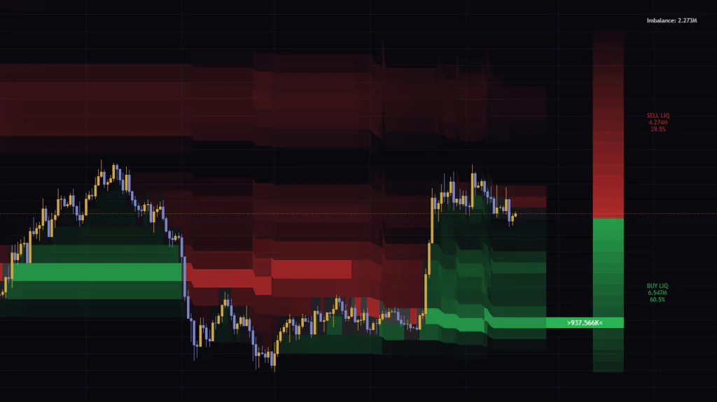


“Liquidity Thermal Map” shows where volume piled up as a heatmap
“Liquidity Thermal Map [BigBeluga]” is an indicator that plots which price levels have soaked up the most volume over a recent lookback window, drawn as horizontal heatmap bands in the chart background. It’s built by BigBeluga and has been featured as a TradingView Editors’ Pick (as of Sep 17, 2026).
It looks flashy, but under the hood it works a lot like a volume profile. A volume profile shows volume at each price level as horizontal bars, whereas “Liquidity Thermal Map” uses band brightness to show how heavy the volume is, and redraws that distribution on every single bar. That means you can see how the high-volume zones have shifted over time just by scrolling back.
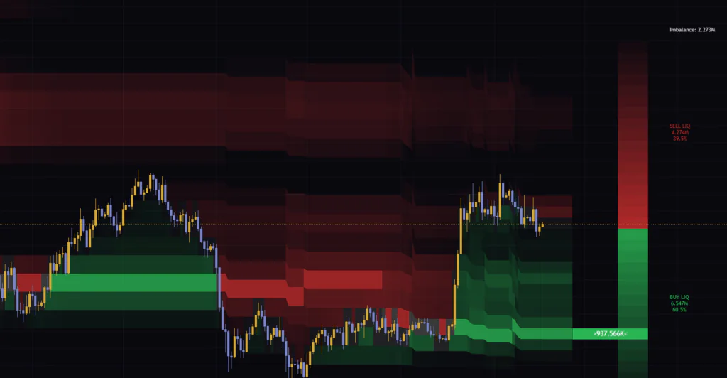
I ran it on Bitcoin’s daily, 4H and 1H charts for a while. My first impression: “support and resistance candidates just pop out on their own.” Before drawing a single horizontal line, you can see exactly where price chopped around. On the flip side, the scale on the far right doesn’t behave the way the author describes, and it’s easy to misread. This article covers that too, so you know what you’re getting before you add it to your chart.
“Liquidity Thermal Map” is not a buy/sell signal tool. It’s a context tool that lays “where the most trading happened” across the chart background, so you can spot the levels price is likely to react to.
What you get on screen: bands, a right-side scale, and three readouts
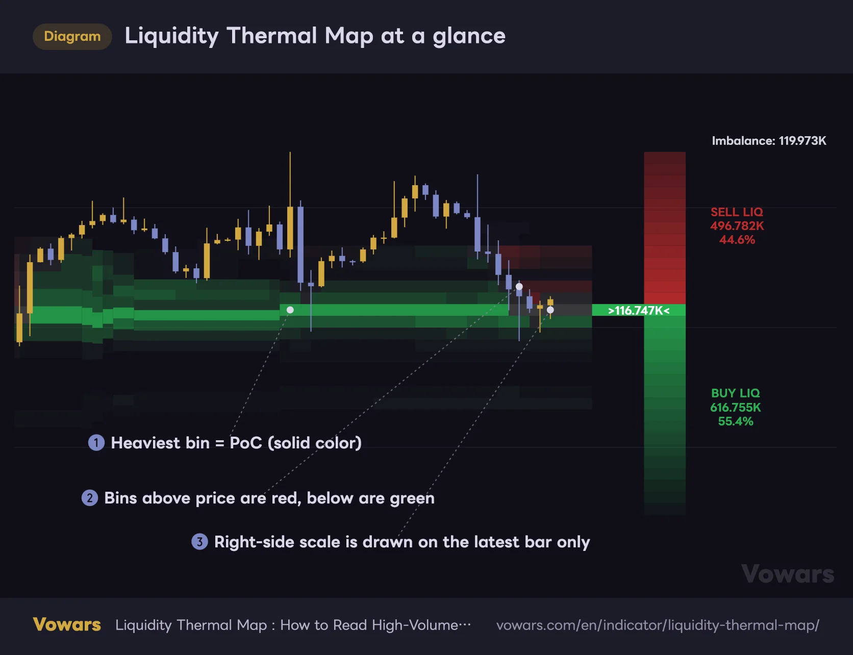
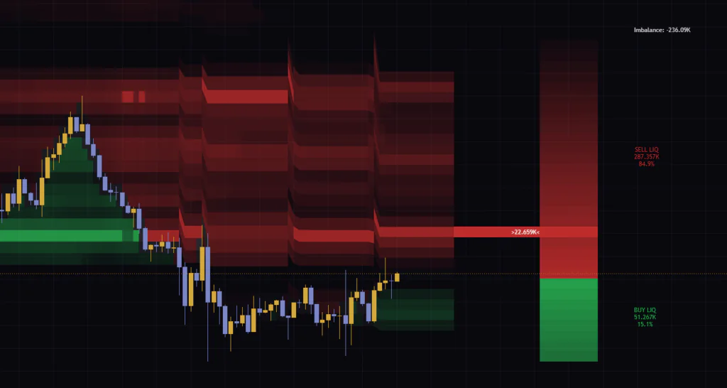
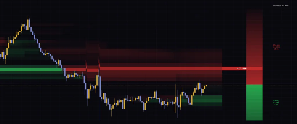
Once it’s on your chart, you’ll see three kinds of elements. Start with the big picture in the diagram below.
Liquidity Thermal Map at a glance
Band brightness shows volume weight; color shows whether the zone sat above or below price at that bar.
Vowars DE ver.3.4.2
| Element | Location | What it shows |
|---|---|---|
| Red and green horizontal bands | Behind the candles | Price zones where volume built up over the recent lookback, as of that bar. Brighter means heavier |
| One solid, strongly colored band | Inside the bands | The bin with the most volume in the window (PoC = Point of Control) |
| Tall red/green bar | To the right of the latest candle | Splits the bins above and below the current price. Shading reflects distance from the current price |
| Band with a “>value<” label | Next to the right-side bar | Where the current PoC sits, and the volume in that bin |
| SELL LIQ / BUY LIQ | Far right | Total volume in the bins above / below the current price, plus each side’s share |
| Imbalance | Top right | BUY LIQ minus SELL LIQ (can be negative) |
The bands stay on historical bars, but the right-side bar and the readouts are drawn on the latest bar only. If you want to see what the scale looked like at some point in the past, rewind with TradingView’s Bar Replay and the indicator recalculates with that bar as the latest one. You have to step forward bar by bar manually, and how far back you can go depends on your plan and timeframe. Scrolling back alone won’t show it, so this one is worth remembering.
How are the bands built? The rules behind color and brightness
Rather than just enjoying “some nice-looking bands,” let’s nail down how they’re made. Once this clicks, it’s obvious why the bands suddenly jump in steps and why their colors flip.
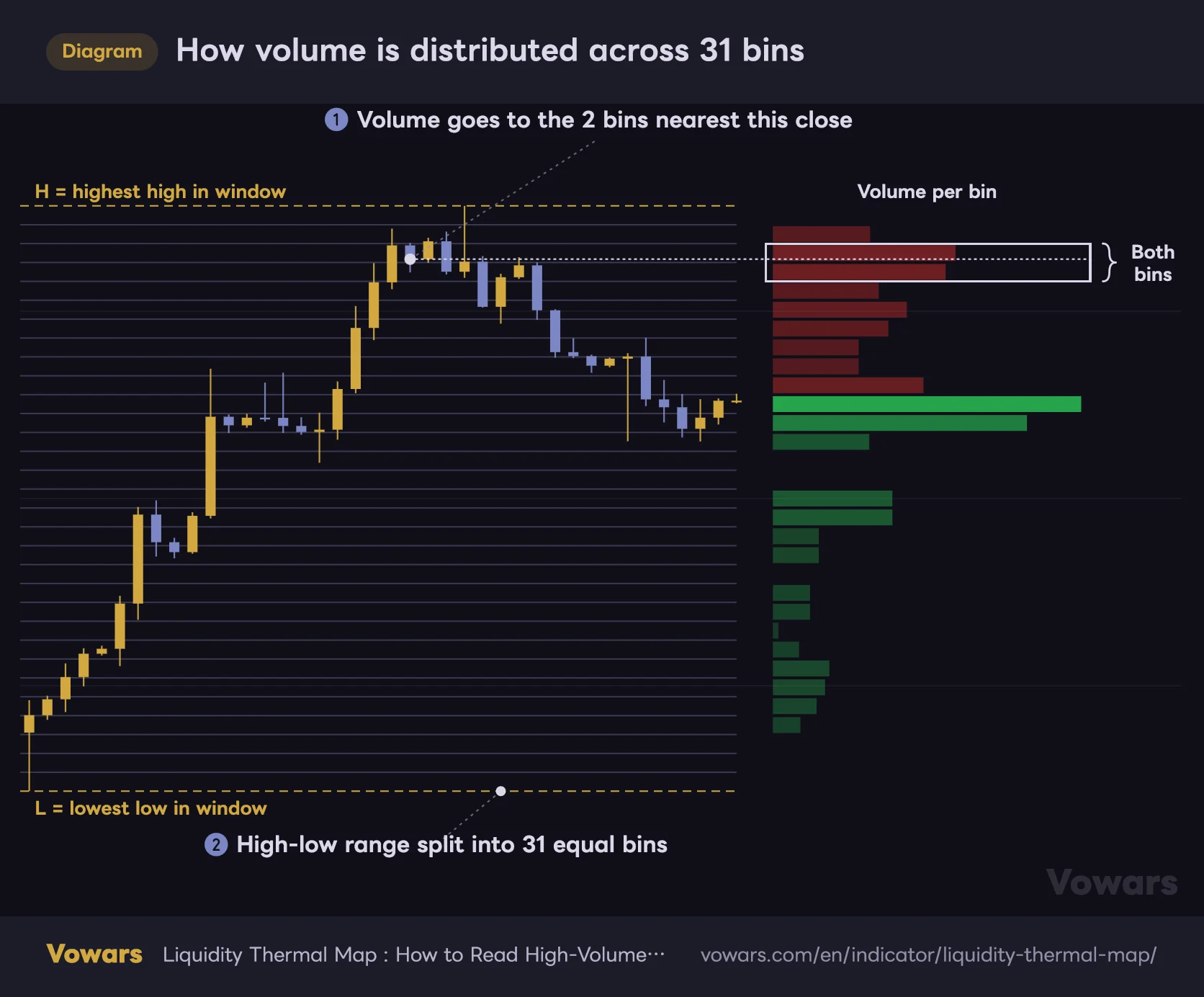
The high-low range is split into 31 bins, and each close feeds volume to the nearest ones
On every bar, “Liquidity Thermal Map” finds the highest high and lowest low over a fixed number of recent bars (300 by default) and splits that range into 31 equal bins. The author’s description says 30, but the indicator actually draws 31.
Then, for each bar in the window, if its close is within one bin-height of a bin’s midpoint, that bar’s volume gets added to the bin.
How volume is distributed across 31 bins
Each bar's volume is added to the two bins closest to its close.
Vowars DE ver.3.4.2
The interesting part is that neighboring bins have overlapping catchment ranges. When a close lands inside a bin, its volume goes into that bin and into the neighbor on the side closer to the close. In other words, almost every bar gets counted in two bins, which makes the shading a little smoother than a strict one-bin-per-bar count.
Because each bar’s volume is counted in two bins, SELL LIQ plus BUY LIQ comes out to roughly twice the real volume traded in the window. That makes the raw values a poor match for other volume indicators. Use them to compare the above/below ratio or the relative weight of bins instead.
Brightness is relative to the heaviest bin
Each bin’s brightness comes from its volume divided by the volume of the heaviest bin in the window. The heaviest bin (the PoC) gets special treatment and is painted almost fully opaque. Every other bin is shaded on a gradient based on that ratio, and bins with a small ratio turn transparent and disappear. Where that cutoff sits depends on Thermal Sensitivity, covered later.
Sometimes the bands suddenly shift up or down in a step. That happens when the window’s highest high or lowest low changes and the 31-bin grid itself gets redrawn. It happens when price prints a new high or low, and also when an old high or low rolls out of the window. On the daily chart, the bands drop sharply during the February 2026 selloff, and once I understood the mechanics, it made total sense.
Red vs. green depends on whether a bin sits above or below that bar’s close
The color logic is simple. If a bin’s bottom edge is at or above that bar’s close, it’s red; otherwise it’s green. The settings are named accordingly, Upper Liquidity Color (above) and Lower Liquidity Color (below).
The key detail is that the reference is “that bar’s close”. The current price has nothing to do with it. Historical bands keep the color they had relative to price at the time, so the same price zone flips from green to red starting from the bar that closes below it. That color flip is the core of how I use this indicator, which I’ll get to below.
Read the right-side scale’s “length” and “%” separately
Honestly, the right-side scale is what tripped me up the most. The author says the red/green bar lets you “instantly see whether buyers or sellers dominate,” but it actually works a bit differently.
The bar length shows where price sits, not volume
The tall bar stacks all 31 bins as one cell each. A bin is green if its midpoint is below the current price and red if it’s above. The shading is based on distance from the current price, so bins closer to price are darker and bins farther away are fainter. Volume plays no part in it.
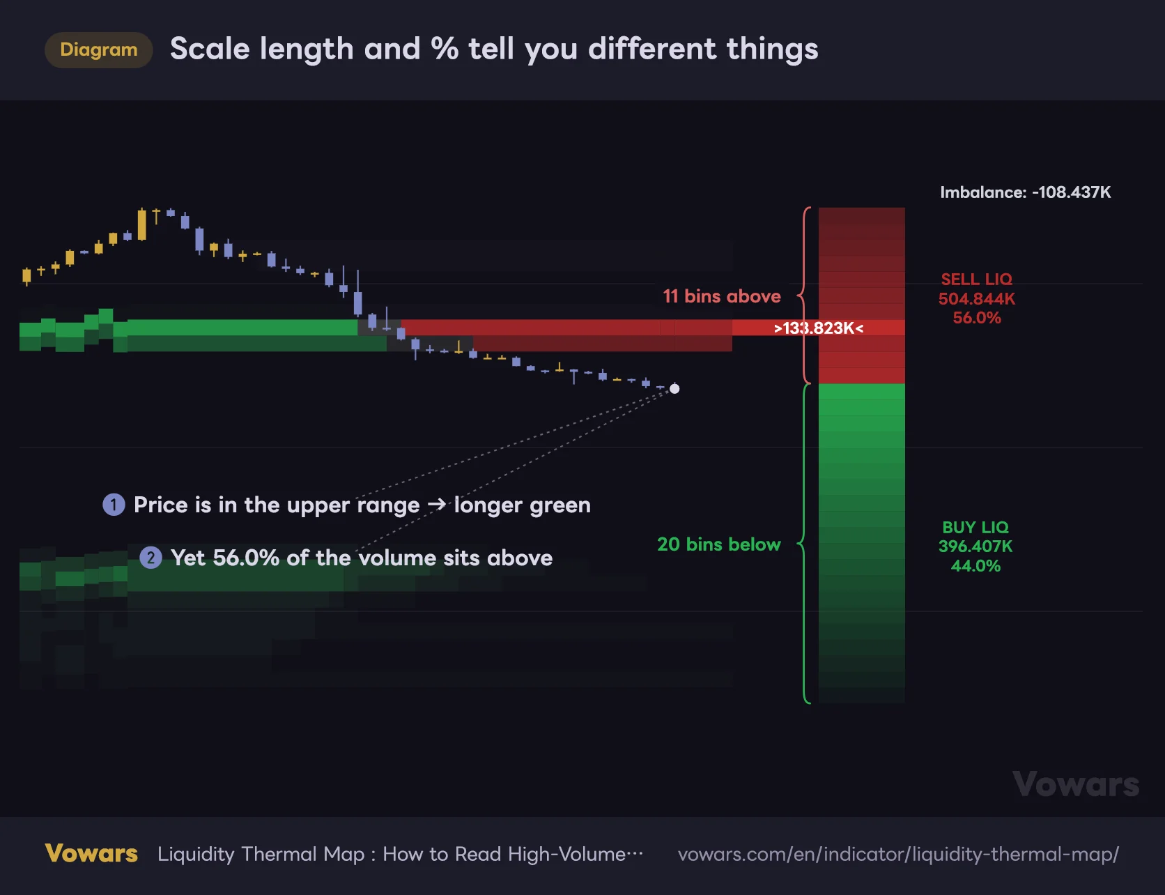
So the green-to-red length ratio only tells you where the current price sits within the lookback range. It says nothing about which side the volume is skewed to.
Scale length and % tell you different things
Even when the green section is longer, more volume can sit in the bins above.
Vowars DE ver.3.4.2
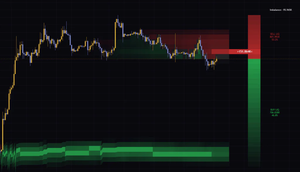
On the Bitcoin 4H chart, for example, the green section was clearly longer, yet SELL LIQ read 57.0% and BUY LIQ 43.0%. The window still included the lows from before the mid-August pump, so price sat in the upper part of the range, while most of the volume was concentrated up in the post-pump highs. If I had called it “buyers in control” based on the bar alone, I would have read it exactly backwards.
SELL LIQ and BUY LIQ mean “volume above” and “volume below”
One more thing to watch: what SELL LIQ and BUY LIQ actually contain. The author’s description calls them “bullish candle volume” and “bearish candle volume,” but that’s not what the indicator displays.
| Readout | Author’s description | What it actually shows |
|---|---|---|
| BUY LIQ | Volume traded on bullish candles | Total volume in bins whose midpoint is below the current price |
| SELL LIQ | Volume traded on bearish candles | Total volume in bins whose midpoint is at or above the current price |
| Imbalance | Absolute difference between buying and selling | BUY LIQ − SELL LIQ (negative when more volume sits above) |
Hover over the labels and the tooltip says the same thing: “volume below current price” and “volume above current price.” The numbers match that too. On the 1H chart I saw SELL LIQ at 302.947K, BUY LIQ at 36.777K, and Imbalance at −266.17K. The math checks out, and negative values show up just fine.
A large BUY LIQ means “a lot of trading happened below the current price.” It does not mean there were more buy orders. Read it as positioning: heavy volume below tends to act as support on pullbacks, and heavy volume above tends to cap rallies.
How I use it: wait for high-volume bins as reaction zones
Now that the mechanics are clear, here’s how I actually use it. I never take trades off “Liquidity Thermal Map” alone. I use it as a base layer to narrow down the price zones worth considering for an entry.
1Check where the bright bands are and what color they are
First, look for bright bands near the current price. A bright green band just below price is a candidate for where a dip might stall. A bright red band just above is a candidate for where sellers might step in on a rally. The band labeled “>value<” on the right is the current PoC, so also note whether it sits above or below price.
2Watch how price reacts when it returns to a heavy bin
When price comes back to a heavy bin, watch for lower wicks or shrinking candle bodies there. Don’t jump in the moment price touches the band; wait for a reaction first. If it bounces, just beyond the band is a natural spot for your stop, which makes it much clearer where your risk sits.
3After a close through the band, use the color flip to confirm the role reversal
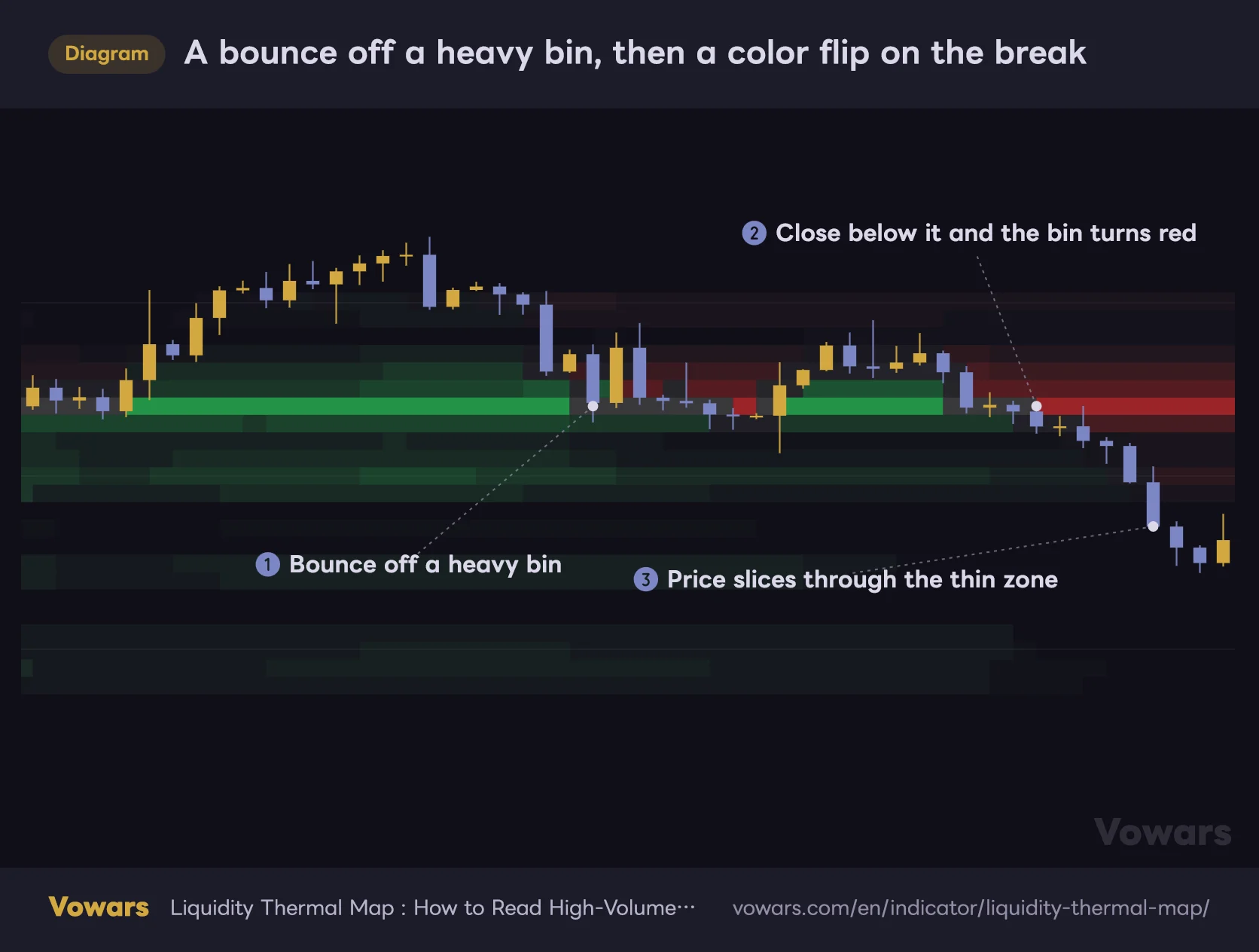
Once a candle closes below a heavy bin, that bin turns red from the next bar on. What used to be support now stays on the chart as overhead supply. Seeing a support/resistance flip show up directly as a color change is something I found unique to “Liquidity Thermal Map.”
A bounce off a heavy bin, then a color flip on the break
Heavy bins tend to get a reaction, and once they break they turn red and remain as overhead volume.
Vowars DE ver.3.4.2
As in point ③ of the diagram, when there’s no bright band past the heavy bin that just broke, price tends to move fast. The author also notes that moves away from dense liquidity areas can expand into low-volume zones. On the 1H chart I was watching, price lost the heavy band around 77,200 and then flushed straight down to the 75,000 area with no notable band below. That band was green before the breakdown, and now it sits overhead as a red PoC.
The band’s color (above or below price), its brightness (heavy or thin), and whether there’s another heavy zone beyond it. Just checking these three makes it much easier to set your profit target and stop placement.
5 settings plus bar count, and Profile Depth is the one to tweak first
There aren’t many settings. Apart from the colors, the two that change the look the most are Profile Depth and Thermal Sensitivity.
| Parameter | Default | Recommended | Effect |
|---|---|---|---|
| Profile Depth | Balanced Profile (300 bars) | Depends on timeframe (see table below) | Number of bars used for the tally. Shallow uses 100, Deep uses 600 |
| Thermal Sensitivity | Balanced | Balanced | How many thin bins stay visible. High Contrast hides bins below 50% of the max, Balanced hides those below 25%. Smooth shows every bin |
| Upper Liquidity Color | Red (RGB 189, 43, 43) | Keep default | Color of bins above the bar’s close and the upper part of the right-side scale |
| Lower Liquidity Color | Green (RGB 41, 180, 83) | Keep default | Color of bins below the bar’s close and the lower part of the right-side scale |
| Hide Active Candle Color | On | On | Swaps the color of bins behind the candle for gray so candles stay readable |
| Calculated bars | 1500 | 1500 (increase only when needed) | Number of recent bars to calculate. No bands are drawn on bars older than this |
Profile Depth decides how far back the indicator remembers consolidation
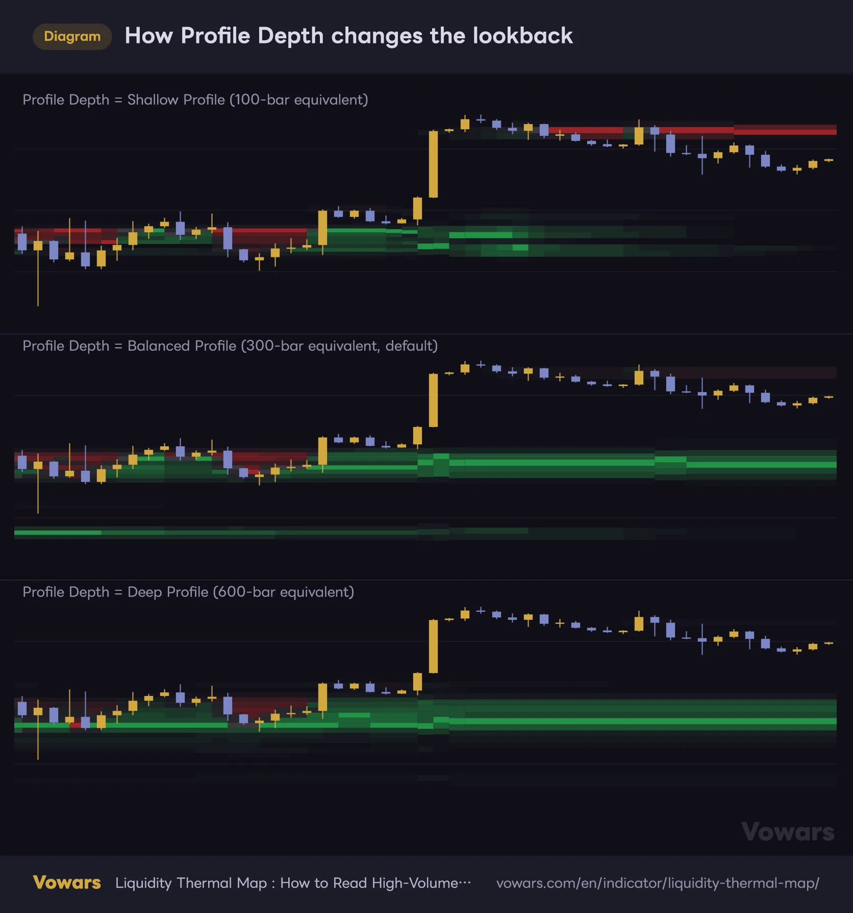
Profile Depth sets how many bars back each bar looks when tallying volume. Fewer bars means the bands follow recent price action quickly; more bars means older zones stick around longer.
How Profile Depth changes the lookback
Fewer bars make the bands track price faster; more bars keep older zones around longer.
Vowars DE ver.3.4.2
As the diagram shows, with Shallow the bands below disappear soon after a pump, while with Deep the pre-pump consolidation hangs around for a long time. Neither is “right”; you pick based on your timeframe and holding period. Converting bar counts into time makes the choice easier.
| Timeframe | Shallow (100 bars) | Balanced (300 bars) | Deep (600 bars) |
|---|---|---|---|
| 5m | ~8 hours | ~1 day | ~2 days |
| 15m | ~1 day | ~3 days | ~6 days |
| 1H | ~4 days | ~12 days | ~25 days |
| 4H | ~17 days | ~50 days | ~100 days |
| 1D | ~3 months | ~10 months | ~1 year 8 months |
Note: These estimates assume a 24/7 market like Bitcoin. For stocks, futures and other instruments with limited trading hours, the same bar count covers a longer stretch of time.
For day trading on the 1H and 15m, I leave it on Balanced. When I’m building a swing bias on the 4H or higher, I switch to Deep. On the 1H, roughly 12 days captures “where price chopped around last week” nicely, which felt like just the right amount of context for intraday decisions. If you’re on the 5m or lower and only care about today’s price action, Shallow is the better fit.
Bands only start appearing once a bar has enough history in the calculated range to fill the lookback. If you pick Deep (600 bars) while Calculated bars is still at the default 1500, bands are drawn only on roughly the last 900 bars. To see bands further back, increase Calculated bars in the Calculation section of the Inputs tab in the settings. Expect slower loading in exchange.
Thermal Sensitivity decides how many thin bins stay visible
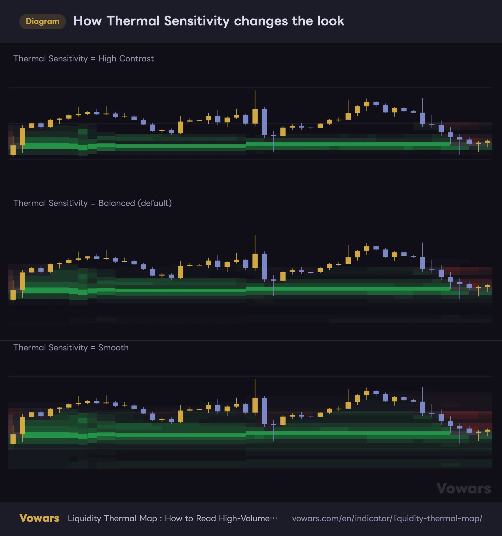
Thermal Sensitivity decides the point at which thin bins, relative to the heaviest one, turn transparent. The PoC is painted the same way on every setting.
How Thermal Sensitivity changes the look
The higher the panel, the more weak bins disappear; the lower, the more thin bins remain (price scale zoomed in).
Vowars DE ver.3.4.2
- High Contrast hides any bin with less than half the volume of the heaviest bin. Only the heavy zones remain, so the chart stays clean.
- Balanced is the default and hides bins below a quarter of the max. It strikes a good balance between showing volume strength and keeping things readable, and it’s what I run day to day.
- Smooth shades every bin that has any volume. It’s handy when you want to see the full distribution, but the background fills up and the candles get harder to read.
A simple rule of thumb: use High Contrast in volatile markets where the bands tend to scatter, and Smooth when price is calm and you want to see the thinner bins too.
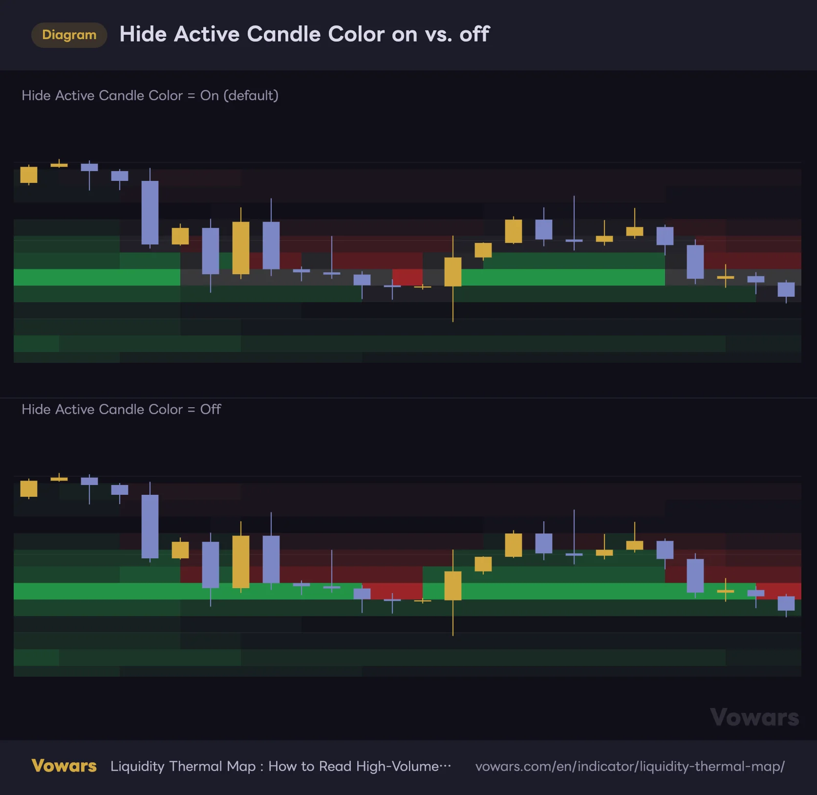
With Hide Active Candle Color on, the area around candles turns gray
With Hide Active Candle Color enabled, any bin containing the bar’s open, close, high-low midpoint, or high-low-close average gets its red or green swapped for gray. The name suggests it goes transparent, but in practice it becomes a gray whose intensity follows the bin’s volume.
Hide Active Candle Color on vs. off
When on, only the bins a candle touches switch from red/green to gray (price scale zoomed in).
Vowars DE ver.3.4.2
When a candle overlaps the PoC in particular, you get a bright gray band. If you see gray blocks around candles on the daily or 1H, that’s this setting at work. It keeps candles from getting lost in the heatmap, so leaving it on is fine for most people. One quirk: in the top two bins of the range, the swap barely kicks in, so red and green stay visible around candles. If you see color behind candles near the highs, that’s not a bug.
Works best on liquid markets with plenty of consolidation
Every band is built from volume, so the quality of the volume data directly determines the quality of the display. Exchange data for crypto like Bitcoin, gold futures, high-volume ETFs like SPY, and equity index futures all pair well with it.
With forex, what “volume” means depends on the data provider behind the symbol. On symbols with no volume data, neither the bands nor the scale will show up. Before adding it, check that TradingView’s built-in Volume indicator actually shows values.
Where it shines
- Mapping out the heavy zones above and below in a ranging market
- Waiting for a pullback or a rally to sell into (it shows how deep to let price come to you)
- Measuring the distance to the next heavy zone after a band breaks
- Getting a quick list of key levels before you start drawing horizontal lines
- Confirming that former support has turned into overhead supply
Where it falls short
- Newly listed symbols without enough history to fill the lookback
- Symbols with no volume data, or with unusual volume data
- Sharp pumps or dumps that reshuffle the window’s high or low (the bin grid gets redrawn constantly)
- When you want exact entry timing (there are no signals or alert conditions)
- When you want to judge supply and demand from the right-side bar length alone
In terms of trading style, I found it most useful for day trading and swing trading. It works for scalping too if you switch to Shallow, but 1-minute volume is lumpy and the bands tend to break up into fragments.
Things to know before you add it to your chart
Bands on closed bars don’t repaint
Each bar’s bands are calculated using only the bars up to that point. No future data is used, so once a bar closes, its bands never get redrawn. That said, on the live bar the bands update every time price and volume move, and the scale and readouts are recalculated on every tick as well.
As long as you know that colors and numbers can change until the bar closes, nothing about the real-time behavior should catch you off guard.
Watch out: it always “looks like it works” on historical charts
Heavy bands mark places where price spent a lot of time. Of course price tends to come back to them, and when you scroll through history it can look like “price bounces off every band.” In reality, price slices straight through them plenty of times. Always wait for a reaction before entering, and keep your stop beyond the band.
Use TradingView’s built-in alerts instead
“Liquidity Thermal Map” has no built-in alert conditions. If you want a heads-up when price approaches a band, draw a horizontal line at that level and set a drawing alert on it, or just use a price alert. The PoC can move from bar to bar, so it’s safer to recheck where the band is from time to time after setting the alert.
“Liquidity Thermal Map” only shows how heavy each price zone is; it doesn’t tell you direction. It only becomes a valid entry reason once you combine it with trend direction and price structure.
If you pair it with anything, pick a tool that gives you direction
The author also recommends using the heatmap as background context alongside trend or market structure tools. These are the combinations I found easiest to work with.
- Use moving averages (EMAs, etc.) for direction, and only take pullbacks or rallies in that direction that line up with a heavy band
- Use a market structure tool that tracks higher highs/higher lows and lower highs/lower lows to confirm a shift, and check whether it lines up with a band’s color flip
- Run it alongside TradingView’s built-in Volume Profile (Fixed Range / Visible Range) to dig into the exact distribution for a specific period
It might look like it overlaps with a volume profile, but the difference is that “Liquidity Thermal Map” keeps a record of how the distribution evolves over time. It makes it easy to tell which consolidation zones are fresh and which ones are aging out, so running both never felt redundant.
Made for traders who want “where price chopped around” always on their chart
 Image
ImageAfter using it for a while, I see “Liquidity Thermal Map” as an indicator that saves a lot of the work of drawing horizontal levels by hand. With the heavy zones sitting in the background, you instantly have a base for thinking about where price might stall next and how far it could run if a level breaks. Watching former support turn red in real time was also a fun touch I haven’t seen much elsewhere.
On the other hand, the right-side scale can’t be read the way the author describes. You need to treat the bar length as price position and the % as the above/below volume split. Once you’ve got that down, there are only a few settings, and you should be up and running right away.
Band brightness shows volume weight, and color shows position relative to that bar’s close. The right-side bar length shows where price sits; read volume skew from the %. Pick Profile Depth to match your timeframe and it works for everything from day trading to swing trading.