

Direction, and the price you wait for. Both on the same chart.
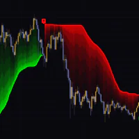
The first thing you notice after loading it is a thick, stair-stepping line: green while price trends up, blue while it trends down. That color is your directional bias, and it flips when price closes through the line. So far, nothing you haven’t seen in other Supertrend tools.
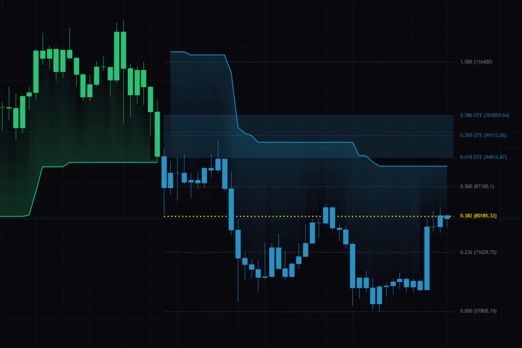
What sets “Supertrend + Fibonacci OTE Grid & Bands” apart is that the moment the color flips, it starts drawing a Fibonacci grid on its own. Flip bullish and the highest high made since becomes 0.000, while the low that kicked the move off becomes 1.000, with horizontal levels from 0.236 through 0.786 stacked in between. a tool that calls direction and a tool that measures dip and rally prices live inside one indicator — that’s the shape of it.
It’s published by BigBeluga and it’s free to add on TradingView. My first reaction after loading it was how little it actually puts on the chart. A line, some dotted levels, and small labels on the right edge. No dashboard, no arrows. That makes it obvious where to look.
This indicator, “Supertrend + Fibonacci OTE Grid & Bands”, has two display modes, OTE Grid and Fibonacci Bands. The names are similar, but the way the lines get drawn and the setups they suit are completely different. The default is OTE Grid.
Everything it puts on the chart, from the top down
Start with it on defaults and see what shows up. There are only five things to look at.
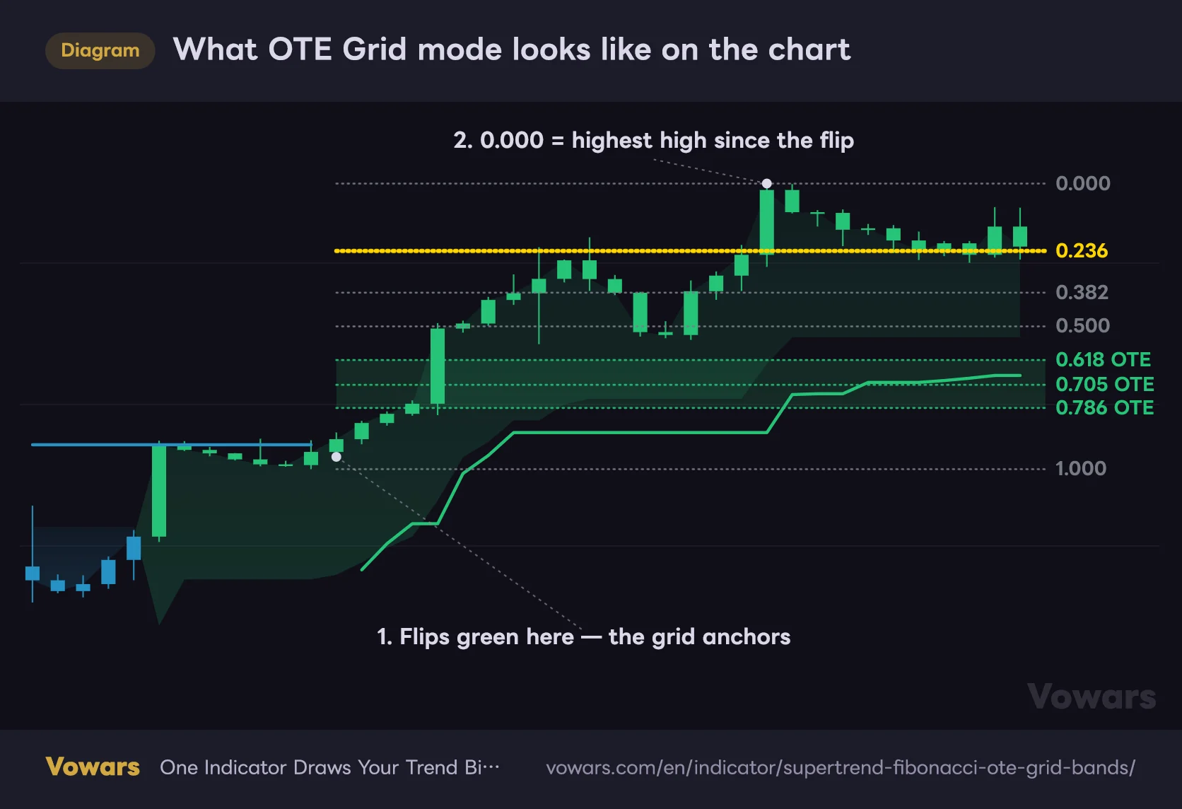
What OTE Grid mode looks like on the chart
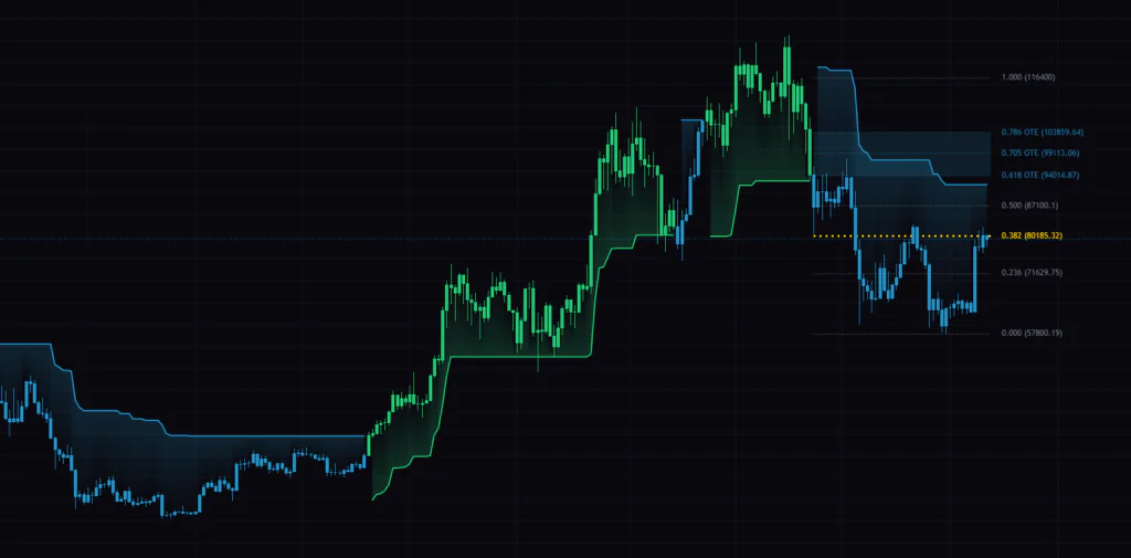
The thick stair-stepping line is the stop line, and the shading from it up to price shows the direction. Anchored to the bar that flipped, eight dotted levels and their right-edge labels get drawn.
Vowars DE ver.3.5.0
The stair-stepping stop line
It’s the thickest line on the chart. It tracks below price in an uptrend and above it in a downtrend, moving in steps rather than curves, so the most recent step doubles as a stop reference. The line breaks on the bar where the color changes. The old color and the new one don’t join up diagonally, so the flip point is obvious at a glance.
The shading between the line and price
The space between the stop line and current price is shaded in the trend color. How thick that shading is tells you how far price has travelled from the stop. Thick means the move is extended; thin means the stop is right behind you.
Eight horizontal levels and the right-edge labels
0.000 / 0.236 / 0.382 / 0.500 / 0.618 / 0.705 / 0.786 / 1.000, eight in total. Out of the box they’re dotted and gray. The exceptions are OTE 0.618 OTE 0.705 OTE 0.786 — these three take the trend color, and the space between them gets shaded. That band is the OTE zone. The right edge carries both the ratio and the price, so you can read your level off a number instead of guessing.
The one line that turns yellow
When the close approaches a level, that one line turns yellow (#FFD600) and triples in width. Proximity is judged with ATR, and on defaults it lights up once price is within one ATR. It’s a way of tracking which of the eight levels is in play using color alone.
The color of the candles themselves
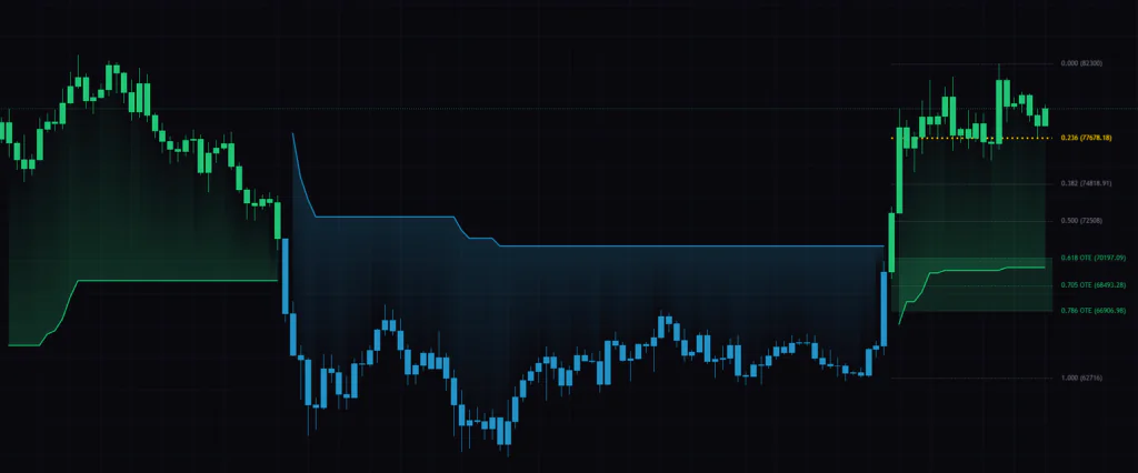
Out of the box, Color Bars by Trend and Plot Trend Candles are both on, which repaints every candle in the trend color. Everything is green while it’s bullish, everything is blue while it’s bearish. Opinions differ here, and losing the up/down distinction on individual candles bothers some people. Within the first few days I turned Plot Trend Candles off and left the rest alone.
Where 0.000 and 1.000 actually get placed
The hardest part of drawing fibs by hand is picking the anchors. “Supertrend + Fibonacci OTE Grid & Bands” takes that decision off your hands.
When it flips bullish, 1.000 is the low around the flip and 0.000 is the highest high made after it. In a downtrend it’s the other way round: 1.000 is the high and 0.000 is the lowest low made since. So 0.000 always marks the furthest the current trend has travelled, and 1.000 marks where it started.
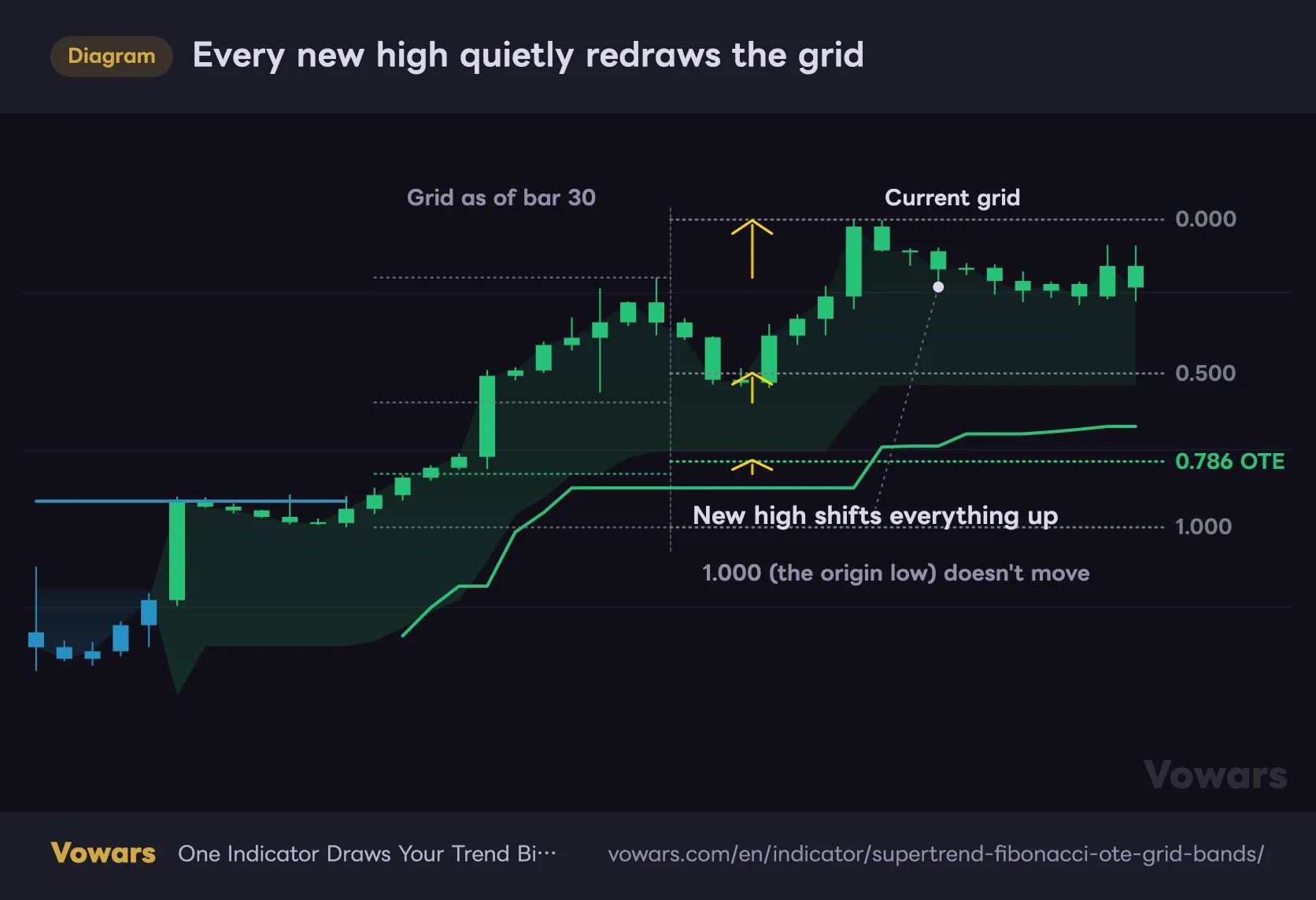
The thing to watch here is that 0.000 keeps moving as the trend extends. Every new high drags 0.000 up with it, and the levels underneath, 0.236 through 0.786, get stretched proportionally.
Every new high quietly redraws the grid
The left half shows the grid as of bar 30, the right half as it stands now. The positions shift even within the same trend.
Vowars DE ver.3.5.0
The levels are always re-anchored to the most recent high and low. On top of that, when the trend flips, the old grid is deleted and nothing is left behind. So scrolling back on a static chart won’t show you where 0.618 actually sat at the time. If you want to check, use Bar Replay: set the start point in the past and the indicator recalculates using only the data available up to that bar, so the grid appears exactly as it was. It takes manual clicking, and how far back you can go depends on your plan and timeframe, but the check is there. What you shouldn’t do is count results off a scrolled-back chart, because that version always looks kinder than the decision you’d actually have faced.
The OTE zone is further away than you’d think
OTE stands for Optimal Trade Entry, the level traders use to buy the dip or sell the rally on the assumption that the trend continues. It usually refers to the 0.618 to 0.786 area, and this indicator shades exactly that range.
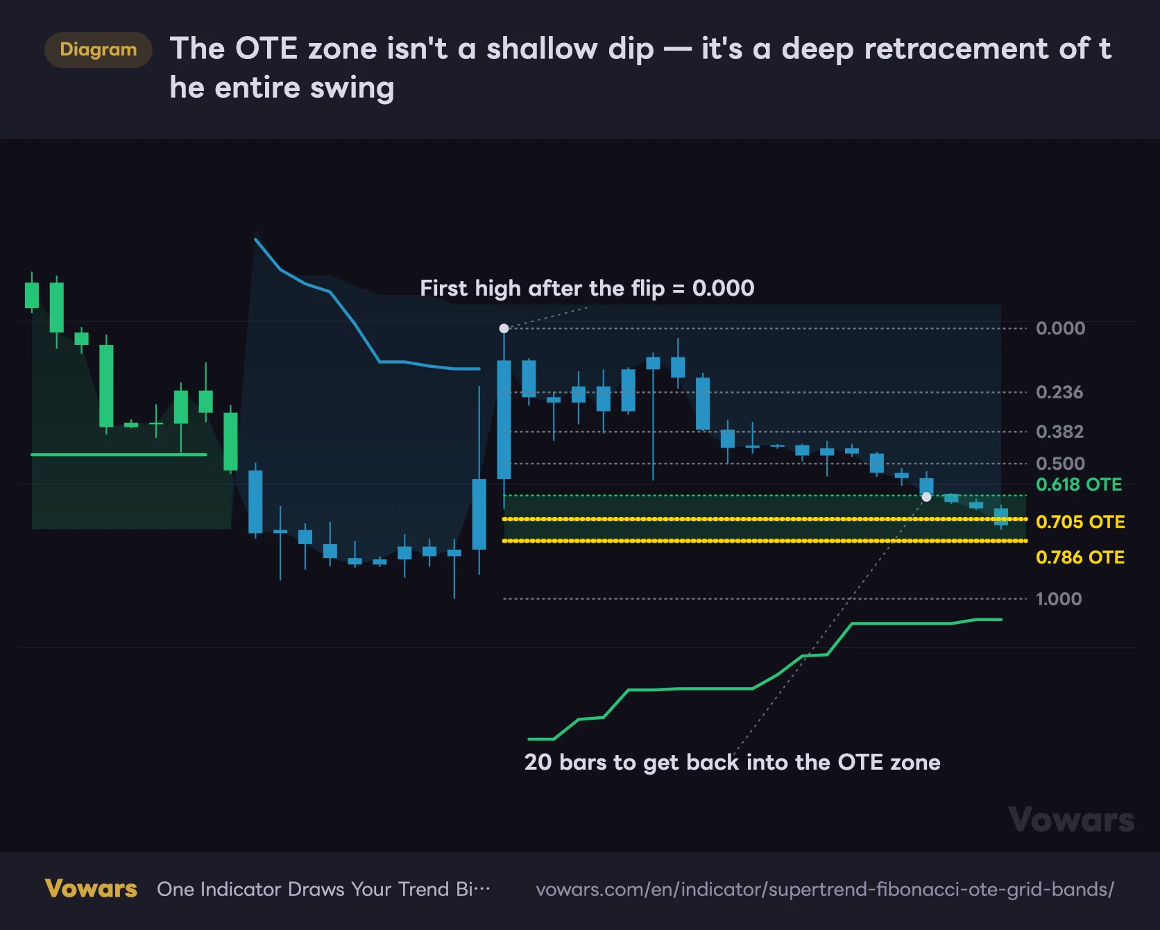
In practice, though, the band sits a long way down, or up in a downtrend. It comes down to how it’s measured: the whole run from the low the trend started at to its highest high, with the band placed 61.8% to 78.6% back across that entire swing. A couple of bars of pullback will never reach it. By the time price tags the band, the chart usually doesn’t look like an uptrend anymore.
The OTE zone isn't a shallow dip — it's a deep retracement of the entire swing
The 0.618–0.786 band is measured across the whole swing, from the low the trend started at to its highest high. By the time price drops into it, the chart no longer looks bullish.
Vowars DE ver.3.5.0
That’s less a flaw than a personality trait. If you want shallow dips, 0.236 and 0.382 are the realistic targets, and the OTE zone works better as a resting limit order, somewhere you’d load up if price really came that far.
One more thing: where the band sits relative to the stop line changes case by case. Right after a flip the stop sits far below the band, but as the trend extends the line ratchets up and starts cutting into the band. In the figure above it sits under the band, but on an extended run it can end up between 0.705 and 0.618. Check that distance every single time before you place a stop.
Standard Fibonacci retracement doesn’t include a 0.705 ratio. It’s the exact midpoint between 0.618 and 0.786, and smart-money traders sometimes treat it as the core of the OTE. This indicator labels all three lines as OTE.
Switch modes and the same “OTE” becomes something else
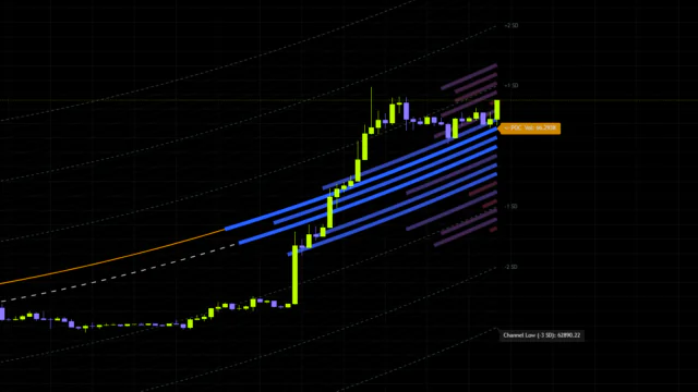
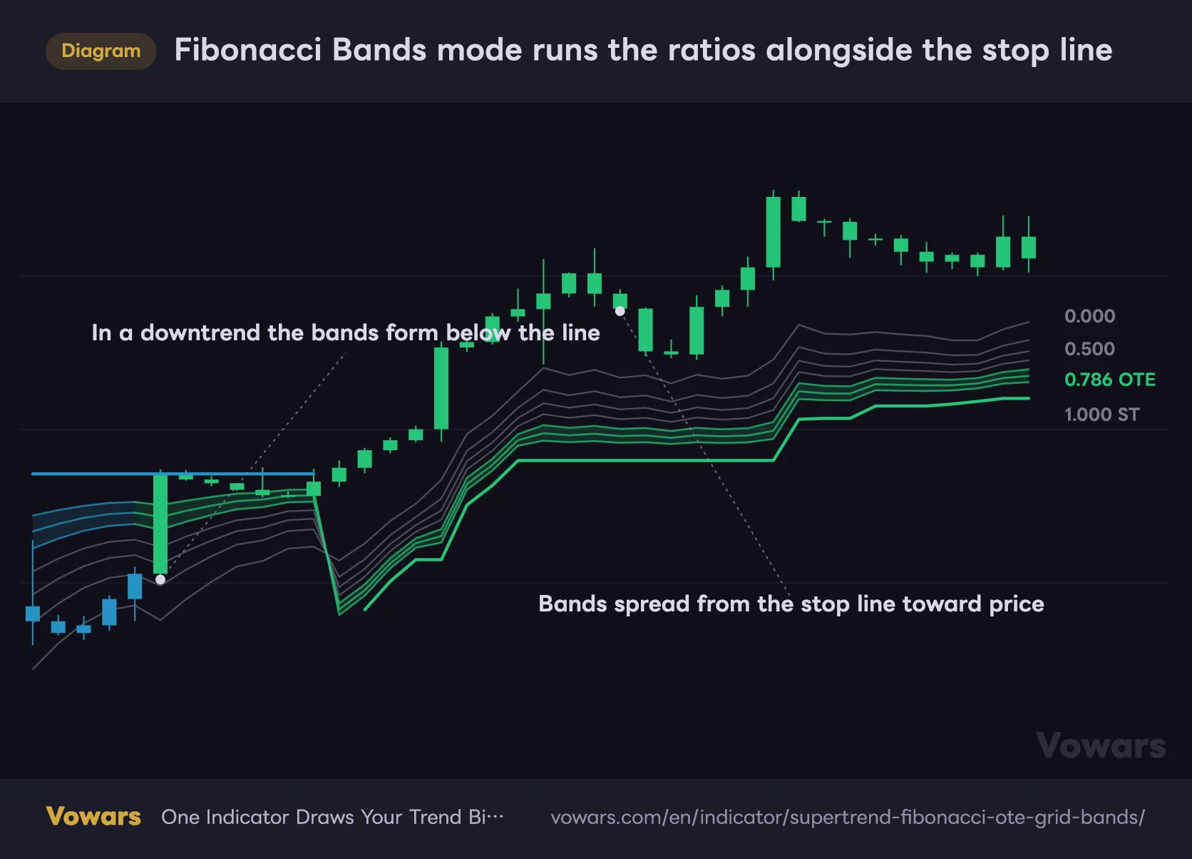
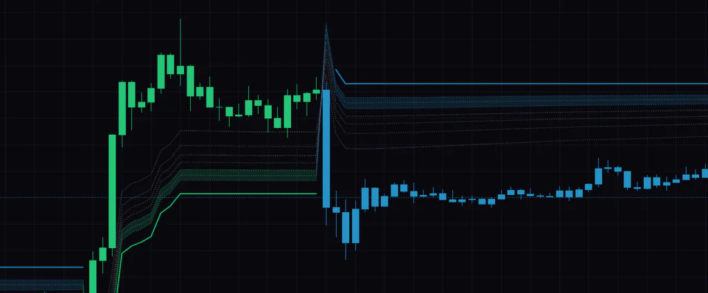
Fibonacci Mode set to Fibonacci Bands changes the picture completely. The horizontal grid disappears and seven bands running alongside the stop line take its place.
Fibonacci Bands mode runs the ratios alongside the stop line
Where OTE Grid gives you horizontal levels, Bands are recalculated every bar as a distance from the stop line, so they track price up and down.
Vowars DE ver.3.5.0
In Bands mode, 1.000 is the stop line itself. Two ATRs away from it sits 0.000, with the ratios splitting the gap in between. The stack builds upward in an uptrend and downward in a downtrend, and either way it spreads toward whichever side price is on.
 Image
ImageWhat’s worth noticing is where the OTE band ends up. In Bands mode, 0.618 to 0.786 is only 0.4 to 0.8 ATR away from the stop line. Where the Grid OTE points at a deep retracement of the entire swing, the Bands OTE sits right next to the stop line. Same name, completely different setups.
| Item | OTE Grid | Fibonacci Bands |
|---|---|---|
| Line shape | Horizontal, fixed for the trend | Rides up and down with the stop line |
| Where 0.000 sits | Highest high / lowest low of the trend | Two ATRs from the stop line |
| Where 1.000 sits | Where the trend started | The stop line itself |
| OTE zone | 61.8–78.6% retracement of the swing | Right next to the stop line |
| Yellow highlight | Yes | No |
| Shading between line and price | Yes | No |
| Best suited to | Resting limits at deep retracements | Riding a trend and managing stops |
The yellow highlight and the dim-non-OTE option only work in OTE Grid mode. In Bands mode the line colors stay fixed, so judging proximity is on you. If you don’t know that going in, it’s easy to assume the setting is broken.
How it differs from a plain Supertrend
The Supertrend that ships with TradingView defaults to an ATR period of 10 and a multiplier of 3. One line, a color change when direction flips, and that’s it. It says nothing about price levels.
There are three differences between that and “Supertrend + Fibonacci OTE Grid & Bands”.
First, how blunt it is. An ATR period of 100 with a 4.5 multiplier is a couple of notches wider than standard. It ignores the small stuff, which makes a color change carry more weight when it finally happens.
Second, it hands you levels. The moment direction is set, the retracement map for that swing gets drawn for you. You look at the line color, decide you’re long-biased, and the same indicator answers the follow-up question of where to actually buy.
Third, how the stop reads. A stair-stepping line that doubles as your stop is standard Supertrend territory, but here you can also eyeball the distance to the OTE zone, which means you can size the risk before you click. If 0.786 sits close to the stop line, that’s a spot you can test cheaply.
Put another way, the direction call itself is the same math as a standard Supertrend. What’s new isn’t the call, it’s the layer of price levels sitting on top of it. Frame it that way and your expectations will hold up.
How to actually read it
1Let the stop line color set your bias
Green means you’re hunting longs, blue means shorts. Nothing else gets read into it. The defaults are blunt enough that the color rarely changes; on the daily it’s normal for the same color to hold for weeks or months. the color changing at all is genuinely big news — that’s about the right weight to give it.
2Read your level off the right-edge labels
The labels carry both the ratio and the price. Check which two levels price is sitting between and you can put the depth of a pullback into words: hasn’t even lost 0.236, or closed below 0.500. That’s fiddly to do with hand-drawn fibs, and it turned out to be the part I appreciated most.
3Treat a lit level as somewhere to watch for a reaction
A lit level means close by, and nothing more. Whether price actually holds there comes down to candle structure and volume. Do you get repeated lower wicks at that level, or does it slice straight through? a lit level is not an entry signal, so don’t get the two mixed up.
4Put your stop outside the stop line
If you’re buying in the OTE zone, just under the stop line is the obvious place for your invalidation. The gap between the band and the line is your risk, so you can size the position before you enter. And because the line ratchets up in steps, it doubles as a trailing stop once the trade is in profit.
The settings live in five groups
The settings panel is split into General Settings, Supertrend Parameters, Fibonacci Bands Parameters, Main Styling & Colors and Fibonacci Level Settings. It looks like a lot, but only four inputs feed the calculation itself. Everything else is cosmetic.
| Parameter | Default | Suggested | What it does |
|---|---|---|---|
| Fibonacci Mode | OTE Grid | OTE Grid | Picks between horizontal levels and bands that ride the line. Grid if you want retracement prices, Bands if you want a trend-following tool |
| Supertrend ATR Period | 100 | 100 | Lookback for the stop line. Longer means slower to react to volatility and a smoother line |
| Supertrend Multiplier | 4.5 | 3.0–4.5 | How far the line sits from price. Lower it and you get more flips, and more grid rebuilds with them |
| Bands ATR Period | 100 | 100 | Lookback for band width. Also drives the proximity check in Grid mode |
| Max Band ATR Multiplier | 2.000 | 2.0–3.0 | Overall band width in Bands mode. Raise it and 0.000 moves further out, widening the spacing |
| Grid Highlight Distance (ATR Multiplier) | 1.0 | 0.5–1.0 | How close price must get before a level lights up. Lower it if several fire at once |
| Grid Line Style | Dotted | Dashed | Line style for the levels. If dotted reads too thin, dashed pops off the background |
| Show Fibonacci Labels | On | On | Ratio and price labels on the right edge. Turn it off and you lose the numbers |
| Dim Non-OTE Levels when Far | Off | On | Makes far-away non-OTE lines translucent. Quiets the chart down when you only care about OTE |
| Color Bars by Trend | On | On | Paints the chart candles in the trend color |
| Plot Trend Candles | On | Off | Draws trend-colored candles on top. Turn it off to get the up/down distinction back |
| Bullish Trend / Bearish Trend | Green / Blue | Default | Bullish and bearish colors. Lines, shading and labels all follow these |
| Active Fibonacci Level | Yellow | Default | Color of a lit level. On a light theme, shifting it toward orange reads better |
| 0.236 / 0.382 / 0.500 / OTE 0.618 / OTE 0.705 / OTE 0.786 | All shown | Turn 0.236 off | Toggles each level individually. Fewer lines makes the band easier to read |
There are six checkboxes under Fibonacci Level Settings, and 0.000 and 1.000 have no visibility toggle at all. Those two can only have their color changed, and they’re always on. They mark the ends of the swing, so there’s not much reason to hide them anyway.
If you’re going to touch anything, start with Supertrend Multiplier
This one number sets the personality of the whole thing. Supertrend Multiplier is the multiple that decides how far the stop line sits from price, and the default of 4.5 is wide for a Supertrend. Most setups run 2 to 3, so this one is deliberately a notch blunter.
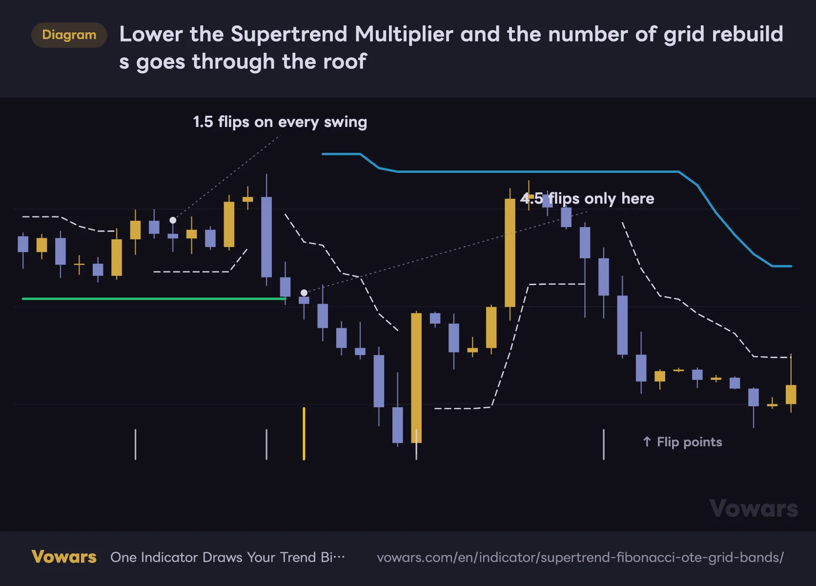
It reacts faster if you lower it, but there’s a cost. More flips means 0.000 and 1.000 get reset more often. Your Fibonacci anchors stop sitting still, which makes it a worse tool for measuring how deep a pullback is.
Lower the Supertrend Multiplier and the number of grid rebuilds goes through the roof
The same price action with the 4.5 default (thick colored line) and 1.5 (thin white dashed line) overlaid. Every flip is one full rebuild of the grid.
Vowars DE ver.3.5.0
Even on 4H and below, I find it easier to handle if I don’t take it under 3.0. If you want a faster cycle than that, shrink Supertrend ATR Period to around 50 instead and leave the multiplier where it is. The grid stays far steadier that way.
Too many lit levels? Use Grid Highlight Distance
Grid Highlight Distance (ATR Multiplier) sets how close the close has to get before a level turns yellow. The default of 1.0 is one ATR. On instruments where the levels sit close together, three or four will light up at the same time. Drop it to around 0.5 and only the level that’s genuinely close survives.
There’s one genuinely confusing piece of wiring here. The ATR behind that distance comes from Bands ATR Period — not fromSupertrend ATR Period at all. You’re sitting in OTE Grid mode, yet a setting parked under the Bands group is what drives the highlight. Change the Supertrend period expecting the sensitivity to move and nothing about the lighting will budge.
Where it works, and where it doesn’t
Where it works
- Daily and weekly markets with a clear directional bias
- Deep corrections after an extended run, when the OTE zone finally comes into range
- When redrawing fibs by hand every time has become a chore
- When you want stop placement decided mechanically
- Gold, equity indices and anything else that trends for long stretches
Where it doesn’t fit
- Directionless ranges, where the grid sits still and levels just keep lighting up
- Shallow dips that resolve in a few bars
- Scalping on the 5-minute and below
- Trying to catch the first leg of a reversal
- Spiky wicks around a data release
In terms of style, this is an indicator built for swing and position trading. Leave it on defaults on the daily and one line manages a bias that lasts weeks to months. It still earns its place for day traders as a higher-timeframe filter on the 4H, but drop it straight onto a 5-minute chart and the grid just keeps stretching without telling you anything.
How useful the grid is depends a lot on the instrument
It pairs well with markets that travel in one direction for a long time, like gold or the US indices. When a trend runs for months the swing grows, the levels spread out, and reading where price sits becomes easy. The same goes for equity ETFs.
Currency pairs that chop back and forth relative to their range are the opposite case: the swing stays small and the levels bunch up. Squeeze eight lines into a narrow range and several fire at once, sometimes with only a few pips between 0.500 and 0.618. if the level spacing gets tighter than ATR, that timeframe is too granular for it — keep that rule of thumb and you’ll know when to move up a timeframe.
In a market that never closes, like crypto, putting it on the weekly and reading only the big picture is the calmer approach. I keep it on both the weekly and the daily, pairing the weekly color with the daily grid.
Traps worth knowing about upfront
A level turning yellow and thickening states one fact: the close is nearby. It isn’t a reason to expect a bounce, or a break. Treat a lit level as an entry trigger and you’ll end up chasing: price keeps going, the next level lights up, and you drift along behind it.
For trend flips and for levels being approached alike, there is no alert function at all. If you’re running it on the daily, opening the chart once a day covers you, but you can’t build a notification-driven workflow around it. If you need one, you’d have to track the stop line color with a separate, alert-capable script.
One more thing, on repainting. Direction is judged on the close, so while a bar is still forming the color can appear and disappear. Once a bar closes, its call is locked in. It doesn’t look ahead, and the lines and labels never extend more than one bar into the future. That part is clean.
The part that actually deserves your attention is the grid rebuild covered earlier. What you see on a scrolled-back chart is the final state of that trend, not what was on screen in real time. The better a backtest looks when you scroll through it, the more worth it is to re-run the key spots in Bar Replay and see the grid as it actually stood.
What to pair it with
“Supertrend + Fibonacci OTE Grid & Bands” gives you direction and levels, but it has no way of measuring momentum. When price drops into the OTE zone you don’t have enough to tell whether it’s a floor or just a waypoint, so anything that fills that gap pairs well.
- RSI or Stochastics — check whether the OTE zone lines up with oversold. When zone arrival and a divergence land together, that’s worth waiting for
- Volume tools — did volume pick up on the bar that tagged the band? If it slid in on thin volume, the support underneath is probably thin too
- The same indicator on a higher timeframe — require green on the weekly plus an OTE tag on the daily and you narrow the setups down considerably
- Horizontal levels and order blocks — the grid is calculated automatically, so it won’t necessarily line up with prices the market actually respected. When a level that’s been tagged again and again sits near an OTE line, that level gets a lot heavier
The one thing that decides whether it stays on your chart
 Image
ImageWhether “Supertrend + Fibonacci OTE Grid & Bands” earns a permanent slot comes down to whether you want to draw your own fibs or have them drawn for you.
If you already have your own rules for picking swing points, having 0.000 and 1.000 chosen for you will get in the way. If you’re the trader who hesitates over where to anchor and ends up never drawing them at all, getting direction and levels in one package is genuinely handy.
That said, it isn’t a complete system. You get direction, you get levels, but it tells you nothing about whether you should actually take that level. Fill that in yourself and it’s an indicator that clears a pane off your screen. Leave it on defaults on the daily and watch it for a month; that’s the fastest way to get a feel for how it behaves.