

How far is Bitcoin floating above its “floor” right now?
“BTC Power-Law Ladder” measures how many times higher Bitcoin’s daily close sits above a line that traces the lower edge of its price history, then sorts that multiple into five rungs. Its full name is “BTC Power-Law Ladder (Point-in-Time)”, and it shows up on the chart as “PIT Ladder”. It’s published open-source by RWCS_LTD.
It answers exactly one question: “How far has price stretched above the floor that has historically held it?” It won’t time your entries or exits, and the author says so plainly: it’s “a risk-framing tool. It is not an entry signal and it is not advice.”
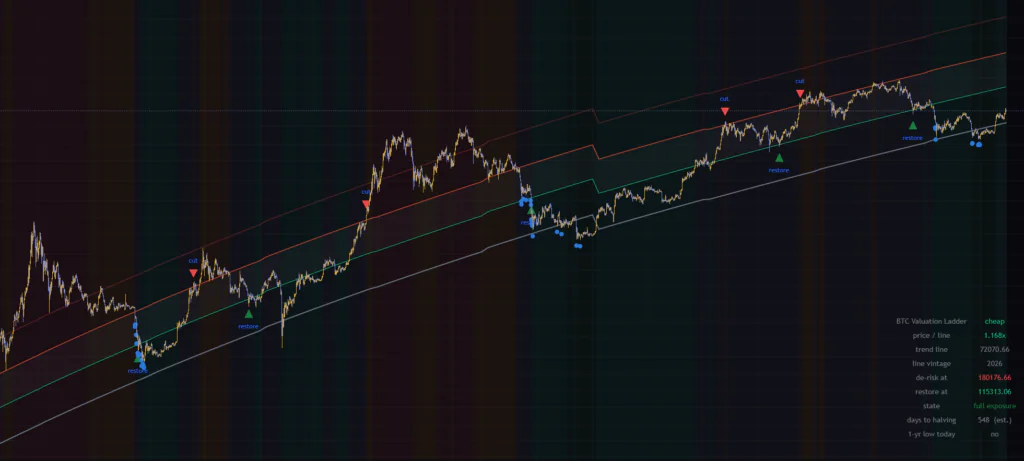
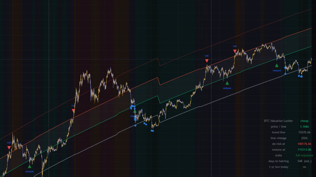
I loaded it on the Binance BTCUSDT daily chart on September 25, 2026. The readout table in the bottom-right said “cheap” and “1.169x” — price at 1.17 times the line, the second rung from the bottom. Watching day-to-day price action, all I could feel was “we’re down more than 30% from the ATH.” Through the lens of “BTC Power-Law Ladder,” though, price was actually sitting on the cheap side of the long-term picture. That shift in perspective was the most interesting part of using it.
“BTC Power-Law Ladder” is an analysis tool for measuring how overextended price is. Even the cut and restore markers are framed by the author as “a rule with insufficient evidence, published so its weaknesses are visible along with its logic.” Keep in mind from the start that it was not built to be used as a buy/sell signal.
Four lines and five rungs on the chart
The thick gray line is a power-law line tracing the “lower edge of past lows”
The thick gray line at the bottom is the trend line. The formula is “line price = 10^a × d^b,” where d is the number of days since January 3, 2009 — the day Bitcoin’s genesis block (the very first block) was mined. Plot both price and days on log scales and Bitcoin’s long-term history lines up roughly along a straight line. Building on that property is the power-law model, a well-known framework in long-term crypto analysis.
Where this indicator, “BTC Power-Law Ladder,” differs from the usual power-law chart is where it draws the line. Most charts run the line through the “middle” of price action, but this one uses quantile regression to fit the bottom 1% of the distribution. It’s a “floor” in the sense that nearly every daily close has printed above it. On the September 25, 2026 daily bar, the line sat at $72,070.66.
Lines at 1.6x, 2.5x and 4x split price into five rungs
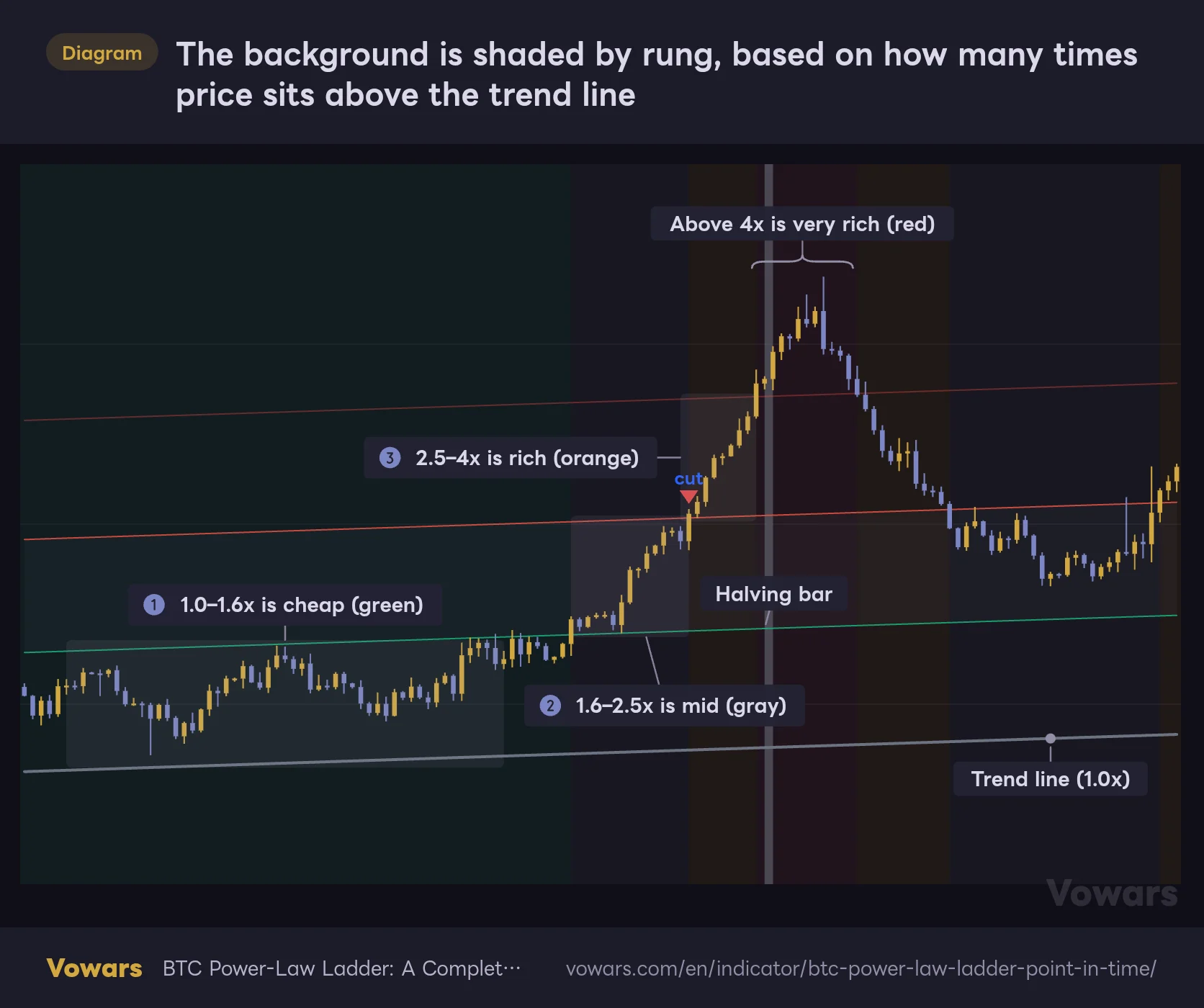
Above the trend line, thin lines are drawn at 1.6x, 2.5x and 4x. Divide the close by the line price, see which lines the multiple falls between, and that’s your rung — each rung gets its own background color. cheap is the zone in Figure ①, mid in Figure ②, and rich in Figure ③.
The background is shaded by rung, based on how many times price sits above the trend line
From the bottom up: 1.0x (the trend line), 1.6x, 2.5x and 4x. The background color depends on which pair of lines the close sits between.
- Trend line
- 1.6x line
- 2.5x line
- 4x line
Vowars DE ver.3.11.2
| Rung (as shown in the table) | Multiple | Background color | What it means |
|---|---|---|---|
| below the line | Below 1.0x | Dark green | Price has broken below the floor itself |
| cheap | 1.0–1.6x | Green | Just above the floor — the cheap side on a long-term view |
| mid | 1.6–2.5x | Gray | Middle ground. Neither cut nor restore fires here |
| rich | 2.5–4.0x | Orange | Well stretched above the floor |
| very rich | 4.0x and above | Red | Overheated. In the author’s stats, big drawdowns usually followed within a year |
The boundaries at 1.0, 1.6, 2.5 and 4.0 are fixed. You can’t move them in the settings. That’s because the author measured each rung’s stats at exactly these four values. If the boundaries were adjustable, the same labels would end up attached to cutoffs nobody ever tested. Once you see it as a way to protect what the numbers mean, the design makes sense.
Without log scale, you can’t read the upper rungs
Full disclosure: I first ran it on a regular (linear) price scale. Around 2018–2020, when BTC was much cheaper, the lines were practically stacked on top of each other, while in recent years the 4x line shot off the top of the screen. The rungs look wildly different in width from year to year, so you can’t intuitively tell which rung you’re in.
The author also assumes you’re using a log scale. Right-click the price scale and choose “Logarithmic,” or toggle it with Alt+L on Windows (Option+L on Mac). On log scale, the 1.0x, 1.6x, 2.5x and 4x lines become nearly evenly spaced parallel lines, and reading the rungs gets much easier. The figure also reproduces the log-scale view.
Background tint, the gray band and the halving markers
The background tint is very faint — 92% transparency. You might not even notice it at first, but the shade shifts on the day the rung changes, so on a long lookback you start to see bands showing “how many months price spent in which rung.”
A faint gray band fills the space between the 1.6x and 2.5x lines. It’s the “wait-and-see zone” where neither cut nor restore fires (more on that below). The halving bars of 2016, 2020 and 2024 also get a gray vertical band. The 2028 and 2032 halvings are registered too, but those dates are estimates based on block production speed and may drift from the real dates.
“Point-in-Time”: a design that refuses hindsight-fitted lines
The headline feature is right there in the name: “Point-in-Time.” Once you understand this part, you’ll know how far you can trust “BTC Power-Law Ladder.”
Most power-law lines you see online fit one set of coefficients to the entire history, then draw that line back over the same history. That line was drawn knowing where the 2017 and 2021 tops landed, so of course it appears to tag past tops and bottoms perfectly. The author describes these as lines that “knew how every cycle ended.”
This one instead refits the line every January using only data through the end of the previous year, and draws that year with those coefficients. The 2016 line uses data only through December 31, 2015; the 2020 line, only through December 31, 2019. In other words, no part of the line on the chart knows anything about the price action that came after it. Thirteen vintages are stored, from 2014 through 2026, which is why the default line starts on January 1, 2014.
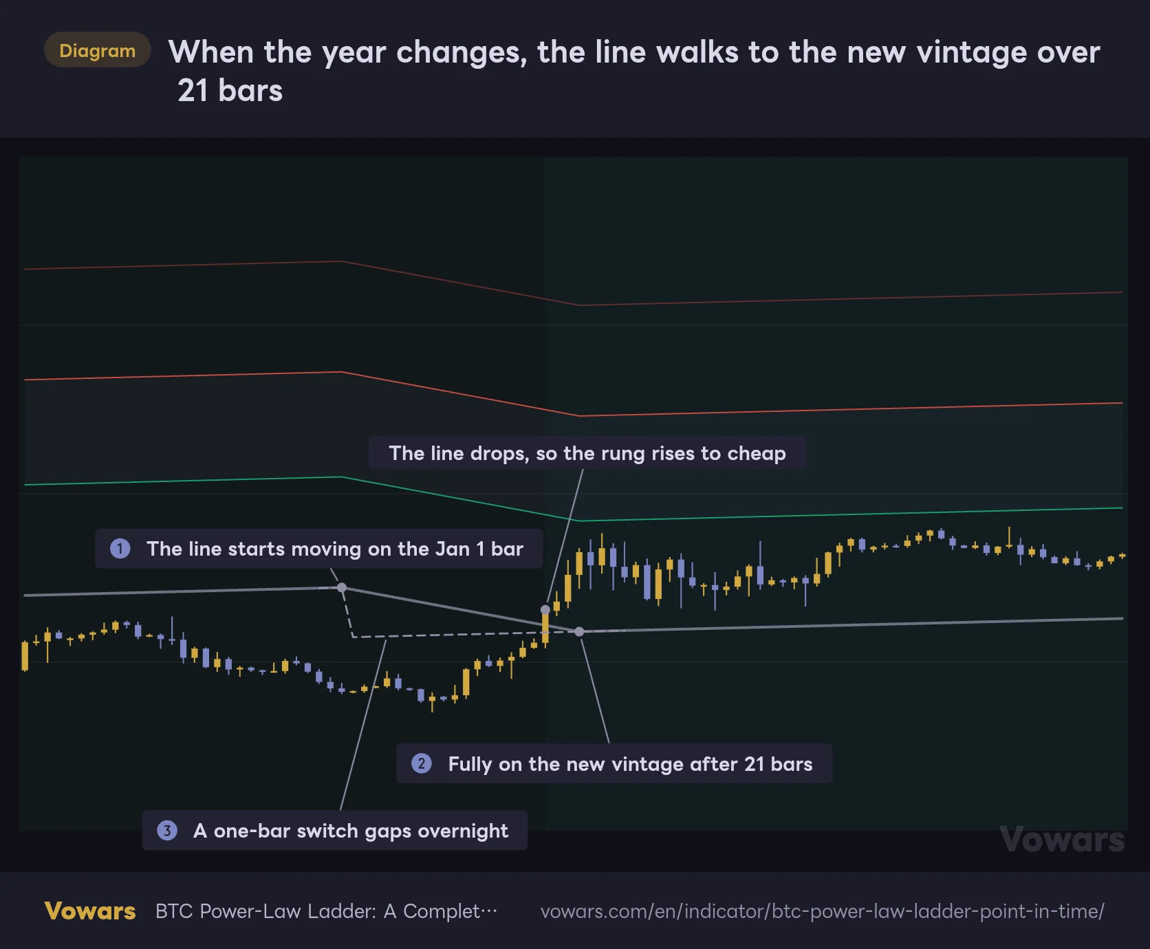
Each January, the line walks to the new vintage over 21 bars
If the coefficients were swapped outright every New Year, the line would jump overnight with no price action behind it. The 2016 vintage sits 43% below the 2015 vintage — a hard switch would spike the multiple by 77% in a single day. That alone could trigger a cut or restore.
So “BTC Power-Law Ladder” moves from the old line to the new one gradually over the first 21 bars of January (Figure ①–Figure ②). Both the old and new coefficients are already known on January 1, so no future data goes into this transition. On a log scale, the line walks in a straight path from the old vintage to the new one.
When the year changes, the line walks to the new vintage over 21 bars
A reproduction of the year-end changeover from the 2022 vintage to the 2023 vintage. All four lines ease down together, smoothly.
Vowars DE ver.3.11.2
January 2023 played out exactly like this. The 2023 vintage sits about 19% below the 2022 vintage, and price, which was below the line at year-end, got back into cheap thanks to January’s rally combined with the falling line. The dashed line in Figure ③ shows what happens with January blend length (bars) set to 1. In that case, the first bar of the year still uses the old vintage, and the line drops all at once on the second bar.
While the transition is in progress, the “line vintage” row in the bottom-right table turns orange and reads something like “2022 to 2023 (5/21),” so you can see how many bars into the blend you are.
From January 2027, the line becomes “provisional”
The latest stored coefficients are the 2026 vintage. From 2027 on, provisional coefficients fitted on data through September 16, 2026 take over, and the “line vintage” row shows “2027 provisional” in orange. The author plans to swap in a proper 2027 vintage once it’s available.
By my own math, the provisional line on January 1, 2027 comes in about 6% below the 2026 vintage. Since the line eases down roughly 6% over January’s 21 bars, the multiple rises by that much even if price goes nowhere. If the rung changes in January 2027, it’s worth first checking whether the line transition is the cause (calculated with the coefficients as of September 25, 2026).
The author admits that yearly refits only remove “coefficient hindsight.” The method itself — fitting a log-log power law to the 1% lower quantile — was chosen by people who had already seen Bitcoin’s history. Nobody would have picked this approach back in 2014. The “BTC Power-Law Ladder” line doesn’t use after-the-fact coefficients, but treating how well it fits past charts as a guarantee for the future is dangerous.
Cut and restore: brace at 2.5x, reload at 1.6x
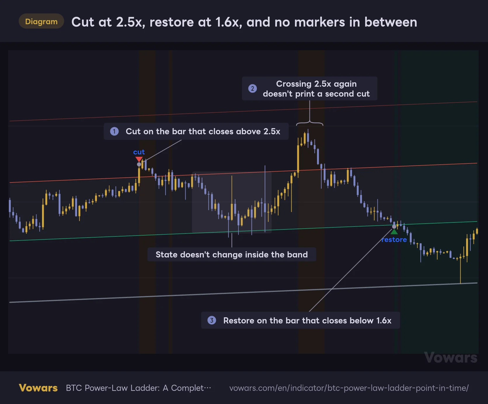
“BTC Power-Law Ladder” can print “cut (reduce risk)” and “restore (go back to full position)” markers based on the multiple. The rule is simple: a close above 2.5x the line prints cut, and a close below 1.6x prints restore (Figure ①, Figure ③).
The key is that the up trigger and the down trigger use different thresholds. After a cut, price can drop back below 2.5x and restore still won’t fire until it gets below 1.6x. Likewise, chopping back and forth across 2.5x won’t print a second cut (Figure ②). With a single threshold, you’d get a flood of markers every time price chopped around the line. Putting a gray band between two lines lets the rule ignore that back-and-forth. This kind of mechanism is called hysteresis.
Cut at 2.5x, restore at 1.6x, and no markers in between
A close above the red line (2.5x) prints cut; a close below the green line (1.6x) prints restore. Only confirmed closes count.
Vowars DE ver.3.11.2
Markers only print on confirmed closes
Only confirmed closes are used. If price spikes above 2.5x intraday but the daily close ends below it, no cut. Markers appear once the daily bar closes and never disappear or move afterward. You can treat the cut and restore markers as non-repainting.
The background tint and the bottom-right table, on the other hand, are calculated from the live price of the forming bar. If price moves hard intraday, that day’s tint and the table’s “price / line” keep updating until the close is confirmed. That’s standard behavior for TradingView indicators, and colors on confirmed bars never get repainted after the fact.
The starting state depends on where your chart’s history begins
The initial state is set by the multiple on the first available bar. If it’s already above 2.5x, the indicator starts in an “already cut” state without printing a cut marker. BTCUSDT starts on August 17, 2017, when the multiple was roughly 4.0x. That’s why the first marker on my chart is the November 2018 restore.
On symbols whose data starts at a different date, the early markers may differ. The author’s published screenshot uses the INDEX Bitcoin index, with signals starting in 2014. Still, once a restore has passed, the state from then on is driven by the same multiple on any symbol, so the differences are limited to the early part of the chart.
All nine markers on my chart, and what happened next
I pulled every marker that printed on the BTCUSDT daily chart from August 2017 through September 25, 2026. “Following year” means the highest and lowest close within 365 days of the marker. The November 2025 restore is the one exception: it’s calculated over roughly 10 months, through September 25, 2026.
| Date | Marker | Close (USD) | Multiple | Following-year high | Following-year low |
|---|---|---|---|---|---|
| 2018/11/24 | restore | 3,932 | 1.59x | +233% | −18.3% |
| 2019/5/26 | cut | 8,614 | 2.56x | +52.0% | −44.3% |
| 2019/11/24 | restore | 6,903 | 1.54x | +170.9% | −30.5% |
| 2020/12/16 | cut | 21,336 | 2.64x | +216.5% | 0.0% |
| 2022/6/12 | restore | 26,575 | 1.58x | +14.6% | −40.6% |
| 2024/3/11 | cut | 72,078 | 2.58x | +47.3% | −25.1% |
| 2024/9/6 | restore | 53,963 | 1.60x | +128.5% | 0.0% |
| 2024/11/15 | cut | 91,032 | 2.50x | +36.9% | −16.2% |
| 2025/11/21 | restore | 85,129 | 1.60x | +13.9% | −31.1% |
Lining them up gave me pause. Price usually kept climbing after a cut — after the December 2020 cut, it more than tripled. After restores in 2022 and 2025, drawdowns of 30–40% were still waiting. Read the markers as “top” and “bottom” calls, and they look like misses almost every time.
But that’s exactly how “BTC Power-Law Ladder” is designed. A cut is meant to “limit the damage if a big drawdown hits after price has run too far from the floor” — it’s not a top call. Even in the author’s backtest, a cut only trims the position to 0.35x (35%), not to zero. Treating it as “stay lighter while things are overextended” felt like the right way to work with these markers.
How to read the author’s published stats for each rung
The author’s page includes stats built from 4,642 daily closes from January 1, 2014 through September 16, 2026. They track what happened after each day spent in each rung, and all figures are medians.
| Rung | Days | 2-year forward price (median) | Share positive after 2 years | Next-year max drawdown (median) | Share with a 50%+ drawdown next year |
|---|---|---|---|---|---|
| Below 1.0x | 445 | 9.77x | 100% | −30% | 0% |
| 1.0–1.6x | 1,544 | 4.31x | 100% | −30% | 14% |
| 1.6–2.5x | 1,162 | 2.05x | 89% | −49% | 46% |
| 2.5–4.0x | 764 | 1.60x | 76% | −62% | 90% |
| 4.0x and above | 727 | 0.74x | 28% | −72% | 97% |
The higher the rung, the worse the 2-year returns, and the share of cases that got cut in half the following year skyrockets. Days spent at 4x or above were positive two years later only 28% of the time. It’s striking how cleanly a single number — the multiple — separates the outcomes.
For the cut/restore rule, the author also shows backtest results including costs, with the position switched the day after each signal.
| Sharpe ratio | Max drawdown | Final multiple | |
|---|---|---|---|
| Buy and hold | 0.88 | −83.6% | 101x |
| Following cut and restore | 1.16 | −55.9% | 260x |
There’s also a test against 5,000 random scenarios that place the same-length “out of the market” periods on random dates. The p-values are 0.0022 for Sharpe, 0.0006 for drawdown and 0.0142 for the final multiple.
The author rates these results as “insufficient evidence — tracked, not rejected.” Here’s why:
- Only six round trips have completed, far short of the 30-event threshold the author uses
- The 2017 episode alone accounts for 57.9% of the rule’s total gross profit. It cut at $2,258 and restored at $3,783, missing the 67.6% rally in between
- Rung day counts are heavily overlapping observations — the multiple has a one-day autocorrelation of 0.997. Consecutive days in the same rung are essentially the same observation counted again
- The sample covers a single asset, Bitcoin, over about 12 years and four cycles
These numbers are a record of what already happened, not a guarantee of what comes next. As the author puts it, “A power-law floor holds until it does not, and there is no mechanism that obliges it to hold at all.”
It’s rare to see an indicator lay out its own weaknesses like this. The author shows the flattering numbers, then adds, in effect, “don’t trust these too much.” Honestly, that’s what earned my trust.
Using the bottom-right table to see “what happens next, and where”
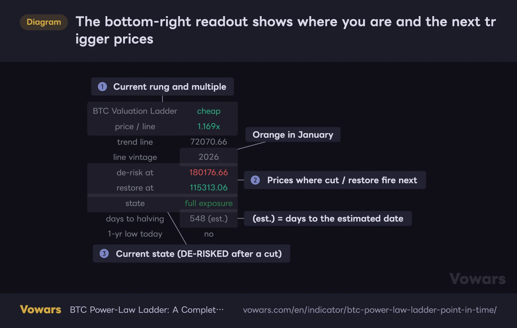
“BTC Power-Law Ladder” shows a readout table in the bottom-right. There are only three places you really need to look: the current rung and multiple (Figure ①), the prices where the next marker would fire (Figure ②), and the current state (Figure ③).
The bottom-right readout shows where you are and the next trigger prices
Copied exactly as displayed on September 25, 2026 (BTCUSDT daily).
Vowars DE ver.3.11.2
| Table row | What it shows |
|---|---|
| BTC Valuation Ladder | Name of the current rung, shown in that rung’s color |
| price / line | How many times above the trend line the close is |
| trend line | Today’s trend line price |
| line vintage | Which year’s vintage the line uses. Orange during the January transition and for the provisional line from 2027 |
| de-risk at | A close above this price triggers a cut (line × 2.5) |
| restore at | A close below this price triggers a restore (line × 1.6) |
| state | full exposure (normal) or DE-RISKED (after a cut) |
| days to halving | Days until the next halving. (est.) means it’s counted from an estimated date |
| 1-yr low today | yes if today’s close is at a 1-year low |
The two rows I use most are “de-risk at” and “restore at.” As of September 25, 2026, the cut trigger was $180,176.66 and the restore trigger was $115,313.06. Since the state is full exposure, the only level that matters next is the $180,176.66 above. The line rises a little every day, so both prices creep higher over time.
The table only shows the latest bar, but you can still check past multiples. “BTC Power-Law Ladder” outputs “price / line” to the Data Window only, so open the Data Window in the right-hand panel and hover over any bar to read that day’s multiple. It came in handy when I wanted to check “what multiple did the 2021 top hit?” On my BTCUSDT chart, the 2021 peak was 6.78x on March 13.
The blue dots flag “the lowest close in a year”
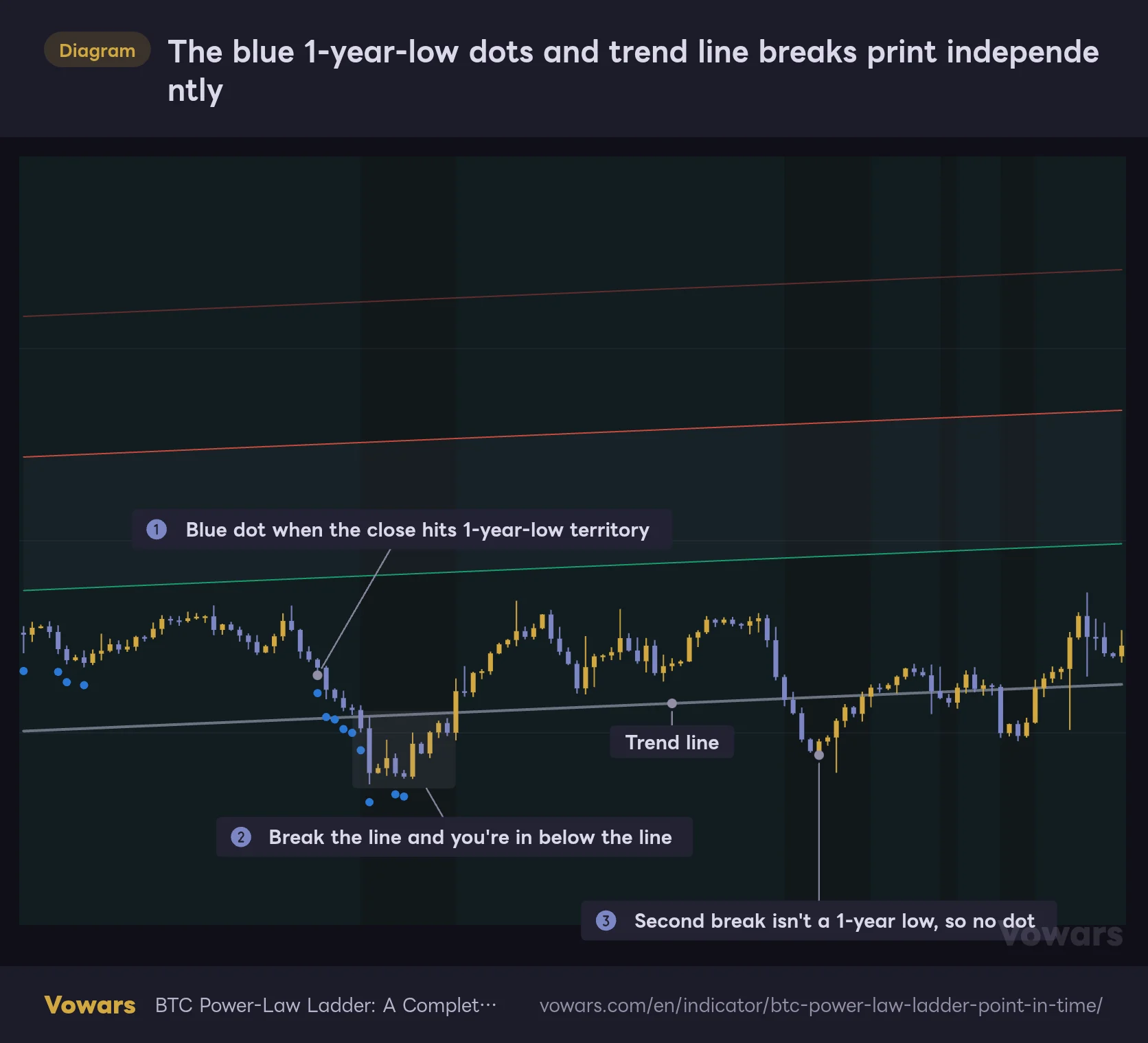
The blue dots under the candles mark days when the close is at the lowest close of the last 365 bars (within 0.1%). During an extended selloff, they string together as in Figure ①. Bitcoin trades on weekends too, so 365 bars is exactly one year.
The blue 1-year-low dots and trend line breaks print independently
Blue dots mark bars with the lowest close of the past 365 bars (within 0.1%). They're evaluated separately from whether price breaks the trend line.
Vowars DE ver.3.11.2
These dots and a break below the trend line are evaluated separately. Sometimes a fresh 1-year low and a line break coincide, as in Figure ②; other times price breaks the line after the bottom is already in, and no dot appears, as in Figure ③. On my BTCUSDT chart, the dots clustered from June to November 2022, and again in February and June 2026. Price broke below the line in March 2020, from November 2022 to January 2023, and from June to August 2026. It breaks more often than you’d think.
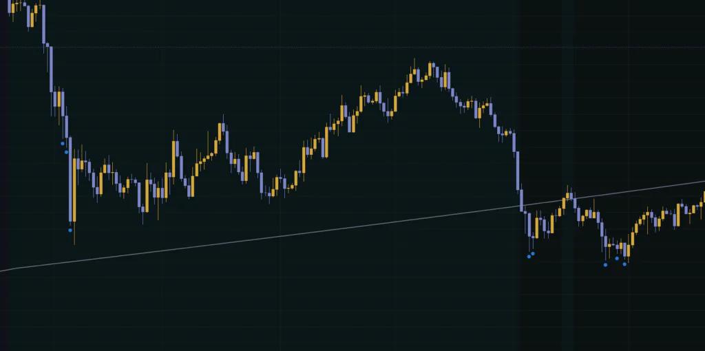
The blue dots are also judged on the forming bar’s close. A dot can appear when price makes a new low intraday and then vanish once the close confirms if price recovers. Base your read on confirmed bars.
Five alerts — and they don’t always match the markers
“BTC Power-Law Ladder” comes with five alert conditions. Pick “BTC Power-Law Ladder” under “Condition” in the Create Alert dialog and you’ll see them listed under these names:
- Crossed above the de-risk level — The multiple crosses above the De-risk above value
- Crossed below the restore level — The multiple crosses below the Restore below value
- Fell below the trend line — The close breaks below the trend line
- Reclaimed the trend line — The close reclaims the trend line
- New trailing 1-year low — The close enters 1-year-low territory (first day of a streak only)
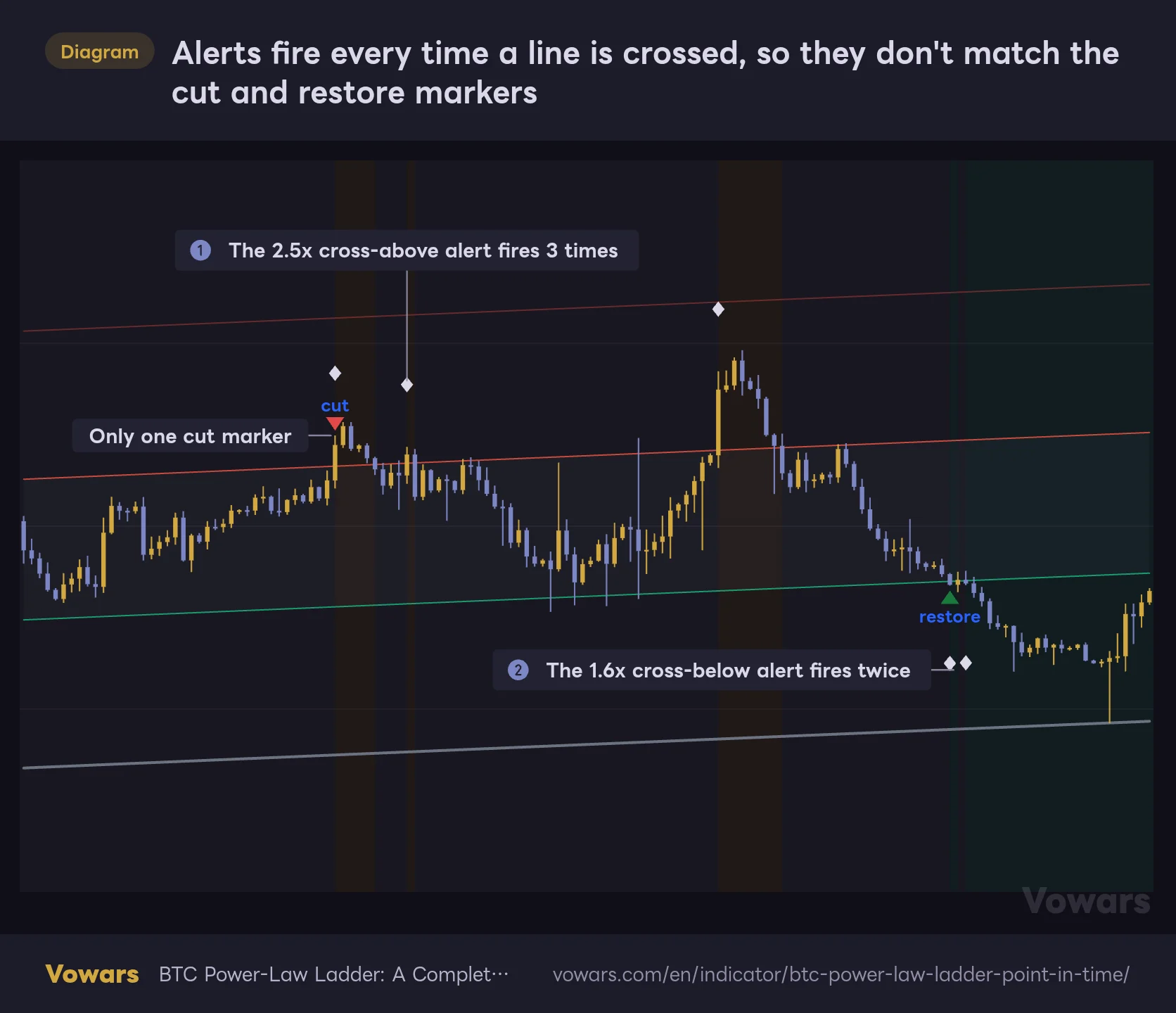
Here’s the catch: the alerts don’t look at the cut/restore “state.” They only check whether the multiple crossed a level, so if price chops around 2.5x, you’ll get the cross-above alert again and again. There’s only one cut marker, yet the cross-above alert fires three times (Figure ①). Same story around 1.6x — you can get another alert right after the restore marker prints (Figure ②).
Alerts fire every time a line is crossed, so they don't match the cut and restore markers
White diamonds show the bars where alerts set to Once Per Bar Close would fire (they don't appear on the chart).
Vowars DE ver.3.11.2
Set the alert frequency to “Once Per Bar Close.” With “Once Per Bar,” an intraday poke across the level is enough to fire it, putting it out of sync with the markers. One more thing: TradingView alerts keep running with the settings they were created with. If you later change De-risk above or anything else, you’ll need to recreate the alert.
Settings, and how to think about changing them
The settings are split into three groups: “Trend line,” “Rungs” and “Markers.” I mostly left everything at the defaults and only touched things to tidy up the display, and never ran into problems.
| Setting | Default | Suggested | Effect |
|---|---|---|---|
| Line | Real-time (refit each January) | Real-time (refit each January) | How the line is built. Choose between the yearly vintage line, constants fitted on the full history, or your own coefficients |
| January blend length (bars) | 21 | 21 | Number of bars to transition to the new vintage in January (1–90). At 1, it switches instantly on the second bar of the year |
| Custom a (log10 intercept) | -17.516 | Leave as is | Coefficient a (intercept) used when Custom is selected |
| Custom b (exponent) | 5.880 | Leave as is | Coefficient b (exponent) used when Custom is selected |
| Show rung boundaries | On | On | Shows the boundary lines at 1.6x, 2.5x and 4x |
| Tint background by rung | On | On | Color-codes the background by rung |
| De-risk above | 2.5 | 2.5 | Multiple that triggers cut (min 1.1) |
| Restore below | 1.6 | 1.6 | Multiple that triggers restore (min 0.5) |
| Mark trailing 1-year lows | On | On | Shows the blue 1-year-low dots |
| Mark de-risk / restore transitions | On | On | Shows the cut and restore triangles |
| Mark halvings | On | Personal preference | Adds a gray vertical band on halving bars |
| Show readout table | On | On | Shows the readout table in the bottom-right |
| Table Position | Bottom Right | Personal preference | Places the table in any of the four corners |
| Table Size | Normal | Personal preference | Table text size (Tiny / Small / Normal / Large) |
Compare the three Line modes to really get it
| Mode | How the line is built | Line starts on | January transition | Line on 2026/9/25 |
|---|---|---|---|---|
| Real-time (refit each January) | Yearly vintages fitted on data up to each January | 2014/1/1 | Yes | $72,070.66 |
| Published constants | Widely quoted full-history constants (a = −17.516, b = 5.880) | 2010/7/17 | No | ≈$78,288 (my calculation) |
| Custom | Whatever you enter in Custom a and Custom b | 2010/7/17 | No | Depends on your coefficients |
Switch to Published constants and the line becomes one smooth curve — as of September 25, 2026, it sits about 9% above Real-time (refit each January). The multiple reads lower as a result, and the rung may change too. I stick with the default day to day and only switch when I want to see “what the hindsight line looks like.” Custom is for anyone who wants to test their own power-law coefficients.
Changing De-risk above and Restore below takes you “off the tested setup”
Change De-risk above or Restore below and the cut/restore trigger levels move, along with the red and green lines on the chart. The rung boundaries (the thin 1.6x, 2.5x and 4x lines), however, stay put. Once you move away from the defaults, the bottom row of the table shows “⚠ thresholds off tested 2.5 / 1.6” in orange — a warning that you’re outside the configuration the author tested.
If you set Restore below equal to or higher than De-risk above, the indicator throws an error and stops. Without a gap between the two, it would flip between cut and restore every single day. Whenever you change them, always keep Restore below as the smaller value.
My take: leave these two at the defaults. All of the author’s stats were calculated at 2.5 and 1.6, and the moment you change them, the performance tables above no longer apply. If you want to match your own risk tolerance, I think it makes more sense to leave the trigger levels alone and decide for yourself how much to trim when a cut prints.
Keep January blend length at 21
January blend length (bars) can be set anywhere from 1 to 90. At 1, the line gaps at the start of the year and the multiple jumps overnight (Figure ③). Larger values smooth the transition, but the old vintage lingers longer. 21 — finishing the move within January’s first three weeks — struck the right balance for me: no gap, and the new vintage kicks in quickly.
If the chart feels cluttered, turning off Mark halvings and Tint background by rung made a real difference. As long as the boundary lines and the bottom-right table are still there, you can read the rungs. If the table overlaps another indicator, move Table Position to “Top Left” or similar and set Table Size to “Small” to keep it out of the way. I recommend keeping at least the cut/restore markers and the de-risk at / restore at rows.
From setup to your first read
1Open a USD-denominated Bitcoin daily chart
Open a USD-denominated chart such as BTCUSD or BTCUSDT (USD or a USD-pegged stablecoin), and switch to the daily timeframe. The line is fitted on USD prices, so pairs quoted in other currencies, like BTCEUR or BTCJPY, won’t give you a correct multiple.
2Add the indicator and switch to log scale
Search for “BTC Power-Law Ladder” in the indicator search, add it, and switch to log scale with Alt+L (Option+L on Mac).
3Check three spots in the table
In the bottom-right table, check three things: the rung name and multiple, de-risk at and restore at, and state. That tells you “where you are now, and at what price something happens next.”
4Review past markers
Zoom out and look at where past cuts and restores printed and what price did afterward. Bar Replay on the daily chart is available even on the free plan, so you can step forward one bar at a time from any past date and see how the line looked back then. Since it’s a point-in-time line, what you see during replay is exactly what was on the chart at the time.
What I could rely on, and what to watch out for
What I could rely on
- Answers “is it cheap or expensive on a long-term view?” instantly with a single number: the multiple
- Because the line uses yearly coefficients, it avoids the “fits the past too perfectly” look of hindsight-fitted lines
- The January transition means a coefficient change alone never flips the rung
- Cut and restore are judged only on confirmed closes, and the markers never repaint
- The next trigger prices are shown in the table, making it easy to set alerts and plan ahead
- The author discloses both the performance numbers and the weaknesses, so you can tell how far to trust it
What to watch out for
- Only meaningful on the USD-denominated Bitcoin daily chart. The multiple is off on non-USD pairs and other assets
- Upper rungs are hard to read without log scale
- Price often keeps rallying after a cut and keeps falling after a restore — useless for timing trades
- The background tint is faint, making it hard to track rung changes by color alone
- Alerts ignore the state, so they can fire more often than the markers
- From 2027 the coefficients are provisional, and the line’s position depends on the author’s updates
Pair it with the 200-day moving average to cover what comes after a restore
If I had to pick one indicator to pair with “BTC Power-Law Ladder,” it’d be the 200-day simple moving average. “BTC Power-Law Ladder” only tells you the position — how far price is from the floor — not whether price is trending up or down right now. The 200-day, the classic long-term trend gauge, fills in that missing direction.
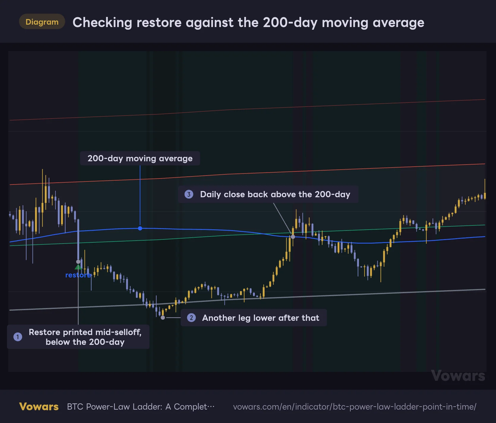
Where it helps most is around restores. As the table above shows, restores usually print in the middle of a selloff. If price is still below the 200-day when a restore prints (Figure ①), you’re still in a downtrend. It’s not unusual for price to take another leg down from there, as in Figure ②. My approach: if a restore prints below the 200-day, I don’t rush to buy back, and wait for a daily close back above the 200-day, as in Figure ③.
Checking restore against the 200-day moving average
The blue line is the 200-day simple moving average (TradingView's built-in Moving Average, length 200).
Vowars DE ver.3.11.2
To add the 200-day, use TradingView’s built-in Moving Average and set the length to 200. Keep in mind this is my own approach, not a rule the author tested. Waiting for a reclaim of the 200-day helps you avoid catching a falling knife, but you’ll buy back at a higher price. After the September 2024 restore, which landed almost exactly on the low, waiting meant paying up. Choose based on how much drawdown you can stomach.
Things to check before you add it
On any timeframe other than daily, it explains why instead of drawing
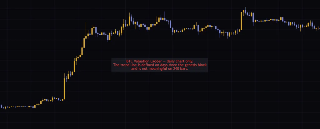
“BTC Power-Law Ladder” is daily-only. Switch to the 4H or weekly chart and no lines or markers are drawn; instead, red text in the middle of the chart explains that it’s daily-only and not meaningful on other timeframes. You won’t be left staring at a blank chart wondering if it broke, which is a nice touch.
It doesn’t check the symbol
Unlike the timeframe, there’s no symbol check. Load it on an Ethereum or gold daily chart and, with no warning, it calculates the Bitcoin line and rungs as usual. Obviously, the multiple means nothing there. For the same reason, on a non-USD pair the multiple gets distorted by the exchange rate — on BTCJPY, for example, the line stays in USD, the multiple blows way past 100x and the table reads very rich permanently. Always use it on USD-denominated Bitcoin.
“BTC Power-Law Ladder” is a yardstick built from roughly 12 years of price action on a single asset, Bitcoin. It’s true that the rung stats separated cleanly in the past, but the market’s character has shifted many times. There’s no guarantee the power-law floor will hold forever, either.
Avoid going all in or all out in one shot based on a cut or restore. Crypto trading carries a substantial risk of loss. You are responsible for your own decisions; consult a qualified professional where appropriate.
What kind of trading it suits
It works on the daily chart. Going from a cut to a restore takes anywhere from a few months to over a year. It’s suited to position trades that hold Bitcoin for months to years, and to reading the broader market context for longer swing trades. It won’t help with entries for day trading or scalping. Where I found it fits best: long-term DCA stackers checking once a month whether “now is a good spot to add” or “time to lighten up a bit.”
A distance gauge for long-term Bitcoin holders
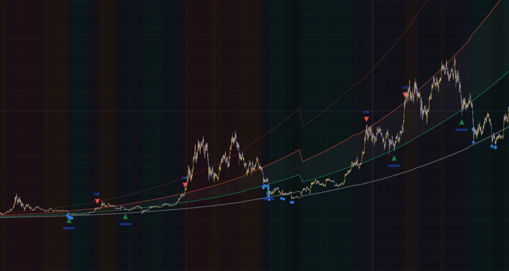 Image
Image“BTC Power-Law Ladder” measures how far Bitcoin’s price is from its historical floor, using a line with no hindsight baked in. It doesn’t do a lot, but that means it’s crystal clear about what it measures — and both where the numbers come from and where they fall short are out in the open.
What helped me most was being able to come back to a calm number — “1.17x the line, cheap rung” — whenever the news cycle or CT sentiment started pulling me along. Don’t hand your buy and sell decisions over to the cut and restore markers; keep them around as a prompt to revisit your position size. Used with that kind of distance, it makes a reliable yardstick for long-term holding.