
Settling the ‘Where Do I Anchor It?’ Problem Before You Even Draw
The hard part of a Fibonacci retracement was never the ratios. It is the anchor. Two traders can open the exact same chart, one drawing from the most recent swing low and the other from the major bottom six months back, and end up with completely different levels. The annoying part is that both sets will show you convincing reactions. Sooner or later everyone has that moment where the line you wanted to work is the only one that looks like it worked.
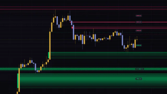
‘Fibonacci Gravity Clusters’ is the kind of tool that takes that decision out of your hands entirely. It runs six swing detectors of different lengths side by side, projects retracement levels off every confirmed leg, and paints heat only where those levels pile up on top of each other. Instead of trusting one line, you are looking at where the votes landed. What shows up on the chart is a stack of colored bands running horizontally across the price axis.

TradingView is full of scripts that auto-plot horizontal levels, and this one looks like none of them. My first impression when I loaded it was that somebody had dropped a thermal camera over the chart. Inside the range price is swinging through, you get layers that glow and layers that are almost pitch black, and the split between them is obvious.
Let me give you the verdict up front. It tells you nothing about direction. But for narrowing down where a dip or a rally is likely to stall, it was both faster and a lot more honest than drawing fibs by hand. The more settled your directional read already is, the better this thing fits.
What You Get Is Not Lines, but Colored Bands Stacked Along the Price Axis
There is not much on screen. First, the price axis gets sliced into thin bands. The height of one band comes from Bin height (ATR x), default 0.25, so each slice is a quarter of ATR tall. Because the slicing is measured in volatility rather than raw points, Bitcoin, gold and USDJPY all end up with roughly the same visual granularity. If you flip between a lot of symbols, that is a genuinely nice touch.
The intensity of a band reflects the combined weight of the projections that landed in it. On the default Thermal palette the ramp runs from deep purple through magenta and orange, topping out at a pale cream. The brighter the band, the more swings are pointing at that exact price. That is the whole read.
The Real Payload Is the Core Lines and Their x-Count Labels
 Image
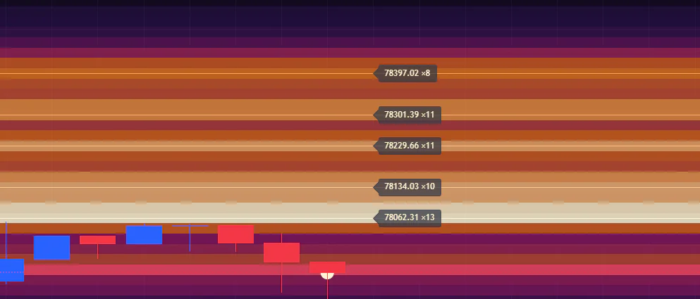
ImageEyeballing the center of a glowing band is guesswork, so the script draws a thin line and a label on the top five heat peaks. Each label shows a price plus something like x14 or x3 next to it. That number is how many raw projections actually landed in that band.
If you take one thing from this article, take this. The heat is normalized, meaning the shading is always relative to the hottest spot on that particular chart. So even on a dead, featureless chart, something is going to be painted as the brightest thing there. Judge a zone as strong purely on color and you will walk straight into that trap. Get into the habit of reading the raw x-count first and the problem basically disappears.
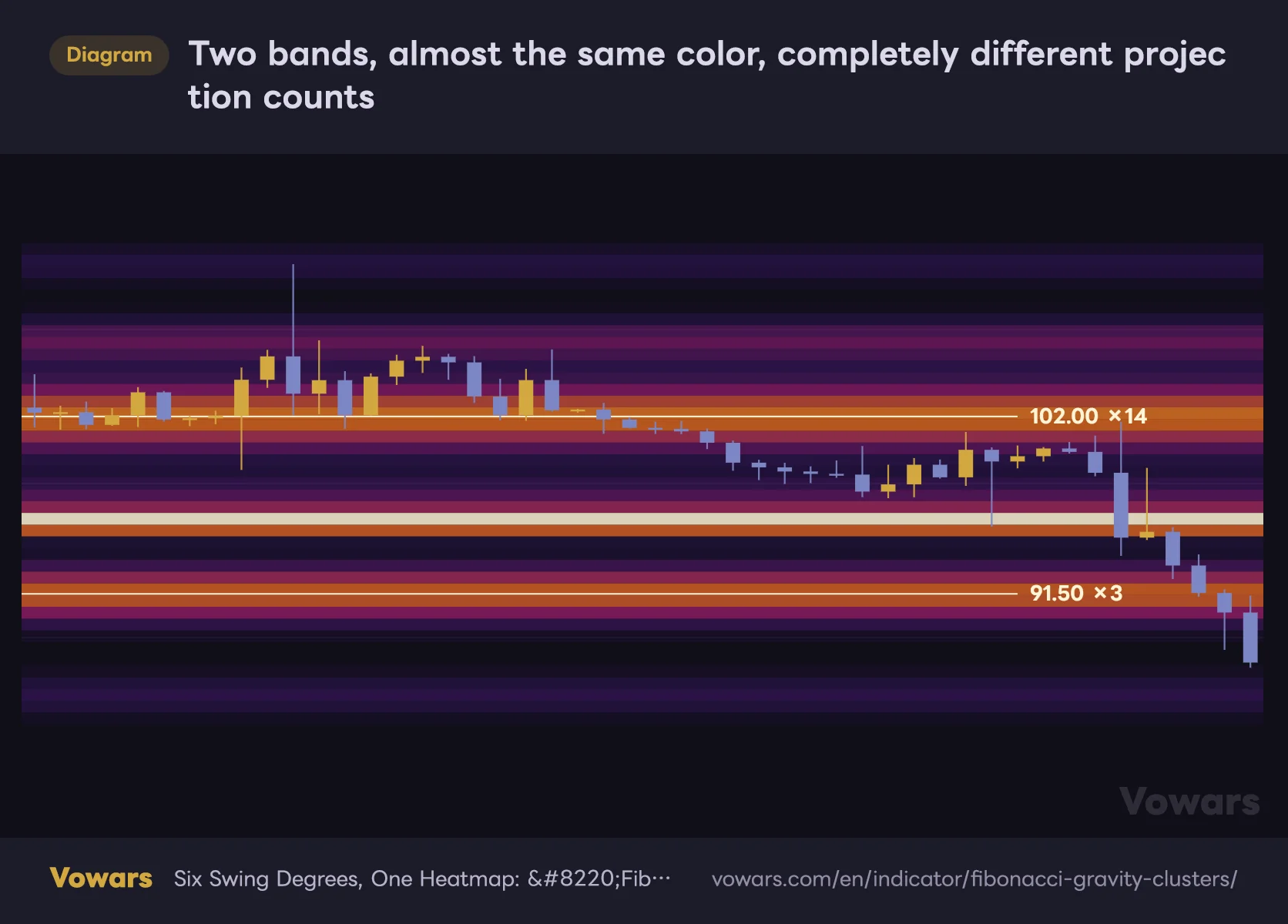
x14 and x3 can look almost identical in color while meaning completely different things. The first is fourteen independent projections landing on the same price band, the second is three. When the label is down in the low single digits, I treat that band as possible coincidence rather than real confluence.
One caveat: that count belongs to the single band at the peak, not the zone as a whole. Projections that scattered into neighboring bands are not added in. On a wide zone the number can therefore look modest relative to how big the glow is. Keep that in mind and you will misread the labels a lot less often.
Two bands, almost the same color, completely different projection counts
Almost identical shading, and yet the x-counts on the labels can be this far apart.
Vowars DE ver.3.5.0
Contact Flash: the Band Lights Up When Price Touches It
When the close lands inside a band above a certain heat level, that band gets repainted a shade stronger and a small dot appears at the price. The cutoff is Flash threshold, default 0.5, meaning at least half the maximum heat on the chart. When you cannot sit in front of the screen all day, it is a handy way to come back later and spot that price had tagged a zone.
Six Swing Degrees, Each Feeding Heat In at a Different Speed
The personality of ‘Fibonacci Gravity Clusters’ comes from its swing degrees. Degree 1 length through Degree 6 length default to 3, 8, 21, 55, 144 and 377, which is just the Fibonacci sequence laid out. Each one runs as an independent ZigZag: the short degrees catch wiggles that turn over in a handful of candles, the long ones catch swings that take months to complete.
| Degree | Default | What it picks up | Bars to pivot confirmation |
|---|---|---|---|
| Degree 1 | 3 | Noisy wiggles that turn over in a few bars | 3 bars |
| Degree 2 | 8 | Short-term dips and rallies | 8 bars |
| Degree 3 | 21 | Mid-sized swings day traders watch | 21 bars |
| Degree 4 | 55 | The main swings of a trend | 55 bars |
| Degree 5 | 144 | Major structural turning points | 144 bars |
| Degree 6 | 377 | The long-term trend as a whole | 377 bars |
Each degree only remembers its last 13 legs; anything older gets pushed out. On top of that, legs smaller than Min leg size (ATR) are thrown away before they ever count. The default is 0.5, so a move that does not even cover half an ATR is treated as noise. Six degrees times 13 legs times five enabled ratios works out to roughly 390 projections scattered across the price axis. That volume is exactly what makes the density idea work at all.
Bigger Swings Arrive Late, and They Arrive Faded
This is worth knowing before you load it. A pivot only confirms once the specified number of candles have printed past the high or low. With Degree 6 length at 377, a top does not get registered as a swing until 377 bars after the fact. On the daily that is more than a year later. The largest degree is essentially never going to help you in real time.
Decay makes it worse. Projection weight halves as bars go by, and the rate is set by Half-life (bars), default 144. A leg that ended 377 bars ago is already down to roughly a sixth of its weight the moment it gets registered. Leg size still earns it credit (measured in ATR multiples, capped at 8x), so it does not vanish outright, but the big degrees act as quiet background rather than the backbone of what you are seeing.
Flip that around and the bands you can actually see glowing are mostly built by the mid degrees, somewhere between Degree 2 and Degree 4. Once that clicked, I started reading the display as a consensus formed by the last few dozen bars of price action. Load it expecting a map of multi-year structure and it will not give you what you came for.
Half-Life Is Really Just How Long the Indicator Remembers
Half-life is set in bars, so the real-world span it covers shifts the moment you change timeframe. Hop between timeframes without thinking about it and the whole display seems to change personality for no obvious reason.
| Timeframe | What the default 144 bars covers | How it feels |
|---|---|---|
| 15-minute | About 1.5 days | Only the current session survives |
| 1-hour | About 6 days | Mostly the last week of dips and rallies |
| 4-hour | About 24 days | Roughly a month of swings stay alive |
| Daily | About 4 to 5 months | Memory of one intermediate trend |
If you want years of significant levels to survive on the daily, stretching half-life out to 233 or 377 is the quickest fix. Going the other way, on the 5-minute where you only care about today, shorten it. No other single input changes the character of this indicator as much as this one.
How I Actually Read It: Numbers First, Color Second
1Load it with default settings and just note where the bright layers sit
Resist the urge to touch anything at first. There are enough inputs here that once you start fiddling you lose track of what you are even looking at. Just count how many bright layers sit above and below current price, and note where price is sitting among them. The bands extend off the right edge, so you can read them as candidate destinations for where price goes next.
2Check the projection count on the core line labels
Scan the top five labels and find which zones are into double digits. Those prices are what the chart is pointing at most heavily right now. If everything is a small number, the market has not built clear structure yet, and sitting the tool out is a perfectly valid call.
3Watch how the candles react when price enters a band
The band itself gives you nothing directional. Did price arrive from above or below? Did a long wick print the moment it got there, or did it slice straight through? That observation is the actual substance of the entry decision. Leaving contact flash on makes the moment of the touch visually obvious.
4Turn on the HTF layer and hunt for double-stacked zones
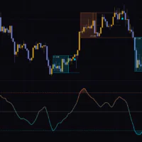
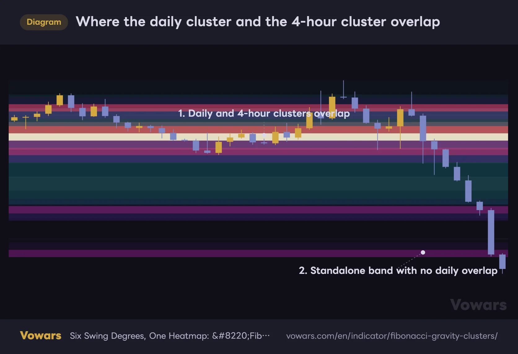
Flip Enable on under HTF layer and the same density field, computed on the daily or weekly, gets laid faintly behind the intraday one. What you are hunting for is an intraday hot band sitting entirely inside a higher timeframe hot band. The author calls this the most interesting picture the tool produces, and once you compare the two side by side it is hard to argue. The quality of the reactions there was noticeably different.
Where the daily cluster and the 4-hour cluster overlap
The blue layer behind is the daily, the warm layer in front is the 4-hour. The more the two overlap, the denser the confluence.
- Daily density (HTF layer)
- 4-hour layer density
Vowars DE ver.3.5.0
Strong on Dips and Rallies, Silent in Blue Sky
Where it works is obvious enough. Corrections inside an existing trend, which is to say pinning down how far a dip or a rally is likely to run. That is its home turf. Because levels projected off prior legs are already stacked up, the moment a pullback starts the candidate destinations are sitting right there on screen.
It holds up in consolidation too. Every time price turns at the top or bottom of the range a new leg is born, and those projections keep stacking onto the same prices. The upper and lower boundaries of the range end up lighting themselves up.
The other side is where it falls down. Break to a new high or a new low, into price territory that has never traded before, and there is simply nothing drawn up there. The reason is trivial: every retracement level lands inside an existing leg. For hunting targets in the early stage of a breakout, this is the wrong tool.
Where it shines
- Pinning down how far a pullback or rally is likely to run
- Mapping the edges of a range without eyeballing it
- Lining up several candidate take-profit levels
- Cross-checking which prices matter across multiple timeframes
Where it does not
- Setting targets in blue sky, such as during an all-time-high run
- Deciding direction in the first place
- One-way moves that ignore levels entirely, like a post-news spike
- Freshly listed symbols with barely any history
On style, day trading and swing trading are the natural fits. The 1-hour to daily band felt about right to me. Scalping is not impossible, but even the shortest Degree 1 makes you wait three bars for confirmation, and on the 5-minute the heat rotated faster than I could keep up with. For position trading, running it on the daily or weekly with a stretched half-life is the realistic approach.
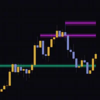
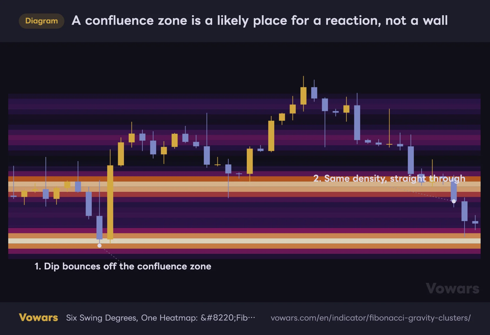
A confluence zone is a likely place for a reaction, not a wall
At 1 the dip stalls right at the zone. At 2 price rips through a band of similar density.
Vowars DE ver.3.5.0
Plenty of Inputs, but Only a Handful Actually Change the Picture
Open the settings and you get seven groups: Swings, Ratios, Heat model, Rendering, HTF layer, Live Leg and Style. It looks like a lot, but only a small slice of it actually shapes what you see. I will walk through everything and then narrow it down to the inputs worth your time at the end.
Swings – How the Legs Get Picked Up
| Parameter | Default | Suggested | What it does |
|---|---|---|---|
| Degree 1 length | 3 | 3 (off on lower timeframes) | Catches the smallest wiggles. On 5-minute and below it floods the field with projections and blurs the bands, so unchecking it reads better |
| Degree 2 length | 8 | 8 | Handles short-term dips and rallies. It carries most of the heat on intraday charts, so leave it alone |
| Degree 3 length | 21 | 21 | Mid-sized swings. Day-trading reaction zones are usually built from this degree |
| Degree 4 length | 55 | 55 | The main trend swings. It pairs well with the default half-life and does the most real work |
| Degree 5 length | 144 | 144 | Lays major structure in as a base layer. It takes 144 bars to confirm, so nothing is immediate |
| Degree 6 length | 377 | Off if your chart history is short | The whole long-term trend. Confirmation comes 377 bars later, so it does nothing on a shallow chart |
| Max legs per degree | 13 | 8〜13 | How many legs each degree remembers. Lower it and only recent structure survives, which cleans the bands up |
| Min leg size (ATR) | 0.5 | 0.5〜1.0 | Discards legs smaller than this. If a low-volatility symbol is producing junk, pushing it to around 0.8 helps |
The practical way to decide whether to drop a degree is to look at how much history your chart has loaded. With fewer than a couple of thousand bars on screen, leaving Degree 6 length enabled does almost nothing, because there is no room to stack 13 legs when each one waits 377 bars to confirm. Anything that is switched on but changes nothing is worth switching off, if only for the load time.
Ratios – Which Levels Get a Vote
| Parameter | Default | Suggested | What it does |
|---|---|---|---|
| 0.236 | On | Fine to turn off | Shallow retracement. It works in strong trends but scatters projections close to price |
| 0.382 | On | On | The shallower dip. It is the workhorse in trend continuation |
| 0.5 | On | On | The 50 percent retracement. Not strictly a Fibonacci ratio, but heavily watched in practice |
| 0.618 | On | On | The golden ratio. It often ends up at the centre of a confluence zone |
| 0.786 | On | On | The deep pullback. It tends to act as the last line for reversal setups |
| 0.886 | Off | On if you hunt reversals | An even deeper retracement. Worth enabling if you also trade harmonic patterns |
| Golden-pocket emphasis (0.618 & 0.65 x1.618) | Off | On if you focus on dip entries | Adds 0.65 and multiplies the weight of 0.618 and 0.65 by 1.618, deliberately brightening the golden pocket |
Switching every ratio on gives you more projections, but it can also flatten the field out until the peaks stop standing apart. More ratios does not mean a better read. Personally I found trimming it down to 0.382, 0.5, 0.618 and 0.786 produced far better contrast between peaks and dead space.
The golden pocket is the narrow band between 0.618 and 0.65, long treated as the classic buy-the-dip zone. Turning this on deliberately gives that zone a weighted vote rather than a normal one. If you want to see the density on its own merits, leave it off.
Heat model – How the Heat Itself Is Built
| Parameter | Default | Suggested | What it does |
|---|---|---|---|
| Size exponent alpha | 1.0 | 1.0〜1.5 | How much leg size matters. Raise it and large swings dominate, leaving fewer but louder bands |
| Half-life (bars) | 144 | 144 (233 to 377 for longer horizons) | How many bars until an old leg is worth half as much. The single most important input on the list |
| Kernel width (bins) | 1.0 | 0.8〜1.5 | How aggressively nearby projections merge. Higher gives fatter, smoother bands, lower splits them apart |
| Bin height (ATR x) | 0.25 | 0.25 | Thickness of a single band. Being ATR-based keeps granularity consistent across symbols |
| Lookback window (bars) | 610 | 300〜610 | Sets the price range drawn and the left edge of the bands. Shorten it for higher heat resolution |
Here is a relationship you will not spot just by reading the settings panel. There is a hard cap on how many bands can be drawn, so if the price range carved out by Lookback window (bars) is too wide, the script silently switches to a coarser slice no matter what you do with Bin height (ATR x). As a rough guide, you start hitting that cap once the range exceeds about 58 times ATR.
When the bands are too fat to pin a level down, shrinking Bin height (ATR x) sometimes does nothing at all. The slice size is not the lever here. The window is. Shorten Lookback window (bars), the price range narrows, and the same number of bands now carves it up far more finely.
Rendering – This Is Where Readability Lives
| Parameter | Default | Suggested | What it does |
|---|---|---|---|
| Palette | Thermal | Thermal / Mono | Color scheme. Thermal, Ember, Ice and Mono. On a chart with lots of other drawings Mono gets in the way least |
| Gamma | 0.6 | 0.8〜1.2 | How much weak heat gets lifted into view. The default shows it all, so raising this leaves only the strong zones |
| Max opacity % | 85 | 55〜70 | Maximum band opacity. On the default there are moments where the candles get hard to read |
| Min heat to draw | 0.05 | 0.15〜0.3 | Bands below this value are not drawn. The higher you go, the quieter the chart and the cleaner the clusters |
| Core lines (top K) | 5 | 3〜5 | How many heat peaks get a line and a label. Trimming to three speeds up decisions |
| ZigZag overlay | Off | On only when investigating | Plots all six ZigZags in separate colors. Useful for checking which legs built a given zone |
| Contact flash | On | On | Highlights the band and drops a dot when the close enters hot territory |
| Flash threshold | 0.5 | 0.5〜0.7 | Heat floor for the flash and the alerts. Raise it to restrict them to genuinely dense zones |
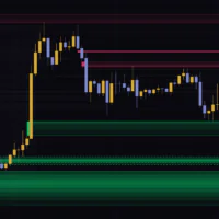
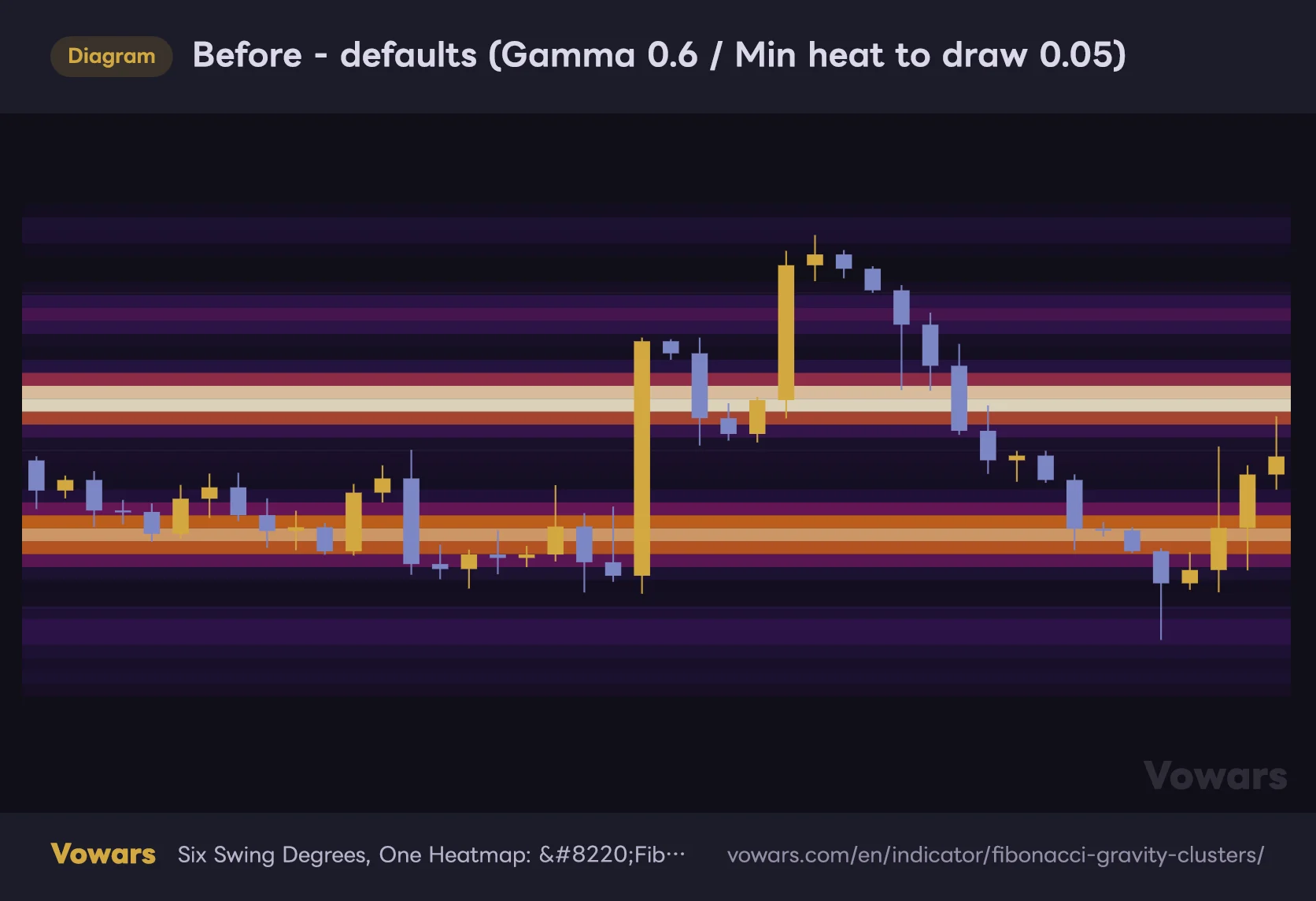
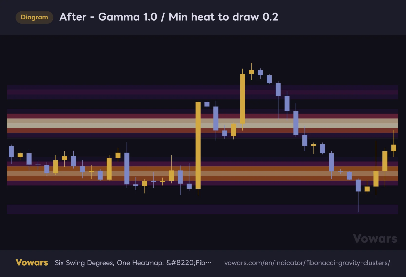
When the chart feels noisy, the two inputs to reach for are Gamma and Min heat to draw. The default Gamma of 0.6 lifts weak heat into visibility, which is why everything ends up faintly tinted. Push it up to around 1.0 and set Min heat to draw to 0.2, and only the real confluence zones survive. The chart gets dramatically easier to read. That is the combination I would recommend.
Before – defaults (Gamma 0.6 / Min heat to draw 0.05)
On defaults even weak heat gets lifted into view, tinting the whole screen.
Vowars DE ver.3.5.0
After – Gamma 1.0 / Min heat to draw 0.2
Push Gamma to around 1.0 and Min heat to draw to 0.2, and only the top clusters survive.
Vowars DE ver.3.5.0
HTF layer, Live Leg and Style
| Parameter | Default | Suggested | What it does |
|---|---|---|---|
| Enable (HTF layer) | Off | On for intraday | Lays higher timeframe density behind the intraday field. Well worth having on intraday charts |
| Timeframe | Auto | Auto | 4-hour and below maps to daily, daily maps to weekly, anything higher maps to monthly |
| HTF pivot length | 21 | 21 | Swing detection length on the higher timeframe. The HTF side runs a single degree only |
| HTF palette | Ice | Ice | Palette for the HTF layer. Keeping it in a different color family makes the two easy to tell apart |
| HTF bin height (ATR x) | 0.5 | 0.5 | Band thickness on the HTF side. Coarser than intraday, which is what makes it work as background |
| Enable (provisional, repaints) | Off | Leave it off | Provisional dashed projections from the leg still forming. The author states outright that it is not a signal |
| HTF intensity % | 40 | 30〜50 | Intensity of the HTF layer. Push it too high and it becomes indistinguishable from the intraday heat |
| Label size | Normal | Small | Label text size. With five labels, Small keeps the right edge from getting crowded |
| Label background | On | On | Label background. Keeps the numbers legible even on top of a bright band |
| Core line & label color | Cream | Personal taste | Color of the core lines and labels |
| Live Leg color | Cyan | Personal taste | Color of the provisional overlay |
The HTF layer only runs when your chart timeframe is lower than the one it has been pointed at. On a daily chart with Timeframe pinned to 240, the layer stays dormant and you get an ‘HTF layer off’ notice printed on the chart. If you enabled it and the background never changed, check this combination first.
What to Change for Each Style of Trading
| Use case | What to change | Goal |
|---|---|---|
| Day trading (15-minute to 1-hour) | Degree 1 off, Half-life (bars) left at 144, HTF layer on, Min heat to draw at 0.2 | Keep only the last few days of structure and hunt for overlap with daily confluence |
| Swing trading (4-hour to daily) | Close to defaults, with Gamma at 1.0 and Core lines (top K) at 3 | Narrow multi-week to multi-month dip candidates down to three |
| Position trading (daily to weekly) | Half-life (bars) at 233 to 377, Max legs per degree left at 13, Lookback window (bars) at 610 | Keep older structure alive so long-term levels survive |
| Reversal hunting | 0.886 on, Golden-pocket emphasis on, Flash threshold at 0.6 | Emphasise deep retracement zones and only flag touches on strong bands |
Every one of those recommendations comes from the same principle. What this tool outputs is density, so any setting that dilutes density blunts your read. Add more ratios, enable every degree, draw the weak heat. All of it adds information and all of it kills the peaks. When in doubt, cut rather than add. That is my conclusion, and in practice the only four I touch are Half-life (bars), Lookback window (bars), Gamma and Min heat to draw.
Separating What Never Moves From What Does
Repainting is where indicators like this attract the most confusion. ‘Fibonacci Gravity Clusters’ is built exclusively from confirmed swings, so levels do not shift around mid-bar and they do not quietly disappear afterwards. The author states this plainly, and in my own use I never saw a confirmed projection move. The HTF layer uses closed bars only, and alerts are evaluated on bar close.
That is not the same as saying the display never changes, though. Conflate the two and you will be disappointed.
- Pivots confirm a fixed number of bars after the high or low, 55 bars for Degree 4. In other words, levels only appear well after the swing that produced them is over.
- When a same-direction pivot gets exceeded, the previous leg is redrawn from the new extreme. That is standard ZigZag behaviour, but it does mean the projections coming off that leg shift with it.
- Heat decays purely with the passage of time. The brightest band today dropping to second place by next week is completely normal.
The third one behaves exactly as designed, but you cannot ignore it in practice. What is on screen is always the density as of right now, and no record of where the heat used to be is left on the chart. Which means simply scrolling back and declaring that price bounced there because a confluence zone was sitting there is not verification. What you are looking at is the current calculation stretched backwards.
The bands are redrawn in their latest state and extended to the right, so scrolling alone
The bands are redrawn in their latest state and extended to the right, so scrolling alone