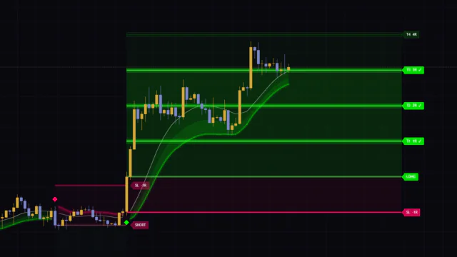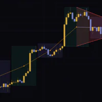


There is no shortage of tools that will draw where price might go and how long it might take to get there. The problem is that most of them hang everything on a Fibonacci ratio or a fixed ATR multiple, which tells you nothing about how the market in front of you actually moves. Market Path Forecast is a rare attempt to rebuild that from the ground up.
In short, it measures how far that specific market has actually travelled on past swings and how long those swings took, then projects the next destination from those measurements. I ran it on the BTC 4H for a few days, and it behaves nothing like the usual forecast tools. Let me walk through it.
What Market Path Forecast actually does
Market Path Forecast shows how far the swing currently in play might run, and how much longer it might last, using a fan-shaped path (the cone) plus a set of target zones. It is built by BOSWaves and runs as an overlay, drawing straight onto the candles.
The interesting part is where the target price comes from. Most projection tools use a ratio imposed from outside, like 1.618 off the last low or three times ATR. Market Path Forecast instead banks the percentage move and bar duration of every completed leg, up and down, and feeds a weighted average of those into the next projection. A high-volatility market automatically gets distant targets, a quiet one gets close targets. The scale fits each instrument without you touching a single setting.
There are three things to read on the chart.
- The forecast path (cone) — a three-layer fan running from current price toward Target 3. The centre line is the average expected path, the outer edges mark the spread
- The forecast levels — up to six lines: Target 1/2/3, Extension, Support (or Resistance), and Invalidation
- Historical structure zones — green (support) and red (resistance) bands built from past pivot highs and lows
The targets in Market Path Forecast come from the average stride that market has actually taken, not a ratio bolted on from outside. Run the same settings on gold and on Bitcoin and you get completely different distances. Once that clicks, the numbers on screen start to carry real weight.
What shows up on the chart
The forecast cone: three layers
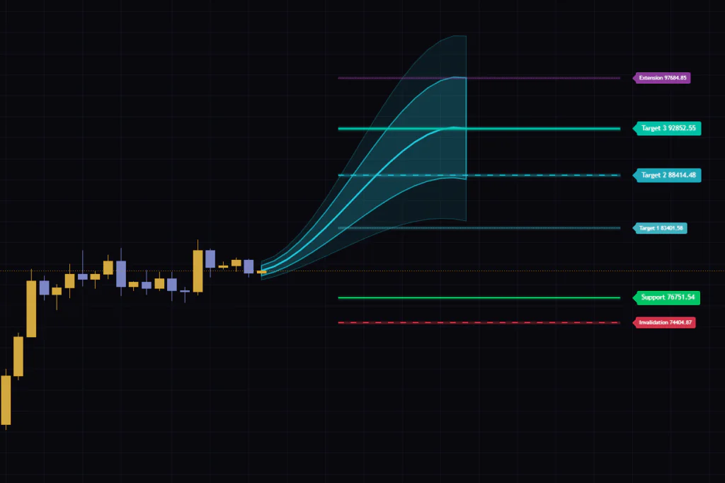
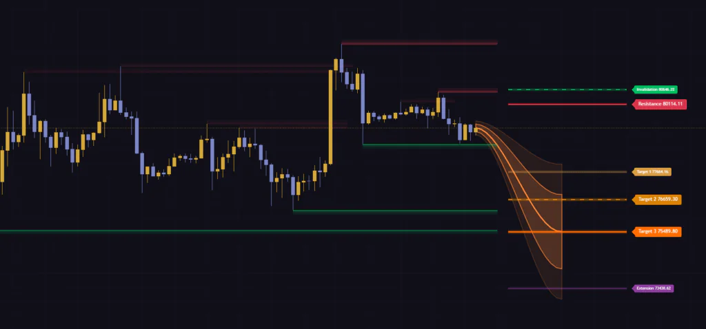
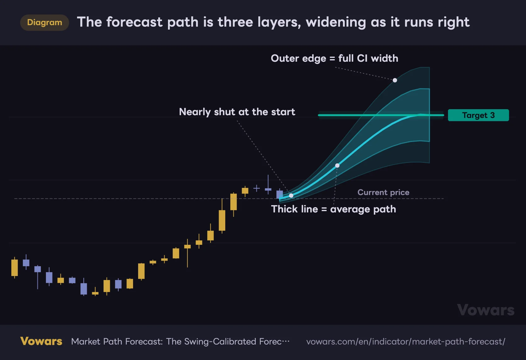
The cone is what grabs your eye first. It fans out to the right of the current bar, aiming at the Target 3 price. Cyan when the read is bullish, orange when it flips bearish, so the bias registers instantly.
Three layers: a faint outer band, a denser inner band, and a thick centre line. The centre line is the average route, the width of the bands is the uncertainty around it. What stands out is that the fan is almost pinched shut at its base and opens up as it runs right. The obvious truth that a forecast gets shakier the further out you go is baked into the shape itself.
The forecast path is three layers, widening as it runs right
The forecast path is made of three layers: outer band, inner band, centre line. It is nearly pinched shut at the base and opens up further out.
Vowars DE ver.3.8.0
The cone also bows rather than running straight. That bend comes from the gap between a fast and a slow moving average, so the path curves with current momentum. It bulges toward whichever side has the push, arcing upward in a rally and flattening out as that fades. Small touch, but it reads current momentum in a way a straight projection line never does, and I have come to like it.
The six forecast levels
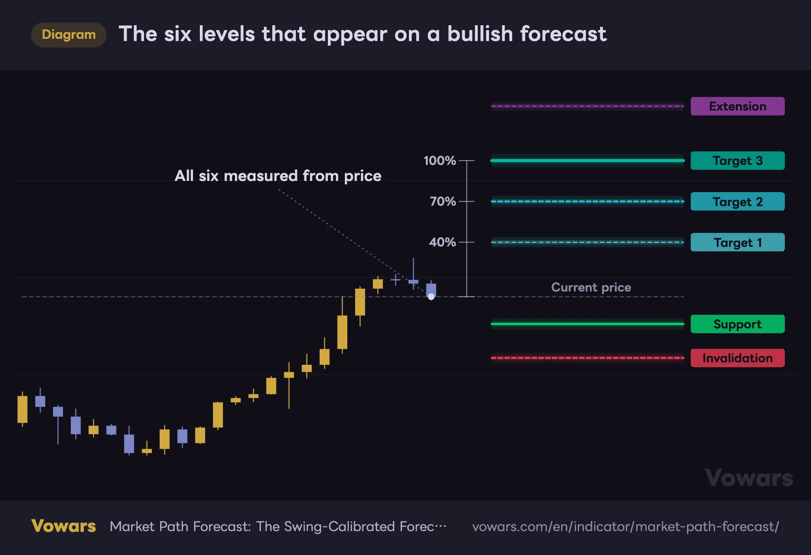
To the right of the cone, the forecast levels are drawn as horizontal zones, each labelled with a name and a price. Start with how they are stacked.
The six levels that appear on a bullish forecast
On a bullish forecast you get three targets above current price and two exit references below.
Vowars DE ver.3.8.0
They each do a different job, so here is the breakdown.
| Level | Where it sits | What it is for |
|---|---|---|
| Target 1 | 40% of base distance | First likely touch. Drawn quietly as a dotted line with a thin zone |
| Target 2 | 70% of base distance | Intermediate target. Dashed, and a natural spot to scale out |
| Target 3 | 100% of base distance | The main target. Solid and the boldest of the set, and where the cone terminates |
| Extension | Beyond Target 3 | Where an above-average swing has reached historically. Drawn in purple |
| Support / Resistance | Opposite side, nearer | The first level price should meet if it turns against you. Labelled Support on a bullish read |
| Invalidation | Opposite side, further | Break this and the current forecast no longer holds |
The Extension level does not sit at a fixed distance. The more scattered a market past swings have been, the further it is pushed beyond Target 3. Where the stride is consistent, it hugs Target 3 closely. That makes the gap between T3 and Extension a rough gauge of how wild the instrument is, and it has become the first thing I check.
Historical structure zones
The green and red bands sitting to the left are the structure zones. They are built from past pivot highs and lows and keep extending to the right. Once a candle closes through one, it switches to a dotted line, fades out, and stops extending. A while after the break it disappears altogether.
These bands are not decoration. They are the raw material for the structure snap covered below. The snap keeps working even with the bands hidden, so turn them off if you want a cleaner chart.
Turning off Show Historical Structure does not change how targets get pulled toward key levels. If the bands clutter your chart, kill them without a second thought.
Why the targets land where they do
This is the engine room of Market Path Forecast. Whether you end up trusting the numbers comes down to whether this logic makes sense to you, so I will take it slowly.
Banking the measured swings
When price takes out the high of a set lookback the internal bias turns bullish, and when it takes out the low it turns bearish. At the moment that flip happens, the leg that had been running is treated as complete, and its percentage move and bar count are logged. Up legs go into one drawer, down legs into another.
Each drawer has a cap, and once it is full the oldest entry drops out, so ancient data never lingers.
Recent swings carry more weight
The averaging is not a plain mean either. It is a weighted average where newer samples count for more and older ones are discounted. That stops the average from dragging its feet when a market changes character. The standard deviation uses the same weighting, and that is what sets the width of the cone.
One caveat: if there are fewer than three samples in the current direction, it borrows from a combined drawer holding both. On a freshly loaded chart or a newly listed market, that means a bullish forecast can be carrying bearish statistics inside it. Do not take the readout at face value for the first stretch.
Nothing at all is drawn until three completed swings are on the books. If your chart comes up empty, either there are not enough bars loaded or Swing Length is set so high that no swings are being detected. Drop to a lower timeframe or shorten the length and it appears.
How the cone width is set
The width comes from how scattered past swing sizes have been. That figure is converted into price terms and multiplied by Confidence Interval (SD) to give the half-width. As the tooltip says, 1.0 covers roughly 68% of past outcomes, 1.5 covers 87%, and 2.0 covers 95%. If stats language is not your thing, read 1.0 as about two thirds of past swings finished inside this band and you are fine.
There are floors and ceilings on that width too. Even with almost no variance the band never collapses into a line, and with huge variance it is capped relative to the distance to Target 3. Clearly a readability decision.
The structure snap, the clever bit
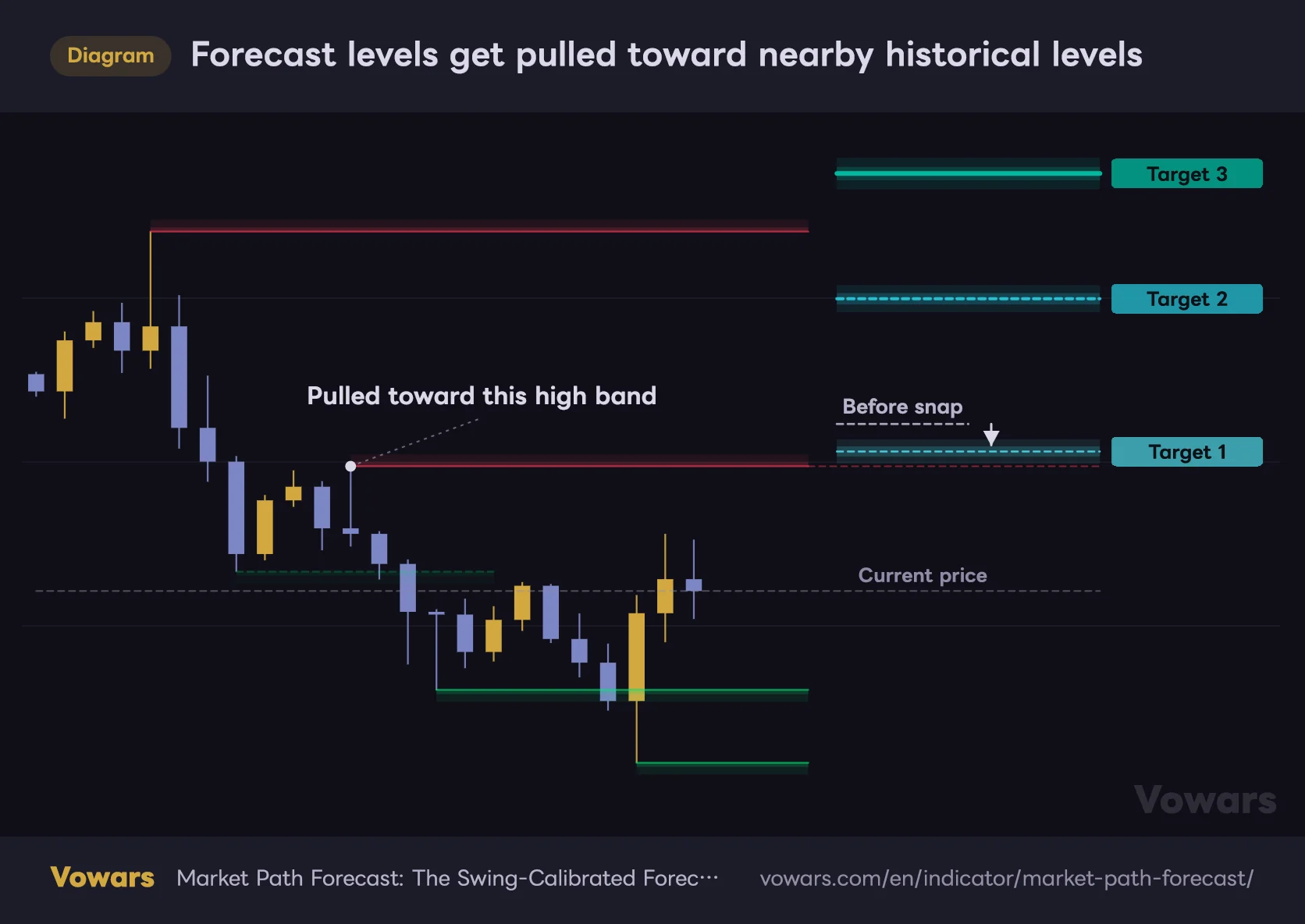
The structure snap is the part I find most interesting. When a past pivot price sits near the raw statistical target, the target gets pulled toward that level. You control how hard it pulls: 0 leaves the statistical value untouched, 1.0 locks it right onto the level.
Forecast levels get pulled toward nearby historical levels
Red bands are past highs, green bands are past lows. When one sits near a statistically derived level, the level drifts toward it.
Vowars DE ver.3.8.0
What it snaps to also flips with direction. On a bullish read the targets are drawn to past highs, on a bearish read to past lows, while Support/Resistance and Invalidation go hunting on the opposite side. The idea is to fold what the statistics expect and what everyone else is watching into the same line.
Worth knowing: at the default 0.65 the level does not land exactly on the pivot. It stops somewhere between the statistical value and the level, closer to the level. If a line appears to stop just short of the key price, that is by design, not a misalignment.
There is also a minimum spacing rule so the snap never bunches levels on top of each other. T1 and T2 will not end up overlapping into an unreadable mess.
Adaptive horizon: how far out it projects
.png.webp) Image
ImageThe length of the cone is not fixed either. With Adaptive Forecast Horizon on, the cone is drawn over the time left, taken as the average bar duration of past swings minus the bars the current swing has already burned. Fresh swing, long cone. Swing that has been running a while, short cone. Watching the cone shrink as time passes is something I have not really seen elsewhere.
That remaining time is clamped at both ends, so it never collapses to nothing or runs off the screen. Switch it off and you get a fixed bar count instead.
Putting it to work
Now the practical side. This is the exact routine I ran on the BTC 4H and 1H.
1Read the direction and the thickness first
Colour gives you direction, thickness gives you dispersion. A narrow cone means a consistent stride and relatively trustworthy targets. A fat cone means the swings are all over the place and the levels are ballpark at best. Treating a target as a precise price while the cone is wide runs against the whole design.
2Track where price is walking inside the cone
This is the day-to-day monitoring. If price is riding outside the centre line and hugging the outer edge, momentum is running above average. If it sags below the centre and goes flat early in the projection, the move is underperforming. Used as a gauge of how fast the swing is progressing rather than a hit-or-miss prediction, the cone earns its keep.
3Use T1, T2 and T3 as a scale-out framework
Taking profit in stages at 40%, 70% and 100% fits this design far better than betting everything on one level. Target 1 sits at 40% of the base distance, so it gets hit more often than the rest. Banking part of the position there and letting the remainder run is an easy structure to build around.
4Lock Invalidation in as your exit criterion
Of the two lines on the opposite side, the further one is Invalidation. A close beyond it means the premise behind the current forecast is gone. Whether your stop physically sits there is a risk management question, but at minimum it makes sense to treat it as the point where your reason for being in the trade has evaporated. The nearer Support/Resistance is more of a heads-up that a bounce could show up along the way.
5Set the flip alerts
Market Path Forecast ships with two alerts, one for the flip to bullish and one for the flip to bearish. A fresh cone is redrawn the moment the forecast turns, so if you cannot sit on the chart all day, alerts are the practical route. Set them to fire on bar close to stay safe.
Where it shines and where it struggles
Being statistics-driven, it splits cleanly into markets where it works and markets where it does not. This lines up with what the developer says, with my own hands-on impressions folded in.
Where it works
- Markets with a consistent swing size, where the cone tightens and the targets get sharper
- Trending markets with a clear direction, where legs keep completing and the statistics stay fresh
- Markets with well-defined historical levels, where the snap lines statistics up with structure
- Swing to position trading where you want take-profit levels set mechanically
Where it struggles
- Tight chop, where only small legs get logged and the average shrinks
- Markets where every swing is a different size, so the cone balloons and the targets blur
- Right after a volatility regime shift, when the historical average no longer fits
- Very low timeframes like the 1-minute, where noise itself becomes the sample
On timeframes, I found anything from the 1H up to the daily easiest to work with. It runs on the 5-minute too, but unless you shorten the swing detection you only get a handful of flips a day, and shorten it too far and you are feeding noise into the average. For day trading, 15m to 1H. For swing trading, 4H to daily. Scalping is structurally the wrong fit.
Working through the settings
There are a lot of inputs, but only some of them change the output. Here they are group by group.
Forecast Detection (the foundation)
| Setting | Default | Suggested | What it does |
|---|---|---|---|
| Swing Length | 16 | 12-20 (8-12 on lower timeframes) | Lookback used for swing detection. Higher means fewer flips and only the larger waves; lower means faster reaction but every small wiggle gets logged as a leg |
| Historical Swings | 20 | 15-20 | How many past swings feed the statistics. More gives a steadier average but slower adaptation; around 10 leans hard on recent behaviour |
| Volatility Length | 200 | 100-200 | Volatility lookback. It underpins zone thickness, minimum target distance and snap range. Shorter makes it sensitive to recent turbulence, so distances and zones shift day to day |
These three set the scale for everything else. Swing Length is the big one: if the forecast keeps flipping on you, raise this before touching anything else. If instead the flips feel far too slow to be useful, drop it to 8-10 and the responsiveness changes completely.
Market Path (cone look and length)
| Setting | Default | Suggested | What it does |
|---|---|---|---|
| Show Forecast Path | On | On | Toggles the forecast cone. Off if you only want the levels, and the chart runs lighter |
| Adaptive Forecast Horizon | On | On | Derives the horizon from the time left on an average swing. Off switches to a fixed bar count |
| Fixed Forecast Bars | 78 | 40-78 | Bars projected when the adaptive horizon is off. Ignored while it is on |
| Minimum Bars | 8 | 8-12 | Floor on the adaptive horizon, so the cone does not collapse late in a swing |
| Maximum Bars | 105 | 60-105 | Ceiling on the projection. If a long cone gets in the way, around 60 tightens the view |
| Forecast Width | 2 | 1.2-1.5 | Horizontal display multiplier for the cone and levels. The statistics are untouched, only the on-screen length stretches. The default sits near the top of the range, so lower it if it sprawls too far right |
| Confidence Interval (SD) | 1.0 | 1.0 (0.5 to tighten, 1.5-2.0 for a wider range) | Standard deviation multiple setting the vertical width of the cone. Higher widens the band to cover rarer outcomes |
| Minimum Target Distance | 5 | 1.0-2.0 | Minimum gap between price and target, as a volatility multiple. The default is the highest the input allows, so this floor often overrides the statistical target |
| Path Curvature | 0.45 | 0-0.45 | How much the cone bows with momentum. Set to 0 for a straight path, handy if you just want the levels |
The default of 5 on Minimum Target Distance is the maximum the input allows. The target taken is whichever is further away, the statistical price or the price sitting this far from current price, which means out of the box the floor is often overriding the statistics entirely. If Target 3 looks unrealistically far away, drop this to 1.0-2.0 first. The whole display tightens up immediately.
Forecast Levels (how targets are placed)
| Setting | Default | Suggested | What it does |
|---|---|---|---|
| Show Forecast Levels | On | On | Toggles all target zones |
| Number of Levels | 6 | 3-6 | How many levels to show, counting out from T1. 3 gives T1-T3 only; 6 adds Extension plus the two on the opposite side. 3 is cleaner |
| Forecast Zone Width | 0.10 | 0.10-0.15 | Thickness of each level band. Thicker makes them read as zones rather than points, but it also widens the enforced spacing between levels |
| Level Start Offset | 0.38 | 0.25-0.38 | How far right the level bands start. Lower brings them closer to current price, where they overlap the cone |
| Structure Snap Range | 0.75 | 0.75-1.2 | How close a level has to be to qualify for the snap. Wider snaps more often, but it starts grabbing distant levels and drifting from the statistics |
| Structure Snap Strength | 0.65 | 0.65-0.8 | Strength of the pull. 0 leaves the statistical value alone, 1.0 locks onto the level. Above 0.8 if you trade levels, around 0.3 if you trust the statistics |
| Confluence Radius | 0.40 | Leave at default | Billed as the search radius for counting nearby levels, but changing it produced no visible difference on the chart |
Out of curiosity I ran Confluence Radius from its minimum to its maximum and nothing moved. Not the level positions, not the colours, nothing. It looks like a hook left in for a future feature, so trying to dial in behaviour with it is wasted time. Leave it alone.
Historical Structure (the zones)
| Setting | Default | Suggested | What it does |
|---|---|---|---|
| Show Historical Structure | On | On (off if it clutters) | Toggles the structure zones. Turning it off does not affect the snap calculation |
| Structure Pivot Length | 5 | 5-10 | Pivot lookback for structure detection. Higher leaves fewer, more significant zones and a more selective set of snap candidates |
| Structure Zone Width | 0.18 | 0.15-0.25 | Thickness of the structure zones. Thin reads as a line, thick reads as a band |
| Maximum Zones | 12 | 6-12 | Cap on zones shown at once. Past that, the oldest drop off. Go to 6 if the chart gets busy |
| Maximum Zone Age | 350 | 200-350 | Zone lifespan. Shorter keeps only recent structure, longer leaves old levels on screen |
The Style section handles colours plus whether labels show the price, the name, or both. Turn on Show Level Prices and Show Level Names together and you get labels like Target 2 68450.00, which gets crowded fast with all six levels running. I settled on names only, prices off.
Tuning by what you want out of it
- Cut the noise and track only the big waves — push Swing Length to 20-24 and Structure Pivot Length to 8-10. Fewer flips, and only the meaningful zones survive
- Make it react faster — drop Swing Length to 8-10 and Historical Swings to around 10. This chases recent price action hard
- Bring targets into realistic range — set Minimum Target Distance to 1.0-1.5. This one change transforms how the tool feels
- Prioritise alignment with key levels — Structure Snap Strength around 0.85 and Structure Snap Range at 1.0-1.2
- Clean up the chart — Number of Levels to 3, Maximum Zones to 6, Forecast Width to 1.2
Quirks worth knowing before you commit
Straight talk here. Listing only the good parts would not help anyone decide whether to run it.
The forecast only draws on the latest bar
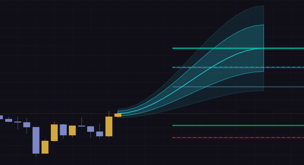
This is the biggest quirk. The cone and the targets are only ever drawn at the right edge of the chart, on the latest bar. Scroll back and there is nothing there, so you cannot eyeball past forecasts the way you can with an indicator that leaves its output on the chart. For a forecasting tool the design makes sense, but it does mean the usual quick visual review is off the table.
 Image
ImageThere is a way around it, though. Fire up Bar Replay and step forward one candle at a time, and the cone and levels are drawn at each replayed bar exactly as they would have been live. The statistics only build from the chart start up to that point, so nothing from the future leaks in, which makes it a fair review. The catch is that every bar takes a manual click, so checking hundreds of bars is not realistic, and how far back you can replay intraday depends on your plan and timeframe. Verification is possible, but it costs patience.
Levels are redrawn off current price every bar
Targets are calculated off the current close, which means when price moves, the targets move with it. The Target 2 price you saw yesterday is not necessarily today’s. Go in expecting a horizontal line that locks once printed and you will be disappointed.
Given that, parking a resting order at a noted target price fits the design far worse than reading the levels fresh each time as a sense of distance and progress.
Targets 1 through 3 and Invalidation are all recalculated off current price every bar, so they shift. If you want one as the basis for a stop, note the price at entry and hold it yourself, or draw your own horizontal line and manage it manually.
Direction can wobble on an unclosed candle
The flip is triggered by new highs and lows, so on a forming candle the condition can switch on and off. Closed bars stay put, but on the live candle you will sometimes see the direction swap back and forth. Another reason to set alerts to fire on bar close.
One detail for the curious: on a big candle that takes out both the lookback high and the lookback low, the bearish read wins. It almost never matters in practice, but if you ever find yourself asking why it turned bearish right there, this is why.
Structure zones arrive a little late
Zones are only created once a pivot is confirmed, so they appear a few bars after the actual high or low prints. They are drawn back at the original price, so this is not repainting, but a zone will never appear at the exact moment a top is being put in. Comes with the territory for anything pivot-based.
There are stretches where the statistics are thin
As mentioned, with fewer than three samples in the current direction it falls back on combined statistics. After a long one-way trend, the first forecast in the opposite direction can be a bearish projection carrying bullish numbers inside it. Discount the first forecast or two after a flip.
Pairing it with other indicators
Market Path Forecast is not there to call direction. It handles how far and how long, once direction is already settled. That means your entry trigger needs to come from somewhere else.
- Trend filter — confirm the bigger picture with a long moving average or ADX and only act on cones pointing the same way. Treat a cone pointing against it as a guide to how far the pullback might run
- Oscillators — line up RSI or stochastic readings with a touch of Target 3 or Extension. Target reached plus overextended makes a far stronger case to take profit
- Volume tools — check whether a target lands on a high-volume node on the volume profile. If it also happens to be a snapped level, that price deserves real attention
- Your own horizontal levels — compare where you drew your key lines against Target 2 and 3. A wide gap is a prompt to question either the statistics or your line
Jot down the cone width each time the forecast flips and you start to see whether that market swing behaviour is settling down or getting choppier. It catches a change in character from a different angle than a volatility indicator does. Quietly useful.
Who this is for
The fit here is pretty clear-cut.
It fits traders who already have an entry method and are stuck on where to take profit and where to get out. If you want to stop closing trades on a hunch, the three-stage T1/T2/T3 framework drops straight in. It also suits anyone watching several markets at once. The scale adapts on its own, so you can have gold, an index and Bitcoin side by side without rebuilding settings for each.
It does not fit anyone who wants to trade off alerts alone. This is not a tool that prints an arrow and tells you to buy. And if you like to review months of past output before committing to anything, the latest-bar-only design will frustrate you. Bar Replay gets you there, but only one candle at a time.
Final take: a measuring tool, not a crystal ball
After a few days with it, my read is that this is not an indicator trying to call the future. It is closer to a way of keeping a ruler pinned to the right edge of your chart that says: one average swing in this market covers about this much ground, in about this much time.
Having that ruler makes decisions a lot easier. How far through an average move is this position? Has it burned too much time? Is this pullback still within tolerance? Putting numbers on things you were eyeballing cuts down the hesitation. That turned out to matter more to me than whether any given target price gets hit.
The gripes, honestly: targets sit too far out on default settings, at least one input does nothing visible when you change it, and because past forecasts are not left on the chart, reviewing it means grinding through Bar Replay one candle at a time. The first of those trips up most people, so drop Minimum Target Distance the moment you install it. That alone changes the impression considerably.
Deriving targets from statistics is hardly new, but the combination here of measuring the market own stride, overlaying it on structural levels, and factoring in the time left is not something I have seen elsewhere. If you want a consistent backbone for your take-profit and exit decisions, Market Path Forecast is worth a look.
Minimum Target Distance to 1.0-2.0, Forecast Width to 1.2-1.5, Number of Levels to 3. Those three changes alone clear up almost all of the out-of-the-box awkwardness where targets sit too far out and the display sprawls. From there, dial in Swing Length for your timeframe.