

Coppock Curve Multi-Filter
The Coppock Curve, published back in 1962, was built for one job only: spotting major bottoms in the stock market on a monthly chart, for long-term investors. The buy signal was a cross above zero. There was no sell signal at all. “Coppock Curve Multi-Filter” keeps that classic as its foundation, but once you actually drop it on a chart you find something that handles nothing like the original.
So what changed? The signal is no longer “did the curve cross zero” but the moment the curve changes direction, and the instant that signal prints, a stop and three take-profit levels get drawn straight onto price. A long-term market-watching tool has been rebuilt into something that hands you a trade plan. In this review I put “Coppock Curve Multi-Filter” through its paces and look at where it earns its space and where the traps are.
From monthly bottom-fishing to catching every change of direction
Start with the foundation. The wave at the centre of “Coppock Curve Multi-Filter” is a long-period rate of change added to a short-period rate of change, then smoothed with a weighted moving average. Rate of change, or ROC, is simply how many percent price has moved from where it was N bars ago.
The defaults are 14 for Long ROC Length, 11 for Short ROC Length and 10 for the WMA Smoothing Length that flattens the result. That 14/11/10 combination is exactly what Coppock published in 1962. The catch is that the original assumed a monthly chart. Fourteen-month and eleven-month rates of change smoothed over ten months means you are looking at more than a year of momentum.
Those 14/11/10 defaults were chosen for monthly charts. Put them on a daily and you are reading roughly two to three weeks of momentum; on an hourly, about half a day. Same settings, completely different horizon depending on the timeframe. Get that straight first and the rest of the configuration makes a lot more sense.
On top of that sits the one change that matters most: how a signal is defined. The original treated only a cross above zero as a buy. “Coppock Curve Multi-Filter” fires its main signal on the first bar where the curve turns from down to up (bull cross) and the first bar where it turns from up to down (bear cross). Where the curve sits relative to zero is irrelevant.
In practice that difference is huge. A zero-line cross shows up maybe a few times a year even on a daily chart, while a change of direction happens at every peak and trough of the wave. In other words, the same indicator now prints vastly more signals than the original ever did. Run it on defaults without knowing that and your first impression will be that it spams signals and can’t be traded.
What actually appears on your chart, in four parts
“Coppock Curve Multi-Filter” draws a lot. Some of it lives in a separate pane and some of it sits directly on price, so it’s worth taking the parts one at a time.
The pane is carried by the histogram, not the line
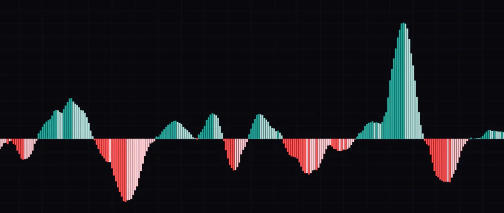
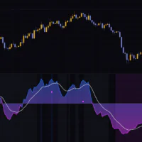
The lower pane fills with bars extending above and below a zero line. Those bars come in four shades, and that colour scheme is one of the better ideas in this indicator.
| Bar colour | Condition | What it tells you |
|---|---|---|
| Dark green | Above zero and rising | Upside momentum is running |
| Light green | Above zero but not rising | Still positive, but the push is fading |
| Light pink | Below zero but rising | Still negative, though a base may be forming |
| Dark red | Below zero and falling | Downside momentum is running |
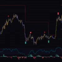
A small triangle also prints inside the pane on the bar that crosses zero, pointing up for a cross above and down for a cross below. You can switch these off with Show Zero-Cross Markers.
Spend time with it and you notice that what’s actually drawn in the pane is the histogram. The Coppock line itself only surfaces as a number on the status line and price scale. Which means turning Show Histogram off leaves the pane essentially blank, with nothing but the zero line and the triangles. If you switch it off hoping for a clean line view, you get the opposite, so watch out for that one.
Your candles get recoloured too
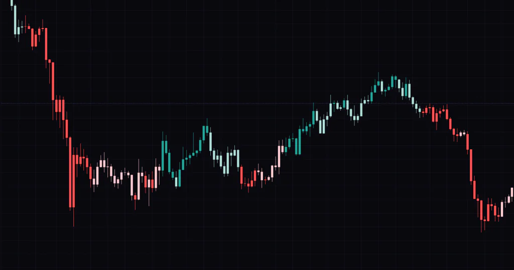
Use Candle Coloring ships on, so your price candles get repainted with the same four shades. I ended up liking this more than I expected, because you can scroll across the chart and see where momentum was strongest without ever looking at the pane.
Gold on the daily is a good place to see it, since it tends to trend cleanly once it gets going. A leg up fills in solid dark green, then light green starts creeping in as price approaches a top. That shift from dark to light is momentum cooling off, and you’re reading it straight off the candles.
The downside is that with only two shades per side, chop makes the colours flip every few bars and the chart flickers. If losing the normal up/down candle colours bothers you, just turn it off.
Every signal comes with five lines and a full trade plan
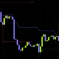
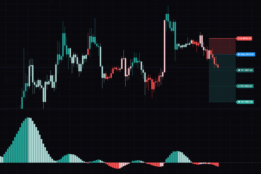
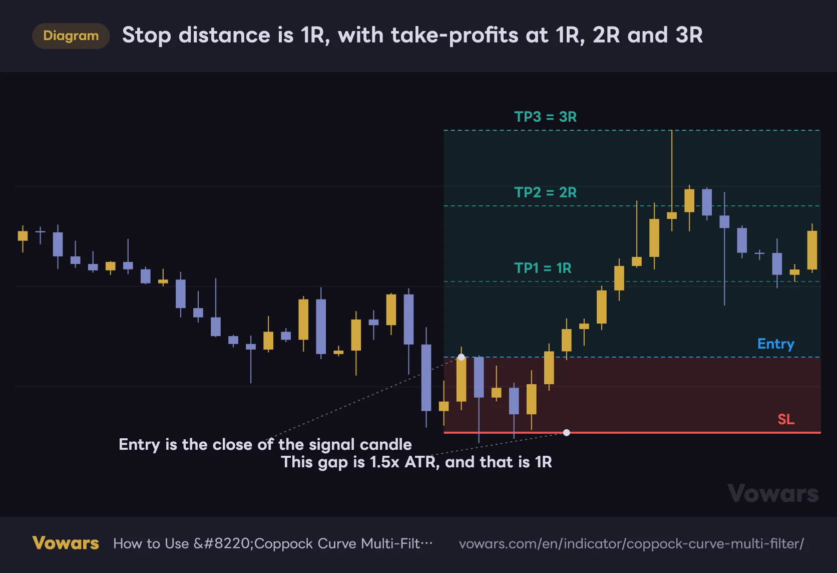
This is the main selling point of “Coppock Curve Multi-Filter” as far as I’m concerned. When a bull or bear cross confirms, these five lines get drawn on price automatically.
- Entry line (blue dashed) — the close of the bar that confirmed the signal
- Stop line (solid red) — 1.5x ATR away from entry
- TP1 (light green dashed) — 1.0x the stop distance in your favour
- TP2 (green dashed) — 2.0x the same distance
- TP3 (dark green dashed) — 3.0x the same distance
ATR, or Average True Range, is an average of how much price has been moving lately. Because the stop is keyed to it, your risk widens automatically when volatility picks up and tightens when things go quiet. Compared with a fixed pip or point stop, the big advantage is that you don’t have to re-tune anything when you switch instruments. Bitcoin on the daily, gold on the 4H, same SL ATR Multiple works.
Here’s how those five lines sit relative to each other.
Stop distance is 1R, with take-profits at 1R, 2R and 3R
The close of the signal candle becomes the entry. The stop sits 1.5x ATR away, and that distance is the 1R unit every take-profit is measured against.
Vowars DE ver.3.8.0
The gap between stop and entry is shaded light red, and the gap between entry and TP3 light green. Comparing the size of those two bands gives you the risk-to-reward of the trade at a glance. The labels show not just the price but the percentage move from entry.
When price actually touches TP1 through TP3 or the stop, that label rewrites itself to show a HIT confirmation and the realised percentage. Being able to see how far the live trade has run without measuring anything by hand is a small thing that saves real time. Only the most recent signal’s plan stays on the chart, though, so the previous lines and labels disappear as soon as a new signal prints. To check how past signals played out, use Bar Replay and step forward; each plan appears in turn as you go.
The dashboard puts the current state in one place
 Image
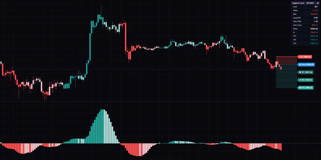
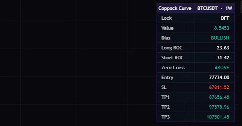
ImageThe table in the corner lists the symbol and timeframe, lock state, the Coppock value, the current bias (BULLISH / BEARISH / NEUTRAL), both ROC readings, whether the curve is above or below zero, and the entry through TP3 prices. Enable the ADX filter and you also get the live ADX reading with a pass/fail colour; pick a smoothing method and its name shows up too.
You can park the table in any of six positions via Position. It runs up to fourteen rows, so on a phone or a small window it eats a fair chunk of the screen. On charts where I already had other indicators loaded it got in the way, and I settled on switching it on only when I actually needed it.
Two kinds of signal, with clearly different jobs
“Coppock Curve Multi-Filter” produces two signal types with genuinely different characters. Mixing them up is the fastest way to misuse the tool, so let’s take them separately.
1The turn cross (main signal)
The bar where the curve crosses above its own previous value is a bull cross; below it, a bear cross. Both the trade levels and the webhook alerts key off this one. It reacts early, but there are a lot of them, and it’s the signal that gets you chopped up in a range.
2The zero-line cross (regime read)
This fires when the curve crosses zero. You get a triangle and nothing else, no trade levels. This is the one closest to how the original Coppock was meant to be used. Above zero means intermediate momentum is positive, below zero negative, and treating it as a regime switch rather than an entry trigger is the sensible approach.
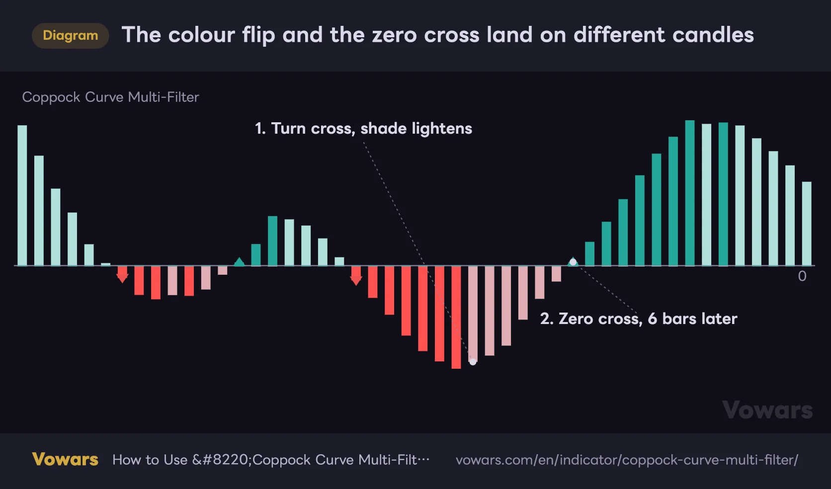
Here’s how far apart the two actually land. The bar where the histogram shifts from dark red to light pink is the turn cross; the triangle that shows up afterwards is the zero cross.
The colour flip and the zero cross land on different candles
The turn cross prints on the candle where the histogram shifts from its dark shade to its light one. The zero-line cross comes later.
Vowars DE ver.3.8.0
What worked for me was stacking the two. Take bull crosses only while the curve is above zero, bear crosses only while it’s below. Filtering down to signals that agree with the regime cuts a lot of the junk you’d otherwise take in a range. The dashboard’s Zero Cross row already shows ABOVE or BELOW, so there’s nothing extra to check.
“Coppock Curve Multi-Filter” ships with all seven filters switched off. That means zero screening out of the box. Drop it on a daily chart as-is and every small wobble in the curve becomes a signal. Turn on at least the ADX filter before you start forming an opinion about it.
Seven filters, and what each one actually touches
This is where the name comes from, and it’s also the most misunderstood part of the indicator. The seven filters do not all apply to the same things. Toggling them one at a time gave me the following map.
| Filter | Turn cross | Zero cross | Dashboard bias |
|---|---|---|---|
| ADX Filter | Applies | Applies | Applies |
| Divergence Filter | Applies | No effect | No effect |
| Slope Acceleration Filter | Applies | No effect | No effect |
| Volume Confirmation Filter | Applies | No effect | No effect |
| HTF Alignment Filter | Applies | No effect | No effect |
| Signal Persistence Filter | Applies | No effect | No effect |
| Volatility-Adjusted Zero Line | No effect | Applies | No effect |
What that table tells you is that if you want to tighten up the zero-line crosses, ADX and the volatility adjustment are your only two options. Turn crosses, on the other hand, have six filters available. None of them touch the histogram or candle colours, so those always reflect the raw reading.
ADX filter, the first one to switch on
ADX measures trend strength on a roughly 0-100 scale without caring about direction. High means price is moving one way with conviction, low means no direction. Turn on Use ADX Filter and signals only pass when ADX is above ADX Threshold, which defaults to 20.
It knocks out the small crosses that pile up during chop, so it’s the best value per click of any filter here. When ADX falls short of the threshold the dashboard bias flips to NEUTRAL, which is a nice way of telling you to sit on your hands. Twenty is the conventional line for “a trend is starting”, so begin there. Bump it to 25 if you’re still getting too many signals, drop it toward 15 if you’re getting too few.
Adaptive Filter, the prep step that changes the curve’s whole character
This one doesn’t screen signals. It conditions the price series before the ROC math runs. You choose whether raw closes feed the calculation or whether they get smoothed first. The default is None, meaning no conditioning. There are eight options.
| Option | Character | When to use it |
|---|---|---|
| SMA | The plainest smoothing. Slow to react | When cutting noise matters most |
| EMA | Weights recent data, sits in the middle | The sensible starting point |
| RMA | Even gentler than EMA | For longer swings |
| Double WMA | Two weighted passes, smoother but slower | When you want far fewer signals |
| Triple VWMA | Three volume-weighted passes. The heaviest | Long-horizon reads on instruments with real volume |
| HMA | Keeps things smooth while trimming lag | When you want both response and stability |
| LLAMA | Adds recent slope to the average and projects it forward | When you want turns as early as possible |
| Kalman Filter | Adjusts its own responsiveness to how uncertain it is | When you want speed without shortening the length |
Flipping between them and overlaying the results, the Kalman Filter is clearly quicker than EMA even at the same Adaptive Filter Length of 20. Triple VWMA goes the other way so hard it’s practically a different indicator, cutting daily signals down to one or two a month.
These two are not lag-reduction methods. They trade response for smoothness. Stacking averages on top of each other makes the output slower, full stop. Read them as “fewer signals, only the big waves” and your expectations will line up with what you get. Triple VWMA also depends on volume, so it may not behave as intended on instruments without reliable volume data. If you’re using it on FX, check the output before you commit to it.
The other five filters, one by one
Use Divergence Filter detects when price and the curve disagree and blocks signals in the opposing direction. If price is making lower lows while the curve makes higher lows, that’s bullish divergence, and sell signals stop passing while it holds. The pivots it works from are set by Divergence Pivot Lookback (default 5), but a pivot only confirms once five bars have printed on each side, so the detection itself runs five bars behind.
Use Slope Acceleration Filter demands that the curve’s slope be steepening, not merely positive. It drops signals where the turn has no real force behind it, and switching it on visibly thins the count.
Use Volume Confirmation Filter only passes a signal when that bar’s volume is above its Volume MA Length average (default 20). It works on crypto and single stocks, but be cautious on FX where volume quality varies by feed.
Use HTF Alignment Filter checks whether the Coppock on a higher timeframe agrees with the signal direction. HTF Alignment Timeframe defaults to 240 minutes. Setting it to roughly four to six times your chart timeframe feels about right. Note that if you’re trading the daily, 240 minutes is a lower timeframe, so you’d need to move it up to weekly.
Use Signal Persistence Filter requires the curve to have moved the same way for a minimum number of bars before it turns. Persistence Bars defaults to 2, meaning only crosses that follow at least two consecutive down bars count as a buy. It filters out the wick-like one-bar dips that immediately reverse.
Use Volatility-Adjusted Zero Line is the one that only touches zero crosses. It builds a noise band from the curve’s own dispersion and refuses any cross that doesn’t clear it. Useful when the curve keeps ducking back and forth across zero. Raising Volatility Zero Band Multiple from 0.5 to 1.0 means only decisive crosses get through.
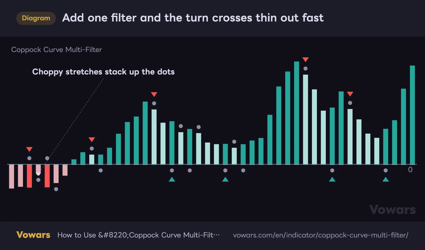
How much does one filter actually change the count? Here’s the same stretch with nothing but the persistence condition added (Persistence Bars at 2).
Add one filter and the turn crosses thin out fast
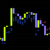
Every filter ships switched off. Through a directionless stretch, the smallest change of slope is enough to print a signal.
Vowars DE ver.3.8.0
Every setting and its default
Core Settings
| Setting | Default | Suggested | What it does |
|---|---|---|---|
| Source | close | close or hlc3 | The price series the calculation runs on. Switch to hlc3 if you want wicks to carry less weight and the wave to run a little smoother |
| Long ROC Length | 14 | 14 (20-25 for less noise) | Lookback for the long-side rate of change. Lengthen it and the wave gets bigger and slower, with fewer signals |
| Short ROC Length | 11 | 11 | Lookback for the short-side rate of change. Its ratio to the long side is the original design, so if you change one, change both and keep the ratio |
| WMA Smoothing Length | 10 | 10-20 | How much the combined rates of change get smoothed. The longer it is, the smoother the curve and the fewer turn crosses you get |
Filters
| Setting | Default | Suggested | What it does |
|---|---|---|---|
| Use ADX Filter | Off | On | Blocks signals when there’s no direction in the market. It ships off, so this is the first switch to touch |
| ADX Threshold | 20.0 | 20-25 | Raise it and only stronger trends produce signals. 20 is the conventional marker for a trend getting underway |
| ADX Length | 14 | 14 | Lookback for the ADX calculation. 14 is Wilder’s own standard and there’s little reason to move it |
| Adaptive Filter | None | None or EMA | Smoothing applied before the ROC math. None matches the original behaviour, so start there to get a baseline before experimenting |
| Adaptive Filter Length | 20 | 10-20 | Lookback for that smoothing. Longer dulls the curve until it stops responding to shorter-term moves |
| Use Divergence Filter | Off | Off (On if you want to avoid counter-trend entries) | Blocks signals that fight a detected price/curve divergence. Keep in mind the detection lags by several bars |
| Divergence Pivot Lookback | 5 | 5-8 | Bars either side used to confirm a pivot. Larger means only major swings count, but confirmation takes longer |
| Use Slope Acceleration Filter | Off | On (if you want fewer signals) | Only passes signals while slope is accelerating. Fewer fakeouts, but you’ll miss more early moves |
| Use Volume Confirmation Filter | Off | On for crypto and stocks | Only passes bars with above-average volume. Leave off where volume data isn’t trustworthy |
| Volume MA Length | 20 | 20 | Averaging period for volume. Shorten it to react faster to recent surges |
| Use HTF Alignment Filter | Off | On for lower timeframes | Only passes signals that agree with the higher timeframe. For traders who want to stay out of counter-trend setups |
| HTF Alignment Timeframe | 240 | 4-6x your chart timeframe | The higher timeframe it references. On daily charts and above you must change this, or it ends up referencing a lower timeframe |
| Use Volatility-Adjusted Zero Line | Off | On | Cuts down the back-and-forth around zero. Worth having if you use zero crosses to read the regime |
| Volatility Zero Band Multiple | 0.5 | 0.5-1.0 | Multiplier on the noise band. Raise it and only decisive zero crosses register |
| Volatility Zero Band Length | 20 | 20 | Period used to measure the noise band. Shorter tracks recent volatility more closely |
| Use Signal Persistence Filter | Off | On | Stops one-bar reversals becoming signals. Cheap way to cut fakeouts, so it’s high on the priority list |
| Persistence Bars | 2 | 2-3 | Consecutive bars required before a turn counts. Set it to 3 or more and the signal count drops noticeably |
Trade Tools
| Setting | Default | Suggested | What it does |
|---|---|---|---|
| Lock Signal | Off | Off (On while monitoring a setup) | Blocks new signals on the latest bar and freezes the trade plan currently on screen |
| SL ATR Multiple | 1.5 | 1.5-2.5 | Distance to the stop. On long-wicked instruments like crypto dailies you’ll get wicked out constantly below 2.0 |
| TP1 R-Multiple | 1.0 | 1.0 | First target, the same distance as your risk. A sensible first scale-out |
| TP2 R-Multiple | 2.0 | 1.5-2.0 | Second target. On rangier instruments, dropping it to 1.5 improves the hit rate |
| TP3 R-Multiple | 3.0 | 3.0 or higher | Final target. On instruments that trend hard, 4.0 or 5.0 still gets reached often enough to be worth it |
| ATR Length | 14 | 14 | Period for the volatility measurement. Shorten it and your stop distance reacts faster to sudden moves |
| Show Trade Levels | On | On | Toggles the on-chart lines and labels together with the dashboard’s level rows |
Three setups worth starting from
Numbers on their own don’t tell you much, so here are three combinations I ended up settling on. Treat them as starting points and adjust for whatever you actually trade.
1Day trading dips and rallies
On the 15m or 1H, turn on Use ADX Filter with ADX Threshold at 20, and Use Signal Persistence Filter with Persistence Bars at 2. Add Use HTF Alignment Filter and set HTF Alignment Timeframe to 60 or 120 if you’re on the 15m. That leaves you buying dips in the direction of the higher timeframe and drops most of the counter-trend signals you’d otherwise get mid-trend. SL ATR Multiple at the default 1.5 is fine here.
2Swing trading the major turns only
On the daily, stretch WMA Smoothing Length to 14-16 and set Adaptive Filter to EMA or HMA around 14. Push the ADX threshold up to 25. The smoother curve means far fewer turn crosses, and I was left with a handful of signals per market cycle. SL ATR Multiple at 2.0-2.5, and TP3 R-Multiple stretched out to around 4.0 still gets reached.
3Regime read only
Turn off Show Trade Levels and Show Dashboard, keep Use Candle Coloring on, and enable Use Volatility-Adjusted Zero Line. You’re left with candle colours and the zero line, which makes for a lean context tool. If you just want something sitting alongside your own system as a filter, this is the configuration that stays out of the way.
Where it works and where it doesn’t
At heart “Coppock Curve Multi-Filter” is an ROC-based momentum tool, so the basic rule hasn’t changed: strong when price has direction, weak when it doesn’t.
Works well for
- Re-entering dips and rallies inside an established trend
- Confirming a bottom after a heavy sell-off (close to the original use case)
- Swing trading where you want ATR-based stop distances handed to you
- High-volatility instruments like crypto and gold, where the moves are big enough to matter
- Automation-leaning setups that push alerts out over webhooks
Struggles with
- Directionless ranges, where turn crosses flip back and forth
- Stalls that keep grinding across the zero line
- Minute-scale scalping (ROC 14 plus WMA 10 simply can’t keep up)
- The volume filter and Triple VWMA on instruments with thin volume data
- Gap-prone instruments, where price can jump straight over the stop
On style, it sits squarely in day trading and swing trading, and you can push it toward position trading on the daily and above. Scalping is a stretch by design. Dropped onto a 1m chart, the curve wobbles constantly and turn crosses print every few bars.
Things worth knowing before you commit
On repainting
Here’s what I could establish about after-the-fact redrawing. Both turn crosses and zero crosses are confirmed only once the bar closes, and the trade level lines and labels are drawn after that confirmation too. I couldn’t find any case of historical signals appearing or vanishing on a reload.
The stop and take-profit hit checks also skip the signal bar itself and only start on the following bar. That’s because part of the signal bar’s range happened before the entry price existed, and it’s a detail the author clearly thought about. The higher-timeframe filter reads confirmed values from the higher timeframe, so it isn’t pulling forward information that wasn’t available yet.
While a candle is still forming, both the Coppock value and the histogram colour shift until the bar closes. That isn’t repainting, just normal real-time calculation. If you’re making decisions off the colour, get in the habit of waiting for the close.
The trade plan sticks around after your targets hit
Something I ran into while using it. Once TP1 through TP3 get tagged, the lines stay on screen until the next opposing signal prints. Which means if price reaches TP3, reverses, and comes all the way back to the stop, you’ll see both a TP hit and a stop hit labelled on the same setup.
As a single trade the stop is irrelevant once you’ve taken profit, but reading the chart alone it looks like both happened. Keep that in mind when judging how the plan on screen actually played out.
Lock Signal only works on the live bar
Switch on Lock Signal and the trade plan currently displayed gets frozen so new signals can’t overwrite it. What it doesn’t do is affect anything except the most recent bar on the chart. Historical bars process signals as normal, so turning it on changes nothing about how your history looks. It’s purely for “don’t wipe the setup I’m watching”.
Setting up the alerts
“Coppock Curve Multi-Filter” ships two kinds of alert. One is the standard sort where you pick a named condition, the other sends JSON payloads aimed at webhooks.
1Using the standard alerts
Pick the indicator as your condition in the alert dialog and you’ll get ten options: Bull Cross, Bear Cross, Zero Cross Up/Down, Close Long/Short, TP1 through TP3 Hit, and SL Hit. Choose whichever you need and you’re done.
2Using the JSON webhook payloads
You need to select “Any alert() function call” as the condition. Pick anything else and the JSON alerts never fire. Before that, edit the action strings in the Alerts group so they match the keys your receiver expects. The payload carries the ticker, timeframe, Coppock value, direction, entry, stop, and the TP1 through TP3 prices.
Having trade levels drawn for you makes the thing look like a complete system. It isn’t. What “Coppock Curve Multi-Filter” calculates is a momentum turn and a set of price levels derived mechanically from it. You still need confirmation from price structure itself, whether that’s horizontal levels, trendlines or something else. And a configuration that looked great on historical bars carries no guarantee of behaving the same way live.
What to pair it with
The only question “Coppock Curve Multi-Filter” answers is which way momentum is currently pointing. What it lacks is any sense of where price is, so pairing it with something that fills that gap makes it considerably more usable.
The pairing that worked best for me was plain horizontal support and resistance. When a bull cross prints, whether that price sits below or above the nearest resistance changes the available move entirely. Signals that fired just underneath a resistance zone tended to get rejected before even reaching TP1.
A single moving average is worth having too. Screening signals by whether price is above or below something like the 200-day gives you a second layer on top of the zero-line regime read. Stacking another momentum tool like RSI or MACD on it, though, didn’t add much. They’re looking at too similar a thing, so you don’t gain any new information.
Volume profile looks like a good fit as well. A bull cross that fires in a low-volume node sits in territory price tends to move through quickly, which improves the odds of reaching TP2 or TP3.
So how good is this rebuild of the classic Coppock Curve?
If I had to sum up “Coppock Curve Multi-Filter” in a sentence, it’s an experiment that grafts modern trade management onto a sixty-year-old long-term indicator. The Coppock Curve underneath stays simple, and on top of it sit seven filters, eight smoothing methods, an ATR-based trade plan and webhook alerts.
 Image
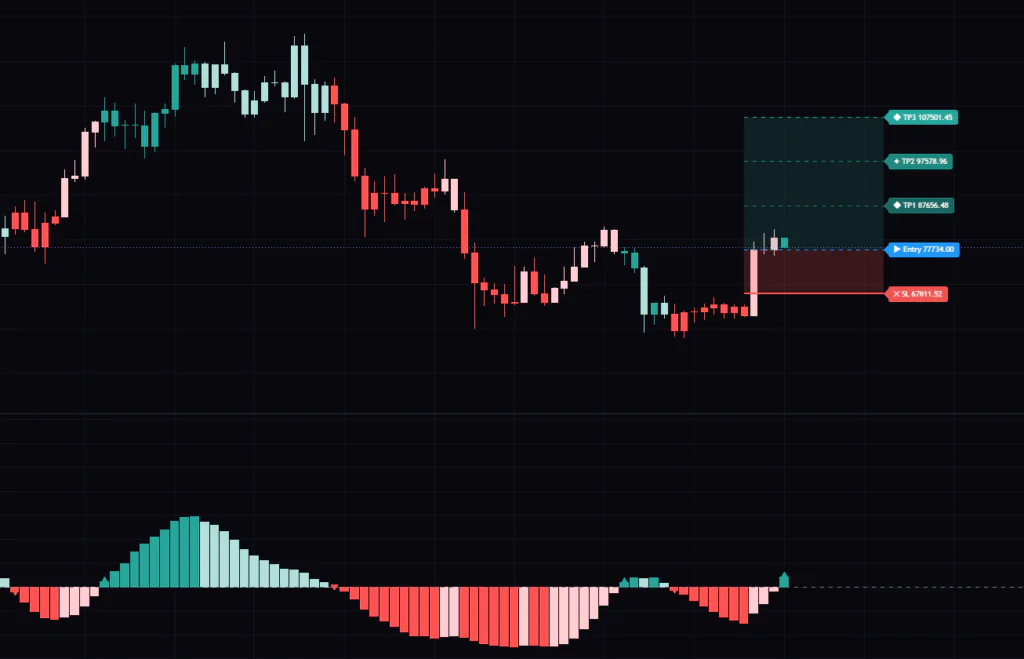
ImageWhat I liked is that the moment a signal prints, where to place the stop and how far price needs to run for 1R are both sitting there as numbers. Having the entry decision and the risk management in the same view saved more mental overhead than I expected. The heatmap candles are a favourite too, since zooming out gives you a map of where momentum has been.
The flip side is that out of the box, with every filter off, it fires far too often. This is not a load-it-and-go indicator. It only takes shape once you’ve built a filter stack for your own instrument and timeframe. Switching on ADX and the persistence filter alone changes the picture considerably, so start there. And the blank pane you get from turning the histogram off is the kind of thing that throws you if nobody warns you first.
Anyone who associates the Coppock Curve name with long-term investing is in for a surprise when they see how this one actually behaves. Understand that gap, use it as a tool for catching momentum turns, and it earns its slot on the chart.