

“Dual-Phase Reversal by DGT” counts overextension in two phases
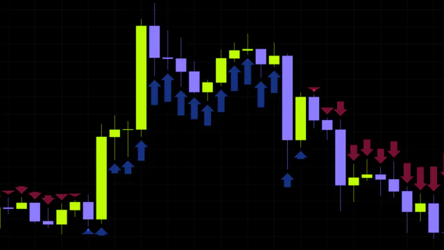
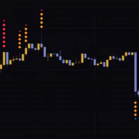
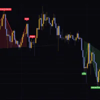
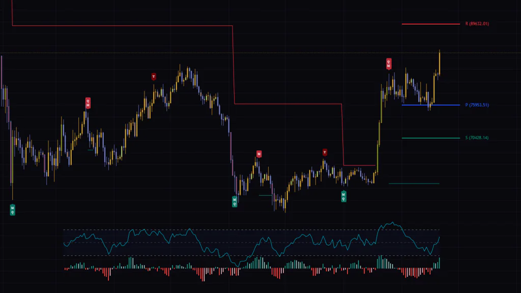
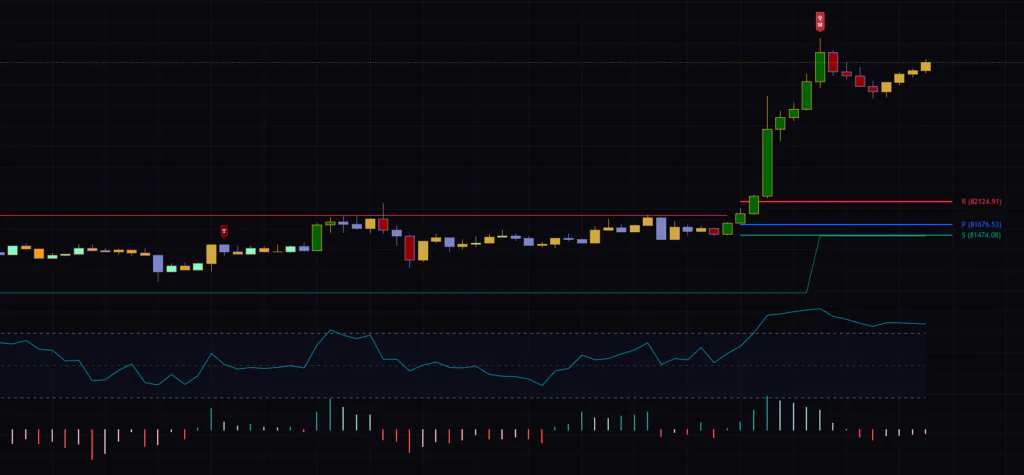
The first thing you notice after adding it to a chart is the small “M” and “T” labels above and below the candles. “Dual-Phase Reversal by DGT” measures how far a move has run in two stages of 9 bars and 13 bars, and drops a marker wherever a stage completes its count. The first stage is Momentum Exhaustion (M), the second is Terminal Exhaustion (T).
It was published by dgtrd on September 5, 2026, and landed in TradingView’s Editors’ Picks. It’s a different animal from signal indicators that try to nail the exact turn. The easiest way to think about it is as a tool that tracks whether a rally (or selloff) is about to run its course, using a bar count as the yardstick instead of chart patterns.
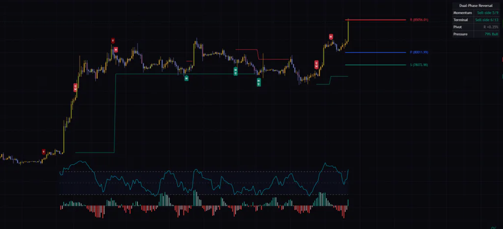
It’s more than just markers. You also get a horizontal level drawn from the point where the 9-count completes, three S/P/R levels calculated from the higher-timeframe range, a meter that turns volume into a buying-pressure ratio, and a status table in the top-right corner. All four live in a single indicator. The pressure meter is drawn right in the empty space below price, so it doesn’t eat up a single extra pane.
Here’s a quick rundown of everything that shows up on screen. Once you have this down, the rest of the article just fills in the details.
| What you see | What it means |
|---|---|
| Green “M” label below a bar | Downside 9-count complete. If you’re watching for a reversal, this is the long side |
| Red “M” label above a bar | Upside 9-count complete. If you’re watching for a reversal, this is the short side |
| “Q” stacked on the label | The lows (or highs) within the 9-count met the qualification condition |
| Dark green “T” below a bar | Downside 13-count complete |
| Dark red “T” above a bar | Upside 13-count complete |
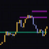
| Red horizontal line | Highest high of a downside 9-count. Disappears on a close above it |
| Green horizontal line | Lowest low of an upside 9-count. Disappears on a close below it |
| R, P and S on the right edge | Pivots calculated from the previous higher-timeframe range |
| Cyan line and bars | Buying-pressure ratio (0–100) and how it’s changing |
| Table in the top-right | Dashboard summarizing the state of the latest bar |
“M” and “T” both track exhaustion, but they look at different things
“Two phases” makes it sound like one continuous count where 13 simply follows 9, but the two run on completely different rules. Phase one compares closes with closes; phase two compares closes with highs and lows. Mix them up and you’ll end up scratching your head later over why the count isn’t advancing.
Phase one’s 9 bars only compare the close with the close 4 bars back
The rule is dead simple: is the current close above or below the close 4 bars ago? If it’s above, the upside count ticks up by one; if it’s below, the downside count does. No RSI, no moving average. The close is the only input.
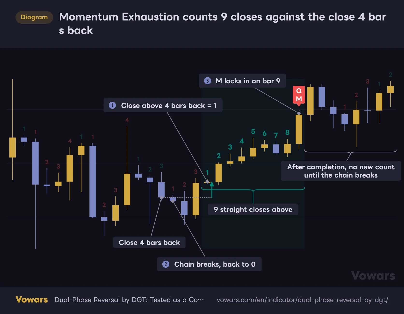
Momentum Exhaustion counts 9 closes against the close 4 bars back
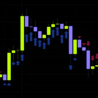
The count starts on the first close above the close 4 bars back, and M prints on the 9th bar in a row.
Vowars DE ver.3.8.0
That said, meeting the condition alone doesn’t start a count. The relationship has to flip to the other side first, and the bar that crosses back above becomes “1”. The author calls this a Momentum Shift. Look at the right side of the diagram: price keeps climbing after the 9-count completes, yet no numbers appear. A trend that just keeps going doesn’t start a new count.
This is exactly what threw me at first. In a strong trend the labels sometimes wouldn’t show up for ages, and I assumed something was broken. The reason turned out to be simple: the chain never broke, so there was never a fresh starting point for a new count.
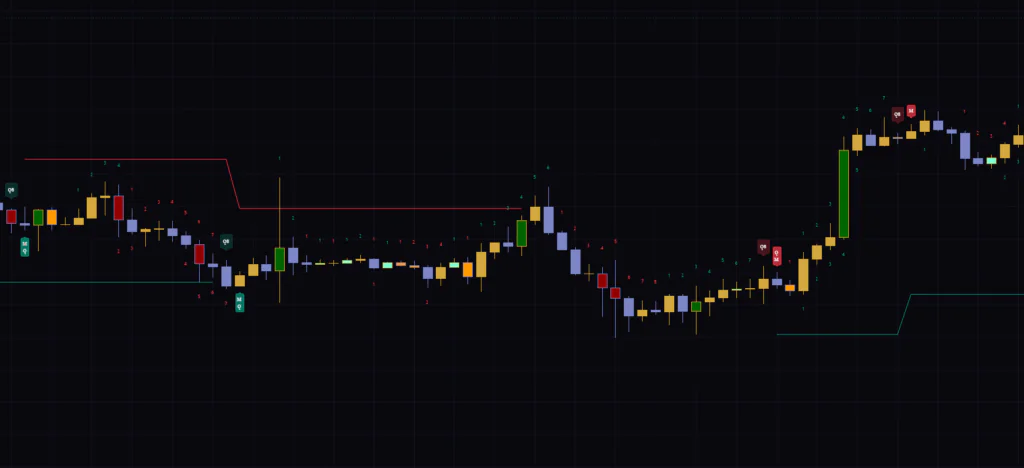
Sometimes a “Q” gets stacked on the 9th-bar label. It stands for Qualification, and it checks whether the low of bar 8 or bar 9 is at or below the lows 2 and 3 bars earlier. On the upside, it compares highs instead. The 13-count starts with or without a Q, so in practice I treat it as a tag for “a 9-count that’s also structurally clean.”
Phase two’s 13 bars switch to the low or high 2 bars back
This is where phase two kicks in. Starting from the bar that completed the 9-count, it now compares the close with the low or high 2 bars back. On the downside, the close has to be at or below the low 2 bars back; on the upside, at or above the high 2 bars back. Bars that don’t qualify don’t advance the number, which just sits there until the next qualifying bar. That’s why it’s not unusual for a full 13 to take 20+ bars.
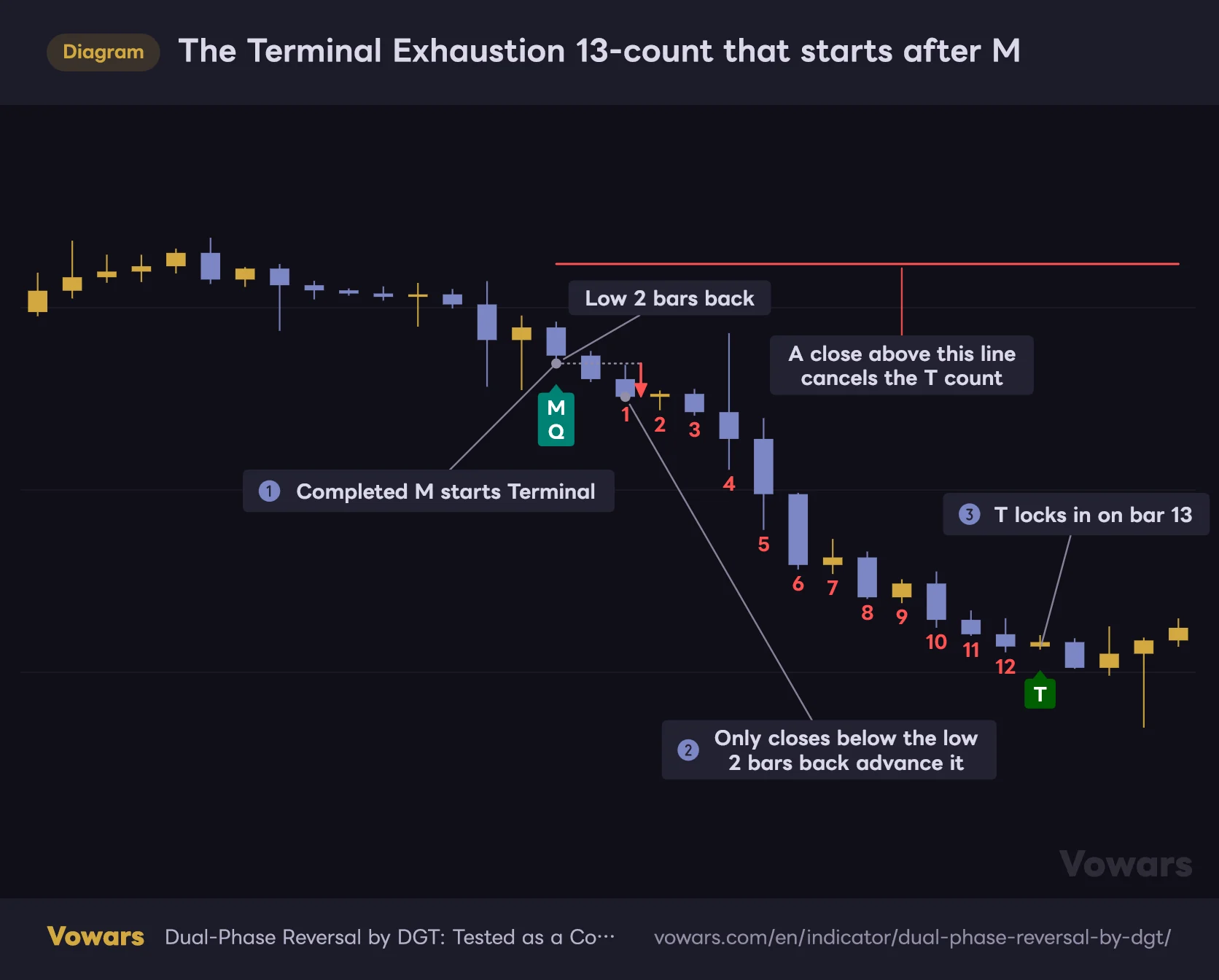
The Terminal Exhaustion 13-count that starts after M
Starting from the M bar, it counts only bars that close below the low 2 bars back, up to 13.
Vowars DE ver.3.8.0
Bar 13 has one more hurdle: its low has to be below the close of count bar 8 (on the upside, its high has to be above it). If it fails, the count drops back to 12 and a “+” prints on that bar. It doesn’t reset to zero. The 13 is simply deferred until a qualifying bar shows up.
If a bar closes beyond the level drawn in phase one while the count is running, the phase-two count is wiped on the spot. That makes sense, since once price snaps back, the premise that the overextension is still playing out is gone. But it’s also why T labels are so rare. Even after scrolling through a few months of Bitcoin on the 4H, I could count the T’s on one hand.
The line M draws vanishes the moment its premise breaks
From the bar that completes the count, a horizontal line starts extending to the right. For a downside 9-count it’s a red line at the highest high of those 9 bars; for an upside count it’s a green line at the lowest low. The level is set purely by the range of the 9 bars that were counted.
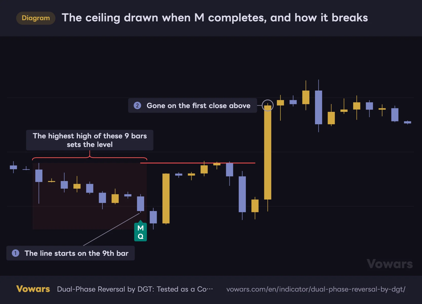
The ceiling drawn when M completes, and how it breaks
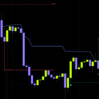
When a downside 9-count completes, a red line is drawn at the highest high of those 9 bars.
Vowars DE ver.3.8.0
The line disappears as soon as a bar closes beyond it, and an alert fires at the same moment, so you can treat it as a signal that the overextension read was wrong. If price closes past it while the 13-count is running, that count gets wiped too. In other words, the red and green lines are also the levels this indicator uses to invalidate its own read.
Since the level comes from the 9-bar range, the bigger the move within those 9 bars, the farther from current price it lands. Right after a sharp run on the 4H, I’ve seen it drawn several thousand dollars away. Rather than using it as a stop-loss as-is, it’s more accurate to read it as a line in the sand: “if price gets past here, I drop the thesis.”
If you want a reference that sits a bit closer, turn on Momentum & Terminal Invalidation Levels in the settings. A blue dotted line appears at the lowest low of the 9 bars, extended further down by that bar’s own range. It’s off by default.
The higher-timeframe S, P and R are DeMark pivots
The three horizontal lines extending on the right are the Range Pivot. They look like the pivot points you already know, but the math is different. Instead of the standard formula (high + low + close divided by 3), it uses DeMark pivots, which change the weighting depending on whether the range closed up or down.
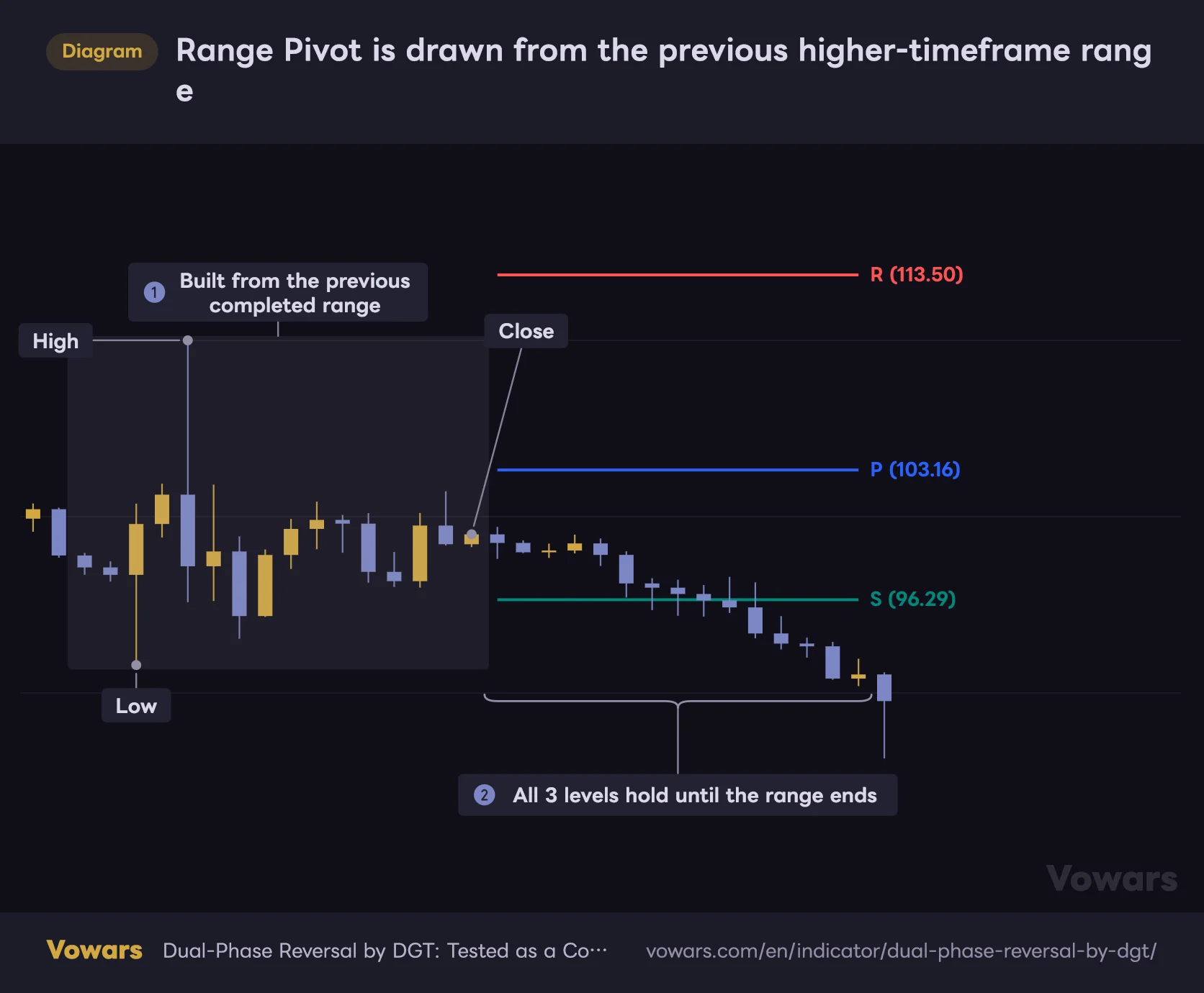
Range Pivot is drawn from the previous higher-timeframe range
S, P and R are calculated from the high, low and close of the last completed higher-timeframe range.
Vowars DE ver.3.8.0
If the range closed down, the low gets counted twice; if it closed up, the high does. As a result, all three levels shift toward the direction of the close. When the prior range closed on selling, all three come in lower; when it closed on buying, they come in higher. If you don’t know about this quirk, the pivots can look “off,” but that’s by design.
The calculation uses the previous completed range, and the lines extend right from the start of the current range for one full range length. They don’t move until the current range ends. You pick the higher timeframe in Pivot Timeframe; with the default Auto, it’s chosen automatically based on your chart timeframe.
| Chart timeframe | Range picked by Auto |
|---|---|
| 1m, 3m | 1H |
| 5m, 15m | 4H |
| 30m, 45m, 1H | Daily |
| 2H, 3H, 4H | Weekly |
| Daily | Monthly |
| Weekly | Quarterly |
| Anything else | Yearly |
Any timeframe that isn’t in Auto’s mapping falls back to Yearly. If you live on the 6H or 8H, switch Pivot Timeframe manually to Daily or Weekly to get the levels you actually want. There are seven options: 1 Hour, 4 Hour, Daily, Weekly, Monthly, Quarterly and Yearly.
There are two optional displays as well. Developing Range Pivot previews the next pivot from the range that’s still forming, so it moves as the range develops. Historical Range Pivot keeps the pivots of past ranges on the chart, which is handy when you want to go back and check whether price actually stalled at the previous P. Both are off by default.
Volume Pressure turns volume into the buyers’ share
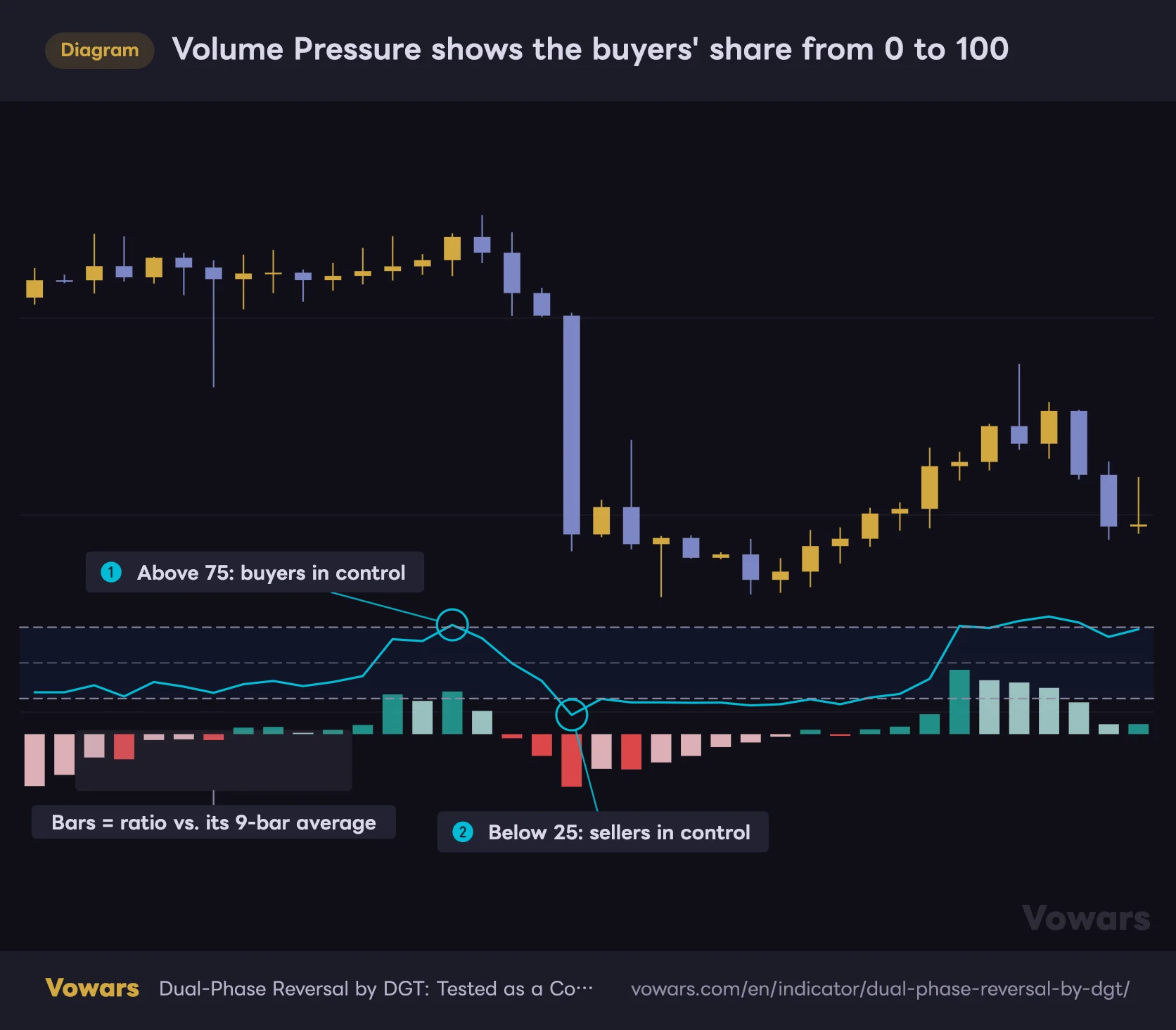
The cyan line at the bottom of the chart is Volume Pressure. For each of the last 13 bars it calculates “body size ÷ bar range × volume”, stacks up-bars as buying and down-bars as selling, and shows buying as a percentage of the total on a 0–100 scale. It’s less a volume oscillator than a measure of how much of the volume tug-of-war the buyers won.
Volume Pressure shows the buyers' share from 0 to 100
Instead of a separate pane, the line and histogram are drawn in the empty space below price.
Vowars DE ver.3.8.0
50 is neutral, and by default the bands sit at 75 and 25. The histogram is the ratio minus its 9-bar average, so growing bars mean pressure is accelerating. It’s not something to trade off directly, but when price was printing new highs while the line kept sliding, it was a useful tell that the volume behind the rally was drying up.
Bars with zero range are excluded from the calculation. On symbols without volume data, nothing is calculated at all and the dashboard shows No data. Keep in mind that on instruments that only have tick volume, like spot FX, the reading carries a lot less meaning.
Red on the dashboard is not a “buy signal”
The table in the top-right only reflects the latest bar. Momentum and Terminal show which side is in progress and how many steps in, Pivot shows the distance to the nearest pivot, and Pressure shows the buy/sell split. This one tripped me up once, so let me spell it out.
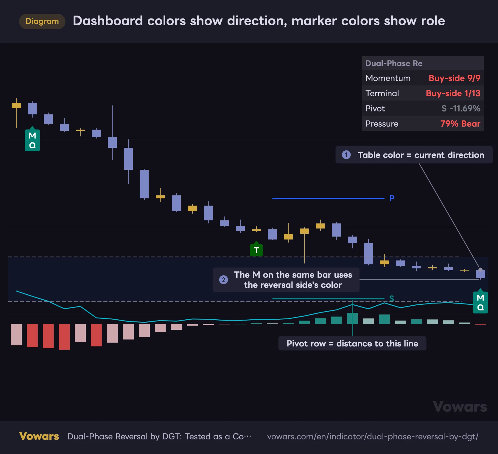
Dashboard colors show direction, marker colors show role
A red Buy-side in the table isn't a buy signal. It means a decline is in progress.
Vowars DE ver.3.8.0
The table color reflects the direction price is currently moving: red while a decline is in progress, green while a rally is. The on-chart markers, on the other hand, are colored by the side you’d trade if it reverses, so a completed downside 9-count is a green M. That means even if Momentum shows “Buy-side 8/9” in red, it isn’t a buy signal. It means the decline is 8 bars deep. In that same moment, the table is red and the marker is green.
The Pivot row shows the distance to the nearest level as a percentage. Negative means the level is below price; positive means it’s above. The text turns green when price is above R, red when it’s below S, and stays gray while price is inside the range. You can place the table top-right, top-left or bottom-left.
Candles that change color with volume
There’s one more feature that pulls its weight: Volume-Weighted Bars. Relative to an 89-bar volume average, bars above 1.618x are painted dark green or dark red, and bars below 0.618x are painted aqua or orange. Everything else keeps your normal candle colors, so only the bars with abnormal volume stand out.
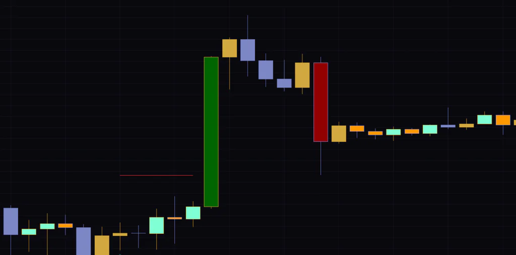
An M that prints on a dark, high-volume bar carries different weight than one that prints on a pale, low-volume bar. Being able to cross-check the count against volume on the same screen makes this a combo that works well, in my experience. The 1.618 and 0.618 values presumably come from Fibonacci ratios, but on some symbols they trigger too often. If that happens, raising the multiplier to around 2.0 calms things down.
Which settings are worth touching
There are quite a few inputs, but in practice you’ll only touch the top three and the pivot timeframe. It works fine on the defaults, too.
| Setting | Default | Suggested | Effect |
|---|---|---|---|
| Phase Display Mode | Completed Only | Completed Only | Which markers are shown. All Sequence Steps displays every step from 1 to 13 as it develops |
| Momentum Support & Resistance Levels | On | On | Horizontal levels at the 9-bar high/low. They disappear once a bar closes beyond them |
| Momentum & Terminal Invalidation Levels | Off | On for review | Blue dotted invalidation levels, projected off the 9- or 13-bar extreme |
| Pivot Timeframe | Auto | Set manually on 6H-type charts | Higher timeframe used for S/P/R. Auto treats unlisted timeframes as Yearly |
| Range Pivot | On | On | Shows the S, P and R levels for the current range |
| Developing Range Pivot | Off | On for short-term trading | Previews the next pivots from the forming range. Keeps moving until the range closes |
| Historical Range Pivot | Off | On for review | Keeps pivots from past ranges on the chart. Useful for checking how well they held |
| Volume Pressure | On | On | Plots the buying-pressure ratio at the bottom of the price chart |
| Pressure Length | 13 | 13–21 | Bars used for the ratio. Higher is smoother but slower to react |
| Pressure Upper Band | 75 | 75–80 | Level treated as buyer dominance. Raising it means fewer triggers |
| Pressure Lower Band | 25 | 20–25 | Level treated as seller dominance. Lowering it means fewer triggers |
| Display Length | 200 | 200 | How many bars back to draw. Up to 475 |
| Placement | Bottom | Bottom | Where the meter is drawn. Choose from Top, Middle or Bottom |
| Height | 9 | 7–9 | Height of the meter. Lower values keep it out of the candles’ way |
| Vertical Offset | 5 | 5 | Distance from price. Higher values push it further from the candles |
| Volume-Weighted Bars | On | On | Recolors only the bars whose volume deviates from the average |
| Volume MA Length | 89 | 89 | Length of the volume average used for comparison |
| High-Volume Multiplier | 1.618 | 1.618–2.0 | Threshold for the dark colors. Raising it paints fewer bars |
| Low-Volume Multiplier | 0.618 | 0.618 | Threshold for the light colors. Lowering it paints fewer bars |
| Dashboard | On | On | Status table. Can be placed top-right, top-left or bottom-left |
For scalping or the 5-minute chart, the combo I found easiest to work with was leaving Pressure Length at 13 to keep it responsive and turning on Developing Range Pivot. Since it projects levels from the forming range, you can set targets without waiting for the 4H range to close.
On the flip side, if you’re on the daily or swing trading and want a cleaner chart, feel free to switch off Volume Pressure. The markers, levels and pivots alone give you enough to work with. If the labels start to feel cluttered, make sure you still leave Phase Display Mode on Completed Only. I’ll explain why in the alerts section next.
All alerts come through a single condition
This indicator’s alerts aren’t split up by condition. Momentum completion, Terminal completion, level crosses, invalidation-level crosses, pivot crosses, pressure entering or leaving the bands, high-volume bars: all of them are bundled into a single option called “Any alert() function call”.
1Right-click the indicator name on the chart and add an alert
In the Condition field, select “Dual-Phase Reversal by DGT”.
2Choose “Any alert() function call” as the condition
There are no separate per-event options, so picking this covers every alert listed above. The message body tells you which event fired, along with the symbol and price, so you sort them out when they arrive.
3Turn off the events you don’t need in the settings
To cut down on notifications, disable the feature itself in the indicator settings. If you don’t want level-cross alerts, turn off Momentum Support & Resistance Levels; if the high-volume alerts get too noisy, turn off Volume-Weighted Bars.
The alerts for a completed 9- or 13-count only fire when Phase Display Mode is set to Completed Only. Switch to All Sequence Steps or None and the completion alerts stop. If you change the display mode to watch the count develop and forget to switch it back, the alerts you actually care about never arrive. That cost me half a day’s worth of alerts.
Repainting, and what to watch for when reviewing past charts
Repainting is probably your first concern, but markers on closed bars never move after the fact. The counts, levels and pivots are all calculated from confirmed closes. The higher-timeframe pivots use the OHLC of the previous completed range, so they don’t keep shifting while the higher-timeframe bar is still forming.
The live, still-forming bar is a different story. The conditions for bar 9 and bar 13 are judged on the close, so labels can appear and disappear until the bar closes. That comes with the territory, so the ground rule is: when you see a label, wait for the bar to close.
The pressure meter is redrawn from the latest bar, so nothing is drawn beyond the number of bars set in Display Length: 200 by default, 475 at most. If you want to see what the meter looked like further back, rewind to that point with TradingView’s Bar Replay and the meter is redrawn with that bar as the latest. Step forward one bar at a time from there to follow what it showed back then. How far back you can go depends on your subscription plan and timeframe.
One more thing. The Terminal side also calculates a target level, but it isn’t drawn on the chart as a line by default. It’s projected off the extreme of the 13-bar phase, the counterpart to the invalidation level. If you’re only working with what’s on screen, you don’t need to worry about it.
What I relied on, and what tripped me up
What you can rely on
- Fixed 9- and 13-bar counts keep your “too early” and “too late” calls consistent
- The moment a 9-count completes, an invalidation level is drawn automatically
- Markers, levels, HTF pivots and volume pressure all fit in a single indicator slot
- The pressure meter lives inside the price pane, so it doesn’t crowd the panes below
- Closed-bar output never changes after the fact, so what you see in review matches live trading
What to watch out for
- T labels are rare. If you wait for them, you’ll barely get any entries
- Levels come from the 9-bar range, so after a spike or crash they can sit far from current price
- Dashboard colors run opposite to marker colors, which is easy to misread until you get used to it
- It’s easy to miss that changing the display mode stops completion alerts
- The count runs on closes only, so big wicks don’t factor into the 9-count
In terms of market conditions, it’s best at catching the exhaustion that follows a long, grinding move in one direction. It meshes well with markets that trend for days and then run out of steam, like gold on the daily or Bitcoin on the 4H. In a choppy, range-bound market, on the other hand, the count keeps breaking at 1 or 2 and labels barely show up. The lack of labels is information in itself, since it tells you the move hasn’t run its course yet, but it makes for a lot of dead time while you wait.
Timeframe-wise, the 4H to daily behaved most cleanly. It works on the 5-minute too, but 9 bars is only 45 minutes, so you get far more completion markers and each one means less. On lower timeframes, it’s more realistic to pair it with the HTF pivots and look for setups like “an M printed just below R.”
If you’re going to combine it with something, a directional indicator is the natural fit. “Dual-Phase Reversal by DGT” doesn’t judge trend direction on its own, so I set the bigger bias with Supertrend or a long-term moving average and skipped any M that went against it. That cut down on the misfires.
Less a reversal-calling tool, more groundwork for finding reversals
The author is upfront that this is a framework for reading context. It isn’t meant to be used as a standalone reversal signal, and after using it, I’d say that description is accurate. An M doesn’t mean price will turn, and there are plenty of cases where the move just keeps going after it prints.
 Image
ImageWhy I still think it’s worth keeping on the chart: it puts a consistent 9- and 13-bar yardstick on the fuzzy feeling of “this looks overextended”. When your gut says it’s about time, which step of the count are you actually on? Has price cleared the level and killed the thesis, or is it still alive? Being able to answer both just by glancing at the chart makes a real difference in how repeatable your decisions are.
Start by throwing it on something like Bitcoin on the 4H and just watch it for a week on Completed Only. Simply comparing the spots where an M printed with the ones where it didn’t should give you a feel for what this two-phase count is trying to catch.