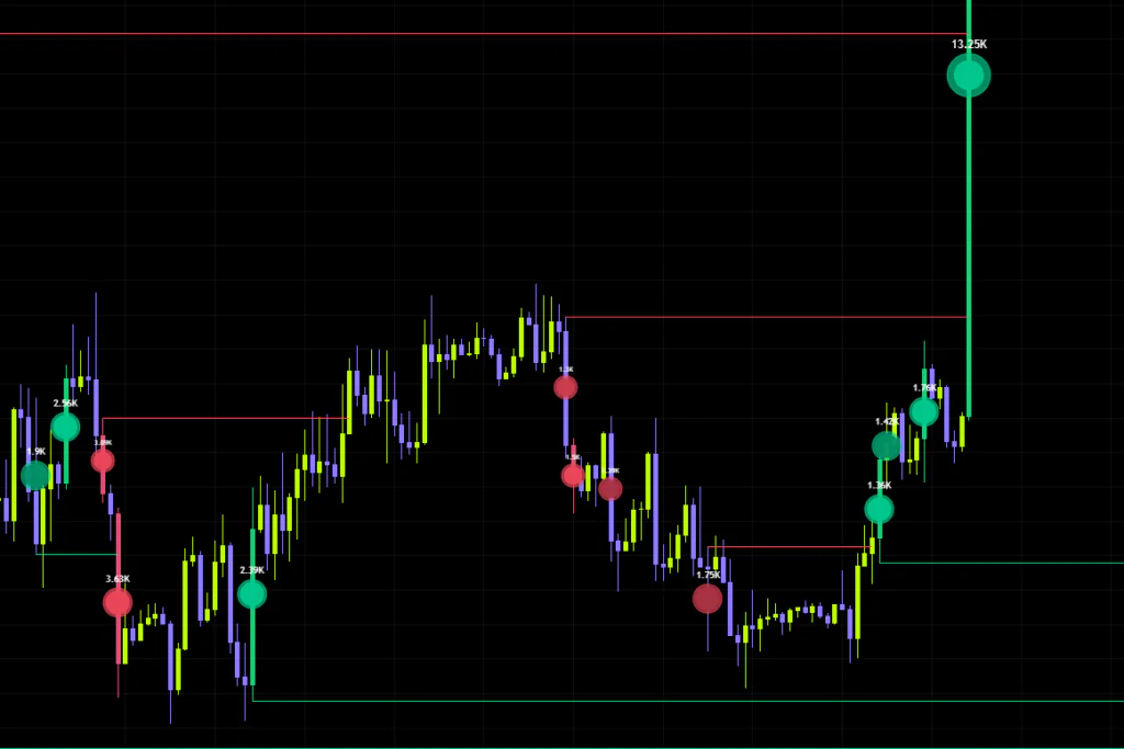


What Exactly Is “LTF Volume Microburst Bubbles”?
You’ve had the moment: you’re scrolling a chart and one candle traded an absurd amount. What a standard volume bar won’t tell you is when inside that candle the volume hit, and which way it was pushing. Volume that got sold into with a long upper wick and volume that ripped straight off the lows look completely identical on the histogram.
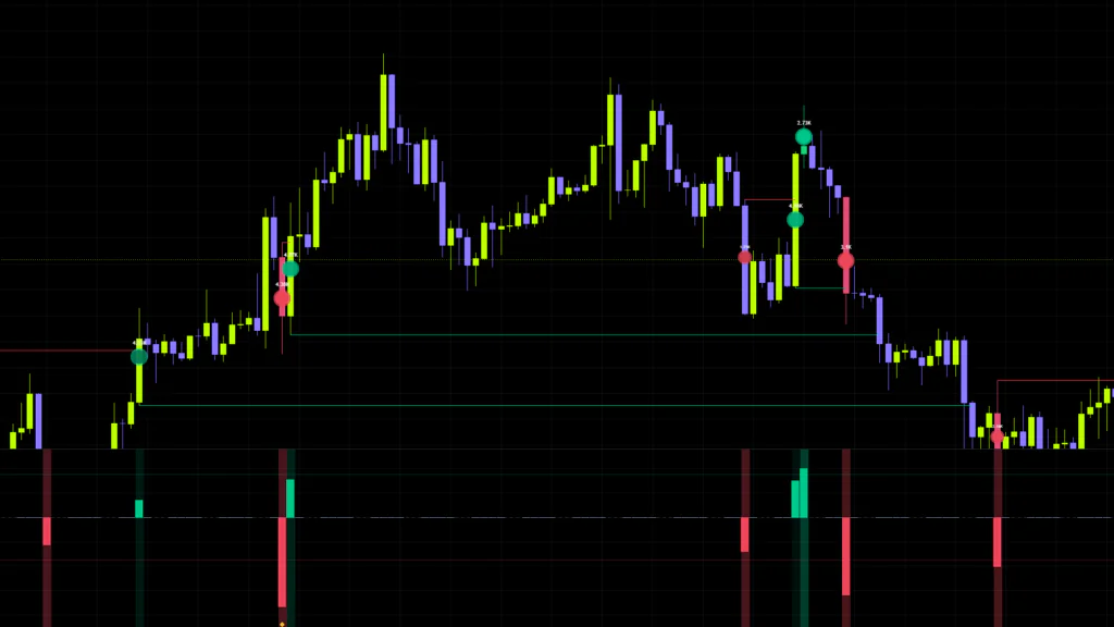
“LTF Volume Microburst Bubbles” is the tool that breaks that open. It splits each candle on your chart into shorter-timeframe candles and pulls out only the moments where volume ran well above its normal level. From there it works out whether that burst — the microburst — was buy-side or sell-side, and drops a bubble onto the price chart.
The whole idea is catching the short bursts of genuinely aggressive trading happening inside a single candle.
This one loads as a separate pane below your chart, but the bubbles, levels and coloured candles are drawn on the price chart itself. It’s easy to add it and assume only the lower pane showed up, so check the price chart too.
What You Actually See on the Chart
There’s a lot going on once it loads. Every element has a clear job though, so it stops feeling busy the moment you’ve sorted them out. Let’s start with a map of where everything sits.
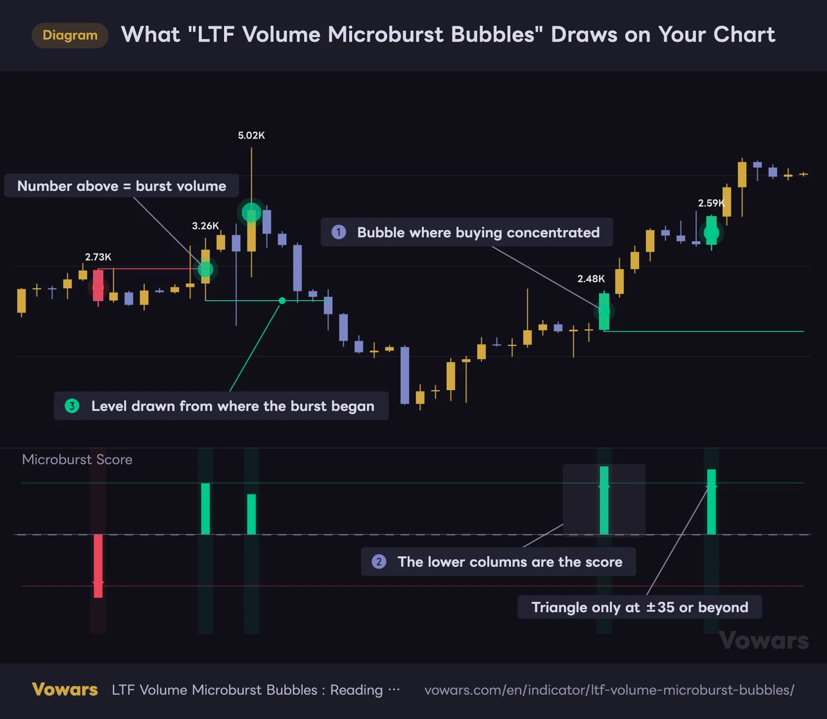
What "LTF Volume Microburst Bubbles" Draws on Your Chart
Bubbles and levels plot on the price chart, the score plots below. They are linked, showing the same candle in two different ways.
Vowars DE ver.3.11.1
The price chart and the lower pane are showing the same candles in two different forms. Look straight down from any bubble and you’ll always find a score column. Here’s what each element means.
| Element | Where | What it means |
|---|---|---|
| Bubbles (circular markers) | Price chart | A volume burst fired inside that candle. Green means buyers on top, red means sellers |
| Number inside the bubble | Price chart | Total volume of the spikes that qualified (shown as K, M or B) |
| Horizontal levels | Price chart | Drawn from the low (bullish) or the high (bearish) of the candle where the burst started |
| Coloured candles | Price chart | Candles where the score reached the signal threshold get painted in |
| Score columns | Lower pane | The Microburst Score. Positive is buyer dominance, negative is seller dominance |
| Triangles | Lower pane | Marks the score reaching the signal threshold |
| Yellow diamonds | Lower pane | Flags extreme volume at 5x the baseline or more |
| Faint background shading | Lower pane | That candle contains a burst. The more concentrated it is, the stronger the shade |
Bubble Size and Bubble Shade Mean Two Different Things
This was the part I found most interesting. Size and colour depth carry separate pieces of information.
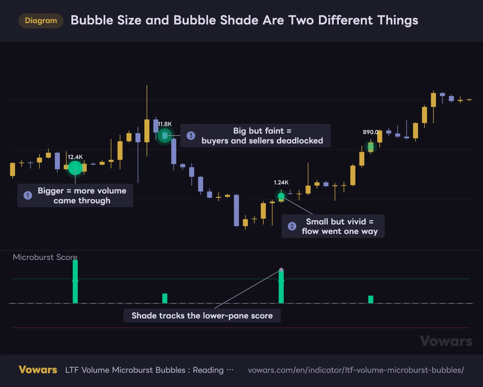
Size is about how much volume came through. More precisely, it measures the burst volume against the average lower-timeframe volume inside that candle and scales up in steps. When several times the usual size floods in at once, you get a big, hard-to-miss bubble.
Colour depth, on the other hand, is about score strength. Reach the Signal Threshold and you get the full, vivid colour; sit around 25% of it and the bubble comes out dark and muted. So a big but washed-out bubble means plenty of volume traded, but it was fighting itself. A small but vivid bubble is the opposite — less size, but cleanly one-directional.
Bubble Size and Bubble Shade Are Two Different Things
Two green bubbles can be saying completely different things depending on their size and shade.
Vowars DE ver.3.11.1
Read those two axes together and bubbles that look similar can mean completely different things. Watch out for the big-but-faint type like ③ in particular. At first glance it looks like a strong signal.
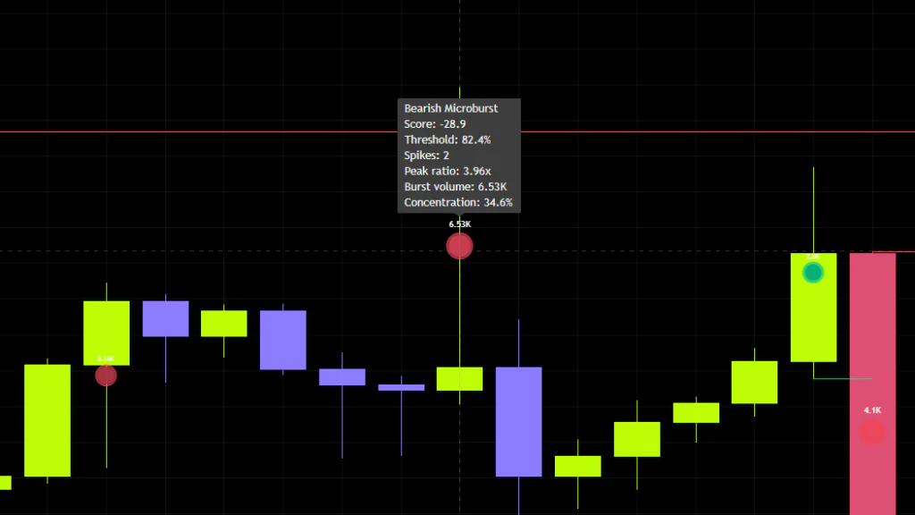
Hover a Bubble and You Get the Full Breakdown
 Image
ImageThis is one you lose out on if nobody tells you. Hovering over a bubble brings up the details of that burst: whether buyers or sellers dominated, the score itself, what percentage of the signal threshold it reached, how many lower-timeframe candles qualified as spikes, the highest volume multiple recorded, the total burst volume, and the concentration.
It’s where you find out whether a burst came from one single spike or was spread across five of them, which matters a lot when you’re judging how much a signal is worth. I check this on anything that looks interesting.
How a Microburst Gets Detected
Knowing why it behaves the way it does lets you judge signal reliability for yourself. Skipping the heavy stuff, here’s the flow.
1Split the current candle into shorter candles
With Auto Lower Timeframe enabled, the timeframe it pulls from is chosen off your chart timeframe. Here’s how it maps out.
| Chart timeframe | Lower timeframe used |
|---|---|
| 1 minute | 10 seconds |
| 5 minutes | 1 minute |
| 15 minutes | 3 minutes |
| 1 hour | 15 minutes |
| 4 hours | 1 hour |
| Daily | 4 hours |
| Weekly / Monthly | 4 hours (when at least one session is enabled) |
Broadly, it’s cutting each candle into four to six pieces. That’s enough granularity to judge whether a burst happened or not.
On a 1-minute chart it goes looking for second-based data. If seconds data isn’t available on your setup it may not behave the way it’s meant to, so if you want to run it down there, switch Auto Lower Timeframe off and set the timeframe manually instead.
2Compare each one against “normal” volume
Every lower-timeframe candle gets measured against a baseline of what normal volume looks like. That baseline is a smoothed average over the period set in Volume Baseline, which defaults to 50. The key part is that it judges on the gap from normal for that symbol and that time of day, not on raw volume size. That’s exactly why it feels the same whether you’re on a heavily traded pair or a quiet one.
3Only spikes clearing both filters get counted
Here’s where it separates itself from a plain volume-spike detector. To qualify, a candle has to tick both boxes.
- Volume at or above Spike Threshold times the baseline (2.5x by default)
- The body of that lower-timeframe candle covering at least Min Body Efficiency (0.10 by default) of its full high-to-low range
That second filter earns its keep. Candles where volume exploded but price got rejected straight back with a long wick are treated as directionless and thrown out. In practice it strips out a decent chunk of the “huge volume, went nowhere” noise.
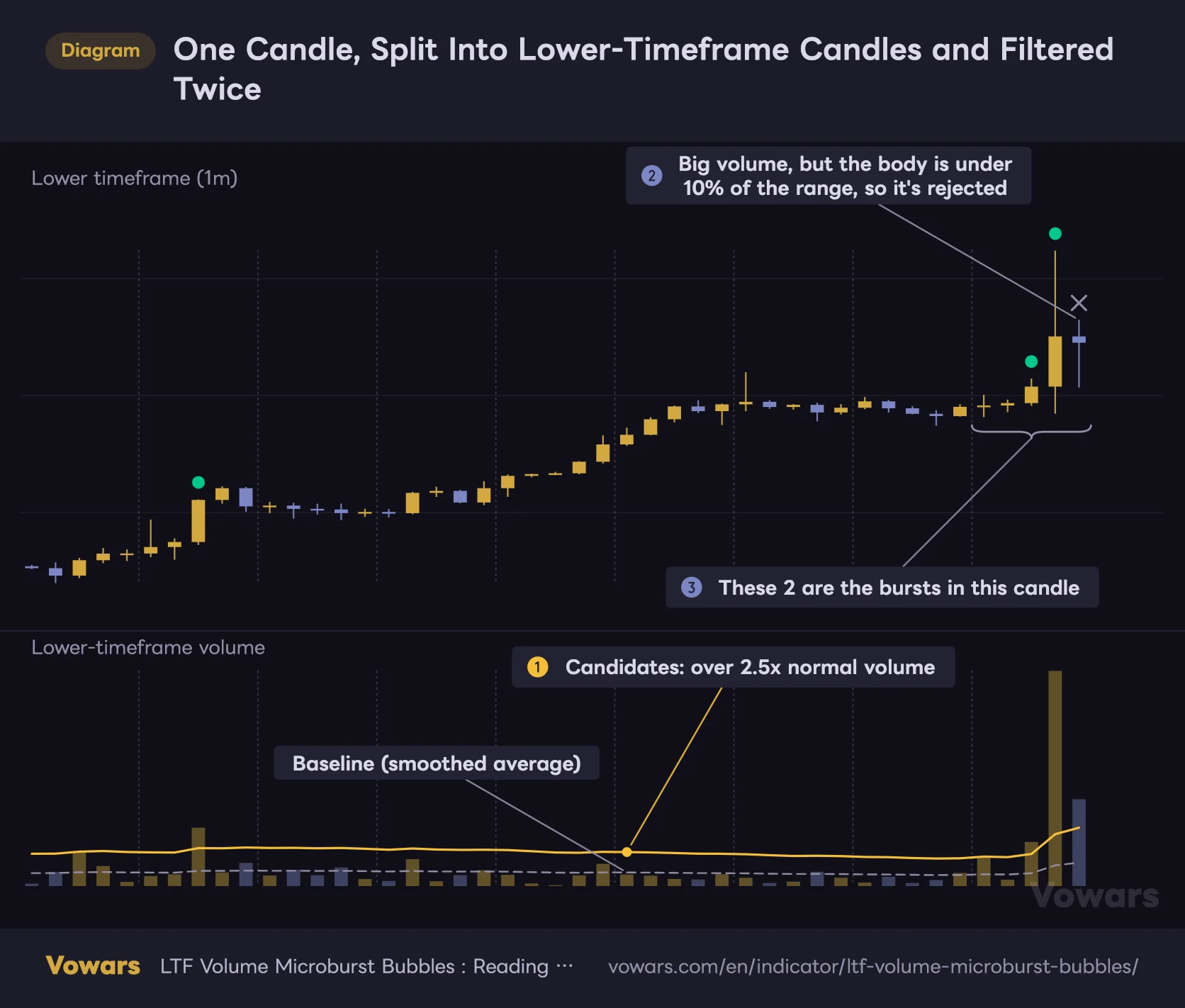
Here are steps 1 to 3 in one picture, opening up the inside of a single 5-minute candle. This is the 1-minute view the indicator works from internally.
One Candle, Split Into Lower-Timeframe Candles and Filtered Twice
What you see here are the 1-minute candles the indicator looks at internally. Each group of five between the dotted lines equals one candle on a 5-minute chart.
Vowars DE ver.3.11.1
Look at the last group on the right. Three candles clear the threshold line, but only two are counted as bursts. The last one has plenty of volume, but its body is under 10% of its range and price went nowhere, so it gets thrown out.
4Score it on directional bias and concentration
Qualifying spikes get sorted into buy-side and sell-side, and the imbalance between them is measured. What makes it interesting is that concentration is layered on top of that.
Bursts packed into one or two standout candles score higher than the same size spread thinly across many. Orders slammed in all at once get weighted more heavily than a slow, grinding bid.
Flip that around and you get the other case. When buy and sell bursts cancel each other out inside the same candle, the score stays near zero no matter how much volume traded. Heavy trading with a washed-out bubble simply means both sides were slugging it out.
The score runs from -100 to +100, positive for buyer dominance and negative for seller dominance. The bigger the absolute value, the more one-sided, forceful and concentrated the activity was. On defaults, crossing ±35 fires the triangle signal.
On Default Settings, There Are Hours Where Nothing Fires
This is the single most important thing to know about running “LTF Volume Microburst Bubbles”, so it gets its own section.
There’s a session filter built into it, and out of the box only London and New York are switched on. Sydney and Tokyo are off.
Volume trading outside an enabled session is excluded from the calculation entirely. Load it onto a Bitcoin chart on defaults and a huge Asian-session volume burst produces exactly zero bubbles. That’s what’s behind the “why is nothing showing up in the morning” thing.
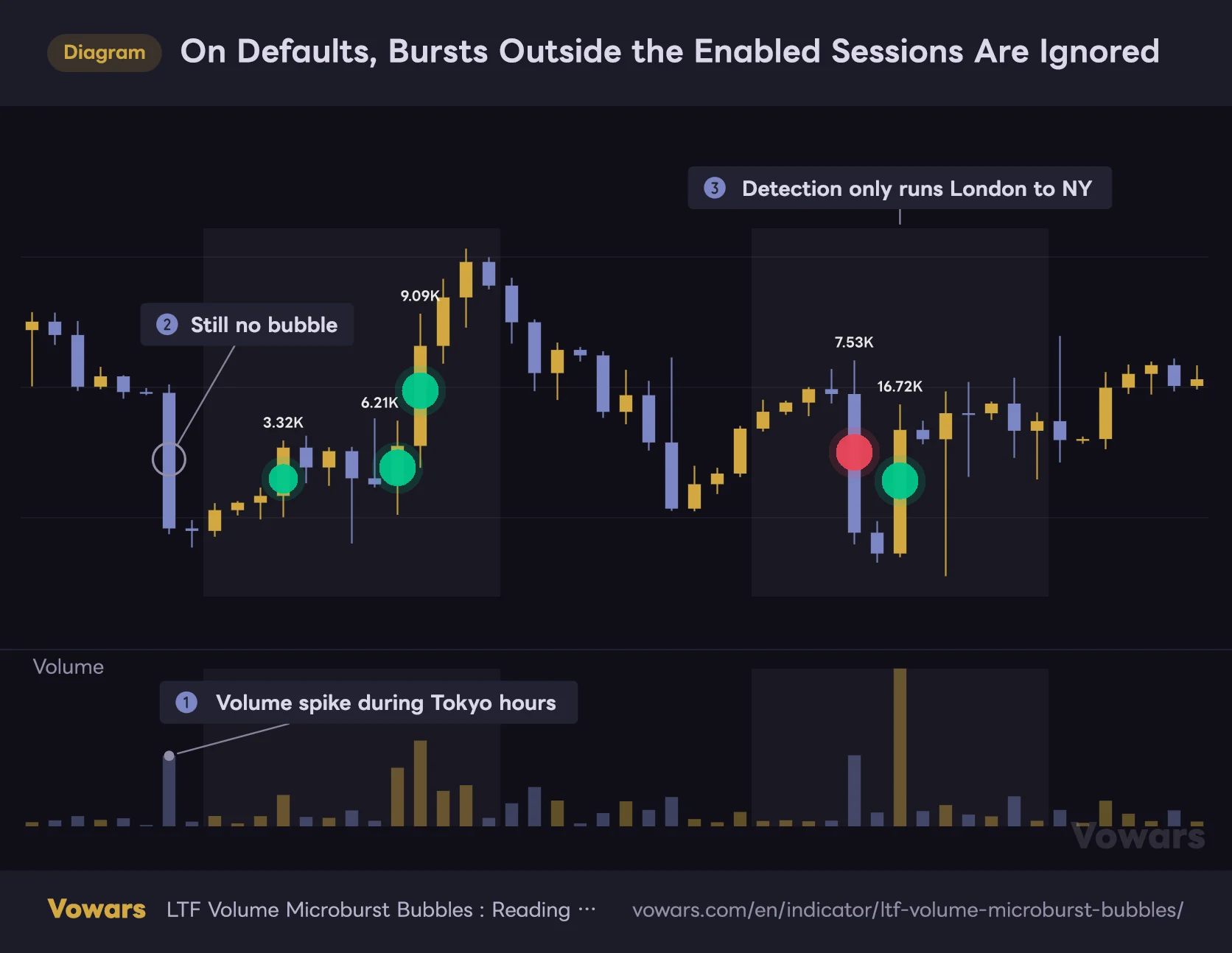
On Defaults, Bursts Outside the Enabled Sessions Are Ignored
The shaded windows are the London and New York sessions, the two enabled by default.
Vowars DE ver.3.11.1
The big red candle on the far left clearly traded far more than the candles around it. It still gets no bubble, simply because that time window isn’t part of the calculation at all. The indicator isn’t broken.
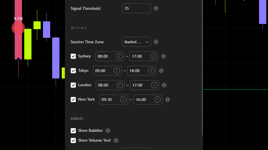
On a market that runs 24/7, switching all four sessions off is the way to go. With everything off it runs one shared baseline around the clock, so Asian-session pumps and dumps get picked up too. If you’d rather analyse a single window at a time, enable only the sessions you care about.
Worth knowing as well: when sessions are enabled, each one keeps its own separate baseline. It’s quietly smart, because it stops naturally thin Asian-session volume from being measured against busy New York activity. Everything gets judged as “unusual for this time of day”.
Through the London–New York overlap, both baselines are compared and the higher multiple is the one used. The result is that spikes trigger slightly more easily during the overlap. Discounting overlap signals a little is probably the right instinct.
Working With the Burst Levels
The auto-drawn levels are every bit as useful as the bubbles themselves.
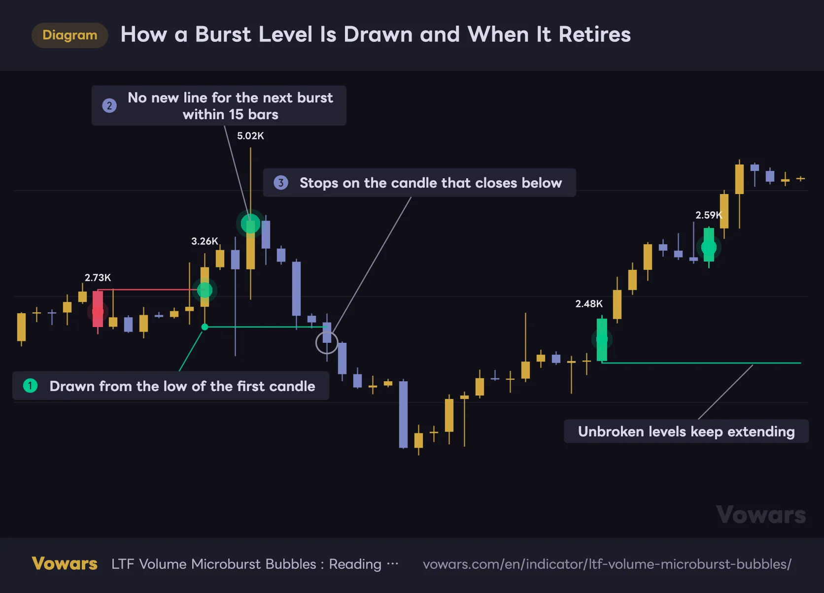
A bullish burst that has just started gets a green line from that candle’s low; a bearish one gets a red line from the high. While bursts keep firing back to back, no new line is added — it’s always drawn from the first candle of the sequence. On top of that, a new line in the same direction won’t be drawn until New Level Cooldown (15 bars by default) has passed.
From there, the line keeps extending to the right until a close breaks through it (below it, in the case of a green line). Once that happens the extension stops and the level has done its job. It stays visible on the chart, but a line that’s stopped growing is a price area that has already been taken out.
How a Burst Level Is Drawn and When It Retires
A level starts from the first candle of a burst and keeps extending right until a close breaks it.
Vowars DE ver.3.11.1
The use case is simple enough: while price is holding above a green line that’s still extending, that area is being respected as support. Whether it actually holds a pullback is a mixed bag — I’ve watched it work cleanly and I’ve watched price slice straight through. Realistically, don’t lean on it alone, and prioritise the ones that line up with levels you’d have drawn yourself anyway.
Where It Earns Its Place in Live Trading
Confirming Trend Continuation
 Image
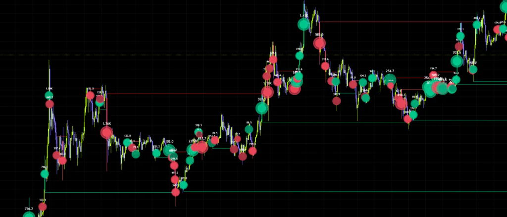
ImageThe most natural use of all. When a pullback in an uptrend ends and price starts pushing again, a large, deeply coloured bullish bubble tells you real money is behind the move. It gives you a way to separate a weak bounce that sellers are fading from one that’s getting genuine fresh buying.
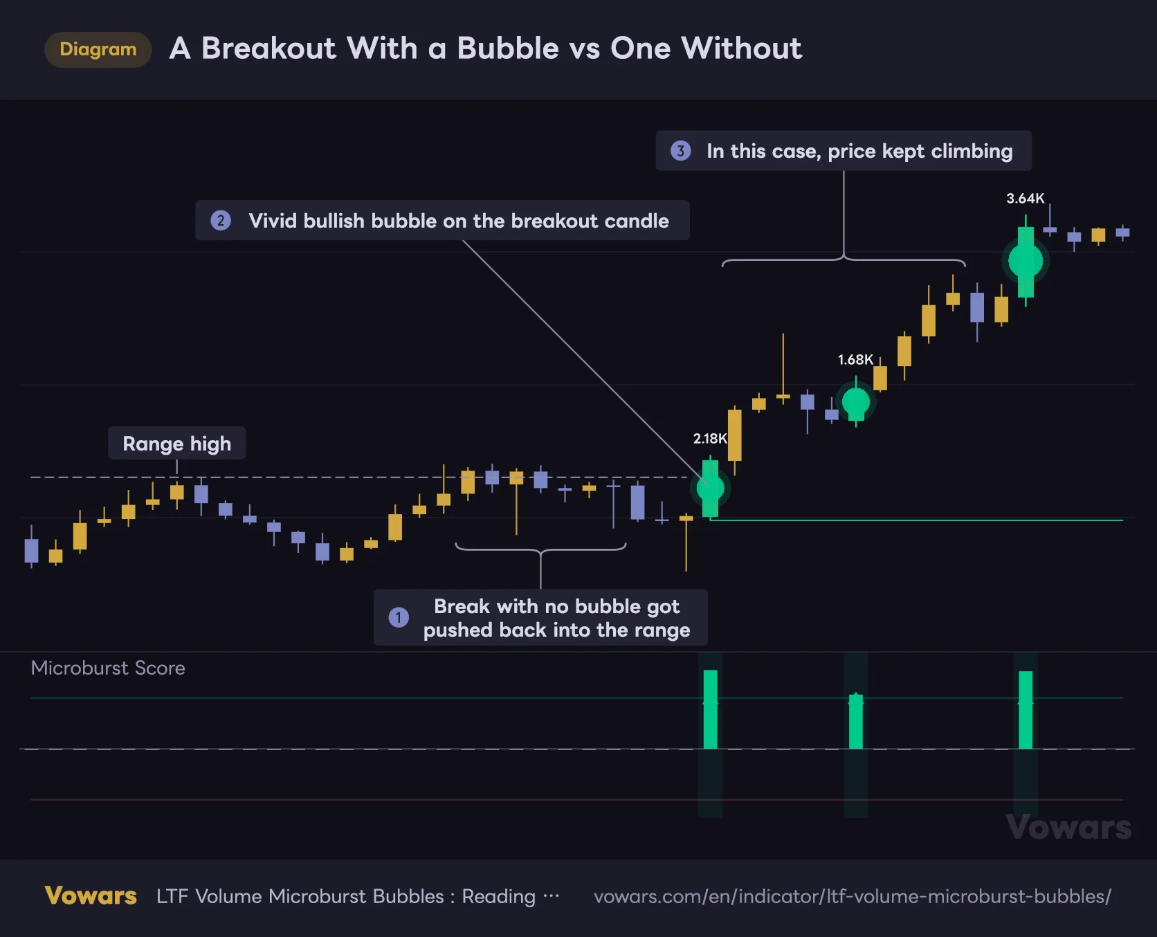
Same story on a range break. If price clears the top and no bullish bubble prints while the score stays flat, there’s a good chance you’re looking at a break on thin participation. I’ve dodged a few fakeouts on exactly that read, so as a breakout filter it’s genuinely strong.
A Breakout With a Bubble vs One Without
Two breaks of the same range high can play out very differently depending on whether buying actually burst inside the candle.
Vowars DE ver.3.11.1
What matters is whether the breakout candle itself carries a bubble. A bubble that shows up a few bars after the break is often just late buyers chasing a move that already happened, so I don’t give it the same weight.
Questioning a Move That’s Gone Too Far
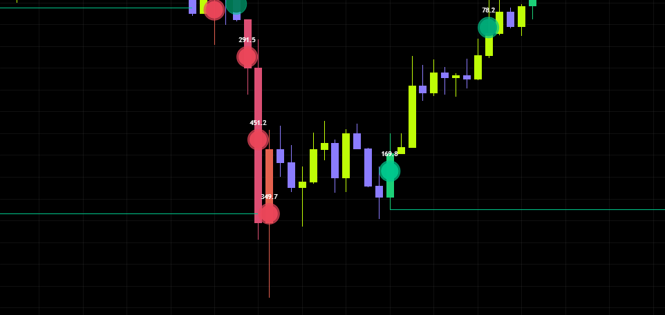
A violent bearish bubble at the tail end of a long grind higher. A violent bullish bubble at the bottom of a flush. Those can be the first sign of money arriving from the other direction.
 Image
ImageThat said, a bubble on its own can’t tell continuation from reversal. The author says as much, and I’d agree. It only works as a reversal read once you take location into account — recent swing highs and lows, support and resistance. A big bubble printed in the middle of nowhere is often just trades clustering.
Treat the Yellow Diamonds as Their Own Signal
The yellow diamonds in the lower pane fire when lower-timeframe volume reaches 5x the baseline or more. That 5x figure is fixed and isn’t exposed in the settings.
It’s evaluated independently of the score and the signal threshold, so you’ll sometimes get a diamond while the score stays low. That’s abnormal volume hitting from both directions at once, and it tends to show up right before or right after violent moves. I treat it as its own separate read on volatility expanding.
Which Trading Styles Suit It
| Style | Fit | Notes |
|---|---|---|
| Scalping | Excellent | Ideal on 5m–15m for catching instant bursts of flow |
| Day trading | Excellent | 15m–1H. Meshes well with session-based analysis |
| Swing trading | Good | Works on 4H–daily, though signals thin out |
| Position trading | Limited | On weekly and above the lower-timeframe data gets too coarse to add much |
A Closer Look at the Settings
Detection settings
| Setting | Default | Suggested | Effect |
|---|---|---|---|
| Auto Lower Timeframe | On | On | Picks the lower timeframe off your chart timeframe. Only worth disabling on the 1-minute |
| Manual Lower Timeframe | 1 (1 min) | 1/4 to 1/6 of chart TF | The timeframe used when auto is off. Finer settings catch more but load heavier |
| Volume Baseline | 50 | 30–50 | Lookback for what counts as normal volume. Higher is steadier, lower tracks recent activity |
| Spike Threshold | 2.5 | 2.0–3.5 | Volume multiple needed to count as a spike. Higher means fewer but genuinely unusual hits |
| Min Body Efficiency | 0.10 | 0.15–0.25 | Minimum body-to-range ratio. Higher rejects wick-heavy candles and keeps clean directional spikes |
| Signal Threshold | 35 | 30–45 | Score needed for triangles and candle colouring. Lower for frequency, higher for selectivity |
| Session Time Zone | Market Local | Market Local | Reads sessions in each market’s local time and follows DST, so it’s fine left alone |
| Sydney | Off / 0800-1700 | Off for crypto | Enables Sydney detection, which keeps its own baseline |
| Tokyo | Off / 0900-1800 | On for JPY and Japanese equities | Enables Tokyo detection. Use it when Asian hours need covering |
| London | On / 0800-1700 | Depends on use | Enables London detection. Useful on European names and FX |
| New York | On / 0930-1600 | On for US equities | Enables New York detection. Default hours match the US cash session |
Spike Threshold is the first dial to touch. The 2.5 default is fairly relaxed, and choppy conditions turn into a wall of bubbles. When Bitcoin is swinging hard, pushing it to around 3.0 leaves only the bursts that actually stand out. Quiet market and no bubbles at all? Drop it to around 2.0 instead.
The 0.10 default on Min Body Efficiency is very permissive. Anything with a body worth 10% of its range gets through, so wick-heavy conditions let noise in. If you only want clean directional bursts, lifting it to around 0.20 makes a noticeable difference. Push it too far, though, and the wild candles that print during fast moves all get filtered out — which is exactly when you want to see them — so I’d stay under 0.3.
Shortening Volume Baseline makes it accept recent heavy activity as normal much faster. The knock-on effect is that spikes stop registering through the back half of a sustained volume build, so if you’re tracking continued inflow, keeping it near the default of 50 is the safer call.
Display settings
| Setting | Default | Suggested | Effect |
|---|---|---|---|
| Show Bubbles | On | On | Toggles bubbles on the price chart. Detection and scoring keep running when it’s off |
| Show Volume Text | On | Off when crowded | Prints the volume figure inside each bubble. Turning it off changes neither sizing nor detection |
| Bubble Size | Normal | Small on low timeframes | Global size adjustment. Relative sizing between bubbles is preserved |
| Bubble Transparency | 4 | 4–10 | Bubble opacity. Higher lets the candles show through |
| Show Levels | On | On | Toggles the levels drawn from the start of each burst |
| New Level Cooldown | 15 | 15–30 | Minimum bars before another same-direction level. Higher means fewer, more selective lines |
| Max Level Age | 2000 | 300–800 | Bars before a level is removed. Shorter keeps the chart tidy |
| Line Width | 1 | 1–2 | Level thickness. Cosmetic only |
| Line Style | Solid | Dashed | Line type. Dashed helps separate these from your own hand-drawn levels |
| Bull Bubble / Bear Bubble | Green / Red | Default | Base bubble colours. Weaker scores render in darker shades |
| Bull Text / Bear Text | White / White | Default | Text colour for the figures inside the bubbles |
| Bull Level / Bear Level | Green / Red | Default | Colour of the burst levels |
| Color Signal Candles | On | Depends on use | Paints candles where a signal fires. Best off if you run other candle-colouring tools |
| Burst Background | On | On | Light shading in the lower pane. More concentrated bursts shade stronger |
The 2000-bar default on Max Level Age is fine on a daily chart, but very long on 5m or 15m. If old lines hanging around forever bothers you, dropping it to somewhere between 300 and 800 cleans the chart right up.
Setups by use case
| Goal | Direction to take |
|---|---|
| Faster reads for scalping | Spike Threshold 2.0, Signal Threshold 30, Volume Baseline 30 |
| Cutting noise, keeping only the best | Spike Threshold 3.0–3.5, Min Body Efficiency 0.20, Signal Threshold 45 |
| Crypto around the clock | All four sessions off (turning them all on does not give you 24-hour coverage), everything else tuned from defaults |
| US cash session only | New York only, Session Time Zone on Market Local |
| Swing trading, big inflows only | 4H and above, Spike Threshold 3.0, Max Level Age left long |
Strengths and Weaknesses
Strengths
- Breaks a single candle open and works out which side the volume was on
- Judges against normal conditions rather than raw size, so it travels across symbols
- Two channels of information at once: size for volume, colour for score
- A wick-rejection filter is built in from the start
- Session design that lets each window carry its own baseline
- Hovering a bubble gives you the full breakdown
- Four alert conditions ready to go
Weaknesses
- Asian hours are excluded on default settings
- It can’t separate continuation from reversal on its own
- Score and signals shift while the candle is still forming
- Pulling lower-timeframe data makes it heavier to run
- A lot of visual elements, which feels like information overload at first
- Scroll far enough back and you’ll hit stretches with no bubbles at all
Things to Know Before You Rely on It
Values Move While the Candle Is Live
This one is baked into how it works. On the candle currently forming, lower-timeframe data keeps stacking up, so the score shifts as the candle develops. A signal can clear the threshold mid-candle and then be gone by the time it closes.
When you create an alert, I’d strongly suggest setting the trigger to Once Per Bar Close. Leave it on the default and you’ll get alerts firing on live candles that later disappear. The four conditions available are bullish signal, bearish signal, extreme volume spike, and one that bundles all of them together.
Closed candles, on the other hand, never get re-evaluated after the fact. Nothing shifts position, and past bubbles don’t vanish or appear later on. What can happen is the chart running out of lower-timeframe data — scroll far enough into the past and the display simply stops.
Bubbles Are a Record, Not a Forecast
A big bubble doesn’t mean price goes that way. All it shows is trading that has already happened. A large bearish bubble partway through a flush is evidence of capitulation — and it might equally be the point where the selling runs dry.
I don’t take entries off this alone. Confirming trend direction, or adding an “is there actual money behind this” layer on top of levels and moving averages you already trust, is where it makes the most sense to me.
You’re at the Mercy of the Volume Data
True of any volume tool, but whatever volume data your exchange or symbol reports feeds straight into the output. Crypto volume differs exchange to exchange, and some markets — FX being the obvious one — report tick counts rather than traded size. Even on Bitcoin, switching the exchange you’re charting changes how the bubbles come out.
Pairing It With Other Indicators
| Pair with | What you get |
|---|---|
| Moving averages (200 EMA and similar) | Lock in trend direction and only take bubbles pointing with it |
| Horizontal levels and pivots | Filtering to bubbles at key prices sharpens the reversal reads |
| Oscillators like RSI | Treat opposing bubbles at overbought or oversold levels as early reversal clues |
| ATR | Check whether volatility is expanding to judge how much weight a bubble deserves |
| A standard volume indicator | Compare total candle volume against the burst volume inside it |
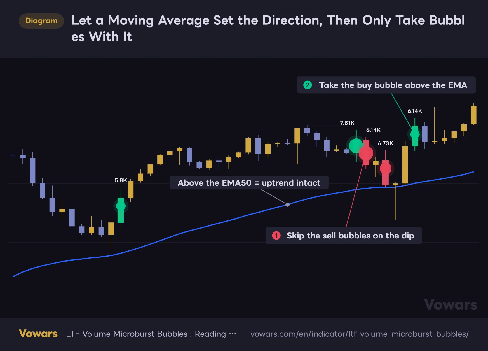
The combination I liked most is with a moving average. Once trend direction is settled, counter-trend bubbles can be dismissed as temporary bounces and only the aligned ones get used as continuation evidence. It simplifies the decision enormously.
Let a Moving Average Set the Direction, Then Only Take Bubbles With It
While price holds above the EMA, only bubbles pointing up count toward the decision.
- EMA50
Vowars DE ver.3.11.1
On the right side of the figure, two sell bubbles print back to back near the highs. Taken on their own, that looks like a possible top. But price never loses the EMA, and the buy bubble that follows kicks off a fresh high, so those sell bubbles read as profit-taking on a dip. If a sell bubble came with price breaking below the EMA, that’s when I’d start questioning the trend.
Getting It Set Up
1Add the indicator
Open the Indicators menu at the top of your TradingView chart, search for “LTF Volume Microburst Bubbles” and add it. You’re good if a score pane appears below and bubbles plus levels show up on the price chart.
2Match the session settings to what you trade
Do this before anything else. All four off for crypto, New York only for US equities, and so on down the list.
3Dial in how many bubbles you get
Too many bubbles, raise Spike Threshold; too few, lower it. On whatever timeframe you normally watch, landing somewhere between a handful and a dozen or so per day tends to be the workable range.
4Scroll back and see how it behaved
Before you trade off it, go back through past pumps and flushes and see how the bubbles printed. Getting a feel for what counts as abnormal on your own symbol makes live decisions dramatically easier.
Overall Verdict
“LTF Volume Microburst Bubbles” shows volume as where, which way and how concentrated, rather than simply how much. It surfaces information a standard volume histogram will never give you, so anyone looking to take volume analysis a step further will get a lot out of it.
What I rate most is the two-channel design — size and shade carrying different information — along with the hover breakdown. Once you can read “big but faint means both sides were fighting”, the chart genuinely looks different.
The shame is the trap sitting in the defaults, where entire sessions produce nothing and people may write it off as broken without ever finding out why. Check the session settings the moment you load it. That’s the one thing not to skip.
It isn’t a standalone trading system, but as a way of adding “is money really moving here” to analysis you already do, it’s very good indeed. If you’re trying to avoid breakout fakeouts, or want to know whether a bounce off a dip is the real thing, it’s well worth a look.
Intermediate traders already working with volume who want another layer of depth. Anyone who keeps getting caught by breakout fakeouts. Short-term traders who want to know which side just committed. If you’re after simple buy and sell arrows, though, there’s probably more here than you need.