

What is “Polynomial/Linear Regression Volume Profile”? Start with the big picture
Almost every volume profile you have ever put on a chart draws itself as horizontal bars stacked sideways. That makes sense, since the whole point is to show how much trade happened at each price level.
“Polynomial/Linear Regression Volume Profile” throws that convention out. The volume distribution bends and curves along the trendline instead. It comes from BigBeluga, and the build is simple in concept: fit a regression baseline through the trend, then bucket volume by how far price sat from that baseline.
So what “Polynomial/Linear Regression Volume Profile” actually shows you is volume by distance from the trend, not volume by price level. That is the single biggest thing separating it from every other volume profile out there, so lock that in before anything else.
It answers one question: within the trend as it stands right now, which deviation zone has absorbed the most trade. Even deep into a strong uptrend, volume is measured against position relative to the trend rather than raw price, which means your pullback reference drifts higher right along with it.
What actually shows up on your chart
Drop it on with default settings and a lot hits you at once. If your first reaction is that there are way too many lines, fair enough. Let us get the overall layout straight with a diagram first, then pull it apart piece by piece.
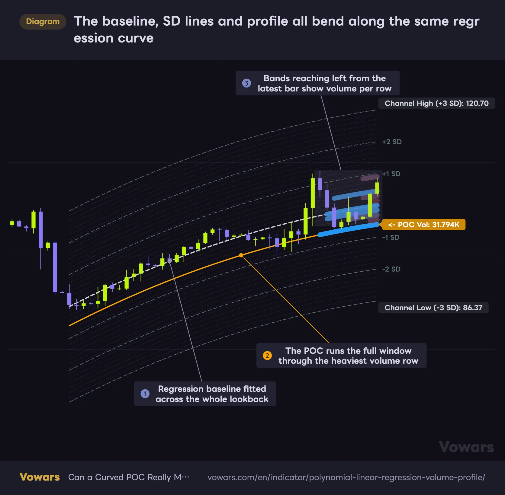
The baseline, SD lines and profile all bend along the same regression curve
The white dashed line is the regression baseline. The SD lines, the POC and the volume bands all run parallel to that curve.
Vowars DE ver.3.9.2
As the diagram shows, every line and every band runs parallel to one regression curve, and that is the visual core of this indicator. When the baseline bends, the SD lines, the POC and the volume bands all bend with it. Keep that in mind and even a crowded chart stays easy to navigate.
1. The regression baseline
The slightly heavier white dashed line running through the middle is the baseline. It is the single best-fitting line through the price action over your chosen lookback, drawn as a second-degree curve (Polynomial) by default. Unlike a moving average that drags along behind price, it takes the shape of the whole window at once, so a run higher that stalls out and rolls over gets expressed as an actual arc. You see the bend in the market, not just the direction.
You can flip it to a straight line if you prefer. In linear mode it looks close to any standard regression trendline you have used before. The difference between the two gets its own diagram in the settings section further down.
2. The grid of faint parallel curves
Above and below the baseline sit a stack of nearly transparent dotted lines. These are just the volume buckets made visible, one for each row you have set on either side. The spacing is adjusted automatically so that the outermost grid line lands exactly on ±3 standard deviations, which means adding rows never moves the outer boundary. More rows, finer slices. Fewer rows, chunkier slices. That is all there is to it.
3. The standard deviation lines
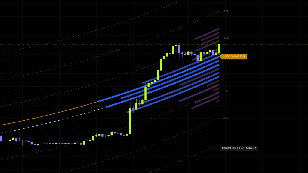
Dashed curves get plotted at ±1, ±2 and ±3 SD, all following the same bend as the baseline. The right edge carries labels for +1 SD, -1 SD, +2 SD and -2 SD, while ±3 SD show up as Channel High (+3 SD) and Channel Low (-3 SD) with the actual price printed on them. Those two are your working ceiling and floor.
It is a statistical measure of how spread out data is. On a chart it works as a yardstick for how far price has strayed from its normal range, which is why a move past ±2 SD gets read as stretched. If it helps, think of it as the same math behind Bollinger Bands.
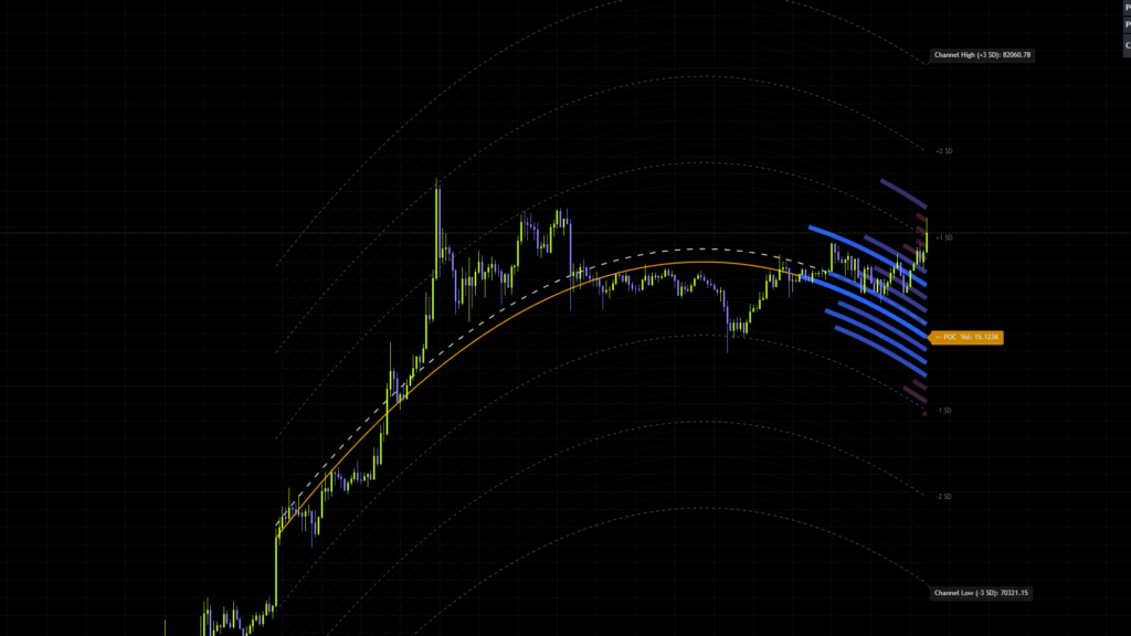
Watching this on Bitcoin, the channel width expands noticeably when the trend has real force behind it. Because the width is derived from the spread of price itself, volatile stretches blow the channel wide open and quiet ranges squeeze it shut. That behavior differs from a conventional regression channel, and knowing it upfront saves you from misreading the chart.
4. The curved volume profile
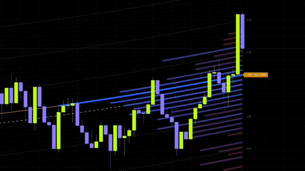
Those thick bands reaching leftward from the right edge of the chart are the main event of “Polynomial/Linear Regression Volume Profile”. Each one belongs to a grid row, and the more volume that row traded, the further the band stretches. The heaviest row runs longest, and everything else scales down from there.
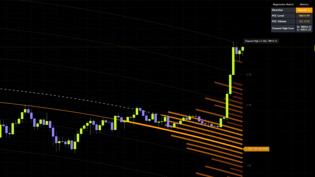
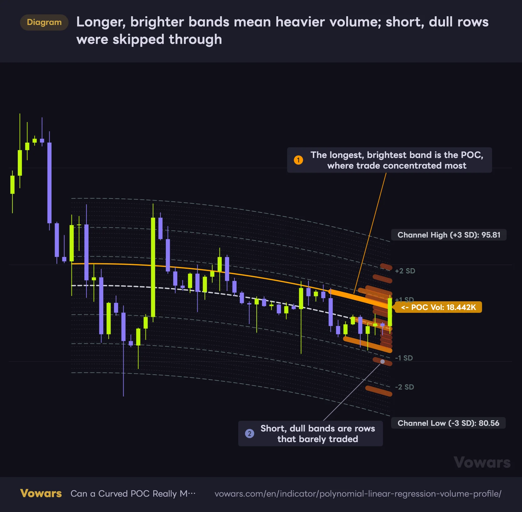
Color tracks volume too. Thin rows sink into a muted red, while heavier rows climb toward the trend color, blue on the way up and orange on the way down by default. Here is how it looks in a downtrend.
Longer, brighter bands mean heavier volume; short, dull rows were skipped through
In a downtrend, heavier rows shift toward bright orange while thinner rows fade toward a dull red.
Vowars DE ver.3.9.2
Honestly, my first reaction was that the orange bands and the orange POC line blur together. But once you read it as bright and long means participants clustered in that deviation zone, and short and dull means price blew through it, the whole thing gets much easier to scan.
5. The POC line
The orange solid line running the full width of the window is the POC, drawn through whichever row held the most volume. A label at the right edge reads POC Vol and prints that row’s total volume outright.
On a standard volume profile the POC is a flat horizontal line. Here it travels along the same curve as the baseline, and that changes everything. In an uptrend the POC climbs with price, which gives you the very intuitive read of a pullback target that keeps stepping higher.
Short for Point of Control, it marks the price area where volume piled up the most. A zone that many participants were willing to trade at tends to be treated as fair value, which is why price so often gets pulled back toward it or bounces off it.
6. The top-right dashboard
A compact info table sits in the upper right corner with four fields.
| Field | What it shows |
|---|---|
| Direction | Current trend direction, printed as Bullish ↗ or Bearish ↘ against a colored background |
| POC Level | Where the POC line currently sits in price |
| POC Volume | Total volume held in that POC row |
| Channel High/Low | Prices of the channel ceiling and floor at ±3 SD |
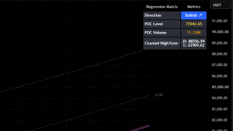
Direction is worked out by comparing where the curve starts against where it ends, and nothing more. So it is entirely possible for the field to still read Bullish while price has already rolled over off a high and started falling. Read the dashboard as a rough regime check, and never call a reversal off it alone (there is a diagram of this in the caveats section).
Why it moves the way it does
Let us go a layer deeper into the logic behind “Polynomial/Linear Regression Volume Profile”. Once this clicks, you can predict what will happen before you touch a setting.
1Fit a single curve through the lookback window
A curve, or a straight line, is fitted through the price action so that the statistical error is as small as possible. That is your baseline. Rather than crawling after price bar by bar the way a moving average does, regression compresses the entire window into one equation. The price input it works from is HL2, the midpoint of the high and low, by default.
2Slice the market into rows by distance from the baseline
The span from the baseline out to ±3 SD gets divided evenly into however many rows you specify. At the default of 20 per side, you end up with a 40-row grid. Each row is 3 SD divided by the row count, an even spacing that is separate from the SD levels.
3Assign every bar’s volume to the row it sat in
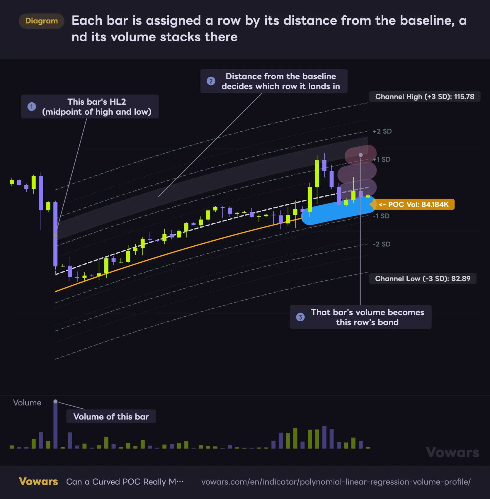
For each candle in the window, the distance from the baseline at that moment gets measured, and that bar’s volume is added to the matching row. With the rows made coarser and one bar in focus, it looks like this.
Each bar is assigned a row by its distance from the baseline, and its volume stacks there
The large first candle sat well above the baseline, so it was assigned to the third row up.
Vowars DE ver.3.9.2
Here one large bar landed in a row that no other bar touched, so its volume alone sets the length of that band. Repeat this across every bar and the stacked result is the curved profile you see. One more detail worth knowing: each band is drawn along the lower edge of its row, not through the middle. If you read a band as a price level, remember it sits half a row below the row’s center.
4Draw the heaviest row as a full-length POC
Once the tally is done, the row holding the most volume is pulled out and drawn as the POC line. Every other row’s length and color are set relative to that maximum, so what you are looking at is always a comparison against the single heaviest row.
Volume from bars that pushed beyond ±3 SD from the baseline lands in no row at all. In other words, the blow-off spikes and capitulation wicks never make it into the profile. That is exactly why the shape of the distribution barely budges even after a violent outlier candle.
How to use it on TradingView
1Add it to your chart
Open the Indicators menu at the top of your TradingView chart and search it by name (as of 2026/9/22). It overlays directly on the candles, so no extra pane gets added.
2Locate where price sits inside the channel
First thing to check is whether price is above or below the baseline, and roughly where it falls between ±1 and ±2 SD. Keep it simple: above the baseline is rich relative to the trend, below it is cheap. Past ±2 SD, call it stretched.
3Find the POC and the heavy bands
Next, trace where the orange POC line runs. If you are in an uptrend with price sitting above it, your first dip-buy candidate is the POC area. Since the POC steps higher as time passes, your reference level refreshes itself session after session, which is genuinely handy.
4Treat the thin bands as pass-through zones
Rows with short, dull bands are deviation zones the market blew straight through without much trade. Price tends not to stall there, and can run all the way to the next heavy band. Scan it as high-volume nodes for resistance, low-volume nodes for travel, and it becomes easy to work with.
5Confirm with something else before you pull the trigger
“Polynomial/Linear Regression Volume Profile” ships with no signal arrows and no alerts. It is a context and target-mapping tool, full stop, so your actual entry trigger has to come from price action or another indicator.
Where it works and where it struggles
Where it earns its place
- Sustained directional trends, where dip and rally levels become obvious
- Temporary overextension inside a trend, fading a tag of ±2 to ±3 SD
- Breaks out of a heavy node into thin air, for gauging how far price can run
- Timeframes with enough data behind them, like daily and 4H
Where it falls short
- Tight, directionless chop, where the curve flattens and the edge evaporates
- Right after a violent one-way break, since outliers never reach the profile
- Symbols and timeframes with thin or unreliable volume data
- Scrolling back to review past price action, which needs Bar Replay instead
Testing it on Bitcoin, the baseline and POC do a clean job of guiding dip entries through the big daily uptrends. Get into one of those multi-week grinds with no direction, though, and the curve goes flat while one fat band parks itself right through the middle of the channel. Accepting that it is basically just an average line in chop will save you a lot of frustration.
Every setting, and what to do with it
The settings panel is grouped, running top to bottom as Core Settings, Grid & Profile Settings, POC Settings, Standard Deviation Levels, Volume Profile Gradient Colors and Style & UI Settings.
| Setting | Default | Suggested | Effect |
|---|---|---|---|
| Source | HL2 | HL2 or Close | The price input the regression is built from. HL2 sits midway between the high and the low, so wick spikes get averaged out and the curve comes out smoother. Switch to Close if you want everything anchored to closing prices |
| Period | 200 | 100 to 300 | The lookback the regression is fitted to. Longer gives a broader, smoother curve; shorter makes the curve react hard to recent price action |
| Regression Mode | Polynomial | Polynomial to see the market bend, Linear for a clean trend angle | Switches the baseline between a curve and a straight line. The curve captures acceleration and slowdown, while the straight line keeps your read simple and steady |
| Grid Rows Each Side | 20 | 15 to 25 | How many rows get carved out above and below. More rows means a finer volume distribution and a tighter POC, but the bands turn thin and crowded |
| Max Profile Width (% of Period) | 20 | 15 to 30 | How far left the profile bands can stretch at maximum. Larger makes the volume differences easier to read, but push it too far and your candles vanish behind it |
| Show POC Line | On (orange, width 2) | On | Toggles the line running through the heaviest volume row. This is the heart of the tool, so leave it on |
| Show SD Levels | On | On | Toggles the plus and minus 1, 2 and 3 SD lines along with their labels. If the chart feels too busy, killing this cleans it up instantly |
| SD Line Style | Dashed | Dashed | Line pattern for the SD lines. Dashed keeps them easy to tell apart from the baseline and the grid |
| SD Line Width | 1 | 1 to 2 | Thickness of the SD lines. Bump it to 2 if the SD bands are central to how you trade it |
| Bullish/Bearish | Blue and orange | Your call | Colors for up and down trends. They feed the dashboard background as well as the color of the heavy volume bands |
| Low Volume | Muted red, semi-transparent | Something close to your chart background | Color for the thin volume bands. Picking a shade that melts into the background makes the heavy nodes pop |
| Baseline Style | Dashed | Solid | Line pattern for the baseline. Solid reads better if you lean on the baseline as a hard reference |
| Grid Lines Style | Dotted | Dotted | Line pattern for the grid. They are already faint, so dotted is fine as is |
| POC Line Style | Solid | Solid | Line pattern for the POC. It is the most important line on the chart, so keep it solid |
| Dashboard Size | Normal | Small on phones and tight screens, otherwise Normal | Text size of the top-right dashboard. Drop to Small if it starts eating your screen |
Hover over the color settings and a tooltip pops up, but the one for Bullish/Bearish calls it the color for low-volume rows, and the one for Low Volume calls it the color for mid-volume rows. Neither matches what they actually do. In practice, Bullish/Bearish colors the heavy volume bands and the dashboard, and Low Volume colors the thin bands. Go by the roles in the table above when you change them.
What happens to the baseline when you switch Regression Mode?
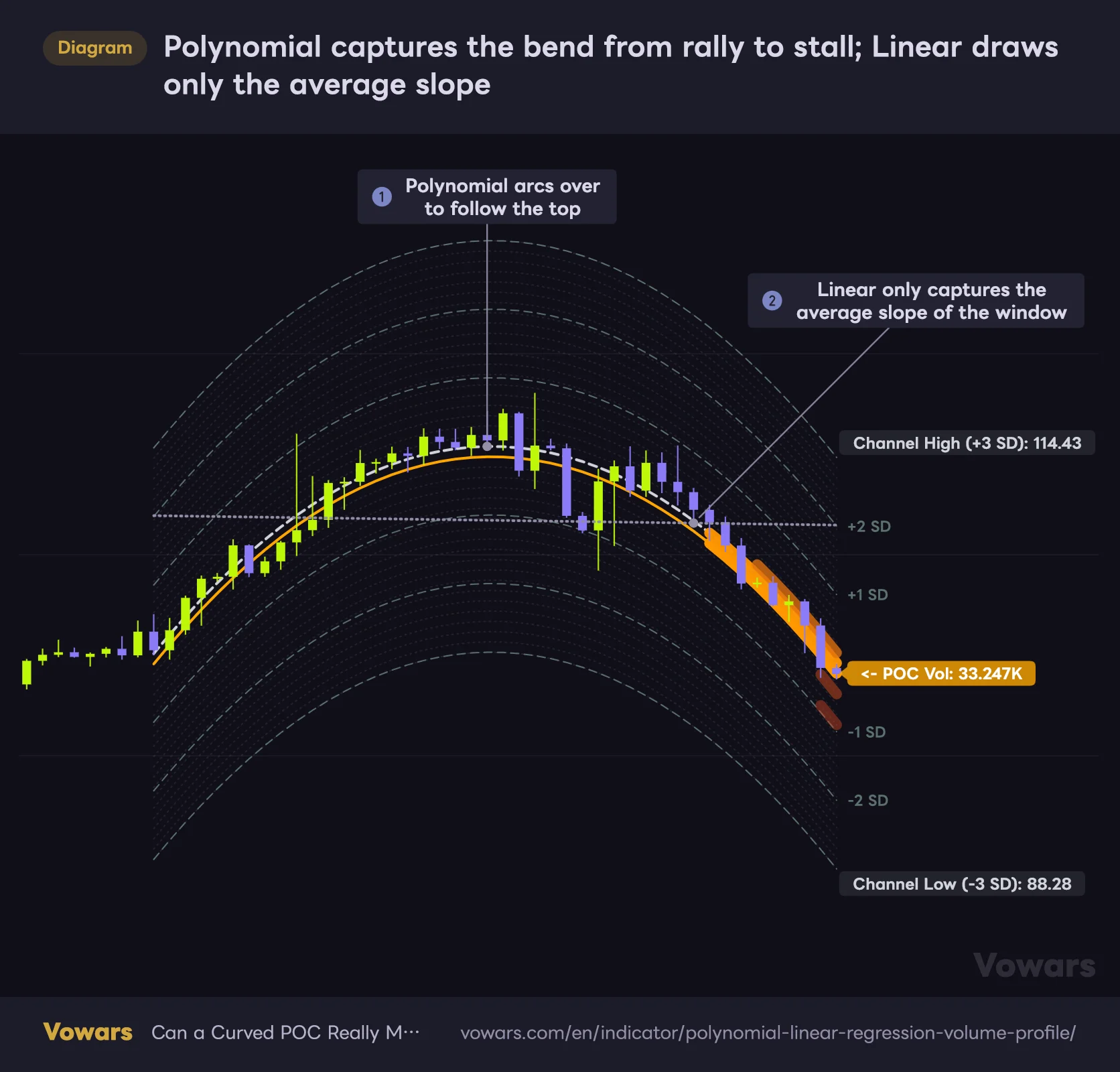
Regression Mode changes the look more than any other setting. The difference is obvious on a market that rallies, tops out and turns lower.
Polynomial captures the bend from rally to stall; Linear draws only the average slope
The white dashed line is the Polynomial baseline (default). The gray dotted line is what the baseline becomes with Regression Mode set to Linear over the same window.
Vowars DE ver.3.9.2
Polynomial arcs over to follow the top, so you can read straight off the curve that momentum has stalled and the market has started rolling downhill. Linear only carries the average slope of the whole window, which in this example leaves an almost flat line, and the recent drop just shows up as price sitting under the baseline. Polynomial when you want to see the bend, Linear when you just want the trend angle is the split that felt right to me.
Setups worth copying
Honestly, only three settings are worth your time: Period, Regression Mode and Grid Rows Each Side. Move those to suit your goal and the whole picture changes.
| Use case | Period | Regression Mode | Grid Rows Each Side |
|---|---|---|---|
| Short-term and swing dip buying | 80 to 120 | Polynomial | 20 to 25 |
| Mid to long-term market context | 250 to 400 | Linear | 15 to 20 |
| Cutting noise to see only the big nodes | Around 200 | Linear | 8 to 12 |
Shorten Period and the curve starts weaving around every recent swing; lengthen it and it picks up only the broad flow of the market. On Bitcoin daily, the default of 200 covers a bit over half a year, so picking a length that contains roughly one full cycle tends to produce a shape that actually makes sense.
Dropping Grid Rows Each Side thickens each row and makes the major clusters easier to spot, and the bands automatically get thicker to match. Pushing it too high does the opposite: the bands get thin, legibility suffers, and with that much being drawn some lines can stop rendering altogether. Err on the conservative side here.
This one calculates across roughly the last 500 bars. Set a lookback well beyond that and it will not render correctly, so keep Period at 500 or below no matter how long you want to go.
Strengths and weaknesses after using it
What you can lean on
- Dip and rally references travel with the trend, which beats a static horizontal line
- Trend, overextension and volume skew all readable from one overlay
- The ±3 SD bounds print actual prices, making targets and risk easy to size
- Curve or straight line, so you can match it to how the market is behaving
- Color plus band length communicates volume density at a glance
What to watch out for
- No signals and no alerts, so it never closes out a decision on its own
- Everything redraws off the latest bar, so reviewing the past means working through Bar Replay by hand
- Change the period and the shape shifts hard, which invites hindsight bias
- Defaults throw a lot of lines up and clutter the chart
- Very little edge in range-bound conditions
What to know before you rely on it
Everything redraws off the most recent bar
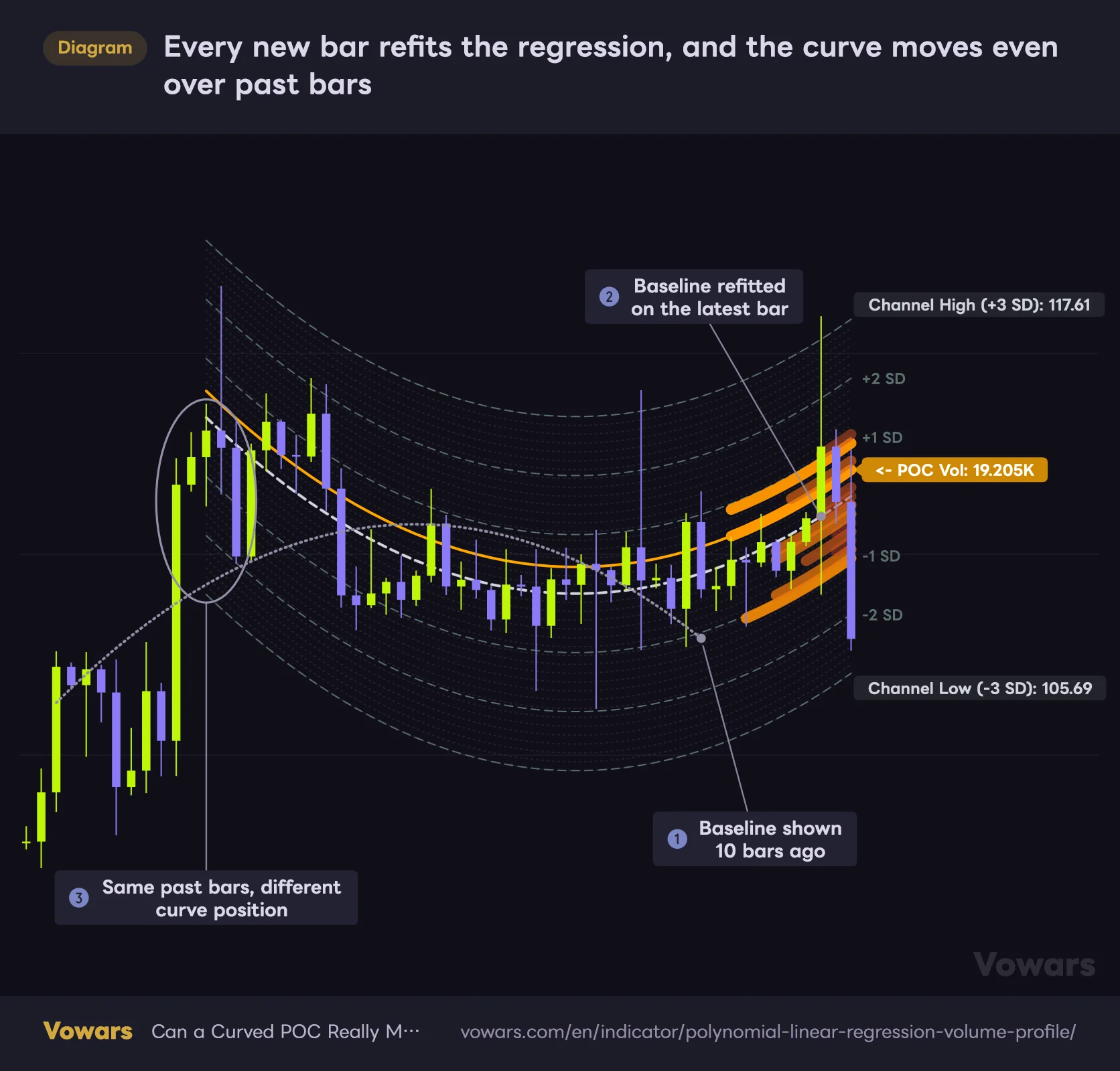
This is the big one. The baseline, grid, SD lines, profile and POC in “Polynomial/Linear Regression Volume Profile” are all rebuilt together against the latest bar. Every time a new candle closes, the regression is refitted, which means the curve you looked at yesterday is subtly, and occasionally dramatically, different from today’s. Here is how much it can move, with the baseline from 10 bars earlier overlaid.
Every new bar refits the regression, and the curve moves even over past bars
The white dashed line is the baseline refitted on the latest bar; the gray dotted line is the one that was on screen 10 bars ago.
Vowars DE ver.3.9.2
In just 10 bars, an arch turned into a bowl. And because the end of the window dropped below its start, the bands flipped from blue to orange. The first time I saw this I honestly did a double take at the past section of the curve moving too, but when one equation is fitted across the whole window, this comes with the territory.
Simply scrolling left will not reproduce what was on screen back then. That clean bounce off the POC you are looking at in hindsight may well have had the POC sitting somewhere else entirely in real time. When you want to verify how it behaved at a given moment, use Bar Replay. The whole thing redraws against the replay bar, so you get the exact shape that was visible at the time. Just be aware it is manual work one candle at a time, and how far back you can go depends on your timeframe and plan.
Worth adding that since there are no signal arrows to begin with, repainting in the sense of markers disappearing or shifting after the fact simply does not happen here. What does keep updating, as covered above, is the shape of the channel and the profile.
Direction is not a reversal signal
The Direction field and the band color both come from comparing the height of the curve at the start of the window against the end. That means they can sit on Bullish for a while after price has already topped and started sliding.
Direction only compares the start and end of the baseline, so it can stay Bullish after the curve turns down
The baseline is clearly pointing down, yet the end sits above the start, so the read stays Bullish.

Vowars DE ver.3.9.2
The baseline in the diagram is clearly pointing down, yet the end is still above the start, so the read stays bullish. It simply does not look at which way the curve is heading right now. Call reversals off price action and other tools, never off this field.
The POC is a magnet, not a wall
High-volume levels pull price toward them, sure, but a market with momentum behind it will slice straight through. Treating the POC as a line price must respect is how traders end up fading a trend over and over. Read it as a level where a reaction is likely, then wait for the candles to confirm before you act.
It can weigh your chart down
Redrawing that many curves every time takes a toll, and depending on your setup things can start to feel sluggish. Rather than stacking it alongside a pile of other heavy scripts, build around it and keep your supporting tools few and lightweight.
What to pair it with
“Polynomial/Linear Regression Volume Profile” handles context, so the natural move is to pair it with something that handles timing.
| Pair it with | What you get |
|---|---|
| RSI or Stochastics | When price reaches the POC or ±2 SD, check whether the oscillator is turning at the same time to sharpen your entries |
| Volume | Watch whether real volume shows up at the moment a heavy band breaks, which separates a genuine break from a fakeout |
| Higher-timeframe levels or a standard volume profile | Where the curved POC overlaps a fixed price level, treat that spot as doubly significant and rank it higher |
| ATR | Compare the ±3 SD channel width against actual realized range to keep stops and targets grounded in reality |
The combination that impressed me most was running it alongside a standard horizontal volume profile. Apply TradingView’s built-in Fixed Range Volume Profile to the same window and you get something like this.
Where the curved POC and the horizontal POC cross, two different reads line up
Orange marks where volume clustered relative to the trend; cyan marks where it clustered in absolute price.

- Curved POC (this indicator)
- Horizontal POC (Fixed Range Volume Profile)
Vowars DE ver.3.9.2
The curved POC gives you fair value within the trend while the horizontal POC gives you fair value in absolute price terms, and where those two cross, price reacts noticeably more often. In the diagram too, price stalls around the crossing, chops for a while, then breaks higher. The horizontal profile has to be redrawn for each window you care about, but the extra step pays for itself.
For traders hunting value inside a trend, backed by volume
“Polynomial/Linear Regression Volume Profile” suits anyone who wants to judge what is rich and what is cheap inside a trend, with volume backing the call. Work purely off horizontal levels and your old POCs get stranded further and further below price during an uptrend until they are useless. Here the POC climbs along with it, and that problem never comes up. For that alone I think it earns a slot on the chart.
On the other hand, if you want clear entry signals or alerts pinging your phone, look elsewhere. Reviewing past behavior is possible through Bar Replay, but it is manual work one candle at a time, so anyone hoping to chew through a large sample quickly will find it tedious. This is a map for reading the chart, not a tool that hands you answers.
A trend follower who wants to pick dips and rallies carefully
Already using volume profiles but frustrated by how they hold up in trending markets
Looking to consolidate down to one main indicator for reading market context
Start by throwing it on the Bitcoin daily at defaults, leave Show SD Levels on, and just watch it for a few days. Once you can feel the difference between price getting drawn into the POC and price sailing right past it, this thing has already become useful to you. From there, start tightening Period around your own trading style.