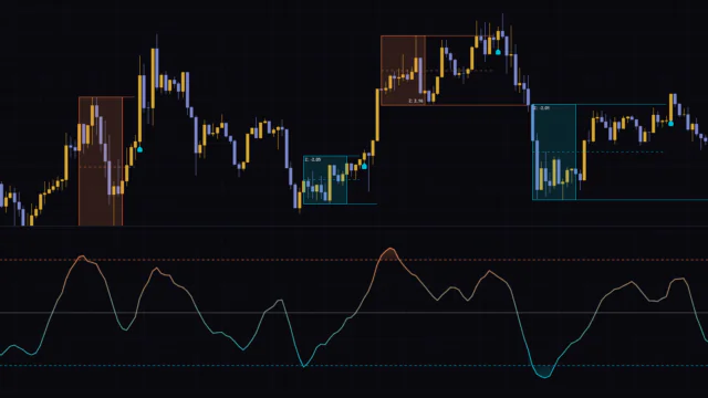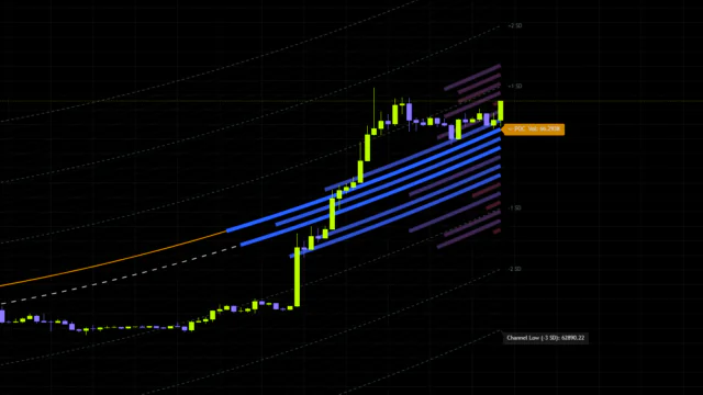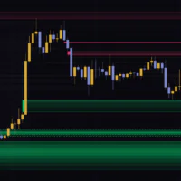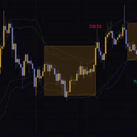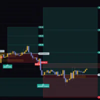


You know that feeling when you drop an SMC indicator on your chart and the screen instantly turns into a wall of boxes, and you have no idea which one actually matters? The indicator we’re looking at today, “Keltner Channel Trend + SMC Liquidity Sweep”, answers that “too much of everything” problem by using volatility as a filter to cut the clutter down.
It’s published by BigBeluga, and just like the name says, it rolls a Keltner Channel and liquidity sweep detection into a single script. I’ve had it running on live charts for a while, so here’s the full rundown: how it draws, how to read the signals, how to set it up, and where it falls short.
So what exactly is “Keltner Channel Trend + SMC Liquidity Sweep”?
In one sentence: it targets only the highs and lows that form where price has already stretched too far, and tells you the moment those levels get hunted.
The name is a mouthful, so it helps to split it in two.
The Keltner Channel Trend half
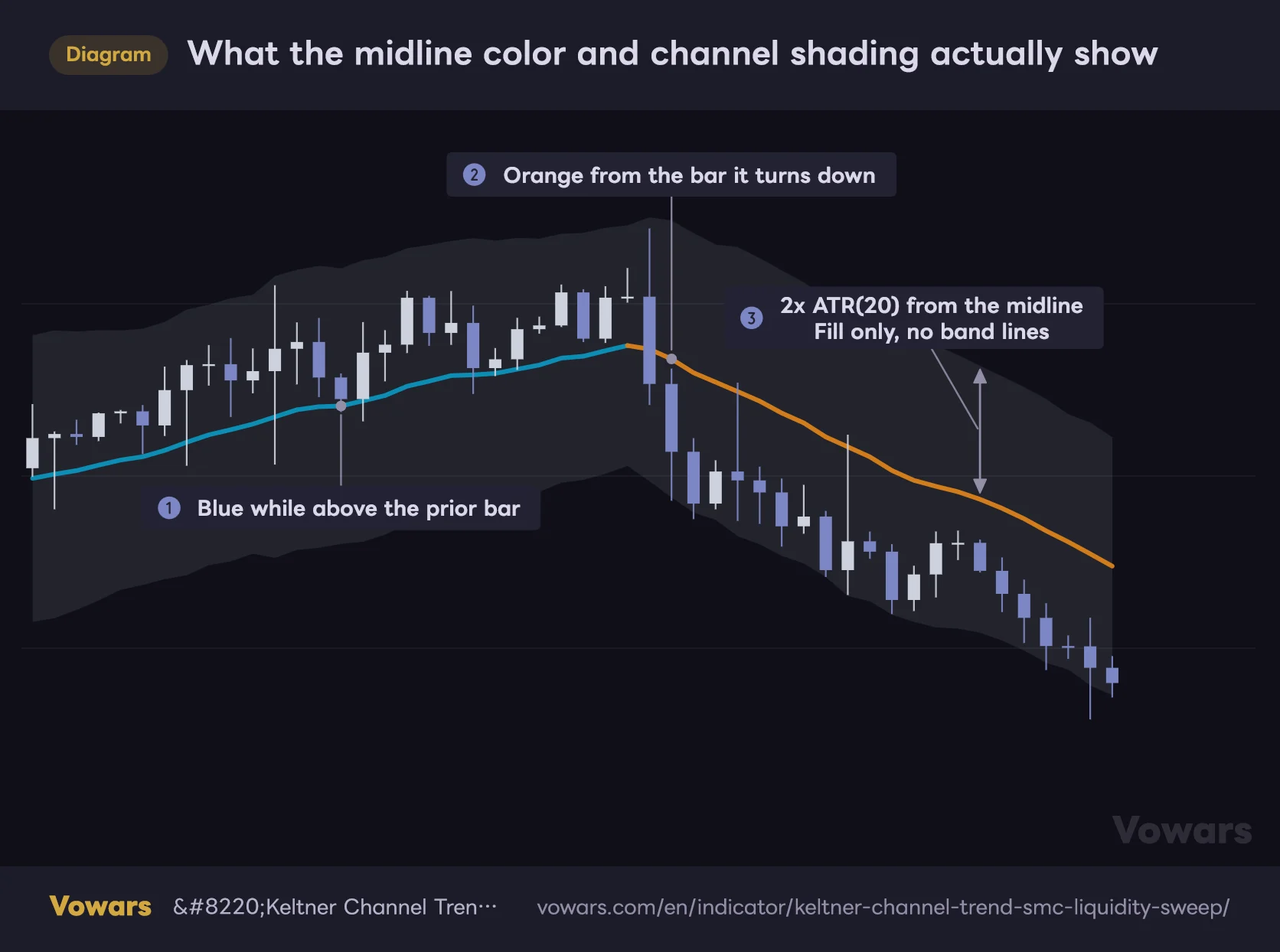
What the midline color and channel shading actually show
The thick midline turns blue when it's higher than the previous bar and orange when it's lower. The band shows only the shading between the upper and lower bands, with no band lines.
Vowars DE ver.3.9.2
A Keltner Channel puts a moving average in the middle and wraps a volatility-based envelope around it. “Keltner Channel Trend + SMC Liquidity Sweep” keeps that structure intact: an EMA down the middle, with ATR-derived bands above and below. The midline changes color depending on its slope, so you can read bullish or bearish bias at a glance.
The SMC Liquidity Sweep half
 Image
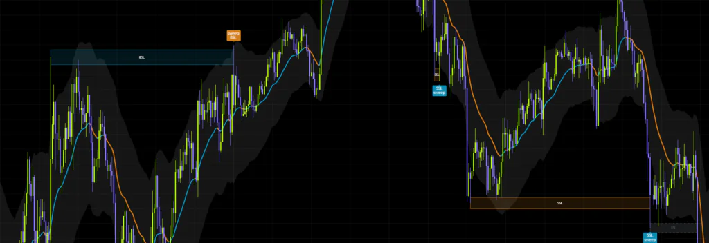
ImageIn Smart Money Concepts, the area above an obvious high and below an obvious low is where other traders’ stop losses and breakout orders pile up. Those pools get called BSL (Buyside Liquidity) on the upside and SSL (Sellside Liquidity) on the downside. The idea is that big players grab that resting order flow first, then move price in the direction they actually wanted. Classic stop hunt behavior.
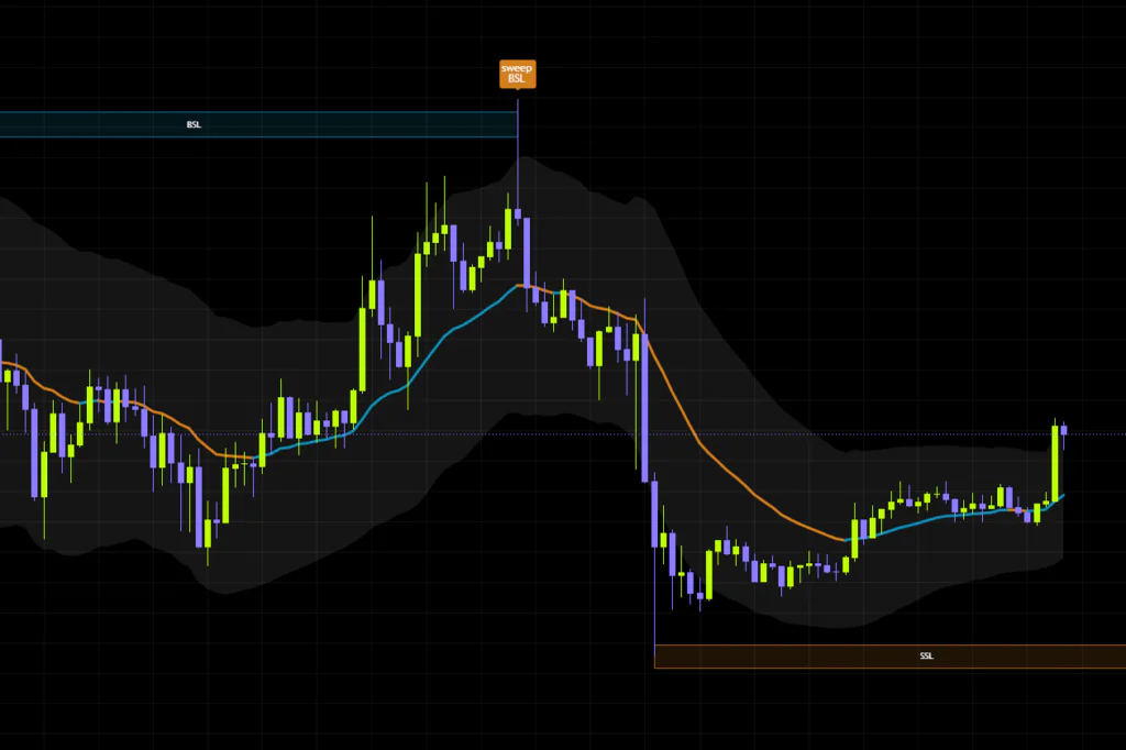
“Keltner Channel Trend + SMC Liquidity Sweep” maps those BSL/SSL pools as boxes automatically, then flags any candle that wicks into one and gets rejected.
There are endless highs and lows on any chart. Turn all of them into zones and the tool becomes useless. So this indicator only accepts swings that poke outside the channel as valid zones. In other words, it hunts liquidity strictly in the spots where price has overextended itself.
The four things it draws on your chart
Once it’s applied, there are basically four visual elements. Get these down and the rest is just reading them in combination.
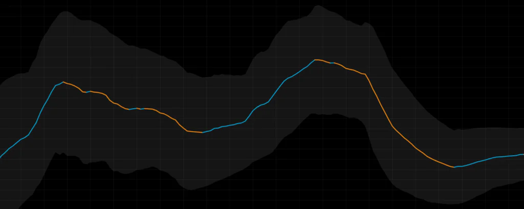
1. The thick midline (trend direction)
That heavy line running through the middle of price is the midline. If it’s ticked up versus the previous bar it flips to the bullish color (blue by default); if it’s ticked down, it goes to the bearish color (orange). The check is purely bar-to-bar, so when price stalls out you’ll see it flicker back and forth between blue and orange. More on that in the caveats section.
2. The faint channel fill
This part is a little unusual. The upper and lower bands aren’t drawn as lines at all — you only see the shading between them. Instead of two crisp lines like Bollinger Bands, you get a soft band hugging price. The fill color is also tied to the chart’s foreground color, so it looks different between light and dark themes.
My first reaction was “wait, where did the band lines go?” But after using it for a while, I get it. With no lines in the way, the candles stay readable and the boxes and labels get to be the main event. Treat the fill as a quick feel for how wild price is right now, judged by area rather than by level, and it works nicely.
3. The BSL / SSL boxes
 Image
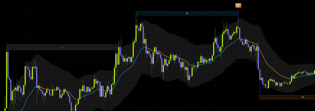
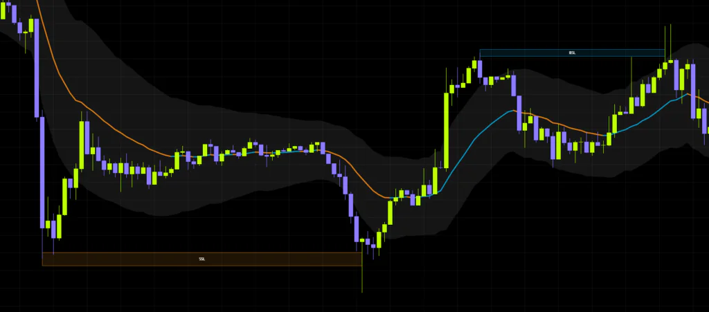
ImageWhen a swing high confirms outside the channel, a horizontal box labeled “BSL” appears straddling that high. On the downside you get an “SSL” box instead. By default BSL is light blue and SSL is orange.
The box keeps extending to the right and stays alive until it gets swept or broken. Its thickness isn’t a fixed pixel height — it scales with volatility, so it renders thicker on choppy, fast-moving markets and thinner on quiet ones. That’s a deliberate hint to treat these as zones with some width, not as pinpoint price levels.
4. The sweep labels
When price only wicks into a box and gets pushed straight back out, a small label prints above or below the candle.
- “SSL sweep” — sellside liquidity got taken. Prints below the candle, a long-side cue
- “sweep BSL” — buyside liquidity got taken. Prints above the candle, a short-side cue
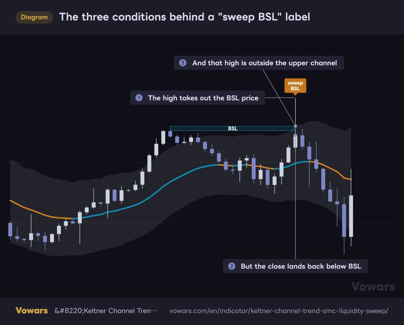
The three conditions behind a "sweep BSL" label
A wick through the level, a close back below it, and a high outside the band. When all three line up, "sweep BSL" prints as the bar closes.
Vowars DE ver.3.9.2
A label only prints when three things line up: a wick through the box’s price, a close back on the inside, and the tip of that wick sitting outside the channel. That third one is easy to miss. A candle that wicks past the BSL price and closes back below it while still inside the band doesn’t get a label.
It doesn’t count as a break either, since the close never got through. So the box just keeps extending to the right. You’ll see a wick sticking straight through a zone that’s still alive, which looks odd at first. Knowing this ahead of time saves you some head-scratching.
The labels render at a very small size. They don’t fire often either, so it’s worth keeping an eye out so you don’t miss one.
Boxes don’t just show up anywhere
This is the part that defines the whole personality of “Keltner Channel Trend + SMC Liquidity Sweep”.
A confirmed swing high or low isn’t enough on its own. At the moment that swing confirms, price also has to be outside the channel — above the upper boundary for highs, below the lower boundary for lows.
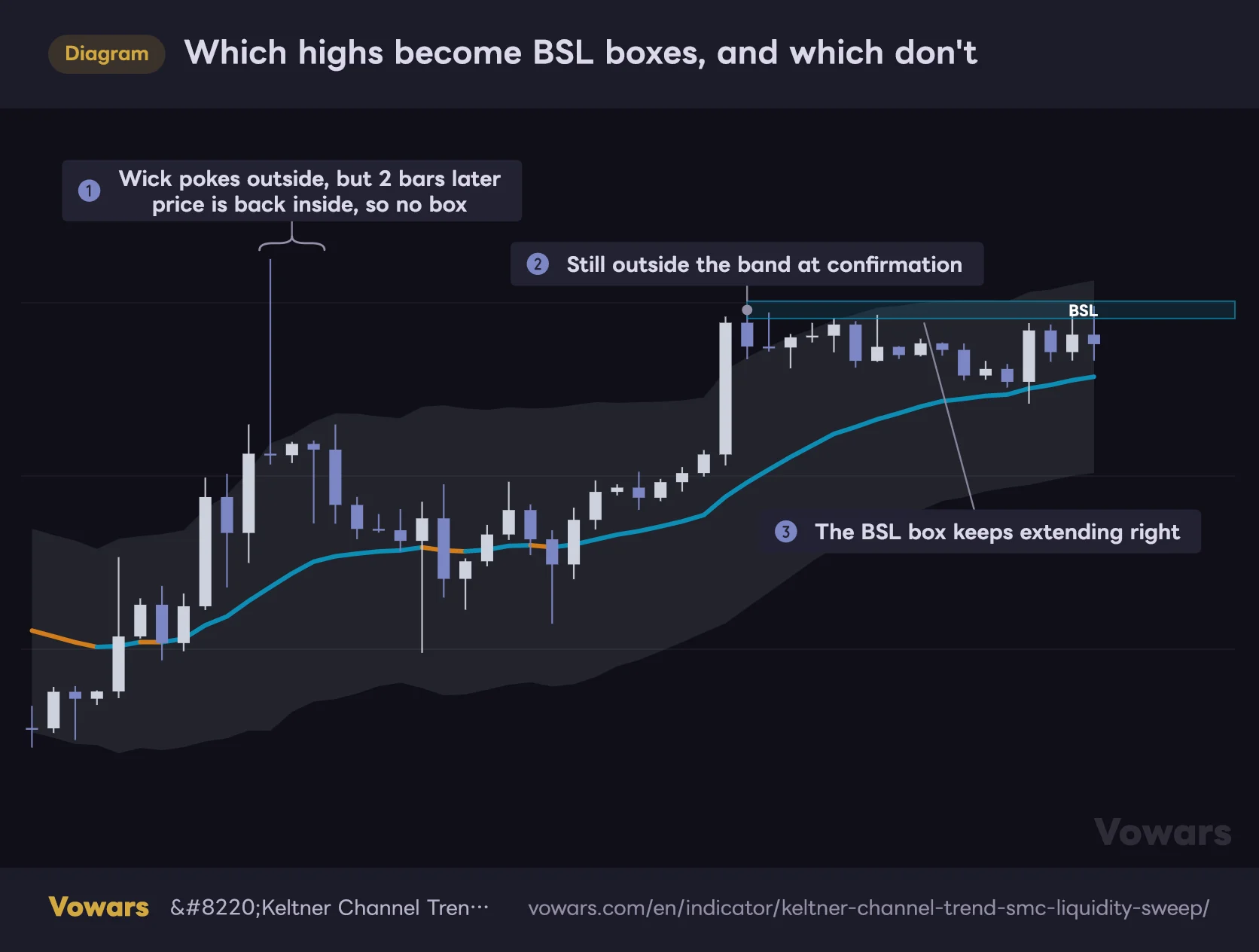
Which highs become BSL boxes, and which don't
What counts isn't the bar that made the high, but the bar two candles later where the swing confirms. Whether that bar is outside the band decides if a box appears.
Vowars DE ver.3.9.2
The price that matters here isn’t from the bar that made the high. It’s from the bar where the swing confirms (two bars later by default). As ① in the figure shows, even if the high itself spikes well outside the band, no box is created if price is back inside by the time the swing confirms. Quick spikes that pierce the band and snap right back tend not to get picked up. Keep that in mind and the chart makes a lot more sense.
Which means the highs and lows formed while price chops around inside the channel get ignored entirely. I watched it on the BTC 15-minute for a while, and during quiet stretches almost no boxes print at all. Then after a strong impulse, a box lands cleanly right on the extreme. That “not noisy” quality is honestly rare for an SMC tool.
Swing detection is governed by how many candles are required on either side of the pivot. The defaults are 5 to the left and 2 to the right. Because the right side is only 2 bars, a peak or trough is confirmed just two candles after it forms. Boxes appear fast as a result, but smaller pivots get picked up as well.
The four ways a box can end
Every box that prints eventually meets one of four fates. Understanding this branching is what separates someone who actually uses this tool from someone who just has it on their chart.
| Box state | What happened | How it looks on the chart | How to read it |
|---|---|---|---|
| Still extending right | Neither a sweep nor a break has happened yet | Stays colored, keeps stretching to the right | A potential target price may get drawn toward |
| Swept | A wick took it out but the close came back | Extension stops on that bar, sweep label prints | Possible reversal origin. A fade signal |
| Broken by the body | The candle closed on the far side of the zone | Turns into a gray dashed box. No label prints | Break confirmed. Watch for continuation that way |
| Replaced | A newer swing confirmed outside the channel | The old box disappears, a new one takes its place | Target updated. The previous zone is void |
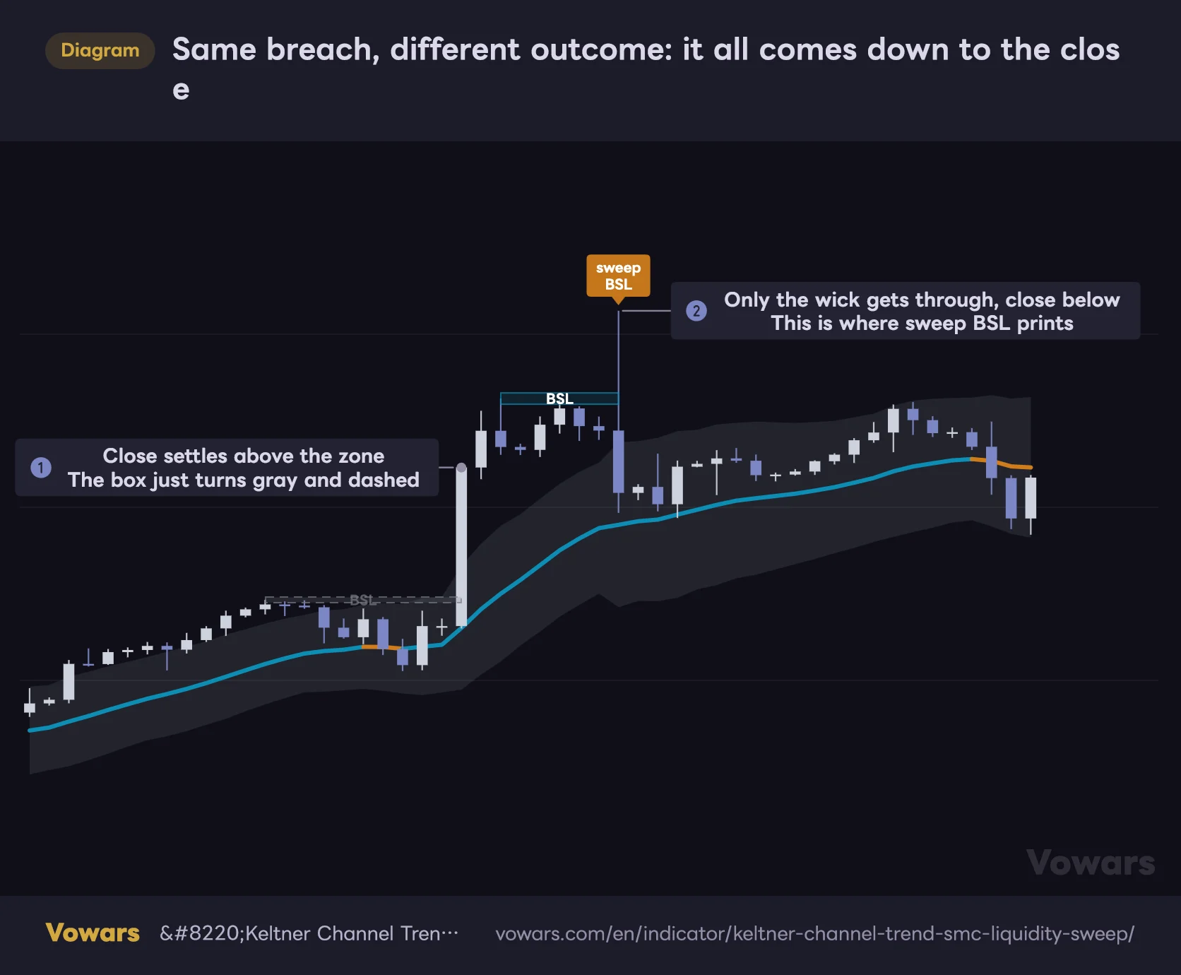
The difference between the second and third rows is the one that really matters. Both involve price going through the box, but if the close gets rejected you get a signal, and if it doesn’t you just get a grayed-out box and nothing else. The line between them is clean, with zero room for interpretation.
Same breach, different outcome: it all comes down to the close
On the left, the candle closes above the zone. On the right, only the wick gets through. Only the right one produces a signal.
Vowars DE ver.3.9.2
Personally, the gray dashed treatment on broken boxes is my favorite touch. The box doesn’t vanish — it loses its color and stays behind as a footprint. That leaves “this price area has already been dealt with” on the chart, so you can follow the story when you scroll back later.
How to actually trade it
Here’s the order of operations once you’ve got it up on a TradingView chart.
1Check the midline color first to see which side you’re on
Don’t go hunting for boxes straight away — look at the midline first. Bullish color holding means bullish bias, bearish color holding means bearish bias. Sweep signals that fight that direction tend to be noise, at least in my experience.
So if the midline has been holding its bearish color and a “sweep BSL” (short cue) prints, that reads cleanly as a sell-the-rally spot. On the flip side, buying purely off an “SSL sweep” in the middle of a hard downtrend is usually just catching a falling knife.
2Map where the live boxes are sitting
Any box still colored and still extending is untouched liquidity. File it away as “a place price might get pulled toward.” If you’re already in a position, it doubles as a take-profit target.
When there’s a BSL box sitting overhead, I like to scale out of longs just short of that zone. Given how often price pokes in and gets rejected, a limit slightly in front of the zone fills a lot more reliably than one parked right on top of it.
3Wait for the sweep label to actually print
Labels only appear once the candle closes. A wick stretching out on a live candle means nothing unless the close comes back. So by the time a label shows up, that candle is already finished. The earliest you can enter is the open of the next bar.
This takes some getting used to. It’s tempting to front-run it — “the wick’s coming back, this one’s going to fire” — but jumping in before the close burned me more than once, with price pushing through in the last few seconds and no signal ever printing.
4Stop beyond the wick, target the opposite zone
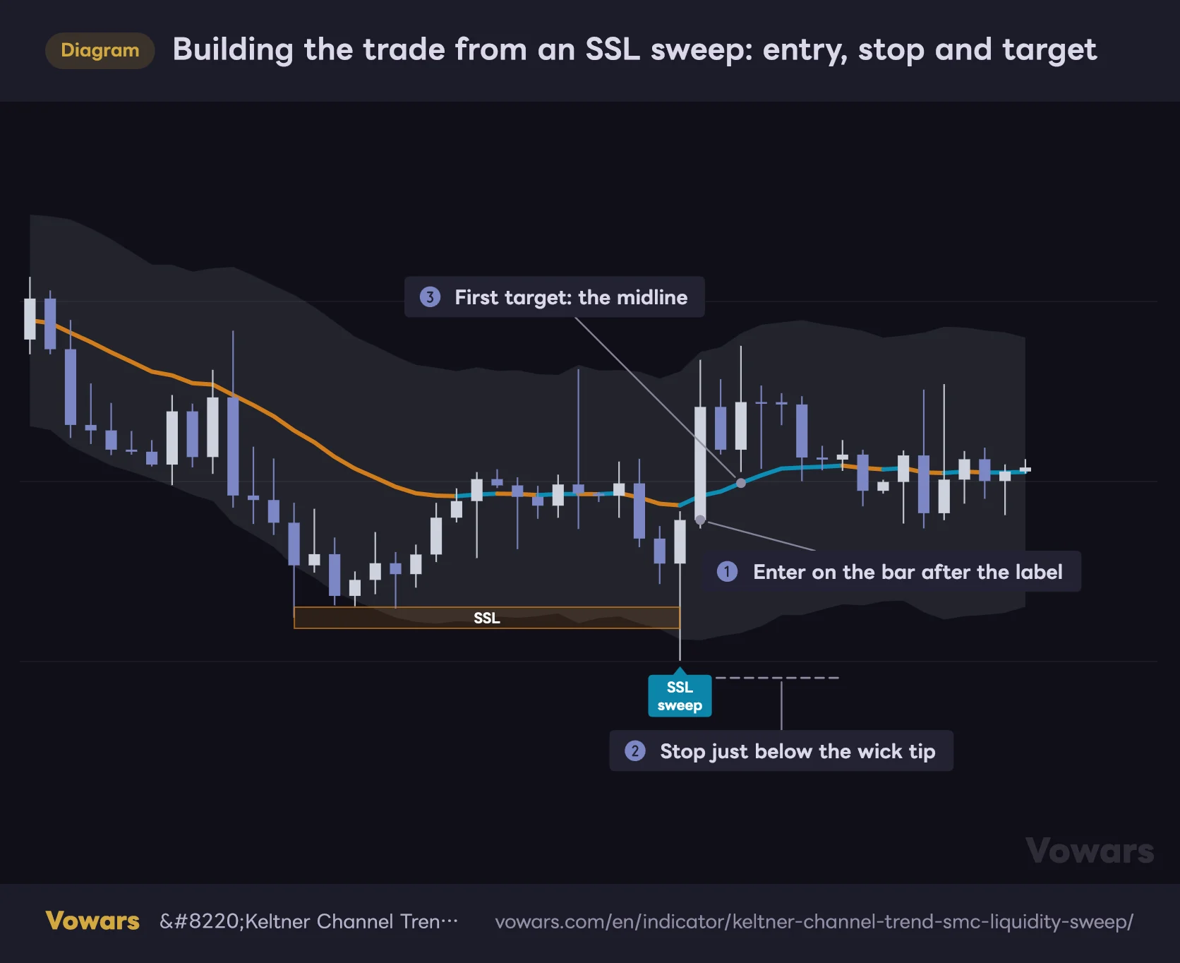
The nice thing about trading sweeps is that stop placement is obvious. Buying an “SSL sweep”? Put the stop just under the wick of that candle. If price takes out the wick that did the hunting, the whole premise is dead.
For targets, use whatever box is still alive on the other side, or the retrace back to the midline. The midline is drawn thick, which makes it a very easy target to eyeball.
Building the trade from an SSL sweep: entry, stop and target
Labels print only after the bar closes, so the earliest entry is the next candle. The natural stop sits just past the wick that went hunting for liquidity.
Vowars DE ver.3.9.2
The expectancy goes up when a sweep label lands on a higher-timeframe support or resistance, or in a high-volume node from earlier price action. Filtering for spots where something else lines up, instead of taking every “wick got rejected,” visibly changes the quality of your signals.
Settings and what I’d recommend
The surprise when you open the settings panel: there are only four numeric inputs. Everything else is color. Fewer knobs to turn means fewer ways to talk yourself in circles, which I appreciate.
| Parameter | Default | Suggested | Effect |
|---|---|---|---|
| KC Length | 20 | 20–34 | Lookback for the midline and the channel width. Raising it smooths the midline and cuts down on color flipping. It also stabilizes the width, so only swings that genuinely overextended get turned into boxes |
| KC Multiplier | 2.0 | 2.0–2.5 | How wide the channel sits. Higher values widen the band, fewer swings land outside it, so you get fewer boxes and fewer signals. Lower values tighten it, producing more boxes and faster reactions |
| Swing Left Bars | 5 | 5–8 | Bars required to the left of a high or low. Raising it filters out minor peaks and troughs, leaving only the more prominent swings as zone candidates |
| Swing Right Bars | 2 | 2–3 | Bars required to the right of a high or low. Lower values print boxes sooner but make them more likely to be replaced right after. Higher values confirm later with better accuracy |
On the color inputs
The color options are split into three groups. The defaults are perfectly readable, so I left them alone at first. Worth changing only if they clash with something else you have loaded.
| Group | Input | What it controls |
|---|---|---|
| Color Customization | BSL Border / Fill / Text Color | Border, fill and text of buyside liquidity zones |
| Color Customization | SSL Border / Fill / Text Color | Border, fill and text of sellside liquidity zones |
| Color Customization | Midline Trend Up / Down Color | Midline color when it’s sloping up or down |
| Signal Customization | Buy / Sell Label BG and Text Color | Background and text color of the sweep labels |
Tuning it for how you trade
I gave you numbers above, but what matters is understanding why you’d push a setting one way or the other.
If you want more signals or you’re trading fast
Dropping KC Multiplier to somewhere around 1.5–1.8 tightens the channel, making it easier for swings to land outside it. More boxes, more sweep opportunities. This is the adjustment for when you’re scalping the 5-minute or 1-minute and feel starved of signals. Just know that a tighter band turns every minor wobble into a zone, so the fakeout rate climbs for sure.
If you want less noise and only the best setups
Go the other way: push KC Multiplier to 2.5–3.0 and stretch Swing Left Bars out to around 8. Now you’re left with only the clean, obvious peaks and troughs that formed in overextended territory. If you’re scouting swing entries on the 4-hour or daily, filtering this hard makes the decisions much easier. It won’t satisfy anyone who wants signals several times a day, but that was never what this tool was built for.
If you want the midline as a trend filter
Stretch KC Length out to 34 or 50. The longer the lookback, the more stable the midline slope, so you get less color flipping and a cleaner read on bias. The trade-off is that the channel width uses the same lookback, so the band reacts more slowly and boxes print less often. Think of this setting as prioritizing “don’t get the direction wrong” over “catch every signal.”
Where it shines, and where it struggles
Conditions where it works
- Volatile conditions where price actually extends past the channel
- Buying dips and selling rallies inside an established trend
- Calling exhaustion at the tail end of a sharp move up or down
- The settling-down phase right after news or a major event whipsaws price
- Instruments like Bitcoin or gold that run hard and retrace cleanly
Conditions where it doesn’t
- Long stretches of tight, narrow-range consolidation (no boxes print at all)
- Strong one-way trends that step higher relentlessly (sweeps become fade traps)
- Thin, illiquid instruments and wick-heavy dead hours
- Gap-prone stocks and ETFs where price jumps clean over a zone
What felt like the best fit in practice was deep, 24-hour markets. Bitcoin obviously, but also gold and the major index futures — anything with sustained volatility keeps the zones refreshing at a sensible pace.
On thin, low-volume instruments, though, I had boxes built off a single freak wick that then did absolutely nothing afterward. The “outside the channel” rule is a smart way to gauge overextension, but it can’t help picking up one-off outliers along with it.
Pros and cons
Pros
- Zones are restricted to outside the channel, so the chart never gets cluttered
- Signals only fire on closed candles, so nothing blinks in and out
- Sweeps and breaks are handled separately, which makes the read unambiguous
- Box thickness scales itself to current volatility
- Only four numeric inputs, and it’s usable straight out of the box
- Trend direction, zones and signals all come from a single script
Cons
- Only one live zone above and one below, so layered liquidity can’t be tracked
- No built-in alert conditions
- Midline color is decided bar by bar, so it flips constantly when price stalls
- No distinction between a weak sweep and a violent rejection
- No higher-timeframe read, so you have to supply the market context yourself
- Because the candle is already closed when the signal fires, your entry price is often worse
Things worth knowing before you run it
Boxes can appear and disappear on the live candle
This is something I noticed while actually watching it. Swing detection includes the currently forming candle, so a box can print before the bar closes and then vanish once subsequent price action stops meeting the condition. Watching live, I had a “there’s the BSL” moment followed immediately by it disappearing, which threw me for a second.
Flip that around and it means any box still standing after the candle closes can be treated as settled information. Don’t rush, wait one bar. That’s the whole fix.
The boxes wobble while a bar is forming, but the sweep label logic requires a confirmed close, so a label that has printed will never disappear later. When you scroll back and see “a signal fired here,” you can trust it fired at that same moment in real time. This is one of the genuinely dependable parts of the tool.
Why historical charts look better than reality
Scroll back through the history and you’ll find plenty of picture-perfect sequences: box prints, liquidity gets taken, price reverses. There’s a catch, though.
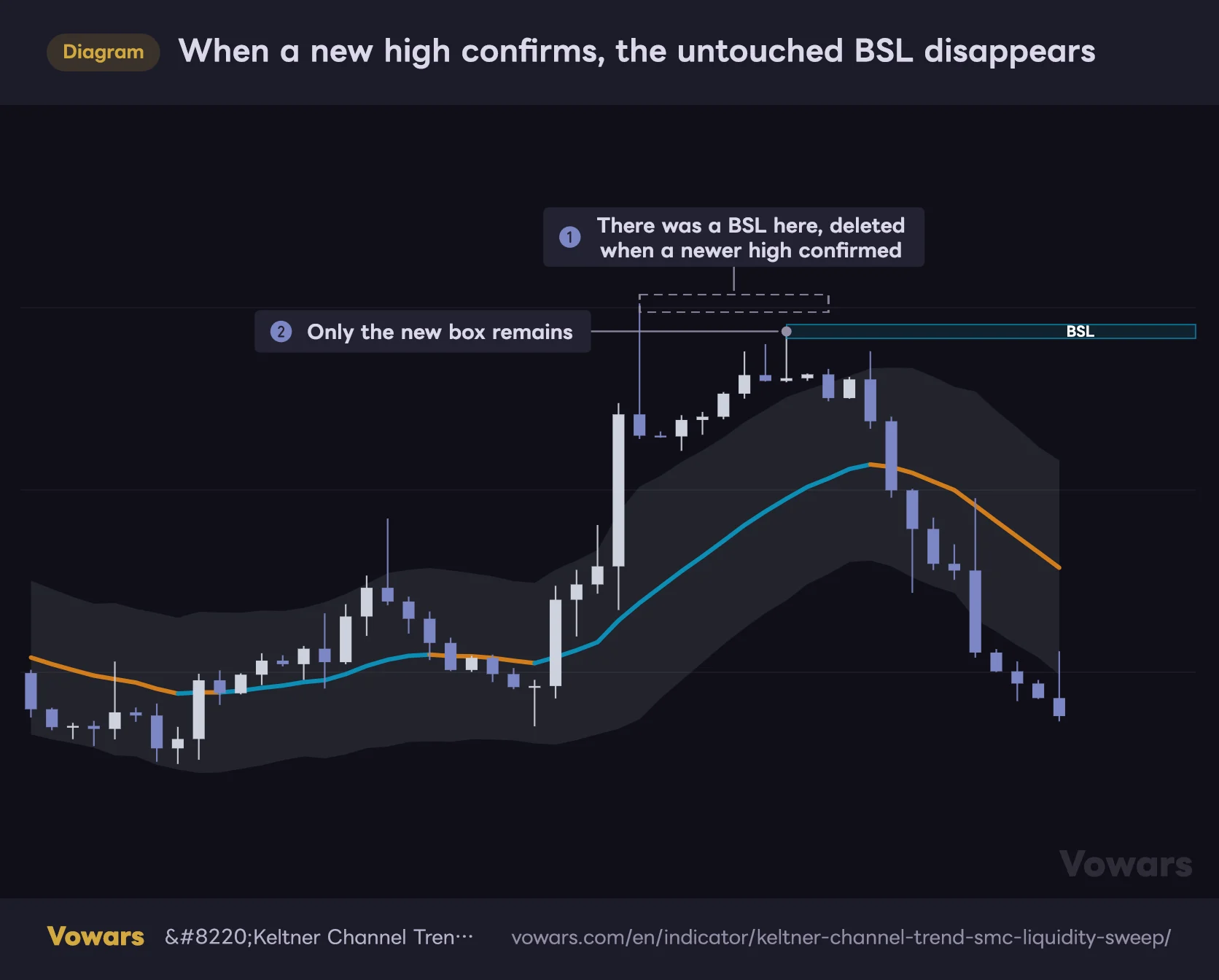
When a newer swing confirms, any older box that was never touched is deleted from the chart entirely. Zones that quietly expired without price ever reaching them leave no record behind. So what survives in the history is only the ones that actually got swept, the ones that actually got broken, and the ones still live right now. With all the zones that never worked invisible, the past looks a lot tidier than the tool really is.
When a new high confirms, the untouched BSL disappears
The dashed outline is added to show where the vanished box used to be. On the real chart, nothing is left behind.
Vowars DE ver.3.9.2
As the figure shows, it’s always the older box that goes, no matter which one sits higher. Even if an untouched BSL is parked further up, a lower swing high that later confirms outside the band replaces it, and the upper box vanishes. The most obvious high on the chart can drop off the screen this way, so it’s worth marking major highs with your own horizontal lines.
Keep this front of mind if you’re eyeballing historical charts to judge signal quality. My own first pass through the history had me thinking “this looks seriously good,” but following it live, there were plenty of stretches where boxes just appeared and vanished over and over.
If you want a fair read, step through it with TradingView’s Bar Replay. The indicator recalculates bar by bar during replay, so you can see exactly what was on screen at each point, including boxes that later disappeared.
A sweep is not a confirmed reversal
All the label tells you is “price went through the zone intrabar, but the close came back.” It is not a guarantee that a reversal has begun.
In the middle of a strong trend especially, it’s completely normal for price to get wicked back once and then break through properly on the next attempt. Fade that signal and you’re stopped out on the following bar. Safer to give yourself a rule: skip any signal that fights the midline color or the higher-timeframe direction.
“Keltner Channel Trend + SMC Liquidity Sweep” is an indicator that hands you a trigger, not one that guarantees direction. Avoid running it mechanically — label prints, therefore buy or sell — and always pair it with your own higher-timeframe read of the market.
You’ll have to build your own alerts
There are no pre-built alert conditions for the signals. If you don’t want to miss a label, you either sit on the chart or set up your own condition through TradingView’s alert dialog. For anyone who can’t watch charts all day, that’s a quietly annoying limitation.
Midline color comes from one bar’s slope, nothing more
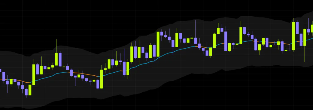
The midline’s coloring is a simple check of whether it’s higher or lower than the previous bar. That’s why it switches so frequently when price goes sideways. The trick is to judge by whether several bars in a row are pointing the same way, and not to react to a single bar flipping color.
One thing worth flagging: the author’s description suggests using the midline to line up with the higher-timeframe trend, but the midline is simply an EMA calculated on whatever timeframe you’re viewing. If you want the higher-timeframe direction, you’ll need to check it separately, for example with an HTF moving average. The description also mentions trend continuation triggers, but no such label ever prints. When price closes through a zone, the box just turns into a gray dashed outline. And while the author describes the sweeps it detects as “high-probability,” no test results are provided to back that up.
What to pair it with
Since it gives you no market context on its own, the default plan is to pair it with something that fills that gap. Here’s what worked best for me.
A higher-timeframe moving average
Easiest and most effective by far. Put a daily or 4-hour moving average on the chart, then only take “SSL sweep” longs while price is above it and only “sweep BSL” shorts while it’s below. Throwing away half the signals noticeably improves the half you keep.
Using a long-term moving average to trade sweeps in one direction
While price holds above the long-term EMA, the bias is bullish. The only setups worth taking are SSL sweeps, where sellside liquidity gets grabbed.
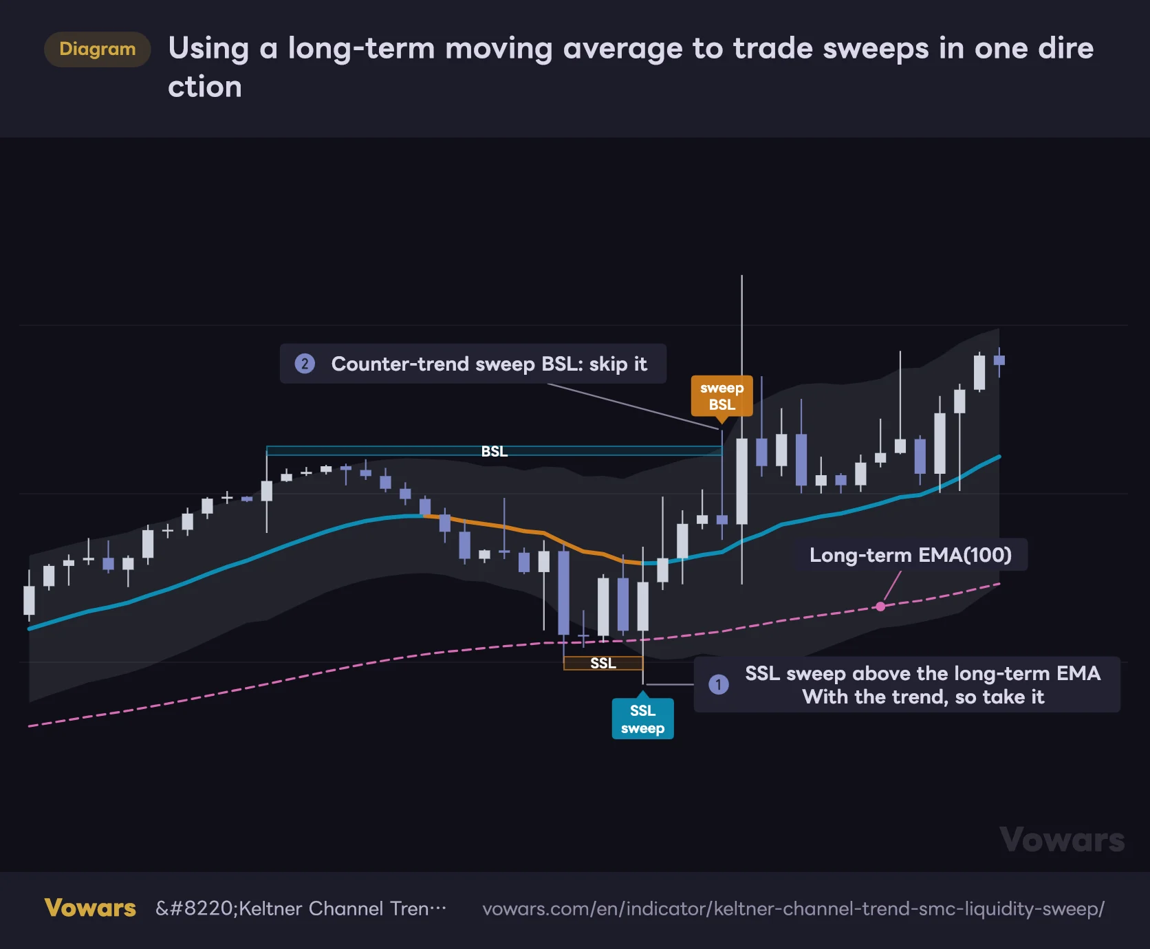
- Long-term EMA(100)
Vowars DE ver.3.9.2
The figure uses a long-term EMA(100) on the same timeframe in place of a higher-timeframe moving average. On a 1-hour chart, for example, a 4-hour EMA25 covers roughly the same span as a 1-hour EMA100, so it works as a directional guide without flipping to another timeframe. Notice how price kept printing new highs after that counter-trend sweep BSL. Simply staying out of shorts in spots like that makes this filter well worth running.
Volume Profile
Whether a sweep happens in a thin volume area or a thick one changes what it means. In my observation, sweeps through low-volume pockets snap back easily, while sweeps into heavy volume tend to turn into a grind.
Oscillators (RSI, Stochastics)
If the oscillator is showing divergence at the moment of the sweep — price makes a new high but the oscillator doesn’t — you’ve got two reasons for the reversal instead of one. This combination worked especially well late in a trend.
What you don’t need alongside it
Bollinger Bands and other ATR-based channel tools do the same job. You just end up with two overlapping envelopes and a messier chart, so pick one or the other.
Who should load “Keltner Channel Trend + SMC Liquidity Sweep”, and who can skip it
Here’s where I land after all of the above.
The single biggest thing this indicator has going for it is the design choice not to try to catch every pool of liquidity. SMC tools tend to compete on how much they can cram onto a chart, but “Keltner Channel Trend + SMC Liquidity Sweep” puts volatility on the door and only lets overextended swings through. Your chart stays readable as a result. That part is genuinely well done.
 Image
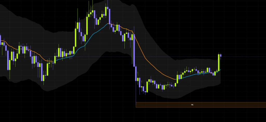
ImageSplitting sweeps and breaks so cleanly — one gets a signal, the other gets grayed out — is easy to follow too. And knowing the labels won’t vanish on you is reassuring.
On the other hand, keeping only one live zone above and one below is arguably too austere. A structure like “three tiers of liquidity stacked overhead” simply can’t be shown. If you want layered liquidity mapping, this will feel thin. The lack of alerts stings as well for anyone who isn’t sitting in front of charts full time.
It suits traders who already have their own way of reading market context and just want a trigger to bolt onto it. It felt like an especially good match for day and swing traders who buy dips and sell rallies. If you’re after one script that makes the entire trade decision for you, look elsewhere.
Start with the defaults on whatever timeframe you normally watch. Get a feel for how often boxes print and where the labels fire first, and only then start moving KC Multiplier up or down. Doing it in that order keeps you from tweaking settings endlessly and losing the plot.
If you want your stop-hunt levels mapped out without trashing your chart, “Keltner Channel Trend + SMC Liquidity Sweep” is well worth a look. I’m keeping it on my layout for a while yet.