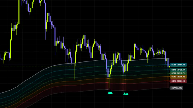


If you trade crypto, you’ve almost certainly run into the term “liquidation heatmap” — those colored bands showing where stops and liquidations are stacked up. The catch is that this kind of data usually means paying for an outside service, and coverage is limited to a handful of symbols. It’s not something you can just pull up on a TradingView chart.
Which brings us to “Whale Liquidity and Absorption Profile”. No liquidation feeds, no order book data — it estimates where liquidity has already been swept using nothing but volume and the shape of candle wicks. It’s a deliberately stripped-back approach, and a clever one.
In this review I ran it live on Bitcoin charts to work out what it actually shows, how it differs from a liquidation heatmap, how to trade with it, and where it falls apart.
What “Whale Liquidity and Absorption Profile” Actually Shows You
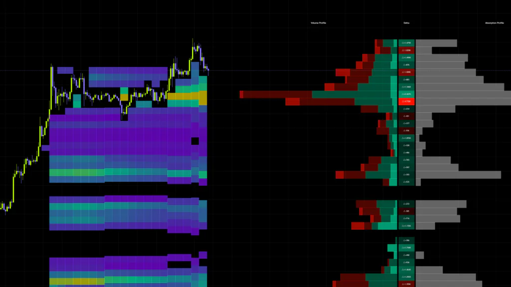
“Whale Liquidity and Absorption Profile” is an indicator published by AlgoAlpha that plots three separate profiles side by side off to the right of your chart.
 Image
ImageBoiled down, it slices recent price action into horizontal price bins and shows you three things at once.
- How much trading happened at each price level (liquidity depth)
- Whether buyers or sellers were driving at that level (directional imbalance)
- How much aggressive order flow got swallowed there (absorption)
That third one is the headline feature. Trades that occur inside a wick get logged separately as orders absorbed by the opposing side, so the levels where price tried to push through and got rejected — the levels where somebody’s orders got eaten — rise to the surface.
How This Differs From a Liquidation Heatmap (Read This First)
Because “Liquidity” is right there in the name, people assume it works like Coinglass or Hyblock. It doesn’t — not even close. Getting this wrong will skew every read you make, so let’s clear it up before anything else.
| Comparison | Typical liquidation heatmap | “Whale Liquidity and Absorption Profile” |
|---|---|---|
| Data source | Exchange open interest and leverage data | Chart volume and price action only |
| Type of liquidity shown | Orders that may still trigger (forward-looking) | Orders already filled and consumed (backward-looking) |
| Symbol coverage | Mostly crypto pairs with data providers | Anything with volume data |
| How you use it | Predicting where price gets hunted next | Confirming where the hunt already happened |
A liquidation heatmap shows you where unfilled orders are sitting. “Whale Liquidity and Absorption Profile” shows you the footprint of liquidity that already got filled and consumed. One is the target, the other is the battlefield after the fact. Same word, opposite direction — keep that straight.
That said, the two complement each other nicely in practice. When price runs into a cluster of liquidations, a huge amount of volume gets transacted right there — and that shows up as heavy absorption on this indicator. In other words, a liquidation heatmap tells you where price might get hunted, while this tells you where the hunt actually played out.
How the Sites of a Liquidity Sweep Stay Visible
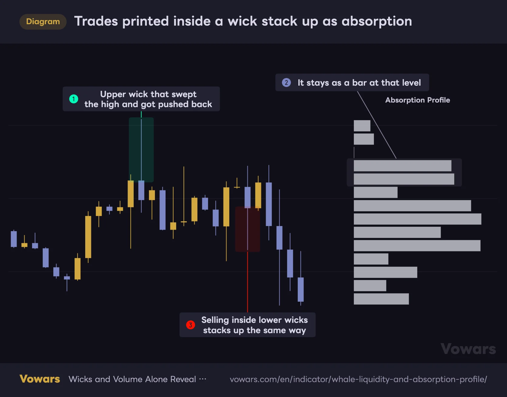
This is probably the question most of you came here with. Short answer: there’s no dedicated detection for “swept the previous high then reversed” patterns. But because of how the math works, levels where a sweep occurred naturally end up as absorption peaks.
The logic is straightforward. When a stop hunt happens, the chart leaves this trail behind.
- Price takes out the previous high, triggering breakout buys and short stops all at once
- Large resting sell limits are sitting there, and every one of those buys gets eaten
- Price gets pushed back down, leaving a long upper wick
“Whale Liquidity and Absorption Profile” counts exactly that — buying that occurred inside the upper wick — as absorption. Same deal for selling inside lower wicks. So even without any sweep detection logic, absorption piles up right where the sweep took place.
Trades printed inside a wick stack up as absorption
Only buying inside upper wicks and selling inside lower wicks stacks up on the profile at right.
Vowars DE ver.3.11.0
Looking at wick length alone, you can’t tell a wick that just happened to stretch from a wick where serious size got eaten. Tying volume to the wick tells you how much actually traded in there, and that’s the whole value proposition. Two wicks can be the same length and mean completely different things.
Breaking Down Everything on the Chart, Piece by Piece
First load is genuinely overwhelming, so let’s go component by component. Start with the overall layout.
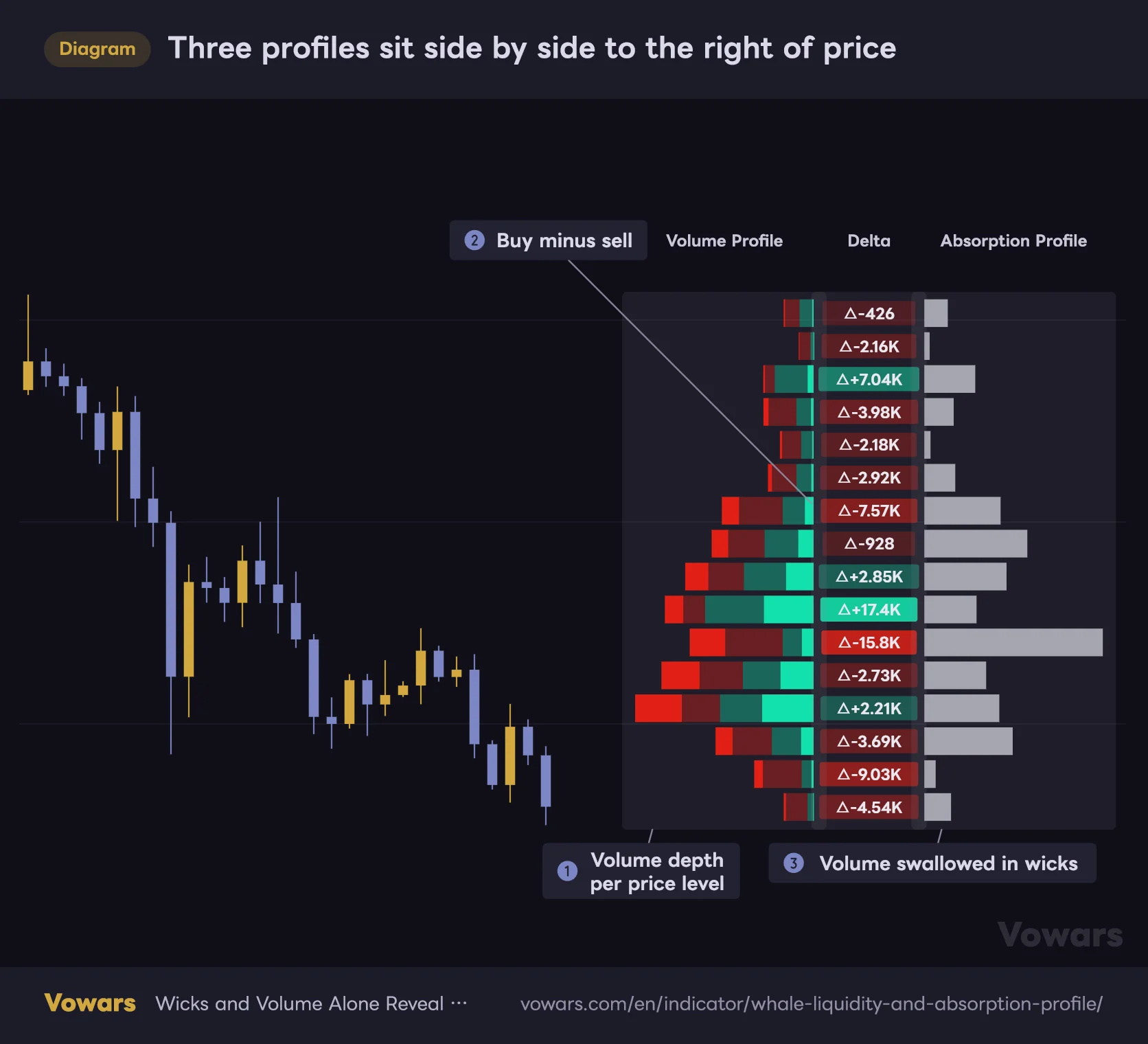
Three profiles sit side by side to the right of price
Left to right: volume by price level, the buy/sell imbalance, and the amount swallowed inside wicks.
Vowars DE ver.3.11.0
1. Volume Profile: Raw Liquidity Depth
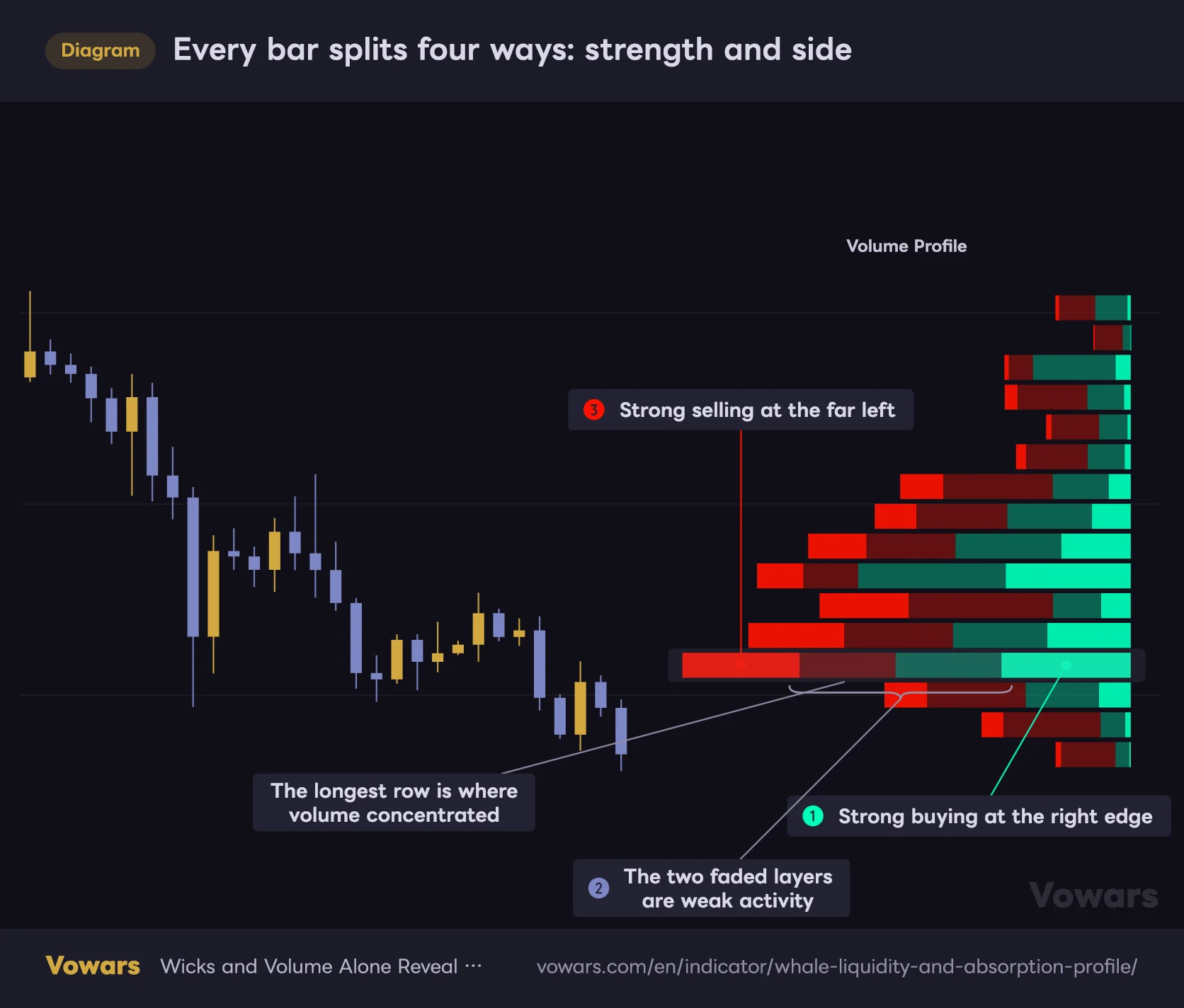
This is the main profile, sitting closest to price on the left. Each bar stacks four segments, reading right to left: strong buying → weak buying → weak selling → strong selling. Buying is green, selling is red, and the more opaque shade marks the “strong” activity.
Every bar splits four ways: strength and side
From the right edge inward: strong buying, weak buying, weak selling, strong selling.
Vowars DE ver.3.11.0
Bar length scales with total volume, normalized so the heaviest level fills the full width. The longest bar marks the price the market agreed on most — the deepest pocket of liquidity. Price tends to gravitate back toward it, and tends to accelerate once it breaks away.
2. Delta Heatmap: Who Was Pushing
The narrow column of cells to the right is delta — buy volume minus sell volume. Positive means buyers dominated, negative means sellers did. Each cell prints a signed value, and the bigger the imbalance, the more saturated the color.
What you’re hunting for here is directional pressure. A level with heavy volume but delta near zero is a genuine battleground — buyers and sellers slugging it out — and those levels tend to move fast once one side gives way.
3. Absorption Profile: How Much Got Eaten
Further right is the absorption profile. It takes its color from the chart’s text color, so on a dark theme you’ll see it in off-white grey.
It only counts two things: buying inside upper wicks and selling inside lower wicks. So a long bar here marks a level where the aggressor lost — where liquidity got consumed. This is the angle you won’t find in other profile indicators.
4. Absorption Zones: Auto-Extracted Reaction Levels
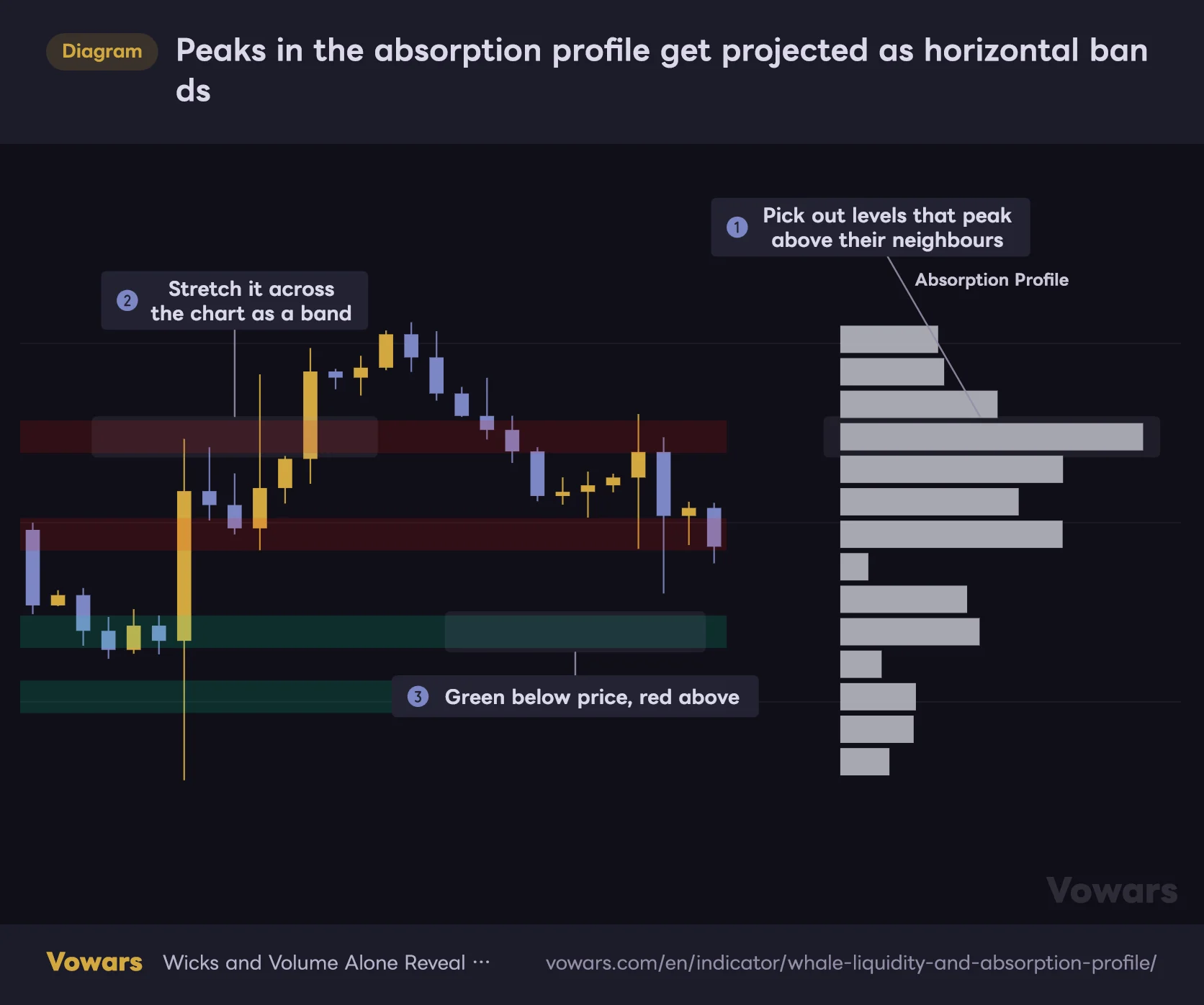
Any bin in the absorption profile that peaks above both neighbors gets pulled out automatically and projected across the chart as a horizontal band. Bands above current price shade red, bands below shade green, so you can read your position relative to them at a glance.
Peaks in the absorption profile get projected as horizontal bands
Only the levels that peak in the profile get stretched across the chart as bands.
Vowars DE ver.3.11.0
On the Bitcoin 4H you’ll regularly find bands where price has tagged the upper edge and printed rejection wicks over and over. That’s price paying attention to a level where liquidity was previously consumed.
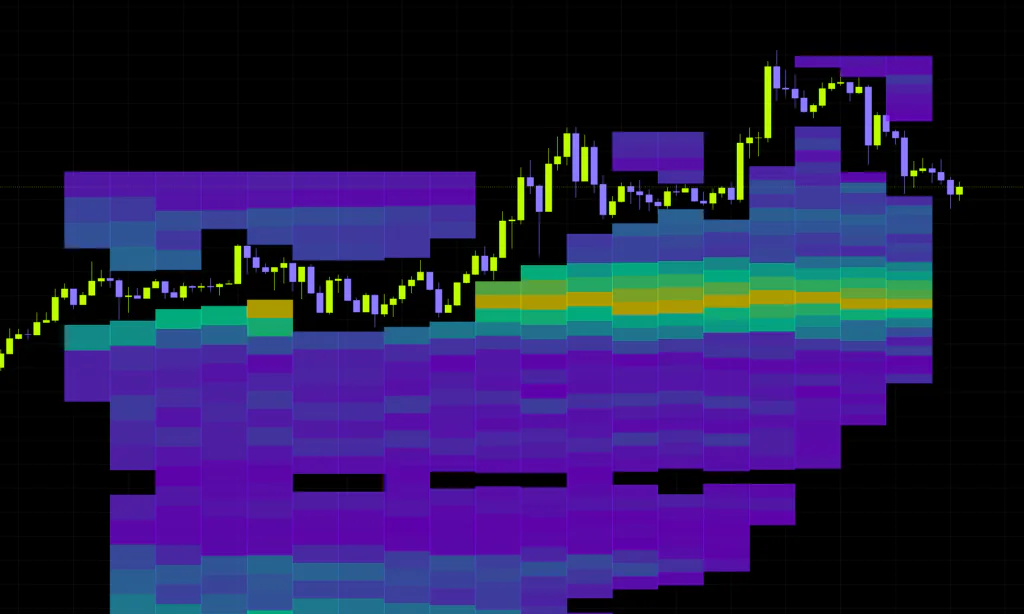
5. Historical Absorption Heatmap
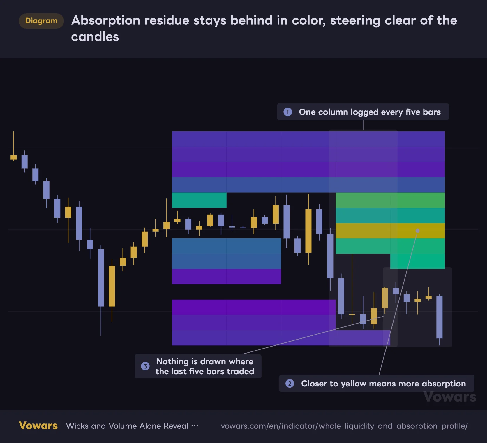
Off by default. Turn it on and it drops a snapshot of the absorption distribution every five bars, leaving colored blocks behind. The gradient runs purple for light absorption, green in the middle, yellow for the heaviest.
Absorption residue stays behind in color, steering clear of the candles
Purple means light absorption; through green toward yellow means more of it has piled up.
Vowars DE ver.3.11.0
The neat part: bins overlapping the last five bars’ range don’t get drawn at all. Your candles stay clean, and only the residue sitting away from price accumulates, drifting across the chart like clouds. Give it some time and the bands price keeps revisiting stand out clearly.
6. Strong Activity Bubbles: Whale Footprints in Real Time
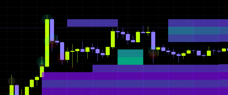
Also off by default. Enable it and dots appear at the price where particularly strong activity printed, sized across four tiers. Green for buying, red for selling. If the profiles map liquidity as an area, this tracks individual moments as points.
How “Strong” Activity Gets Classified
This is the core of how “Whale Liquidity and Absorption Profile” works, so it’s worth digging into.
The indicator takes each candle on your chart and breaks it down into lower timeframe data. On a 1H chart with default settings, it’s pulling roughly 6-minute data under the hood. Each of those smaller bars then gets tagged as buying or selling depending on whether it closed up or down.
From there, every sample gets ranked by volume, and the classification comes down to which percentile it lands in. At the default of 97, only the top 3% counts as strong.
Bitcoin’s baseline volume swings wildly depending on the season. A fixed threshold would go completely quiet during dead periods and flag everything as “strong” when things heat up. Percentile ranking isolates whatever stands out relative to that particular stretch of market, whatever the regime.
How to Read It on a Live Chart
1Add it, then scroll right
Search the name in the indicator list and add it. If your first reaction is “nothing showed up,” it’s just that the profiles render well to the right of the current candle. By default the right edge sits 120 bars ahead of price. Pull it closer by lowering Profile Offset.
2Locate the deepest liquidity
Find the longest bar on the main profile — that’s your volume-heavy level and the current center of gravity. The further price drifts from it, the more likely a retrace; when price rips through it, treat that as a regime change.
3Check the delta imbalance
Look at the delta cell at the same height. Heavy volume plus strongly positive delta means buyers were leaning into that level aggressively. Strongly negative means sellers ran the show.
4Cross-reference delta against absorption
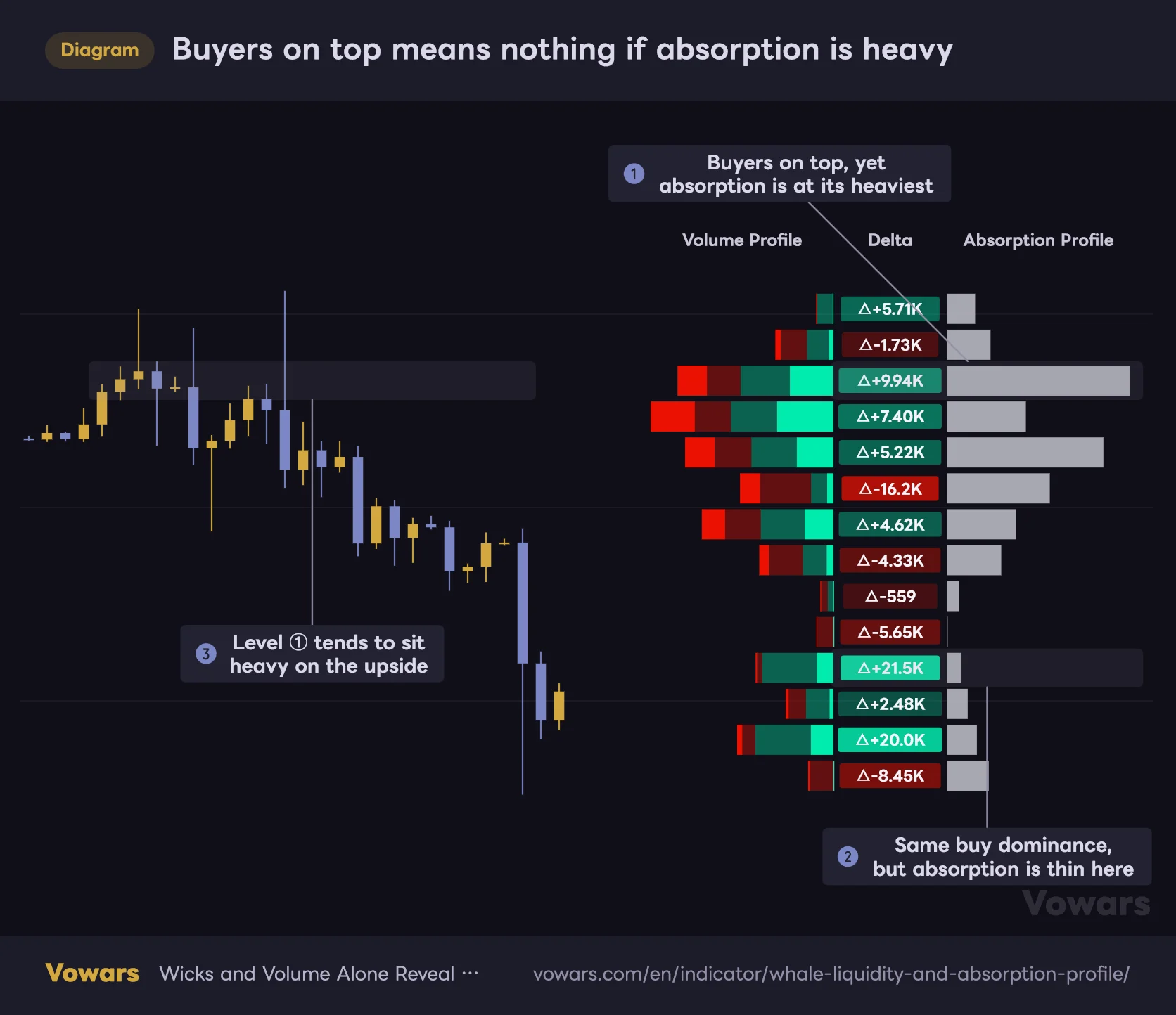
Here’s the money read. Strongly positive delta paired with heavy absorption at the same level means buyers piled in and got swallowed by upper wicks. Odds are those longs are still sitting underwater, which makes that level heavy overhead resistance where supply keeps showing up.
Buyers on top means nothing if absorption is heavy
Read the absorption at the same height, not just the sign of the delta.
Vowars DE ver.3.11.0
Flip it around: negative delta with heavy absorption on the lower-wick side marks a candidate support level where selling got absorbed. Shorts are the ones trapped there, which opens the door to a squeeze off that level.
5Wait for the retest and read the reaction
The moment to watch is when price approaches an absorption zone. Long rejection wicks inside the band mean that liquidity is still live. A clean body close through it means whatever was sitting there has been fully consumed.
Don’t treat the band itself as an entry signal — wait for the reaction at the band, then act. That’s the realistic way to use it.
Every Setting, Sorted Out
| Setting | Default | Suggested | Effect |
|---|---|---|---|
| Profile Lookback | 200 | 150-300 | Number of bars used to build the profiles. Higher is more structural, lower reacts faster to recent action |
| Bar Granularity | 10 | 10-20 | How many slices each candle gets sampled into. Higher means finer detail but a heavier load |
| Allow Seconds | Off | On for low timeframes | Permits seconds-based data requests. Left off, 1-minute is the floor |
| Strength Filter | 97 | 93-97 | Percentile cutoff for strong activity. Higher makes strong reads rarer |
| Strong Only | Off | On when needed | Hides weak activity and rebuilds the profile from strong volume alone |
| Profile Resolution | 35 | 30-45 | Number of price bins. Higher is finer but eats more drawing objects |
| Profile Width | 100 | 80-150 | Horizontal width of the profiles. Longer makes level-to-level comparison easier |
| Profile Offset | 120 | 30-120 | Distance from the current bar to the profile’s right edge. Lower pulls it toward price |
| Detect Value Area | Off | On | Brightens the high-volume core and fades everything outside it |
| Value Area Percent | 30 | 30 or 70 | Share of profile volume included in the value area. Higher widens the bright band |
| Show Volume Profile | On | On | Toggles the main stacked profile |
| Show Delta Profile | On | On | Toggles the delta heatmap |
| Show Absorption Profile | On | On | Toggles the absorption profile |
| Show Levels | On | On | Detects absorption peaks and projects them as horizontal bands |
| Show Bubbles | Off | On for short-term trading | Marks strong activity with four-tier dots at price |
| Show Absorption Heatmap | Off | On in a second instance | Logs absorption snapshots every 5 bars to map liquidity residue |
| Bullish Colour | Bright green | Your call | Color for the buy side and the heatmap midpoint |
| Bearish Colour | Red | Your call | Color for the sell side |
Three Settings Worth Understanding Properly
Bar Granularity and Allow Seconds Work as a Pair
Bar Granularity sets how finely your chart timeframe gets sliced, but with Allow Seconds left off, anything that calculates below one minute gets clamped to 1-minute data. Set granularity to 10 on a 15-minute chart and you’re still sampling 1-minute bars.
On 1H and 4H charts, though, cranking granularity pays off directly. Set it to 20 on the 4H and you’re sampling roughly 12-minute data. Getting real precision on low timeframes means allowing seconds data, but some symbols and plan tiers will throw a runtime error instead, so start with it off on a higher timeframe.
The Value Area Percent Default Isn’t the Standard Number
In volume profile land, “value area” almost always means 70%. Here Value Area Percent defaults to 30 instead. That’s intentional — it’s built to highlight a tighter core where liquidity is genuinely concentrated.
For short-term trading where you want the current battleground pinpointed, the default 30 works well. If you want it lining up with your other tools, switch it to 70. Neither is more correct — it’s a question of how granular you want the read.
Profile Resolution Eats Your Drawing Budget
TradingView caps how many objects a single indicator can draw, and “Whale Liquidity and Absorption Profile” uses several per profile row. Push Profile Resolution too high and the profiles alone will consume the entire budget, leaving nothing for everything else. The next section covers that in detail.
Running Every Feature at Once Means Loading It Twice
The first thing that trips people up is enabling the heatmap and then watching all three profiles vanish after a while. You didn’t misconfigure anything — it’s baked into how the indicator works, so learn the fix alongside the feature.
Why the Profiles Are the Ones That Disappear
The three profiles and the absorption zones claim their allocation the instant it loads, while the heatmap keeps adding new objects every five bars and never clears them.
When the cap gets hit, TradingView deletes the oldest objects first. The profiles were created at startup, which makes them the oldest — so they’re first in line to get culled. The more heatmap history accumulates, the more of your profile gets eaten.
Once you’re in this state, toggling the display back on often doesn’t bring anything back, because the heatmap is still holding the allocation. The real fix is splitting the roles across two instances, which is what we’ll set up next.
The Fix: Add It Twice and Split the Roles
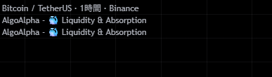
This is the workaround the developer recommends, and honestly it’s the only practical one. Add the indicator to your chart twice, making one instance the profile handler and the other the heatmap handler.
1Make the first one your profile handler
Use the copy you already have. Keep Show Volume Profile, Show Delta Profile, Show Absorption Profile and Show Levels enabled, and leave Show Absorption Heatmap off. Defaults are fine here.
2Duplicate the indicator
Hover the indicator name in the top left of your chart and duplicate it from the menu that appears. Searching and adding it again works too, but duplicating is quicker.
3Make the second one heatmap-only
Open the duplicate’s settings and invert every display toggle. Turn all the profile options off and leave only Show Absorption Heatmap on.
| Setting | Instance 1 (profiles) | Instance 2 (heatmap) |
|---|---|---|
| Show Volume Profile | On | Off |
| Show Delta Profile | On | Off |
| Show Absorption Profile | On | Off |
| Show Levels | On | Off |
| Show Absorption Heatmap | Off | On |
| Show Bubbles | Your call | Off |
4Lower Profile Resolution on the second one
Plenty of people skip this step, but turning the profile display off does not release the allocation. Your heatmap instance is still holding drawing objects for profiles it never renders.
So drop Profile Resolution on the second instance. Less gets reserved, and the heatmap history survives that much longer.
| Profile Resolution (instance 2) | Headroom for the heatmap | What it feels like |
|---|---|---|
| 35 (default) | Tight | History starts vanishing fast. Change it |
| Around 20 | Balanced | Detail and history length both hold up |
| 10-15 | Plenty | History-focused, but the color detail gets coarse |
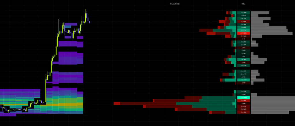
Profile Resolution also controls the vertical detail of the heatmap, so you’re trading granularity against history length. If the goal is tracking liquidity residue, longer history beats finer resolution. Start around 20 and adjust from there.
Even without the heatmap, pushing Profile Resolution near max on your first instance will burn through the budget and stop the absorption zone bands from rendering. I get wanting finer price detail, but capping it around 35 to 40 is the safe play.
Settings by Trading Style
| Use case | Settings direction | What you’re after |
|---|---|---|
| Day trading (15m-1H) | Lookback around 150 / Resolution 35-40 / Detect Value Area on | Quickly map the session’s battleground and recently swept levels |
| Swing trading (4H-daily) | Lookback 250-300 / Resolution around 30 / Granularity 15-20 | Surface structural support and resistance zones |
| Scalping (5m and below) | Lookback around 100 / Allow Seconds on / Show Bubbles on | Catch individual moments of size stepping in |
| Tracking sweep residue | Second instance with heatmap only, everything else off | Conserve drawing objects and keep liquidity history alive longer |
Where It Clicks and Where It Doesn’t
Conditions Where It Just Works
The best fit by far is range-bound price action cycling between two boundaries. Volume stacks up at the same levels, so clean absorption bands form at the range highs and lows. Heavy upper-wick absorption at the range high tells you sellers are defending that level.
The other one is the aftermath of a sharp move. After price runs one direction, liquidity is thin through the range it covered and thick where it started from. Price retraces quickly through thin bands and stalls when it reaches thick ones, which makes this a solid read for buying the dip or selling the rally.
Symbol-wise, it reads cleanly on markets where participants care about specific price levels — gold and index ETFs come to mind. With Bitcoin, just keep in mind that wicks stretch more over weekends and during thin sessions, which colors how you interpret the absorption.
Conditions Where It Spins Its Wheels
In the middle of a strong trend, price never sits still long enough for profile peaks to build, so there isn’t much to work with. Trending conditions also print wicks constantly on pullbacks and rallies, which means absorption bands get generated at levels that won’t actually hold.
Big gaps or violent expansions cause the same problem from a different angle: the price range widens, each bin gets fatter, and fine-grained level detection goes out the window.
What You Can Lean On, and What You Live With
What you can lean on
- No external liquidation feed needed, so it runs on any symbol with volume data
- Breaking wick absorption into its own profile is a genuinely original angle for pinpointing swept liquidity
- Strength classification is relative, so the baseline adapts as market conditions shift
- Absorption peaks get converted into bands automatically, which speeds up marking levels
- Six alert conditions let you monitor level touches without watching the chart
- Granular display toggles let you strip it back to only what you need
What you live with
- Tight drawing-object limits mean two instances are required to run everything
- Only the current profile is ever drawn, so scrolling back won’t show past distributions
- Buy/sell classification comes from intrabar closes, not actual aggressor side
- It won’t show you liquidity that’s about to get targeted — only the footprint left behind
- How far back you can go is capped by lower timeframe data availability
- No signals to follow, so reading it is on you
What to Know Before You Rely on It
Only the Current Profile Ever Gets Drawn
The three profiles and the absorption bands are redrawn from scratch off the latest bar, covering whatever lookback you’ve set. Which means scrolling back won’t show you where the bands sat three days ago. To review past behavior you’ll need Bar Replay, which treats the replay position as the latest bar, so you can step through each point in time and see the profile as it stood.
Because the bands recalculate off current data, scrolling back through history makes them look like they nailed every reversal. That’s because the data building those bands already includes the bounces themselves. Don’t assume the same precision holds in real time.
Data Only Accumulates on Closed Bars
Samples get logged when a candle closes. Activity inside the forming bar isn’t in the profile yet, so the distribution shifts slightly the moment a bar completes. This isn’t repainting in the future-data sense — just understand there’s a one-bar lag and you’re fine.
The dots are a different story: they’re calculated against the forming bar too, so their placement can move until the candle closes. If you’re basing anything on them, wait for the close.
Buy/Sell Isn’t True Aggressor Side
What gets labeled “buying” and “selling” here is just whether each sampled intrabar closed up or down. It isn’t reading actual market-order direction off the book, so it behaves differently from a genuine order flow tool. Plenty useful for reading tendencies, but treat it as precise execution analysis and you’ll be disappointed.
And the obvious one: buying because price tagged a band, or because delta is green, is asking for trouble. What you’re getting is a shortlist of levels where price is likely to react — whether it actually reverses has to be confirmed by the price action itself.
Letting Alerts Do the Watching
Six alert conditions ship with it. Pick them from the condition dropdown in TradingView’s alert dialog.
| Alert | Trigger |
|---|---|
| Strong Buying | Activity classified as strong buying prints |
| Strong Selling | Activity classified as strong selling prints |
| Value Area Touch | Price enters the value area core |
| Bullish Delta Dominance | Price is sitting at the level with the strongest positive delta |
| Bearish Delta Dominance | Price is sitting at the level with the strongest negative delta |
| Absorption Level Touch | Price enters a level flagged as an absorption peak |
The most useful of the bunch is Absorption Level Touch. It pings you the moment price returns to a level where liquidity was consumed, so you can wait for reaction points without staring at the chart. One gotcha: Value Area Touch won’t fire unless Detect Value Area is enabled, so don’t skip that.
What It Pairs Well With
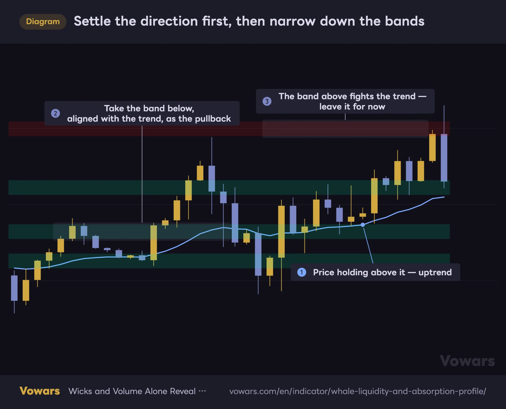
It won’t tell you direction, so pair it with something that does. A moving average is the cleanest fit: settle the trend first, then work only the bands on that side.
Settle the direction first, then narrow down the bands
Bands print on both sides, so use a moving average to settle direction before picking which ones to trade.
- EMA21
Vowars DE ver.3.11.0
- External liquidation heatmaps: line up where liquidity is likely to get targeted against where it’s already been consumed, and you get a much fuller picture of which side still has fuel
- RSI and similar oscillators: check whether price is overbought or oversold as it reaches a band
- ATR and volatility tools: size up the expected move on a band break and place stops accordingly
Who This Is Built For
This suits traders who want to map out reaction levels ahead of time. If you trade mechanically off signals it’s the wrong tool, but if you mark horizontal levels and wait for price to come to you, it’s a serious piece of supporting evidence.
Timeframe-wise, mapping zones on the 1H to 4H and timing entries on something lower was the most practical setup I found. It sits naturally somewhere between day trading and swing trading.
Right after adding it, turn on Detect Value Area and drop Profile Offset to somewhere around 30 to 50. The profiles move in closer to price and the liquidity core lights up, which makes the whole thing far easier to read on day one.
Reading the Market From What It Left Behind
What makes “Whale Liquidity and Absorption Profile” interesting is the premise: no external data at all, just the footprint left on the chart, used to estimate where liquidity got consumed. It won’t tell you where price is heading to hunt next the way a liquidation heatmap does, but in exchange it’s symbol-agnostic — the same logic applies whether you’re on Bitcoin, gold, or an index.
The flip side is real: drawing-object limits stop you running everything at once, and scrolling back won’t show you past profiles. There are a lot of settings too, and poking at them without understanding what they do just makes your screen busy. This is a topographic map of the market, not a signal generator — and it rewards the traders who treat it that way.
If you’ve reached the point where “why does price always get rejected here” needs a data-backed answer rather than a gut feeling, this earns its place on the chart. Start simple: drop it on a Bitcoin chart at a timeframe you know well, leave the defaults alone, and just watch it for a few days.