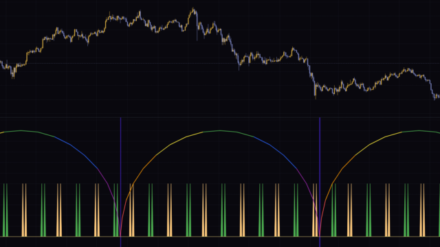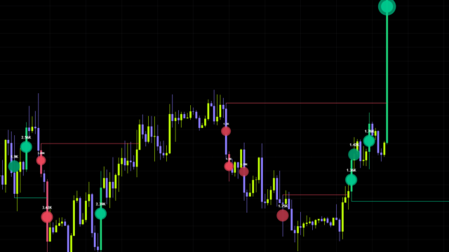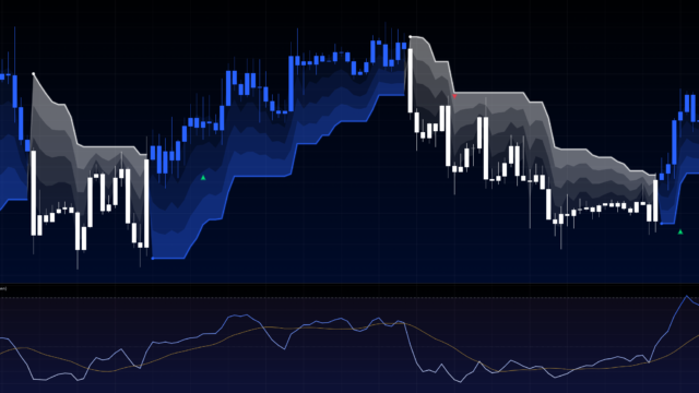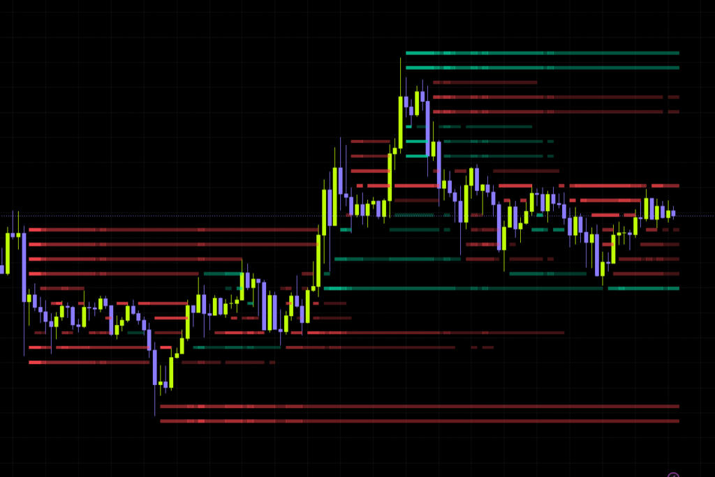


Ever stared at a chart and thought “price keeps getting rejected right here”? A volume profile will show you which prices traded the most, but it never tells you whether that volume was buyers lifting offers or sellers hitting bids. “Volume Delta Footprint Map” is built to fill exactly that gap.
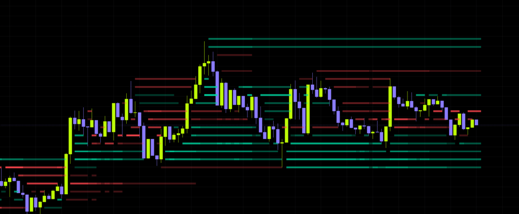
Published by Zeiierman, this indicator “Volume Delta Footprint Map” estimates the buy/sell imbalance (delta) from lower-timeframe price action and paints it straight onto the chart as horizontal stripes at each price level. Drop it on a Bitcoin chart and you get thin green and red bands stacking up in layers around the candles, so you can see at a glance which side left pressure sitting in which zone.
In this review I’ll walk through how it reads on the chart, how to actually use it, how to dial in the settings, and where it falls short.
What Is “Volume Delta Footprint Map”? The Quick Version
“Volume Delta Footprint Map” is an indicator that maps out which price levels were dominated by buying or selling pressure, drawing them as colored stripes. It’s an overlay, so everything sits directly on top of your candles.
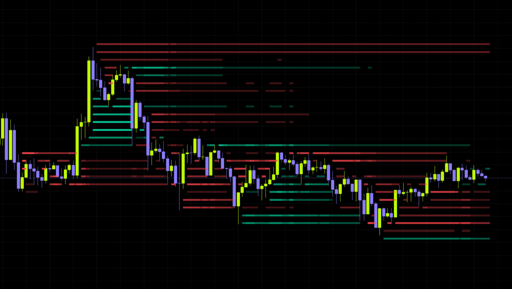
In one sentence: it looks inside each chart candle using lower-timeframe candles, nets the up-volume against the down-volume, and drops the result at the price level where it happened. The end product looks a lot like a footprint chart.
The important part here is that it doesn’t use TradingView’s paid footprint data. The developer says as much: it isn’t pulling exchange-level bid/ask prints, it’s inferring direction from lower-timeframe price action and volume. The upside is that it works on just about any symbol that reports volume.
Delta is basically buying pressure minus selling pressure. Positive means buyers had the edge, negative means sellers did. Normally it’s calculated from actual bid/ask prints, but “Volume Delta Footprint Map” treats each lower-timeframe candle as bullish or bearish and multiplies that direction by its volume to estimate the number.
What It Looks Like on the Chart
Two Colors, and Opacity Does the Talking
The stripes are about as simple as it gets. There are only two colors.
| Stripe | Meaning | Default color |
|---|---|---|
| Green stripe | Buying activity is estimated to have dominated at that price level | Emerald green |
| Red stripe | Selling activity is estimated to have dominated at that price level | Red |
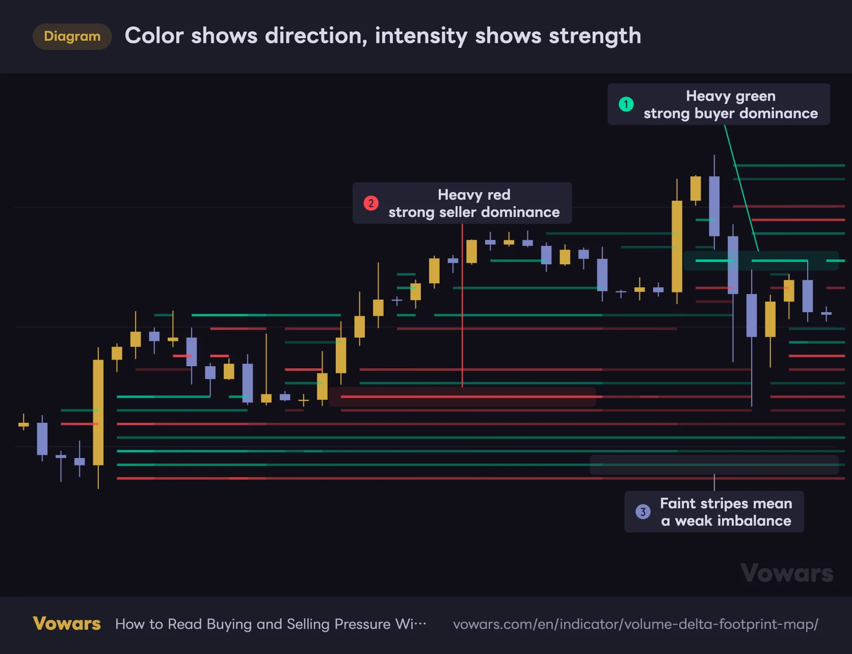
On top of that, the stripes come in different intensities. A faint stripe is a weak imbalance; a solid, saturated one is a strong imbalance. Personally I think that intensity gradient is the single best thing about this tool. Faint stripes are pretty much noise, so the practical way to read it is to only track where the heavy stripes cluster.
Color shows direction, intensity shows strength
Green marks price levels where buyers dominated, red where sellers dominated. The heavier the stripe, the stronger that imbalance was.
Vowars DE ver.3.8.0
Price Punches Holes Through the Stripes
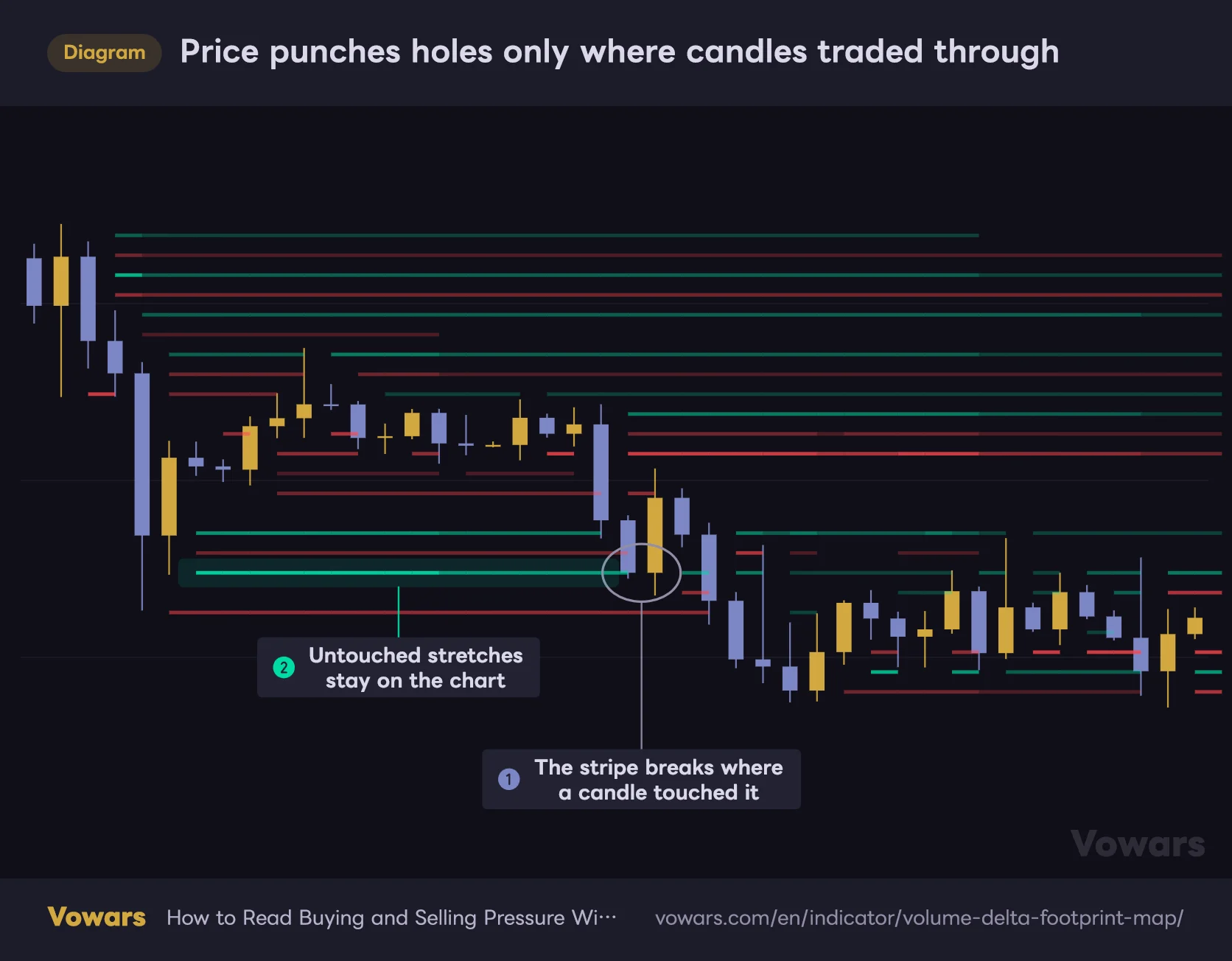
The first thing that throws people off is that the stripes are cut away wherever price has already traded through. That’s by design, controlled by the Create gap when price touches stripe setting, which is on out of the box.
On a 4-hour Bitcoin chart it carves a tunnel-shaped void along the path of the candles, leaving stripes above and below. Which means everything you can still see on screen is residual pressure that price hasn’t come back to test yet. That makes it much easier to spot zones likely to react if price revisits them.
Price punches holes only where candles traded through
With Create gap when price touches stripe enabled, any stripe inside a bar's high-to-low range is not drawn at that bar.
Vowars DE ver.3.8.0
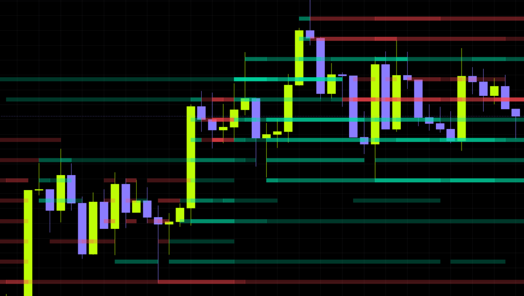
If that behavior gets in your way, switch it off. The stripes then run continuously through price, which is the better look when you want to judge total pressure as a solid block.
How “Volume Delta Footprint Map” Works, and Why It Behaves That Way
You can get by without this part, but knowing the mechanics makes it click when you ask yourself “why is there a heavy stripe right there?” Here’s the short version.
It Estimates Direction From Lower-Timeframe Candles
“Volume Delta Footprint Map” pulls in the lower-timeframe candles that sit inside each of your chart candles. A bullish LTF candle counts as positive, a bearish one as negative, and its volume is added with that sign attached. If open and close come out identical, it compares against the previous close to settle the direction.
Automatic lower timeframe is enabled by default, so the LTF switches automatically based on your chart timeframe. Here’s the actual mapping.
| Your chart timeframe | Lower timeframe used |
|---|---|
| 1 minute and below | Same as the chart |
| Above 1 min up to 15 min | 1 minute |
| Above 15 min up to 1 hour | 5 minutes |
| Above 1 hour up to 4 hours | 15 minutes |
| Above 4 hours up to daily | 1 hour |
| Above daily up to weekly | 4 hours |
| Above weekly | Daily |
On a 1-minute chart or lower, the LTF ends up being the same as your chart timeframe. At that point there’s nothing inside the candle left to break down, so it’s just plotting “bullish or bearish × volume”. If you scalp with it, run it on 3-minute or 5-minute and up so the map still carries real information.
Delta Gets Spread Across Price Levels
The estimated delta isn’t dumped onto a single point. The indicator looks at the high-to-low range each LTF candle covered and distributes the delta evenly across every price level it touched. So when one candle travels a long way, its delta ends up spread thin over a tall vertical section.
The top and bottom of the map are set by the highest high and lowest low in the lookback window, plus an ATR-based buffer. Volatile conditions stretch the map taller; quiet conditions squeeze it down. This auto-scaling is quietly useful, because you never have to re-fit the range when you change symbol or timeframe.
Old Delta Fades By Half
This is where “Volume Delta Footprint Map” gets interesting. Delta doesn’t just sit frozen on the bar where it happened. It’s carried forward to the right, toward the present, decaying a little more with every bar.
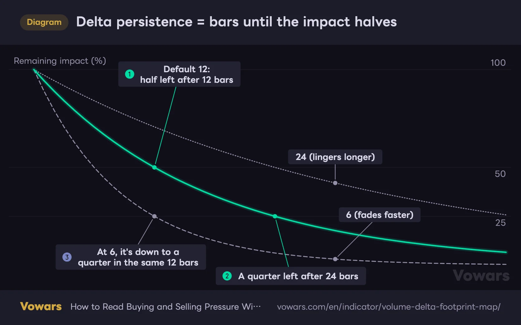
The decay follows a half-life model: once the number of bars set in Delta persistence has passed, the influence is roughly halved. The default is 12, so pressure from 12 bars ago carries half the weight it originally had. Go back 24 bars and it’s a quarter, 36 bars and it’s an eighth. Older activity naturally fades out.
The difference is easiest to see when you compare the values side by side as lines.
Delta persistence = bars until the impact halves
Starting impact is 100. At the default of 12, it drops to 50 after 12 bars and to 25 after 24.
Vowars DE ver.3.8.0
Because of that design, pressure from days ago never sits there cluttering the screen forever, and what you see stays close to “where is the pressure right now.”
What Actually Decides a Stripe’s Intensity
Stripe strength is a blend of two things.
- Relative magnitude — how it measures up against the strongest price level in the same vertical column (i.e. the same bar)
- Directional dominance — how one-sided the flow was relative to the total activity at that level
The weighting is 70% on the first and 30% on the second. The takeaway here is that strength is mostly a relative reading within the same bar. Even in a dead, low-participation stretch, whichever level had the most lopsided delta in that bar still prints relatively dark. Heavy stripe does not automatically mean heavy volume, and that’s worth internalizing.
Stripe intensity tells you which price level stood out within that same moment in time. It isn’t built for comparing absolute size across different periods. When absolute volume matters to you, pair it with something like a volume profile.
How I Actually Use It
1Add it and pick your timeframe
Search for “Volume Delta Footprint Map” in TradingView’s indicator list and add it. Straight out of the box it runs on defaults and maps the last 120 bars. Start on whatever timeframe you normally trade. As covered above, only 1-minute and below lose resolution, so I’d check it on 5-minute or higher.
2Find where the heavy stripes cluster
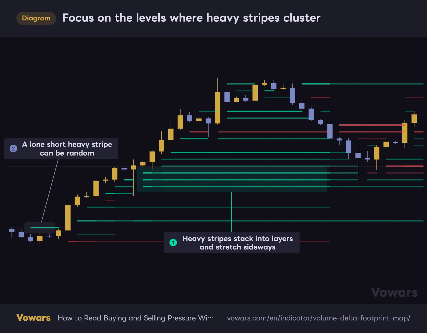
Focus on the levels where heavy stripes cluster
A level where several heavy stripes stack up and run long is where the same side kept stepping in again and again.
Vowars DE ver.3.8.0
The first thing to look for isn’t the faint stuff, it’s clusters of heavy stripes. One isolated dark stripe can easily be random, but when heavy stripes run side by side at the same level, or stack into a layered block, that’s a sign the same side kept stepping in there over and over.
3Check where price sits relative to that level
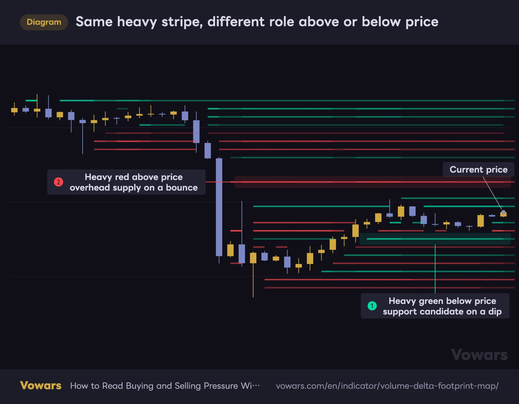
Once you’ve found a heavy stripe, check whether price is currently above or below it. That relationship changes what the stripe means.
- Price sitting above a heavy green stripe → buyers still have the upper hand. A support candidate on a pullback
- Price broken below a heavy green stripe → those buyers are underwater. Expect them to bail if price gets back there
- Price sitting below a heavy red stripe → sellers in control. A resistance candidate on a bounce
- Price broken above a heavy red stripe → those sellers are getting squeezed. Prime zone for short covering
Here are the two setups you’ll run into most out of those four. Price hasn’t touched either stripe yet; what matters is which side of price the heavy stripe sits on.
Same heavy stripe, different role above or below price
Look for heavy green below current price and heavy red above it. Price hasn't touched either one yet.
Vowars DE ver.3.8.0
4Overlay it with highs, lows and S/R
“Volume Delta Footprint Map” on its own won’t tell you which prices actually matter. The highest-conviction setups are when a heavy stripe lines up with a level you drew yourself or a recent swing high/low. A heavy stripe floating at some random price in the middle of nowhere gets a much lower priority from me.
Reading It Situation by Situation
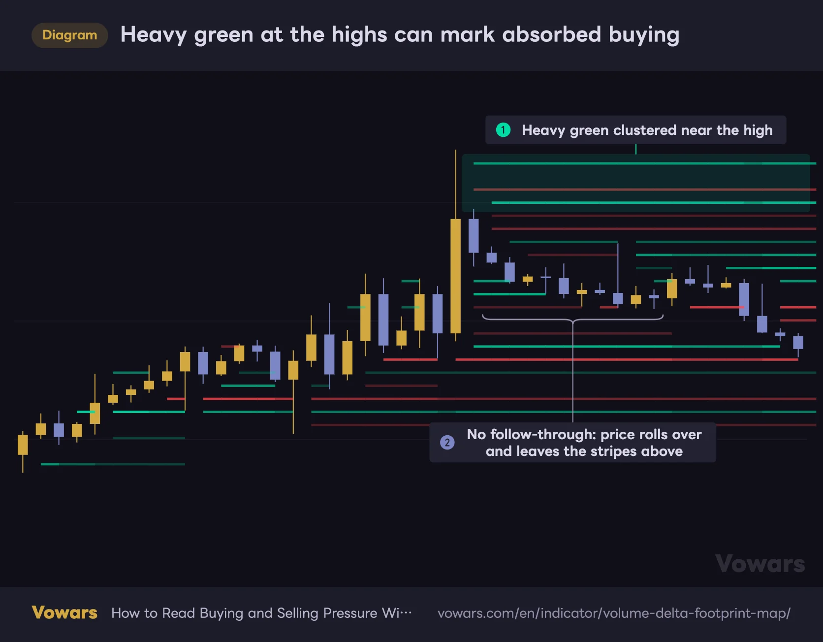
Heavy Green Near the Highs → Buyers Likely Got Absorbed
Say heavy green stripes pile up near a recent high, but price can’t extend and rolls over instead. That tells you buy orders went in and produced nothing, which points to sellers absorbing them. It’s a pattern you see all the time on higher-timeframe Bitcoin charts, and on the way down that same zone often works as a sell-the-rally area rather than support.
Heavy green at the highs can mark absorbed buying
Buying piled in around the candle that printed the high and left heavy green stripes. Price still never pushed above them.
Vowars DE ver.3.8.0
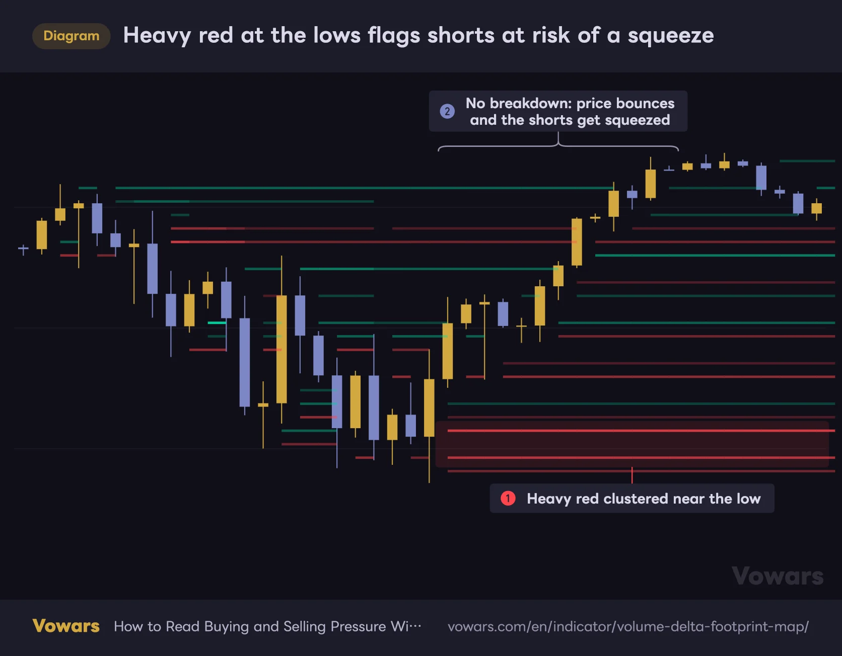
Heavy Red Near the Lows → Sellers Are Squeeze Candidates
Same thing in reverse. Red stripes go dark near a low, price refuses to break down, and then it starts climbing. That’s the setup where the shorts get forced to cover. Short covering can accelerate the move fast, so it’s a formation to respect if you’re sitting in a short down there.
Heavy red at the lows flags shorts at risk of a squeeze
Selling piled in near the low and left heavy red stripes. Price still never broke below them.
Vowars DE ver.3.8.0
Stripes Aligned With the Trend → A Continuation Clue
In an uptrend, heavy green stripes showing up on every dip while price keeps pulling away from them suggests buyers are still running the show. Flip side: if price is grinding higher but red stripes are the ones multiplying, I take that as a warning that the upside is getting heavy and step back for a minute.
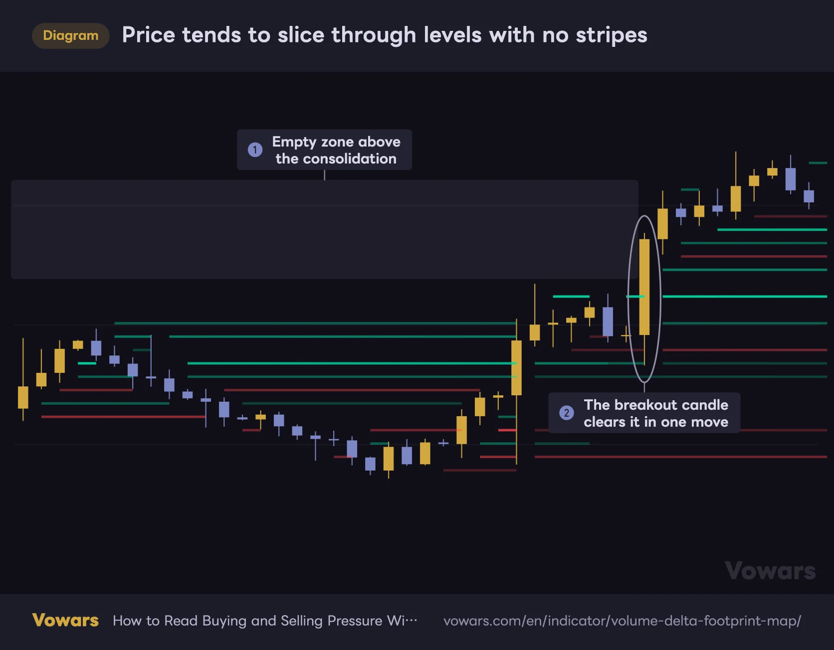
Empty Zones → Price Tends to Slice Straight Through
This one isn’t in the developer’s write-up, it’s something I picked up from using it. Price regions with almost no heavy stripes are areas nobody cared much about in the first place. When price enters them it tends to move fast with very little resistance. Handy for estimating how much room a breakout has to run.
Price tends to slice through levels with no stripes
During the consolidation, almost no stripes sit above it, because nobody was trading up there.
Vowars DE ver.3.8.0
Settings Breakdown
The settings panel is split into four groups. There aren’t many inputs, so let’s go through them one by one.
| Setting | Default | Suggested | Effect |
|---|---|---|---|
| Automatic lower timeframe | On | On | Picks the lower timeframe automatically from your chart timeframe. No reason to touch it unless you have a specific one |
| Manual lower timeframe | 1 (minute) | 1-5 min | The LTF used when auto selection is off. Finer means more precision but a heavier data load |
| Lookback bars | 120 | 100-200 | How many historical bars the map covers. More history, but you hit the drawing cap sooner |
| Price stripes | 26 | 20-34 | Number of price rows. More rows means finer price resolution, but thinner stripes and more objects drawn |
| Delta persistence | 12 | 8-25 | Half-life of delta in bars. Higher keeps old pressure alive longer, lower reacts faster to recent flow |
| Minimum stripe strength | 0.12 | 0.15-0.30 | Minimum strength required to display. Raise it to strip out weak stripes and clean up the chart |
| Intensity steps | 7 | 5-8 | Number of intensity levels. More steps means smoother gradients, but stripes get chopped up and eat into the draw budget |
| Create gap when price touches stripe | On | On | Erases stripe sections price has already traded through. Keep it on if you want untested pressure to stand out |
| Positive delta | Emerald green | Your call | Color for buy-dominant stripes. Change it if it clashes with your bullish candle color |
| Negative delta | Red | Your call | Color for sell-dominant stripes |
| Stripe thickness | 0.18 | 0.18-0.45 | Vertical thickness of each stripe. Higher values pull them together into something closer to a solid fill |
| Weak transparency | 88 | 88-95 | Transparency of weak stripes. Raise it to push low-grade activity into the background |
| Strong transparency | 8 | 0-15 | Transparency of strong stripes. Lower it to make heavy imbalances pop |
Why These Numbers
Start with Delta persistence, because the rule of thumb is to match it to your holding time. Scalping in and out over a few bars? Drop it to around 8 so you’re only looking at recent pressure and cut the noise. Holding swings for days? Push it to 20-25 so you can see the residue of pressure over a longer stretch. Since it’s a half-life, doubling the value roughly doubles how long pressure sticks around, which makes it easy to reason about.
Next, Minimum stripe strength. The default of 0.12 is honestly pretty loose, and it lets a lot of weak stripes through, which makes the chart busy. I found bumping it to around 0.2 so only the meaningful stripes survive works better in practice. Push it too far and you strip out so much that there’s nothing left to read, so 0.35 is about the practical ceiling.
Setups by Trading Style
| Use case | Lookback bars | Price stripes | Delta persistence | Minimum stripe strength |
|---|---|---|---|---|
| Short-term / scalping lean | 80-100 | Around 30 | 6-8 | 0.15 |
| Day trading (baseline) | 120 | 26 | 12 | 0.20 |
| Swing / longer horizon | 180-250 | 20-24 | 20-30 | 0.25 |
| Maximum noise reduction | 120 | 20 | 15 | 0.30-0.35 |
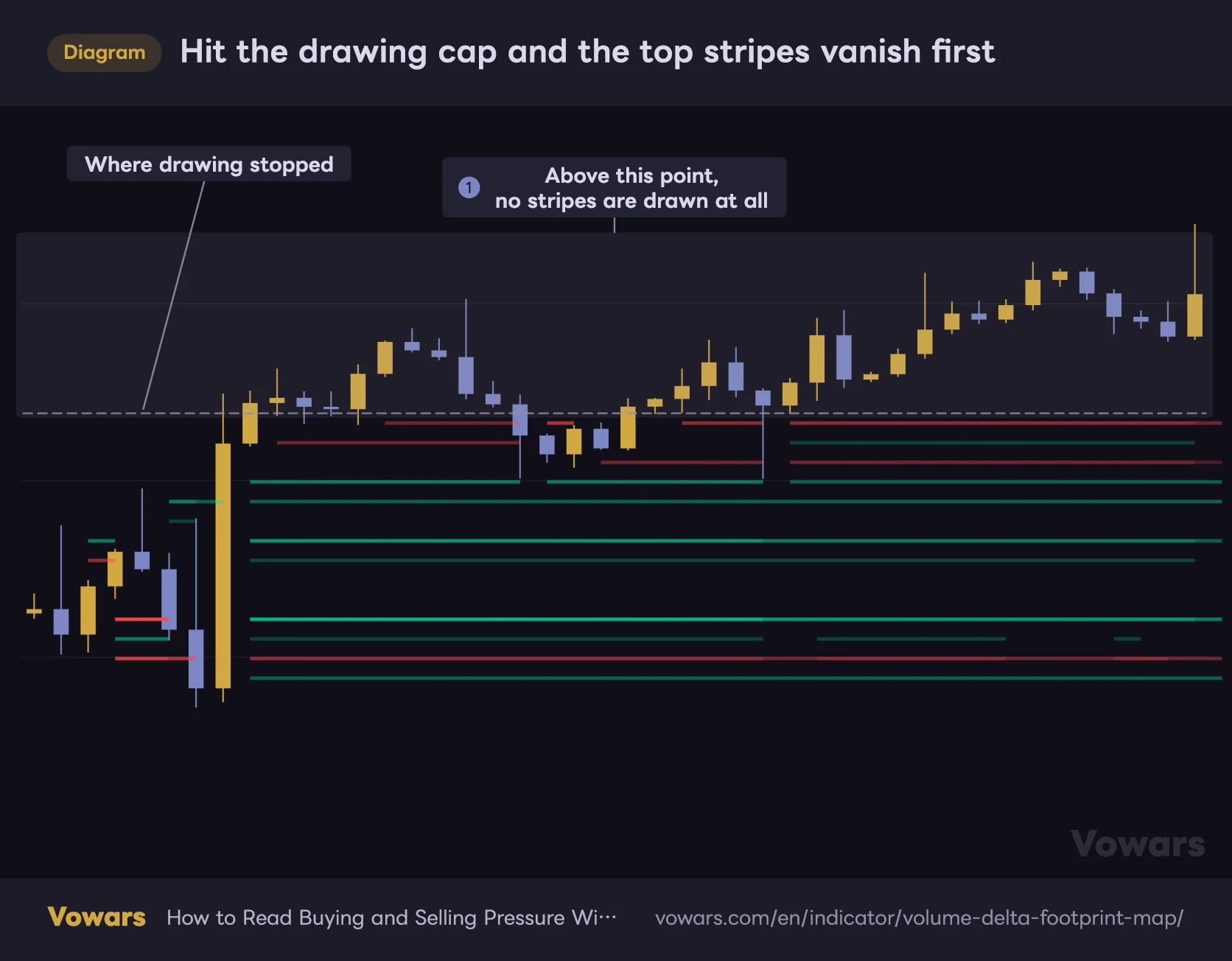
“Volume Delta Footprint Map” has a hard cap on how many objects it can draw. Push Lookback bars, Price stripes or Intensity steps too far and you hit that ceiling, at which point stripes toward the upper part of the range stop getting drawn. If the top of your map looks oddly empty, dial back Price stripes or Lookback bars first and see if it fills back in.
There’s a reason it’s always the top that goes missing. “Volume Delta Footprint Map” draws its stripes starting from the lowest price level and working up, so once it hits the cap, every level above that point is skipped. No error shows up, so if you don’t know this, it’s easy to misread the gap as “no pressure up there.”
Hit the drawing cap and the top stripes vanish first
Volume Delta Footprint Map draws stripes from the lowest price level upward. Once it hits the drawing cap, nothing above that point gets drawn.
Vowars DE ver.3.8.0
Where It Shines and Where It Struggles
Works well in
- Liquid symbols with real volume behind them
- Figuring out which side has the edge inside a range
- Gauging strength before a retest of recent highs or lows
- Waiting on a pullback or retrace after a breakout
- Judging continuation versus exhaustion inside a trend
Struggles in
- Symbols with no meaningful volume data
- Thin sessions, like crypto over the weekend
- Post-news conditions full of gaps and long wicks
- Ultra short-term charts at 1 minute and below
- Standalone entries taken to dodge fakeouts
On high-turnover markets like Bitcoin, gold or major equities, the clusters form clearly and hold their shape. Spot forex is the one to watch out for, since the volume there is tick volume. It isn’t useless, but it isn’t true traded volume either, so the stripes carry less weight than they do on crypto or futures.
When volume is zero or unavailable, “Volume Delta Footprint Map” treats volume as 1 and simply accumulates direction. Stripes will still appear, but they represent a bullish/bearish candle count rather than a volume imbalance. That’s a big drop in signal value, so choose your symbols with that in mind.
Pros and Cons
Pros
- Price, time and direction all readable on a single screen
- No dedicated footprint data required, so nothing extra to pay for
- Gaps where price traded through make untested pressure easy to spot
- Half-life decay fades old data automatically and keeps the chart clean
- Auto-scaling range means no re-tuning when you switch symbol or timeframe
- Few enough inputs that you won’t get lost in them
Cons
- No trade signals and no alerts whatsoever
- Delta is an estimate and won’t match real bid/ask prints
- No numeric readout, so you can’t compare strength quantitatively
- Push the settings and parts of the map stop rendering
- Only the most recent bars are drawn, which makes reviewing history awkward
- Results lean heavily on how well you interpret it
Things to Know Before You Trust It
The Whole Map Gets Redrawn Every Time
“Volume Delta Footprint Map” wipes the entire map and rebuilds it from scratch on the latest bar. What that means in practice is that the stripe you looked at yesterday isn’t guaranteed to sit in the same spot today.
In particular, the top and bottom of the map are derived from the highs and lows in the lookback window. A new high or low widens the whole range and shifts where the price rows are cut. The result is that a stripe that used to stand out can appear to have moved to a different level.
This isn’t the same thing as signal repainting after the fact, but the historical stripes you’re looking at right now reflect the current calculation, not necessarily what was on screen in real time. “There was a heavy stripe here, so I would have taken it” doesn’t really hold up as a review method, so step through it with Bar Replay instead.
Stripes Keep Moving on the Live Bar
The far right of the chart, the unclosed bar, updates every time new lower-timeframe data comes in. So the intensity and position of stripes can shift right up until the bar closes. If you’re using it for entries, wait for the bar to close.
Don’t Trade It Standalone
Obvious, but worth saying. “Volume Delta Footprint Map” is there to help you read context and rank which price levels matter, not to hand you entries. A heavy green stripe is no guarantee price bounces there. In a strong trend, price blows straight through heavy stripes all the time.
Pairing It With Other Tools
| Pair with | What you get |
|---|---|
| Volume Profile (VPVR) | Covers both “how much traded” and “which way it leaned”. Levels heavy on both counts are the ones that matter |
| Moving averages / EMAs | Set the directional bias first, then use stripes as dip-buy or rally-sell candidates |
| Horizontal levels / recent swings | Filtering down to prices where a stripe and a level agree sharpens the read |
| ATR | Tells you whether the distance to a stripe is realistic given current volatility |
| RSI and other oscillators | Helps separate a reaction driven by exhaustion from one driven by genuine flow |
The pairing I like most is the simplest one: plain horizontal levels. Just checking whether a heavy stripe sits on a key line you already drew makes it far easier to judge how much that line is worth. Stack too many indicators on top and you lose sight of the stripes entirely, so go easy.
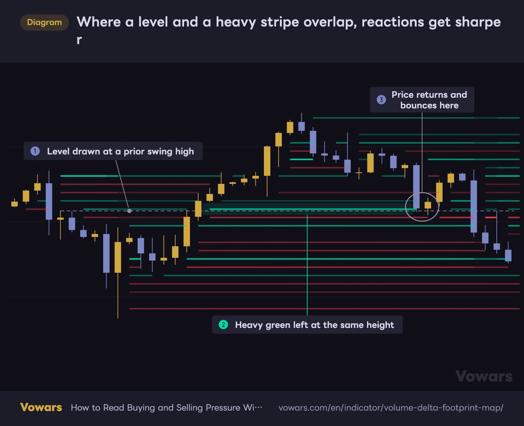
Here’s what that looks like with a level on the chart. I start by drawing lines at the recent swing highs and lows, then simply check whether a heavy stripe is sitting at that height.
Where a level and a heavy stripe overlap, reactions get sharper
Volume Delta Footprint Map with a hand-drawn horizontal level on top. The gray dashed line is the level.
Vowars DE ver.3.8.0
Who This Is For
- Good fit: traders curious about order flow and footprint but not paying for the data, anyone who wants a closer look at the fight inside ranges and at extremes, and intermediate traders after one more piece of confluence
- Poor fit: anyone who wants arrows and alerts to do the deciding, anyone who needs delta as hard numbers, and anyone trading symbols without real volume
Timeframe-wise, it feels most comfortable somewhere between 5-minute and 4-hour. It works for day trading and swing trading alike, and shortening Delta persistence makes it a decent scalping aid too. For position trading on a multi-week horizon, though, the limited lookback window means it won’t be your main tool.
Final Verdict
After putting “Volume Delta Footprint Map” through its paces, my take is that it’s a surprisingly practical low-cost stand-in for a real footprint. The way it hollows out where price traded and leaves only the untested pressure showing is genuinely well executed. Most footprint tools bury you in numbers until your eyes glaze over; this one is color and opacity only, so the picture lands instantly.
That said, and I’ll say it again, the delta is an estimate. It isn’t reading actual exchange prints, so expecting true footprint accuracy will leave you disappointed. Treat it as “directional bias inferred from lower-timeframe price action” and use it as a context layer, and you’ll get the most out of it.
Also, with no signals and no alerts, it only does anything while you’re actually looking at the chart. If you want to be notified automatically, this isn’t it. On the other hand, if you just want one more layer of information feeding your discretionary read, the distance it keeps is about right.
If you trade discretionary between the 5-minute and 4-hour on symbols with trustworthy volume, “Volume Delta Footprint Map” is well worth a spot on your chart. Run it on defaults for a few days first, get a feel for how the stripes line up with actual price action, and tune the settings after that.
One last thing. This applies to every indicator, not just this one: nothing is absolute. What “Volume Delta Footprint Map” shows you is the residue of pressure that already happened, not a promise about what comes next. Keep that framing and build it into your own rules from there.