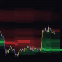

Focus Bars lines up what happened inside each candle
“Focus Bars” is an indicator published on TradingView by Kioseff Trading. It rebuilds the last few candles out of lower-timeframe data and maps out, in a separate pane, which price levels inside a single candle attracted the buying and the selling.

A candle only ever tells you four things: open, high, low and close. A long upper wick tells you price got rejected at the high. What it will not tell you is whether real size hit the offer up there or whether price just drifted back on almost no volume. “Focus Bars” exists to settle that question.
The layout is simple. A candle sits in the middle, levels where selling won extend to the left as horizontal rows, levels where buying won extend to the right, and further right again you get the sell and buy volume printed as numbers for every level. There are no entry signals and no alerts. What you get instead is this is a tool for reading the inside of a candle and adding to your own read.
Reading one Focus Bar, piece by piece
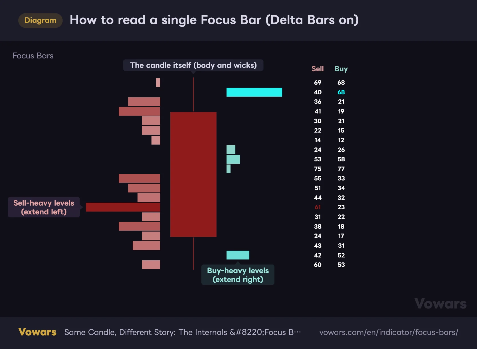
Start with how a single Focus Bar is put together. Delta Bars is on by default, which gives you the layout in the figure below.
How to read a single Focus Bar (Delta Bars on)
The candle in the middle is the outside of the bar. The rows stretching left and right are what went on inside it.
Vowars DE ver.3.8.0
The candle in the middle is the candle itself
It is drawn with the same open, high, low and close as the candle on your main chart, cyan when it closed up and dark red when it closed down. The pane’s vertical axis is real price, so you can read levels straight off it: the top of this Focus Bar sits around $78,600, and that is exactly where it sits on the chart above.
The rows left and right show which side won
The range from high to low is cut into equal rows, 20 of them by default. For each row the indicator takes buy volume minus sell volume, which is the delta for that level, and then rows with more selling stretch left, rows with more buying stretch right. No single row ever appears on both sides.
Colour carries information too. The sell side runs from pale pink to deep red and the buy side from soft teal to bright cyan, getting more saturated as the delta grows. Length and colour come off the same scale, so the longest, most saturated rows are the levels where the imbalance was heaviest.
The numbers on the right are raw sell and buy volume
The two columns to the right of each Focus Bar are sell volume on the left and buy volume on the right. They print in white, with exactly two exceptions: the buy figure on the most buy-heavy row turns cyan, and the sell figure on the most sell-heavy row turns dark red.
Length is scaled inside each candle: the smallest delta in that candle gets the shortest row, the largest gets the longest. Which means the longest row is the same length on every Focus Bar you look at. Comparing a quiet candle with a busy one by row length tells you nothing. When you want to compare pressure between candles, read the numbers.
I got this wrong early on. The rows were longer than on the previous candle, so I read it as selling picking up, then checked the numbers and found the volume was less than half. Not my finest moment. Treat length as an in-candle measure and nothing more.
How buys and sells actually get separated
The first thing to know is that this is not reading exchange prints one by one. “Focus Bars” pulls lower-timeframe data (1-minute by default) and sorts it into buys and sells with these rules.
- If a 1-minute bar closes above the previous 1-minute close, all of its volume counts as buying
- If it closes below the previous close, all of its volume counts as selling
- If the close is unchanged, that bar’s volume is dropped and never lands in any row
- The volume is then spread evenly across every row the bar’s high-to-low range touches
A 4-hour candle holds 240 one-minute bars, a daily candle 1,440 on a 24/7 crypto market. Run every one of them through those rules and what you get is the rows and numbers on the Focus Bar.
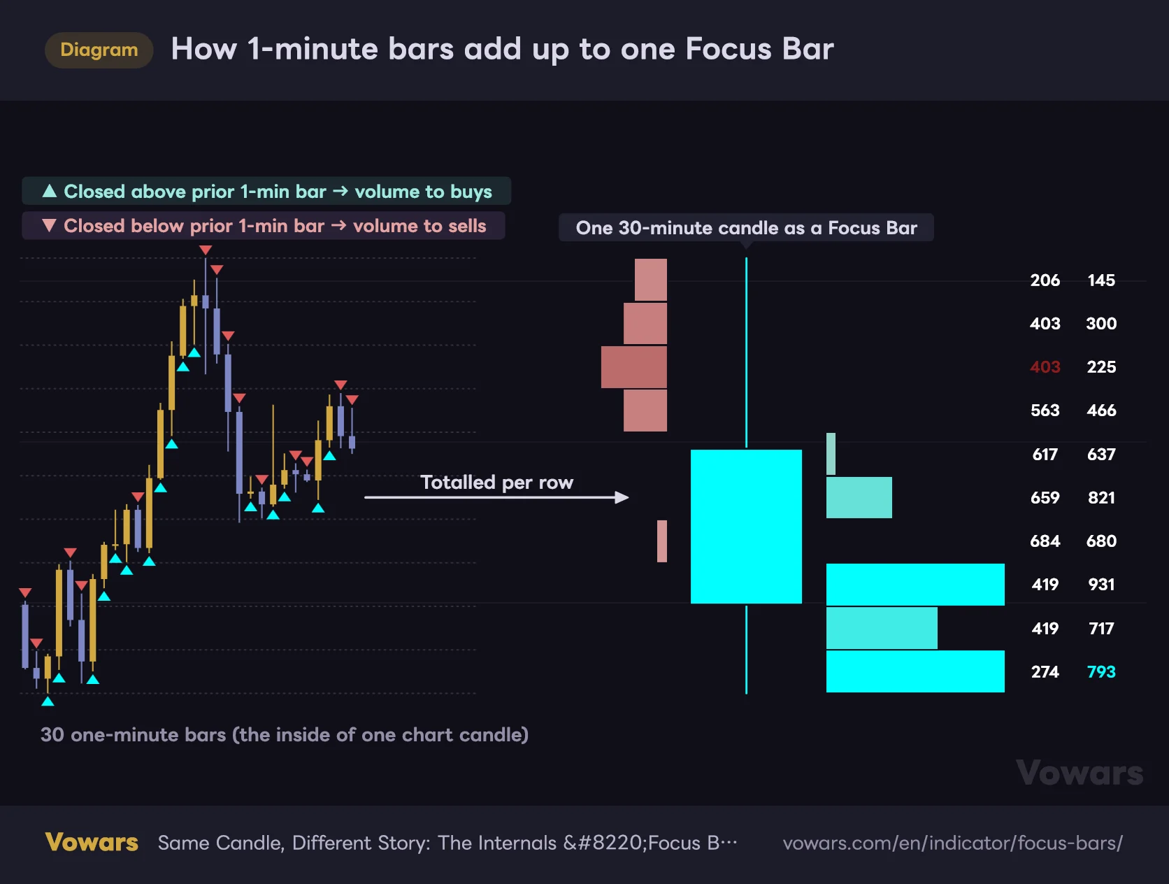
How 1-minute bars add up to one Focus Bar
The small candles on the left are the 1-minute bars that sat inside one chart candle. The right side is what they add up to.
Vowars DE ver.3.8.0
As the figure shows, the test is not whether the 1-minute bar closed up or down on itself. It is close versus the previous close. A green 1-minute bar that still finished below the prior close is counted as selling.
This method infers buying and selling from the direction of price. If size traded both ways inside that minute and the close finished a tick higher, the whole lot goes into the buy column. The author is upfront about it in the description, calling the internal order flow an approximation. Take the numbers as a rough read on imbalance, not as fact.
Granularity set to 1-Tick changes the classification slightly. A print at the bid counts as selling, a print at the ask counts as buying, and anything else falls back to a comparison with the previous tick. This only works on symbols with tick data available, so switch it on and see whether your symbol supports it.
Where are the last five bars? The layout quirk to know about
If you add the indicator, zoom into the last few dozen candles and see an empty pane, this is why. “Focus Bars” treats the pane’s horizontal axis as shelf space for laying out the Focus Bars, not as a time scale.
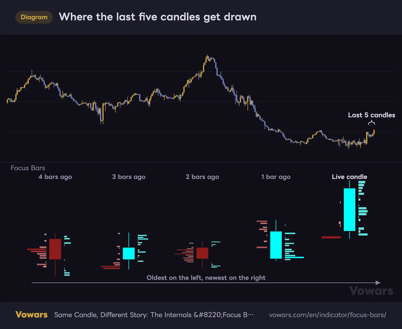
Where the last five candles get drawn
The five candles at the right edge of the top pane are what the five Focus Bars below are made of.
Vowars DE ver.3.8.0
With default settings the newest Focus Bar sits 25 bars to the left of the live candle, and the older ones line up every 60 bars from there. Show all five and you are using roughly 300 bars of width. On a daily chart that is about ten months of screen; on a 4-hour chart, around 50 days. It is wider than you would expect.

Zoom out on a daily chart and you will see February, May and so on running underneath the Focus Bars. Ignore those dates: every bar shown is from the last five sessions. The vertical axis is real price and worth reading, the horizontal position is not.
The figures on the right scale down with the height and width of each row. With a daily chart zoomed out, they turn into columns of dots. To actually read them, scroll over to the Focus Bars and zoom in.
On mobile, the quickest fix is to show fewer bars. Drop Bars To Show to 3 and the footprint shrinks to about 180 bars of width, which stays manageable even zoomed in.
Identical candles can mean opposite things
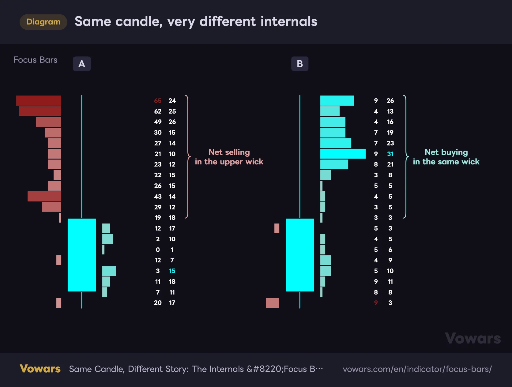
“Focus Bars” earns its keep exactly where the shape of a candle leaves you guessing. Take the clearest case: two bullish candles with a long upper wick and precisely the same open, high, low and close.
Same candle, very different internals
The candles in A and B are identical. All the difference shows up in the rows beside them.
Vowars DE ver.3.8.0
In A, nearly every level in the upper wick is net selling, and the red deepens toward the top row. That reads as size hitting the market right after the high printed. If you treat a long upper wick as supply overhead, A backs you up.
B has the same wick but almost every row is net buying, with the largest buy figure sitting just under the high, and the pullback itself came on thin volume. Here the wick is weak evidence of sellers, and a retest of the high on the next candle is very much on the table.
A real bearish 4-hour candle gave me the same kind of read. The sell-heavy rows were clustered in the lower half of the body while buy-heavy rows survived up near the wick: people were bidding up high, but the selling below them was heavier. From the outside it is just a red candle. Knowing where the selling actually stacked up gives you a level to wait at on the next one.
Line them up and you can track where the pressure moves
Showing five bars side by side is about watching that imbalance travel, and this is the fun part. If price is rising and the buy-heavy rows climb to higher levels candle after candle, buyers are following price up. If price keeps rising while the buy-heavy rows get left behind near the lows and the upper rows flip to net selling, the move is running on fumes and it is worth stepping back.
On a breakout candle, go straight to the top rows
When a candle clears the top of a range, check the rows near the top of its Focus Bar. Deep cyan at the broken level with big buy figures behind it means real buying went with the break.
The pattern to watch out for is the mirror image: buy-heavy rows bunched in the lower half of the candle while the broken level shows pale colour or outright net selling. Price ran ahead on its own and the bid never followed it up there. When I see that shape I would rather not chase it until the next candle proves it is not falling back into the range. As a filter against bull traps, it is a genuinely handy read.
Delta Bars off changes what you are looking at
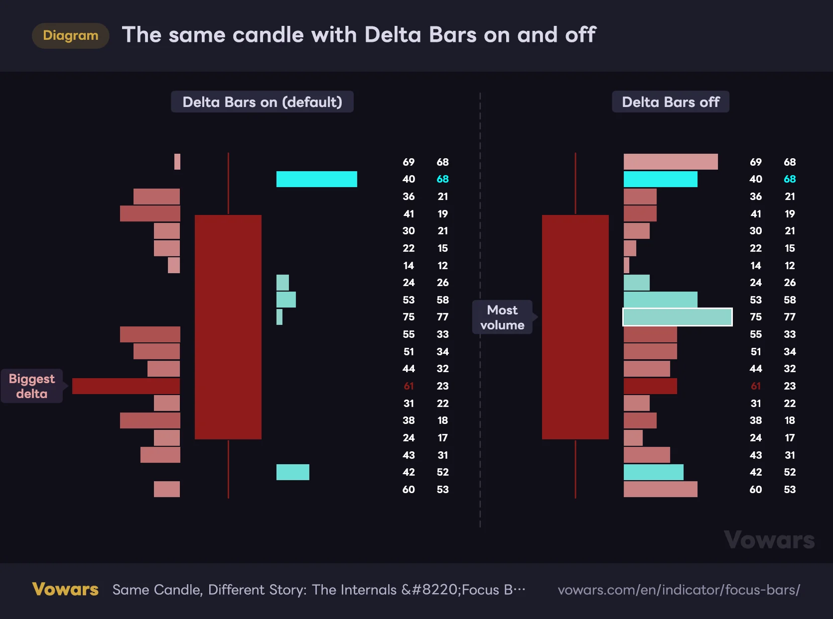
Delta Bars off switches the rows from measuring which side won to measuring how much traded. The same candle side by side makes it obvious.
The same candle with Delta Bars on and off
It is the same candle on both sides. What changes is which way the rows point and what their length measures.
Vowars DE ver.3.8.0
With it off, every row runs right and its length is total volume at that level, buys plus sells. Colour still comes from the delta, which is why you end up with red rows sitting on the right-hand side. The spacing between Focus Bars also tightens, from 60 bars to 45.
Rule of thumb: on when you care about imbalance, off when you want to know where the candle actually did its business. The longest row with the mode off is close in meaning to the POC on a volume profile, the level with the most volume traded. I leave it on nearly all the time and flip it off on candles at key levels to find where the trading was centred.
Setting it up on TradingView
1Match your chart timeframe to Granularity
The first decision is how your chart timeframe pairs with Granularity. Your chart timeframe has to be comfortably larger than Granularity. Pick 1-Minute on a 1-minute chart and there is nothing inside the candle to break apart. Here is roughly how many lower-timeframe bars you get per candle.
| Chart timeframe | With 1-Minute | With 1-Second |
|---|---|---|
| 1 min | Nothing to split | 60 |
| 5 min | 5 | 300 |
| 15 min | 15 | 900 |
| 1 hour | 60 | 3,600 |
| 4 hour | 240 | 14,400 |
| Daily (24/7 market) | 1,440 | 86,400 |
A 5-minute chart on 1-Minute leaves five bars inside each candle. Split that into 20 rows and most rows are just the same 1-minute volume divided up again. My own rule of thumb is at least 60 bars inside a candle, so I run 1-Minute on the 1-hour and above and 1-Second on anything faster.
2Pick how many bars to show, then find them on the pane
Bars To Show runs from 1 to 8. The default 5 works well on a wide desktop layout; on a phone I found around 3 far easier to handle. Once you have set it, zoom the chart out a little and check where the Focus Bars have landed.
3Wait for the rightmost bar to close
The Focus Bar on the far right is the live candle. Its shape, its rows and its numbers all keep updating until the candle closes. As a rule, base decisions on closed candles: once a candle is done, its internals are fixed and will not be redrawn. When a new candle opens, the whole set shifts along by one and the oldest bar drops off.
4Carry the strongest levels back to the main chart
Take the price of the most saturated row, which is the one with the coloured number next to it, and drop a horizontal line at that level on your main chart. It marks a place to watch on later candles: does price stall there or go straight through? Since the pane’s vertical axis is real price, you can read the level off the pane and draw the line with the horizontal line tool.
Nothing guarantees that line will act as support or resistance. It is a record of where one candle’s flow was lopsided, no more. Give priority to the ones that line up with something else, a recent swing high or low or a moving average, and you will cut the list down to the levels worth watching.
Settings and what to run them at
There are only eight settings. The two that need any real thought are Granularity and Rows.
| Setting | Default | Recommended | What it does |
|---|---|---|---|
| Granularity | 1-Minute | 1-Minute on 1-hour and above, 1-Second below that | How fine the lower-timeframe data is. Finer means more bars inside each candle, so each row’s imbalance reflects reality more closely |
| Delta Bars | On | On | On puts sell-heavy rows left and buy-heavy rows right. Off sends every row right and makes length total volume |
| Bars To Show | 5 | 5 on desktop, 3 on mobile | How many recent candles get broken out (1-8). More bars means more chart width used |
| Rows | 20 | 20-30 | How many rows each candle is split into (5-150). More rows means finer detail but thinner volume per row |
| Buy-Side Color | #96d3c8 / #00ffff | Default | Left is the colour for small buy deltas, right for large ones. The right-hand colour is also used for up candle bodies and the largest buy figure |
| Sell-Side Color | #d39696 / #8f1b1b | Lighten the right-hand red if it is hard to see | Left is the colour for small sell deltas, right for large ones. The right-hand colour is also used for down candle bodies and the largest sell figure |
| Text Color | White | Default | Colour of the sell and buy volume figures, except on the extreme rows |
| Bars Offset | -30 | -30 | Horizontal position of the whole set. Negative shifts left, positive shifts right into the future area |
Granularity: a couple of things to watch
The dropdown offers 5-Minute alongside 1-Minute, 1-Second and 1-Tick. The author’s description only covers the latter three, and I have not been able to confirm that picking 5-Minute really does split the candle into 5-minute pieces. For now I would leave it alone.
1-Second and 1-Tick depend on the symbol and on your TradingView plan, and are not always available. Where the lower-timeframe data cannot be pulled, no Focus Bar is drawn for that candle at all. Combinations that pull an enormous amount of data per candle, 1-Second on a daily chart being the obvious one, can also bog the chart down. Use the table above as a guide and resist going finer than you need.
Rows and Bars To Show have a ceiling when combined
Rows goes up to 150, but push it up alongside Bars To Show and the older Focus Bars start rendering incomplete. TradingView caps how many boxes one indicator can draw, 500 in this case, and each Focus Bar eats 1 + Rows × 3 of them.
| Bars To Show | Max Rows that still renders everything |
|---|---|
| 3 | 55 |
| 5 (default) | 33 |
| 8 | 20 |
More rows gives you a finer shape. It also puts less volume in each row, and because one 1-minute bar’s volume gets divided across several rows, the imbalance smooths out and becomes harder to pick. Splitting 240 one-minute bars on a 4-hour candle, I think 20 to 30 rows is where detail and readability balance out.
Starting points by trading style
| Style | Chart timeframe | Granularity | Bars To Show | Rows |
|---|---|---|---|---|
| Scalping | 1-5 min | 1-Second (1-Tick if available) | 3 | 20 |
| Day trading | 15 min to 1 hour | 1-Second on 15 min, 1-Minute on 1 hour | 5 | 20-30 |
| Swing trading | 4 hour and daily | 1-Minute | 5 | 20-30 |
Each of these clears both bars: at least 60 lower-timeframe bars inside a candle, and a row count that still renders in full. The higher the timeframe, the more substance there is inside each candle, and I found the 4-hour and daily the easiest to read by some margin.
Where it fits, and where it struggles
How good the internals are comes down to how close the lower-timeframe volume is to what actually traded. Symbols where you get genuine exchange volume are the sweet spot: CME index futures such as ES and NQ, gold futures, crypto spot and perps, and heavily traded ETFs like SPY.
Spot FX is the other story. There is no single exchange behind it, so the volume TradingView shows is whatever that data feed saw, or plain tick counts. The shape of the imbalance still means something; the size of the numbers deserves a pinch of salt. Thin symbols and dead hours are a poor fit too, since a lot of 1-minute bars close unchanged and their volume never makes it into the totals.
In terms of market conditions, breakout candles and long-wicked reversal candidates are where you will reach for it most. Inside a quiet range with small candles, every Focus Bar tends to look much like the last and there is little to take away.
Pair it with a volume profile
“Focus Bars” only ever shows you the inside of the last few candles. For the bigger picture of where volume has built up over a wide range, TradingView’s own Volume Profile Visible Range fills the gap neatly. Find the high-volume nodes on VPVR, then use “Focus Bars” to inspect the candles that trade into them. You get to move between the wide view and the inside of a single candle.
TradingView ships a Volume Footprint chart type that breaks each candle’s volume out by price level. It needs a Premium plan or higher (as of 11 Sep 2026). “Focus Bars” caps out at eight candles, but in exchange it lets you try the same kind of analysis without Premium.
What works and what does not
Strengths
- Shows which side actually dominated inside an upper or lower wick
- Splitting rows left and right makes sell-heavy and buy-heavy levels obvious at a glance
- Prints sell and buy volume per level as actual numbers
- Once a candle closes, its internals are fixed and never repaint
- Few settings; get the timeframe and granularity paired and you are running
Weaknesses
- Only the last 1-8 candles are drawn, so reviewing older ones means running Bar Replay
- Row length is relative to each candle, so comparing candles means reading the numbers
- Takes up a lot of chart width, and on mobile getting the numbers readable is a chore
- Buys and sells are inferred from price direction, not real bid/ask prints
- No signals and no alerts; every read is on you
Things worth knowing before you rely on it
Reviewing old candles takes Bar Replay
Only the most recent handful of candles ever get drawn, so scrolling back to a candle from last month and opening it up is not a thing. Bar Replay is the way around it: set the replay start to that date and the indicator recalculates from that point, drawing Focus Bars for the candles leading into it. You are stepping through manually, and how far back you can go depends on your plan and interval, with intraday replay off the table on the free tier, so this is no substitute for grinding through a large sample. For going back over one candle that caught your eye, it does the job.
The live candle is still moving
The rightmost Focus Bar keeps changing until the candle closes. Call it early, deciding to short because the upper wick shows net selling, and the rest of the candle can turn the whole picture around. Closed candles never repaint, so let the candle finish before you act on it.
A Focus Bar is an estimate of what happened inside a candle that has already finished. A sell-heavy row does not mean the next candle goes down. Use it as one input alongside trend direction and key levels, never on its own.
Fast 1-minute bars smear their volume thin
A 1-minute bar’s volume is spread evenly over every row its range touches. The more that bar travelled in the minute, the thinner its volume gets smeared across the rows.
So even if serious selling hit during a one-minute flush, the Focus Bar just shows an even band of selling across the whole range. Where the prints actually clustered is lost. Around data releases and on violently fast candles, either drop to a finer granularity or read the row shape as a broad tendency rather than a precise map.
Change the data feed and the internals change
BTCUSDT on one exchange carries different volume from BTCUSDT on another, and the author says as much: the level of detail you can reconstruct varies by symbol and by feed. If you are flipping between exchanges, do not put the Focus Bar numbers side by side and treat them as comparable.
For traders who read candles as a process, not a result
 Image
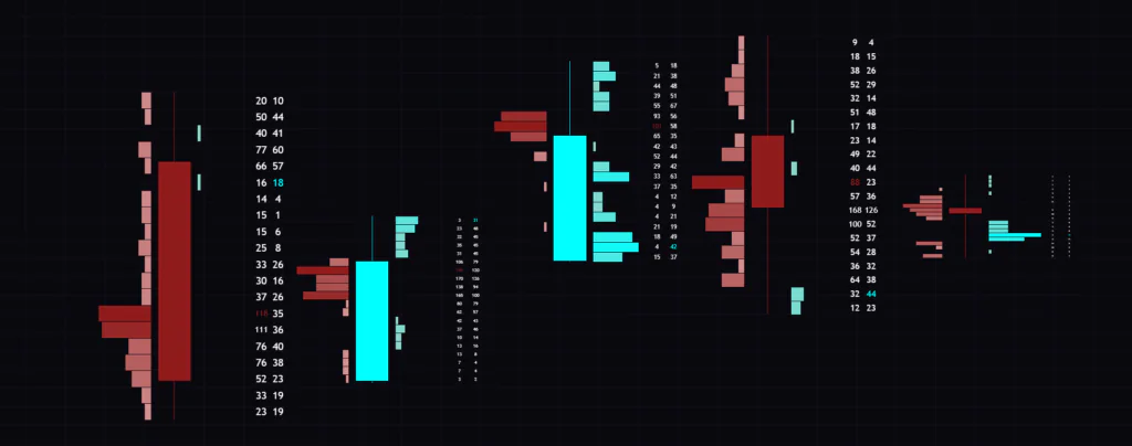
Image“Focus Bars” is a magnifying glass for how a candle got built. It does not produce signals, so nothing about your win rate changes the moment you add it. What it does give you, every time a long wick shows up, is a way to check whether anyone actually sold up there, and for discretionary traders working key levels that is worth a lot.
The people who will get the most out of it are swing traders picking apart key candles on the 4-hour and daily, and day traders with access to 1-Second data who want to see inside faster candles. If your process is grinding through large samples of historical candles to build rules, or you work mostly on a phone, the display limits will grate. Start with defaults on a 4-hour chart and break down one recent long-wicked candle. Seeing what the shape was hiding changes how those candles feel.