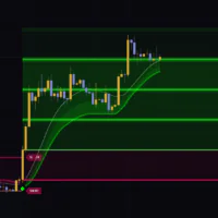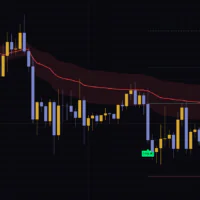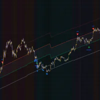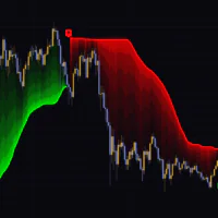


Isotropic Trend Lines: a trend channel that lets you compare slopes by the numbers
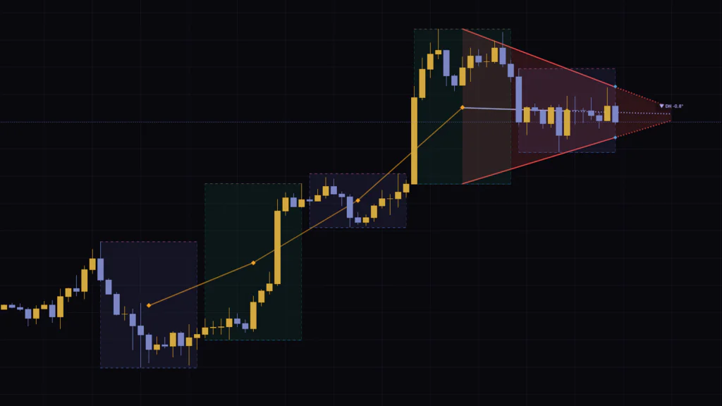
Isotropic Trend Lines is a trend channel built so you can compare the angle of a trendline across different markets and timeframes. Its full name on TradingView is “Smart Trader, Episode 06, Isotropic Trend Lines,” and it shows up on the chart under the short title “ST-EP06.” It was published open-source by ata_sabanci, and it has also been featured in TradingView’s Editors’ Picks.
Here’s the catch with any trendline you draw: its angle doesn’t actually tell you anything about the market. Stretch the chart horizontally and the slope flattens out; squeeze it and the slope gets steeper. A gold daily chart and a Bitcoin 1H chart can both look like a 30° trend while telling completely different stories. Isotropic Trend Lines tackles this by putting price on a log scale and dividing by recent volatility (σ, the typical size of a single bar’s move). Measure the slope in that σ-scaled space, and you get an angle that doesn’t care how zoomed in you are.
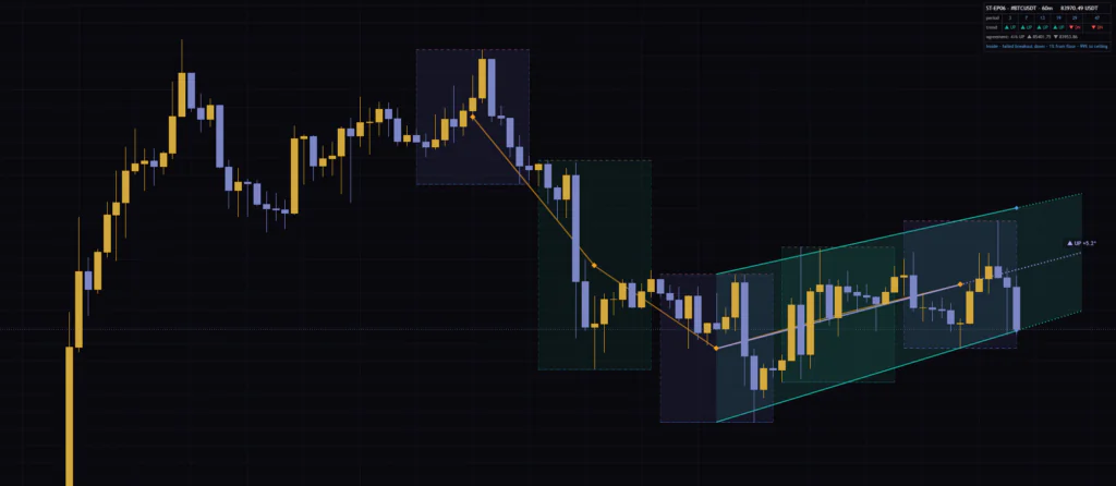
I ran it on Bitcoin’s 15m, 1H and daily charts for a while and compared it against price action. My first reaction was confusion: there’s a lot on screen, yet the one thing the indicator is built around, the angle, doesn’t show up at default settings. Once the mechanics clicked, though, a quick look at the channel and the dashboard was enough to tell me which timeframes the market is trending on, and how hard. In this review I’ll break down everything that appears on the chart, one piece at a time, so you can decide whether it deserves a spot on yours.
At the end of the description, the author states plainly that Isotropic Trend Lines does not generate buy or sell signals and does not predict price. What you get is context: the direction and strength of the structure, and where price sits within the channel. Read it as a map of the market and you’re far less likely to misuse it. Entries should come from other confluence you pair it with.
What shows up on the chart, and what doesn’t by default
First, let’s sort out what actually gets drawn. Isotropic Trend Lines lets you toggle nearly every visual element in the settings, so the chart looks very different at default settings versus with everything switched on.
| Element | Default | What it shows |
|---|---|---|
| Channel (solid lines and fill) | Shown | Ceiling and floor of the trend segment. Green for up, red for down, gray for range |
| Projection (dotted lines) | Shown | The channel slope extended 7 bars forward as-is |
| ◆ markers (blue) | Shown | Ceiling and floor on the latest bar. Hover to see the close, ceiling, floor and position % inside the channel |
| Dashboard | Shown (top right) | Direction on six timeframes, the vote, channel prices, and a breakout status line |
| Block boxes and GM | Hidden | A price-range box for every 13 bars, plus its midpoint (orange ◆ and connecting line) |
| Angle line (lavender) | Hidden | The line between the two points the angle is measured from, plus its projection |
| Direction/angle label | Hidden | Direction and angle, e.g. “▲ UP +11.3°” |
Pay attention to the last row. The angle, supposedly the headline feature, never appears on the chart unless you turn on Show Angle Label. The dashboard has no angle field either, so at default settings you end up with an “angle-comparison indicator” that doesn’t show you the angle. I spent a minute hunting for the label myself.
Right after adding it, go to the Block Visualization group and turn on Show Angle Label. That alone puts a direction and angle label above the channel. Also note that the label is only drawn while Show Channel is on, which saves you a “where did my label go?” moment.
It sets direction by comparing 13-bar “blocks”
Isotropic Trend Lines doesn’t look at candles one at a time. It chops recent price action into chunks of 13 bars and compares those chunks to decide direction. The author calls each chunk a “block.”
Each block is boiled down to one midpoint between its high and low
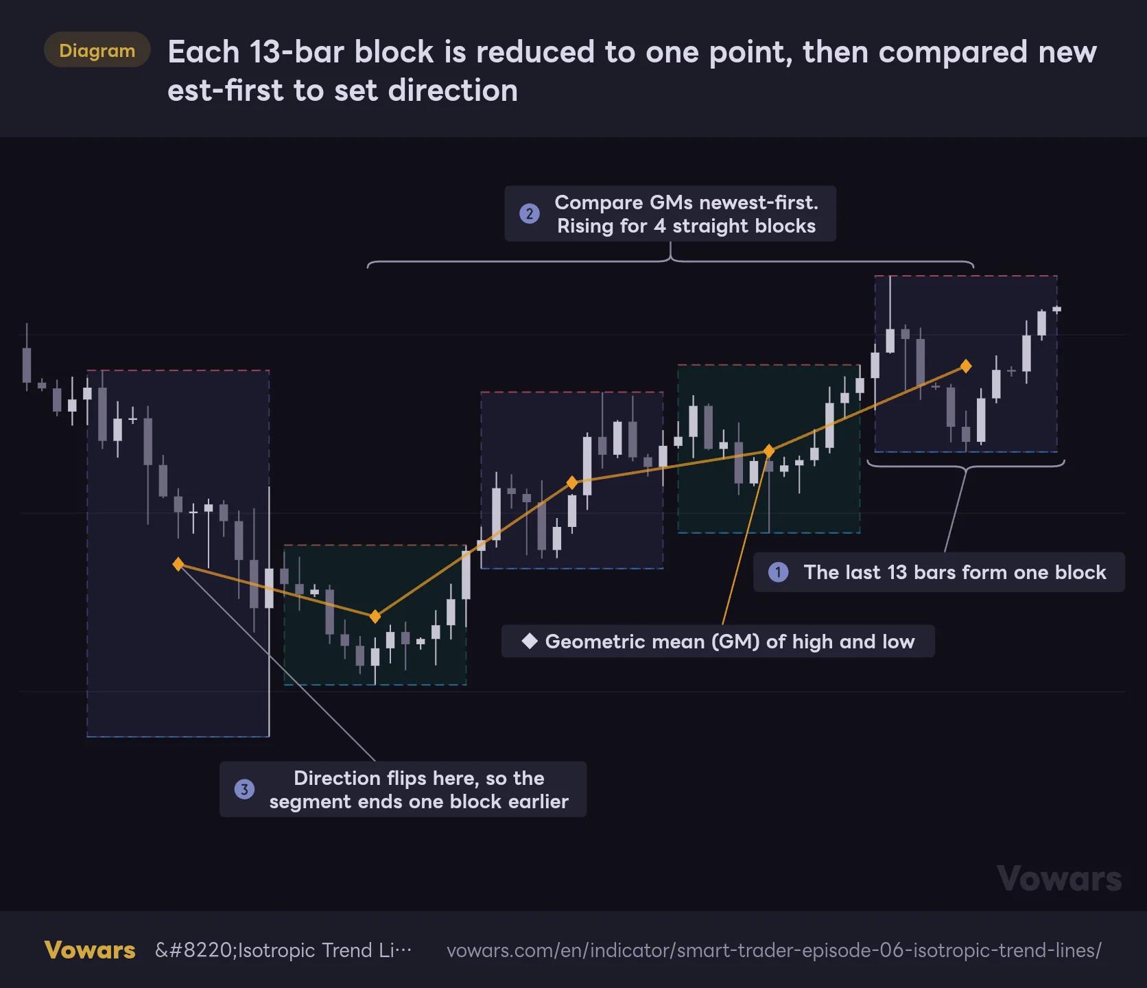
For each block it takes the highest high and the lowest low and calculates their geometric mean (multiply the two and take the square root; in log terms, the exact midpoint). That’s the GM (Geometric Mean). Because the representative value is the center of the range, a single big bar at the end of a block doesn’t drag it around much. Turn on Show Blocks and the boxes and GMs appear on the chart (Figure ①).
Each 13-bar block is reduced to one point, then compared newest-first to set direction
Show Blocks is on (Show Channel is off). Each dashed box is one block, and the orange ◆ is that block’s midpoint.
Vowars DE ver.3.12.1
The comparison runs from the newest block backward
Direction starts with the GM of the newest block versus the GM of the block before it. Higher means up, lower means down. From there it keeps comparing further back and extends the segment for as long as the direction holds. The moment it flips even once, the segment ends (Figure ②, Figure ③).
By default it looks at five blocks (Trend Block Groups = 5), so it reaches back up to 65 bars. In the figure above, the rise holds for four blocks and breaks on the fifth. That surviving stretch is what feeds the channel and the angle from here on.
Block boundaries are not pinned to the clock. The newest block is always “the last 13 bars,” so every time a new bar prints, all the boxes slide one bar to the right. If the boxes sit in a different spot today than yesterday, that’s not a bug. Don’t treat the boxes like horizontal levels.
The channel connects block highs to block highs, and block lows to block lows
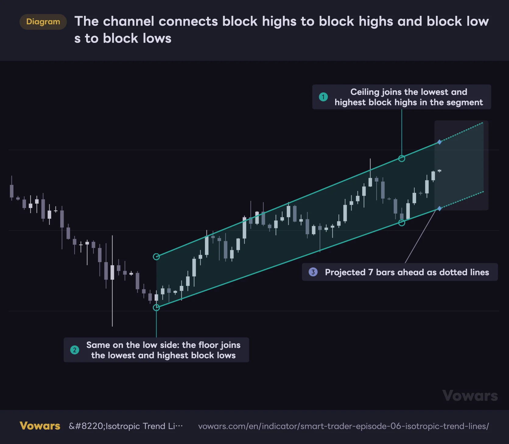
Once the trend segment is set, the indicator pulls four values from the blocks inside it: the highest and lowest block highs, and the highest and lowest block lows. In an uptrend, the line from the lowest to the highest block high becomes the ceiling, and the line from the lowest to the highest block low becomes the floor (Figure ①, Figure ②). In a downtrend the pairing is reversed.
The channel connects block highs to block highs and block lows to block lows
Default settings. The solid lines are the trend-segment channel, the dotted lines are the 7-bar projection, and the ◆ on the right mark the ceiling and floor on the latest bar.
Vowars DE ver.3.12.1
The lines start at the center of the oldest block in the segment and run as solid lines up to the latest bar. From there they’re extended as dotted lines for Projection Offset bars (7 by default) (Figure ③).
One detail that’s hard to pick up from the description: the four anchor points aren’t placed on the bar that actually printed the wick. They sit at the center bar of each block. So the lines won’t necessarily tag the real highs, and candles can poke outside the ceiling or floor mid-segment. If you’re expecting a classic wick-to-wick trendline, it’ll look a little off.
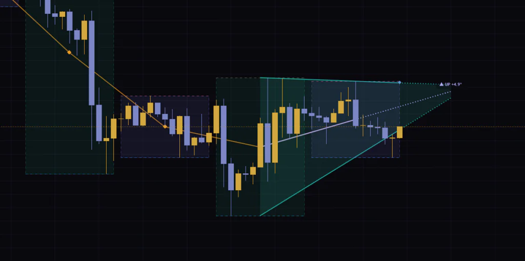
The ceiling can even slope down during an uptrend. If the lowest block high is more recent than the highest one, the ceiling and floor converge into a wedge. If the lines cross, the channel stops at the intersection and no projection is drawn.
The angle is “σ per bar,” converted to degrees with arctan
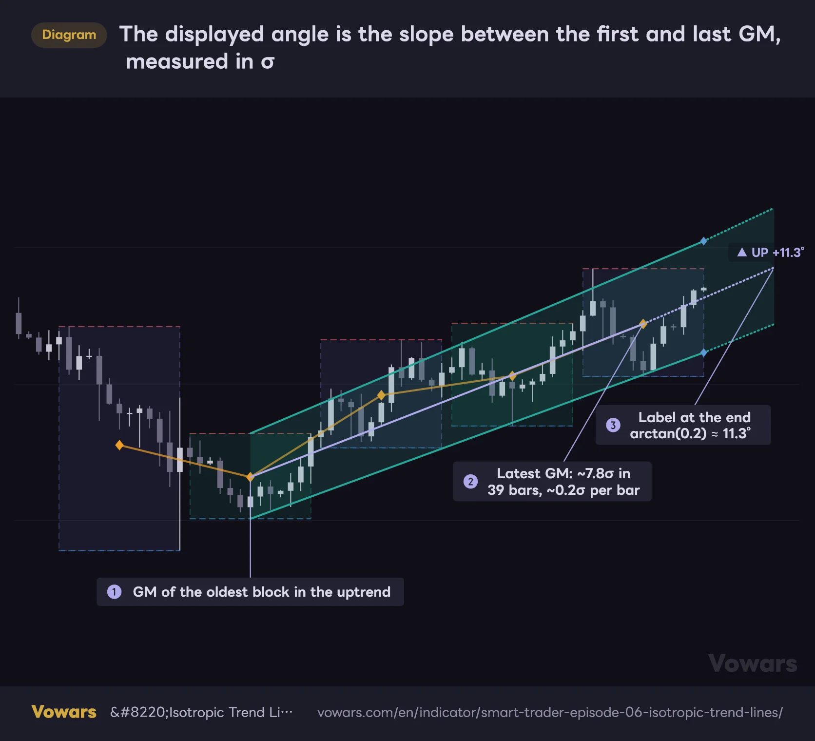
The angle in Isotropic Trend Lines is the slope of the line joining the GM of the oldest block in the trend segment to the GM of the newest block. Turn on Show Angle Line and this line appears in lavender (Figure ①, Figure ②).
The displayed angle is the slope between the first and last GM, measured in σ
Show Blocks, Show Angle Line and Show Angle Label are all on. The lavender line is the exact line the angle is measured from.
Vowars DE ver.3.12.1
Here’s how the math flows. Take the log difference between the two points and divide by σ to express the move in “how many σ.” Divide by the number of bars between them to get “σ per bar,” then run arctan to turn it into an angle. In the figure above, price climbed about 7.8σ over 39 bars, so roughly 0.2σ per bar, which works out to 11.3° (Figure ③).
45° means 1σ per bar, i.e. price advancing by a full “normal bar” every single bar. That’s a serious rip or dump, and you rarely see it on a real chart. In what I watched on Bitcoin, even clean trends sat around 10–20°, and the daily after a sharp rally was about 17°. My rough mental scale: under 5° is weak, over 15° is strong.
σ comes from the Yang-Zhang estimator over the last 20 bars
The σ in the denominator is calculated with the Yang-Zhang (2000) estimator. It combines three pieces, the gap from the previous close to the next open, the open-to-close move, and the high-low range, so it uses more information than a close-to-close standard deviation. The lookback is Yang-Zhang Sigma Length (20 bars by default).
That leads to a practical caveat. σ is taken as of the latest bar, so the angle changes when volatility changes, even if price hasn’t moved. When the market suddenly gets choppy, σ expands and the same move prints a smaller angle.
Crypto trades 24/7, so there’s almost no gap between bars. Intraday stock charts, or markets with trading breaks like gold, can gap at the reopen. σ includes those gaps, so after a big gap σ stays inflated for a while and the angle can look flatter than the trend really is. It’s safer not to compare strength by angle right after a gap.
The dashboard: a six-timeframe vote plus where price sits in the channel
The dashboard in the top right has five rows. It’s in English, with seven language options in total (as of Sep 25, 2026). At the default Dashboard Font Size of 12 the text is tiny, so I bump it to 16.
The dashboard packs a six-timeframe vote and your position in the channel into one panel
Shown with Dashboard Font Size raised to 16. There are five rows; read them top to bottom and you can follow the market structure.
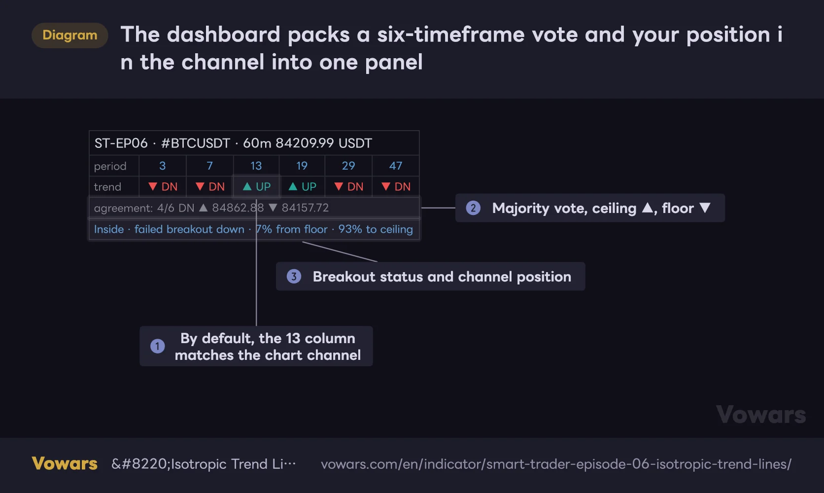
Values in the table are illustrative.
Vowars DE ver.3.12.1
Rows two and three run the same analysis in parallel with six block sizes: 3, 7, 13, 19, 29 and 47 bars. If short and long cycles all point the same way, you can read the trend as holding across timeframes. Row four is the vote, how many of the six agree, followed by the channel ceiling (▲) and floor (▼) prices (Figure ②).
The column that matches the chart channel is “13”
The author’s description says the 19 column is the primary engine, reflects your settings and is highlighted. In practice, all six columns are calculated with fixed lengths, and nothing is highlighted. The channel on the chart is calculated separately using Trend Block Period, and at the default of 13 bars, the column that gives the same reading is “13” (Figure ①). Across my screenshots on three timeframes, the 13 column always matched the channel color.
The six-column vote and the chart channel are calculated separately. As in the example above, the vote can say 4/6 DN while the channel points up, and that’s perfectly normal. No need to suspect a glitch. This is how a split between bullish short cycles and bearish long cycles shows up on screen.
The vote display has another quirk. It shows whichever of UP or DN has more votes, and only shows RNG when the two are tied. So even 1 UP, 0 DN and 5 RNG reads “1/6 UP.” Always check the number, not just the direction.
How to read the dashboard text
| Display | Meaning |
|---|---|
| period | The six block sizes (3, 7, 13, 19, 29, 47 bars) |
| trend | Direction for each block size. ▲ UP is up, ▼ DN is down, ◈ RNG is range |
| agreement: 4/6 DN | Four of six point down, the majority. The ▲▼ that follow are the channel ceiling and floor prices |
| Inside channel · 41% from floor · 59% to ceiling | Price is inside the channel, 41% up from the floor and 59% below the ceiling |
| Breakout Up at price · 26% above ceiling | Price broke above the ceiling. The price is the ceiling at the time of the break; the % is how far above the ceiling price is, relative to channel width |
| Retest Up · broke at price · now price | After breaking out and moving away, price has come back near the ceiling |
| ✓ / retested price | Price retested, moved away again, and the breakout is confirmed. “retested” is the close at the retest |
| (gap) | Price crossed the entire channel to the other side in one move |
| Inside · failed breakout up | Price broke above, then fell back inside the channel (failed breakout) |
| Inside · direction changed | The channel direction flipped and the breakout record was reset |
Every % is “percent of channel width,” measured on a log scale. Because it’s relative to the channel width, it reads the same way no matter what price range the market trades in.
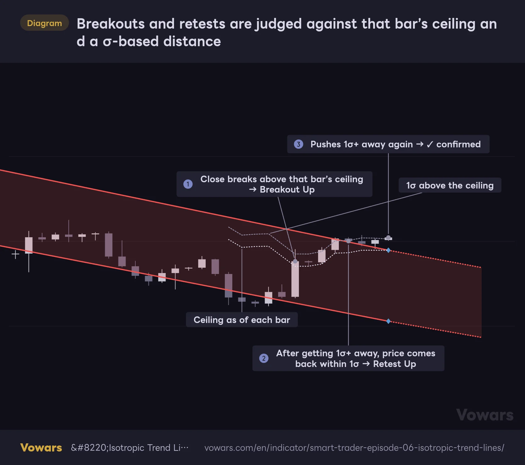
Breakouts and retests are judged against that bar’s ceiling and a σ-based distance
The bottom row of the dashboard tracks the relationship between price and the channel through five states. Let’s walk through what flips each one.
1Close above the ceiling = Breakout Up
When a close that was inside the channel settles above the ceiling, the state becomes “Breakout Up.” A close below the floor gives “Breakout Down.” The key point: it’s judged on the close, not the wick.
2Move 1σ+ away, then come back within 1σ = Retest Up
After the breakout, once the close gets at least 1σ away from the ceiling, the indicator records that price has cleared it. If price then drifts back to within 1σ of the ceiling while still outside the channel, you get “Retest Up.” Since 1σ here is just one bar’s typical move, even a smaller pullback than you’d expect counts as a retest.
3Push 1σ+ away again = ✓ confirmed
From the retest state, another push of 1σ or more away confirms the breakout and adds a ✓. On the other hand, if the close drops back inside the channel during the retest, it’s marked “failed breakout,” and if price rips all the way through to the other side, “(gap)” is added.
Breakouts and retests are judged against that bar’s ceiling and a σ-based distance
The default channel is overlaid with the ceiling as it stood on each bar, which is what the checks actually use. The gray dotted lines are for explanation only and do not appear in TradingView.
Vowars DE ver.3.12.1
Here’s the whole sequence in one figure (Figure ① → Figure ② → Figure ③). Look at the gray dotted lines. The channel is redrawn every bar, so the ceiling used for the check shifts a little every bar too. Taking the latest channel and laying it over past bars to re-judge old breakouts will mislead you. To see what was actually displayed back then, use Bar Replay, which I cover below.
Because the channel gets redrawn, you’ll sometimes get a breakout even though price barely moved. The ceiling of a falling channel keeps dropping, so it can slide under a sideways price and trigger Breakout Up. Don’t trade off the status text alone; eyeball the channel shape and where price actually is.
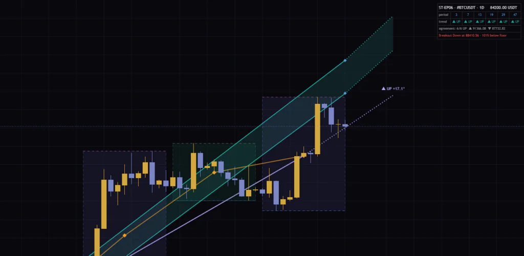
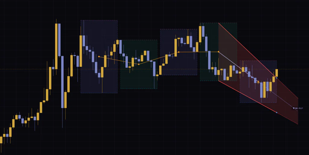
I saw this a lot on live charts. On Bitcoin’s 15m, the channel was still falling (DN −15.3°) while the dashboard read “Breakout Up · 26% above ceiling,” which did tell me the selling was running out of steam. On the daily, the opposite happened: after a sharp rally the channel stayed steep at “UP +17.1°” while price had fallen a full channel width below the floor, reading “101% below floor.” Direction is judged block by block, so it lags on sharp reversals.
Live Bar vs. Close Bar, and how repainting works here
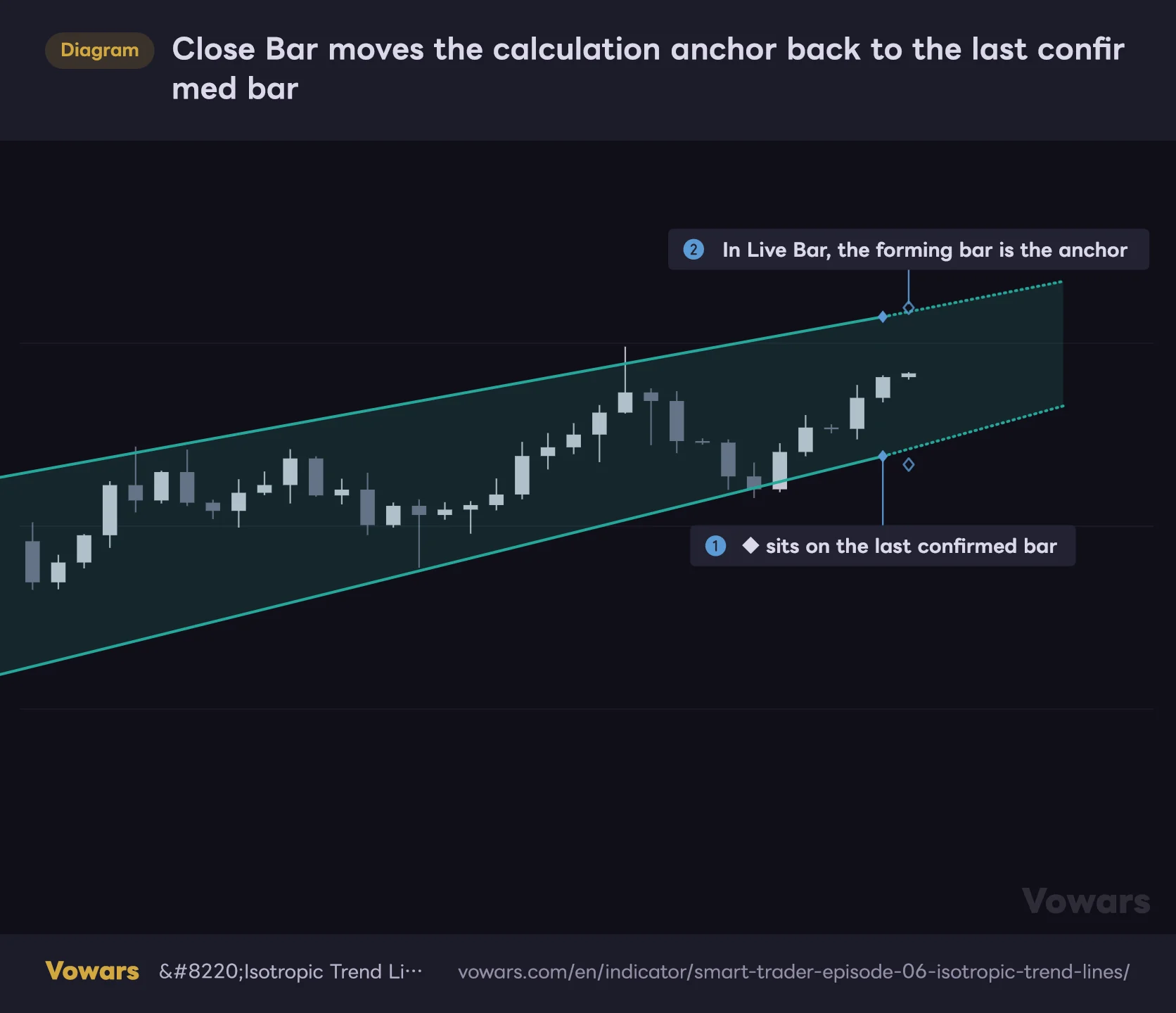
Calculation Bar decides which bar anchors the calculation. The default, Live Bar, includes the forming bar, so values and lines move until the bar closes. Switch to Close Bar and the last confirmed bar becomes the anchor, so confirmed values never change after the fact (Figure ①, Figure ②).
Close Bar moves the calculation anchor back to the last confirmed bar
Calculation Bar is set to Close Bar. The channel end and the ◆ markers sit on the bar before the forming bar on the far right.
Vowars DE ver.3.12.1
Neither mode uses future data. The Live Bar behavior is the same “values wobble on the unconfirmed bar” you get with most TradingView indicators, and the author discloses it in both the description and the settings tooltips. The one exception is the price at the top of the dashboard, which always shows the live price, even in Close Bar mode.
One more thing to know: the channel, boxes and labels are only drawn on the latest bar. Scrolling back won’t show you what the channel looked like at some point in the past. If you want to check that, TradingView’s Bar Replay works: the indicator recalculates with the replay bar as the latest bar, so you can step forward one bar at a time and follow the channel as it was. It’s manual, though, and how far back you can go on intraday charts depends on your plan and timeframe (as of Sep 25, 2026).
When you want to test it on historical charts, set Calculation Bar to Close Bar and step through with Bar Replay one bar at a time. Judging it as “accurate” from how the latest bar looks is dangerous; it only becomes real evidence once you’ve checked what was displayed at that moment.
Settings, and which ones are worth changing
The inputs are split into six groups: calculation, lines, display, fill, block visualization and alerts. Most of them are cosmetic, so let’s start with the five that affect the calculation.
| Setting | Default | Suggested | Effect |
|---|---|---|---|
| Calculation Bar | Live Bar | Live Bar for alerts, Close Bar for backtesting and analysis | Anchors the calculation to the forming bar or to the last confirmed bar |
| Trend Block Period | 13 | 13 (if changing, 7, 19 or 29) | Bars per block. Higher picks up slower structure, lower reacts faster. Affects only the chart channel |
| Trend Block Groups | 5 | 5 (3–4 for faster response) | Number of blocks compared (3–5). Applies to all six timeframes; max lookback is 47 × Groups |
| Range Threshold (°) | 0.5 | Start around 3 | Angles inside this band are classified as range. Applies to all six timeframes |
| Yang-Zhang Sigma Length | 20 | 20 | Lookback for σ. Shorter reacts faster to volatility shifts; longer is more stable |
Match Trend Block Period to a dashboard column
Trend Block Period can be set anywhere from 5 to 100 bars, but I recommend sticking to 7, 13, 19 or 29. The six dashboard columns use fixed lengths, so if the channel length matches one of them, you can read “chart channel = that column.” Set it to 14, for example, and no column on the dashboard lines up with the channel anymore.
For a swing-leaning read, 19 is a good starting point; to catch small pullbacks, try 7. Keep in mind that 7 bars × 5 blocks only covers 35 bars, so the channel will flip direction on noise fairly often.
The default Range Threshold (°) almost never calls a range
The default 0.5° works out to a slope of about 0.009σ per bar. Even across 52 bars (13 bars × 4 steps), that’s only about 0.5σ of movement, so it won’t call a range unless price is going almost perfectly sideways. In practice, the only RNG I saw was the occasional one in the longer-cycle columns of the dashboard.
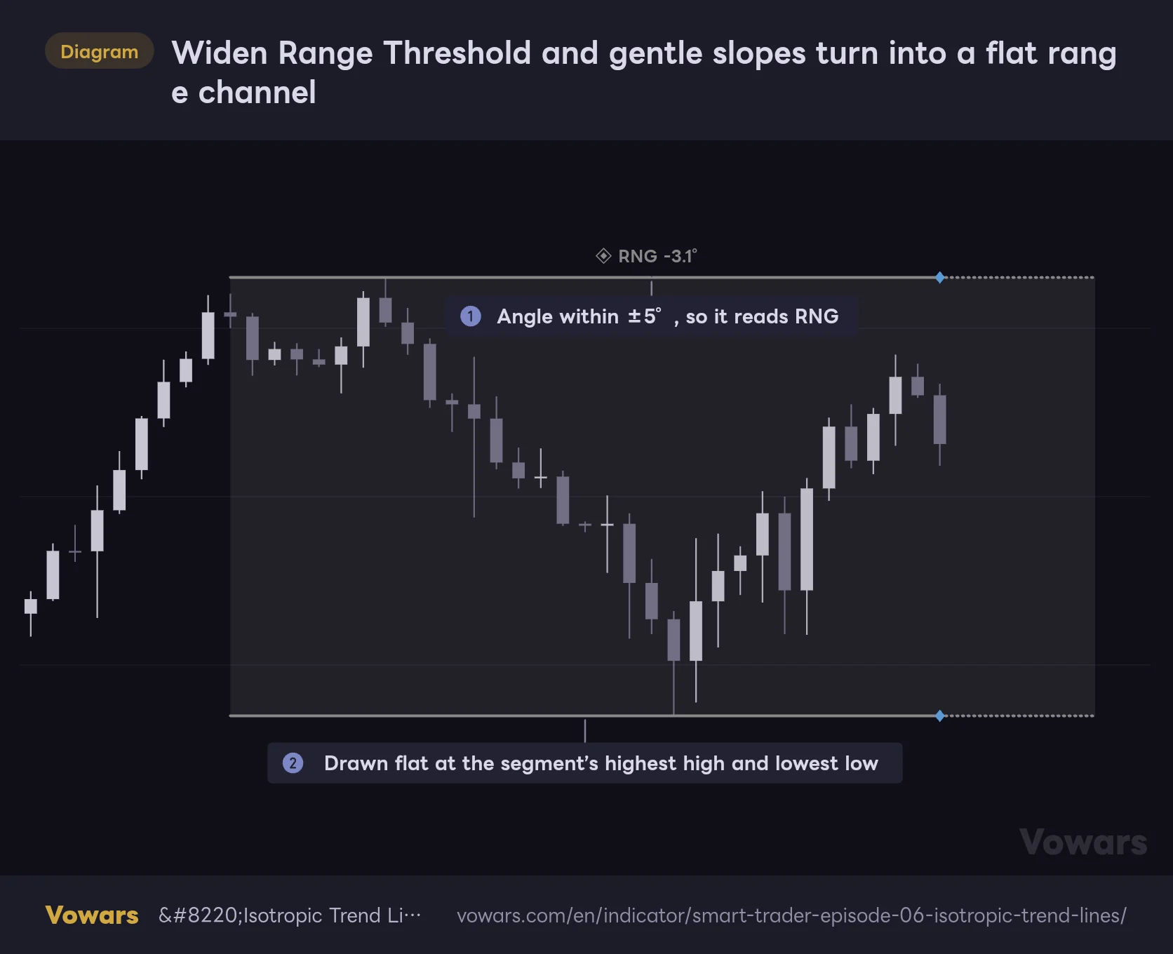
Widen Range Threshold and gentle slopes turn into a flat range channel
Range Threshold (°) is set to 5 with Show Angle Label on. The angle stayed within ±5°, so the channel switched to flat gray lines.
Vowars DE ver.3.12.1
If you want gentle trends treated as “no direction,” try Range Threshold (°) around 3 as a starting point. 3° is roughly 0.05σ per bar, or about 2.7σ over 52 bars. When a range is called, the channel turns into flat gray lines drawn at the highest high and lowest low of the segment (Figure ①, Figure ②). This value also applies to all six dashboard columns, so push it too high and the vote turns into a wall of RNG.
Display settings
| Setting | Default | Suggested | Effect |
|---|---|---|---|
| Up Color / Down Color / Range Color | Green / Red / Gray | No change needed | Channel line colors. Fill colors are set separately |
| Line Width / Line Style | 2 / Solid | No change needed | Width and style of the solid channel lines |
| Projection Offset | 7 | 7 (around 13 for swing trading) | How many bars forward the projection extends (1–100) |
| Projection Width / Projection Style | 2 / Dotted | No change needed | Width and style of the projection lines |
| Language | English | English | Dashboard language (seven options) |
| Show Channel | On | On | Shows the channel, projection, fill, ◆ markers and label together |
| Show Fill | On | Your preference | Fill inside the channel |
| Show Dashboard | On | On | Shows the dashboard |
| Dashboard Font Size | 12 | 14–16 | Dashboard font size (6–50). Also scales the ◆ markers and label |
| Dashboard Position | Top Right | Your preference | Dashboard position (9 options) |
| Fill Transparency | 85 | 85 | Fill transparency. 0 is solid, 100 is invisible |
| Show Blocks | Off | On only when checking the mechanics | Block boxes, dashed high/low lines, GM ◆ and connecting line |
| Show Angle Line | Off | Your preference | Shows the line the angle is measured from, plus its projection |
| Show Angle Label | Off | On | Shows the direction and angle label |
| Enable Alerts | Off | On only when creating alerts | Master switch for the 19 alert conditions |
The block colors and transparency (Block Color (Even) and so on) only need changing if they clash with another indicator. Show Blocks makes the chart pretty busy, so I only turn it on when I want to check the mechanics; day to day I just add Show Angle Label.
19 alert conditions. Turn on Enable Alerts before creating them
Isotropic Trend Lines offers 19 alert conditions across five categories. To use them, turn on Enable Alerts and leave Calculation Bar on Live Bar. If you enable alerts while in Close Bar mode, the chart shows a warning, “⚠ Alerts require Calculation Bar = Live Bar,” and every alert is suppressed.
| Category | Alert name | When it fires |
|---|---|---|
| D (Direction) | ▲ Uptrend Entry / ▼ Downtrend Entry / ◈ Range Entry | On the bar where the channel direction turns up, down or range |
| B (Breakout) | ▲ Breakout Up / ▼ Breakout Down | Break above the ceiling / below the floor |
| B (Breakout) | ✓ BO Up Confirmed / ✓ BO Down Confirmed | Breakout confirmed after a retest |
| R (Retest) | ↺ Retest Up / ↺ Retest Down | Price came back within 1σ after a breakout |
| S (Structural) | ⚡ Gap Up Through / ⚡ Gap Down Through | Price crossed the entire channel in one move |
| S (Structural) | ✗ Failed Breakout Up / ✗ Failed Breakout Down | Price fell back inside the channel after a breakout |
| S (Structural) | ↻ Direction Reset | Direction flipped and the breakout record was reset |
| A (Agreement) | 🔵 Full Bull 6/6 / 🔵 Strong Bull 5/6 | Six or five of the six columns turned up |
| A (Agreement) | 🔴 Full Bear 6/6 / 🔴 Strong Bear 5/6 | Six or five of the six columns turned down |
| A (Agreement) | ◈ Range Consensus ≥4/6 | Four or more of the six columns are in range |
In Live Bar mode, conditions can appear and disappear while the bar is still forming. Set the alert trigger to Once Per Bar Close and you’ll only be notified if the condition is still true when the bar closes, which filters out intrabar fakeouts. If you go with Once Per Bar for speed, treat each alert as a heads-up and confirm on the chart once the bar closes.
For a more advanced setup, the angle, the vote (UP count minus DN count) and the channel position % are output as values that don’t appear on the chart. Put something like {{plot(“Angle”)}} in the alert message and the notification will include the angle.
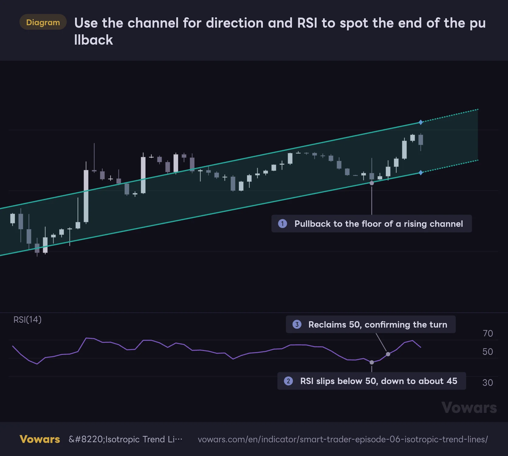
Best pairing: RSI. Use the channel for direction and RSI for the end of the pullback
What Isotropic Trend Lines tells you is which way the market leans, how hard, and where price sits in the channel. What it doesn’t tell you is when a pullback is done. For that gap, RSI(14) was the best fit for me.
Use the channel for direction and RSI to spot the end of the pullback
Isotropic Trend Lines at default settings with RSI(14) below. When price pulls back to the floor of a rising channel, check what RSI is doing.
Vowars DE ver.3.12.1
The workflow is simple. When the channel is rising and price pulls back near the floor (Figure ①), check RSI. If RSI dips below 50 (Figure ②) and then reclaims 50, that’s evidence the selling pressure is fading (Figure ③). RSI is calculated from price alone, so it works the same in FX, where volume data varies from broker to broker.
The 50 line is a guideline, and how well it works depends on the market. The floor won’t always hold, so it matters more to have an exit plan: if price closes below the floor and “Breakout Down” appears, be ready to cut the trade.
What I learned using it: where it shines and where to be careful
Where it shines
- Because the angle is divided by σ, “strong vs. weak” stays consistent across timeframes and markets
- Direction on six timeframes sits in one row, so short- vs. long-term splits jump out
- Breakouts, retests and failures appear as short English status lines, making it hard to misread where price is relative to the channel
- With blocks and the angle line on, you can verify the logic behind every reading right on the chart
- No future data, and in Close Bar mode confirmed readings never change
Where to be careful
- No angle at default settings; turning on Show Angle Label is a must
- Direction is judged block by block, so it lags on sharp reversals
- The channel is redrawn every bar, and past channels aren’t kept on the chart
- Dashboard text is tiny at the default font size and easy to misread
- Unlike the description says, the dashboard’s 19 column doesn’t match the channel
Most of the cautions go away once you change a setting or two and know how to read it. The lag, though, is baked into the design. I found it easier to accept up front that this isn’t the tool for catching the first leg of a sell-off.
Where it fits: market conditions and timeframes
It’s at its best in the middle of a clear trend. While channel direction, angle and the vote all line up, it works as a map for finding dips near the floor and rallies near the ceiling. In directionless chop, the channel flips every time block GMs swap places, and the lines never settle. In that kind of market, raising Range Threshold (°) and treating it as a range gives a cleaner read.
Timeframe-wise, 1H to daily felt the most comfortable. It looks at 13 bars × 5 blocks = 65 bars, which is about 16 hours on the 15m, about 2.7 days on the 1H, and about two months on the daily (roughly three months for stocks that only trade weekdays). It handles anything from day trading to swing trading without strain. It will run on 1m charts for scalping, but the Live Bar wobble and the direction lag stood out, and I didn’t get much out of it there.
The longest-cycle column (47 bars) needs 47 bars × 5 blocks = 235 bars of history before it calculates. On freshly listed markets, or timeframes with limited history, some columns or the channel itself may not appear.
A channel for traders who want angle as a number, not a feeling
The core of Isotropic Trend Lines is that it brings in an angle that doesn’t depend on chart scaling. Being able to answer “is today’s trend stronger than last week’s?” or “which has more momentum, gold or Bitcoin?” with the same yardstick is something I haven’t gotten from any other trend channel.
 Image
ImageOn the flip side, the angle is hidden at default settings, and parts of the dashboard description don’t match what it actually does. The setup I settled on comes down to three things: turn on Show Angle Label, match Trend Block Period to a dashboard column, and backtest with Close Bar and Bar Replay. That clears up most of what the description leaves unclear.
It won’t time your entries for you, but if you want “which way, how strong, and where in the channel” on one screen, I think it’s well worth keeping on your chart.