
An Indicator That Checks This Chart’s Own History to See Which Way a Squeeze Tends to Break
There’s no shortage of indicators that spot a squeeze, the stretch where price coils up and volatility dries out. The classic read is simple: when the Bollinger Bands slip inside the Keltner Channels, energy is building. But almost all of them stop at “squeeze on” and “squeeze fired.” Which way it breaks is still your call.
“Squeeze AI – Breakout Direction Probability” (just “Squeeze AI” from here on) goes after that second half. It logs every completed squeeze on the chart, along with which way price actually went afterward. Then, the moment a new squeeze fires, it prints a label showing what percentage of the 15 most similar past squeezes broke to the upside. It isn’t a formula that predicts the future. It takes a majority vote from the historical record of the same symbol on the same timeframe.
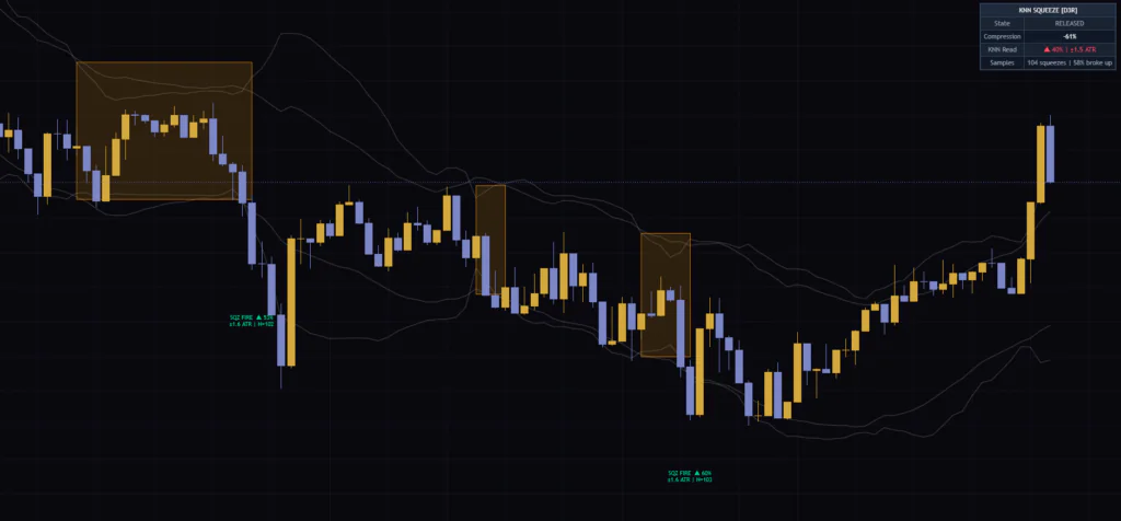
I ran it on Bitcoin’s 5-minute, 1-hour, daily and weekly charts for a few days. My first impression: for a squeeze tool, it’s refreshing that the numbers are the main thing you read. That said, a few of those numbers are easy to misread, and I’ll dig into each of them below.
It’s a method that looks through the data you have, picks the k items most similar to what you’re checking, and answers by majority vote. In Squeeze AI, k is 15 by default, and “similar” is measured as distance across five yardsticks, such as how long and how deep the squeeze was. In the legend it shows up under its short name, “KNN Squeeze Breakout [D3R]”.
What Shows Up on the Chart and What Each Piece Means
Let’s start by sorting out what’s on screen. It looks like a lot at first, but each element has a clear job.
| Element | When it appears | What it shows |
|---|---|---|
| Four thin white lines | Always | Upper and lower Bollinger Bands (BB) and upper and lower Keltner Channels (KC) |
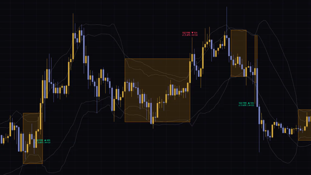
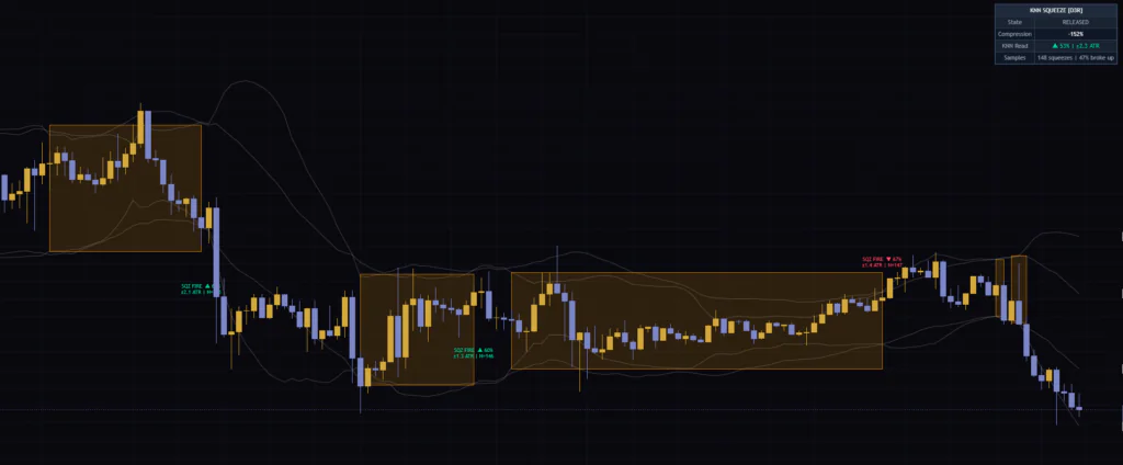
| Orange box | From the bar the squeeze starts to the bar it releases | How long the squeeze lasted, plus the BB high and low during that stretch |
| SQZ FIRE label | On the release bar (after it closes) | Majority direction of similar past squeezes, the percentage, the average move and the number of stored samples |
| Anticipation label (SQUEEZE ○ bars) | Only on the latest bar while a squeeze is on | The majority direction while the squeeze is still building |
| Dashboard | Latest bar (top right) | State, squeeze depth, the latest read, stored samples and the overall upside breakout rate |
How the Four White Lines Relate to the Orange Box
The squeeze condition is the textbook one. A bar counts as “in a squeeze” when the upper BB is below the upper KC and the lower BB is above the lower KC, in other words when the BB sits entirely inside the KC. The BB is the 20-period SMA of the close ± 2 standard deviations, and the KC is the same 20-period SMA ± 1.5 × ATR(20).
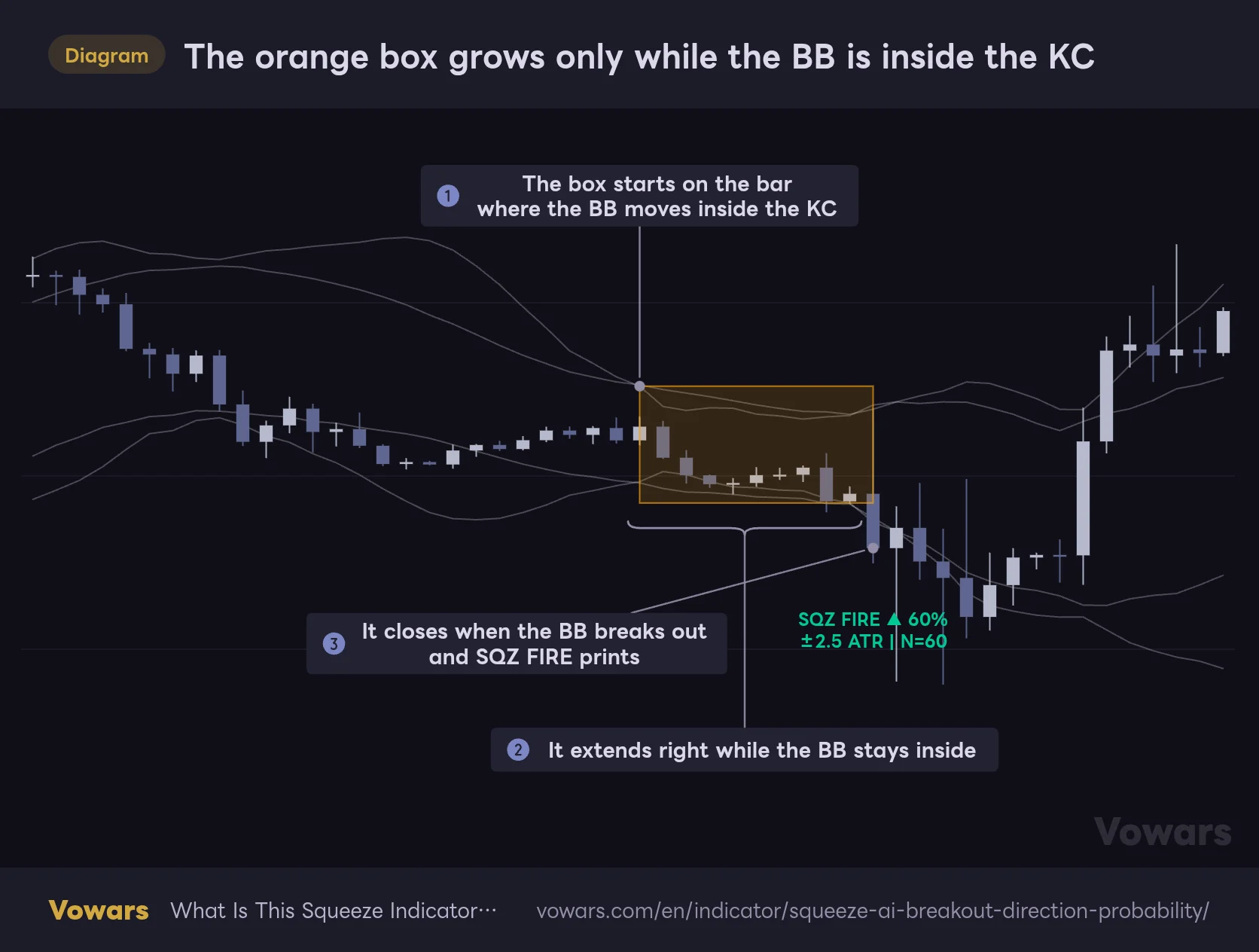
The orange box grows only while the BB is inside the KC
The box starts on the bar where both Bollinger Bands move inside the Keltner Channels, and closes with a SQZ FIRE label on the bar where they break back out.
Vowars DE ver.3.12.4
The box is created on the bar where the squeeze begins ① and keeps extending to the right while the BB stays inside. Its top and bottom stretch to wherever the BB got widest during that time, so the box height often ends up matching where the BB sat right after the squeeze started ②. On the bar where the BB pushes back outside the KC, the box closes and SQZ FIRE prints on that same bar ③.
One thing that bugged me in practice: all four lines are drawn in the same (quite faint) white, so you can’t tell BB from KC by color. Turn on Fill Between BB in the settings and the two gaps between the BB and KC, above and below, get a light gray fill. That makes it obvious at a glance whether the bands are inside. Going by the name, you’d expect it to fill between the upper and lower BB, but what actually gets shaded is the gap between the BB and KC.
What Compression Reading Counts as a Tight Squeeze?
“Compression” on the dashboard tells you how narrow the BB is compared with the KC. The formula is 1 − (BB width ÷ KC width), so if the BB is exactly as wide as the KC you get 0%, and if it’s half as wide you get 50%.
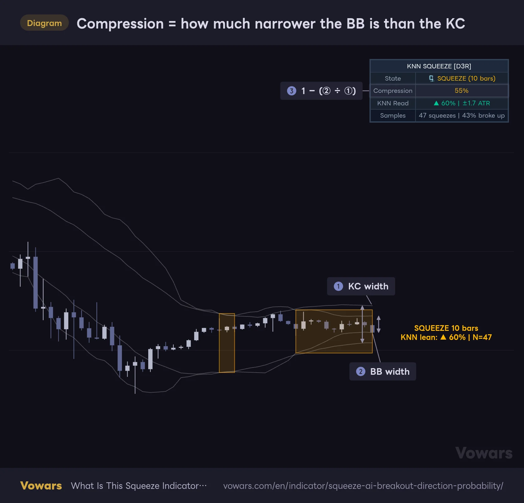
Compression = how much narrower the BB is than the KC
On the latest bar, the BB width is compared with the KC width, and 1 − (BB width ÷ KC width) is shown as Compression on the dashboard.
Vowars DE ver.3.12.4
On the latest bar in the figure, measured against the KC width ①, the BB width ② has shrunk to a bit under half, so Compression reads 55% ③. Once it goes above 50%, the number turns yellow, which works as a quick cue that things are really tight.
Heads up: this number can go negative. After the release, when the BB gets wider than the KC, you’re subtracting something bigger than 1 from 1. On my Bitcoin charts it showed -20% on the 5-minute and -152% on the 1-hour. Read a negative value as “not in a squeeze,” and a large negative as “already expanded a lot” and you’re fine. If you assume it always stays between 0% and 100%, it’ll throw you at first.
Read the SQZ FIRE Label as a “Vote of 15 Similar Squeezes”
The SQZ FIRE label is the star of this indicator. Exactly one prints, right as the release bar closes.
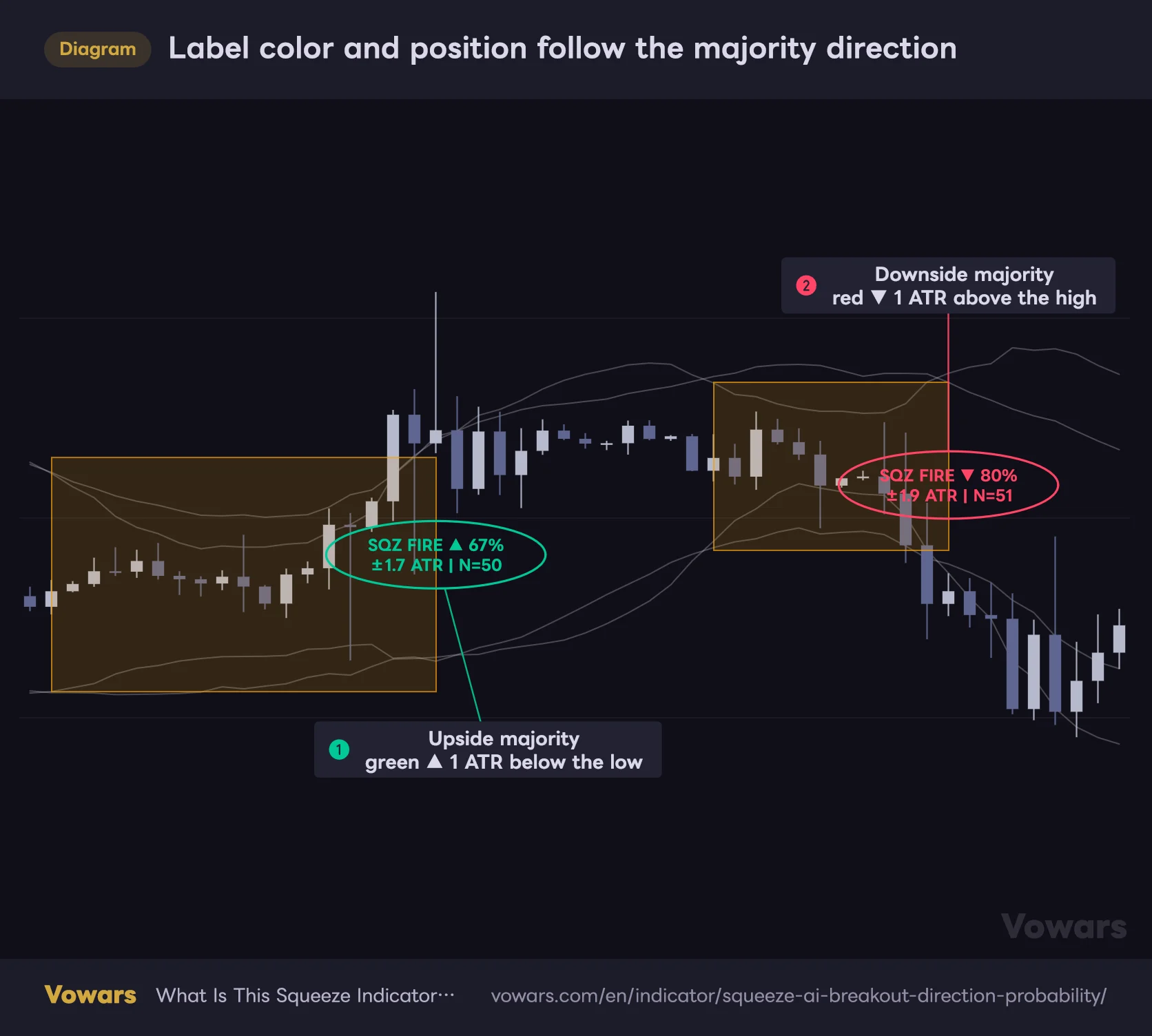
Label color and position follow the majority direction
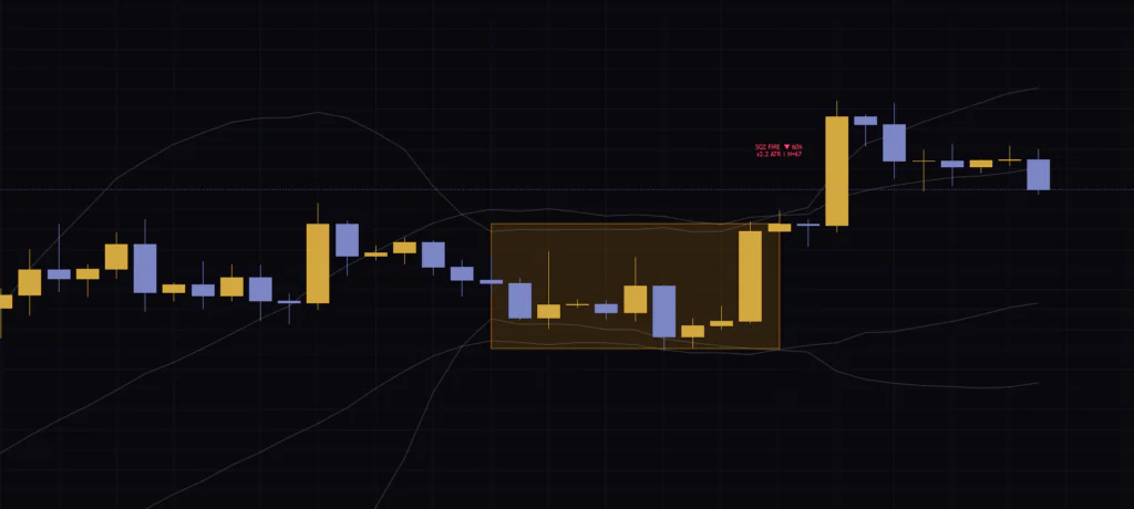
If at least half of the 15 similar past squeezes broke up, you get a green ▲; otherwise a red ▼, and the label flips from below to above the bar.
Vowars DE ver.3.12.4
If at least half of the 15 most similar past squeezes broke up, you get a green “▲” placed 1 ATR(14) below the low ①. If fewer than half did, it becomes a red “▼” placed 1 ATR above the high, and the percentage switches to the downside share ②. The label has a transparent background, so the text can overlap the candles.
Break the label down into three parts.
| Example | Meaning | How to read it |
|---|---|---|
| ▲ 67% | Share of the 15 similar squeezes that broke up | It’s a 15-vote majority, so it moves in steps of about 6.7%: 53%, 60%, 67%, 73%… |
| ±1.7 ATR | Average distance of the close 10 bars later across those 15 cases, in ATR units | An average that mixes up and down moves. It carries no direction |
| N=50 | Total number of squeezes stored so far | Not the number of votes. The 15 are picked from this pool |
Sure enough, the labels on my screen jumped in clean steps too: 53%, 60%, 67%. There’s not much point sweating small differences. I’ve found it works best to read it at the level of “60s or 70-plus.”
The public description includes an example that reads like “68% of the 34 most similar squeezes broke up,” but on the actual chart N is the total number of squeezes stored on that chart. Only the 15 picked from that pool (the K Neighbors value) take part in the vote. Whether N is 100 or 30, the denominator is always 15. Keep that in mind and it won’t trip you up.
Also, the example writes “+2.1 ATR” with a plus sign, but the real label shows “±”. It’s an average that lumps upside and downside moves together, so don’t read it as “expect a 2.1 ATR move up.”
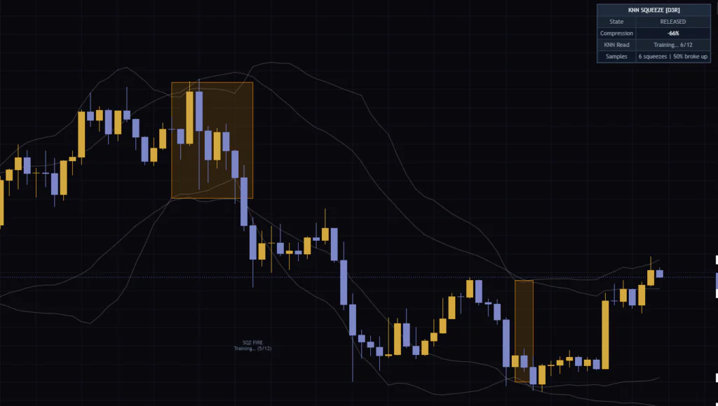
Until 12 samples are stored (the default for Min Samples Before Display), the label shows gray text like “Training… (4/12)” instead of a percentage. When I put it on the weekly chart, it topped out at 6 samples even with all available history loaded, and the dashboard stayed on “Training… 6/12.”
Under the Hood It Repeats Two Steps: Five Yardsticks and a 10-Bar Check
Knowing where the label’s numbers come from tells you when to trust them and when to be skeptical. Each release records the five values below, each scaled to roughly 0–1 before it’s stored.
| Yardstick | What it measures | How it’s scaled |
|---|---|---|
| Duration | How many bars the squeeze lasted | Capped at 40 bars (anything longer counts the same) |
| Depth | Highest Compression reading during the squeeze | Clamped to 0–100% |
| Volume profile | Average of volume divided by its 20-bar average during the squeeze | Capped at 3× |
| Momentum at release | Slope of a 20-bar linear regression divided by ATR(14) | Clamped to −1 to +1 |
| Volatility regime | ATR(14) relative to its own 50-bar average | Capped at 3× |
When a new squeeze fires, these five values are compared by distance against every stored squeeze, and the 15 closest are chosen. All five carry equal weight. On symbols with no volume data, the volume value is always treated as the same number, so in practice similarity comes down to the other four.
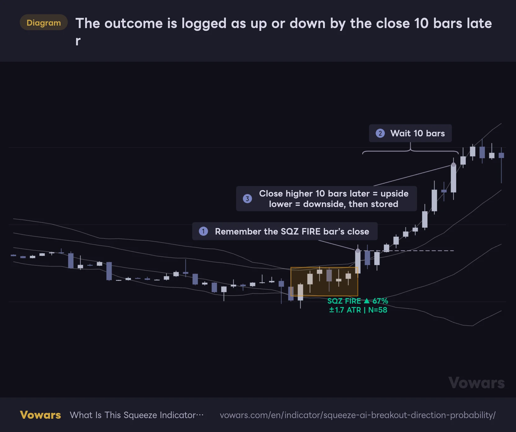
The outcome is logged as up or down by the close 10 bars later
The close of the SQZ FIRE bar is compared with the close after the Outcome Window (10 bars by default). Higher is added to the training data as an upside breakout, lower as a downside breakout.
Vowars DE ver.3.12.4
The way outcomes are recorded is about as blunt as it gets. It remembers the close of the SQZ FIRE bar ① and waits the number of bars set in Outcome Window (bars), 10 by default ②. If the close 10 bars later is higher, it’s logged as an upside breakout. If it’s lower, a downside breakout ③.
Even if price spikes well higher along the way, a close 10 bars later that’s even slightly lower gets logged as a downside breakout. It only compares one close with another. How far the highs or lows reached doesn’t matter. So “▲70%” means “in 70% of cases, price closed higher 10 bars later,” which isn’t quite the same as “a 70% chance of a big move up.”
Some Squeezes Get a Box but No Label
Right after I started using it, I noticed spots with an orange box but no SQZ FIRE. I thought it was a bug, but after tracking the behavior there turned out to be two reasons.
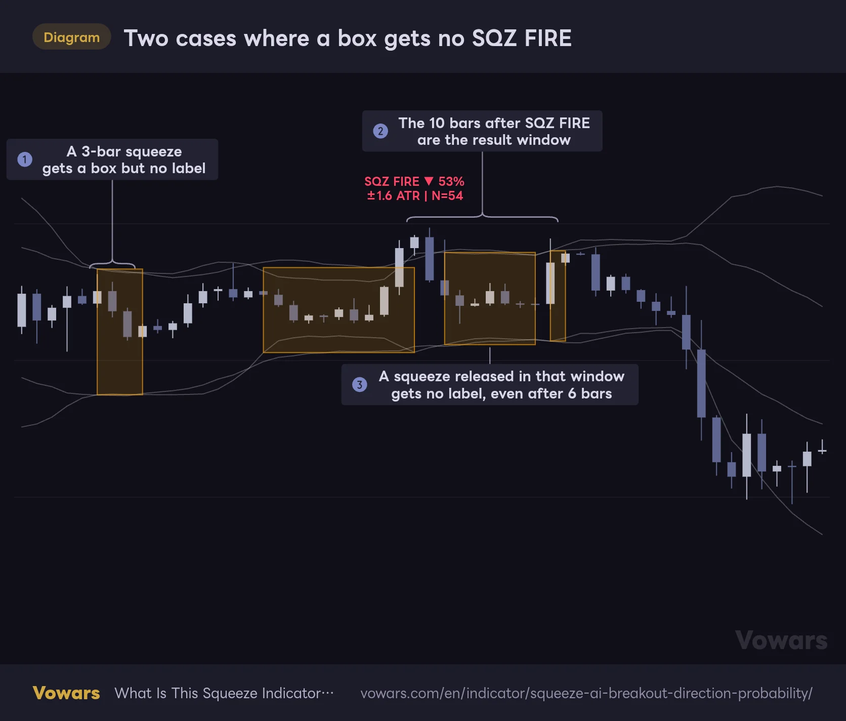
Two cases where a box gets no SQZ FIRE
An orange box is drawn for every squeeze, but only squeezes that meet the conditions get a label.
Vowars DE ver.3.12.4
The first is a squeeze that’s too short. If a squeeze doesn’t reach Min Squeeze Duration (bars) (4 bars by default), you get the box but no label and no record ①.
The second is easier to miss: a squeeze that releases while the previous SQZ FIRE is still waiting on its outcome gets no label, no matter how long it lasted. The 10 bars after a SQZ FIRE are an “awaiting result” window ②, and any squeeze that fires inside it is left out of the calculation ③. That’s why labels look thinned out in markets that squeeze and release in quick succession. The “Squeeze Fired” alert follows the same rule, so it stays silent in these spots too.
While the Squeeze Is Still On, Watch the Anticipation Label and the Dashboard
Even while things are still coiling, the latest bar gives you a running read on “which way did past squeezes like this one break?” The way it’s displayed has a quirk worth knowing.
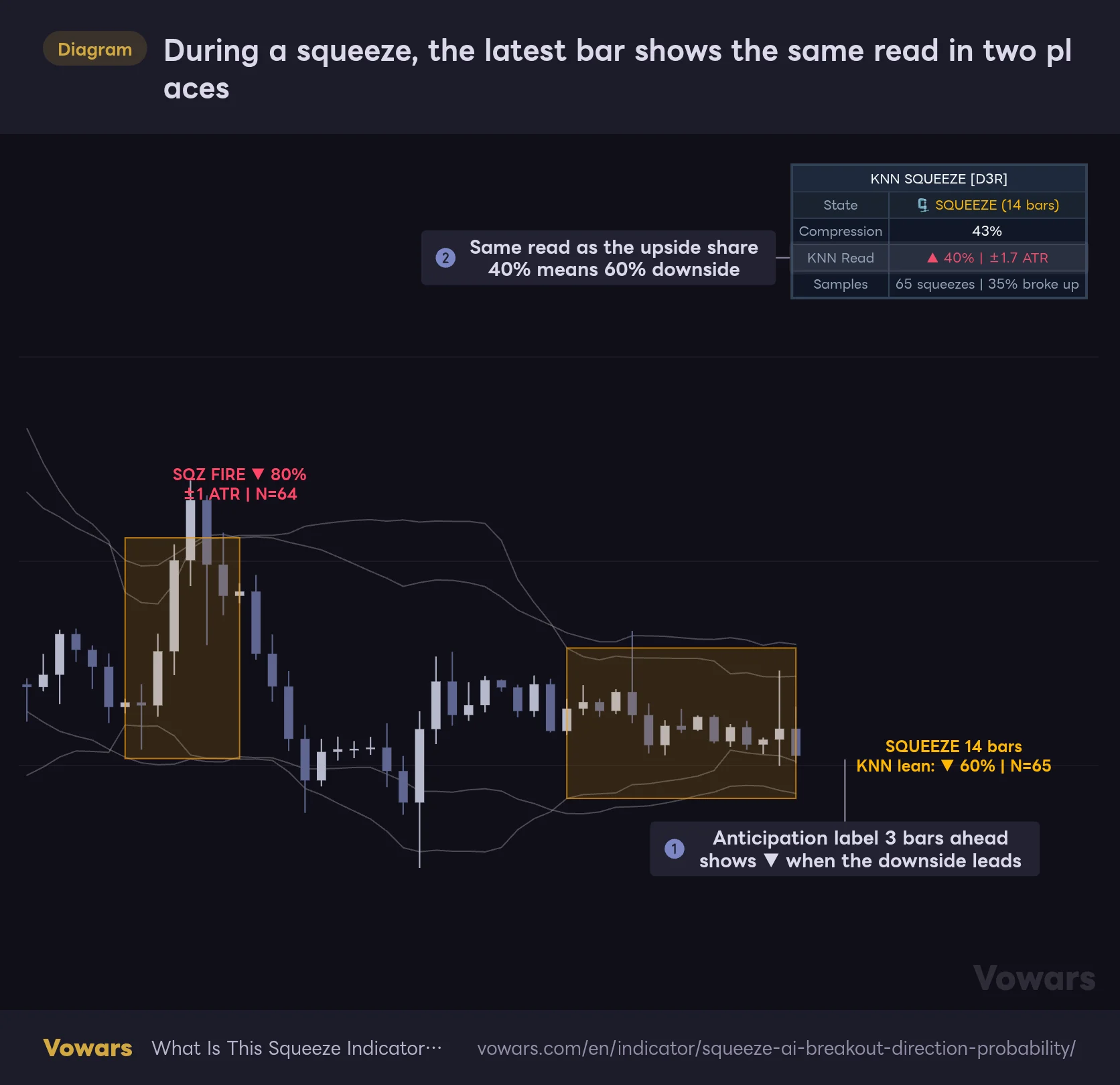
During a squeeze, the latest bar shows the same read in two places
The anticipation label on the chart and KNN Read on the dashboard show the same result, written two different ways.
Vowars DE ver.3.12.4
Three bars to the right of the latest bar, an anticipation label appears in orange text, something like “SQUEEZE 14 bars / KNN lean: ▼ 60% | N=65” ①. The dashboard’s KNN Read shows the same result, but it always shows the upside share with a “▲”, whichever side has the majority ②. A red “▲ 40%” means the downside side is at 60%. At first I misread that red ▲ as “a weak bullish sign.” Going by the color is the safe way to read it.
The anticipation label only appears on the latest bar and is deleted and redrawn every time a new bar comes in. If you want to see how it evolved during a past squeeze, step through with TradingView’s Bar Replay and you can follow it as if each bar were the live one. How far back you can go depends on your plan and timeframe.
When the state is RELEASED, the dashboard’s KNN Read keeps showing a number. But at that point it’s searching for neighbors with placeholder inputs (0 bars of duration, average volume, and the previous squeeze’s depth), so it doesn’t tell you much about the next squeeze. I found it easier to just decide that during RELEASED I only look at the “Samples” row.
How I Actually Use It
After a few days with it, this is the routine I settled on. It assumes short-term trading on the 5-minute to 1-hour charts.
1Check the Samples count first
Look at “Samples” at the bottom of the dashboard to see how many squeezes are stored. A percentage appears at 12, but between 12 and 14 there are fewer than 15 samples, so every sample votes and the number is just the overall average. The “pick the similar ones” effect only kicks in once you’re well past 15. Until you pass about 50, I’d treat the numbers as a rough reference.
2During the squeeze, watch Compression and the anticipation label
Once the box starts growing, keep an eye on whether Compression pushes past 50% and turns yellow, and which way the anticipation label is leaning. Don’t act yet. Just get ready for the break.
3Check direction and percentage on SQZ FIRE
When the release bar closes and SQZ FIRE prints, check the color and the percentage. Something close to a coin flip, like 53%, tells you that history couldn’t make up its mind either, so I usually pass. I only treat it as a candidate at 70% or higher, and only when the next step lines up too.
4Make sure it agrees with the higher-timeframe trend
Don’t enter on the label alone. Check it against the trend direction. The next section shows how I combine the two, with a figure.
5Use ±ATR as a gauge of range
“±3.2 ATR” means that in similar squeezes, the close 10 bars later ended up about 3 ATR away from the release bar’s close on average. It has no direction, so it isn’t a take-profit target in itself. I use it to judge whether this is the kind of squeeze that tends to move big, and to weigh that against my stop distance.
The Best Pairing I Found: the 200 EMA
I tried a few, and the easiest to work with was TradingView’s built-in EMA set to 200. The SQZ FIRE percentage is a record of similar past squeezes, so it doesn’t account for which way the market is leaning right now. The long-term moving average fills that gap.
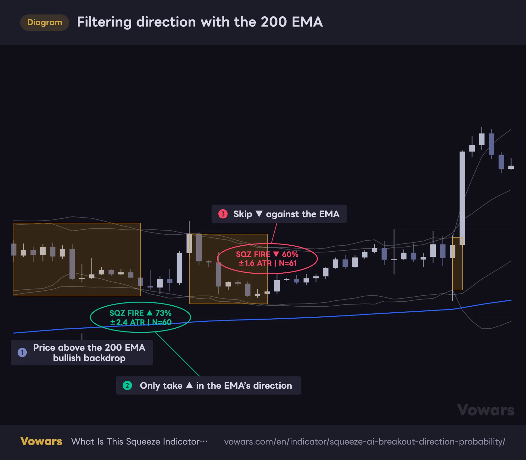
Filtering direction with the 200 EMA
Overlay TradingView’s built-in EMA (length 200), and while price is above it, only consider ▲ labels.
Vowars DE ver.3.12.4
While price is above the 200 EMA ①, I only consider green ▲ signals ② and skip red ▼ ones ③. Below it, the reverse. In the figure’s example, too, after a ▼ that went against the EMA, price didn’t break down and pushed higher instead. Even if the percentage is over 70%, when it fights the EMA, I stop and think. Since adopting that rule, I get jerked around by the labels a lot less.
Two Alert Conditions
There are two alert conditions: “Squeeze Started” (on the close of the bar where a squeeze begins) and “Squeeze Fired” (on the close of the bar where SQZ FIRE prints). In TradingView’s Create Alert dialog, pick this indicator as the condition and choose one of the two. I only set “Squeeze Fired,” and when it goes off I open the chart to check the percentage and the EMA. The alert message doesn’t include the percentage, so you have to read the numbers on the chart.
Parameters, and Which Ones Are Worth Changing
Here are the default values and the settings I’d suggest after testing.
| Setting | Default | Suggested | Effect |
|---|---|---|---|
| BB Length | 20 | 20 | Lookback for the BB. Longer makes squeeze detection slower to react |
| BB Multiplier | 2.0 | 2.0 | BB width. Higher makes it harder to fit inside the KC, so fewer squeezes |
| KC Length | 20 | 20 | Period for the KC midline and ATR. Matching BB Length keeps both midlines aligned |
| KC Multiplier | 1.5 | 1.5 (2.0 for more squeezes) | KC width. Higher lets the BB fit inside more easily, adding squeezes and stored samples |
| Min Squeeze Duration (bars) | 4 | 4 up to daily, 3 on weekly | Squeezes shorter than this get no label and no record |
| Outcome Window (bars) | 10 | Match your holding period | How many bars later the close is checked for up or down |
| K Neighbors | 15 | An odd number such as 15 or 21 | Number of votes. Higher smooths the numbers but lets less similar history in |
| Max Training Samples | 300 | 300 | Cap on stored squeezes. Oldest are dropped once exceeded |
| Min Samples Before Display | 12 | 30–50 | Shows Training instead of a percentage until this many samples exist |
| ATR Baseline Period | 50 | 50 | Baseline period for measuring the volatility regime |
| Fill Between BB | false | true | Lightly fills the gaps between the BB and KC |
| Squeeze Background Tint | false | Your preference | Tints the background light orange during a squeeze |
| Squeeze Zone Box | true | true | Draws a box around each squeeze |
| Fire Labels with Probability | true | true | Shows the SQZ FIRE label |
| Live Anticipation Label During Squeeze | true | true | Shows the anticipation label on the latest bar during a squeeze |
| Show Dashboard | true | true | Shows the dashboard |
| Position | Top Right | Your preference | Dashboard position (any of the four corners) |
Keep K Neighbors an Odd Number
Set K Neighbors to an even number and you’ll get exact 50/50 splits. Since the label turns into a green ▲ whenever the upside share is 50% or more, a dead-even vote gets shown in the bullish color. Stick with an odd number like the default 15 and that ambiguity never comes up. Raising it makes the steps finer and the numbers steadier, but less similar squeezes start voting too, so I felt 15 was plenty until you have more than 100 samples stored.
Min Samples Before Display Is Worth Raising
As mentioned earlier, while the stored count is below K Neighbors, picking similar squeezes means almost nothing. Raising Min Samples Before Display to 30–50 keeps thinly supported numbers off the labels. It takes longer before anything shows up, but I trust the numbers a lot more once they do.
Balancing Timeframe and Sample Count
How often squeezes happen varies hugely by timeframe and symbol. In my setup, Bitcoin stored about 100 samples on the 5-minute, 148 on the 1-hour, 67 on the daily and just 6 on the weekly. The daily clears the 12-sample bar, but on the weekly you’d need to raise KC Multiplier to 2.0 or lower Min Squeeze Duration (bars) to 3 to get more squeezes. Both tweaks add shallower squeezes, though, so each sample carries less information.
For Outcome Window (bars), the setting that makes the most sense is your actual holding time. Ten bars on the 5-minute is a 50-minute check. If you scalp and close out in about 30 minutes, use 6. If you hold for half a day on the 1-hour, use 12. Match it to the point in time you actually care about.
Where It Shines and Where It Struggles
It works best on lower timeframes of symbols that chop sideways and break out several times a day. Bitcoin and gold (XAUUSD) on the 5-minute to 1-hour, or intraday charts of index futures like ES and NQ, squeeze often and build up samples fast. On the daily I still got 67 samples, so there’s room to use it as one input for swing trades. Since it only uses records from the same symbol and timeframe, the numbers should mean more on symbols with a clear personality.
Where it struggles is sudden moves on economic data releases or breaking news. Those moves have nothing to do with the squeeze’s characteristics, so digging up similar past squeezes won’t help. And in a long one-directional trend, squeezes rarely form, so you’ll barely see any labels.
Where it helps
- Gives you an upside vs. downside breakout ratio from the same chart’s history on every squeeze
- Percentage, average move and sample count all fit on one label
- The anticipation label and dashboard let you follow the read while the squeeze is still on
- Labels and boxes are drawn after the bar closes and never move afterward
What to watch for
- All four lines share one color, so BB and KC are hard to tell apart
- N is the stored sample count, not the number of votes
- “±ATR” is a directionless average, not an upside target
- Squeezes that fire during the 10-bar wait for a result get no label and no alert
- On the weekly there may not be enough samples for a probability to show
The Numbers Depend on How Much History Is Loaded
The SQZ FIRE label, the box and the outcome records are all processed only when a bar closes. Once a label prints on a closed bar, later price action won’t move it or make it disappear. Alerts are evaluated on bar close as well. The anticipation label and dashboard, on the other hand, update on the forming bar and vanish if conditions change.
What to watch out for is that the training data is built only from bars loaded on the chart. On intraday charts, the number of bars TradingView loads depends on your plan: 5,000 on Basic, 10,000 on Essential and Plus, 20,000 on Premium, 25,000 on Expert and 40,000 on Ultimate (per the TradingView Help Center, as of September 28, 2026).
A different number of loaded bars means a different number of stored squeezes. So the same SQZ FIRE on the same symbol, timeframe and bar can show a different percentage or N depending on your plan or when the chart was reloaded. That’s a separate issue from repainting, where a closed bar gets redrawn, but it’s safer not to count past label numbers as a track record.
Also, no limit is set for the number of boxes, so once TradingView’s default (around 50) is exceeded, the oldest boxes start disappearing. Labels stay up to 500, so over a long stretch of history you’ll see sections with labels but no boxes.
As the public page itself states, past results don’t guarantee future performance, and this indicator’s numbers are not trade signals. They’re a record of “on this chart, this is how things usually went after a similar squeeze,” nothing more.
For Traders Who Want a Directional Clue Pulled from Their Own Chart’s History
 Image
ImageSqueeze AI tries to fill the one blank squeeze indicators have always left, “which way is it likely to break?”, with an answer drawn from historical records. It uses a machine learning method called k-nearest neighbors, but underneath it’s simple: a vote of 15 similar squeezes, checked against the close 10 bars later. Get that down and you won’t get lost reading the numbers.
On top of that, lock in three things from the start: what N means, that ±ATR has no direction, and that no label prints during the wait for a result. Get these wrong and the numbers look stronger than they really are. Personally, I’ve settled on only looking at SQZ FIRE signals that line up with the 200 EMA, on the 5-minute to 1-hour, once more than 50 samples are stored.
If you find yourself stuck on “up or down?” every time a squeeze fires, this indicator gives you one more piece of evidence. If you trade squeeze-heavy symbols on lower timeframes, I’d suggest loading it for a week or so and just watching how the Samples count grows.