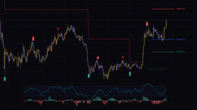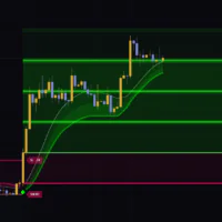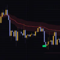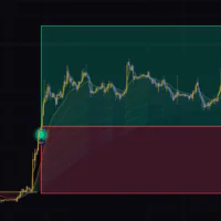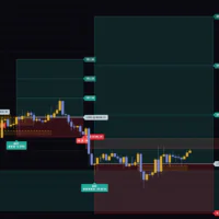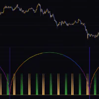


Load “Momentum Acceleration” onto a chart and the first thing you see is a row of small arrows floating above and below the candles. The name sounds heavier than the tool actually is. What it does is fairly simple: it takes how fast price is moving and how that speed itself is changing, and uses the two together to show which way momentum is currently leaning — as arrows sitting right on your candles.
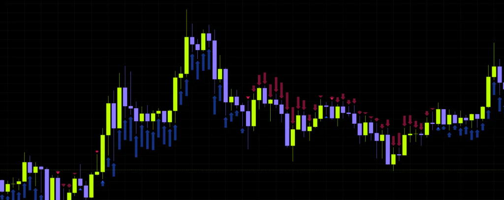
The short name on the chart is “SpeedyGonzales”, which is a nice touch. The author says that since the whole thing revolves around speed, the name got borrowed from the cartoon character. Having used it for a while, the name fits. It reacts early.
What “Momentum Acceleration” Is Actually Measuring
In one line: it’s the kind of indicator that tries to catch a shift in momentum before the trend is visibly there. That’s a different job from a moving average, which by design only picks up a trend once it has already formed.
The author explains it through basic physics. Speed is how much distance you cover in a given time. Acceleration is how much that speed changes. Map that onto a chart and speed becomes the range covered over a set number of bars, while acceleration becomes whether that range is expanding or contracting. As the author points out, the thinking is close to Momentum and ROC (Rate of Change).
What “Momentum Acceleration” actually plots, though, isn’t speed on its own. It’s speed minus the acceleration component. Acceleration is used as a signal line, so the feel is closer to a MACD histogram: when speed sits above the signal the arrows point up, and when it drops below they flip down.
What “Momentum Acceleration” shows you is the slope of momentum, not price itself. An up arrow doesn’t promise price will rise — it only tells you the market is accelerating to the upside right now.
Three Things Drawn on Your Chart
Before touching any settings, it’s worth knowing exactly what’s on screen. Skip this and every setting below turns into guesswork.
1. Arrows Overlaid on the Candles
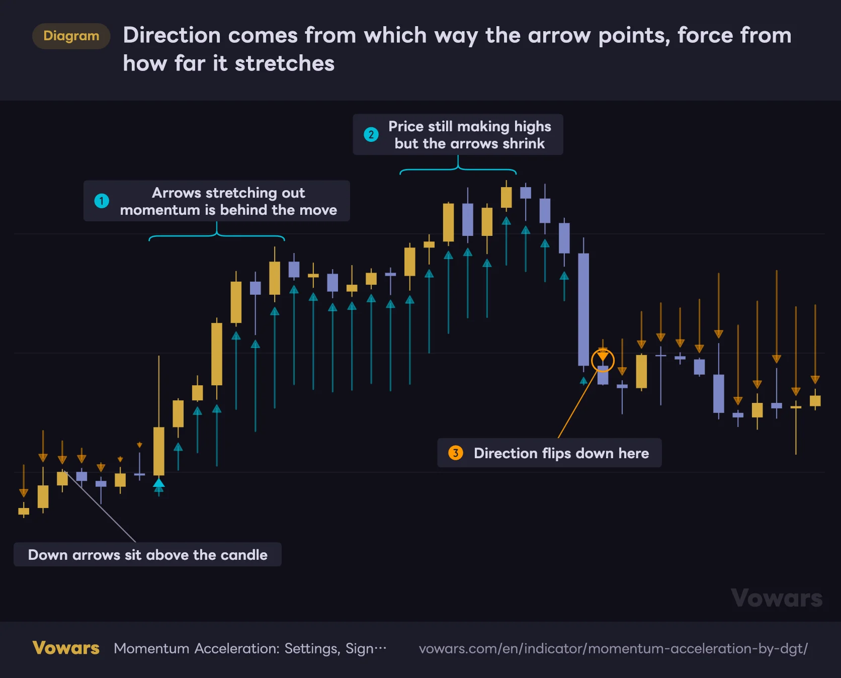
Direction comes from which way the arrow points, force from how far it stretches
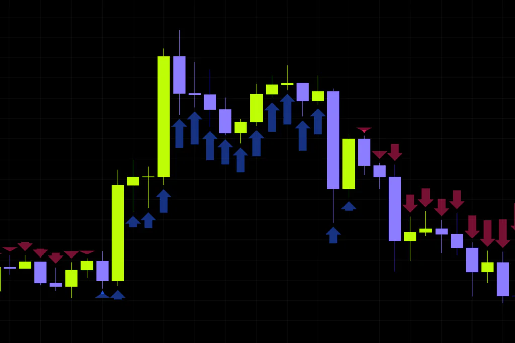
Up arrows sit below the candle and down arrows above it, and the stronger the move the longer they run.
- Up (acceleration positive)
- Down (acceleration negative)
Vowars DE ver.3.11.0
Positive readings put an up arrow below the candle, negative readings put a down arrow above it. The interesting part is that arrow length scales with the size of the value. Strong momentum stretches the arrows out; fading momentum shrinks them. So if price is still grinding higher while the arrows are quietly getting shorter, that’s your heads-up that the move may be running out of fuel.
One catch. Out of the box, both Bullish Color and Bearish Color are set at 80% transparency, which honestly makes them very faint. Turning the opacity up fixes that instantly, but it also makes the triangle markers harder to pick out, so it’s worth experimenting once you’ve installed it. For the screenshots in this article, the transparency was dialled down to 50% for readability.
2. Triangle Markers for Direction Flips
 Image
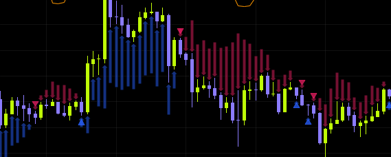
ImageThese are the real signal. The first bar where the value crosses above zero gets a small up triangle below the candle; the first bar it crosses below zero gets a down triangle above. They’re drawn in a stronger color than the arrows, so these you won’t miss. Drop down to intraday timeframes like the minute charts, though, and the triangles start firing constantly.
Up triangle means a flip to the upside, down triangle a flip to the downside. Remember that much and you can already read the chart.
3. The Projection Oscillator (Off by Default)
 Image
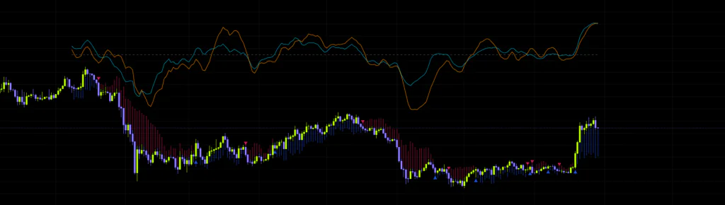
ImageSwitch it on in the settings and an oscillator waveform is drawn near the bottom (or top) of the price chart itself. No extra pane needed, which is the appeal. More on this below.
Why It Behaves the Way It Does
“It measures acceleration” is a bit abstract, so here’s the mechanic in plain terms.
First it takes the range covered over a set number of bars and divides by that number, giving an average move per bar — the speed. That gets smoothed over three bars to knock out the small stuff. Then it checks how that speed compares to the same lookback earlier — the acceleration — and subtracts it. Whether what’s left is positive or negative decides the arrow direction.
The part worth internalizing is how far back it’s really looking. The lookback is applied once for speed and again for acceleration, so with the default of 13 the engine is effectively reading around 29 bars of price action. On a daily chart that’s roughly six weeks; on the 4H it’s about five days. Keep that in mind and the timing of the signals starts making a lot more sense.
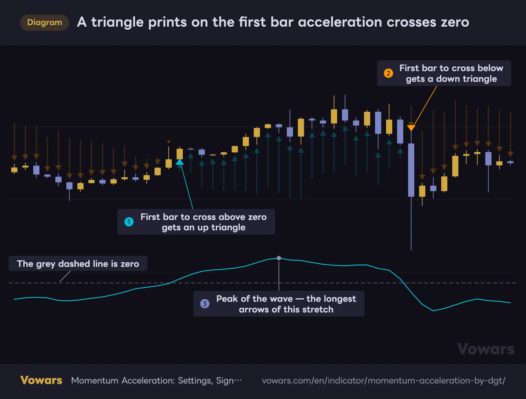
That is hard to picture from words alone, so here it is with the projection oscillator switched on. The relationship is right there: a triangle prints on the bar where the waveform crosses the dashed zero line.
A triangle prints on the first bar acceleration crosses zero
Switch on the projection oscillator and you can watch exactly why each triangle shows up.
Vowars DE ver.3.11.0
A standard momentum indicator just looks at the difference between now and X bars ago. “Momentum Acceleration” subtracts the change in speed on top of that, which changes how it responds when a move starts losing steam. The zero crosses land on slightly different bars than a plain momentum cross would.
Trading It: A Four-Step Read
1Take direction from the triangle
Start with which way the triangle points. Up triangle, you’re looking long. Down triangle, you’re looking short. Nothing ambiguous here.
2Use arrow length to judge whether it holds
If the arrows start stretching out right after a triangle prints, momentum is genuinely behind the move. If the triangle fires but the arrows barely grow, it’s a weak flip. Watching the Bitcoin daily, almost every one of those “triangle with no arrow growth” cases turned out to be a round trip inside a range. Arrow expansion works as a quick, built-in confidence filter on the signal.
3Cross-check against the higher timeframe
The author recommends this too. An up triangle on the 1H means little if the 4H and daily are still pointing down — odds are you’re looking at a bounce inside a downtrend. Whenever I want to get in early on a lower timeframe, I load the same indicator on a higher one and only take signals where both agree.
4Set the alerts in two stages
Alerts for “Momentum Acceleration” come in two flavors per direction: an “Early Warning” that fires while the bar is still unconfirmed, and a “Trading Opportunity” that waits one bar for confirmation. Use the first to get your eyes on the chart and the second to act. That two-stage design tells you the author built this with live trading in mind rather than backtest screenshots.
| Alert | When it fires | What it’s for |
|---|---|---|
| Early Warning | On the bar the zero cross happens | Your cue to pull up the chart |
| Trading Opportunity | One bar later | Confirmed — now consider the entry |
| Long / Short : Early Warning | On the cross up or cross down bar | Waiting for one direction only |
| Long / Short : Trading Opportunity | One bar later | Confirmed, direction-specific |
Price or OBV? The Data Source Choice Matters
This is where the indicator shows its personality. Data Source lets you switch between “Price” and “On Balance Volume”.
“Price” is exactly what it says — acceleration of price, reacting directly to the candles. “On Balance Volume” runs the same math on cumulative volume flow instead. That means when buy volume is quietly stacking up before price has done anything, the OBV version can flip direction ahead of the price-based one.
The other feature I ended up rating highly is the projection oscillator. Show Price Acceleration and Show OBV Acceleration work independently of the Data Source setting, so you can display both at once.
Price acceleration and OBV acceleration, side by side on one chart
Show Price Acceleration and Show OBV Acceleration can be displayed at the same time.
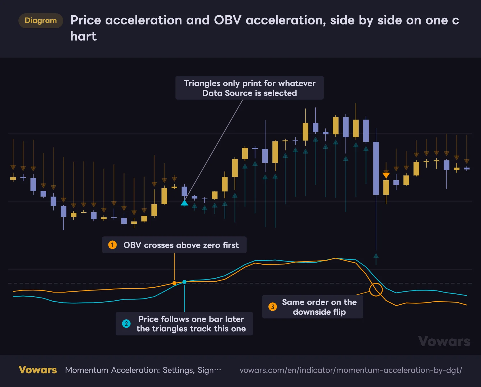
- Price acceleration
- OBV acceleration
Vowars DE ver.3.11.0
Overlay price acceleration and OBV acceleration and you start seeing where the two line up cleanly and where they clearly don’t. Price grinding lower while the OBV wave lifts first is the setup I pay the most attention to.
The waveform is auto-scaled against the highest value within the visible range. That rules out any absolute comparison like “this wave is taller than last time, so momentum is stronger”. Read the shape, and which side of the dashed zero line it’s on — nothing more.
Every Setting, Explained
The Engine (Momentum Acceleration Engine)
| Parameter | Default | Suggested | Effect |
|---|---|---|---|
| Data Source | Price | Price | What the engine runs on. On Balance Volume is worth trying where volume data is reliable |
| Acceleration Period | 13 | 8-21 | The core sensitivity dial. Lower reacts faster, higher smooths everything out |
| Bullish Color | Aqua (80% transparency) | 30-50% transparency | Up arrow color. The default is faint, so raising the opacity improves visibility |
| Bearish Color | Orange (80% transparency) | 30-50% transparency | Down arrow color. Keeping the two hues clearly distinct speeds up your read |
| Display Length | 233 | 100-233 | How many recent bars get arrows and triangles. Lower it to declutter the chart |
Getting a Feel for Acceleration Period
The default of 13 is a Fibonacci number. As covered above, the effective lookback is close to double that, so changing this value hits harder than you’d expect.
- Lower it (around 8): more triangles and a faster reaction to turns, at the cost of more round trips in chop
- Raise it (around 21): arrow direction gets steadier and only the bigger swings register, but the flip is flagged later
For Bitcoin on the 4H through daily, the default 13 felt like the right balance to me. Drop down to something like the 5m and noise sends the triangles into overdrive, so either stretch the period out or — for your own sanity — just don’t use it down there.
Settings by Trading Style
| Style | Typical timeframe | Acceleration Period | What you’re after |
|---|---|---|---|
| Scalping | 5m-15m | Around 21 | Crush the lower-timeframe noise and read direction only |
| Day trading | 1H-4H | 13 (default) | Easiest balance between reaction speed and stability |
| Swing trading | 4H-Daily | 13-21 | Use arrow expansion to confirm a pullback has finished |
| Position trading | Daily-Weekly | 21+ | Only the major acceleration phases. Triangle count drops sharply |
The logic behind those numbers is straightforward: structurally, this indicator reads roughly double the period you set, plus a little. Noise makes up a bigger share of each bar on lower timeframes, so you lengthen the lookback to offset it. Higher timeframes pack more information into every bar, which is why the default already feels smooth up there.
Projection Oscillator (Oscillator Projection View)
| Parameter | Default | Suggested | Effect |
|---|---|---|---|
| Show Price Acceleration | Off | On | Projects the price-based acceleration waveform onto the chart |
| Show OBV Acceleration | Off | On (instruments with volume) | Projects the volume-based waveform, for comparison against the price one |
| Scale | 7 | 5-8 | Vertical size of the waveform. Higher values draw bigger waves |
| Offset | 3 | 3-5 | How far from price it is drawn. Raise it to stop the waveform colliding with the candles |
| Placement | Bottom | Bottom | Whether the waveform sits below or above price |
There’s a ceiling on how many line segments the projection can draw. With both waveforms enabled, Display Length tops out at roughly 240 bars — beyond that, the older portion simply isn’t drawn. The default of 233 fits comfortably.
What to Do With the Backtest Framework
“Momentum Acceleration” ships with a trade simulation built in. Enable Backtest is off by default, so none of the labels appear until you switch it on. Miss that and it’s easy to assume the feature isn’t there at all.
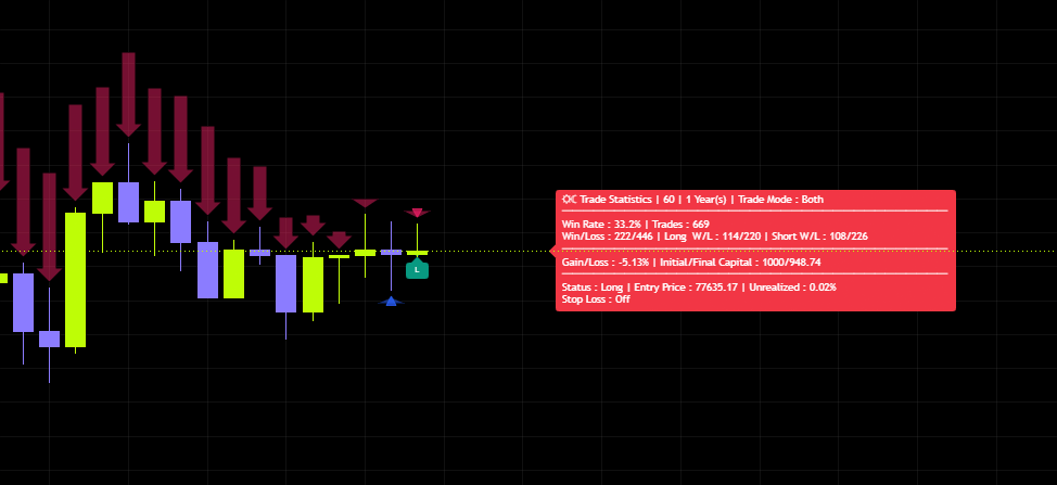
Turn it on and you get “L” and “S” labels at entries, “TP” and “SL” at exits, plus a summary label off to the right. That label carries win rate, trade count, separate long and short records, percentage gain, starting and ending capital, current position status, unrealized PnL and the active stop level. That’s a lot of detail for a free script.
| Parameter | Default | Suggested | Effect |
|---|---|---|---|
| Enable Backtest | Off | On only while testing | Master switch for the trade simulation and all its labels |
| Trade Mode | Both | Both | Pick the traded direction from Long Only, Short Only or Both |
| Reverse on Opposite Signal | On | Depends what you are testing | Flips the position immediately on an opposite signal, keeping you always in the market |
| Initial Capital | 1000 | Your call | Starting balance for the simulation and the base for compounding |
| Period (Years) | 1 | 1-3 | Lookback window in years. Automatically shortened if history runs out |
| Apply Stop Loss | Off | On, with a revised distance | Enables the stop when price moves against the position |
| % | 1 | 2-4 for crypto | Stop distance. 1% is far too tight for high-volatility instruments |
| Long Candle Confirmation | Off | On | Only takes longs on bullish bars, cutting out wasted entries |
| Short Candle Confirmation | Off | On | Only takes shorts on bearish bars |
| Avoid Same-Bar Conflicts | On | Leave it on | Skips the entry when long and short signals collide on the same bar |
| ❗ Next Bar Mode (Repaints) | Off | Leave it off | Test mode that fills one bar earlier. Signals will repaint |
| Show Entry / Exit Labels | On | On | Displays the L, S, TP and SL labels |
| Show Early Warnings | On | On | Puts a ⚠ marker on unconfirmed signals |
| Show Trade Statistics | On | On | Displays the summary statistics label |
This simulation accounts for zero fees, zero spread and zero slippage. A “TP” label also doesn’t mean a profit target was reached — exits driven by an opposite signal carry the same label. On top of that, every trade compounds the full balance, so treat the output as something entirely separate from live performance.
Worth noting too: the ⚠ markers and the stop loss alerts only run when the backtest framework is enabled. If your early warning labels aren’t showing up, check Enable Backtest first.
One more detail. Avoid Same-Bar Conflicts exists to skip bars where opposing signals collide, but given how the engine is built, a cross up and a cross down on the same bar is close to impossible. Its practical effect is limited. Leaving it on costs nothing, so there’s no reason to overthink it.
Does It Repaint?
This is the part I checked most carefully.
Short answer: arrows and triangles on closed bars never move afterwards. Reload the chart and the historical display is identical.
The live bar is a different story. A triangle can print on an unclosed candle and then vanish if price pulls back before the bar closes. That’s standard behavior for anything calculating in real time, not a flaw specific to this script — and it’s precisely why the alerts are split into an early warning and a confirmed version.
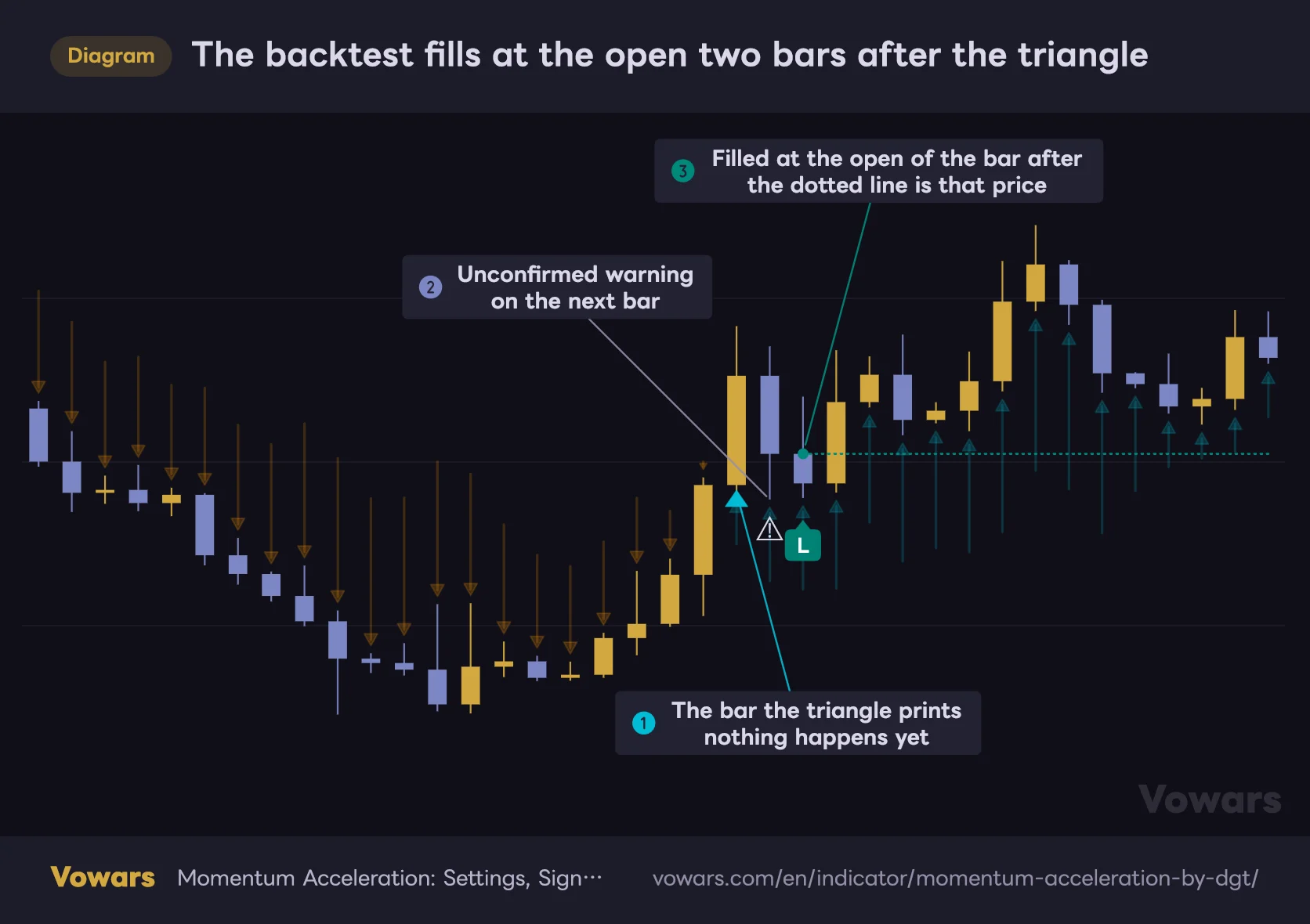
The backtest side is even more conservative. By default it waits two bars after the signal and uses that bar’s open as the fill price. Switching on ❗ Next Bar Mode (Repaints) fills a bar earlier, but as the label says, it repaints. It’s tempting to flip when you want prettier numbers, but leave it alone outside of side-by-side comparisons.
Worth seeing how wide that two-bar gap actually is. The triangle bar is where you want to jump in, but as far as the simulation is concerned, nothing has happened yet.
The backtest fills at the open two bars after the triangle
Switch on Enable Backtest and the gap between signal and fill becomes visible.
Vowars DE ver.3.11.0
The stop is triggered off the bar’s high or low, but the exit is booked at that bar’s close. If a wick breaches your stop level and price recovers before the close, the simulated fill and a real one part ways. Understand that it can understate or overstate the loss depending on how the bar ends.
Where It Works, and Where It Doesn’t
Works Well In
- Clean, directional trends
- The first leg off a capitulation low
- Re-acceleration once a pullback has finished
- Volatility expanding out of a quiet stretch
- Timing exits inside a trend, via shrinking arrows
Struggles In
- Tight, low-range consolidation (triangles everywhere)
- News-driven spikes in both directions
- Thin sessions and illiquid instruments
- Very low timeframes, where it drowns in noise
- OBV mode on instruments with unreliable volume data
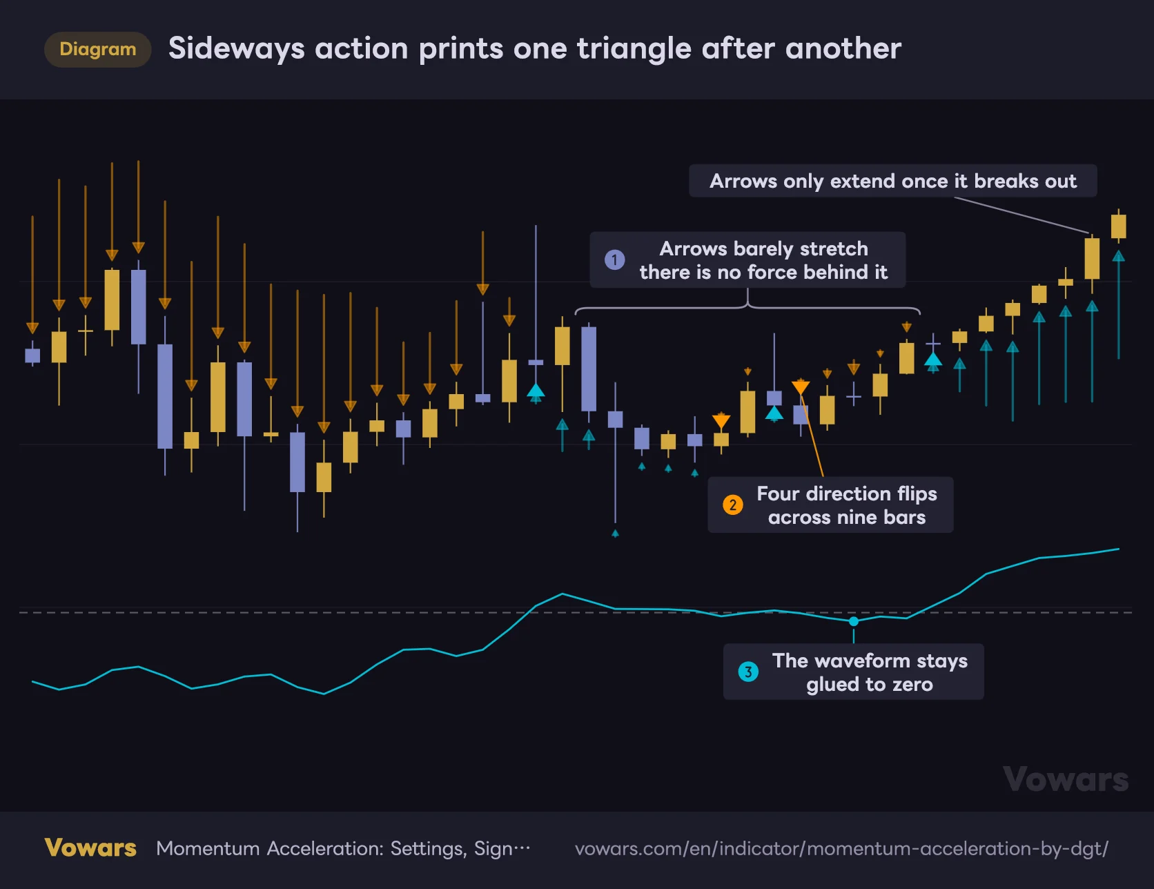
The least frustrating experience by far was on timeframes with some structure to them — the daily and 4H. It also pairs nicely with instruments that tend to keep going once a trend starts, like gold or the major index ETFs. In a market chopping sideways inside a box, though, up and down triangles alternate until you have no idea which one deserves your money.
Sideways action prints one triangle after another
When the range tightens, acceleration hugs zero and the direction keeps flipping.
Vowars DE ver.3.11.0
A stretch where the arrows barely extend is telling you there is no force behind the move. Watching only the triangles you would never catch it, but read the arrow length too and it is obvious this is not a place to take the signal.
Pairing It to Cover the Weak Spot
Everything that goes wrong with this indicator traces back to fakeouts in chop, which means the fix is always the same: add something that tells you whether you’re in a trend or not.
- A long moving average (200 or similar): only take up triangles above it and down triangles below. That alone cuts the signal count roughly in half
- ADX or a volatility gauge: use it to sit out signals entirely while trend strength stays below your threshold
- ATR: replace the fixed percentage stop with a volatility-based one. The 1% default is far too tight for Bitcoin, so this is worth setting yourself for live use
- Horizontal levels and range boundaries: a discretionary filter — skip up triangles printing just under obvious resistance
Here is the first one on a chart. Dropping up triangles that print below the moving average is all it takes to narrow things down this much.
Add a 200-period moving average and the misaligned triangles drop out
Mechanically dropping signals that fight the trend cuts down how often you have to think.
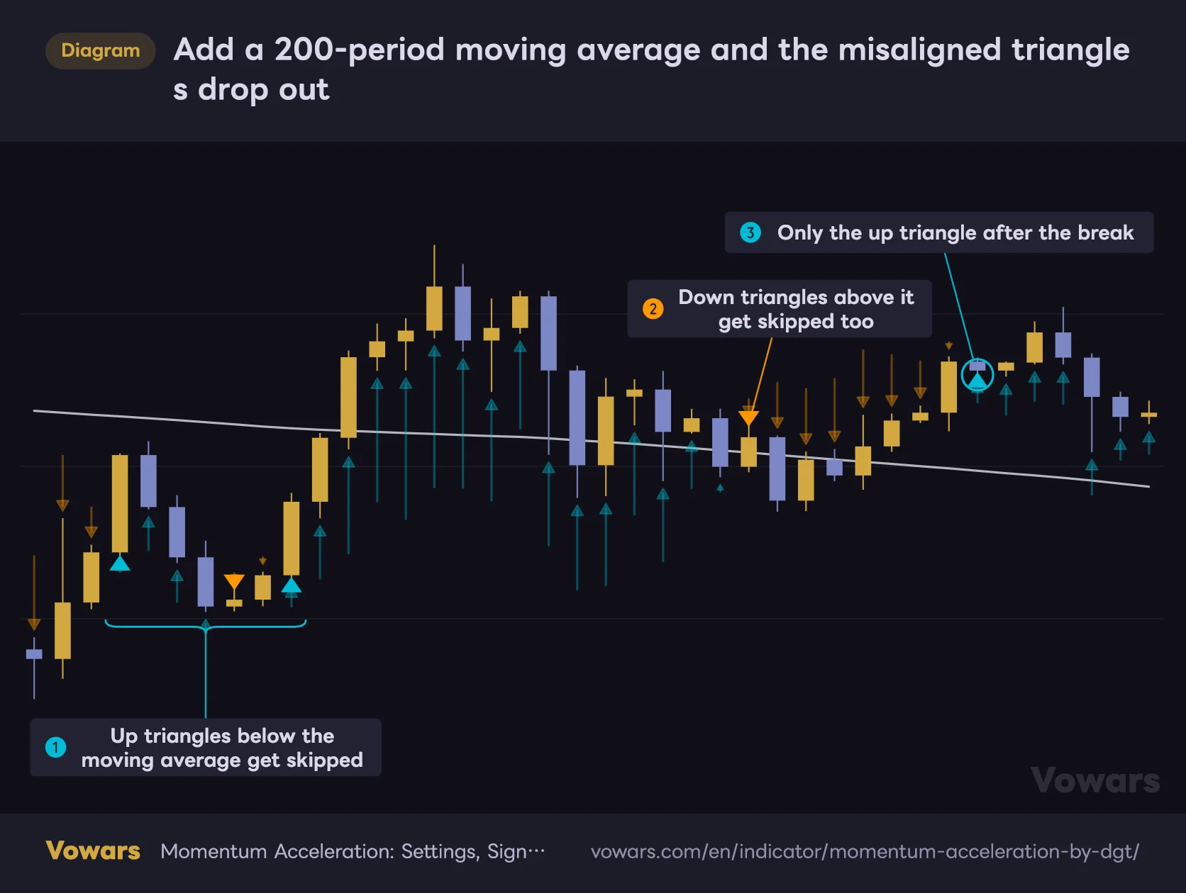
- 200-period moving average
Vowars DE ver.3.11.0
Set direction with “Momentum Acceleration” on a higher timeframe, then take timing from the triangles on a lower one. Just running the same indicator on two timeframes is far steadier than trading it alone, and it’s the approach I’d suggest if you’d rather not pile on more indicators.
Ways to Use It That Will Cost You
A few things that struck me as genuinely risky while testing.
- Trading the triangles mechanically: the author repeatedly states that indicators belong inside a strategy and shouldn’t be traded on their own. That turned out to be completely accurate here
- Jumping in on a live-bar triangle: nothing is settled until the bar closes. The ⚠ marker means “get ready”, not “get in”
- Mistaking the backtest win rate for your own: those numbers come from a world without fees or spread
- Measuring performance in Next Bar Mode: of course it looks better when you fill earlier, and you can’t replicate it live
- Comparing arrow length across instruments: both the arrows and the projection are normalized to whatever’s on screen, so cross-symbol or cross-period comparisons mean nothing
With a backtest built in, the urge to hunt for whatever number produces the highest win rate is hard to resist. But that number is fitted to one stretch of history and carries no guarantee whatsoever for the next one. Always check whether the setting holds up when you shift the period.
So, Should Momentum Acceleration Live on Your Chart?
Here’s where I landed after spending time with it.
The strength of “Momentum Acceleration” is that you can read the state of momentum from arrow direction and length alone, without knowing any of the theory behind it. No separate pane to line up, everything handled inside the price chart. That convenience counts for more than it sounds like.
On top of that, being able to overlay price acceleration and volume acceleration together is a perspective most momentum tools don’t offer. Just watching where the two diverge feels like getting a look under the hood of the move, and it might honestly be my favorite thing about the whole script.
The flip side is signal frequency. There are plenty of them, and in a range they’ll take you back and forth without mercy. This is clearly not a “one indicator and you’re done” tool. It only shows its worth once you pair it with something that establishes trend direction.
All in, this is an indicator for traders who already have their own read on the market and want to layer the slope of momentum on top of it. If you’re looking for arrows to follow blindly into an entry, this won’t serve you well as it ships. Start by turning up the arrow opacity, load it on a higher and a lower timeframe, and just watch it for a while. Working out your own use for it from there was, for me, the best way to get along with it.