

“Real Fair Value Gaps” shows you how an FVG gets filled, not just where it is
An FVG (fair value gap) is a price range where the wicks of candle 1 and candle 3 in a three-candle sequence don’t overlap, meaning price shot through it with barely any trading. It’s a staple of ICT-style trading, and the usual read is that price will come back later to fill that void, or react off it.
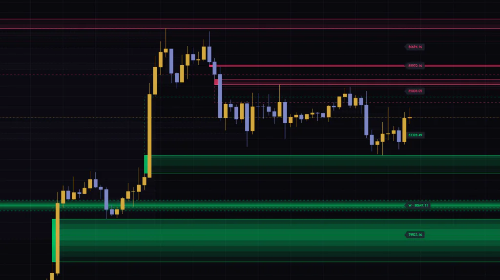
There are tons of FVG indicators on TradingView. What sets “Real Fair Value Gaps” apart is that it doesn’t stop at finding the gap and drawing a box. How deep has price traded into it? Has it tagged the midpoint? Is it fully filled, or did price close straight through and flip it into an inverse FVG? It’s built so you can follow each FVG from the moment it forms to the moment it’s done, just by watching how it looks on the chart.
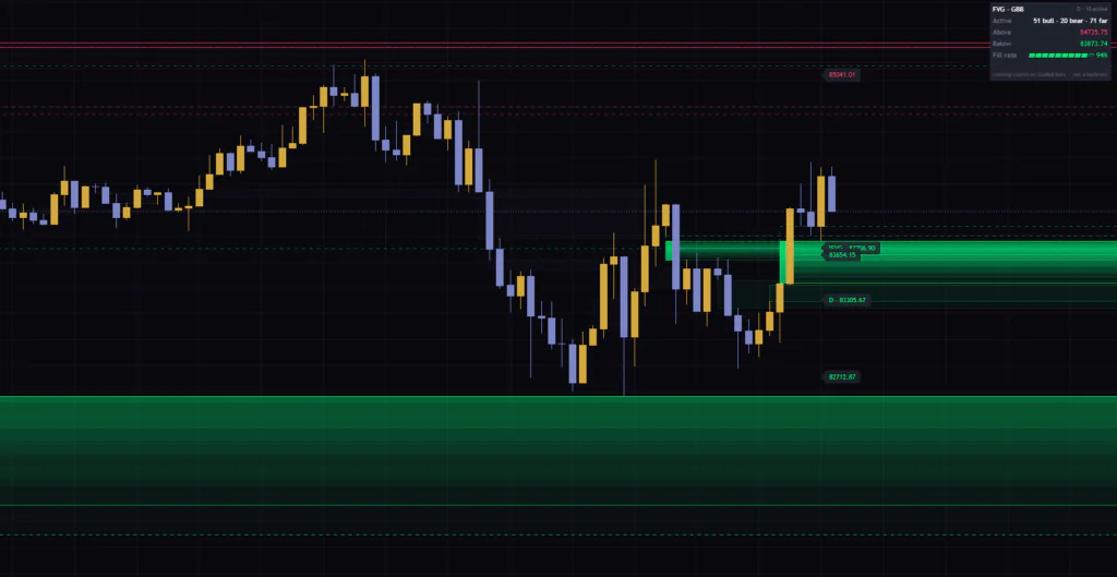
If you load “Real Fair Value Gaps” yourself, you’ll probably feel it too: at first, the sheer number of lines and zones is a bit overwhelming. But once you know what each visual means, calls like “this FVG is already more than half eaten” or “that one hasn’t been touched yet” become almost instant. In this review I’ll walk through how to read it, one visual at a time.
| Item | Details |
|---|---|
| What it shows | FVGs on the chart timeframe and one timeframe higher |
| Stages it tracks | Untouched, touched, midpoint tapped, mitigated, inverted (IFVG) |
| Buy/sell signals | None (alerts are available for new FVGs, touches and more) |
| Repainting | Evaluated on confirmed bars only. HTF data comes from closed candles only |
| Where it’s drawn | Overlaid on the main price chart |
Which three candles define an FVG?
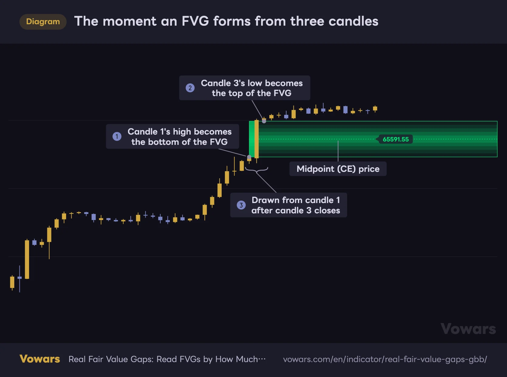
Let’s start with the basics: how FVGs are found. Every time a bar closes, “Real Fair Value Gaps” looks at the last three candles. If candle 3’s low is above candle 1’s high, it registers a bullish FVG. If candle 3’s high is below candle 1’s low, it registers a bearish FVG.
The moment an FVG forms from three candles
When the high of candle 1 and the low of candle 3 don't overlap, the space between them is registered as a bullish FVG.
Vowars DE ver.3.12.4
For a bullish FVG, candle 1’s high in Figure ① becomes the bottom of the FVG, and candle 3’s low in Figure ② becomes the top. Candle 2 in the middle is the one that ripped through that empty space.
One thing worth remembering is how it gets drawn, shown in Figure ③. The FVG is only confirmed when candle 3 closes, yet the zone starts from candle 1. Scroll back through history and it looks like the FVG was visible two bars earlier, but it actually appeared on the chart at the close of candle 3. Keep that two-bar offset in mind whenever you review past setups.
Out of the box, it picks up even tiny FVGs
By default there’s no minimum size, so a gap of a single tick between wicks counts as an FVG. On a 5-minute chart, it showed 54 active bullish and 24 active bearish FVGs, plus 84 that were too far away to be drawn, HTF ones included (checked on BTCUSDT 5m, as of Sep 28, 2026). The razor-thin ones look like single lines, and honestly, it gets a little noisy.
There are three settings to trim that down.
- Min size (ATR x) keeps only FVGs at least this many times ATR(14) tall. HTF FVGs are compared against the HTF ATR
- Auto threshold keeps only FVGs whose height relative to price is above the average of every candidate found so far. When it’s on, Min size (ATR x) is ignored
- Require displacement adds the condition that candle 2 closes beyond candle 1’s high (or low, for a bearish FVG). It narrows things down to gaps left by strong, impulsive candles
Note that the Auto threshold average is a running value counted from the first bar loaded on the chart. Scroll back and load more history, or switch timeframes, and the baseline shifts. If you want the same cutoff every time, I found Min size (ATR x) easier to work with.
Following an FVG from birth to retirement by color and shape
This is where “Real Fair Value Gaps” really earns its keep. Once registered, each FVG moves through the following stages as price interacts with it.
| Stage | Trigger (bullish FVG) | How it looks on the chart |
|---|---|---|
| Untouched | Right after it’s registered | The whole zone glows, with a dotted center line, a solid block on the left edge and a price label on the right |
| Touched | The low tags the top | The consumed part becomes a dashed outline and the shading shrinks to what’s left |
| Midpoint tapped | The low reaches the midpoint | The dotted center line disappears |
| Mitigated | By default, the low reaches the bottom | Turns into a gray dashed box that ends at that bar |
| Inverted (IFVG) | A close below the bottom | Switches to the bearish color, gets a dotted border and an IFVG tag on the label |
The zone gets thinner the deeper price goes
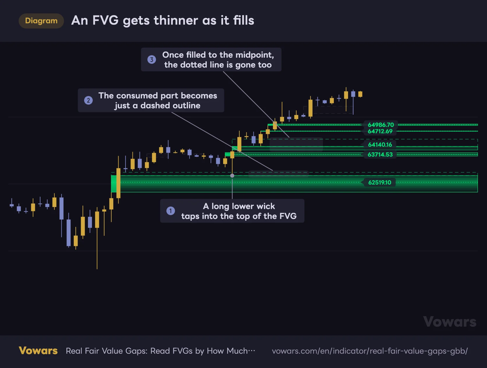
An FVG gets thinner as it fills
Once price trades into an FVG, the shaded zone shrinks to the unfilled part, and the consumed portion turns into a dashed outline.
Vowars DE ver.3.12.4
With a typical FVG indicator, the box stays the same size even after price trades into it. With “Real Fair Value Gaps”, as soon as a wick enters the FVG as in Figure ①, the consumed part turns into just a dashed outline as in Figure ②, and the colored zone shrinks to the remaining range. The penetration depth doesn’t reset if price pulls away afterward. The deepest point reached stays on record.
The other thing to watch is the dotted center line. It marks the exact middle of the FVG, what ICT calls the CE (consequent encroachment), and it disappears once the FVG is filled to the midpoint, as in Figure ③. Whether that line is still there tells you at a glance if the FVG has held above its halfway point. Personally, this was the feature I found most useful.
Also, as long as Labels isn’t set to None (the default counts), highlighted FVGs that have been touched get a text tag on the box like “FVG · 45%”, showing what percentage of the gap’s height has been filled.
Once price hits the far edge, it stays as a gray box
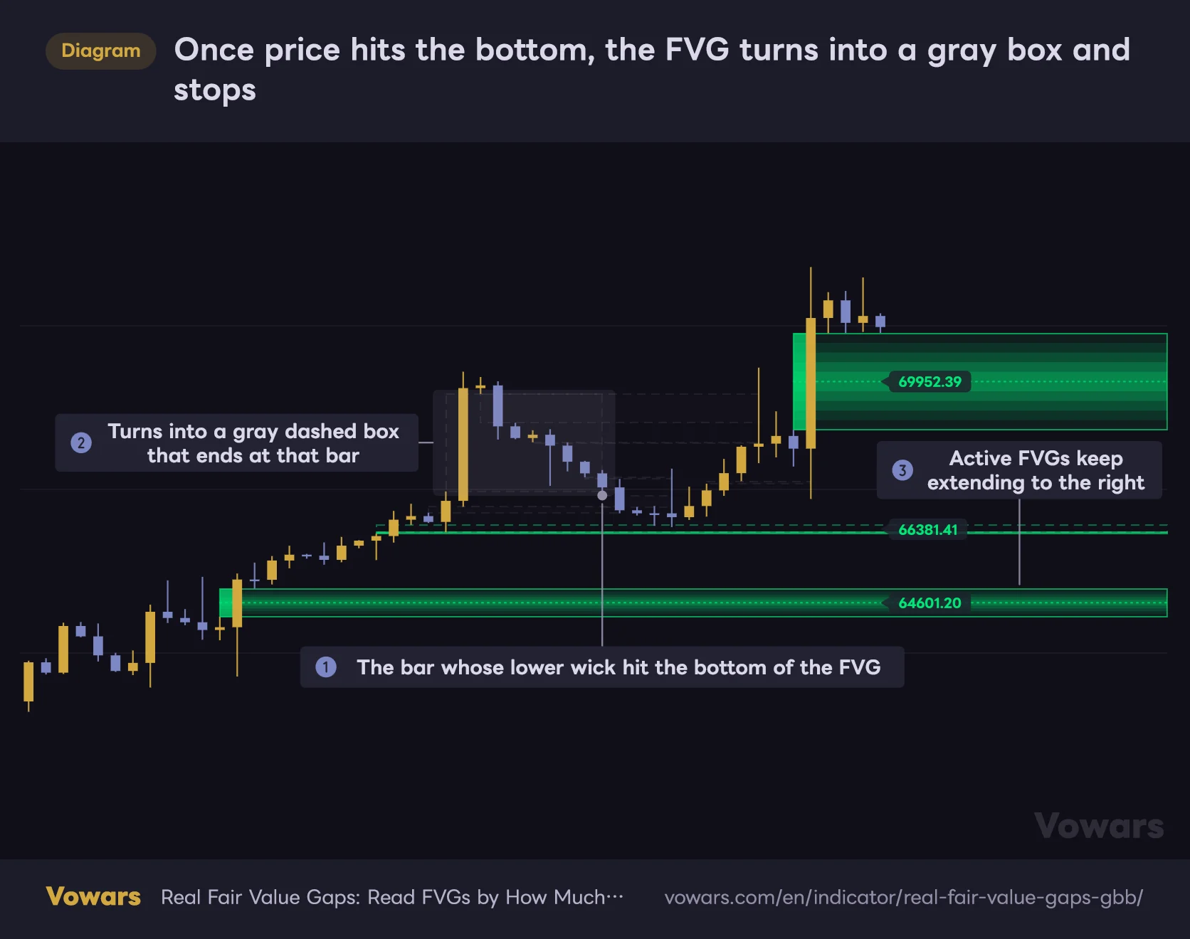
Once price hits the bottom, the FVG turns into a gray box and stops
When price reaches the bottom of a bullish FVG, it's treated as mitigated and switches from a colored zone to a faint gray dashed box.
Vowars DE ver.3.12.4
By default, an FVG counts as mitigated as soon as a wick reaches the far edge, as in Figure ①. A mitigated FVG becomes a faint gray dashed box as in Figure ② and stops extending to the right. Next to the active FVGs in Figure ③, you’ll rarely have trouble telling which ones are still in play.
The gray boxes disappear after the number of bars set in Keep mitigated (bars) (500 by default). Go longer if you want to review past reactions, shorter if you want a cleaner chart.
An FVG that price closes through comes back as an IFVG
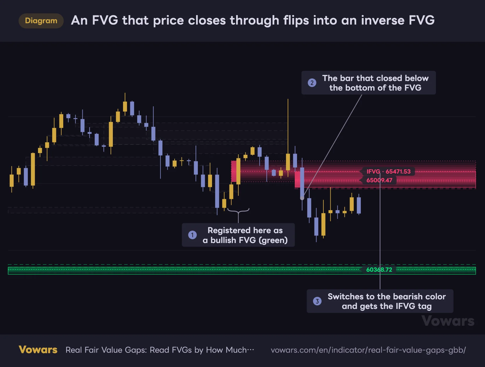
An FVG that price closes through flips into an inverse FVG
When price closes below the bottom of a bullish FVG, the FVG doesn't disappear. It flips into a bearish FVG (IFVG).
Vowars DE ver.3.12.4
Things change when price crosses the far edge on a close rather than with a wick. With Track inversions on (the default), the FVG isn’t retired. It flips color and direction and becomes an IFVG (inverse FVG). In Figure ① the FVG is registered as bullish, price closes below its bottom in Figure ②, and it switches to the bearish color in Figure ③. At the moment it flips, the bar count resets and the penetration record starts over from zero.
A zone that used to be support gets treated as resistance once it breaks. This is that classic role reversal, drawn right on your chart. The catch is that it only flips once. If price closes through the IFVG again, or a wick reaches its far edge, it doesn’t flip back. It just turns into a gray box.
When a single big red candle slices through an FVG, the wick obviously hits the bottom too, but the close is checked first. If it closed below, the FVG flips to an IFVG. If only the wick went through and the close stayed inside or above the FVG, it’s mitigated.
Two settings decide what counts as mitigated
Use Source to choose which price is used for mitigation, and Point to choose how far it has to reach. Here’s how each combination behaves.
| Source × Point | When a bullish FVG counts as mitigated | Best suited for |
|---|---|---|
| Wick × Far edge (default) | The low reaches the bottom | Treating the FVG as valid until it’s completely filled |
| Wick × Midpoint | The low reaches the midpoint | Treating the FVG as done once the CE is tagged |
| Wick × Near edge | The low tags the top | Never reusing an FVG once it’s been touched |
| Close × Midpoint | A close at or below the midpoint | Tolerating wicks that poke into the zone |
| Close × Far edge | Only when price closes exactly at the bottom. A close below the bottom triggers the flip first | Making inversions the main focus |
The last one, Close × Far edge, is a bit quirky. With Track inversions left on, a close below the bottom triggers the flip first, so an FVG almost never turns gray before inverting. It only goes gray after it has become an IFVG.
Three tricks that keep an FVG-heavy chart readable
Since the defaults pick up even the smallest FVGs, you’d expect the chart to drown in zones. It stays surprisingly readable thanks to the following three mechanisms.
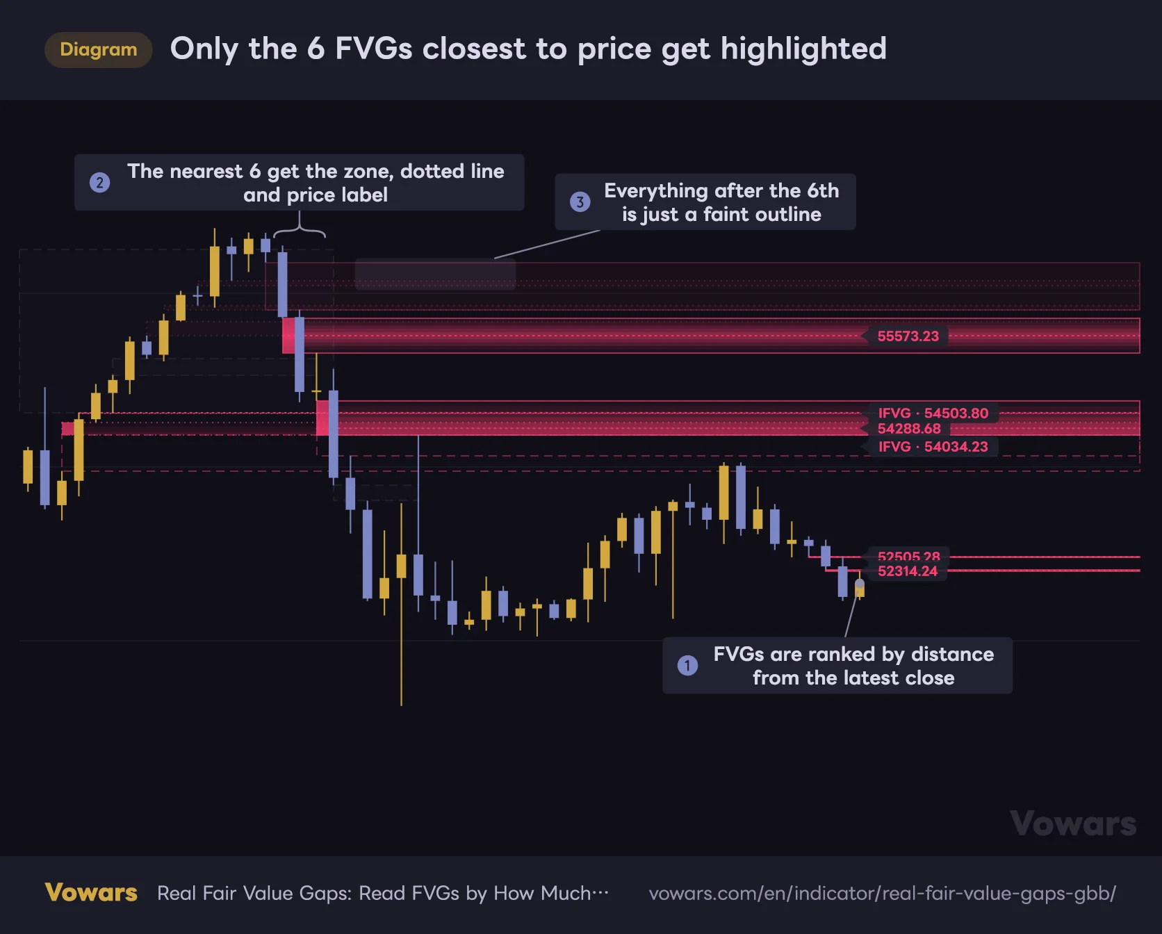
Only the 6 FVGs closest to price get highlighted
“Real Fair Value Gaps” highlights a fixed number of active FVGs, starting with the ones closest to the current price.
Vowars DE ver.3.12.4
Only the FVGs closest to price are highlighted
Active FVGs are ranked by their distance from the latest close, as in Figure ①, and only the closest ones, up to the number set in Spotlight gaps (6 by default), get highlighted. Highlighted FVGs get a zone that’s brightest in the middle, a dotted center line, a block on the left edge and a price label on the right, as in Figure ②. Everything from the 7th onward in Figure ③ is just a nearly transparent fill with a thin outline. When price is inside an FVG, that FVG counts as distance 0, so whichever FVG is being fought over right now always ranks at the top.
Older FVGs slowly fade
The highlight fades as bars pass after an FVG is registered. It drops to half strength over the number of bars set in Fade over (bars) (100 by default) and holds there. That works out to about 8 hours on a 5-minute chart and about 4 days on a 1-hour chart. Just remember: the brighter the FVG, the newer it is. HTF FVGs are drawn a little dimmer and IFVGs dimmer still, so you can tell them apart even when they’re the same age.
FVGs that are too far away aren’t drawn
FVGs farther from the close than Show gaps within (ATR x) times ATR(14) are still tracked, but not drawn. The default is 6. This avoids a common annoyance with FVG indicators, where a gap from months ago stretches the price scale and squashes your candles. As soon as price gets close again, the FVG is drawn automatically.
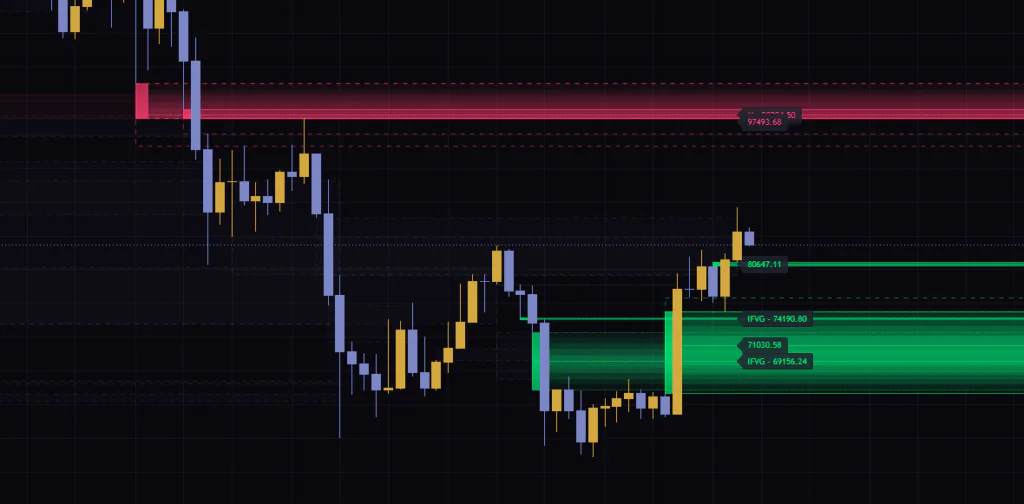
All the price labels line up to the right of the latest bar, so FVGs with nearby midpoints can end up with overlapping, unreadable labels. When I tested it on the weekly chart, the HTF (monthly) label overlapped another FVG’s label. If you can’t read the numbers, stretch the chart vertically or lower Spotlight gaps, and that usually clears it up.
See HTF FVGs on the same chart
On top of the chart timeframe, “Real Fair Value Gaps” automatically draws FVGs from one timeframe higher. On a 5-minute chart that’s the 1H, on a 1-hour chart it’s the daily. For anyone trading the lower timeframes, HTF FVGs are handy for getting a feel for where price is likely to stall today.
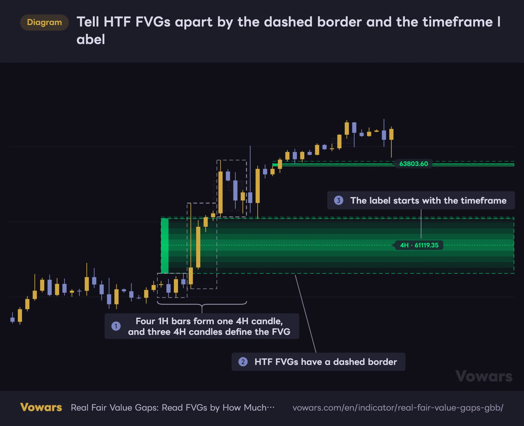
Tell HTF FVGs apart by the dashed border and the timeframe label
On top of the chart timeframe, “Real Fair Value Gaps” also draws FVGs from one timeframe higher on the same chart.
Vowars DE ver.3.12.4
They’re easy to spot: the border is dashed as in Figure ②, and the label starts with the timeframe, like “4H” or “D”, as in Figure ③. As Figure ① shows, the gap is defined by three candles on the higher timeframe itself.
| Chart timeframe | Auto-selected HTF |
|---|---|
| 1m, 3m | 15m |
| 5m | 1H |
| 15m, 30m | 4H |
| 1H, 2H | Daily |
| 3H to Daily | Weekly |
| Weekly | Monthly |
The table shows the automatic selection when Timeframe is left blank. You can enter any timeframe you like, but if it isn’t higher than the chart timeframe, no HTF FVGs are drawn and the info table shows “HTF off: not above chart TF”. The same thing happens on a monthly chart with the auto setting, since nothing above monthly gets selected.
HTF FVGs are only registered after the HTF candle has closed. More precisely, they appear once the third HTF candle closes and the first chart bar of the next HTF candle closes. HTF values are only read from closed candles, so nothing gets redrawn after the fact.
Touches and mitigation are checked against the chart bars’ wicks on every bar, HTF FVGs included. Anything based on the close, though (the flip to an IFVG, or mitigation with Source set to Close), is judged on the HTF close. If you’re showing daily FVGs on a 1H chart, price can dump well below an FVG intraday, and if the daily candle closes back inside the FVG, it won’t flip.
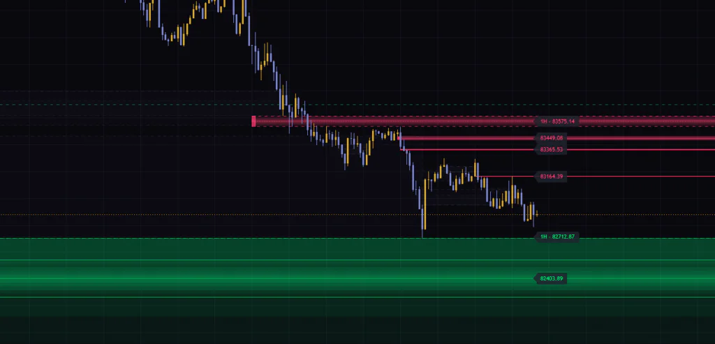
You can only set one higher timeframe. If you want both the 4H and the daily, you can add a second copy of the indicator to the chart and change the Timeframe on one of them. Keep in mind that the number of indicators you can add to a single chart is capped depending on your TradingView plan.
What the info table and alerts tell you
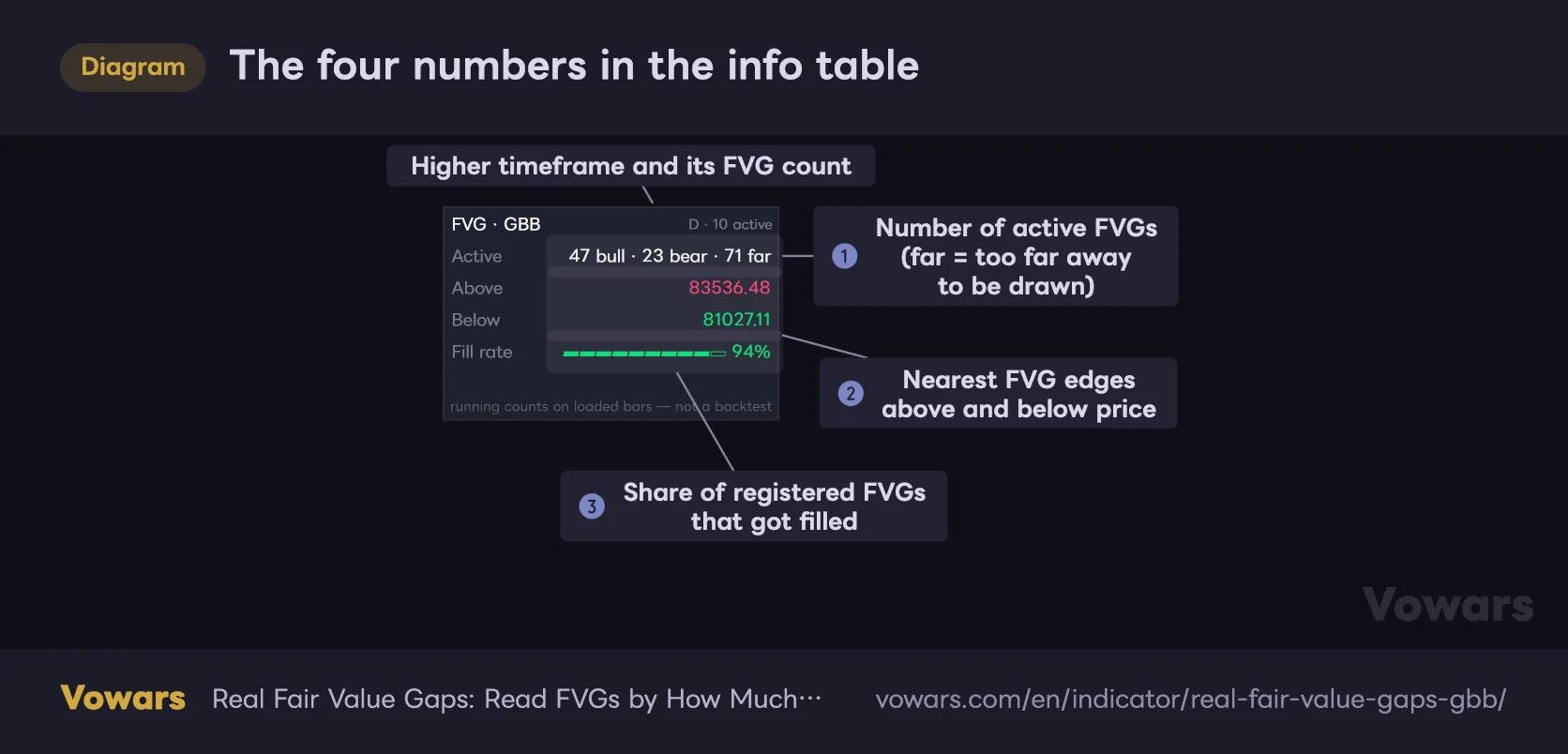
The four numbers in the info table
The table in the top-right corner shows the FVG count, the nearest FVGs to current price, and the fill rate.
Values in the table are illustrative.
Vowars DE ver.3.12.4
The info table in the top-right corner shows how many FVGs are currently active, where the nearest FVGs above and below price are, and the fill rate.
First, the Active row in Figure ①. It lists the number of bullish (bull) and bearish (bear) FVGs on the chart timeframe, plus the number that are outside the drawing range (far). The far count covers everything not being drawn, HTF FVGs included, and it isn’t something you add on top of bull and bear. The HTF FVG count appears on the right side of the top row, like “D · 10 active”.
Below that, Above and Below in Figure ② show the bottom edge of the nearest FVG above current price and the top edge of the nearest FVG below it. FVGs outside the drawing range are included here too. An FVG that price is already trading inside isn’t counted in either one.
The one I personally found most interesting is Fill rate in Figure ③. It shows the share of all registered FVGs that have been judged as mitigated. On my charts it was 95% on the 5-minute, 94% on the 1-hour and 75% on the weekly (checked on BTCUSDT, as of Sep 28, 2026). The lower the timeframe, the more likely an FVG is to get filled, which matched my gut feeling once I saw the numbers.
As the bottom row of the table itself says, this is a running count over the bars loaded on the chart, not a backtest. FVGs that flip into IFVGs aren’t counted as filled; they’re counted once they get mitigated after flipping. It does not mean you’ll win 95% of the time by fading price into FVGs, so be careful with how you read it.
Eight alerts, and one thing to watch out for
To set an alert, open TradingView’s alert dialog, choose “RFVG [GBB]” as the condition, and pick the event you want from the list below it. All of them are evaluated on bar close.
| Alert name | What it tells you | Applies to |
|---|---|---|
| New bullish FVG / New bearish FVG | A bullish or bearish FVG was registered | Chart timeframe |
| New HTF bullish FVG / New HTF bearish FVG | An HTF FVG was registered | HTF |
| Price entered a gap | Price started trading into an FVG | Both |
| Midpoint tapped | Price reached the midpoint | Both |
| Gap mitigated | The FVG was mitigated | Both |
| Gap inverted | The FVG flipped into an IFVG | Both |
The thing to watch out for is when a single bar blows through several stages at once. Say one big candle enters an FVG and runs straight to the midpoint: for that FVG, only “Midpoint tapped” fires, and “Price entered a gap” doesn’t. If it goes all the way to the bottom in one bar, you only get “Gap mitigated”. For each FVG you’re only alerted to the furthest stage reached on that bar, so don’t assume you’ll always get a ping on first touch.
On top of that, the Data Window shows the number of bullish and bearish FVGs on the chart timeframe, the running count of mitigated FVGs on the chart timeframe, the HTF FVG count, and an event code for that bar (1 = new bullish, 2 = new bearish, 3 = touch, 4 = midpoint, 5 = mitigated, 6 = inverted, 0 = nothing). The event code only covers FVGs on the chart timeframe, and if several events happen on the same bar, the highest code is shown. These values aren’t drawn on the chart, but you can select them as a source input in another indicator.
Settings, and how to tune them for your style
The settings are split into five groups: Detection, Mitigation, Higher timeframe, Look and Display. The suggested values are what worked for me on the 5-minute and 1-hour charts. They’ll vary with the market and your preferences, so treat them as a starting point.
Detection and Mitigation (which FVGs to track, and for how long)
| Setting | Default | Suggested | Effect |
|---|---|---|---|
| Min size (ATR x) | 0 (off) | 0.3–0.5 on 5–15m, 0 on 1H and up | Keeps only FVGs at least this many times ATR(14) tall. Higher values remove small FVGs; lower values pick up finer ones |
| Auto threshold | Off | Off | When on, keeps only FVGs whose height relative to price beats the running average of all candidates so far. Min size (ATR x) is ignored while this is on |
| Require displacement | Off | On for day trading and longer timeframes | Keeps only FVGs where candle 2 closed beyond candle 1’s high (or low). Filters out gaps left by weak candles |
| Source | Wick | Wick | Whether mitigation is judged by the wick (Wick) or the close (Close) |
| Point | Far edge | Far edge, or Midpoint if you trade the CE | How far price must travel for the FVG to count as mitigated. Near edge = the entry side, Midpoint = the CE, Far edge = the opposite side |
| Track inversions | On | On | Instead of retiring an FVG that price closes through, flips it into an inverse FVG (IFVG) |
Setting Min size (ATR x) to around 0.3–0.5 on the 5- or 15-minute chart gets rid of almost all the razor-thin FVGs where the wicks barely miss each other. On lower timeframes most FVGs get filled quickly anyway, and in my experience tracking gaps smaller than half an ATR doesn’t add much to your read. On the daily and above, FVGs are rare enough that leaving it at 0 was fine.
Higher timeframe (HTF FVGs)
| Setting | Default | Suggested | Effect |
|---|---|---|---|
| Enable | On | On | Shows FVGs from the higher timeframe |
| Timeframe | Blank (auto) | Blank | Sets the higher timeframe. Leave it blank to use one step above the chart automatically. If you pick a timeframe at or below the chart’s, no HTF FVGs are drawn |
Look and Display (appearance and how much gets drawn)
| Setting | Default | Suggested | Effect |
|---|---|---|---|
| Palette | GBB | GBB | Color scheme. GBB is green and pink, Calm blue-amber is blue and amber, Custom uses the two colors below |
| Custom up | #00E676 | Your preference | Bullish color when Palette is set to Custom |
| down | #FF3D71 | Your preference | Bearish color when Palette is set to Custom |
| Glow intensity (%) | 100 | 60–100 | Zone opacity (0–150). At 0 the fill almost disappears; higher values make it stronger |
| Spotlight gaps | 6 | 3–6 | How many FVGs get the zone, dotted line and label (0–20). Fewer means a cleaner chart |
| Fade over (bars) | 100 | 100 | Number of bars over which the highlight fades to half strength. Shorter values make old FVGs fade sooner |
| Keep mitigated (bars) | 500 | 50–100 on lower timeframes | How many bars the gray box of a mitigated FVG stays on the chart |
| Labels | HTF badge | HTF badge | Choose HTF badge, All or None. All adds a text tag to untouched FVGs too; None removes both the price labels and the text |
| Show gaps within (ATR x) | 6 | 3–6 | Draws only FVGs within this many times ATR(14) from the close. 0 draws everything |
| Show info table | On | On | Shows the info table in the top-right corner |
The difference between the Labels options is a little confusing, so here’s the breakdown. With both HTF badge (the default) and All, highlighted FVGs get a price label on the right, plus the fill-percentage text once touched. All also adds an “FVG” text tag to untouched FVGs on the chart timeframe. None removes the labels and the text, leaving just the zones.
| Style | Settings to change | Goal |
|---|---|---|
| Scalping (1–5m) | Min size (ATR x) 0.3–0.5, Spotlight gaps 3–4, Keep mitigated (bars) 50–100 | Cut the razor-thin FVGs and old gray boxes, and focus only on the action near price |
| Day trading (15m–1H) | Require displacement on, everything else default | Focus on FVGs left by impulsive candles |
| Swing trading (4H–Daily) | Defaults, or Point set to Midpoint if needed | Combine with HTF (weekly) FVGs to spot the major levels |
| Lighter visuals | Show gaps within (ATR x) 3, Glow intensity (%) around 60 | Draw only nearby FVGs in softer colors |
How I actually use it on live charts
“Real Fair Value Gaps” doesn’t give buy or sell signals on its own. It organizes FVGs, the places price tends to come back to, so you need something else to decide direction. What worked best for me was using the EMA 50 to set the trend, then only taking dips and rallies into FVGs that line up with it.
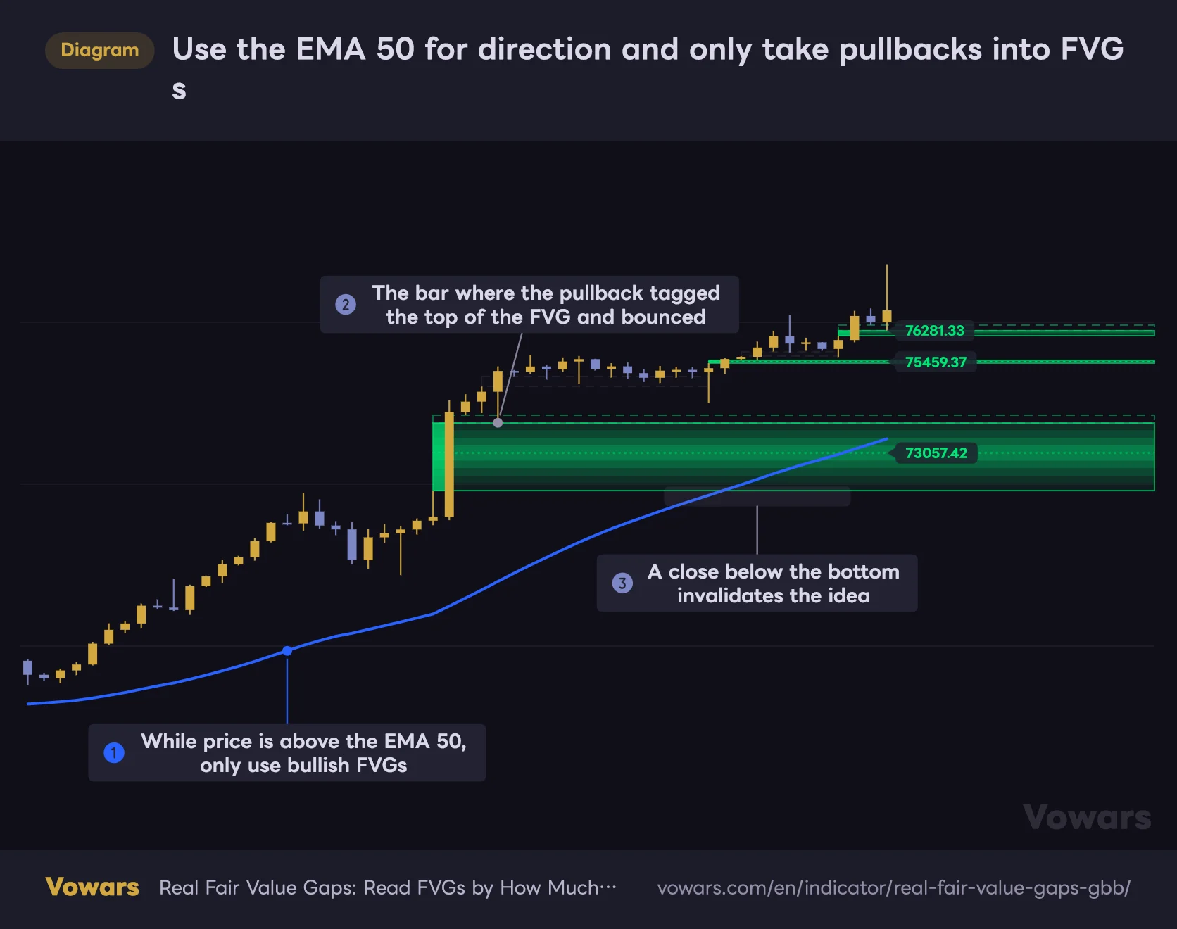
Use the EMA 50 for direction and only take pullbacks into FVGs
An example combo: decide the trend with the EMA 50 first, then only consider setups where price pulls back into an FVG of the same color.
- EMA 50
Vowars DE ver.3.12.4
1Use the EMA 50 to pick a direction
If price is above the EMA 50, only bullish (green) FVGs are candidates; if it’s below, only bearish (red) ones. As in Figure ①, cutting the field in half at this stage keeps you from getting lost even when the chart is full of FVGs.
2Wait for price to come back to a highlighted, untouched FVG
The target is a highlighted FVG that still has its dotted center line. If the line is still there, at least half of the gap is untouched. A bar that tags the top of the FVG on the pullback and leaves a lower wick, like the one in Figure ②, is your first clue for gauging the reaction. Set a “Price entered a gap” alert and you can wait without staring at the chart.
3Watch the reaction at the midpoint, and get out if it breaks
My approach is to wait for a reaction, like price holding at the midpoint (CE) and printing a green candle, before getting in. My stop reference is a close below the bottom of the FVG, as in Figure ③. When that happens the FVG flips into an IFVG right on the chart, which makes it hard to miss that the idea is invalidated.
I pay extra attention when an HTF FVG overlaps the same price area. For example, if there’s a 1H FVG right below a bullish 5-minute FVG, you can treat it as a two-layer support. On the flip side, when a bearish HTF FVG is sitting right overhead, I take profits earlier.
Also, since FVGs form when price moves fast in one direction, more volatile markets produce more of them. On something like Bitcoin that trades 24/7, FVGs keep lining up across day boundaries without a break. It works the same way on gold, FX pairs like USD/JPY and stock indices, but bars that span a weekend or holiday gap can leave extra space between candles, so FVGs that include those bars may come out larger than usual.
Where it fits, and where it doesn’t
After using it for a while, its strengths and weaknesses felt pretty clear-cut.
Where it shines
- You can see at a glance how much of an FVG is filled from the zone’s thickness and whether the dotted line is still there
- FVGs that price closes through flip into IFVGs, making support-to-resistance flips easy to track
- Only FVGs near price are highlighted and far-away ones aren’t drawn, so the price scale doesn’t get stretched
- HTF FVGs show up on the same chart, and since everything runs on confirmed bars, nothing gets redrawn
- Alerts are available for every stage: touch, midpoint, mitigation and inversion
What to watch out for
- The defaults pick up even razor-thin FVGs, so lower timeframes can get cluttered
- When FVGs with nearby midpoints stack up, the price labels on the right overlap and get hard to read
- It doesn’t tell you direction, so you need another indicator for trend bias
- In long stretches of chop, FVGs form and fill in quick succession, and none of them really hold
- When one bar runs through several stages, the alerts for the stages in between don’t fire
It’s at its best on pullbacks in the middle of a clear trend. FVGs left by strong candles tend to act as landing zones on the next dip, and together with the IFVG flip, they give you a clear line for deciding how far a pullback can go before the trend has turned. In a directionless, choppy market, on the other hand, small FVGs keep popping up and getting filled, and staring at the chart won’t get you any closer to a decision.
Behavior to know before you use it
No repainting, but you only see things after the bar closes
FVG registration, stage changes and alerts only update when a bar closes. You won’t see an FVG flash up and vanish on the live bar. HTF FVGs are also built from closed candles only, so nothing in the past gets rewritten after the fact.
The trade-off is a one-bar lag. Even if a wick is poking into an FVG on the live bar, the zone doesn’t shrink until the bar closes. The one exception is Above and Below in the info table, which are recalculated from the live bar’s price on every tick and can change mid-bar.
Don’t take how past charts look at face value
As mentioned earlier, the FVG zone is drawn from candle 1, but it only appears when candle 3 closes. When you look back and think “price bounced off this FVG”, leave out the two bars when the FVG wasn’t visible yet. If you want to see what it actually looked like at the time, stepping through bar by bar with TradingView’s Bar Replay is the reliable way. How far back Bar Replay goes depends on your plan and the timeframe, and lower-tier plans, including the free one, have limits on intraday history (as of Sep 28, 2026).
Once the record limit is hit, the oldest FVGs get dropped
TradingView caps how many boxes a single indicator can draw, so “Real Fair Value Gaps” manages the number of FVGs it tracks on its own. As it approaches the limit, it deletes mitigated (gray) FVGs first, oldest first, and if that’s not enough, the oldest FVGs that aren’t highlighted. If an active FVG gets deleted, the info table shows a red warning: “budget hit: oldest gaps dropped”. If you see it, raise Min size (ATR x) or shorten Keep mitigated (bars) to cut down the number of registered FVGs.
An FVG marks a likely area for price to return to. There’s no guarantee it will bounce there or get filled. In a strong trend, price can easily run away without ever touching the FVG. Treat FVGs not as a reason to enter, but as a way to decide where to wait and where to bail. In my view, that’s the safest way to use this indicator.
For traders who want to read FVGs as a process, not a single point
 Image
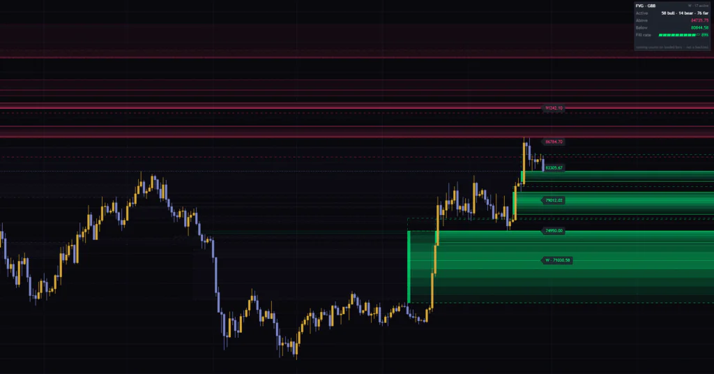
Image“Real Fair Value Gaps” does more than just find FVGs. It leaves the whole story on your chart through changes in color and shape: how far each gap has been filled, whether the midpoint has broken, and whether support has flipped into resistance. Thanks to the spotlight and the drawing-range limit, the chart holds up surprisingly well given how many FVGs it tracks, which I liked.
On the other hand, it won’t tell you which way to trade, and with the default settings lower timeframes get a bit busy. Set your direction with something like an EMA, then dial in Min size (ATR x) and Spotlight gaps to suit your timeframe. If you’re willing to put in that little bit of setup, it should make trading FVG pullbacks and rallies a lot cleaner.