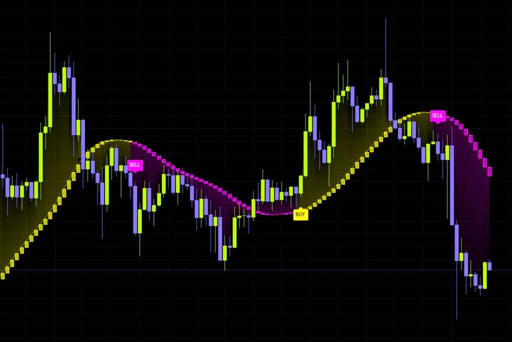


What “Butterworth Spectral Trend” actually is
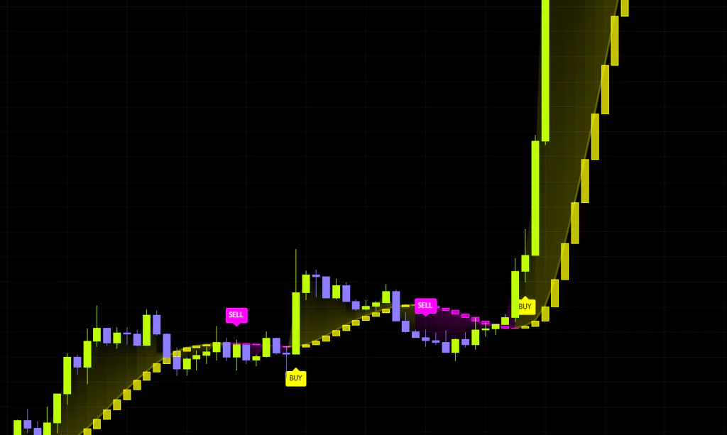
TradingView is drowning in moving-average trend indicators, and “Butterworth Spectral Trend” stands out because of how it strips noise and how it decides which way the trend is pointing. It is an overlay indicator from QuantAlgo, so it sits right on your price chart, and what you get is one smooth line, a gradient shaded between that line and price, and BUY / SELL labels printed wherever the trend flips.
At a glance it looks like a colour-changing moving average, but the engine underneath is a different animal. First, it calls direction from whether the line is pointing up, not from whether price has crossed above it. Second, it automatically slows the line down when the tape gets messy and speeds it up when price is trending cleanly. Once those two ideas click, everything this indicator does starts to make sense.
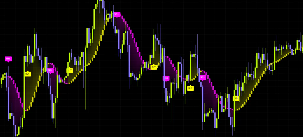
I ran it on the Bitcoin 4H for a few weeks, and the first thing I noticed was how little of that classic moving-average strobe effect showed up in chop, where price keeps flicking across the line and the colour changes with it. Nothing moves until the line itself rolls over, so a single wick never flips the call.
It is a smoothing method built to strip out short-cycle wiggles while leaving the bigger swing intact. Instead of averaging past values the way a simple moving average does, it works as a filter that refuses to pass any wave shorter than a set length, which is why it generally carries less lag for the same amount of smoothness. “Butterworth Spectral Trend” is built on that idea.
The four things it draws on your chart
Before anything else, let’s sort out what you are actually looking at. “Butterworth Spectral Trend” puts four things on screen.
1. The main trend line, which fades in and out
The centrepiece is a single thick line, coloured bullish when the call is up and bearish when it is down. Standard stuff so far. The interesting part is that its opacity is not fixed.
The line darkens or fades based on how big its own slope is relative to how much price is scattering around it. When the move is pushing through the noise in one direction, the line is solid and bright. When it is buried in noise with no real direction, it washes out. So a line that is coloured but oddly faint reads as “there is a trend call, but there is nothing behind it”. That turned out to be genuinely useful in live trading, and I ended up checking the opacity before I even looked at the labels.
2. Spectral bodies
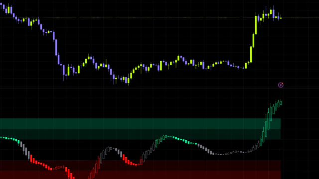
Along the line you get a chain of small candle-like blocks. These are not price candles — they plot how far the line itself travelled on that bar. The previous bar’s line value is the open and the current one is the close, so a long body means the line is moving at a steep angle, which means momentum. There are no wicks, just bodies.
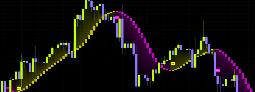
Because acceleration and deceleration show up as body length, you get a read on whether a move is running out of steam or still building. If you want a cleaner chart, you can switch them off.
3. Gradient fill
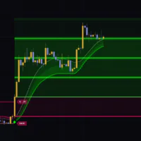
The space between the line and price is shaded in the trend colour. The size of that shaded area tells you how stretched price is from the line, which makes it a decent gauge for when to wait for a pullback. The fill is densest against the line and fades out toward price.
4. BUY / SELL labels
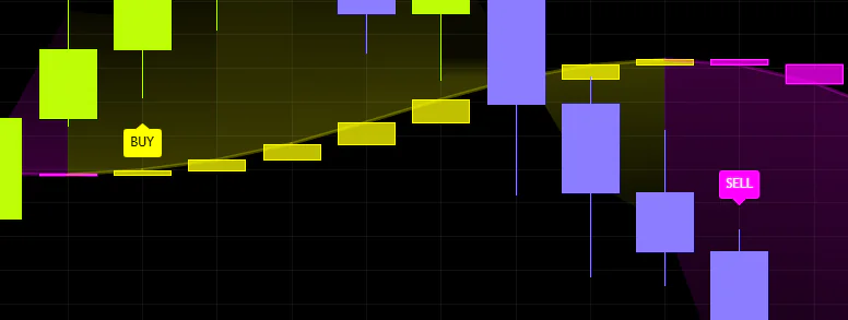
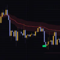
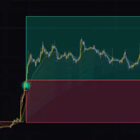
On the bar where the trend call flips, you get a BUY label below the candle or a SELL label above it. These are a notification that the state changed, not a recommendation to hit the button. That distinction matters, and I come back to it below.
How the trend call works: slope, not crossovers
The logic behind “Butterworth Spectral Trend” is simple. If the line is above where it was on the previous bar, the call is up. If it is below, the call is down. That is it. Whether price crossed above or below the line has nothing to do with it.
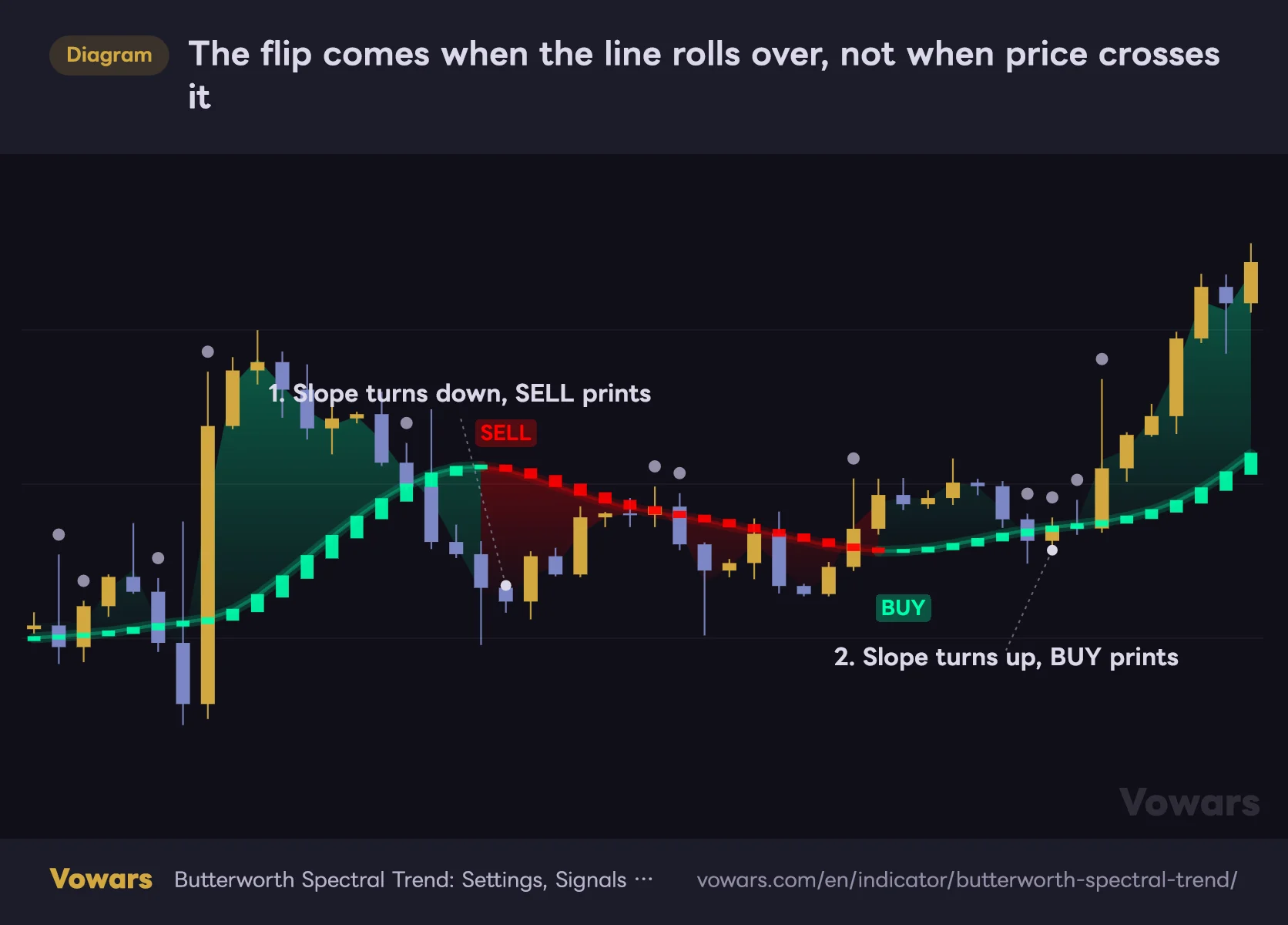
The flip comes when the line rolls over, not when price crosses it
While the line points up the call is bullish; while it points down it is bearish. The grey dots mark bars where price crossed the line, and crossing alone does not move the call.
Vowars DE ver.3.4.2
Here is what that changes in practice.
Why slope-based helps
- A long wick or a quick stop run does not flip the call
- The state stays stable while price chops around the line
- It is closer to asking whether the trend actually turned
Where slope-based costs you
- Flips tend to come later than a crossover would
- You only get the turn once price has pulled away from the high or low
- When the line goes flat, even a tiny wobble changes direction
That last one — a flat line flipping on tiny wobbles — is the single most important thing to understand about this indicator. Smooth as it is, the line is never a perfectly straight rail, so in a directionless market the smallest up-tick or down-tick is enough to swap the call. Which is exactly why the filters below exist.
The two filters that cut fakeouts
“Butterworth Spectral Trend” gives you two settings that make a flip harder to trigger.
- Hysteresis Factor: sets a minimum slope strength before a reversal is allowed. It measures the typical recent slope and asks how many times bigger than that an opposite move has to be. Because the bar is a moving reference rather than a fixed number, the same setting carries across markets and timeframes with very different volatility.
- Minimum Hold Bars: once a flip happens, no new flip is allowed until the set number of bars has passed. It wipes out the round-trip signals that fire and immediately reverse.
On the Default preset, both of these sit at 0, which means no filtering at all. The slightest opposite slope flips the state immediately. If your reaction is that it fires too much, assume the settings are the problem before you write off the indicator. Whether you touch these two is the difference between two completely different tools.
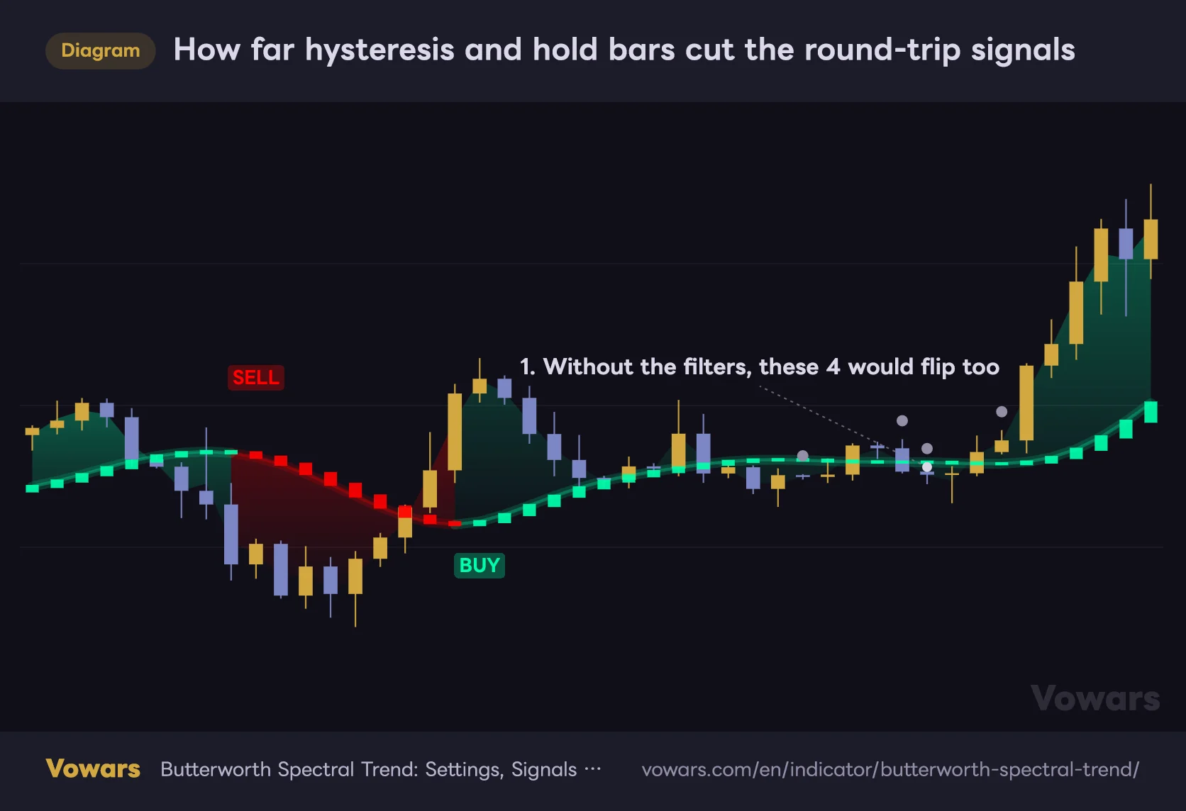
How far hysteresis and hold bars cut the round-trip signals
The grey dots are bars that would have flipped the call if Hysteresis Factor and Minimum Hold Bars were still sitting at 0.
Vowars DE ver.3.4.2
The adaptive cutoff that stretches and shrinks the smoothing
The other headline feature is adaptivity. Alongside its baseline line, “Butterworth Spectral Trend” is constantly comparing how widely price is scattering away from the line (noise) against how far the line is travelling in one direction (momentum).
- Noise winning → the line is re-tuned longer, so it gets slower and smoother
- Momentum winning → the line is re-tuned shorter, so it gets more responsive
The switch is gradual rather than abrupt. On the defaults, with a base of 20, the effective smoothing stretches and shrinks somewhere between roughly 17 and 33 bars. That behaviour pairs well with something like Bitcoin, which keeps cycling between days of consolidation and a vertical move. The line dulls down through the range, which makes the breakout itself easier to isolate.
How I actually use it, from install to decision
1Add it and settle on a timeframe
Search for “Butterworth Spectral Trend” in the TradingView indicator list and add it. It is an overlay, so it drops straight onto the price chart. Leave everything alone at first and just watch it on whatever timeframe you normally trade.
2Pick the preset that matches your timeframe
At the top of the settings, Preset Configuration lets you load a whole configuration that suits your style. Changing it swaps the base length, the adaptivity strength and the filter values all at once.
3Read direction and opacity together
This is the core of it in live trading. Think of it as direction = which way, opacity = how much to trust it. If the line is coloured but faint, the trend is weak and sitting on your hands usually beats buying the dip. While the line stays solid, you are better off playing pullbacks in the direction it is pointing.
4Treat the labels as a heads-up, not an entry
Market-buying the bar a BUY or SELL prints on is not something I would recommend. The label only tells you the state changed, so waiting for the pullback after the label gives you a better entry, especially since you can size up the gradient fill while you wait.
5Set up the alerts
There are three alert conditions: bullish confirmations only, bearish confirmations only, and a combined one that fires on either. Alerts keep working even with the labels hidden, so you can run a clean chart and still get pinged.
What separates the three presets
Each preset targets a clearly different timeframe band. Here is what actually changes.
| Preset | Target timeframe | Character of the line | Filters |
|---|---|---|---|
| Default | 1H to daily | Standard smoothing, moderate adaptivity | None (0) |
| Fast Response | 5m to 1H | Shorter and quicker, stronger adaptivity | None (0) |
| Smooth Trend | Daily to weekly | Longer and steadier, softer adaptivity | Yes (light hysteresis + 2-bar hold) |
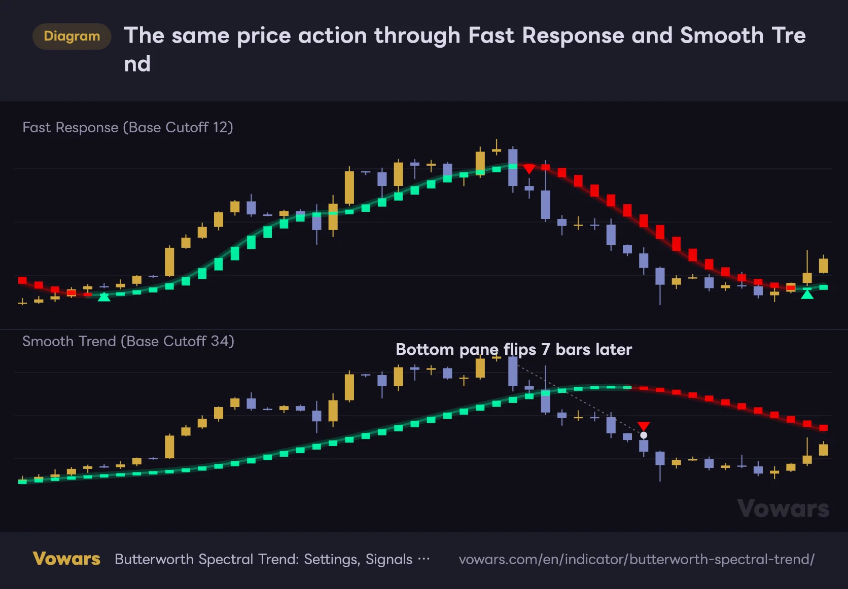
Notice that Smooth Trend is the only one with filtering switched on. On daily and weekly charts a single fakeout is expensive, so it is built to hold back flips even at the cost of some lag. Fast Response, aimed at the scalping end, prioritises speed instead and will print more signals than the other two.
The same price action through Fast Response and Smooth Trend
The top pane runs the Fast Response preset and the bottom one runs Smooth Trend. The price action feeding both is exactly the same.
Vowars DE ver.3.4.2
If you select Fast Response or Smooth Trend, the base length, adaptivity and signal inputs below them stop responding to manual edits. To dial things in yourself, stay on Default and adjust from there. This is the first thing most people trip over.
Every setting, and what I would run
Core, adaptivity and signal settings
| Parameter | Default | Recommended | What it does |
|---|---|---|---|
| Preset Configuration | Default | Match your timeframe | Swaps the whole configuration at once. Stay on Default if you want to fine-tune |
| Price Source | hlc3 | hlc3 | The price the calculation runs on. hlc3 averages high, low and close, so it is steadier than close alone |
| Base Cutoff Period | 20 | 12-34 | The baseline length of the line. Higher is smoother and slower, lower hugs price |
| Damping Factor | 1.414 | 1.414 | How sharply the line reacts. Raising it speeds up the response but picks up more noise |
| Nyquist Average | On | On | Suppresses the bar-to-bar oscillation that alternates up and down. Leave it on |
| Adaptive Cutoff | On | On | Auto-adjusts the smoothing based on how noisy the market is |
| Adaptivity Lookback | 32 | 20-48 | The window used to measure noise and momentum. Longer adapts slowly, shorter reacts to the last few bars |
| Adaptivity Strength | 0.55 | 0.4-0.75 | How much you trust the adaptation. 0 keeps the base length, 1 hands it over completely |
| Minimum Cutoff Multiplier | 0.55 | 0.5-0.7 | Floor for the auto-adjustment. Too low and it gets twitchy in clean conditions |
| Maximum Cutoff Multiplier | 2.25 | 1.8-2.6 | Ceiling for the auto-adjustment. Higher makes the line very sluggish in messy conditions |
| Cutoff Smoothing | 0.15 | 0.10-0.22 | How fast the smoothing changes. Lower is steadier, higher switches more readily |
| Hysteresis Factor | 0.0 | 0.3-0.6 | The bar a reversal has to clear. Higher wipes out the small round-trip signals |
| Minimum Hold Bars | 0 | 2-5 | Cooldown in bars after a flip. Kills clusters of opposing signals |
Visual settings
| Parameter | Default | Recommended | What it does |
|---|---|---|---|
| Show Spectral Bodies | On | On | Shows the line’s momentum as blocks. Switch off if it looks cluttered |
| Show Gradient Fill | On | On | Shades the distance between the line and price |
| Show Signal Labels | On | On | Displays the BUY and SELL labels. Alerts still work with this off |
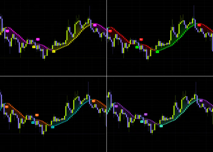
| Color Preset | Custom | Your call | Swaps the whole palette. The two colours below only apply on Custom |
| Bullish Color | Mint green | Your call | Colour for bullish states, applied to the line, fill and labels |
| Bearish Color | Red | Your call | Colour for bearish states |
| Enable Bar Coloring | Off | On | Tints the candles with the trend colour so the state reads instantly |
| Bar Color Transparency | 50 | 40-60 | Strength of the candle tint. Lower is vivid, higher is faint |
| Enable Background Coloring | Off | Off | Tints the whole pane. Tends to clash once you stack other indicators |
| Background Color Transparency | 90 | Around 90 | Strength of the background tint. Too low and price gets hard to read |
Why those numbers
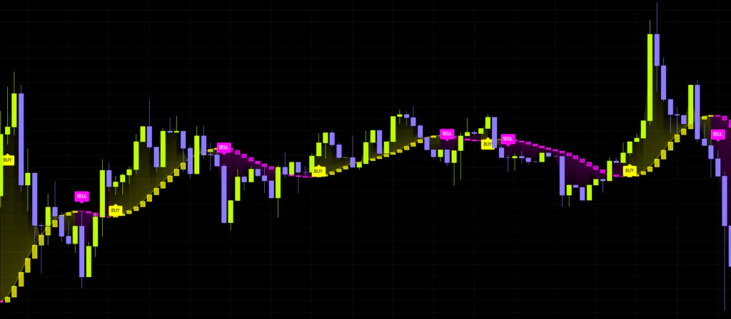
Start with Hysteresis Factor and Minimum Hold Bars. Leave both at 0 and the call swaps on the tiniest movement in the line. Testing on something short like the Bitcoin 15m, I hit stretches of range where a label printed every few bars. Raise the bar to somewhere around 0.3 to 0.6 and the decision starts referencing the typical recent swing, so only the turns that actually mean something survive. Adding 2 to 5 hold bars on top of that clears out the round trips in one go.
Next, Adaptivity Strength. The closer you push it to 0, the more the adaptation is effectively disabled and you are left with a plain fixed-length smoother. Since that is the whole selling point, I would keep it at 0.4 or above. Crank it all the way to 1.0, though, and the line goes extremely sluggish in messy conditions, which can cost you the entire first leg of a move. The default 0.55 felt like a sensible middle to me.
One thing worth knowing: Adaptivity Lookback does double duty. It controls how fast the adaptation moves, and it is also the window used to measure the typical recent slope that hysteresis is scaled against. That means it still affects the signals even with the adaptation switched off, so I would avoid pushing it to an extreme on its own.
The tooltip in the settings reads as though going above 1.414 softens the response, but when you actually move the number and compare the output, raising it makes the line hug price while lowering it makes the line smoother and slower. If you do touch it, move it in small steps and watch the line change with your own eyes. Leaving it at the default 1.414 is perfectly fine.
Where it shines and where it struggles
Here is what became obvious after running it across a lot of different conditions.
Where it works
- Sustained one-way trends, where the line is solid and dips are easy to spot
- The first leg out of a range or after a breakout
- Markets whose volatility swings hard in both directions, where the adaptation earns its keep
- Locating dips and rallies to trade inside an existing trend
Where it struggles
- Tight sideways ranges, where flips multiply with the filters off
- Sharp V-shaped reversals, since nothing happens until the slope rolls over
- Calling exact tops and bottoms, which is not what it is for in the first place
- Thin, gappy charts on illiquid markets
In terms of style, day trading and swing trading are the sweet spot. Fast Response makes scalping workable, but because the call is slope-based it is never going to keep up with a few-tick game. On daily and weekly charts, Smooth Trend works well as a trend-continuation check for position trades.
What to know before you rely on it
Closed bars and live bars behave differently
“Butterworth Spectral Trend” does not pull data from a higher timeframe and does not peek at future bars. So the line and the labels on closed historical bars never get rewritten after the fact.
The live, unclosed bar is a different story. The line moves in real time with the current price, so a BUY label can appear mid-bar and then disappear before that bar closes. This is not a flaw unique to this indicator — it is how any real-time calculation behaves — but it is worth keeping front of mind if you run alerts on low timeframes.
If labels or alerts are going into your decision, act on closed bars. Setting the trigger condition to Once Per Bar Close in the TradingView alert dialog stops you getting jerked around by signals that vanish mid-bar.
Don’t trade it on its own
This tells you which way the trend is pointing. It does not tell you how far the move can run or whether price is already overextended. A BUY label does not mean up, which sounds obvious until you see one re-fire near the highs after a big run. Chasing that is a great way to buy the top, so check whether the gradient fill has stretched out too far before you act on it.
Small differences depending on how far back you load
Because each value is carried forward from the previous one, a different chart start point can shift the line slightly for the first few dozen bars after it begins plotting. When you are reviewing history, load plenty of data first and treat anything near the left edge of the screen as indicative only.
What to pair it with
“Butterworth Spectral Trend” only does direction, so pairing it with something that fills the gaps is where it gets useful.
| Pairing | What it adds | Example use |
|---|---|---|
| RSI / Stochastics | Overextension | Buy the dip when RSI drops and turns back up while the call is bullish |
| ATR | Stop placement | Place the stop one ATR below the low of the label bar |
| Volume tools (Volume, OBV) | Breakout conviction | Check whether volume showed up when the label printed |
| Horizontal levels / S&R | Targets and turn points | Skip BUYs that print just below a recent high |
| The same indicator on a higher timeframe | Alignment with the bigger picture | Only take 15m BUYs while the 4H call is bullish |
The last one is the one I would push hardest: using it multi-timeframe. The call is binary, which makes it easy to build a rule around only taking setups where the higher and lower timeframes agree. Bitcoin 4H for context and 15m for timing is the combination that clicked for me.
Is “Butterworth Spectral Trend” worth a slot on your chart?
There is no shortage of colour-changing trend lines out there, but what sets “Butterworth Spectral Trend” apart is that it shows you direction and strength at the same time, from a single line. Follow it while it stays solid, stand down when it fades. Having that simple a rule literally drawn on screen is a very comfortable setup if you don’t like cramming your chart.
Then there is the adaptation, dulling the line through ranges and sharpening it when momentum shows up. That behaviour fits a market like Bitcoin that keeps flipping between quiet and violent. It works perfectly well on cleaner trending instruments like gold or the indices too, and it is not fussy about timeframe.
That said, you will not see the best of it on the default settings. Both fakeout filters ship switched off, and I suspect a fair number of people never notice and walk away thinking it just signals too much. Flip that around and it means one or two tweaks turn it into a different tool, so this rewards anyone willing to put in a little setup time.
All in, I would recommend it strongly to anyone tired of moving-average crossovers strobing on and off, and anyone who wants one calm trend line for market context. It is not for you if you want flawless signals the moment you add it, or if you are hunting exact tops and bottoms. Run it on a demo or small size first and get a feel for how often it signals on your own timeframe before you build it into anything.