

An Indicator That Measures Time, Not Price
TradingView has countless indicators built to analyze price, but “Market Time Cycle (Expo)” is a different animal. It doesn’t care whether price is strong or weak. All it shows you is where you are in the current cycle, and nothing else.
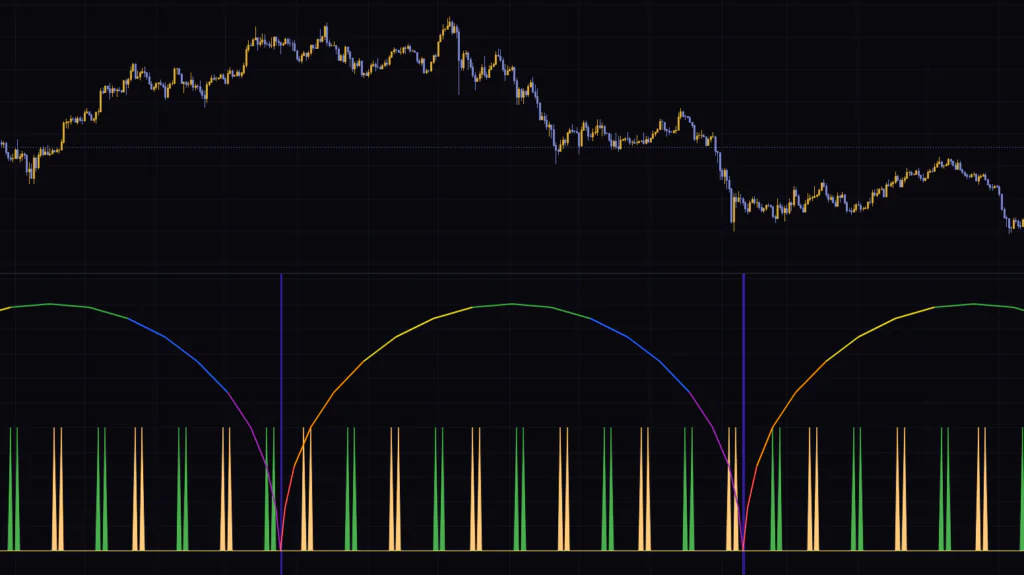
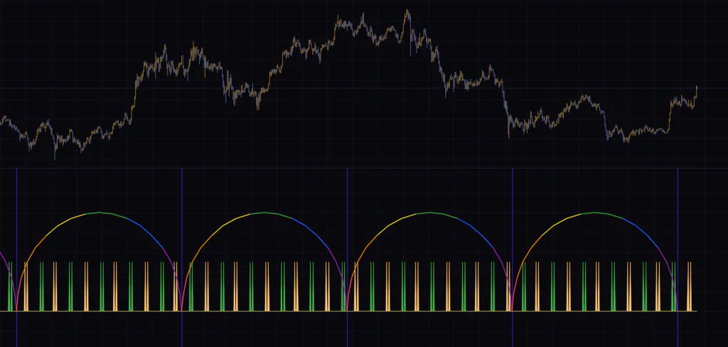
Add it to a chart and a row of large semicircular arches appears in the lower pane. Each arch moves from left to right through red, orange, yellow, green, blue and purple, with a vertical line at its base. On top of that, thin green and light-orange spikes pop up here and there. That’s the whole display. Nothing is drawn on price itself.
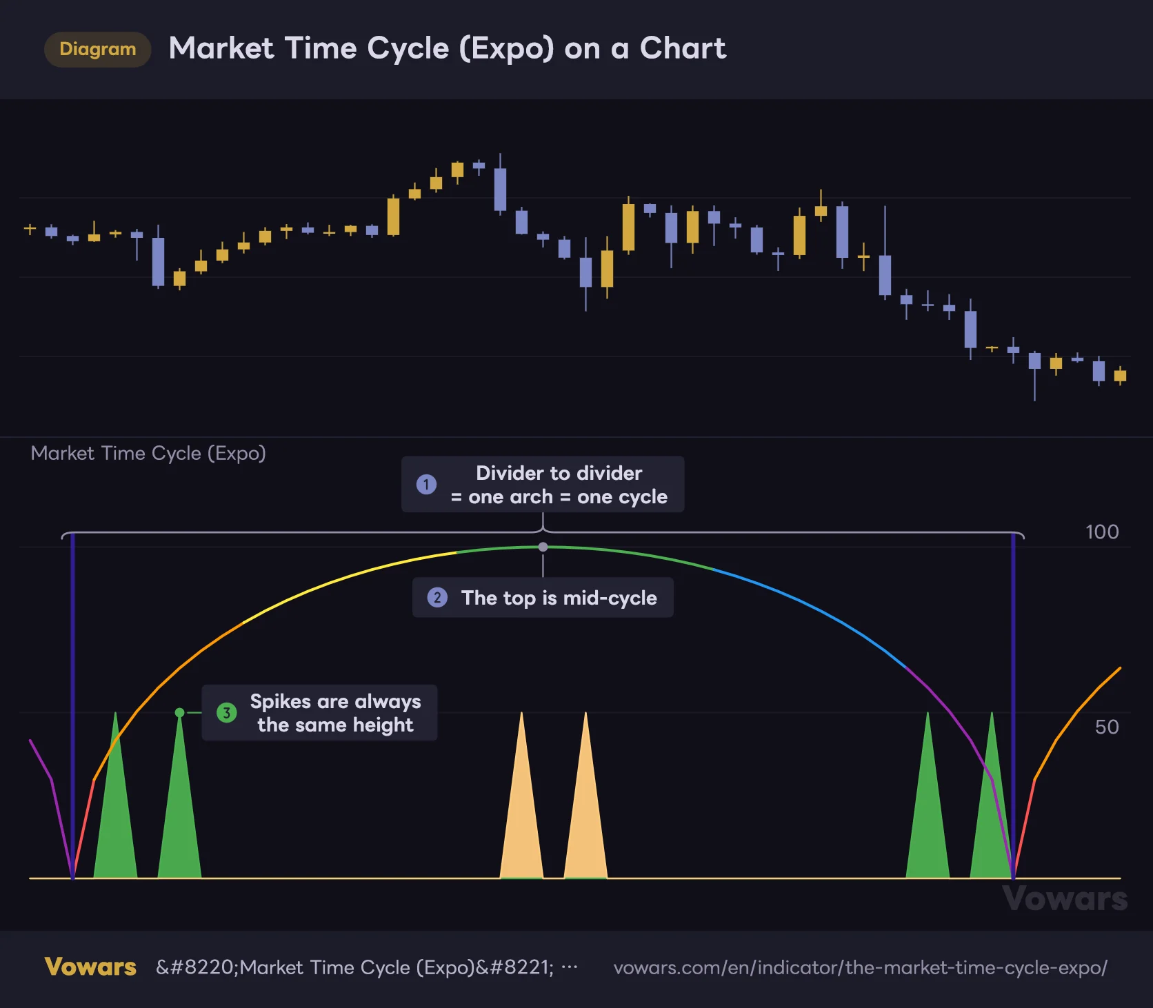
Market Time Cycle (Expo) on a Chart
The lower pane shows an arch representing one full cycle, with vertical lines marking the cycle boundaries.
Vowars DE ver.3.8.0
The idea of market cycles has been around for a long time: price isn’t pure noise, but moves back and forth in rhythms of roughly similar length. The author frames time cycles as a roadmap for knowing when the market is likely to move. It clicks once you think of “Market Time Cycle (Expo)” as an indicator that pins that roadmap to the bottom of your chart.
When I first loaded it on a daily Bitcoin chart, I was a little confused. No matter what the candles did, the arches didn’t budge. Switch the symbol, let the bars get wild, and the arch height and spike count stay exactly the same. After staring at it for a while, it finally sank in: this isn’t a tool for measuring price action. It’s a clock you place on the chart. Get that point down first, and everything else in this review falls into place.
One thing worth adding: the author’s description says it uses mathematical techniques to analyze market cycles and detect possible turning points. In practice, though, the display doesn’t derive the cycle from price action on the chart. It draws a divider every set number of bars and color-codes the space in between. That’s what’s actually going on. If you install it expecting it to find the market’s cycles for you, this is where expectations and reality part ways.
Only Three Things Show Up in the Lower Pane
| What you see | What it represents | Can you hide it? |
|---|---|---|
| Color-coded semicircular arches | Progress through one cycle. The left edge is the start, the top is the midpoint, the right edge is the end | Turning off Market Cycle hides only the arches |
| Vertical line (background color) | The cycle boundary. One line where two arches meet | Turning off Cycle divider hides it |
| Green and light-orange spikes | Points where an internal wave turns over. Always the same height | Turning off Sine Wave Cycle hides them |
The three are independent, so you can hide just the ones you don’t need. At first I kept only the arches and the divider lines and turned the spikes off. I’ll explain why later.
The Color Tells You Where You Are in the Cycle at a Glance
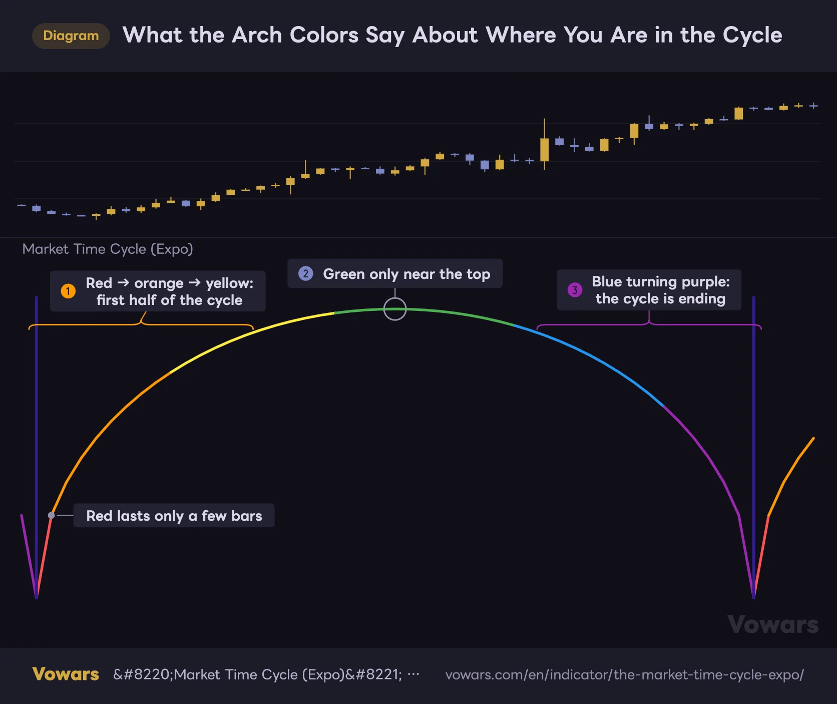
The most useful part of this indicator is the arch color. It’s split into six colors by angle, running from the left base through red → orange → yellow → green → blue → purple. Green is the top, in other words the middle of the cycle.
What the Arch Colors Say About Where You Are in the Cycle
The arch is split into six colors, so you can tell roughly where you are in the cycle just from the color.
Vowars DE ver.3.8.0
The fact that the color bands aren’t evenly sized turns out to matter. Red and purple only appear in a very short stretch near the base, while yellow, green and blue last much longer. With the value at its default of 200, each color covers roughly this many bars.
| Color | Position in the cycle | Approx. bars (at a setting of 200) |
|---|---|---|
| Red | Right after the cycle starts | ~6 bars |
| Orange | Early in the climb | ~30 bars |
| Yellow | Just before the midpoint | ~47 bars |
| Green | Top (midpoint of the cycle) | ~51 bars |
| Blue | Second half, after the turn | ~43 bars |
| Purple | Final stretch | ~23 bars |
In other words, once purple shows up, the cycle is close to ending. That’s the part I rely on most. From the start of purple to the divider line is just over 20 bars, so on a daily chart it reads as “this boundary is about three weeks out.” Reading the time left straight off a color is much faster than parsing numbers.
Green doesn’t mean the uptrend is strong. Where the colors change is determined only by how many bars have passed, and price plays no part at all. Seeing a sharp sell-off right at the green top is perfectly normal.
The Arch Is Drawn All at Once on the “Midpoint Bar”
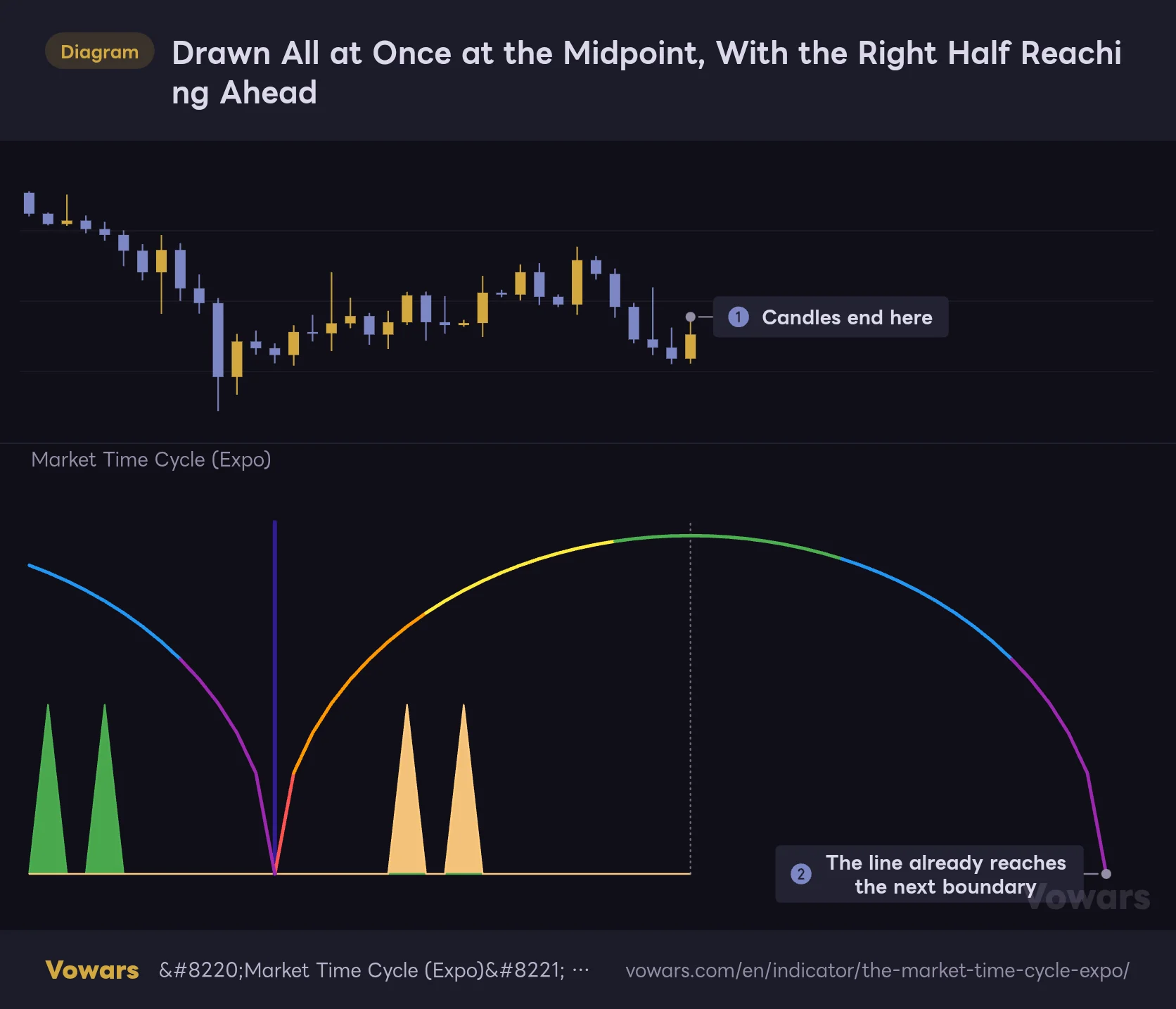
This is the part you really need to know before using it. The arches don’t grow from left to right. The moment price reaches the bar at the midpoint of a cycle, the entire arch spanning both sides appears in one go.
Drawn All at Once at the Midpoint, With the Right Half Reaching Ahead
The arch is drawn on the bar at the midpoint of the cycle. At that moment, the right half reaches out to bars that haven't printed yet.
Vowars DE ver.3.8.0
This has one clear upside. The right half of the arch is drawn ahead of time, out into bars that haven’t printed yet. At the default of 200, that’s 100 bars ahead. On a daily chart, that’s more than three months out, so you can see when the next boundary will land right then and there. And once a line is drawn, it never moves afterward.
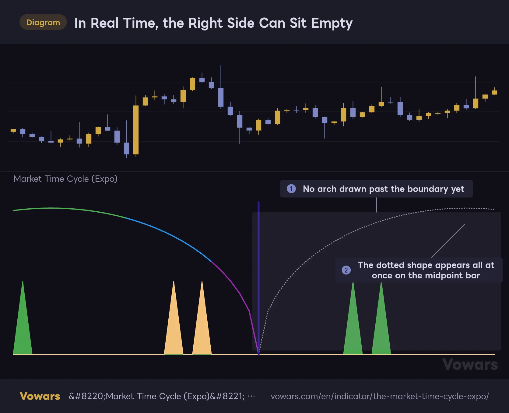
There’s a flip side, though. After a boundary passes and until the next midpoint bar arrives, nothing at all is drawn on the right side of the chart.
In Real Time, the Right Side Can Sit Empty
Historical charts show arches lined up neatly, but in real time there are stretches when the right side is blank.
Vowars DE ver.3.8.0
Scroll back through history and the arches line up neatly with no gaps. In real time, however, the right side stays empty for half a cycle (100 bars at the default). Even if a historical chart makes it look like price reversed right at the end of an arch, that arch may have been drawn after the reversal. When you backtest, step through bar by bar with Bar Replay and check whether the arch was actually on screen at the time.
Put another way, the bar where a new arch appears is exactly the turning point of that cycle. The moment an arch shows up, you know the cycle is already half over, which is useful in its own way. While the right side is blank, you’re “waiting for the next arch”; once it appears, you’re “past the midpoint.” After a while, you can read the chart with just those two states.
The Spikes Aren’t Trade Signals. Think of Them as a Second Hand
The thin green and light-orange spikes look like “signals,” and the author’s description does say a signal fires when the wave crosses certain thresholds. But once I actually lined them up against price, they turned out to be quite different from what you’d expect.
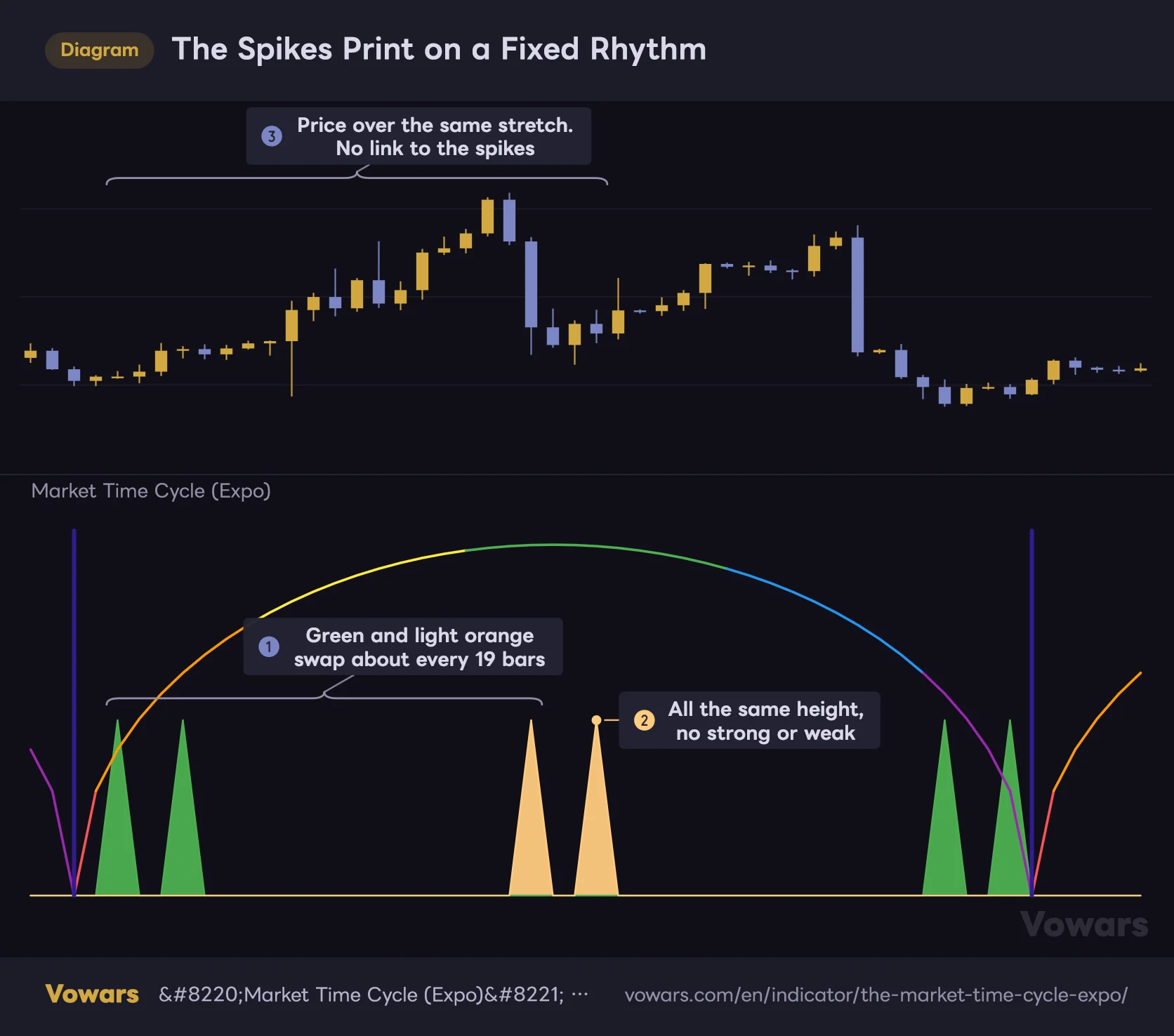
The Spikes Print on a Fixed Rhythm
Sine Wave Cycle spikes print at fixed intervals regardless of price.
Vowars DE ver.3.8.0
With Sine Wave Cycle at its default of 20, green and light orange take turns roughly every 19 bars, two spikes at a time. I got the same rhythm counting on a Bitcoin 1H chart and on a gold daily chart. Sometimes they print at a high, sometimes right in the middle of a range. They’re all the same height too, with no distinction between strong and weak.
In short, it’s a metronome ticking at a fixed interval. It isn’t reacting to price, so “green spike, time to buy” simply doesn’t work. If you use it at all, it’s as a finer set of tick marks that divides the cycle into smaller pieces.
Please don’t use the spikes as a reason to enter a trade. Where they print is decided from the start and reflects nothing about what the chart is doing at that moment. If the fine tick marks feel like clutter, uncheck Sine Wave Cycle and run it with just the arches and divider lines. It’s much cleaner that way.
Four Settings. Understand the Values and You Won’t Get Lost
The settings panel is very short: four checkboxes and two number fields. The number fields have no labels, so you tell them apart by which checkbox they sit next to.
| Setting | Default | Suggested | Effect |
|---|---|---|---|
| Market Cycle | On | On | Shows the color-coded arches. Turning it off hides only the arches; the divider lines and spikes remain |
| Market Cycle (value field) | 200 | 200 (96–120 for short-term) | Number of bars per cycle. The arch height is half this value |
| Overlap Cycles | Off | Off | When on, cycles start at half the interval and the arches overlap |
| Cycle divider | On | On | Vertical line at each cycle boundary. Its position depends on Overlap Cycles |
| Sine Wave Cycle | On | Depends on your use | Shows the green and light-orange spikes |
| Sine Wave Cycle (value field) | 20 | 20 | Spacing between spikes. At 20, roughly every 19 bars |
The 200 in the Value Field Is Exactly the Number of Bars per Cycle
Market Cycle has a number field to its right (the author’s description calls it NumbOfBars), and that field is the heart of this indicator. The default is 200, and there are exactly 200 bars from one divider line to the next. The vertical scale is tied to this value as well: the top of the arch is 100 and the spikes are 50. In other words, the arch height is half the setting. Change it to 300 and the top becomes 150.
Because it counts bars, the actual duration depends on your timeframe. The same 200 means very different things (assuming a market that trades 24 hours).
| Timeframe | Length of 200 bars | Best for |
|---|---|---|
| Daily | 200 days. About 6.5 months in crypto, about 10 months for stocks | Marking turning points in the bigger trend |
| 4H | ~33 days | Deciding whether to keep holding a swing trade |
| 1H | ~8 days | Weekly rhythm |
| 15m | ~2 days | Splitting up day-trading sessions |
For lower timeframes, I found values around 96–120 easier to work with. On the 1H chart, 120 bars is five days, a full trading week. On the 15m chart, 96 bars is one day. Pick a value that matches the length of your own trading cycle, and the arch color starts working as a gauge for “where am I in this week?” Leave it at 200 on the daily, on the other hand, and the boundaries mark half-year milestones, which suits people who hold positions for a long time.
Note that the smaller the value, the more arches you’ll see on screen, but only the most recent twenty-odd cycles are kept. Older arches drop off in order. If you set a small value like 50 and zoom far out, the left side can end up empty.
Overlap Cycles: For When You Want to Split the Cycle in Half
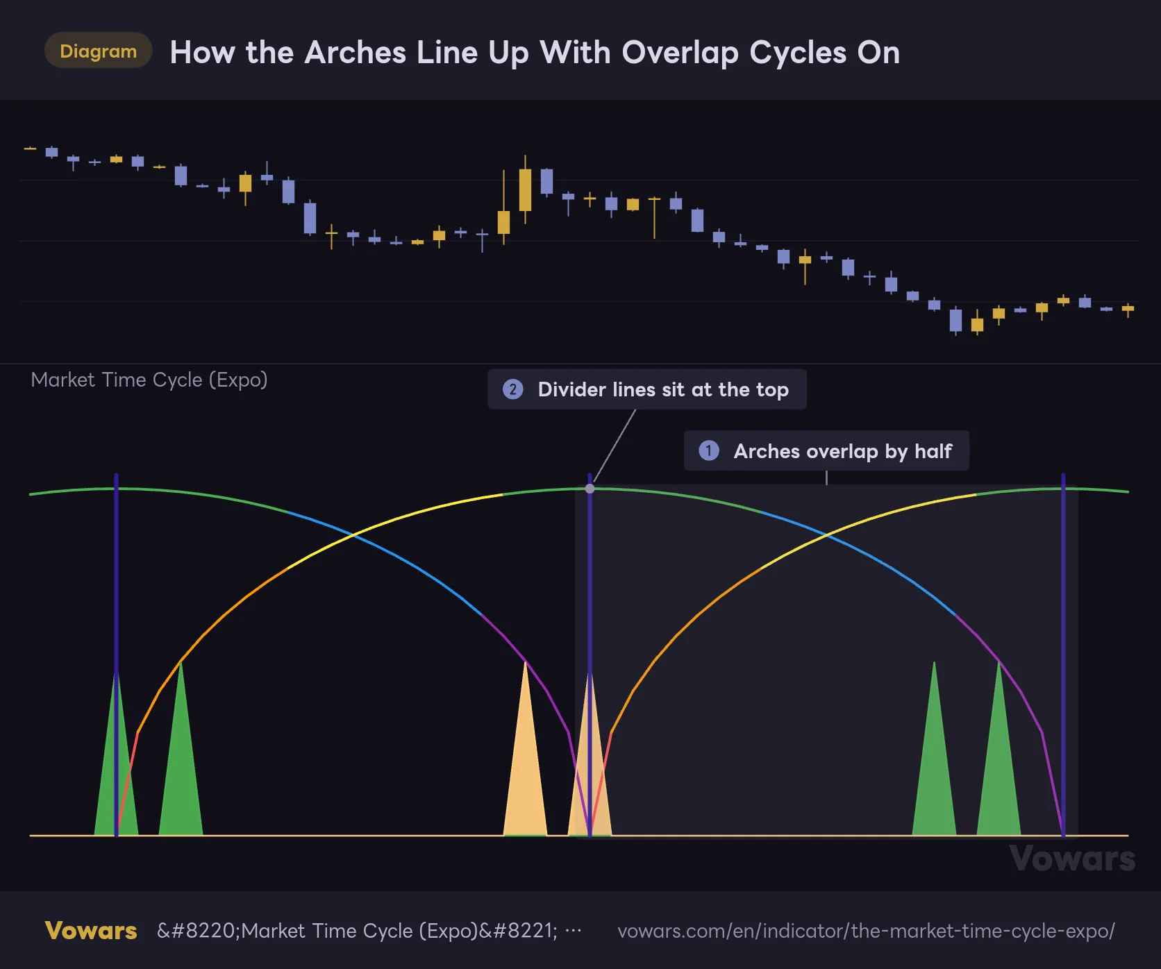
Overlap Cycles changes the look quite a bit when you turn it on. The arch width (equal to the setting) stays the same, but each new arch starts partway through the previous one. As a result, the spacing between boundaries is cut in half.
How the Arches Line Up With Overlap Cycles On
With Overlap Cycles on, the arch width stays the same, but each new arch starts partway through the previous one.
Vowars DE ver.3.8.0
The divider lines move too. When it’s off, they sit at the base, where two arches meet. Turn it on and they land at the top of the arch, the midpoint of the cycle. It’s handy when you want twice as many markers without changing the setting, or when you want the turn between the first and second half drawn as a line. That said, the overlapping arches cross each other, which makes it harder to read at first. I’d get used to it with this off before trying it.
The Sine Wave Cycle Value Controls Spike Spacing
This number field sets how far apart the spikes are. At the default of 20, they come roughly every 19 bars. The relationship isn’t linear: past about 40, raising the value widens the spacing (around every 28 bars at 50, and more than 70 at 60). Drop it to around 14, on the other hand, and I got a lopsided pattern, with a few spikes bunched together and then a long gap.
Since spike spacing has nothing to do with price, changing the value won’t make them “more accurate.” The only reason to touch it is to change how fine the tick marks are. The default of 20 gave the cleanest pattern.
Narrow It Down by Time, Decide Direction by Price
On its own, this indicator can’t tell you whether to buy or sell. It only tells you “when,” not “which way.” The approach I settled on comes down to three steps.
1Match the cycle to your timeframe
First, line up the boundary spacing with your own trading cycle. If you close trades within a few days, use 96–120 on the 1H; if you hold for weeks, use 200 on the 4H or daily. If these don’t match, your market view will have changed long before the boundary arrives.
2Treat the area around purple and the divider line as a “candidate zone”
When an arch turns purple, the end of the cycle is near. Mark the few bars on either side of the divider line as a window where a turn might be more likely. The key here is to do nothing just because you’re in the zone. At that point, all you have is the timing condition.
3Confirm direction with a price-based indicator
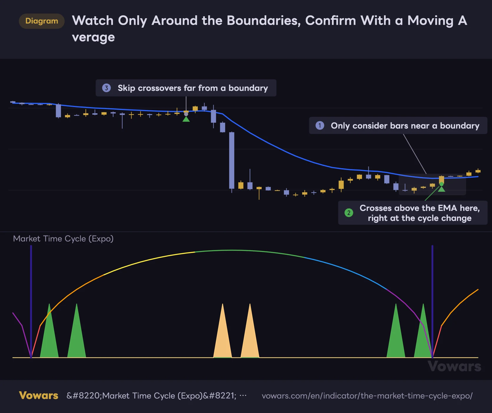
Only act when a price-based signal shows up inside the zone, such as a moving average break or a key swing low being taken out. If the same signal fires away from the zone, pass. You’ll take far fewer trades this way, but only the ones where two separate reasons line up.
Watch Only Around the Boundaries, Confirm With a Moving Average
Pairing cycle boundaries with a price-based indicator such as a moving average narrows down your candidates.
Vowars DE ver.3.8.0
Anything that can show direction works as a partner. I used the 20 and 50 EMAs. Some people will pair it with RSI or MACD divergence, and the same logic applies to horizontal levels or trendlines. Let “Market Time Cycle (Expo)” handle the filtering, and let something else pull the trigger. That’s what felt most natural to me.
Which Markets and Timeframes It Suits
Since it doesn’t look at price, there’s no such thing as “it works better in this kind of market.” Even so, the situations where it helps and where it doesn’t are clearly separated.
It fits best with trades you hold for a longer time. In swing and position trading you have to decide how much longer to stay in, and a gauge showing the time left in the cycle feeds straight into that decision. With markets like gold or stock indices, where seasonality and supply-and-demand rhythms get a lot of attention, the boundary positions are worth watching too. In markets like Bitcoin that trade around the clock, there’s no clear daily or weekly break to begin with, so having lines drawn mechanically by bar count turned out to be surprisingly handy.
On the other hand, it’s a poor fit for scalping, where trades are settled in minutes. 200 bars on a 1-minute chart is just over three hours, and the arch color barely changes in that time, so watching it doesn’t add any decisions. The same goes for moves driven by economic data or news. A time gauge won’t help you there at all.
What You Can Rely On, and What You Have to Accept
What you can rely on
- The next boundary is locked in and visible up to half a cycle ahead
- Lines never move once drawn, so the comparisons you make don’t shift later
- You can read the time left in the cycle from the color alone, no numbers needed
- Works the same way on any symbol or timeframe
- Only four settings, so there’s almost nothing to get confused about
- Draws nothing on price, so it doesn’t clash with your other indicators
What you have to accept
- The cycle length is a fixed value you choose; it doesn’t stretch or shrink with the market
- It says nothing about buy or sell, so it can’t drive order decisions on its own
- In real time, the right side stays blank for half a cycle
- Boundary positions are set by the number of loaded bars, not by date or time
- The spikes just print at fixed intervals and can’t be used as trade signals
- It takes up a whole pane for a fairly limited amount of information
Four Quirks to Know Before You Add It
Boundaries Are Set by Bar Count, Not by Date
Counting starts from the oldest bar loaded on the chart. Since it isn’t tied to any specific date, switching timeframes on the same symbol moves the boundaries. Even if the daily chart shows a boundary on September 1, the 1H chart will put its line on a different day. And if you scroll left and more history loads, the starting bar changes, which can shift everything. If you want to keep a record of an important boundary, the safe move is to mark that spot with the Vertical Line drawing tool.
Nothing Shows Up for the First Cycle
An arch is only drawn once price reaches the first midpoint bar, and spikes only start appearing after that. On newly listed symbols or data with a short history, the left half of the chart may show nothing. The indicator isn’t broken. It just hasn’t reached one full cycle yet.
You Have to Set Up Alerts Yourself
This indicator doesn’t come with any built-in alert conditions. That said, if you select “Market Time Cycle (Expo)” in TradingView’s Create Alert dialog, you can use the two plotted values, Sine Wave Cycle 1 and Sine Wave Cycle 2, as conditions. For example, set the condition to “Greater Than 0” and you’ll get notified on the bar where a spike prints. The divider lines, on the other hand, are background colors, so they don’t show up as condition options. If you want a heads-up for boundaries, it’s quicker to take advantage of knowing their position in advance and put the date in your calendar or a reminder app.
No Repainting, but Arches Get Filled In After the Fact
A lot of people care about repainting, so let me be clear. Once a spike or arch appears, it never changes position or height afterward. The values are set before the bar even closes, so there’s no flickering while you wait for confirmation.
That said, the left half of each arch is drawn after the fact, over bars that are already in the past. It’s not the kind of repaint where values get rewritten, but as long as you’re only looking at historical charts, you won’t notice the difference. If you want more accurate testing, recreating what was on screen at the time with Bar Replay is the reliable way. You do have to step through bars manually, and how far back you can go depends on your plan and timeframe.
When you use Bar Replay, start a few bars before a boundary and it’s much easier to follow. Watch once as the arch goes from absent to appearing all at once on the midpoint bar, and you’ll get a feel for how it looks in real time.
Use It as a Clock and It Earns Its Place
If you install “Market Time Cycle (Expo)” thinking it’s a prediction machine, you’ll probably remove it within a few days. It doesn’t look at price, so it isn’t even playing the right-or-wrong game. Sometimes price dumps right at the green top; sometimes a strong trend kicks off at the tail end of purple.
 Image
ImageOn the other hand, if you use it as a clock on your chart, “Market Time Cycle (Expo)” is a well-made tool. It slices the market into equal-length rhythms and uses color to show where you are inside one. And the next boundary is locked in ahead of time. It turns that “I’ve been in this position for about two months now” feeling into something you can actually see. As a way to add one more axis to your decision-making, it has real value.
I’d recommend it to people who want to bring the idea of cycles into their trading, and to anyone who struggles to decide how long to hold a position. If your goal is more entry signals, on the other hand, this indicator won’t deliver. As long as you understand that difference, I think it’s well worth keeping at the bottom of your chart.
One last note. Trading decisions are ultimately your own responsibility, and no indicator guarantees results on its own. Start by finding a value that fits your timeframe on a demo account or with small size.