

What is “Fibonacci Trend Continuation Signals”? The quick version first
Say the word Fibonacci and most people picture the tool where you pick a swing high and a swing low yourself. The problem with that is simple: anchor it in the wrong place and every level below it is wrong too. I’ve lost plenty of time arguing with myself over which high to use as the starting point.
“Fibonacci Trend Continuation Signals” is an attempt to remove that decision entirely. Both the anchor and the endpoint keep moving on their own as market conditions change, so there’s nothing to redraw.
If I had to sum up what you’re watching in one line: how far price has pulled back inside the trend that’s currently running. When that pullback stalls and price starts working its way back, a continuation signal prints. It’s published by AlgoAlpha and is free to add on TradingView (as of 2026/8/26).
“Fibonacci Trend Continuation Signals” rolls three jobs into one script: calling the direction of the trend, measuring how deep the pullback has gone, and flagging the moment price starts climbing back out of it. Treat it as a trend-following aid rather than a standalone Fibonacci tool and it makes a lot more sense.
What actually shows up on the chart? Breaking down the pieces
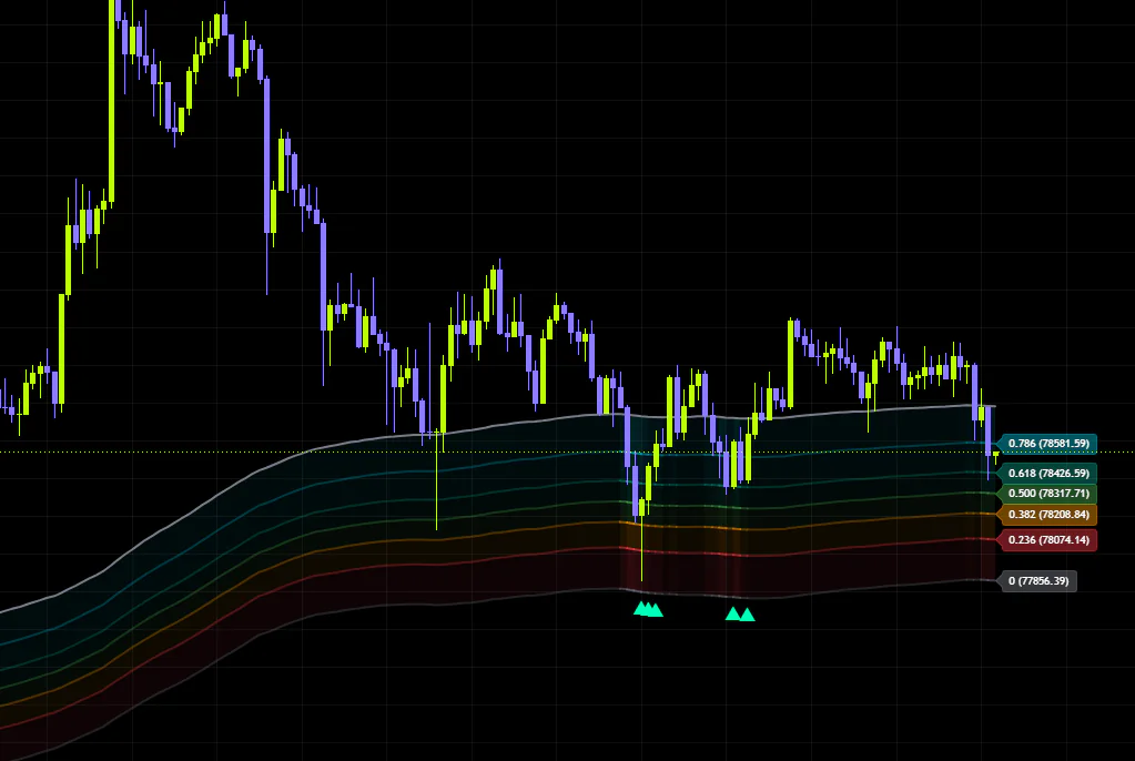
Add it to a chart and you get a set of lines and shaded zones drawn over price. It can look busy at first glance, but it only ever comes down to three components.
1. The gray midline
The thick gray line cutting through the middle of the screen is the midline. It’s an exponential moving average of the close, and it acts as the center of gravity for everything else. An EMA weights recent prices more heavily than older ones, which makes it react to price a little faster than a simple moving average.
This midline sits at the 1.0 end of the Fibonacci range we’re about to cover. In other words, a shallow pullback is one where price is still hugging this line.
2. The outer band (the 0 line)
A second gray line sits a fixed distance away from the midline. It’s placed above or below the midline using a smoothed read on volatility, taken from the high-to-low range of each bar.
Here’s the neat part: only one side is ever drawn. In an uptrend you see the lower band, in a downtrend the upper one. That keeps the chart clean and forces your attention onto the only zone that matters right now.
3. Five Fibonacci levels and the shaded zones
The space between the outer band and the midline is carved up by five lines at 0.236, 0.382, 0.500, 0.618 and 0.786. Each gap is lightly shaded so you can gauge the depth of a pullback by color alone. Here’s the default palette.
| Level | Default color | Position relative to the midline |
|---|---|---|
| 0.786 | Cyan | Closest to the midline = shallow pullback |
| 0.618 | Teal green | Fairly shallow pullback |
| 0.500 | Green | Halfway point |
| 0.382 | Orange | Fairly deep pullback |
| 0.236 | Red | Closest to the outer band = deep pullback |
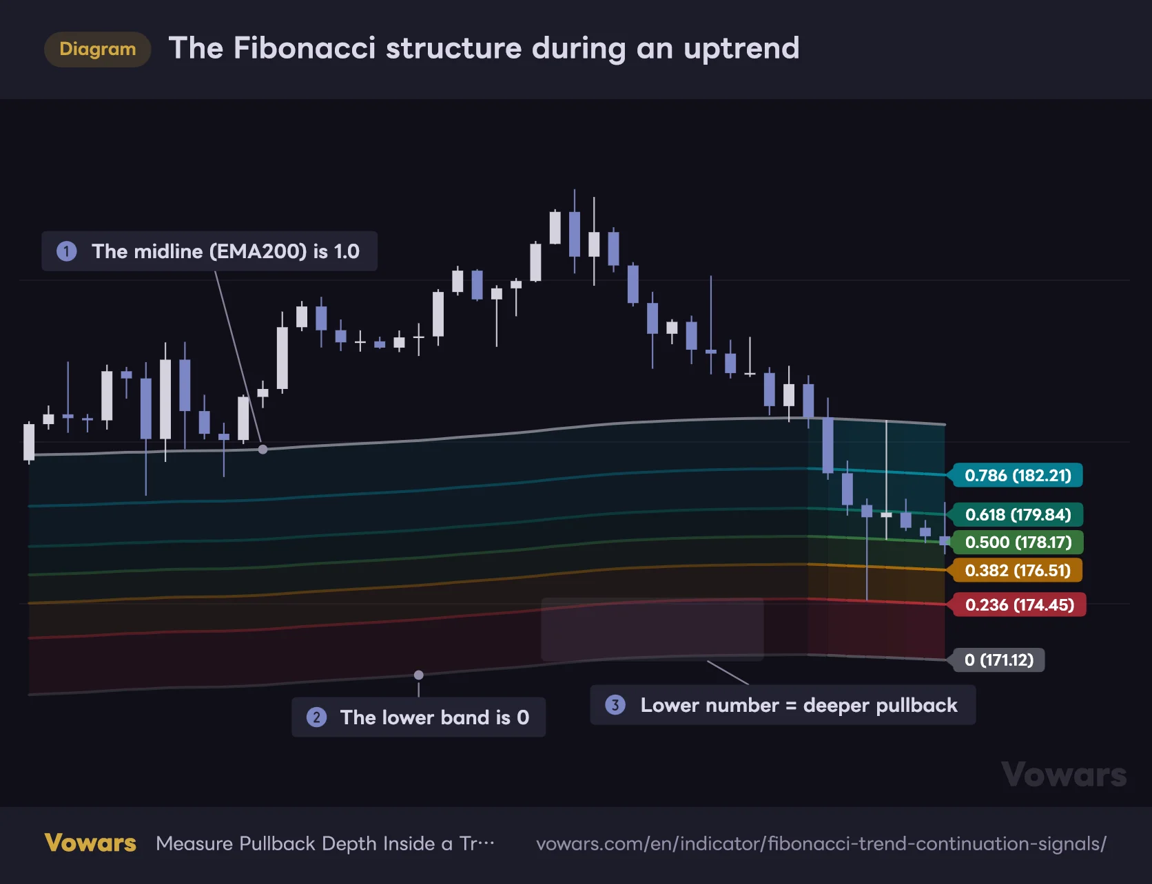
On a normal Fibonacci retracement, a move back to 0.786 means a deep pullback. In “Fibonacci Trend Continuation Signals” the scale is built the other way around: 0 sits on the outer band and 1.0 sits on the midline, so the smaller the number, the deeper the pullback. Price dropping into the red 0.236 zone means it has given back a lot of ground. Get this backwards and every read you make will be the opposite of reality.
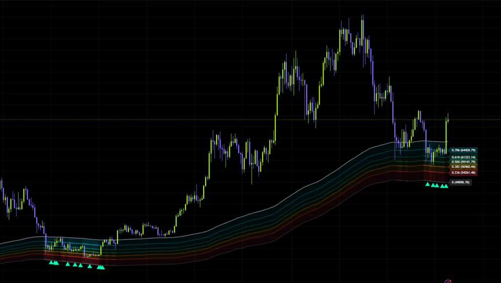
Here’s how that looks on an actual chart. The latest bar carries a price label for every visible level on the right, so you can read off exactly where the pullback zone sits without hovering over anything.
The Fibonacci structure during an uptrend
In an uptrend, five levels divide the space between the lower band (0) and the midline (1.0).
Vowars DE ver.3.9.2
The opacity trick nobody tells you about
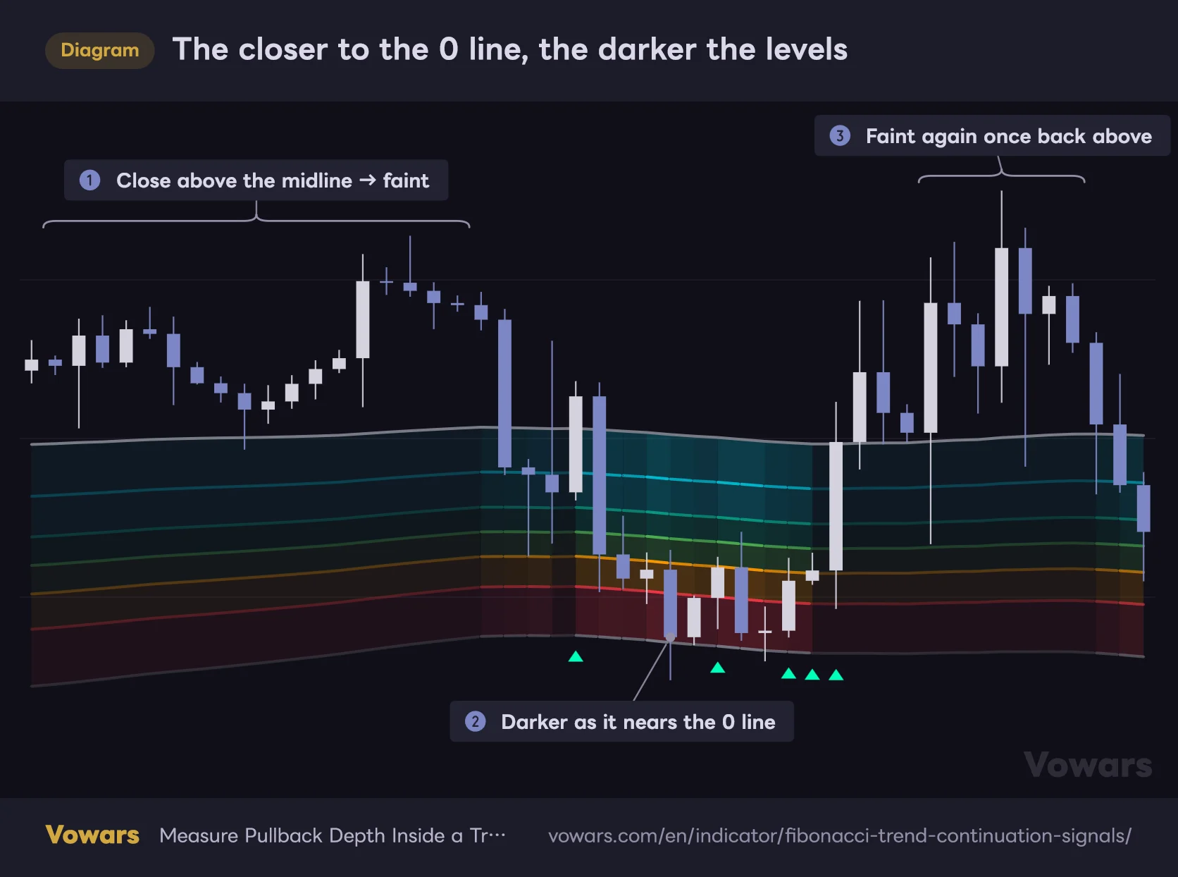
This is the detail that made me sit up while using it. When price is far from the outer band, the lines and shading stay faint. The closer price gets to that band, the more solid everything becomes.
The closer to the 0 line, the darker the levels
How solid the lines and fills look depends on the distance between the close and the 0 line.
Vowars DE ver.3.9.2
While an uptrend is running cleanly, the Fibonacci band nearly disappears into the background. Then price rolls over into the zone and the lines gradually darken. The screen getting heavier means the trend is getting shakier — a warning you pick up without reading a single number. Design that communicates without demanding your attention is something I rate highly.
Live price labels and the trend-flip dots
On the right edge of the chart, at the most recent bar, each enabled level is labeled with its current price. The format looks like “0.618 (00000)”, so you never have to hover over a line to read a value when placing a limit order or setting an alert. Small thing, but it saves real time.
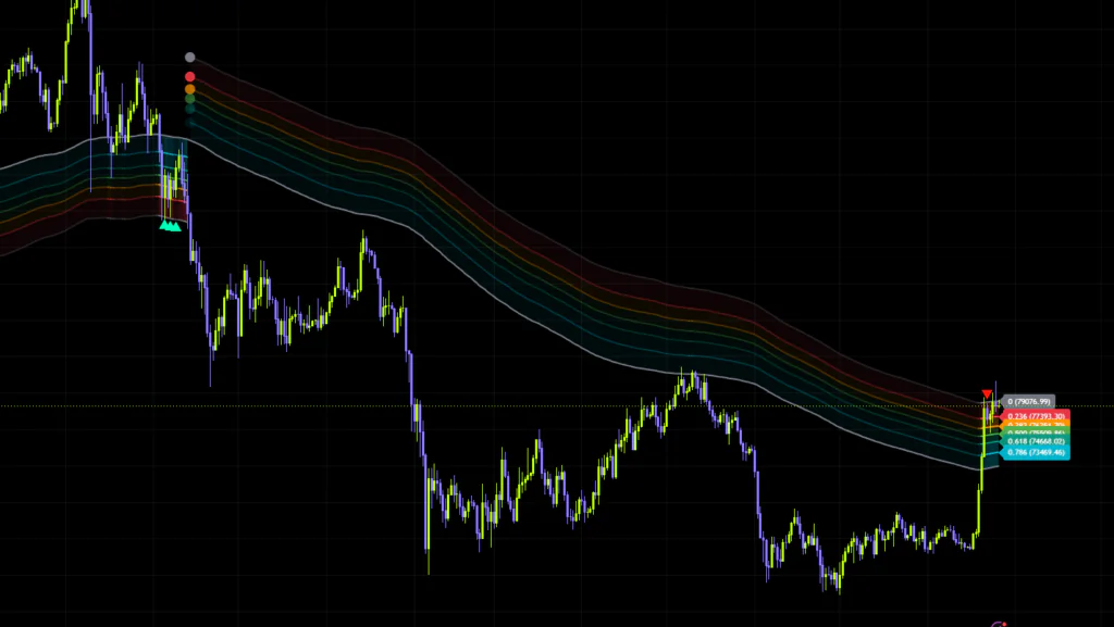
On top of that, the moment the trend flips, a vertical stack of dots prints on each level of the newly built Fibonacci structure. That’s your marker for where the current trend structure began. Levels closer to the midline get fainter dots, so from a distance the ones around the 0 line stand out most.
How does it decide the trend?
This is the engine room of “Fibonacci Trend Continuation Signals”. Direction only ever changes when a close pushes clean through the outer band.
- A close above the upper band → flips to a bullish trend
- A close below the lower band → flips to a bearish trend
- Until one of those happens, the previous trend simply stays in place
That last point carries a lot of weight. It doesn’t flip every time price crosses the midline the way a moving average cross would, so the trend read doesn’t flicker. Scrolling through Bitcoin on the 4H, the number of direction changes stays genuinely low.
During an uptrend, the 0 line on display (the lower band) is the floor of the pullback zone and, at the same time, the line that flips the trend bearish if price closes below it. So the 0 line you’re looking at literally is the boundary between “still just a pullback” and “trend’s over”. That makes it usable as a stop reference straight off the chart.
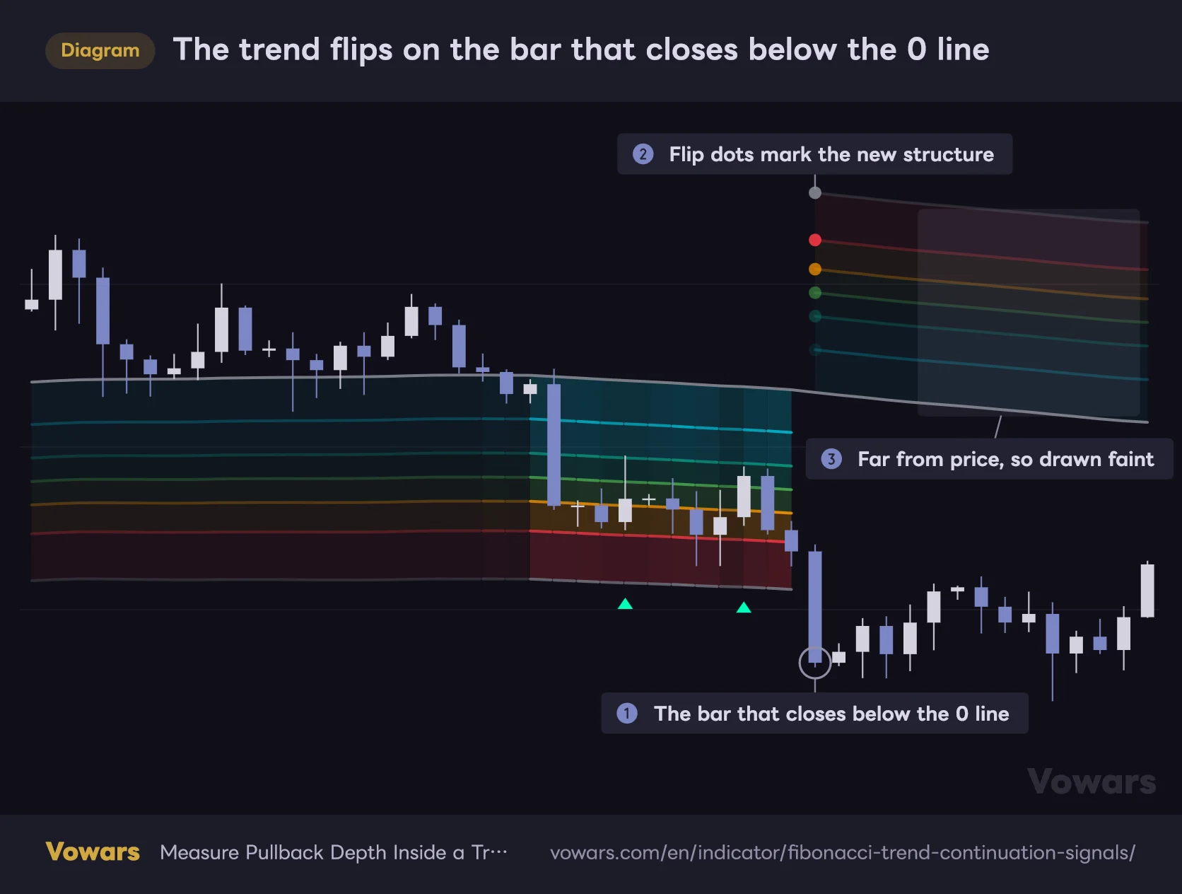
The figure below captures the moment an uptrend flips bearish. On the bar that closes below the visible 0 line, the whole Fibonacci structure jumps to the other side of the midline.
The trend flips on the bar that closes below the 0 line
Close below the visible 0 line (the lower band) during an uptrend and the trend turns bearish, moving the whole structure above the midline.
Vowars DE ver.3.9.2
A quirk to expect right after a flip
There’s one oddity worth knowing about. A flip to bullish happens on a close above the upper band, but the Fibonacci structure that appears at that moment is drawn from the lower band up to the midline. Price is way up above all of it, which means the zone right after a flip sits far below price and barely registers visually.
If you’re wondering why the lines are nowhere near price after a signal, that’s by design. Think of the zone as a landing area waiting for the pullback that hasn’t happened yet. That’s exactly what ③ shows in the figure above — a bearish flip is just the same thing upside down.
Reading the continuation signals (▲▼)
This is the “Continuation Signals” half of the name. The trigger is straightforward — both of these have to be true at once.
- A trend direction is currently active (bullish or bearish)
- A close pushes back through an enabled Fibonacci level in the direction of that trend
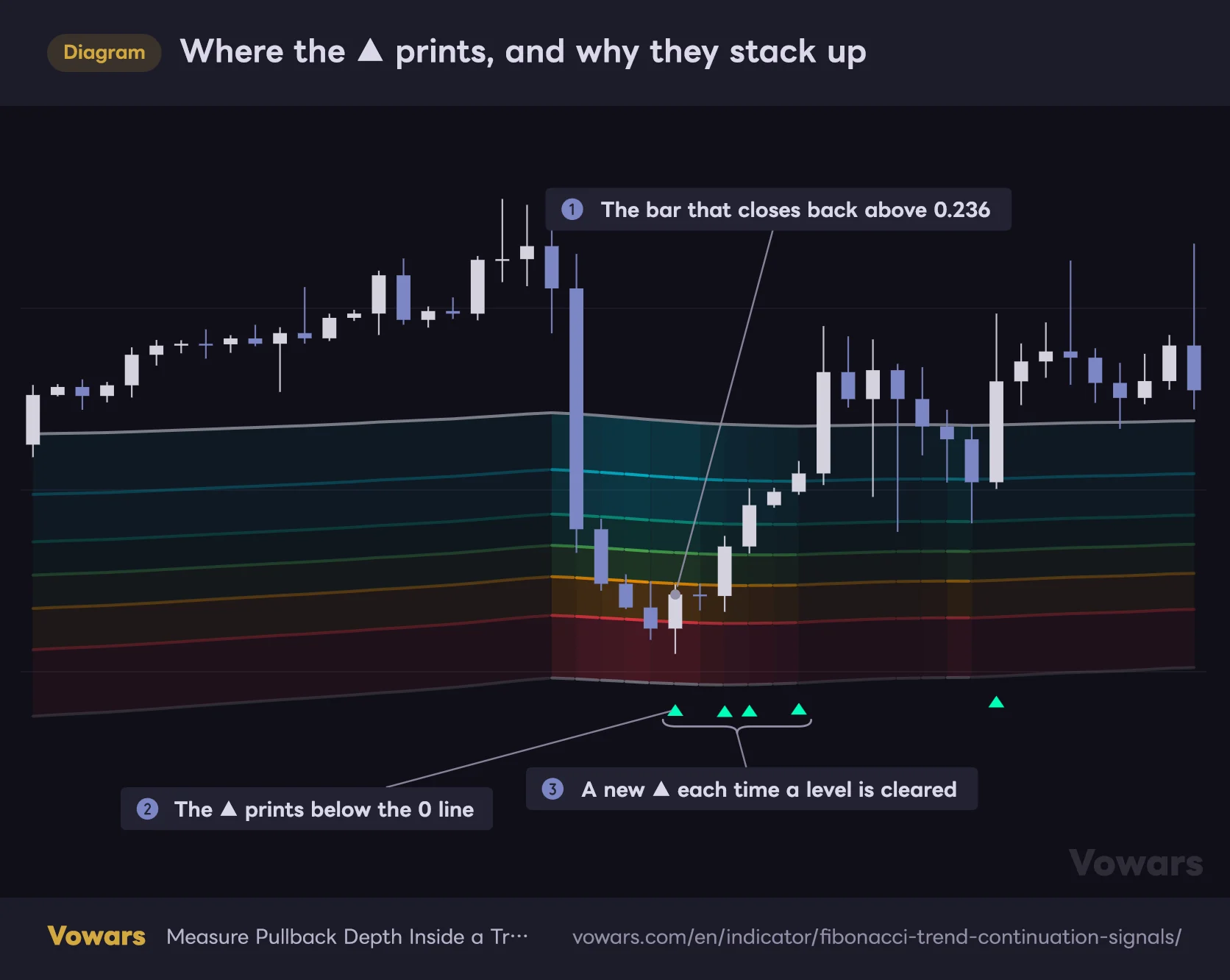
Where the ▲ prints, and why they stack up
The ▲ doesn’t print at the level that was crossed. It lines up at a fixed height just below the 0 line.
Vowars DE ver.3.9.2
In an uptrend, price bouncing off a pullback and closing back above a Fibonacci level prints a green ▲. In a downtrend, price rolling over from a bounce and closing back below a level prints a red ▼.
The marker placement takes getting used to
This was the first thing that threw me. The ▲▼ markers don’t print at the level that was actually crossed — they print at a fixed height just outside the Fibonacci structure. Below the 0 line in an uptrend, above it in a downtrend.
So the height of the marker tells you nothing about which level got crossed. You have to track which candle the marker lines up with vertically and work out for yourself which zone that candle broke through. The markers are on the small side too, so they’re easy to miss until your eye adjusts.
Why signals come in clusters
The deeper the pullback, the more signals you get on the way back. If price drops all the way into the red 0.236 zone, the recovery crosses 0.236, then 0.382, 0.500, 0.618 and 0.786 in sequence, which means up to five ▲ in a row.
One catch: if a single bar clears two levels at once, you only get one ▲. In the figure above, the second ▲ is a bar that cleared 0.382 and 0.500 together. So the count reflects bars that cleared a level, not the number of levels cleared.
A shallow pullback, on the other hand, only crosses 0.786 once. Here’s the practical takeaway from that.
Higher-confidence setups
- A bounce out of the deep zones (0.236–0.382) with ▲ printing back to back
- The bounce happens with the 0 line held cleanly
- The zone darkens, then fades out quickly
Setups to be wary of
- ▲ and ▼ alternating repeatedly around the same level
- Price chopping in and out of 0.786 over and over
- A flat midline with the whole zone stretched out sideways
Using it on TradingView
1Add it to your chart
Open Indicators at the top of the TradingView chart, search for “Fibonacci Trend Continuation Signals” and add it. It plots over price, so it won’t take up a separate pane.
2Check which way the structure is pointing
Fibonacci band drawn below the midline means a bullish structure; above it means bearish. Everything else follows from getting this right first.
3Gauge the pullback depth by color
Look at how far into the zone price has pushed. Reaching the orange or red bands means the trend is running close to the edge.
4Cross-check the signal against price structure
When a ▲ or ▼ prints, check the bars around it for a higher low forming and whether the level lines up with horizontal support or resistance. Personally I skip any signal that doesn’t sit on a level I’d already marked.
5Set up alerts
There are four alert conditions available: bullish signal, bearish signal, bullish trend change and bearish trend change. I got more mileage out of the trend change alerts than the signals themselves. You only get pinged when the bigger picture shifts, which means you’re not glued to the screen.
Settings, one by one
The settings panel is refreshingly light. In practice there are only three numbers worth touching.
| Setting | Default | Suggested | Effect |
|---|---|---|---|
| Midline Length | 200 | 100–200 | Lookback for the midline that anchors the structure. Higher values give a smoother, longer-term reference; lower values track price closely and keep the pullback zone on the move |
| Pivot Length | 7 | 5–14 | Lookback for the range that feeds the band width. It gets averaged over a long window afterwards, so changing it has a muted effect |
| Band Width | 3.0 | 2.5–4.0 | Distance from the midline to the outer band. Higher values make trend flips rarer and widen the zone. The setting you feel the most |
| 0.786 | ON | Depends on your style | The shallowest level. Leaving it on adds a lot of signals |
| 0.618 | ON | ON | Catches bounces out of shallow pullbacks. A natural reference for buying the dip |
| 0.500 | ON | ON | Midpoint of the zone. Works as a marker for a pullback that’s halfway done |
| 0.382 | ON | ON | Marks recoveries from deeper pullbacks. Fires less often |
| 0.236 | ON | ON | The deepest level. Bounces from here are rare, which is exactly what makes them worth watching |
| Bullish Color | Bright green | Leave as is | Color of the ▲ signal |
| Bearish Color | Red | Leave as is | Color of the ▼ signal |
How to think about Midline Length
The default 200 on Midline Length lines up with a lookback a lot of traders already watch, so there’s a solid case for leaving it alone. If your center of gravity sits where the rest of the market is looking, your pullback zone lands close to where everyone else is looking too.
On lower timeframes, dropping it to around 100 makes the midline track price more closely and the whole zone moves with it. The catch is that the pullback zone moves too, so price slips back out of a zone it just entered more often. If you’re playing the daily and happy to wait, the default or higher is fine.
Band Width is where the real leverage is
Of everything I tried, Band Width changes the display the most. This one number controls how hard it is to flip the trend and how wide the pullback zone is at the same time.
- Down to 2.0–2.5: trend flips become frequent and the zone tightens. Signals fire on shallower pullbacks, which suits shorter-term trading — but you’ll get a lot of flips in choppy conditions
- Up to 4.0 or more: flips become rare and you only catch the big swings. The zone widens, so it takes longer for price to reach it
The default 3.0 struck me as a well-judged balance — even on something as volatile as Bitcoin the trend doesn’t flip for no reason. Start at 3.0 and raise it if the signals feel too noisy is about as simple a tuning rule as you’ll get.
What to do with Pivot Length
Pivot Length sets the lookback for the range feeding the band width, but that reading is then smoothed again over a much longer window, so moving it anywhere between 5 and 14 barely shifts the band width. That double layer of smoothing is exactly why the bands don’t jump around on day-to-day volatility. If you want to change the width, go to Band Width instead.
Setups by trading style
| Use case | How to set it | What you’re after |
|---|---|---|
| Day trading (15m–1H) | Midline Length around 100 / Band Width 2.5 | Stay with the intraday flow and react to shallower pullbacks |
| Swing trading (4H–daily) | Leave everything at default | Favor a stable zone and only act on well-defined pullbacks |
| Position trading (daily–weekly) | Band Width around 4.0 | Focus purely on continuation of the larger trend and ignore the noise in between |
| Fewer, better signals | Turn 0.786 and 0.618 off | Cut out shallow-pullback triggers and keep only recoveries from deep pullbacks |
If you want fewer signals, forget the numeric settings — switching 0.786 off is by far the quickest fix. It sits right under the midline, so price loitering anywhere near the center of gravity sets it off repeatedly. If you’d rather have earlier signals, leave it on.
Where it shines, where it struggles
Conditions it handles well
It’s at its best in a clearly trending market that pauses to correct on the way. On Bitcoin, that means a rally that pulls back toward the center of gravity a few times and turns back up each time. In that rhythm you get a clean repeating loop: zone darkens → ▲ prints → price resumes.
Because pullback depth is measured in concrete numbers, it also answers the “I want to buy the dip but I have no idea how far to let it run” problem rather well. I found it worked nicely on gold and equity indices too, where medium-term trends tend to stick around.
Conditions it doesn’t
Directionless, choppy markets are the obvious weak spot. Since the trend read only changes on a break of the outer band, in a range the old direction just stays stuck in place. With price shuffling around the center of gravity in that state, continuation signals keep firing with nothing behind them.
When the midline is running more or less flat, signal quality drops off a cliff. If the whole zone looks like a horizontal slab, you’re better off ignoring what it prints. It’s a trend-following tool, so not working without a trend is just the deal you’re signing up for.
Pros and cons
Pros
- Nothing to redraw by hand, so no subjectivity in picking the anchor
- Pullback depth is readable both as a number and as a color
- The 0 line works as a stop reference straight off the chart
- The zone darkens as price approaches, making risk intuitive
- Live price labels on every level at the latest bar make limit orders easy
- Few settings, so not much to get lost in
- Four alert conditions, trend changes included
Cons
- Continuation signals spam in ranging markets
- ▲▼ print at a fixed height, so you can’t tell at a glance which level was crossed
- The scale runs opposite to a standard Fibonacci, which is confusing until it clicks
- A recovery from a deep pullback can fire up to five signals in a row, which muddies the read
- Right after a trend flip the zone sits far from price and isn’t much use for a while
- No multi-timeframe display or dashboard
- Needs enough history to settle (roughly 400 bars is the mark)
Caveats, and the repainting question
Closed bars don’t get redrawn
The repainting question everyone asks first: a signal printed on a closed candle won’t disappear or shift position later. There’s no higher-timeframe data being pulled in and nothing reaching forward for values it shouldn’t have yet. On that front it’s a sound build.
The live bar is a different story
That said, both the signals and the trend read run off the close, so everything stays in flux while a candle is still forming. A ▲ can print the moment price clears a zone and then vanish if price slips back before the candle closes.
Jumping in on a signal that appeared mid-candle and watching it disappear the second the bar closes is a completely normal thing to have happen. Wait for the candle to close before you act — no exceptions. Same applies to alerts: when the notification lands, the bar may not be final yet.
Trading it on its own is asking for trouble
Stating the obvious, but a continuation signal only tells you that price closed back through a level in the direction of the trend. It guarantees nothing about what happens next. “Continuation” is in the name, but it isn’t forecasting continuation — it’s flagging a shape that can be read as the start of one. That distinction matters.
Scrolling back through history it looks like the ▲ lands perfectly on every bounce, but that’s only because you already know the bounce happened. In real time, plenty of those signals are followed by another leg down and a trend flip.
What to pair it with
Adding a single filter improves it noticeably compared to running it alone. These are the combinations that worked best for me.
| Pairing | Role | How to use it |
|---|---|---|
| RSI | Confirm the pullback is oversold | Only take ▲ in the deep zones that coincide with RSI turning up |
| Volume-based indicators | Measure how serious the bounce is | Check whether the signal bar comes with a pickup in volume |
| Horizontal S/R | Align with price structure | Prioritize points where the zone overlaps an old demand area |
| ADX | Filter out ranges | Skip signals while ADX(14) is below 20 |
The range filter is the one that pays for itself. Given that signal spam in chop is this indicator’s main weakness, plugging that one hole changes how it feels in use more than anything else.
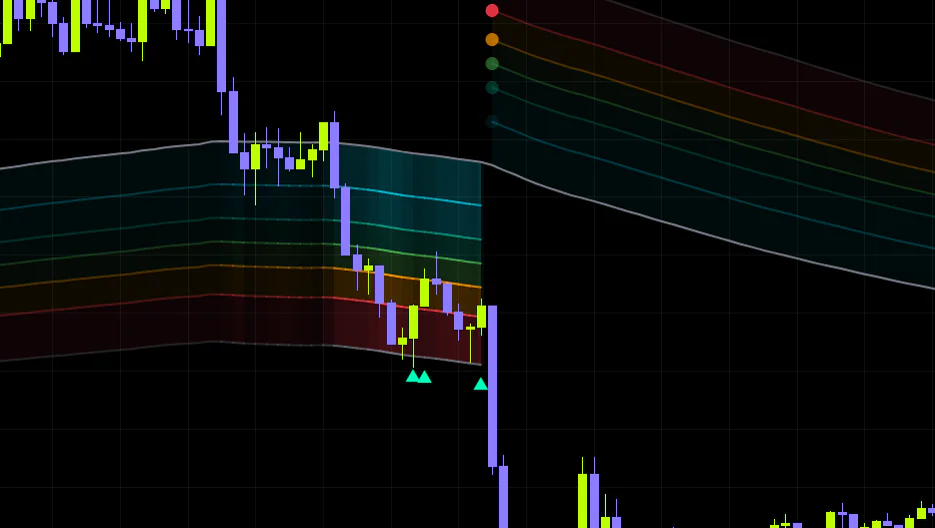
The best match of the lot was ADX. ADX measures how strong a move is rather than which way it’s going, and a reading below 20 is widely treated as a market without direction. I pass on any ▲ or ▼ that prints while ADX(14) is under 20. As the figure below shows, once momentum fades the ▲ signals tend to repeat while price can’t get back above the midline, and cutting those out alone removes a good share of the fakeouts.
Using ADX to spot ▲ signals in chop
Once ADX drops below 20, the ▲ signals keep firing while price fails to get back above the midline.
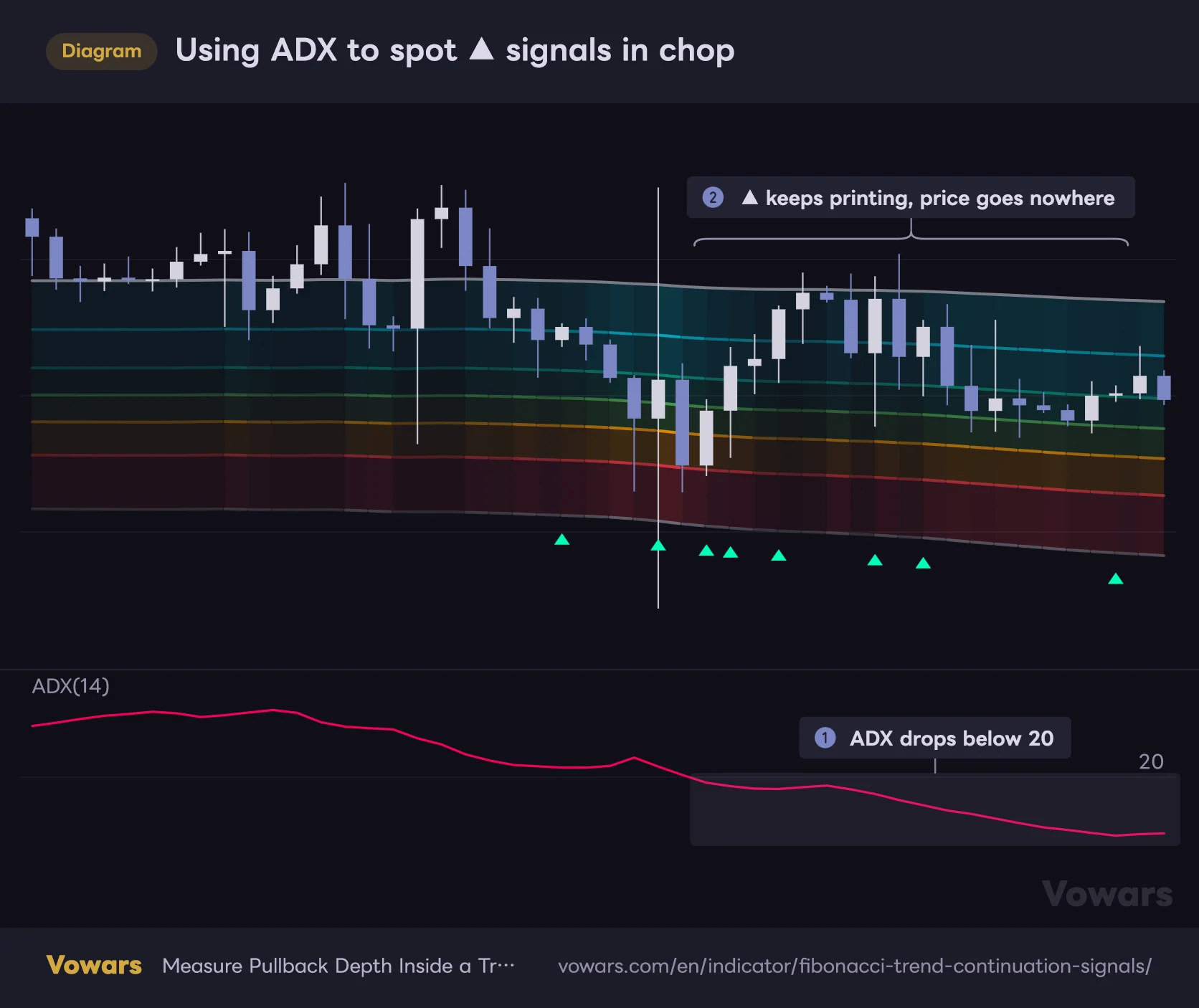
- ADX(14)
Vowars DE ver.3.9.2
Who it’s for
Let me be direct about the fit.
- Good fit: trend followers who want a consistent rule for timing dips and rallies. Anyone who wastes time every session deciding where to anchor a Fibonacci
- Poor fit: mean-reversion traders fading the edges of a range. Anyone scalping on a seconds-to-minutes horizon
On timeframes, 1H and above, with the patience to sit on your hands is where it clicks. Reading the broader direction on the daily and waiting for a pullback into the zone on the 4H works well too.
Final verdict
What defines “Fibonacci Trend Continuation Signals” is that it reframes Fibonacci from a tool for guessing reversal points into a ruler for measuring pullback depth. That shift in framing is what makes it sit so naturally alongside trend following.
The part I rate most is that the 0 line serves as both the floor of the pullback zone and the trend invalidation level. Your reason for entering and your reason for getting out live on the same line, which makes planning a trade straightforward. Not many other Fibonacci tools give you that.
It’s not a cure-all, obviously. Signal spam in chop, ▲▼ markers that don’t tell you where they came from, an inverted scale that fights your instincts — the quirks are real. But these are the kind of weaknesses you can work around once you know they’re there.
If you’ve been timing your dip entries on feel and want one consistent reference to work from, it’s worth a look. Drop it on Bitcoin on the 4H at default settings and watch the zone darken a few times. Even that alone will tell you what this indicator is trying to say.
Leave it on defaults and go back over where the signals landed during past trending stretches. If it looks like it fits your approach, start tuning with the level toggles — that’s the fastest route in. With so few settings to work through, the cost of experimenting is low, which is another point in its favor.