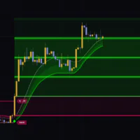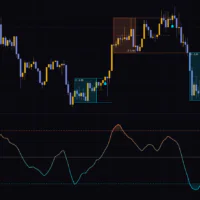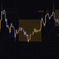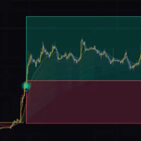


“Adaptive Ehlers Filtered Percentile” is a trend filter that holds a bullish or bearish regime and shows it in color
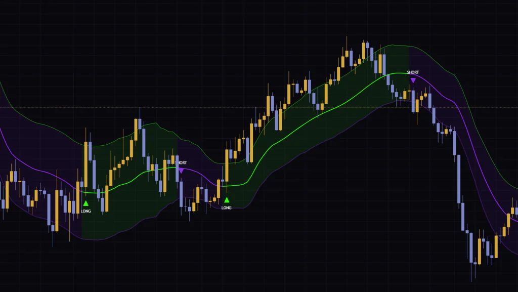
“Adaptive Ehlers Filtered Percentile” is a trend-regime indicator published on TradingView by SchizoQuant. It overlays a basis line and two bands on the price chart, then flips to green when price closes above the upper band and to purple when it closes below the lower band. The candles get painted too, so you can tell at a glance whether you should be leaning long or short.
At first glance it looks like a Keltner Channel or Bollinger Bands. Under the hood, though, it is a very different animal. The basis line speeds up or slows down depending on volatility, and the band width comes from ranking how far price has strayed from that line in the past. Once the color flips, it stays that way until price closes beyond the opposite band. That “sticky regime” behavior shapes almost everything about how it feels to use.
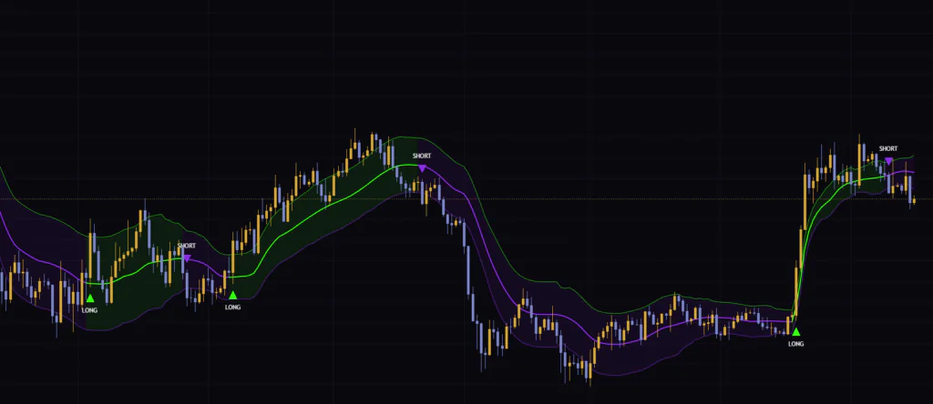
I ran it on Bitcoin’s 4H and 1H charts. On the 4H it caught the major trend shifts really cleanly, while on the 1H the signal count went up noticeably. Let’s start with how it works and get into those differences along the way.
Only four things on screen, and every color follows the same logic
There isn’t much plotted on the chart. Here is the full rundown.
| Element | Appearance | How to read it |
|---|---|---|
| Basis line (Adaptive Ehlers Filter) | Thick line, green or purple depending on the regime | The trend baseline. How far price moves away from it drives the band width |
| Upper and lower bands | Thin lines, upper always green, lower always purple | The trigger levels. A close above the upper band flips bullish, a close below the lower band flips bearish |
| Channel fill | Light shading between the two bands, colored by the current regime | A background tint so you can read the regime at a glance |
| LONG / SHORT labels and candle colors | Green “LONG” triangle below the bar, purple “SHORT” triangle above it | Labels only print on the bar where the regime flips. Candles keep the same color for as long as the regime lasts |
The band colors are fixed: green on top, purple on the bottom. Only three things change color with the regime: the basis line, the fill, and the candles. Mix this up and you’ll end up asking “why is the upper band green if we’re in a downtrend?”, so it’s worth getting straight from the start.
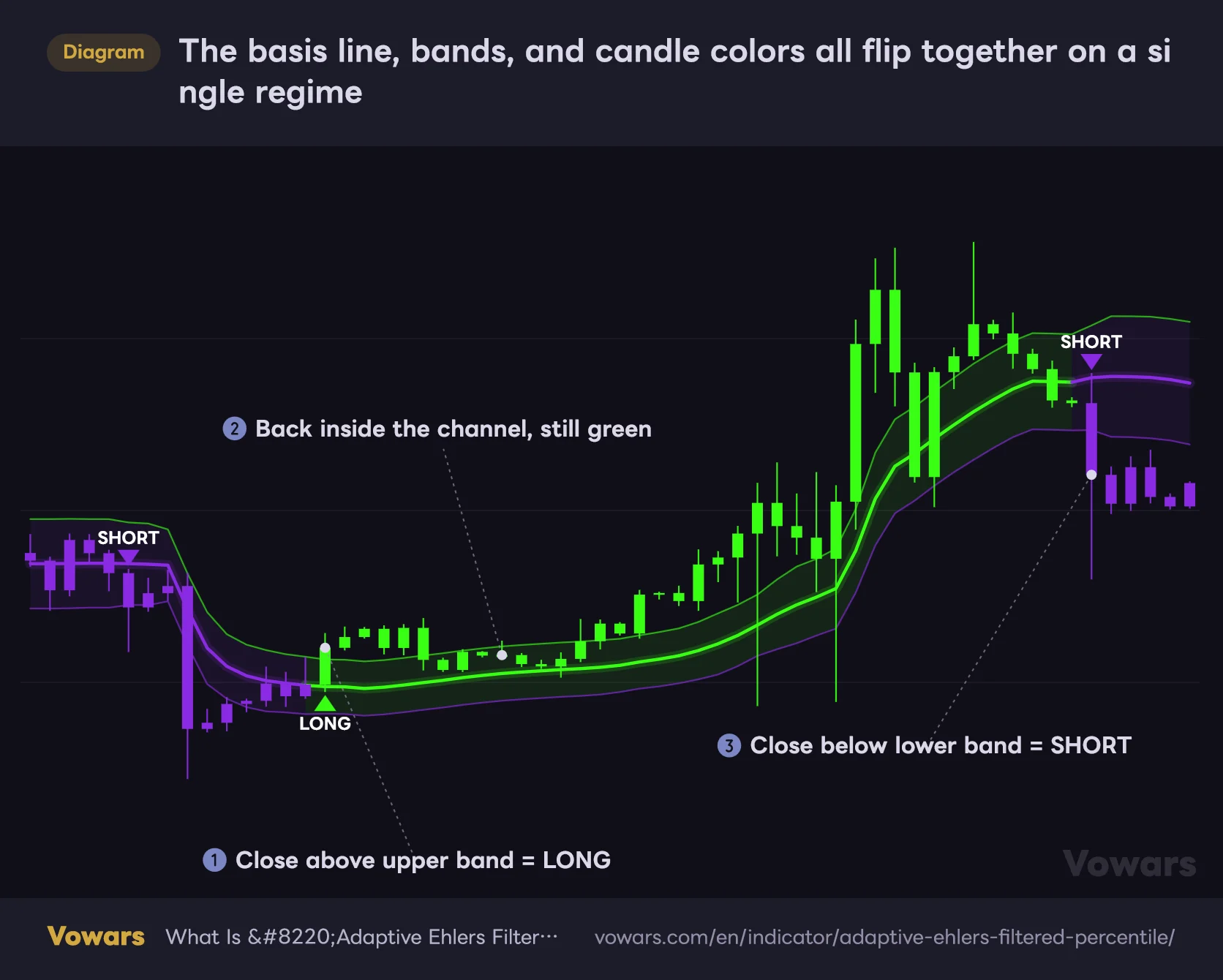
The basis line, bands, and candle colors all flip together on a single regime
The color flips on the bar that closes outside the channel, and holds as long as price stays inside it.
Vowars DE ver.3.4.1
LONG / SHORT only prints on the bar that flips
No matter how many bars close above the upper band, LONG only shows up on the first one. While the move continues, the candles and basis line simply stay green. The flip side is that closing back inside the channel doesn’t change the color either. It only turns purple on a bar that closes below the lower band.
Point ② in the figure shows exactly that: a string of bars back inside the upper band, and it’s still green. The same goes for a slight dip below the basis line. The color is set by which band price last closed beyond, not by whether it’s above or below the basis line. Keep that in mind and you won’t misread it.
At the far left of the chart, “Adaptive Ehlers Filtered Percentile” starts in a neutral regime. But the coloring rule is “green if bullish, purple otherwise,” so everything shows purple until price first closes above the upper band. If the leftmost part of your loaded history is oddly purple, that doesn’t mean a bearish regime was detected.
The basis line chases price harder when volatility picks up
The basis line is built in two stages. Stage one is a moving average whose length changes with volatility. Stage two smooths that average again, giving more weight to periods where it moved a lot. The “Adaptive” and “Ehlers” in the name refer to these two stages.
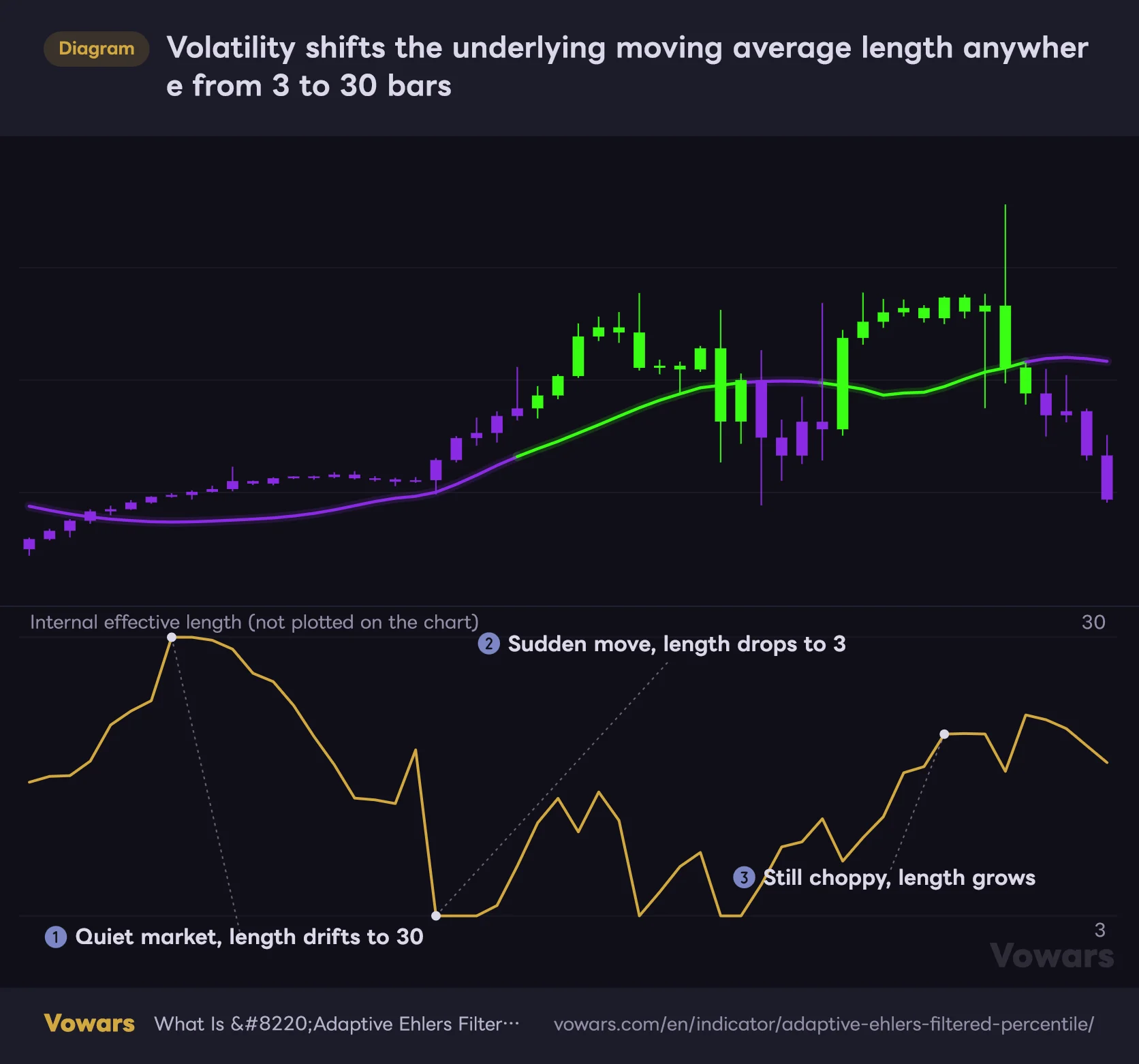
The length shifts between 3 and 30 bars, bar by bar
In stage one, the indicator takes the bar-to-bar change in close over the last 9 bars and measures how spread out it is (standard deviation). The key detail is that this reading is then compared against its own 9-bar average. At 1.75x the average or higher, the length drops to the minimum of 3 bars. At 0.25x or lower, it goes to the maximum of 30. Anything in between is scaled linearly, so average volatility lands at about 16.5 bars.
Once the length is set, the line updates bar by bar using the same formula as an exponential moving average (EMA). On short-length bars it snaps toward price; on long-length bars it barely moves.
Volatility shifts the underlying moving average length anywhere from 3 to 30 bars
The lower the number in the bottom pane, the faster the basis line catches up to price.
Vowars DE ver.3.4.1
Point ③ is the first thing that made me go “huh?” when using it. When choppy bars keep coming, the average it compares against also rises, so the length drifts back toward the long end. In other words, it reacts fast when volatility first spikes, but gets sluggish once high volatility becomes the norm. That’s why the basis line lags a bit during an extended selloff.
The Ehlers filter gives more weight to big moves
Stage two is a smoothing step based on John Ehlers’ nonlinear filter concept. For each of the last 9 moving average values, it measures the difference from the value 15 bars earlier, then averages them with bigger weights on the bars with bigger differences.
The upshot is that the line barely wiggles in sideways markets, while decisive moves leave a strong imprint on it. In my testing, the basis line stayed pretty calm during ranges.
Because the weights come from the difference versus 15 bars ago, values near the top of a pump get the heaviest weights. Even when price pulls back afterward, the basis line can stay flat for a while, anchored by those values near the top. Combine that with the stage-one length stretching out, and it’s best not to use the basis line as a buy-the-dip level right after a pump reverses hard.
Band width comes from a ranking, not standard deviation
Bollinger Bands set their width by multiplying the standard deviation of price. “Adaptive Ehlers Filtered Percentile” takes a different route.
First, it measures the distance between the close and the basis line on every bar. It then sorts the last 50 of those distances from smallest to largest and picks the value sitting at the 75% mark. Picking a value by its position in a sorted list like this is called a percentile. Multiply that value by 0.7 and you get the distance from the basis line to each band.
Since it makes no assumptions about how the data is distributed, a single outlier bar won’t blow the width out. On the other hand, it comes with a quirk worth knowing about.
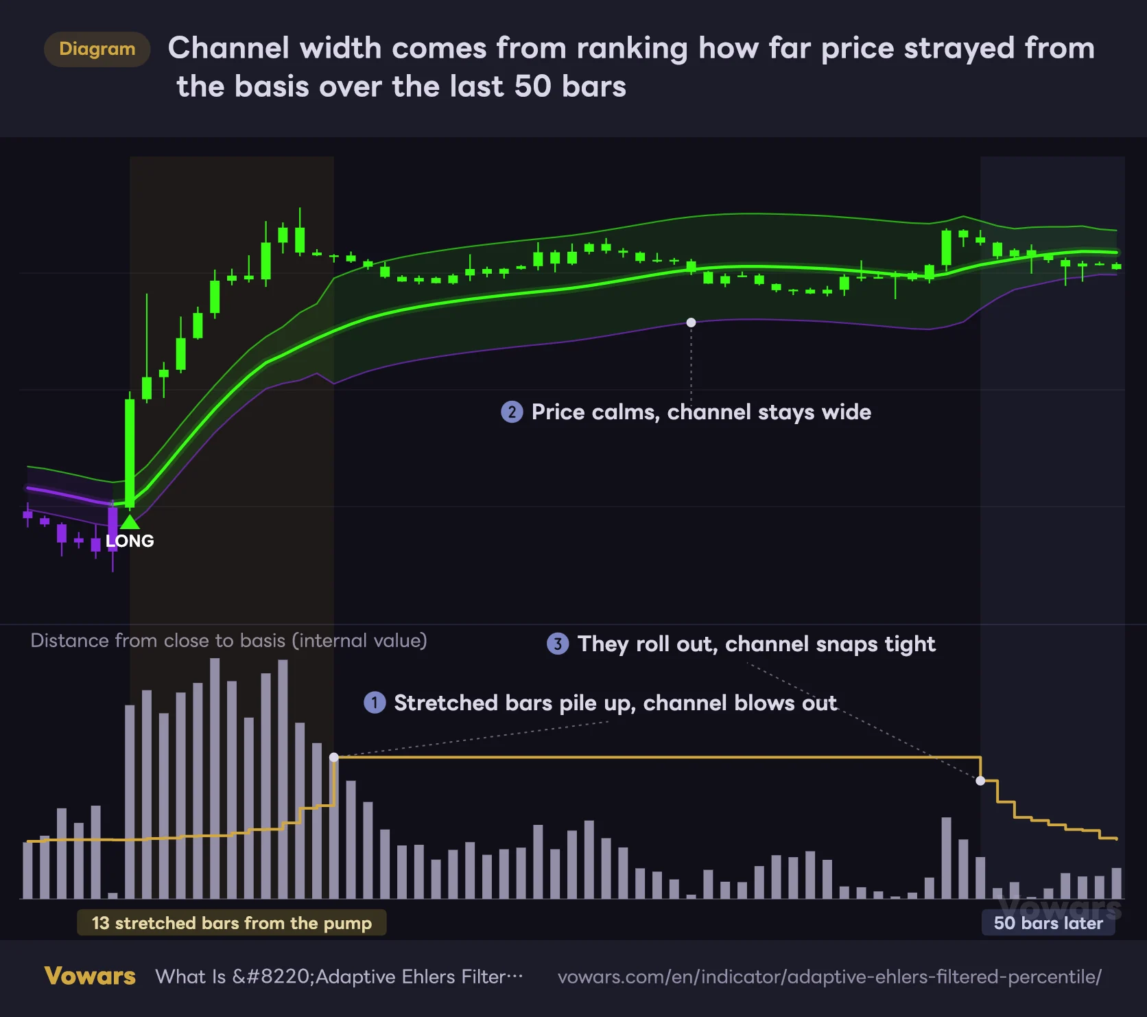
Channel width comes from ranking how far price strayed from the basis over the last 50 bars
The line in the bottom pane is the base distance used to offset the bands from the basis.
Vowars DE ver.3.4.1
The 75% mark in a list of 50 is the 38th value counting up from the smallest. Put another way, the width is based on the 13th-largest distance. As long as 13 or more stretched bars stay in the sample, the channel hardly narrows at all. The moment they drop out of the 50-bar window, it snaps tight.
This quirk showed up clearly on Bitcoin’s 4H chart. The August 21 pump blew the channel wide open, and even after price settled down, the width barely changed. Then it abruptly pinched in around August 29 to 30. Fifty 4H bars is roughly eight days, so that lines up exactly with the pump bars rolling out of the sample.
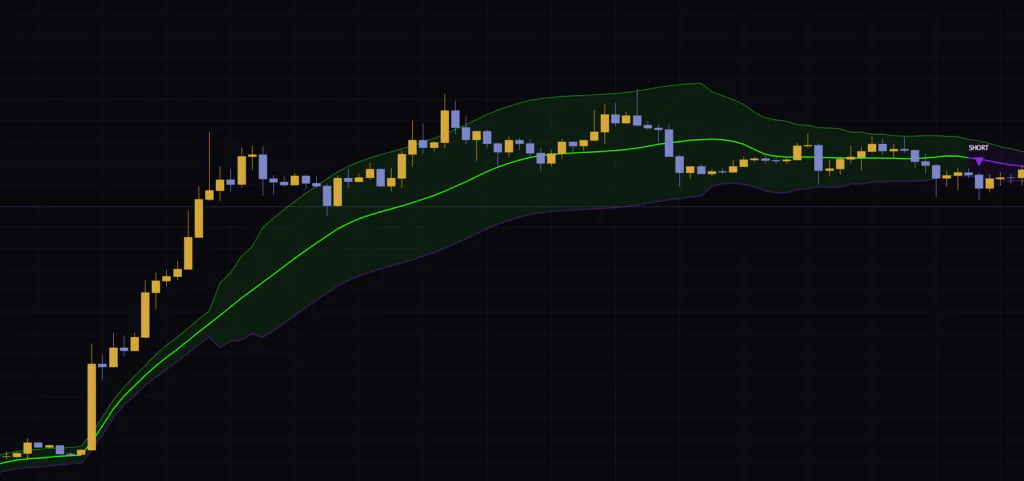
Right after the channel pinches in, even a small move can reach the opposite band. I treat signals that fire around a sudden width change with extra caution.
How it held up on three Bitcoin timeframes
The daily chart catches major trend shifts cleanly
The timeframe where it felt most at home was the daily. On Bitcoin’s 2026 daily chart, it printed LONG in early March, SHORT at the end of March, and LONG again in early April, then flipped purple on a SHORT in late May. From there it stayed purple through the June dump and the July break below $60K. The mid-August pump brought a LONG, and it went back to SHORT in September (as of September 16, 2026).
Watching the candles stay purple for about three months straight, from late May to mid-August, without a single green flip was genuinely satisfying. There were plenty of relief rallies along the way, but none of them reached the upper band. There were stretches like late March where SHORT and LONG swapped within a few weeks, but across the whole daily chart from January through September, it only fired about seven signals.
On the 1H, the signal count jumps
Switch to the 1H and it’s a different story. Over roughly two weeks from early to mid-August, it printed around eight LONGs and eight SHORTs. In tight consolidation, the whipsaws stand out: a LONG, a SHORT a few bars later, then another LONG a few hours after that.
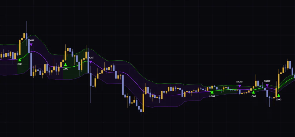
That said, during a clean directional move like the drop into the 11th, it stayed purple for a long stretch with almost no signals in between. On the 1H, I found it more useful to watch which color has been holding than to chase every single signal.
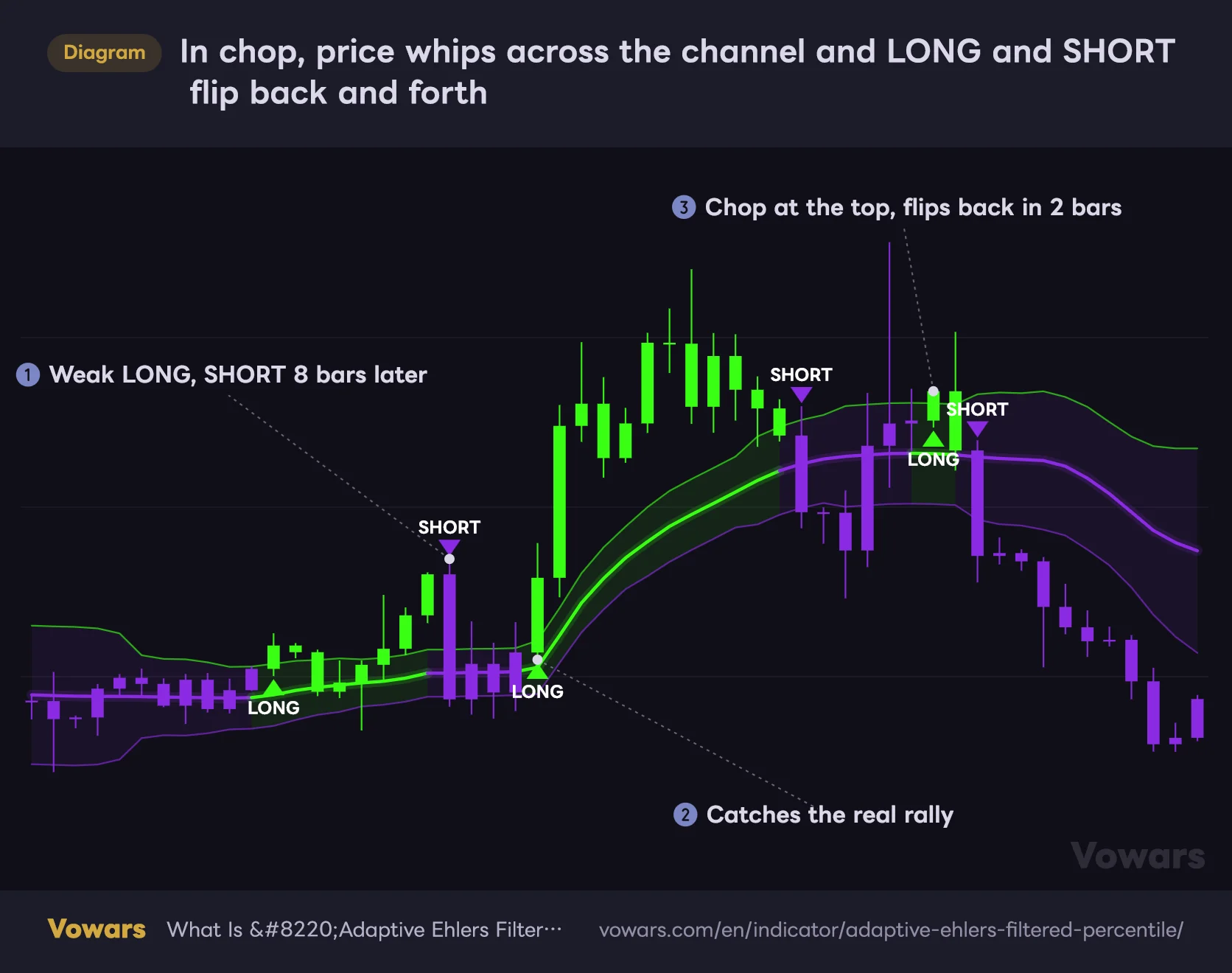
In chop, one bar outside the channel is all it takes for a fakeout
All it takes to flip the regime is one bar closing outside the channel. There’s no requirement for consecutive closes, and no extra filter like the slope of the basis line. So in a directionless market, you get whipsaws like the ones in the next figure.
In chop, price whips across the channel and LONG and SHORT flip back and forth
A single bar closing outside the channel is enough to flip the regime, so directionless markets throw off more signals.
Vowars DE ver.3.4.1
As point ② shows, it does catch the start of a real rally. The trouble is what happens around it. At ①, a small breakout triggers a LONG that flips to SHORT eight bars later. At ③, during consolidation near the top, a LONG prints right after a SHORT and flips back to SHORT just two bars later.
“Adaptive Ehlers Filtered Percentile” has nothing built in to throttle back-to-back signals. When LONG and SHORT start flipping in quick succession, read it as a sign the market has lost direction, and hold off on taking those signals. That alone tends to keep losses down.
How I ended up using it: color for direction, distance for entries
After a lot of trial and error, reading it in the following order worked better for me than trading the signals as-is.
1Use the higher-timeframe color to pick a direction
If I’m trading the 1H, I check the 4H color first; if I’m trading the 4H, I check the daily. Green on the higher timeframe means longs only, purple means shorts only. Just sticking to one direction cut down a lot on getting chopped up by whipsaws like the ones in figure 4.
2Check how far the signal bar is from the basis line
By definition, the bar that prints LONG has already closed above the upper band. Chase an entry that far from the basis line, and the lower band, which makes a natural stop reference, ends up a long way down. I usually wait for price to pull back toward the basis line after the signal. Since moving back inside the channel doesn’t change the regime, there’s no rush.
3Use the opposite band as your invalidation level
If you’re long, the regime only turns purple on a close below the lower band. In other words, the lower band is exactly where this indicator changes its mind. That said, nothing is confirmed until the bar closes, so in practice it makes more sense to place your actual stop a little beyond that band.
When the channel is extremely tight, a small move can reach the opposite band. When it’s wide right after a pump or dump, flips come late. Not every LONG is equal; how much you trust it depends on the channel width. Thinking of it that way keeps your decisions more consistent.
Ten inputs drive the logic. Here’s what happens when you tweak them
The settings are split into five groups: “Adaptive MA Settings,” “Ehlers Filter,” “Percentile Bands,” “Visualization,” and “Color Settings.” Here are the defaults along with the values I’d suggest based on my testing.
| Parameter | Default | Recommended | Effect |
|---|---|---|---|
| Source | close | close | The price used for calculations. The basis line, bands, and regime logic all run off this value |
| Minimum MA Period | 3 | 3 to 5 | Shortest length, used on volatile bars. Lower reacts faster to sudden moves |
| Maximum MA Period | 30 | 30 (around 40 is fine on lower timeframes) | Longest length, used on quiet bars. Higher keeps the basis line steadier in ranges |
| Volatility Period | 9 | 9 | Lookback for measuring volatility. Longer makes length changes more gradual |
| Filter Length | 9 | 9 | Number of values averaged by the Ehlers filter. Longer gives a smoother basis line with more lag |
| Momentum Length | 15 | 15 | How far back each value is compared when setting weights. Longer puts more weight on broader moves |
| Percentile Length | 50 | 50 | Number of bars sampled to set the width. Longer keeps the width steadier, but a post-spike blowout lingers longer too |
| Percentile Level | 75 | 75 (85 to 90 on lower timeframes) | Which ranked distance sets the width. Higher widens the channel and cuts down signals |
| Upper Band Multiplier | 0.7 | 0.7 | Multiplier for the upper band distance. Higher makes LONG harder to trigger |
| Lower Band Multiplier | 0.7 | 0.7 | Multiplier for the lower band distance. Higher makes SHORT harder to trigger |
| Show Adaptive Filter / Show Percentile Bands / Show Band Fill / Show Signals / Color Bars | All on | Your call | Toggles for the basis line, bands, fill, LONG / SHORT labels, and candle coloring. Turning them off does not change the logic |
| Bullish Color / Bearish Color | Bright green / purple | Default | Colors for the bullish and bearish regimes. The upper band always uses Bullish Color and the lower band always uses Bearish Color |
These recommendations come from eyeballing Bitcoin charts side by side, not from backtesting win rates. I’d start with the defaults and adjust one input at a time while watching how often signals fire.
Don’t let the min and max lengths cross over
Minimum MA Period and Maximum MA Period sit on the same row in the settings. The inputs only enforce a lower limit, so the indicator will happily calculate even if you swap them. Be careful: if Minimum MA Period ends up larger, the line gets slower on volatile bars, which is the exact opposite of what it’s supposed to do.
If the basis line feels too jittery during ranges on lower timeframes, raising Maximum MA Period to around 40 settles it down. Reaction speed to sudden moves is governed by Minimum MA Period, so raising the max barely affects how fast it responds to the first leg of a move.
Filter Length and Momentum Length are best left alone
A longer Filter Length gives you a smoother line at the cost of more lag. Momentum Length sets how many bars back each value is compared when assigning weights. The longer it is, the more it favors broader moves, and the more the basis line tends to hang up high after a pump. In my testing, I didn’t see much upside in moving either one far from the default.
Want fewer signals? Start with Percentile Level
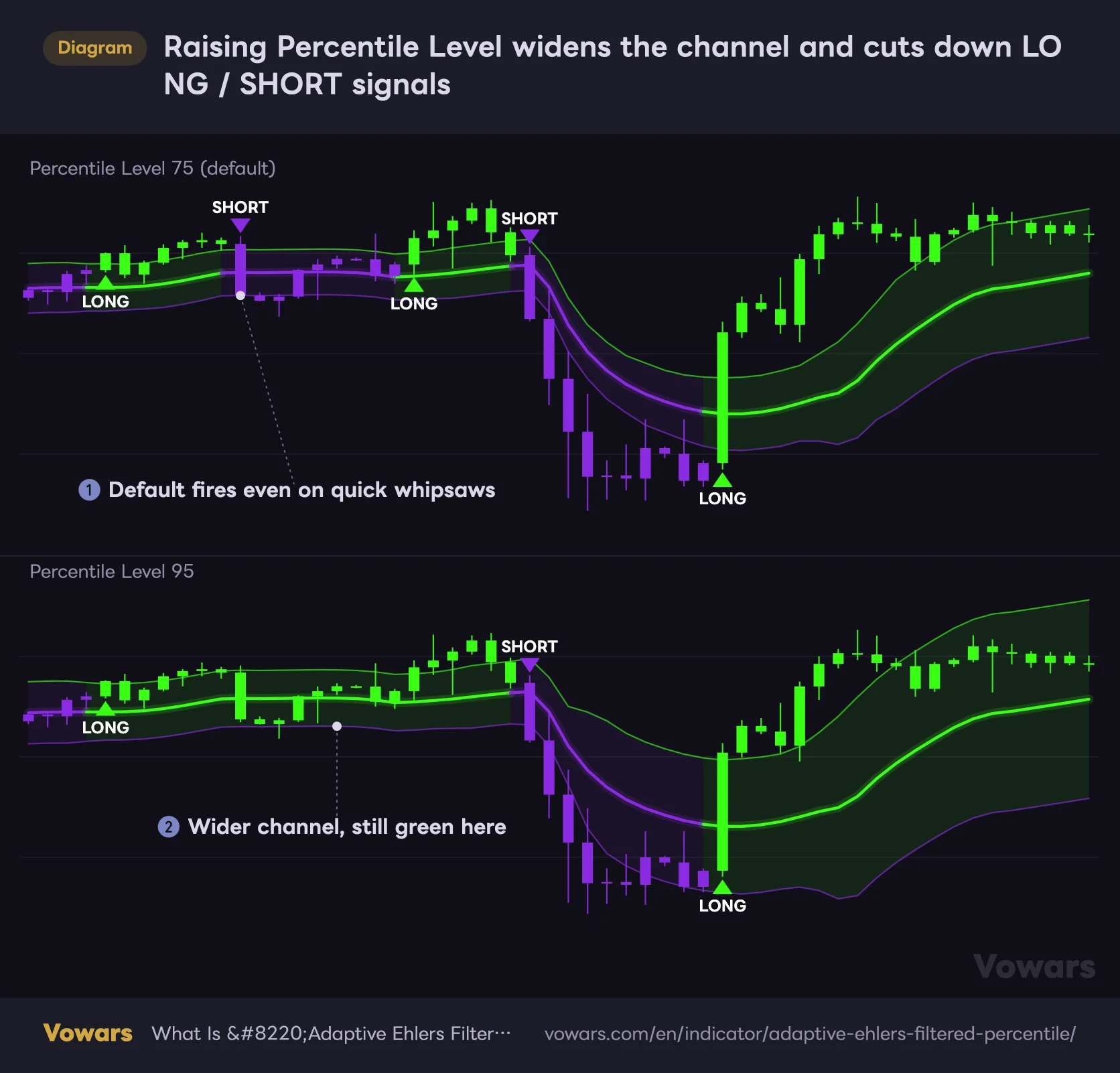
If you’re getting too many signals, Percentile Level is the most effective fix. Raising it from 75 to 95 changes the base distance from the 13th-largest of 50 bars to the 3rd-largest, so the channel gets noticeably wider.
Raising Percentile Level widens the channel and cuts down LONG / SHORT signals
Both panes show identical price action. The only difference is the rank used to set the channel width.
Vowars DE ver.3.4.1
On choppy timeframes like the 1H, 85 to 90 was a good place to start. Keep in mind that a wider channel also means price has to move further to flip the regime. Push it too high and you’ll be late to the start of new trends.
Percentile Length is the number of bars in the sample. A longer setting keeps the width steadier, but it also takes longer for a blown-out channel to return to normal. The “sudden pinch about eight days later” we saw on the 4H gets pushed further out the longer you set it.
Separate multipliers let you tighten just one side
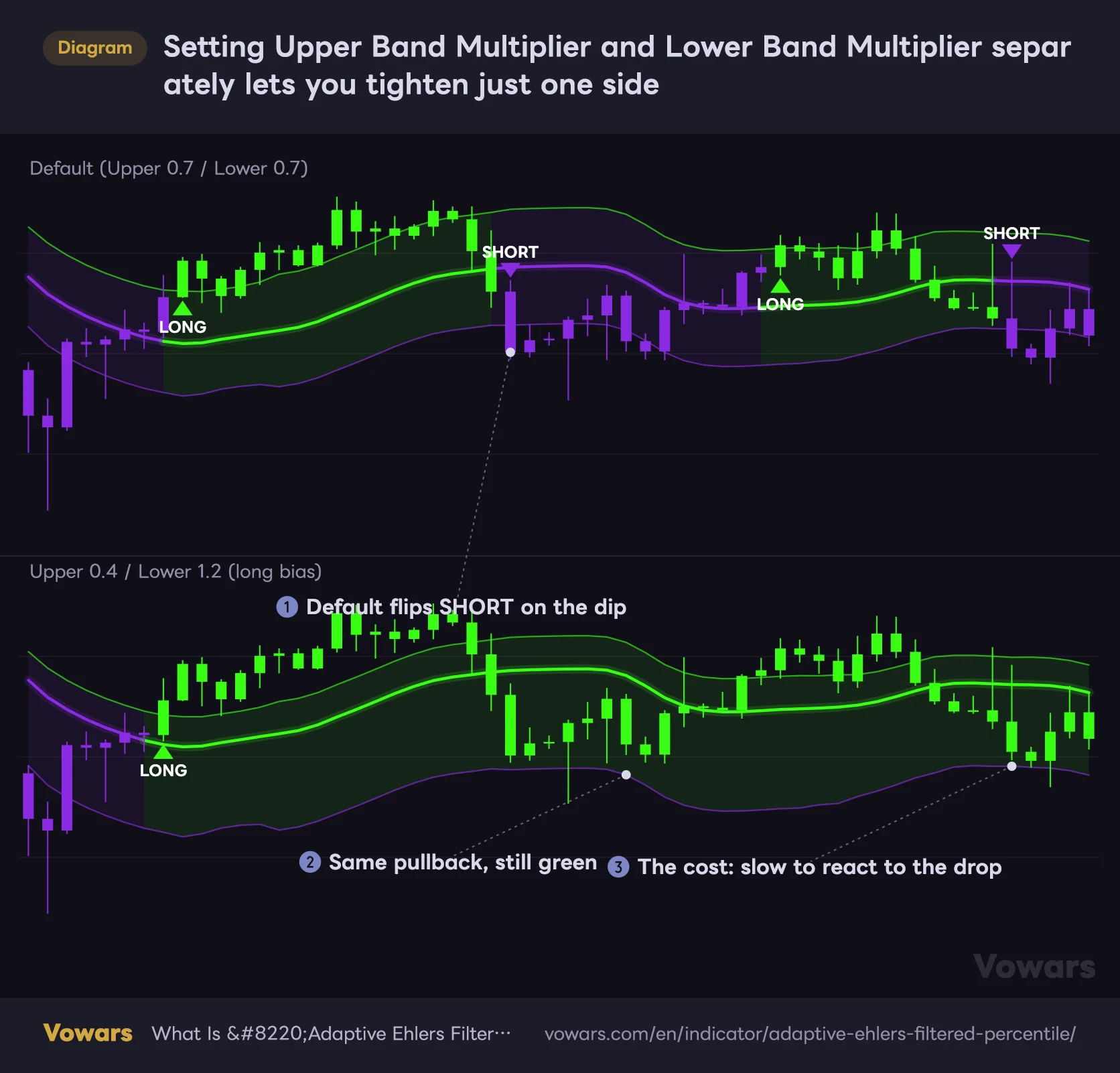
Upper Band Multiplier and Lower Band Multiplier can be set independently, and the author calls out this ability to tune the bullish and bearish triggers separately as a key feature. For example, if the higher timeframe is clearly trending up, you can pull the upper band in and push the lower band out for a long-biased setup that is less likely to flip purple on a pullback.
Setting Upper Band Multiplier and Lower Band Multiplier separately lets you tighten just one side
Both panes show identical price action. Only the distance to the upper and lower bands differs.
Vowars DE ver.3.4.1
As point ③ shows, the trade-off is a slower reaction to reversals. I think the practical approach is to use this only while the higher-timeframe trend is clear, and to reset both to 0.7 once the direction starts to look shaky.
Display toggles and choosing a Source
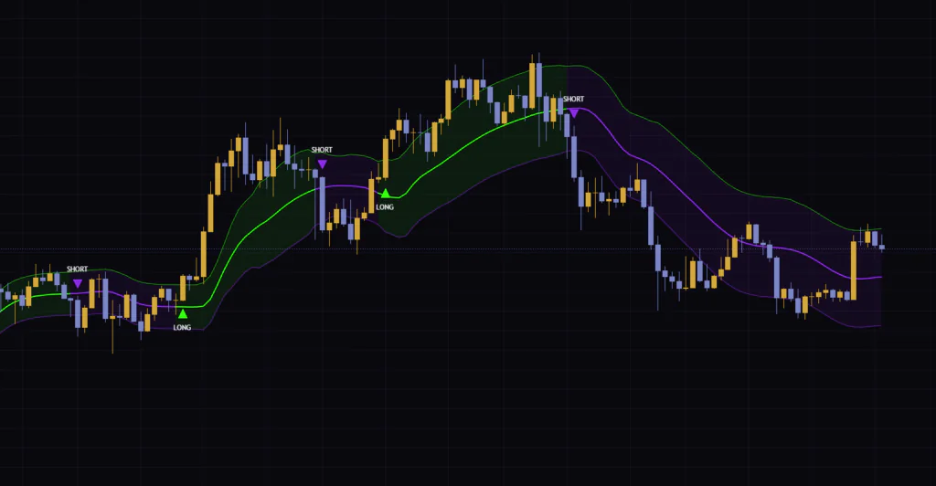
None of the five toggles in the “Visualization” group affect the logic when turned off. If your chart gets cluttered with other indicators, just turning off Show Band Fill cleans things up a lot. The 4H screenshot was taken with Color Bars off, so the candles keep their normal colors and only the basis line and bands are shown.
Leaving Source at the default close is fine. If you switch to something like hl2, that value is used not only for the basis line but also for checking whether price has crossed a band, so the signals will change too.
Starting points by use case
| Use case | What to change | Goal |
|---|---|---|
| Swing trading on the daily / 4H | Nothing (defaults) | On the daily, the defaults didn’t produce too many signals |
| Day trading around the 1H | Percentile Level at 85 to 90 | Fewer whipsaws in chop |
| When the higher timeframe is in a strong uptrend | Upper Band Multiplier 0.5, Lower Band Multiplier around 1.0 | Less likely to flip bearish on pullbacks |
| To calm the basis line during ranges | Maximum MA Period to around 40 | Less wobble in quiet markets |
Signals don’t repaint once the bar closes, but the live bar is a different story
“Adaptive Ehlers Filtered Percentile” doesn’t pull in higher-timeframe data and doesn’t use any lookahead, and the author states this explicitly. It only uses prices up to the current bar. That means once a bar closes, its LONG / SHORT won’t disappear or get redrawn somewhere else.
The one to watch is the live, still-forming bar. The basis line and bands are recalculated on every tick, so before the bar closes, a LONG can pop up for a moment and then vanish.
“Adaptive Ehlers Filtered Percentile” comes with two alert conditions: “Long Signal” and “Short Signal.” When you pick one in the alert dialog, set the trigger to “Once Per Bar Close,” which only evaluates when the bar closes, and you’ll only get notified of confirmed signals. Choose “Once Per Bar,” which fires the first time the condition is met on each bar, and you can get pinged even if the condition was only true for a moment on the live bar.
Use Bar Replay to review past signals
“Adaptive Ehlers Filtered Percentile” isn’t published as a strategy that simulates trades and reports performance, so adding it to your chart won’t give you any results in the Strategy Tester. To check how it behaved in the past, the reliable approach is TradingView’s Bar Replay: step forward one bar at a time and look at each signal bar and what price did next.
How far back Bar Replay goes depends on your plan and timeframe. On the daily and higher, you can replay all available history, but how far back you can go on intraday timeframes varies by subscription (as of September 16, 2026). If you want to review a long stretch on the 1H, check this first to save yourself some time.
Check the higher timeframe on a side-by-side chart
There’s no input for changing the timeframe used in the calculation. The easy way to see the higher-timeframe color is a TradingView multi-chart layout: put the 4H and 1H side by side and add “Adaptive Ehlers Filtered Percentile” to each. I split my screen with the higher timeframe on the left and my trading timeframe on the right.
Where it shines and where it struggles
Where it shines
- Tracking trends that last weeks to months on the daily and 4H
- Candles are painted too, so you won’t lose track of the regime even with other indicators stacked on top
- The regime holds when price moves back inside the channel, so pullbacks and relief rallies won’t shake you out
- No repainting on closed bars
- Separate upper and lower multipliers let you bias it long or short
Where to be careful
- In chop, a single bar outside the channel is enough to flip LONG / SHORT
- After a pump reverses, the basis line and bands are slow to follow
- After a big spike, the channel stays wide for about 50 bars, then suddenly pinches in
- Price is often far from the basis line at signal time, which means wider stops
- Nothing filters back-to-back signals, so that judgment call is on you
Best paired with something that tells you whether a trend exists
The weak spot of “Adaptive Ehlers Filtered Percentile” is whipsawing in directionless markets. To cover that, I think it pairs best with an indicator that measures trend strength.
For example, skip LONG / SHORT signals when ADX (which rates trend strength from 0 to 100) is low and flat. Be skeptical of band breaks that come without volume. Hand the “should I even take this signal” decision to another tool, and this indicator can focus on what it does best: tracking regime changes. The same approach works beyond Bitcoin, on instruments that tend to trend for long stretches, like gold and stock indices.
A regime-based trend filter for traders who can wait for the color to change
 Image
Image“Adaptive Ehlers Filtered Percentile” is less about pinpointing entries and more about keeping track of whether you should be leaning long or short right now. The basis line reacts quickly to sudden moves, the band width is set by a ranking of past deviations, and the regime holds until price closes beyond the opposite band. Those three pieces fit together well, and on the daily and 4H it let me follow the trend without second-guessing.
On the flip side, signals pile up in chop on the 1H and below, and after a big spike the channel stays wide for about 50 bars. Chase every signal and you’ll get whipsawed, but if you set your direction with the higher-timeframe color first, I think it has more than earned a spot on the chart.