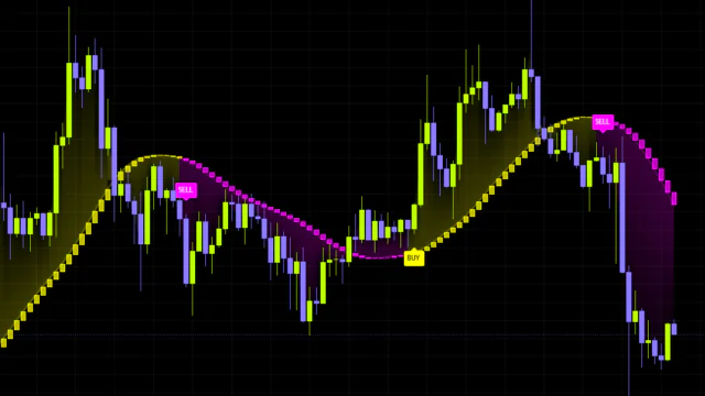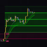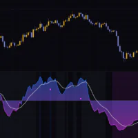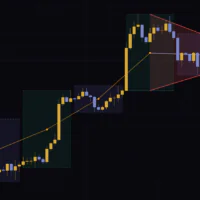


What is the Regression Slope Oscillator?
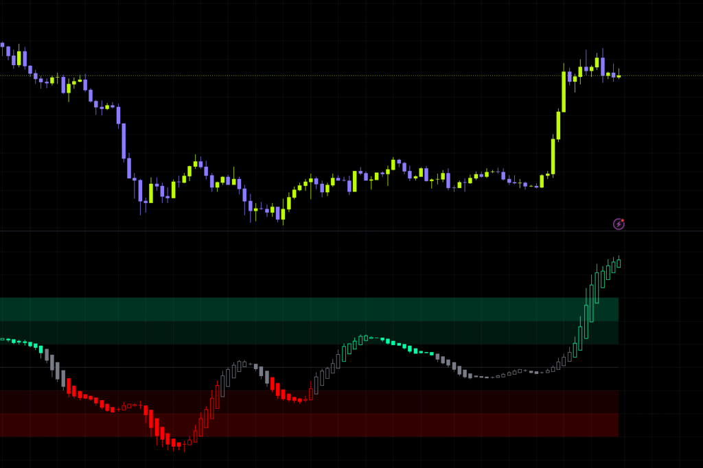
The first thing that hit me after loading it on a chart was that this thing isn’t really looking at price. What the Regression Slope Oscillator plots isn’t price itself, it’s the slope of price. How fast is the market climbing (or falling) per bar, right now? That’s the only thing it extracts, and it puts it in a separate pane below the chart as an oscillator.
When you look at a moving average, you glance at it and think “it’s pointing up, so we’re in an uptrend.” Right?
This indicator takes that “pointing” part, turns it into a number, and then divides it by the instrument’s own volatility before displaying it. That’s the core idea behind the Regression Slope Oscillator. Another way to put it: a $100 per bar move on BTC and a $3 per bar move on gold end up on the same measuring stick.
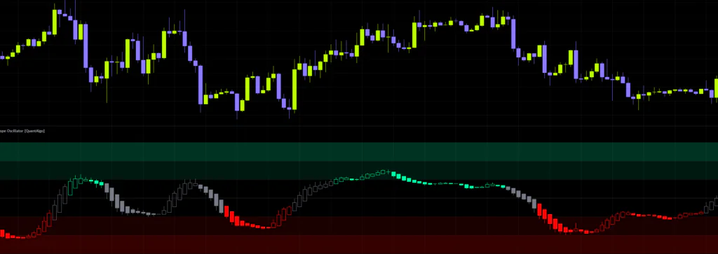
From there, it sorts the market into three states: bullish, bearish, and neutral, based on how steep that slope is. Green means up, red means down, gray means “no direction right now.” That’s genuinely all there is to reading it, so despite how busy the pane looks at first glance, the actual decision is simple.
The Regression Slope Oscillator is an indicator for judging whether a trend exists at all. That’s a different job from an oscillator like RSI, which measures overbought and oversold conditions. Both live in a pane under the chart and both oscillate, but they’re watching completely different things, and knowing that upfront saves a lot of confusion.
Breaking down what shows up in the lower pane
Those odd looking candles
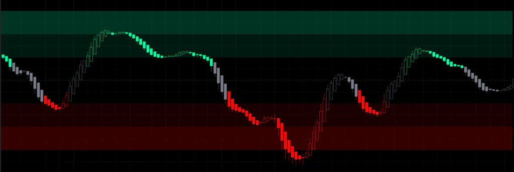
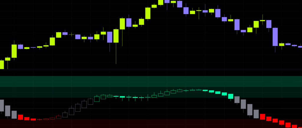
Load it with the default settings and you get a row of small candle-like shapes in the lower pane. These aren’t price candles, they’re synthetic candles built in slope space. The body spans how much the slope changed from the previous bar to the current one, and the wicks come from fitting the slope separately to the bar’s high and low.
 Image
ImageSo the reading works like this: an up body means the slope is steepening, a down body means it’s easing off. This is where most people trip up at first, because you’ll regularly see a down body that’s still colored green. It looks contradictory, but all it means is “the advance is still intact, momentum just eased on this particular bar.”
The setting that makes this even easier to read is Hollow Up Candles. With it on, bars where the slope steepened are drawn as hollow outlines instead of solid bodies. If a filled bar shows up in the middle of a green run, that’s your cue that momentum dipped there. Personally I find the hollow display genuinely useful, especially as a clue for spotting the start of a pullback.
The three stacked colored zones
 Image
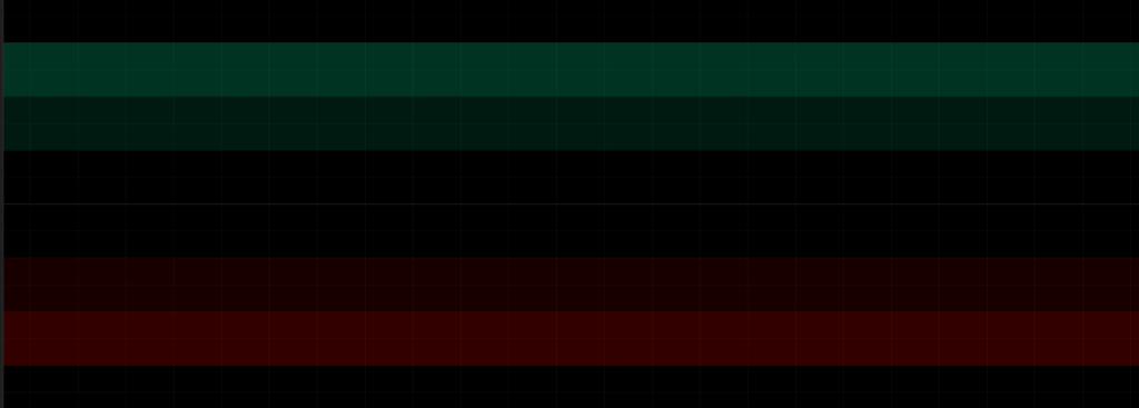
ImageAbove and below the midline you’ll see faint colored bands stacked three deep. These sit at 1x, 2x, and 3x the Entry Threshold, getting more pronounced as you move outward.
The inner edge of the first band is the line you have to clear to enter a bullish or bearish state. The color only changes once that’s crossed. When the reading pushes into the second or third band, price is moving at two or three times the rate required for confirmation. The zero line runs through the middle in faint gray, marking where the slope flips sign.
That third band is what determines the vertical scale of the entire pane. Push Entry Threshold too high and the zones stretch out vertically while the oscillator itself gets squashed into the middle. If the plot suddenly looks tiny, this is the first thing to check.
The three states are the real engine here
If there’s one part of the Regression Slope Oscillator worth understanding properly, it’s how these states work.
Entry and exit levels are deliberately different
When the normalized slope crosses above Entry Threshold, it enters a bullish state and the color changes. Nothing surprising so far. The interesting part comes next: once a state is established, dropping back to that same line doesn’t release it.
Release happens at a much tighter line, Entry Threshold multiplied by Exit Fraction. Out of the box that’s 0.10 and 0.40, so you go bullish above 0.10 and stay bullish until the slope drops under 0.04. Offsetting entry and exit like this is why you almost never get that flickering, strobe-light color change around the boundary.
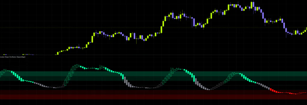
If you’ve ever run a moving average crossover and been driven mad by reversal signals firing over and over at the boundary, you’ll feel the difference immediately. The slope can ease off during a pullback and the plot still holds its green or gray. Honestly, about half the reason I like this indicator comes down to this one design choice.
Turn neutral off and it becomes a different tool
Switch Enable Neutral State off and the gray state disappears entirely. Even with a weak slope it keeps holding its last direction, and the color won’t change until the opposite threshold gets cleared. It turns into a two-state indicator.
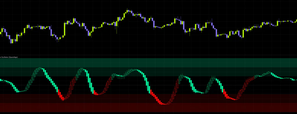
That suits anyone who’s always in a position, or who never wants to lose directional bias. Be aware, though, that this setting makes Exit Fraction and Neutral Color inert and stops the neutral alert from firing. If you want to use it as a signal to stand aside during chop, leave it on.
Wicks and gaps don’t drag the reading around
Plenty of indicators measure slope. What clearly separates the Regression Slope Oscillator is that it fits that slope using a method built to resist outliers.
Ordinary regression draws a line that minimizes the deviation from every bar in the window. Straightforward and easy to picture, but a single long liquidation wick or an overnight gap is enough to tilt the whole line toward it. In crypto and commodity futures, those bars show up like clockwork.
 Image
ImageWhat the Regression Slope Oscillator does instead is calculate the slope between every possible pair of points in the window and take the middle value. Throw in a handful of extreme bars and the middle value barely budges. The two options under Estimator Method differ in how much of that abuse they can absorb.
| Estimator Method | Outlier tolerance | Compute cost | Best suited for |
|---|---|---|---|
| Theil-Sen | Holds up to roughly 29% bad data | Light | Fine for most situations. Runs light and it’s the default |
| Repeated Median | Holds up to 50%, the theoretical ceiling | Heavy | Markets prone to gaps and sudden spikes. Gets expensive paired with a long window |
Flipping between the two on BTC 4H, the plots sit almost on top of each other during normal price action. The gap shows up right after a cluster of extreme bars, like a sharp V-shaped bounce out of a flush. If you want the steadier reading there, go Repeated Median. If you want the lighter load, stay on Theil-Sen.
Estimator Method is never overridden when you change presets. If you’ve swapped presets and it still feels sluggish, check whether this is sitting on Repeated Median.
Why the same threshold works across different markets
The raw slope on its own is useless for comparison, since the magnitudes differ by orders of magnitude between instruments. So the Regression Slope Oscillator divides it by a volatility unit before plotting. The three options under Normalization Method are three different ways of doing that division.
| Normalization Method | Divided by | How to read it | Notes |
|---|---|---|---|
| ATR | Average true range | 0.10 means one tenth of an ATR per bar | Adapts automatically as volatility regimes shift. This is the default |
| Stdev | Standard deviation of bar-to-bar changes | Reads closer to a t-statistic | Reacts to volatility compression faster than ATR does |
| Percent | No volatility adjustment, plotted as a rate | 0.10 means 0.1% per bar | Ignores volatility entirely. Use it when you want a fixed economic threshold |
This is the part of the Regression Slope Oscillator people misread most often. The three readings are not interchangeable. Take a setup dialed in at 0.10 on ATR, switch it to Percent, and that same 0.10 now means something entirely different. Change the method and you have to retune the threshold.
On top of that, with Log Transform enabled the slope is treated as a proportional rate, “what percent per bar.” That’s what lets you compare BTC at $10k against BTC at $100k on the same scale. The only real reason to turn it off is if you’ve pointed Source at something that can hit zero or go negative. Otherwise, leave it on.
Zone depth reads the opposite way depending on your style
Here’s the genuinely interesting part of the Regression Slope Oscillator: the exact same plot can be interpreted in completely opposite ways depending on how you trade.
For trend traders, depth means strength
Reaching the second or third band means price is moving two or three times faster than the confirmation line requires. From a trend-following seat, that’s evidence the trend is strengthening, not a reason to take profit. Hold until the state releases, and that’s the basic playbook.
For mean reversion traders, depth means stretched
On the flip side, a reading pinned in the third band doesn’t last long. From a fade seat, the signal isn’t arriving in the outer zone, it’s the turn back out of it. Fade it purely because it got there and you’ll get run over repeatedly by trends that just keep going. I really want to flag this one.
When price keeps pushing but the slope pulls back
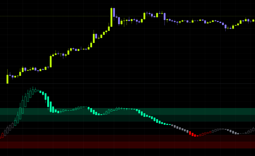
This is the setup that makes me sit up when I’m watching it live. Price keeps printing higher highs, but the reading in the pane is drifting back in from the outer zone. That’s the rate of the advance decaying, and it shows up well before the state formally releases.
Trend traders can use it as a reason to tighten stops, fade traders as a heads-up to start building. But it’s a slowdown in pace, not a confirmed reversal. In a strong trend this pattern can appear and the move can still run for weeks, so taking a counter-trend position on it alone is asking for trouble.
From setup to actual trade decisions
1Pick the preset that matches your timeframe
Start here. Open Preset Configuration and pick whichever one lines up with the timeframe you actually trade. Rough guide: Fast Response for 5m through 1H, Default for 4H through daily, Smooth Trend for daily through weekly.
2Scroll back and see where the color flips
Don’t jump straight into trading it. Walk back through past price action first and follow where the color actually switches. Getting a feel for whether it’s slower or faster than your own read makes the tuning later much easier.
3Count how much time it spends gray
If neutral feels like it’s taking up too much of the chart, your threshold is too high. If gray barely ever appears, it’s too low. Use whether the gray stretches land on the parts where you’d genuinely say “yeah, that was chop” as your benchmark, and fine-tune Entry Threshold from there.
4Cross check against price levels
Even when the state flips bullish, skip it if price is sitting right underneath nearby resistance. That single extra step cuts a visible chunk out of your junk entries. The Regression Slope Oscillator tells you direction and pace, but it never tells you how far the move can run, so pairing it with horizontal levels and range highs and lows is the realistic approach.
5Lock your alerts to bar close
When you create an alert, always set the frequency to Once Per Bar Close. I’ll explain why further down, but get this wrong and your phone won’t stop buzzing.
Every setting explained, plus what I’d run
| Parameter | Default | Recommended | What it does |
|---|---|---|---|
| Preset Configuration | Default | Match your timeframe | Choosing Fast Response or Smooth Trend overwrites the window, normalization and thresholds as a set. The inputs below only respond to manual changes while this sits on Default |
| Source | Close | Close | The price series the slope is fitted to. Switching to hl2 or hlc3 folds in the intrabar range and smooths things slightly, but Close gives the most stable reading |
| Log Transform | On | On | Treats the slope as a proportional rate, keeping readings consistent across instruments at different price levels and across long histories. Only turn it off if your source can hit zero or go negative |
| Estimator Method | Theil-Sen | Theil-Sen | How the slope is fitted. Repeated Median buys you more outlier resistance at a heavier compute cost. Presets never override this |
| Slope Window | 21 | 14-28 | How many bars the slope is fitted across. 8-15 reacts quickly to turns but gets noisier, 30-40 gives a smooth, high-conviction reading with more lag. Range is 5-40 |
| Normalization Method | ATR | ATR | The unit the slope is divided by. Changing it changes what the threshold actually means, so you must retune Entry Threshold whenever you switch |
| Normalization Length | 14 | 10-20 | The lookback for the volatility unit. 5-10 tracks volatility shifts quickly, 30-50 holds the scale steadier so raw trend magnitude comes through. No effect when set to Percent |
| Entry Threshold | 0.10 | 0.08-0.15 | How steep the slope must be to establish a state. Raise it to filter marginal trends, lower it to engage earlier. Practical range is 0.05-0.30, capped at 1.00 |
| Exit Fraction | 0.40 | 0.30-0.50 | What fraction of Entry Threshold releases an established state. Lower values hold states longer, and 1.00 puts entry and exit on the same level, killing the anti-flicker effect |
| Enable Neutral State | On | On | Whether the gray third state exists. Off turns it into a two-state engine that always holds a direction, and makes Exit Fraction and Neutral Color inert |
| Display Style | Candles | Candles | Synthetic candles or a single plotted line. Candles let you read both the change in slope and its dispersion, at roughly three times the compute of Line |
| Heikin-Ashi Transform | On | On | Suppresses single-bar noise and makes sustained trend phases visually contiguous. Off reacts faster but looks choppier. Only active in Candles mode |
| Hollow Up Candles | On | On | Draws bars where the slope steepened as hollow outlines. Lets you read bar-level momentum on top of the state color |
| Color Preset | Custom | Personal preference | Five ready-made schemes: Classic, Aqua, Cosmic, Cyber and Neon. The three color inputs below only work while this is on Custom |
| Bullish Color | #00ffaa | Personal preference | Color while a bullish state is held. Also tints the upper zones |
| Bearish Color | #ff0000 | Personal preference | Color while a bearish state is held. Also tints the lower zones |
| Neutral Color | Gray | Something that blends into the background | Color while no directional state is held. Keep it understated and the directional stretches stand out on their own |
While Fast Response or Smooth Trend is selected, the window and threshold fields below still show numbers, but those numbers are ignored. If you change a value and nothing on the chart moves, check whether Preset Configuration has drifted off Default. I lost a good ten minutes to exactly that.
Comparing what’s inside the three presets
| Preset | Slope Window | Normalization Length | Entry Threshold | Exit Fraction | Intended use |
|---|---|---|---|---|---|
| Default | 21 | 14 | 0.10 | 0.40 | Swing trading on 4H to daily. Balanced: filters noise while still turning inside a multi-week move |
| Fast Response | 10 | 7 | 0.06 | 0.55 | Intraday on 5m to 1H. Engages states early, releases them quickly. Built for day trading |
| Smooth Trend | 34 | 30 | 0.15 | 0.30 | Daily to weekly. Few but high-conviction states, held through deep pullbacks. Built for position trading |
All three normalize by ATR. Stare at the table and the design logic surfaces: Fast Response is “easy in, easy out,” Smooth Trend is “hard in, hard out,” a neat mirror image. The Default option effectively means “configure it yourself”, and the 21 and 0.10 you see are simply the stock starting values.
What to adjust, depending on what you want
When the presets don’t quite get you there, here’s the direction to push each input.
- To catch direction earlier, shorten Slope Window to around 12 and drop Entry Threshold to 0.06-0.08. The trade-off is less gray on the chart and more marginal trends getting picked up
- To cut down on fakeouts, raising Entry Threshold to 0.15-0.20 is the first move. Fewer side effects than lengthening the window, and the effect is more direct
- To hold states for longer, drop Exit Fraction to around 0.25. The color becomes much harder to shake off during deep pullbacks, which makes riding the bigger swings easier
- To handle sudden volatility shifts better, shorten Normalization Length to 7-10. Readings get lifted during compressed conditions, so states still register in quieter markets
Set Entry Threshold to 0 and it becomes a pure sign follower that flips color on every zero-line cross. Neutral becomes unreachable, so Enable Neutral State and Exit Fraction stop doing anything. The zone scale falls back to a fixed 0.10 basis so the fills stay visible. Fun as an experiment, but you’re throwing away the anti-flicker design yourself, so I wouldn’t run it day to day.
Where it shines, and where it clearly struggles
Here’s the impression I came away with after going back over several months of BTC on the 4H and daily.
Where it works beautifully
Markets with a settled direction that grind higher in steps, pausing for pullbacks along the way. The color holds for long stretches here, and each dip flips the bars from hollow to filled and back to hollow again. You can visually track where a pullback starts and where it ends, which makes it usable for deciding when to join a move already underway.
The early stage of a volatility expansion is another good fit. Because normalization runs off ATR, readings push further right after expansion kicks off than they do once volatility has fully expanded.
Where it struggles
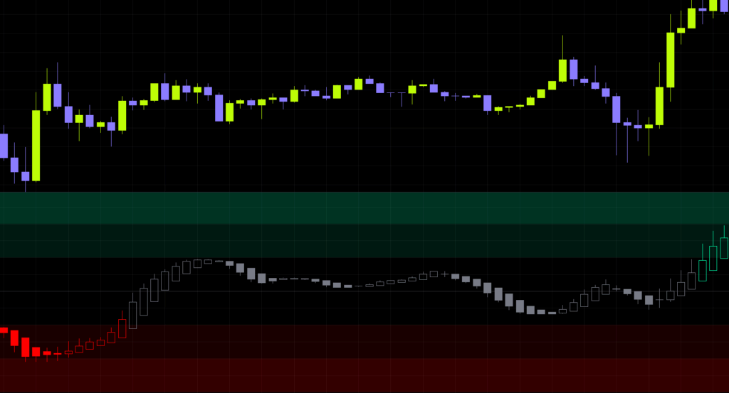
First, tight low-range chop that drags on. The reading just parks inside the threshold band and stays gray. That’s the design working as intended rather than a malfunction, but it does mean long stretches where the indicator tells you nothing.
 Image
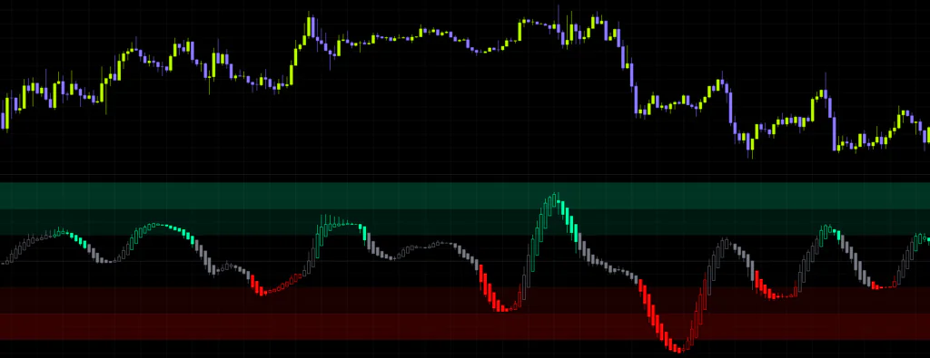
ImageSecond, wide ranges that keep swinging up and down. Every few bars in one direction confirms a state, then the swing back releases it, over and over. This is where the Regression Slope Oscillator throws the most fakeouts, and using it without a higher timeframe direction check will bleed you.
Third, V-shaped bounces off a sharp flush. Because the slope is fitted across a window, it takes several bars to climb out of a bearish state, so it’s never going to catch the first leg of the reversal. Better to accept it isn’t a top and bottom picker.
What I liked and what left me wanting
Strengths
- A handful of long wicks or gaps won’t wreck the reading
- Normalization means the same threshold carries over across instruments and timeframes
- Offset entry and exit levels mean almost no color flicker at the boundary
- The neutral state makes “no trend right now” an explicit, readable condition
- Zone depth reads for both trend following and mean reversion, which widens what you can do with it
- Readings on closed bars are never revised after the fact
- Presets are broken out by timeframe, so it’s usable with a sensible configuration from day one
Weaknesses
- Fitting a slope across a window means reversals are always caught late
- Switching normalization method changes what the threshold means, forcing a full retune
- Wide ranges produce more state changes and more fakeouts
- Repeated Median plus a long window plus Candles mode gets heavy
- Tells you nothing about price levels or how far a move can run
- The state can flip mid-bar while a bar is still forming
The things you really don’t want to get wrong
No repainting, with one caveat
There’s no repainting here, meaning no past signals quietly disappearing or shifting position later. Nothing in it pulls higher timeframe data and nothing references future values, so once a bar closes, its reading and its state are locked in and never revised. That part you can trust.
The developing bar is a different story. Because the fit includes the current bar, the reading updates on every tick, and the state can flip bullish mid-bar and then revert before the close. That’s exactly where the gap between “looks clean on historical charts” and “feels uncertain in real time” comes from.
When you build an alert, always set the frequency to Once Per Bar Close. Otherwise you’ll get pinged every time the state swaps on an unclosed bar. Six conditions ship with it: Any State Change, Bullish State, Bearish State, Neutral State, Bullish Zero Cross and Bearish Zero Cross. The zero cross fires earlier than threshold confirmation, but assume the hit rate drops accordingly.
Don’t trade it on its own
The only question the Regression Slope Oscillator answers is “which way, and at what pace, is price moving right now.” Where price sits, where the recent highs and lows are, which way the higher timeframe is pointing, none of that is in there.
A state flipping bullish right underneath a weekly resistance band happens all the time. Use it to confirm direction and let something else decide where you actually get in. That division of labor is the realistic way to run it.
It needs a warm-up before it plots
Nothing plots until enough bars have accumulated to fill the Slope Window you set. That’s why the far left of the chart is blank when you first load it. Also, the slope computation scales with the square of the window, so a 40-bar window running Repeated Median in Candles mode is the heaviest combination available. If it’s dragging, just switching Display Style to Line makes a noticeable difference.
What pairs well with it
What the Regression Slope Oscillator lacks is location. Anything that fills that gap tends to pair well, and that’s the sense I got from using it.
- Horizontal levels and range highs and lows are the best fit by far. Confirm direction here, let the levels decide the entry
- Volume tools let you check whether a confirmed state is backed by real participation. Confirmations on thin volume don’t seem to stick around long
- The same indicator on a higher timeframe works well too. Bullish on the daily but neutral on the 4H, for instance, reads as a dip setting up
- Overbought/oversold tools like RSI complement it precisely because they measure something else. Pace and stretch are different things, so the spots where both point the same way carry more weight
What doesn’t make much sense is stacking it with another indicator that reads the slope of a moving average. The roles overlap, so you mostly just end up with a cluttered pane.
Who this is for
The Regression Slope Oscillator clicks for traders who only want to participate while a trend is actually running. Stand aside while it’s gray, trade with the direction once it colors up. Having that simple rule expressed as a color you can act on mechanically is the real strength.
On timeframes, swing trading on 4H to daily felt the easiest to work with, exactly as the presets suggest. For daily and weekly position trading, the way Smooth Trend holds a state through deep pullbacks starts to pay off. Day trading works too with Fast Response, but the lower you go the more range chop you eat, so plan on running it alongside a higher timeframe direction check.
Scalping is where it doesn’t belong. Fitting a slope across a fixed number of bars simply can’t keep up with the speed you need to grab moves a few bars out.
Should you add it? My take
Honestly, my first reaction to the pane was “I have no idea what I’m supposed to be looking at.” Synthetic candles, three stacked zones, it’s a lot of information on first contact. But a few days in, you realize there are only two things to watch: the color, and roughly where in the zones the reading sits. After that, it actually sped my decisions up.
 Image
ImageWhat I rate is that the anti-flicker thinking is baked properly into the design. Trend-state indicators usually get chewed up by boundary whipsaw, and the fix here, separating entry from exit, is clean enough that the color holds through pullbacks. On top of that, normalization means a configuration you dialed in on BTC transfers straight over to gold or an index chart. If you watch multiple markets, that portability matters more than you’d expect.
If I’m picking at something, it’s the lag. That comes from the mechanism itself so there’s no getting around it, and expecting it to call tops and bottoms will disappoint you every time. The other thing is that the threshold number is tied to the normalization method, and if you don’t grasp that upfront your settings will end up lost.
Even so, for the specific goal of judging whether a trend exists and how fast it’s running, on the same scale regardless of instrument, this delivers pretty directly. Start by dropping the preset onto your timeframe as-is and check whether the gray stretches land where they should. If that part feels right, you’ve got an indicator you can keep on the chart long term.
The Regression Slope Oscillator is a trend-state oscillator that fits price slope with an outlier-resistant method, divides it by volatility, and sorts the result into three states. Read direction from the color and strength from zone depth, and stand down while it’s gray. Readings on closed bars are never revised, so run your alerts off the bar close.