

“Quant Regime Oscillator” reads overextension, momentum, and market regime in one pane
“Quant Regime Oscillator” is an open-source oscillator published by JackOfAllTrades. *On TradingView, the author goes by officialjackofalltrades.
It rolls two things into a single line bounded between −100 and +100: how far price has stretched from its mean, and how strong the momentum is. On top of that, the background color tells you whether the market is actually trending in one direction or just chopping back and forth.
There are three things to read. The line’s position tells you how overextended price is, crosses with the white signal line show shifts in momentum, and the background color shows the character of the market. You also get BUY/SELL labels that only print when every condition lines up, divergence dots, and a dashboard in the top-right corner.
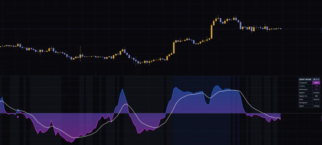
When I first loaded it on Bitcoin’s daily, 4H, and 15m charts, I was honestly confused because not a single label showed up. The dashboard header stayed at “◆ FLAT” on every timeframe. Thinking I had messed up a setting, I dug into how it works and found it wasn’t a bug at all. The signal conditions are just extremely strict. In this article I lay out why, and which settings actually get signals to print, using the numbers I counted myself.
“Quant” refers to putting a number on the market with statistical yardsticks, such as how many standard deviations price is from its mean. “Regime” means the market phase, and this indicator sorts it into three buckets: trend, mean reversion (Mean-Rev), and random. Measure overextension with statistics, then change how you read it depending on the regime. That design is literally the name.
Start here: what’s in the lower pane
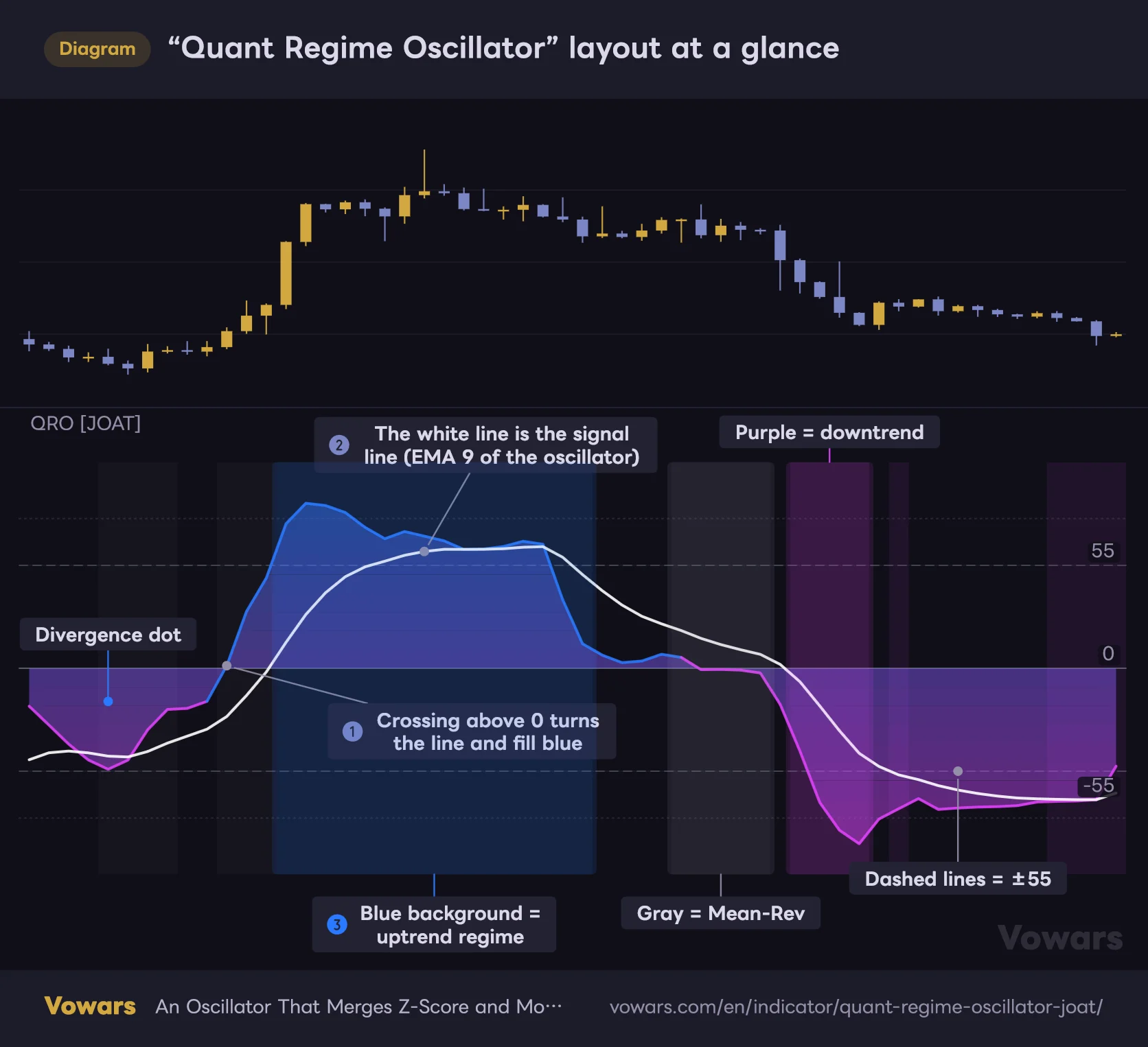
“Quant Regime Oscillator” draws nothing on the price chart. It runs in its own pane below. Here’s the whole thing in one view.
“Quant Regime Oscillator” layout at a glance
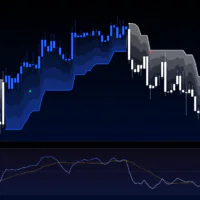
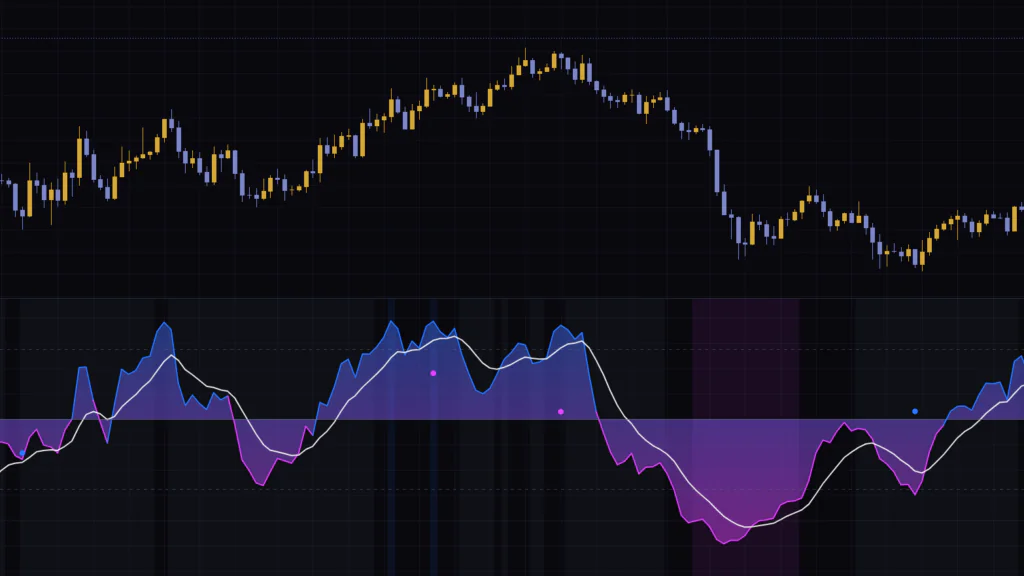
In the lower pane, a single oscillator shaded blue and magenta, a white signal line, and a background color showing the market regime are layered together.
Vowars DE ver.3.12.4
The line and fill switch between blue and magenta at the zero line. You can see the line flip to blue on the bar that crosses above zero in Figure ①. The fill is a gradient: the closer to +100, the bluer it gets, the closer to −100, the deeper the magenta, with a purple-ish blend around zero.
The white line is the signal line. It’s a 9-period EMA of the oscillator, and as Figure ② shows, it trails slightly behind the main line. Crosses between the two are your cue for momentum shifts.
The background shows the market’s character. Bars classified as an uptrend are shaded blue as in Figure ③, downtrends get purple, and choppy back-and-forth markets get a faint gray. Bars that fall in between get no color at all.
| Element | Appearance | Meaning |
|---|---|---|
| Oscillator | Line that’s blue at 0 and above, magenta below 0 | Combined value of distance from the mean and momentum (−100 to +100) |
| Gradient fill | Between the line and 0. Bluer when high, more magenta when low | Helps you read the line’s position at a glance |
| Signal line | White line | EMA of the oscillator (default 9 periods) |
| ±55 dashed lines | Gray dashed lines | Overbought/oversold thresholds. Used in the signal conditions |
| ±80 dotted lines | Very faint dotted lines | Rough guide for extreme levels. Not used in any logic |
| Background color | Blue, purple, gray, or none | Regime classification |
| Divergence dots | Small blue (bullish) and magenta (bearish) circles | Price and oscillator moving in opposite directions |
| BUY/SELL | Blue and magenta labels | Only print on bars where all three conditions line up |
The author describes the area beyond ±80 as an exhaustion zone. But the dotted lines are extremely faint, and on a dark theme you really have to squint to see them. On top of that, ±80 isn’t used in any of the logic. The overbought/oversold calls are made off the ±55 dashed lines.
Under the hood, the line is an average of “distance from the mean” and “momentum”
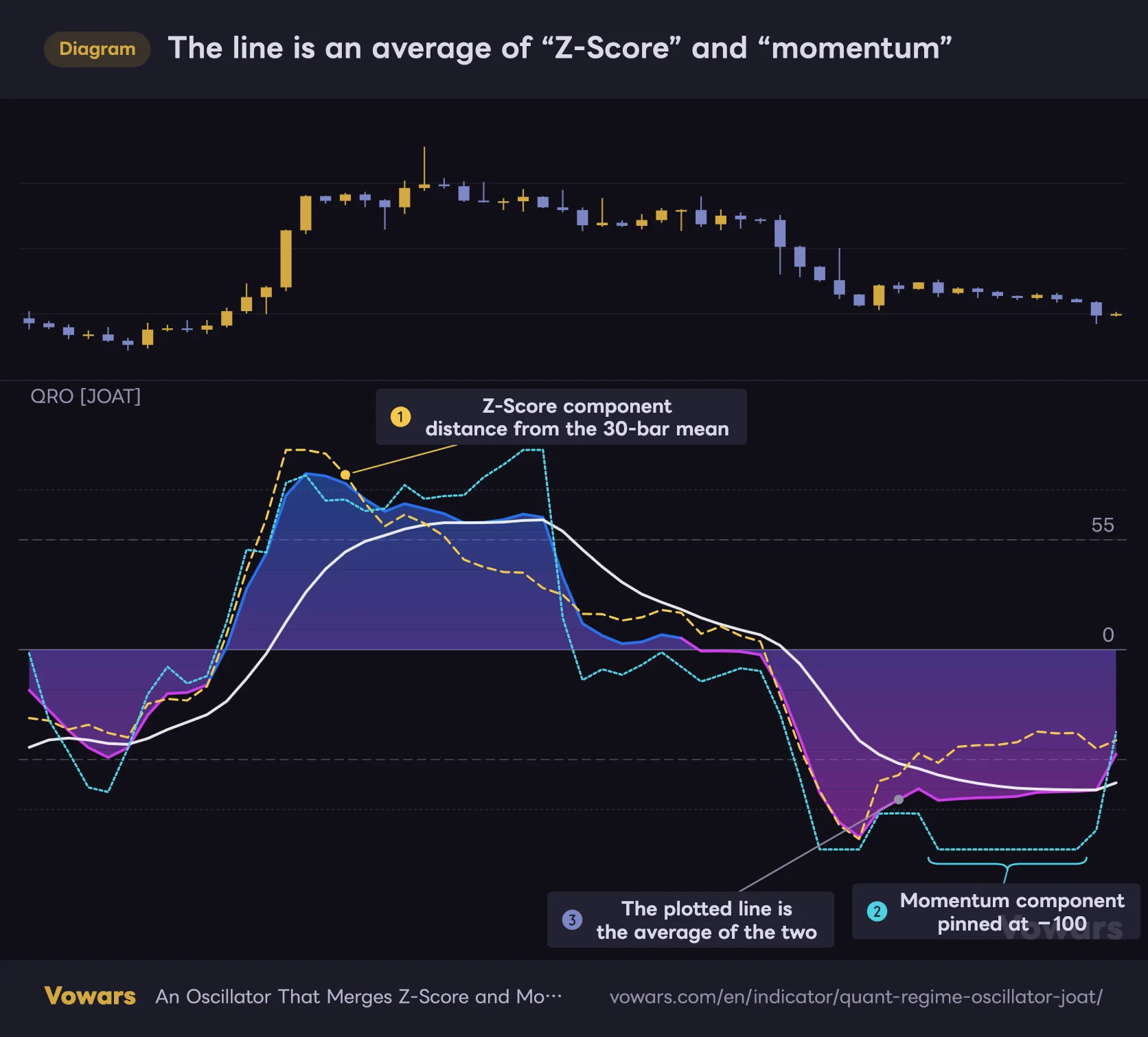
The oscillator value is built from two components. Let’s go through them one at a time. Neither one is shown on the chart, so I overlaid them as dotted lines in the figure.
The line is an average of “Z-Score” and “momentum”
The two dotted lines are internal components that aren't shown on the chart. The oscillator you see is these two added together, divided by 2, and lightly smoothed.
Vowars DE ver.3.12.4
The Z-Score component: how many standard deviations from the 30-bar mean
The first is the Z-Score. It measures how many standard deviations the close is from the 30-bar simple moving average. +2 means 2σ above the mean, −1 means 1σ below. The value is capped at ±3σ and then rescaled to ±100, so anything beyond +3σ is simply treated as +100. The yellow dotted line in Figure ① is this component. It spikes right after the surge and drifts lower as the rally cools off.
The momentum component: rate of change divided by its own dispersion
The second is momentum. It takes the rate of change versus 14 bars ago (ROC), divides it by the standard deviation of that ROC over the last 14 bars, then caps it at ±3 and rescales it to ±100 as well. The idea is to let you compare assets with very different price levels and volatility on the same yardstick.
In practice, though, this component has a quirk. When price moves cleanly in one direction, the ROC barely varies, which means the denominator shrinks. The value then shoots straight to its cap and gets pinned at +100 or −100. In the back half of the selloff, you can see the momentum component flatlined at −100 around Figure ②. When I counted on Bitcoin from the 15m up to the daily, this pinning happened on roughly 10–13% of all bars. The Z-Score component only hits its cap about 2% of the time, so when the line is pressed against an extreme, it’s usually momentum doing the pushing.
Averaging the two, lightly smoothing, and clamping to ±100
By default the two components are averaged with equal weight. That average is lightly smoothed with a 2-period EMA and clamped to ±100, and that’s the line you see. In the far-right stretch, the pinned momentum component (−100) and the recovering Z-Score component (the −40s) are averaged, so the line hovers around −70, as Figure ③ shows. That combination is why the line is slow to turn up even after price stops falling.
If both components are swinging equally, ±55 works out to roughly ±1.65σ on the Z-Score. Under a normal distribution, that’s a level you’d only hit about 5% of the time on each side. Yet when I actually counted on Bitcoin, the line spent 15–21% of the time at +55 or higher and 14–15% at −55 or lower. Because the momentum pinning gets added in, it reaches those levels far more often than the numbers suggest. Keep that in mind and you won’t read too much into a simple push past ±55.
The background color is a test of whether price is moving in a straight line
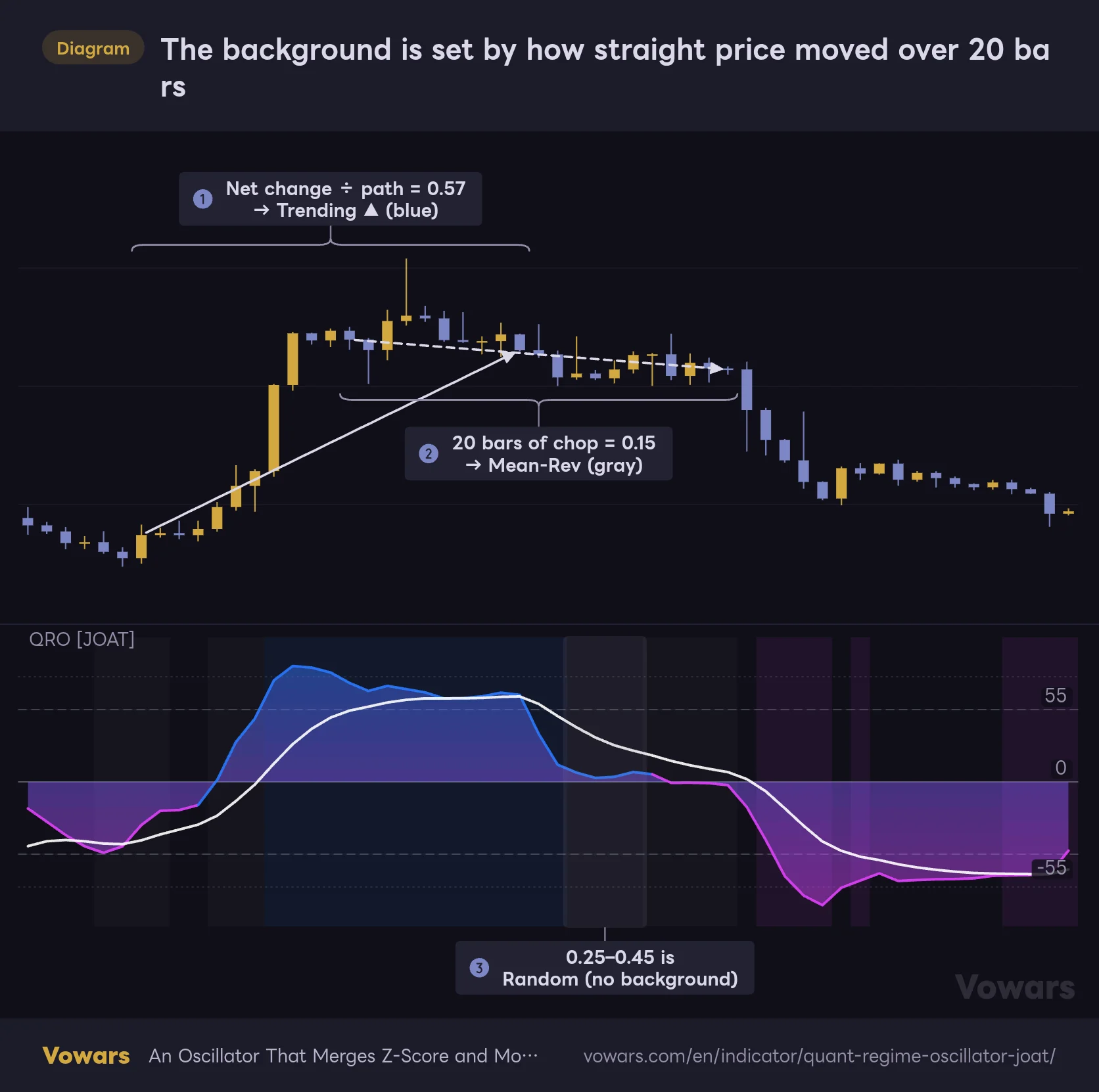
The background color is driven by Kaufman’s Efficiency Ratio (ER). It’s the same measure used in the adaptive moving average KAMA: the net price change over the last 20 bars divided by the total path, meaning the sum of every bar-to-bar move.
The background is set by how straight price moved over 20 bars
The Efficiency Ratio is the net change over the last 20 bars divided by the path, the sum of every bar-to-bar move.
Vowars DE ver.3.12.4
If price climbs in a straight line for 20 bars, the net change and the path are nearly equal and ER approaches 1. If price whipsaws and ends up back where it started, the path is long but the net change is close to zero, so ER approaches 0. Put numbers on it and the difference is obvious. The rally in Figure ① reads 0.57 and is classified as Trending, while the chop near the highs in Figure ② reads 0.15 and is classified as Mean-Rev.
The default cutoffs are 0.45 and above for Trending, 0.25 and below for Mean-Rev, and Random for everything in between. Random bars get no background, as shown in Figure ③.
ER can’t tell you direction. “Quant Regime Oscillator” calls it an uptrend when the close is above the 30-bar simple moving average and a downtrend when it’s below, and shades the background blue or purple accordingly. That moving average is the same line used as the Z-Score baseline.
Once it’s on the chart, the background is almost always gray
The first thing I noticed was how rare blue and purple backgrounds are. I counted the regime breakdown on each Bitcoin timeframe.
| Timeframe | Bars checked | Trending (blue/purple) | Mean-Rev (gray) | Random (no color) |
|---|---|---|---|---|
| 15m | ~30,000 | 9.1% | 64.4% | 26.5% |
| 1H | ~20,000 | 11.8% | 60.2% | 28.0% |
| 4H | ~12,000 | 14.6% | 57.7% | 27.7% |
| Daily | ~3,300 | 16.4% | 55.4% | 28.2% |
The sample periods start in November 2025 for the 15m, June 2024 for the 1H, April 2021 for the 4H, and August 2017 for the daily, all running through September 26, 2026. Mean-Rev shows up more on lower timeframes, most likely because small noise stretches the path.
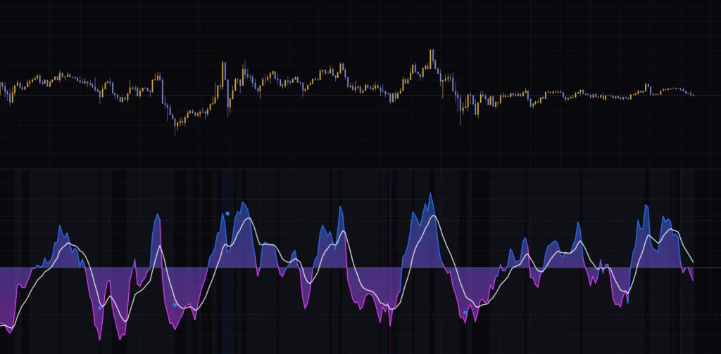
If you wait for the background as a “trend signal,” you’ll be disappointed, because it barely ever shows up. That was me at first. These days I flip it around: when blue or purple appears, I read it as price is unusually moving in one direction right now.
The regime playbook the author recommends
The author suggests using the regime as a cue to switch your playbook.
- When Trending, favor trend-following entries off pullbacks and rallies
- When Mean-Rev, look to fade moves that stretch beyond ±55
- When Random, stand aside or size down
Despite the name, Mean-Rev only means the efficiency over the last 20 bars was low. It doesn’t say price is going to revert to its mean from here. The bar right before price breaks out of a range and takes off will also read Mean-Rev. If you’re going to use it as a reason to fade a move, confirm it against the highs and lows on the price chart too.
Three dashboard rows that are easy to misread
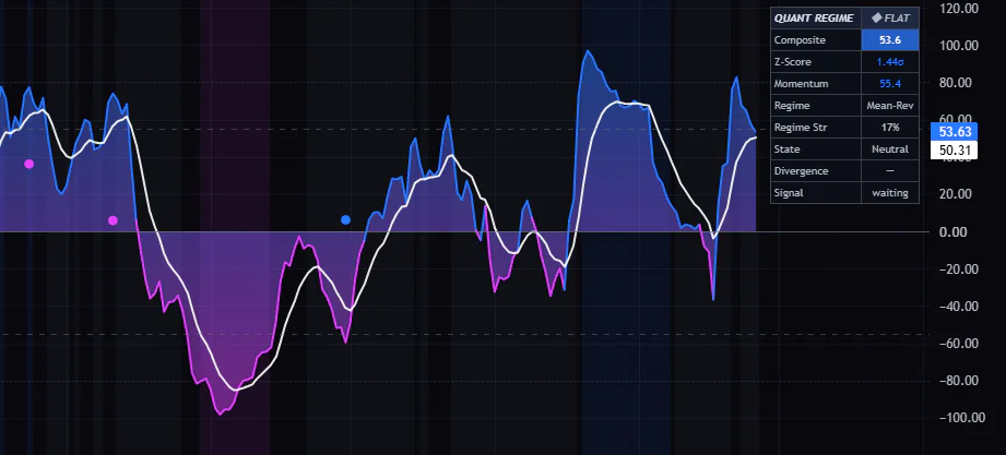
The dashboard is a small 2-column, 9-row table that sits in the top-right corner of the chart by default.
What the dashboard's 9 rows tell you
This is the small table in the top-right of the chart. Of the 9 rows, the easiest to misread are the right side of the header and the bottom two rows.
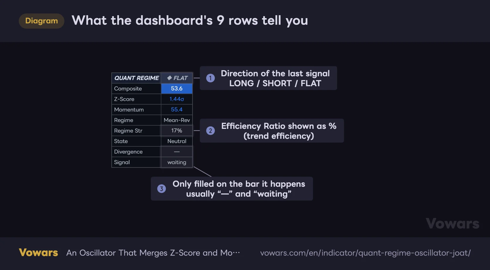
Values in the table are illustrative.
Vowars DE ver.3.12.4
Most rows are self-explanatory. The one to watch is the right side of the header in Figure ①, which is easy to misread. It doesn’t show the current market direction. It shows the direction of the most recent BUY/SELL signal. Once a BUY fires, it stays at “◆ LONG” until a SELL prints, and it never goes back to FLAT. “◆ FLAT” means no signal has fired anywhere within the loaded history.
The other confusing one is Regime Str. The name makes you think it’s a confidence score for the regime call, but the value in Figure ② is just ER multiplied by 100. If you see 17% next to Mean-Rev, it means the trend efficiency is only 17%. It doesn’t measure how strong the mean reversion is.
The bottom two rows, Divergence and Signal in Figure ③, only fill in on the bar where the event happens. A divergence shows for just the one bar it’s confirmed on, and BUY/SELL only on the bar it prints, so most of the time you’ll see “—” and “waiting.”
| Row | Example | What it shows |
|---|---|---|
| Composite | 53.6 | Current oscillator value. The cell’s blue/magenta shading also changes with the value |
| Z-Score | 1.44σ | Distance from the 30-bar mean, before the ±3σ cap |
| Momentum | 55.4 | Momentum component (after rescaling to ±100) |
| Regime | Mean-Rev | One of Trending ▲, Trending ▼, Mean-Rev, or Random |
| Regime Str | 17% | ER × 100 |
| State | Neutral | Overbought, Oversold, or Neutral based on ±55 |
| Divergence | — | Divergence confirmed on that bar |
| Signal | waiting | BUY/SELL on that bar |
The Z-Score row drops the leading zero. 0.47σ displays as “.47σ” and −0.77σ as “-.77σ.” The first time I saw it I thought a digit was missing, but that’s just the format.
Why don’t BUY/SELL signals show up? I checked the conditions one by one
As I mentioned at the top, “Quant Regime Oscillator” on default settings will almost never print a label. A BUY only fires when all three of the following line up on the same bar. SELL is the mirror image.
1The oscillator crosses above the signal line
This is a bullish cross between the oscillator and the white line. On the Bitcoin 4H, crosses in either direction happen about 15 times per 100 bars, so on its own it’s very common.
2It dipped to −55 or lower within the last 6 bars
It’s satisfied if at least one bar within the last 6 bars, including the current one, was at −55 or lower. That lookback is controlled by OB/OS Recall Bars.
3It’s in an uptrend regime
ER is 0.45 or higher and the close is above the 30-bar mean. These are the bars with a blue background.
Each condition is common on its own. The problem is the combination, and the reason is simple. Price only drops below −55 when it’s stretched far below its 30-bar mean. For it to get back above the mean within 6 bars, and for the 20-bar efficiency to clear 0.45 on top of that, you need a rebound that’s far more violent than the selloff.
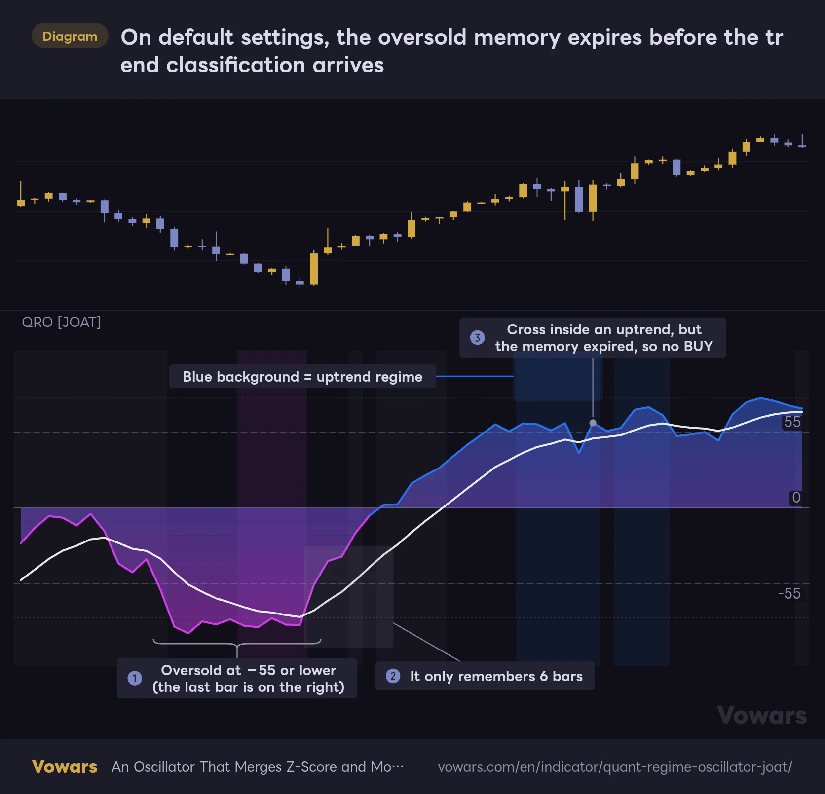
On default settings, the oversold memory expires before the trend classification arrives
After dropping below −55, the uptrend classification kicks in and the oscillator crosses above the signal line inside it. Still, no BUY prints on default settings.
Vowars DE ver.3.12.4
In this example, after dropping below −55 in Figure ①, price bounces and even earns an uptrend classification. In Figure ③, the oscillator crosses above the signal line inside the blue background, which looks like a textbook buy-the-dip setup. Still no BUY. As Figure ② shows, the oversold memory expires after 6 bars, and by the time of the cross, that oversold dip was 20 bars in the past.
Zero signals across three assets and four timeframes
Is it really that rare? I counted on real data. These are the results on Bitcoin, Ethereum, and PAXG (a token that tracks the price of gold), from the 15m up to the daily, all on default settings. As with the earlier table, the data runs through September 26, 2026.
| Asset | 15m (~30k bars) | 1H (~20k bars) | 4H (~12k bars) | Daily |
|---|---|---|---|---|
| Bitcoin | 0/0 | 0/0 | 0/0 | 0/0 (3,328 bars) |
| Ethereum | 0/0 | 0/0 | 0/0 | 0/0 (3,328 bars) |
| PAXG (gold-backed) | 0/0 | 0/0 | 0/0 | 0/0 (2,221 bars) |
The numbers are BUY/SELL counts. Across nearly 200,000 bars in total, not a single signal fired. Looking at the intermediate conditions, the Bitcoin 4H had 293 bars where a bullish cross and a sub−55 reading within the last 6 bars overlapped, but the number of those bars that also had an uptrend classification was zero.
For the record, I verified that the calculations behind these counts are correct. On the daily, 4H, and 15m charts in TradingView, the dashboard’s Composite, Z-Score, Momentum, and Regime Str values, plus the signal line value, matched down to the decimal.
Want to see signals? Increase OB/OS Recall Bars
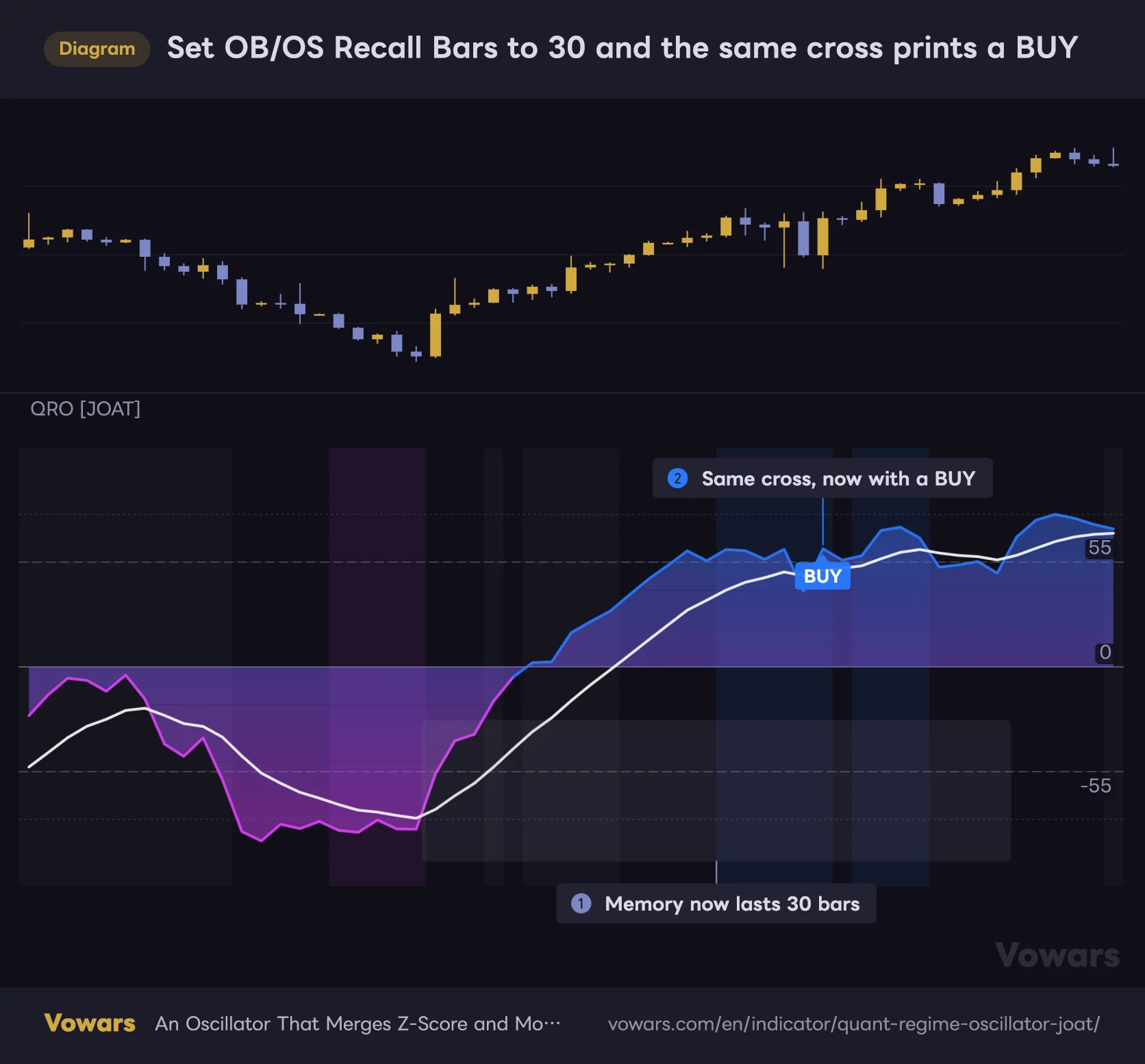
I tried a few ways to loosen the conditions, and the one that made the clearest difference was OB/OS Recall Bars. Keep the overbought/oversold memory around longer, and the setup in the figure becomes a signal as-is.
Set OB/OS Recall Bars to 30 and the same cross prints a BUY
The price action is identical to the previous figure. The only change is one input: OB/OS Recall Bars.
Vowars DE ver.3.12.4
The price action is identical to the previous figure. The only thing changed is the memory length in Figure ①. If it remembers back 30 bars, the cross 20 bars later still qualifies, and a BUY prints as Figure ② shows. Here’s how the counts compare on Bitcoin.
| Settings (BUY/SELL counts) | 15m | 1H | 4H | Daily |
|---|---|---|---|---|
| Default | 0/0 | 0/0 | 0/0 | 0/0 |
| OB/OS Recall Bars 20 | 5/3 | 1/5 | 6/3 | 0/0 |
| OB/OS Recall Bars 30 | 15/18 | 13/17 | 21/11 | 2/0 |
| Recall 30 + Trending Threshold 0.35 | 39/32 | 33/34 | 31/20 | 6/2 |
| Overbought/Oversold changed to ±35 | 0/0 | 0/0 | 0/0 | 0/0 |
Even with OB/OS Recall Bars maxed out at 30, the 4H gives about 30 signals over five and a half years, roughly one every two months. Only when you also drop Trending Threshold to 0.35 does the count visibly pick up. On the other hand, tightening Overbought Level and Oversold Level in to ±35 left the count at zero. The bottleneck is the memory length and the timing of the trend classification.
All I counted here is how often a label printed. I didn’t evaluate how price behaved afterward. Stretching the memory to 30 bars means it starts catching second crosses that happen after price has already recovered from a dip well in the past. Treat it as changing the character of the signal away from the “reversal out of oversold” the author intended. The sample is also too small to say anything statistically meaningful about win rates.
Divergence dots print away from the trough, at the height of “5 bars later”
Divergence works by confirming an oscillator trough (or peak) with 5 bars on each side, comparing it to the previous one, and plotting a dot when price moved the opposite way. Bullish is blue, bearish is magenta. This is another quirk I only discovered by actually using it.
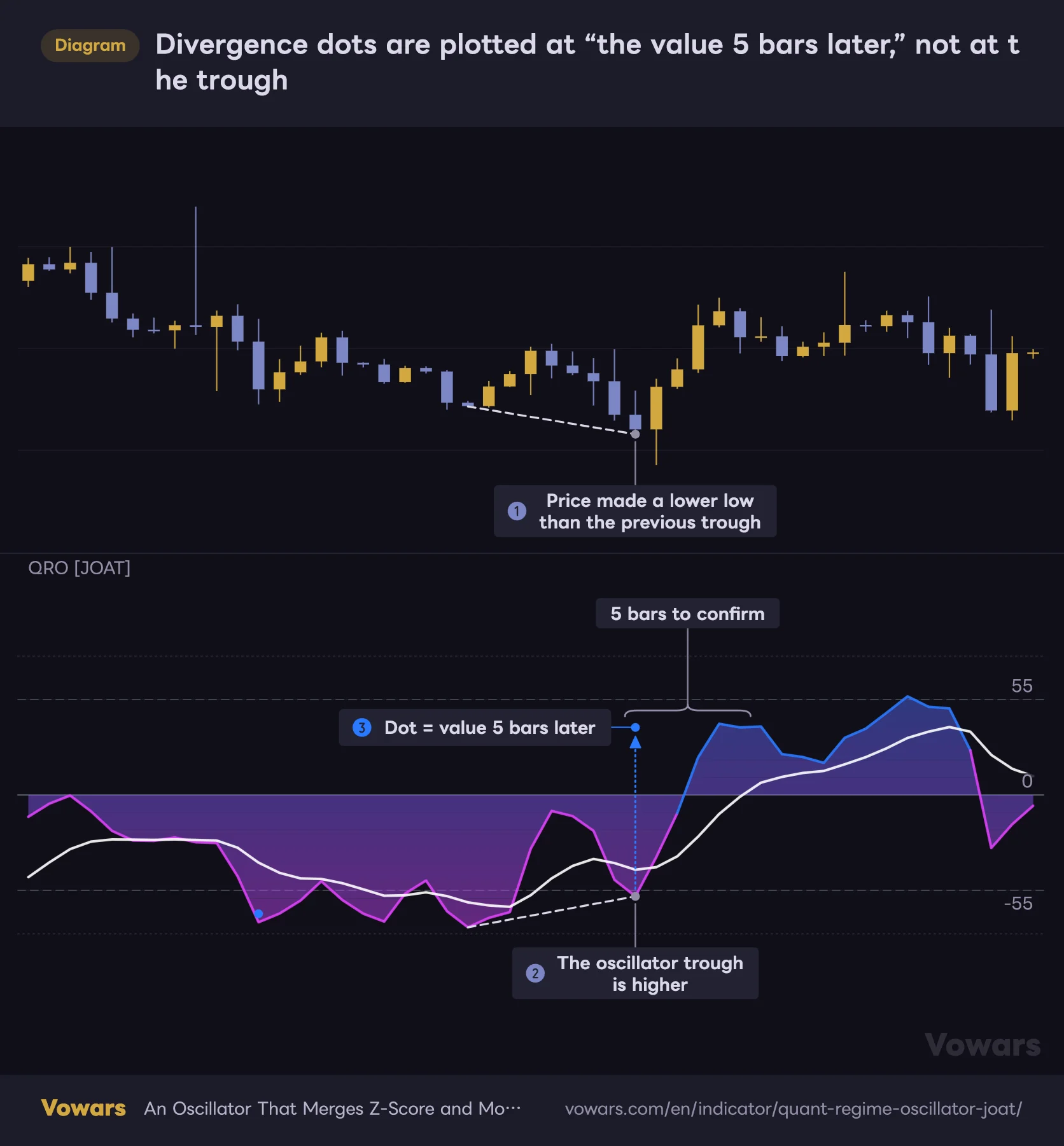
Divergence dots are plotted at “the value 5 bars later,” not at the trough
Price makes a lower low while the oscillator makes a higher low. It's a bullish divergence, but the blue dot shows up away from the trough.
Vowars DE ver.3.12.4
Price makes a lower low in Figure ①, while the oscillator makes a higher low in Figure ②. A classic bullish divergence. But the blue dot floats well above the trough, as in Figure ③. That one caught me off guard.
A trough is only confirmed once 5 bars have printed to its right. The dot’s horizontal position is drawn back at the trough bar, but its vertical position uses the oscillator value at the moment of confirmation. If price rips higher after the low, the dot ends up far away from the trough.
I confirmed this on the actual Bitcoin daily chart too. The June 30, 2026 trough had the oscillator at −59.6, yet the blue dot sits at +6.2. If you just look at the dot and read it as “divergence near zero,” you’re reading it wrong. Take the dot as a marker that says “there was a trough around this bar”, and check the depth of the trough on the line itself.
What it actually compares: the low of the bar where the oscillator bottomed
One more detail. According to the author’s description, oscillator troughs and peaks are compared with price troughs and peaks. What’s actually compared is the low of the bar where the oscillator bottomed (or the high, for peaks). It doesn’t look for a separate swing low in price. The offset is usually small. But when the actual price low and the oscillator trough are a few bars apart, the result can disagree with what you’d see by connecting the lows on the chart.
Also, it only compares against the single previous trough (or peak), and it doesn’t care whether that’s above or below zero. You can get a bullish divergence above zero. Dots never move on confirmed bars, but on the bar that’s still forming, a dot can pop in and out depending on how that bar trades.
Parameters and settings by use case
The settings are split into five groups, with 23 inputs in total. The input names are shown in English, so I’ll refer to them by those names as-is.
01 · Engine (the oscillator itself)
| Setting | Default | Suggested | Effect |
|---|---|---|---|
| Z-Score Length | 30 | 30 | Length of the SMA and standard deviation used as the Z-Score baseline. Longer values measure distance from a slower mean and calm the line’s swings. The regime’s up/down call also uses this mean |
| Momentum (ROC) Length | 14 | 14 | How many bars back to measure momentum against. The same length is used for the dispersion calculation |
| Weight · Z-Score | 1.0 | 1.0 | Weight of the Z-Score component. Set to 0 and the line becomes pure momentum |
| Weight · Momentum | 1.0 | 1.0 (0.5 if the pinning bothers you) | Weight of the momentum component. Lowering it reduces how much the ±100 pinning affects the line |
| Oscillator Smoothing | 2 | 2〜4 | EMA length used to smooth the line. At 4, crosses with the signal line drop by about 25% |
| Signal Line Length | 9 | 9 | EMA length of the signal line. Longer means fewer crosses but more lag |
In this group, Oscillator Smoothing is about the only one I touch. On the 4H, raising it from 2 to 4 cut signal-line crosses from 15.0 to 11.2 per 100 bars. The line gets less jagged, which makes it easier to read if you like using crosses as a cue. Setting Signal Line Length to 14 also cuts crosses to 12.8, but the signal line lags a lot more.
02 · Regime (regime classification)
| Setting | Default | Suggested | Effect |
|---|---|---|---|
| Efficiency Ratio Length | 20 | 20 | Lookback for measuring ER. Longer means fewer Trending bars, shorter means more |
| Trending Threshold | 0.45 | 0.45 (0.35 if you prioritize signals) | ER at or above this is Trending. Lower it to get more blue/purple background and more signals |
| Mean-Revert Threshold | 0.25 | 0.25 | ER at or below this is Mean-Rev. Keep it lower than Trending Threshold |
Efficiency Ratio Length has a big impact. Comparing the share of Trending bars on the Bitcoin 4H, the default 20 gave 14.6%. At 40 it drops to 4.9%, and at 10 it jumps to 29.8%. Go shorter if you want to see the background more often, and longer if you only want color on truly strong trends.
03 · Signals (signals and divergence)
| Setting | Default | Suggested | Effect |
|---|---|---|---|
| Overbought Level | 55 | 55 | Overbought threshold. Used for the SELL condition and the dashboard’s State |
| Oversold Level | -55 | -55 | Oversold threshold. Used for the BUY condition and the dashboard’s State |
| OB/OS Recall Bars | 6 | 6 (30 if you want to see signals) | How many bars the memory of crossing a threshold lasts. Has the biggest impact on signal count |
| Min Bars Between Signals | 10 | 10 | Minimum spacing between BUY/SELL signals. Shared by BUY and SELL, so no SELL can fire right after a BUY |
| Show Divergences | On | On | Shows the divergence dots |
| Divergence Pivot Len | 5 | 5 | Bars on each side used to confirm troughs and peaks. The dots are also delayed by this many bars |
On the Bitcoin 4H, setting Divergence Pivot Len to 3 increased the number of dots by about 40%, while 8 cut them by about 20%. Smaller values fire earlier but pick up even minor troughs. Larger values filter dots down, but the confirmation delay grows by the same number of bars.
04 · Visuals and 05 · Dashboard (display)
| Setting | Default | Suggested | Effect |
|---|---|---|---|
| Gradient Fill | On | On | Gradient between the line and 0 |
| Oscillator Line | On | On | The oscillator line. The fill stays even when turned off |
| Signal Line | On | On | The white signal line |
| Regime Background | On | On | Regime background color |
| Signal Markers | On | On | BUY/SELL labels. Turning them off doesn’t change the alert conditions |
| Show Dashboard | On | On | Shows the dashboard |
| Position | Top Right | Your preference | Dashboard position (choose from 8 spots) |
| Size | Small | Small | Dashboard text size (Auto, Large, Normal, Small, Tiny) |
Example settings by goal
| Goal | What to change | Why |
|---|---|---|
| Read it as an oscillator | Keep the defaults | The share of time beyond ±55 barely changes across assets and timeframes, so you can compare directly |
| Also see BUY/SELL | OB/OS Recall Bars at 30, and Trending Threshold at 0.35 if needed | The combination that produced signals in testing. Even then, expect one every few weeks to few months |
| Calm the line down | Oscillator Smoothing at 3–4 | Fewer crosses and a less jagged line |
| More trend background | Efficiency Ratio Length at 10–15 | The shorter the lookback, the easier it is to classify as Trending |
| Filter divergences | Divergence Pivot Len at 8 | Fewer dots, but they print 8 bars late |
I checked 12 combinations across Bitcoin, Ethereum, and PAXG from the 15m to the daily. The line spent 15–24% of the time at +55 or higher and 12–16% at −55 or lower. Being able to compare different assets and timeframes straight out of the box is a clear strength of this indicator.
How I use it: set direction elsewhere, then use QRO to gauge pullback depth
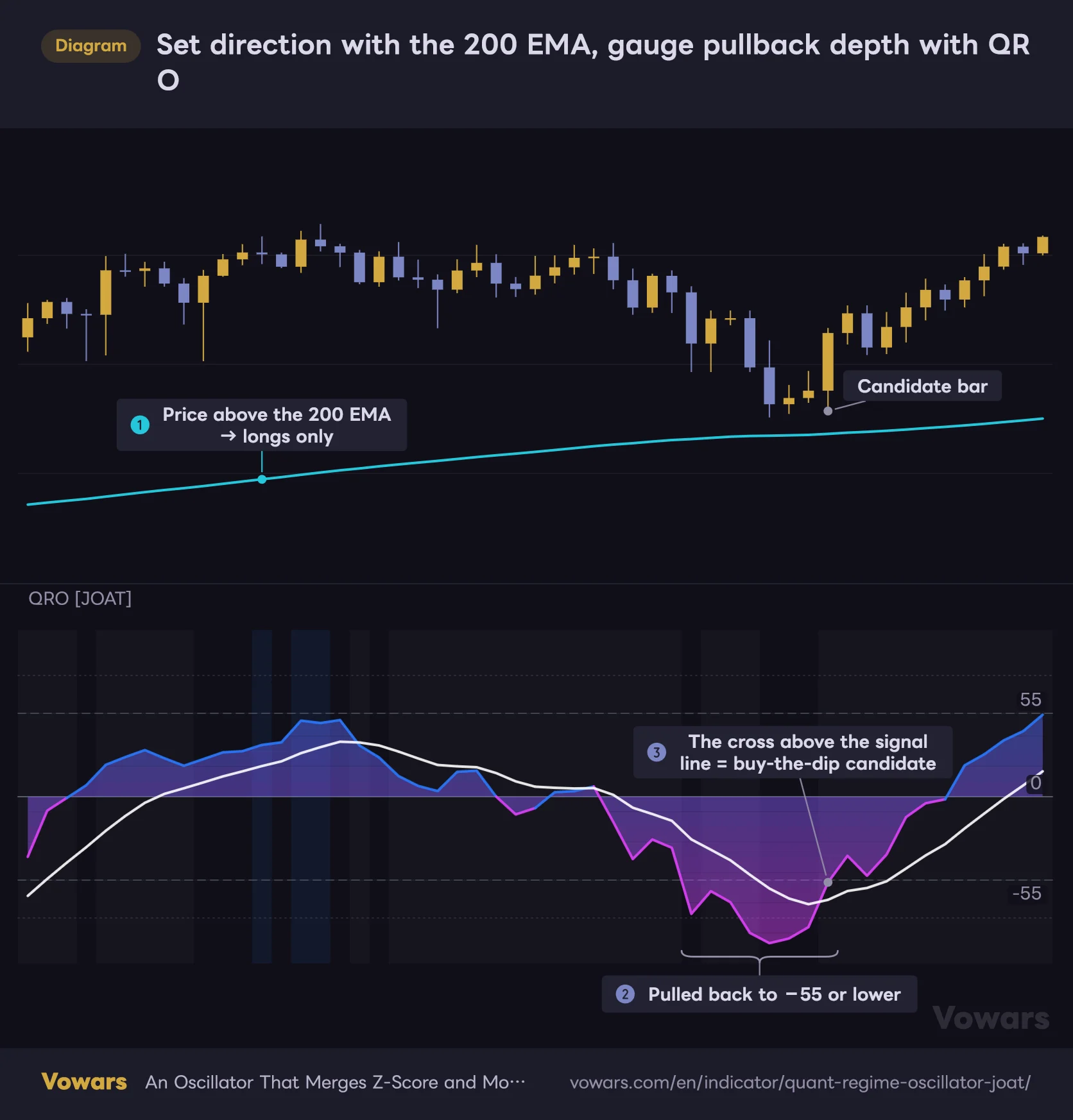
Since signals are so rare, I felt it would be a waste to sit around waiting for labels from “Quant Regime Oscillator.” So what I’ve been testing is handing the directional call to a long-term moving average and using QRO only to gauge the depth and timing of pullbacks and rallies. For the partner, I went with the 200 EMA, which a lot of traders watch.
Set direction with the 200 EMA, gauge pullback depth with QRO
Price is above the 200 EMA, so the bigger picture is bullish. Within that, the bar where QRO dips below −55 and then crosses above its signal line is treated as a buy-the-dip candidate.
- EMA 200
Vowars DE ver.3.12.4
1Set direction with the 200 EMA
If price is above the 200 EMA as in Figure ①, I only look for longs. Below it, only shorts. Since direction is decided here, I don’t rely on QRO’s regime classification.
2Wait for QRO to pull back to −55 or lower
In an uptrend, a drop below −55 like Figure ② is a deep pullback, with price stretched well below its 30-bar mean. I pass on shallow dips.
3Flag a candidate on the cross above the signal line
When the oscillator crosses above the signal line in Figure ③, that’s a buy-the-dip candidate. Place your stop on the price chart, for example just below the pullback low.
There’s one goal here. What this approach replaces is the trend classification in “Quant Regime Oscillator.” Because ER looks at the efficiency of the last 20 bars, it’s always going to be low right after a deep pullback. The better the buy-the-dip setup, the more likely the uptrend classification is to be missing, and that’s baked into how it works. Handing direction off to a longer-period moving average sidesteps that conflict.
The “candidate bar” in the figure is an annotation for explanation only. In this situation, “Quant Regime Oscillator” doesn’t display a BUY. If you want notifications, a practical split is to set an alert for when the oscillator crosses above the signal line, then check where price is relative to the 200 EMA on the chart once the alert comes in.
As for timeframes, I mostly use it on the 1H and 4H. It works on the 15m as well. The line behaves the same, but Mean-Rev makes up over 60% of bars, so the background adds very little information. Even on an asset like gold, where rallies and pullbacks tend to be clearly separated, the numbers I counted on PAXG came out almost identical to Bitcoin’s.
What you can rely on, and what to watch out for
What you can rely on
- See overextension and momentum in one line, using just one pane
- Values behave almost the same across assets and timeframes, making comparisons easy
- The ER background lets you check trend efficiency by color and by number
- Confirmed bars never change after the fact
- The dashboard lets you check the Z-Score and Momentum breakdown
What to watch out for
- On default settings BUY/SELL almost never fires, and the dashboard stays at FLAT
- The background is mostly gray, with few trend classifications
- Divergence dots print at a height away from the trough, which is easy to misread
- The momentum component pins at ±100 easily, pushing the line to the extremes in trends
- The ±80 dotted lines are very faint and aren’t used in any logic
What to know before using it in real time
Confirmed bars don’t repaint. The forming bar moves
The oscillator, signal line, and background color are calculated using only values up to each bar’s close. There’s no higher-timeframe data and nothing that looks ahead. The display on confirmed bars never changes after the fact.
The bar that’s still forming is a different story. The values move every time the close moves. A BUY/SELL label can appear mid-bar and disappear before the bar closes. The author also states that signals lock in on the bar close.
Set alerts to “Once Per Bar Close”
Three alert conditions are available: QRO — Long, QRO — Short, and QRO — Any Signal. To avoid catching signals that appear and vanish on the forming bar, the safe choice is to set the trigger to Once Per Bar Close. According to TradingView’s help center, if you change the indicator’s settings after creating an alert, the alert keeps running on the settings it was created with. If you change OB/OS Recall Bars or anything else, recreate the alert.
One more important point. As we saw in the previous section, the conditions are almost never met on default settings. It’s easy to end up with an alert that sits there and never goes off, so keep that in mind.
“◆ FLAT” only applies to the loaded history
The dashboard header and past BUY/SELL signals are calculated over the bars loaded on the chart. How many bars you can load depends on your plan, with the free Basic plan reportedly capped at 5,000 bars (as of 2026/9/26). BUY/SELL labels on the chart are limited to the most recent 60, and older ones are removed automatically.
Use Bar Replay to see how it behaves
You can’t see divergence dots appearing 5 bars late, or the moment a signal fires, just by scrolling back through history. Stepping forward one bar at a time with Bar Replay lets you check it in an order close to real time. On the free plan, Replay is limited to the daily and higher, and intraday Replay and how far back you can go depend on which paid plan you have (as of 2026/9/26).
Less a buy/sell signal, more a market thermometer worth keeping on your chart
![Quant Regime Oscillator [JOAT]](https://vowars.com/wp-content/webp-express/webp-images/uploads/2026/09/Quant-Regime-Oscillator5-1024x562.png.webp) Image
ImageAt the core of “Quant Regime Oscillator” are a single line that combines distance from the mean with momentum, and an ER-based read on the market’s character. Both are designed to be read on the same yardstick across assets and timeframes, and in 12 different combinations the values behaved almost identically. That consistency is a big draw if you want to compare across markets.
On the flip side, the BUY/SELL signals, one of its headline features, almost never fire on default settings. If you load it expecting signals, you’ll probably be puzzled by a dashboard stuck on FLAT. I know I was. If you want to see them, increase OB/OS Recall Bars, and use them knowing that both the frequency and the character of the signals will change. This is where opinions will differ.
Personally, I treat the labels as a bonus and keep it on the chart as an oscillator that measures “how deep did it pull back” and “has momentum come back” relative to a direction I’ve set with something like the 200 EMA. Just make sure you know from the start that divergence dots print at a height offset from the trough. Get that down, and it’s a genuinely handy oscillator that lets you check overextension, momentum, and market character in a single pane.