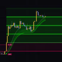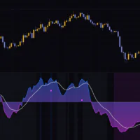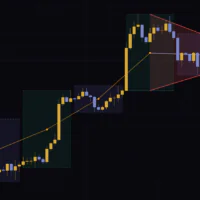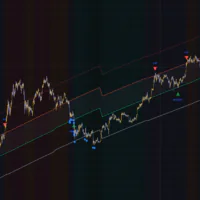


Reading the slope of a regression line drawn on price is hardly a new idea. The problem has always been that a raw slope number is useless across instruments, because the magnitude is completely different from one ticker to the next.ChartPrime’s Linear Regression Oscillator gets around that by re-measuring the slope against recent volatility as its yardstick.
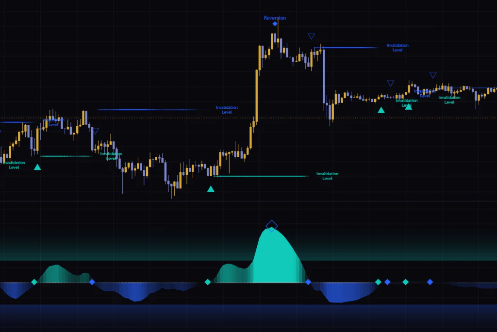
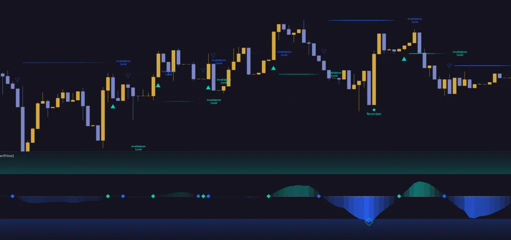
Drop it on a Bitcoin chart and you get teal and blue humps in the lower pane, plus triangles and horizontal lines on the price chart itself. There is a fair amount going on, so the first reaction is usually “okay, what am I actually supposed to be watching?” This review unpacks each piece in order.
What the Linear Regression Oscillator is actually showing you
What the Linear Regression Oscillator tracks is not price itself, but the slope of price. It fits a single straight line through the last 20 closes and pulls out how steep that line is.
A raw slope reading on its own is not much use. Bitcoin moves on a completely different scale on the 1H versus the daily, and the magnitude shifts again between quiet stretches and violent ones. So the Linear Regression Oscillator takes that slope and re-measures it using the variance of the last 100 bars as its unit. The textbook word is standardization, but all it really does is express the current slope as a multiple of how steep things have been lately.
That means the numbers on screen are not dollars or ticks. A reading of 1.5 says the slope is 1.5 standard deviations steeper than the recent average. Once that clicks, everything else about this indicator falls into place.
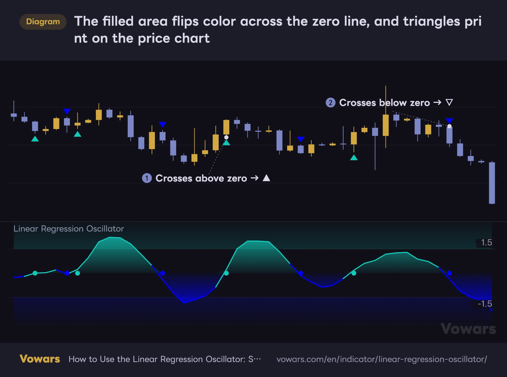
The filled area flips color across the zero line, and triangles print on the price chart
The lower pane is the oscillator itself. It fills teal above zero and blue below, and a triangle prints on the price chart on the very same bar the color flips.
Vowars DE ver.3.8.0
Five things show up on your chart
If you assume everything stays neatly in the lower pane, the objects that appear on the price chart come as a surprise. Here is the full inventory.
| What you see | Where | What it means |
|---|---|---|
| Teal / blue filled area | Lower pane | The slope reading itself. Denser the further it runs from zero |
| Small diamond on the zero line | Lower pane | Marks the bar that crossed zero |
| ▲ (teal) / ▽ (blue) | Price chart | The bar that crossed zero. Below the low, or above the high |
| Larger diamond plus a Reversion tag | Both panes | A turn that happened outside the threshold |
| Horizontal line tagged Invalidation Level | Price chart | The price that kills the signal |
Rather than memorizing those five as separate objects, group them into three jobs: zero crosses give you direction, Reversion flags overextension, and the invalidation line gives you a price level. That framing makes the whole thing far easier to hold in your head.
Read the zero line as “no momentum” and you will misread this thing
This is the single most important section of the review.
On a normal oscillator, zero means neutral – neither up nor down. Zero on the Linear Regression Oscillator is a different animal. The baseline is the average slope over the last 100 bars, so zero does not mean the slope went flat, it means the slope came back to its recent average.
Here is what that does in practice. After dozens of bars of a strong rally, that average gets dragged well above flat. Price is still climbing, but the moment the climb eases off even slightly the value drops under zero and a ▽ prints. The mirror image happens after a long sell-off: the faintest slowdown in the decline lights up a ▲.
A zero cross is not a buy or sell signal, it is a report on whether price is accelerating or decelerating. A ▽ is no guarantee that a sell-off is starting; very often the rally is simply taking a breather.
This is the design, not a bug. It actually catches the loss of steam earlier than a moving average cross does, which makes it a solid input for taking profit. If you watch ▲ and ▽ flipping back and forth mid-trend and write the whole thing off as fakeout-prone, you are throwing away the best part of the Linear Regression Oscillator.
The ±1.5 bands are your overextension markers
There are faintly tinted bands at the top and bottom of the lower pane, teal above and blue below, with diamond tags on the right edge showing 1.5 and -1.5. Inside the bands is business as usual; outside them is the overextended zone.
At 1.5 standard deviations, theory says you should not see it often. Markets do not distribute themselves in a neat bell curve though, so in practice it turns up rather more than that. On something like Bitcoin, where volatility arrives in clusters, I have watched it pin itself to the band and stay there for a good while.
The Reversion print is not there to call tops and bottoms
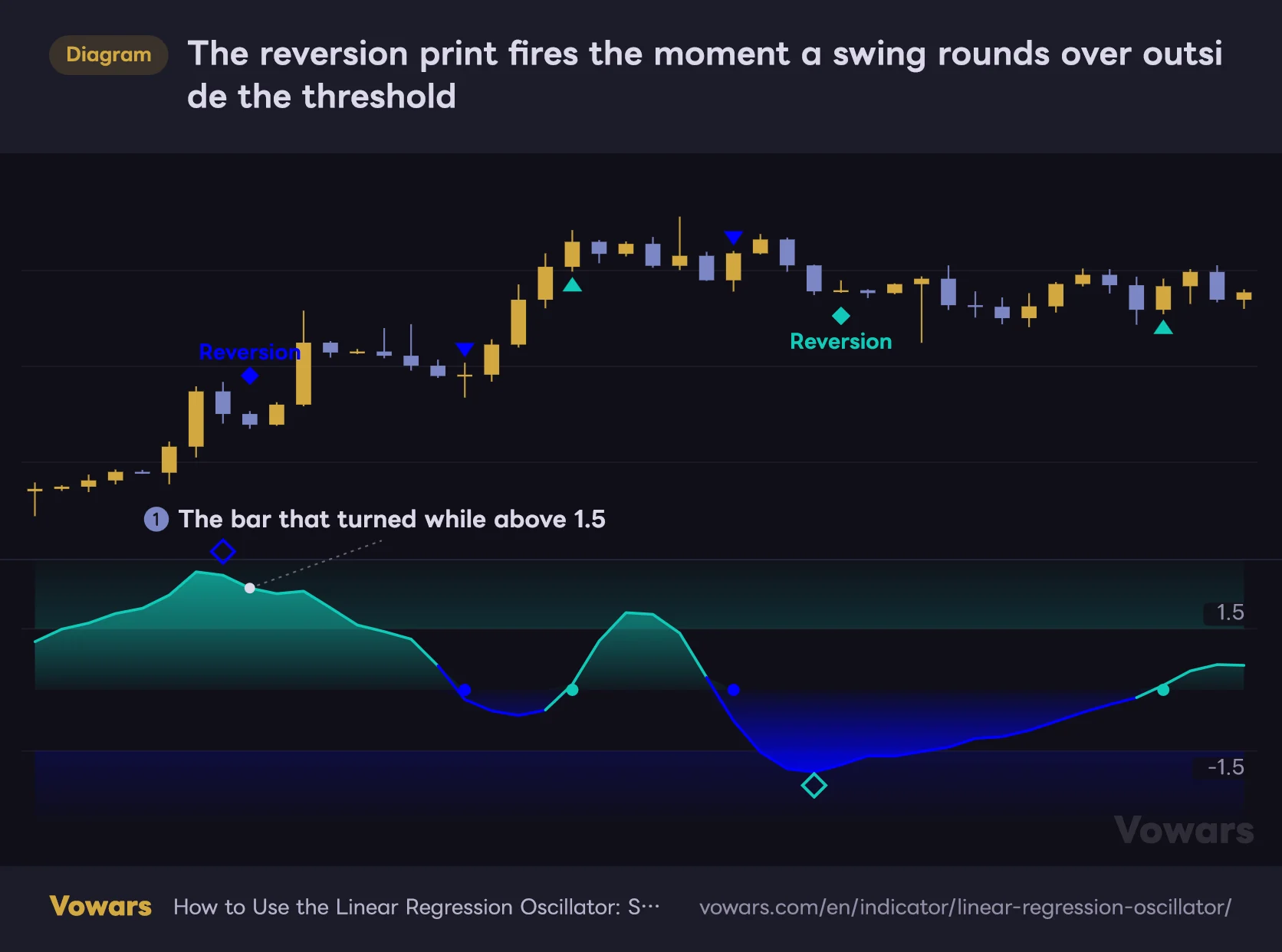
When a peak or trough rounds over while the value sits outside the bands, a larger diamond prints at that turn and a Reversion tag appears on the price chart. That is the turn signal.
The part worth internalizing is that the only condition being checked is whether the direction changed. It compares against the value two bars back, so the print lands on the bar where the rounding is confirmed, not on the exact peak. By the time you see it, the momentum high is already a couple of bars behind you.
The reversion print fires the moment a swing rounds over outside the threshold
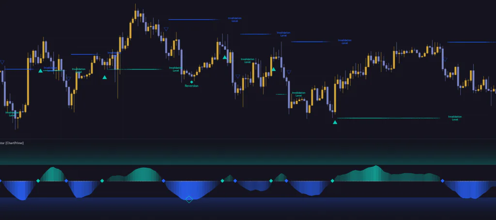
When a peak or trough rounds over while the value sits beyond 1.5, a diamond prints at that turn and a Reversion label appears on the price chart.
Vowars DE ver.3.8.0
Look at the middle of the figure. That swing rounds over in exactly the same way, yet nothing prints, because it stayed inside the threshold. Both conditions have to line up – overextended and turning. That filters the count down hard. Scrolling several months of Bitcoin 4H, I could count the Reversion prints on one hand.
Price continuing to run after a Reversion print is completely normal. In the figure above, price pushes further up after the upper signal fires. This is a report that momentum has cooled, not a forecast that the top is in. Fade it on its own in a strong trend and you will get run over.
The invalidation level is the best thing in this indicator
The invalidation level is what made me decide to keep this one on my layout.
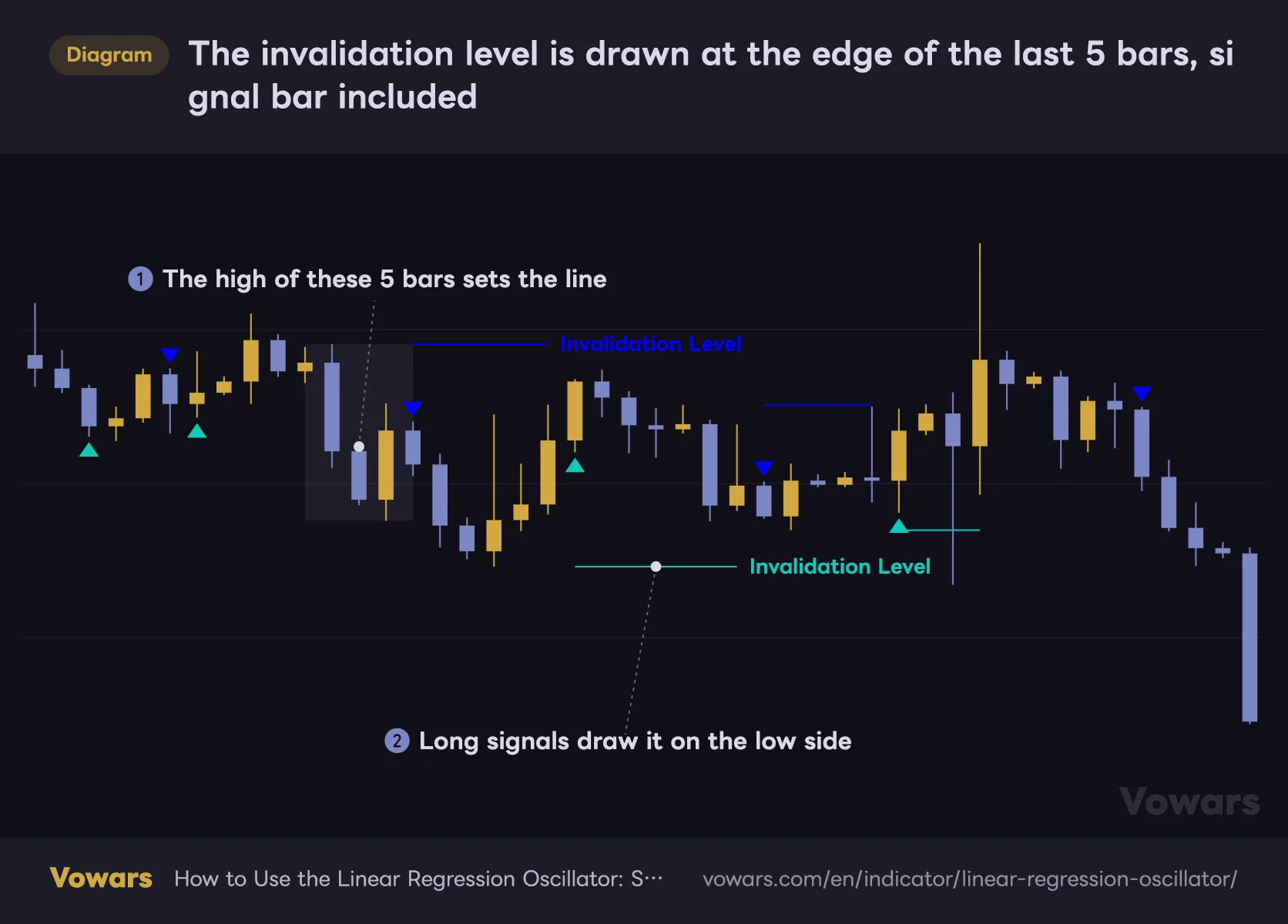
When a triangle prints, a horizontal line is drawn at the edge of the last 5 bars including that one. Short signals take the highest high of those 5 bars, long signals take the lowest low. The line extends to the right until the next signal, then stops and picks up the Invalidation Level tag at its right end.
The invalidation level is drawn at the edge of the last 5 bars, signal bar included
When a triangle prints, a horizontal line is drawn at the edge of the last 5 bars including that one – the high for a short signal, the low for a long one.
Vowars DE ver.3.8.0
What I appreciate is that it answers the most annoying question in trading – where to put the stop – with the same rule every single time. Five bars is a tight window, so the distance never gets greedy. It is a lot more consistent than eyeballing “somewhere around here.”
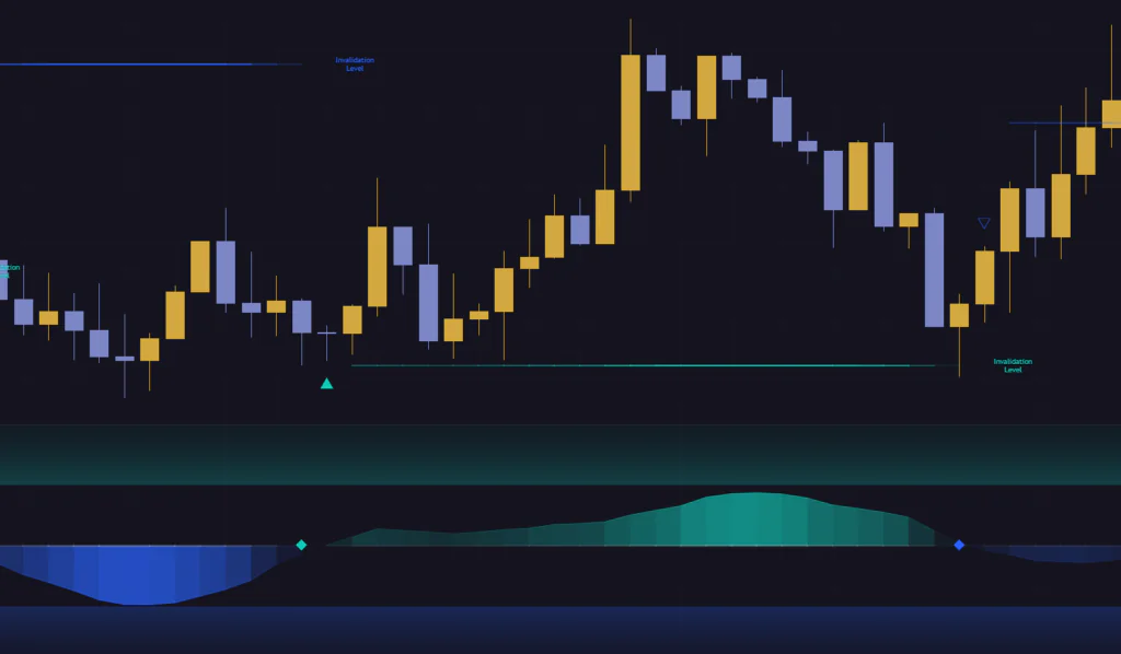
The opacity of the line carries information too. It is stronger the further the oscillator sits from zero, and fades as it comes back. When the line starts to disappear, a zero cross is getting close. It is a subtle touch, but it tells you where you stand the instant you glance at the chart. Nicely done.
1Wait for the triangle bar to close
The reading does not move while a bar is still forming. Wait for the close before you act on it. More on this in the caveats further down.
2Put the stop just outside the plotted line
Sitting exactly on the line gets you wicked out. Depending on how volatile the instrument is, pushing it 0.2 to 0.5 ATR beyond the line settles things down.
3Treat the signal as dead once the line breaks
Then wait for the next signal. Hanging on after the line breaks is the fastest way I know to turn a small loss into a big one.
 Image
ImageThe line is redrawn whenever an opposite signal fires. In other words, the moment the line gets redrawn doubles as your exit cue. Managing both the stop and the exit off a single line keeps things refreshingly simple.
Only four settings, and there is an order to touching them
Open the settings and there are exactly four fields, so there is nothing to get lost in. If you are tired of bloated indicators with forty inputs, that alone is a decent selling point.
| Parameter | Default | Recommended | Effect |
|---|---|---|---|
| Length | 20 | 20 (10-14 for short-term, 30-40 for long-term) | Number of bars used to measure the slope. Lower is faster with choppier swings; higher is smoother but the prints lag |
| Upper Threshold | 1.5 | 1.5 to 2.0 | Upper overextension line. Raise it for fewer Reversion prints, lower it for more |
| Lower Threshold | -1.5 | -1.5 to -2.0 | Lower overextension line. Set independently from the upper one |
| Plot Bar Color | Off | Off (switch on only when you want direction at a glance) | Repaints candles to match whichever side of zero the oscillator is on |
How to pick your Length
Length is the response speed, plain and simple. Scalping the 5-minute, tightening it to 10-14 breaks the swings into smaller pieces and makes it easier to catch shallow dips and rallies. Swinging the daily, stretching it to 30-40 stops noise from flipping ▲ and ▽ all over the place.
There is one trap worth knowing about. The 100-bar window it uses as a yardstick is hard-wired and cannot be changed from the settings. So if you shorten Length on its own, you end up measuring a fine-grained slope against a long 100-bar ruler, and the readings get a bit jumpy. If you move the number a long way, revisit the thresholds at the same time.
Your thresholds do not have to be symmetrical
This one seems to get overlooked. Upper Threshold and Lower Threshold are independent fields, so you can run different values on each side.
Take something like gold or an equity index, which tends to grind higher and then drop fast. Setting the upper side to 1.8 and the lower to -1.3 changes the feel noticeably: you pick up the downside prints more readily while cutting the premature warnings during rallies. There is no single correct answer here, so the reliable approach is to eyeball how high the swings actually run on your own instrument and set it from there.
Leave the defaults on, scroll back a few months and watch how far the peaks and troughs actually reach. If they never touch the band, lower the number; if they live inside it, raise it. That single adjustment gets the signal count close to where you want it.
Should you turn Plot Bar Color on?
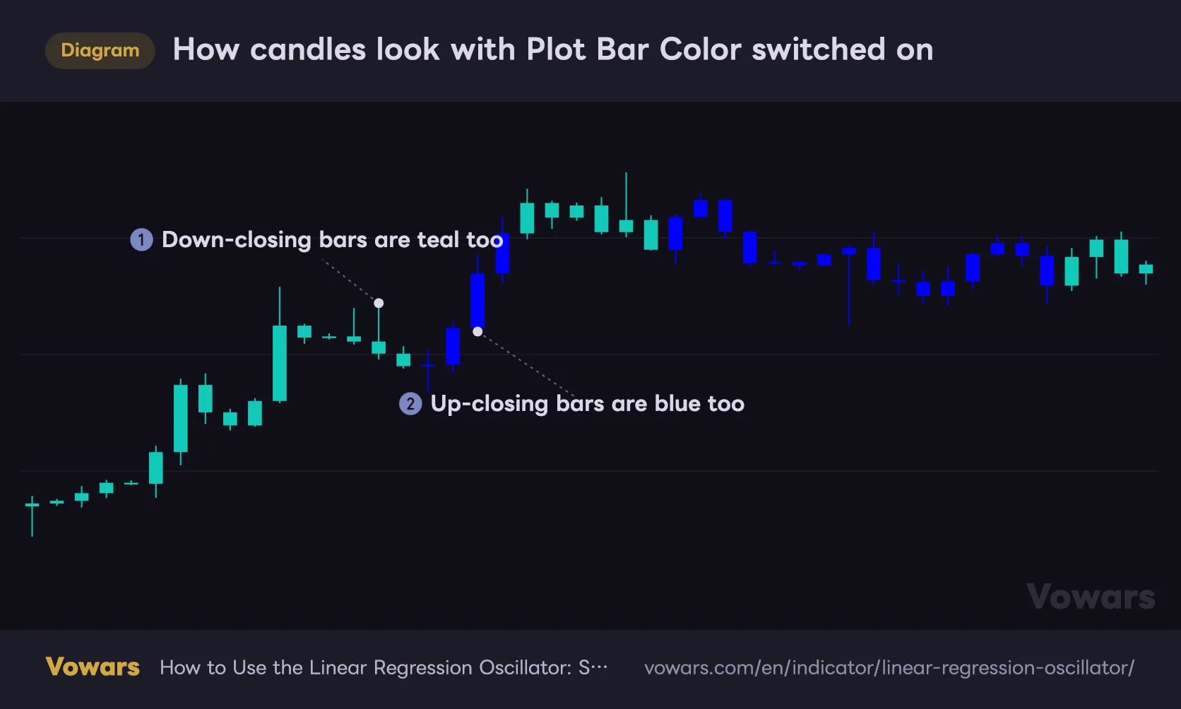
Plot Bar Color repaints your candles to match whichever side of zero the oscillator is on: teal above, blue below.
How candles look with Plot Bar Color switched on
With Plot Bar Color on, the body, the wick and the border are all repainted in a single color that follows whichever side of zero the oscillator is on.
Vowars DE ver.3.8.0
Having direction land at a glance does feel good. But as the figure shows, the body, the wick and the border all go the same color, so whether the bar closed up or down vanishes from the coloring. If you read price action off candle shapes, you are actually losing information. Leaving it off by default and flipping it on briefly when you just want a read on direction is the better way to use it.
Where it works, and where it slips
Here is the honest take after scrolling back through a few months of charts.
Where it clicks
- Trending markets where you want to buy the dip or sell the rally
- Checking whether a breakout is still accelerating
- Timing an exit on a position you are already holding
- Instruments whose volatility swings hard, since the yardstick rescales itself
- When you want your stop placed by the same rule every time
Where it struggles
- Tight, directionless ranges – ▲ and ▽ flip every few bars
- Dead, low-liquidity sessions where a tiny slope change spikes the reading
- Freshly loaded charts, or tickers without enough history behind them
- Mid-way through a strong trend, where counter-direction prints keep firing
Ranges are the real weak spot. The 100 bars of variance it measures against shrink, so a tiny move throws the reading a long way. The quieter the market, the twitchier it gets – worth keeping in mind. During a stretch where Bitcoin chopped sideways for a few days, ▲ and ▽ swapped over and over and the thing was unusable.
Which trading styles it fits
| Style | Fit | How to run it |
|---|---|---|
| Scalping | Workable, with conditions | Drop Length to 10-14, but stay out of thin sessions |
| Day trading | Good fit | Leave the defaults. The invalidation level works as your stop as-is |
| Swing trading | Good fit | Push Length to 30-40 and use Reversion as an exit cue |
| Position trading | Supporting role | Too few prints on the weekly. Pair it with the daily or lower |
What to pair it with
The weakness of the Linear Regression Oscillator is easy to state. It will not tell you whether you are in a trend or a range. A zero cross means something completely different in those two environments, yet it prints the identical triangle either way.
So the natural fix is to bolt on something that classifies the market regime for you.
- ADX or the Choppiness Index. Lets you manually filter down to taking ▲ and ▽ only while a trend is actually running
- A slow moving average such as the 200 EMA. Simply deciding which triangle you take based on which side of it price sits cuts counter-trend entries dramatically
- Horizontal levels and prior highs and lows. Only acting when a Reversion lines up with a key level is an effective filter
- Volume tools. Helps you tell whether a break of the invalidation level was real participation or just a thin-liquidity wick
Stacking another oscillator like RSI or Stochastics on top, on the other hand, did not do much for me. They fire in similar spots, so all you get is a busier screen without any extra information.
What to know before you run it
The value only moves when the bar closes
The reading does not update while a bar is forming. It holds the previous closed value and then jumps to the new one the instant the bar closes. Nothing flickers tick by tick, which keeps the pane calm, but it does mean triangles can appear or disappear right at the close. If you do not know that, you will be baffled when a print you just saw vanishes.
Act on a forming bar and the condition can fail at the close, taking the signal with it. Enter after the bar has closed. That said, signals on closed bars are never rewritten afterwards. Anything you see scrolling back through history was also there in real time.
You have to build the alerts yourself
The Linear Regression Oscillator ships with no built-in alert conditions. If you want a notification on a zero cross, you have to open TradingView’s alert dialog, select this indicator, and build the condition against its plot yourself – something like “crossing up 0”. It is an extra step, so factor that in if your workflow depends on alerts.
Do not trust it right after loading
Because the yardstick is the last 100 bars, the reading will not settle without at least 100 bars of history behind it. Near the left edge of a freshly loaded chart, or on a recently listed ticker, it will either swing wildly or pin itself flat. Ignore whatever happens at the left edge and judge only from the right side, where there is enough data behind it.
One more detail. There is a cap on how many labels can be drawn at once, so scroll far enough back and the Reversion and Invalidation Level tags simply go missing in the older section. Before you conclude from a backtest that there was no signal in a given stretch, scroll to it and check directly.
So, does it earn a slot on your chart?
My answer is yes, it stays. The reason is probably not the one most people expect, though.
Judged purely as an oscillator, it is honestly not that unique. Standardizing the slope is a neat idea, but if all you want is to catch dips and rallies, there are plenty of other options. The real value of the Linear Regression Oscillator is that it draws you a line showing exactly how far price can go before the signal is dead. Indicators that not only fire a signal but also plot the condition under which that signal expires are rarer than you would think.
Load it expecting Reversion to be your counter-trend trigger and you will probably delete it inside a week. It is not a forecast of a top or a bottom, just a report that momentum cooled. Get that straight and it punches well above its weight for something you control with four inputs.
Start with the defaults on whatever instrument and timeframe you already watch, and just observe it for a few days. How often do the zero-cross triangles print, and does the invalidation level sit at a distance that matches your usual stop? Answer those two and you will know quickly whether it deserves a permanent slot.